
Concept | Model summaries within the visual ML tool#
Watch the video or read the summary below.
The Summary panel of the Report page displays general information about the model, such as the algorithm and training date. In addition, the report page also contains sections relating to the model interpretation, performance, and detailed information about the model.

Model interpretation (explainability)#
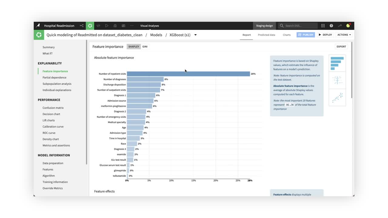
Feature importance#
In the Explainability section, the Feature importance tab displays three charts, with each giving more details about the model behavior and the relationship between input data and output predictions.
The first chart, the Absolute feature importance plot, measures how strongly each variable impacts the model predictions. In the chart below, the Number of inpatient visits feature has the strongest relationship with hospital readmission rates.

Scrolling down, the Feature effects and Feature dependence plots allow you to dig deeper into feature importance to help evaluate the model’s predictions.
The Feature effects plot shows how individual feature values affect the predictions. Each point represents one row in the dataset, and the color reflects the feature’s value. The farther away from center, the more that point affected predictions, either positively or negatively.

The Feature dependence chart allows you to plot the Shapley value, or a measure of each value’s importance in the model, as a function of a selected feature in the dataset.

Note
In versions 12.0 and above, Dataiku automatically produces the three feature importance plots for all algorithms except K-nearest neighbors and support vector machine models, which both require long computation time. You can compute feature importance after training KNN and SVM models in Model Reports, but be aware it will take longer.
For tree-based models, you can opt to view feature importance calculated via Shapley values, which produces the three plots, or by Gini importance, which produces only one plot.
Partial dependence#
Partial dependence plots help us understand the effect an individual feature has on model predictions. For example, computing the Partial dependence plot of the Age feature reveals the likelihood of hospital readmission increases approximately from age 60 to 80.

Subpopulation analysis#
Subpopulation analysis allows us to assess the behavior of the model across different subgroups. For example, we can analyze the model performance based on Gender. The results show similar model behavior across genders, with a slight decrease in performance for male patients.

Individual explanations#
While global variable importance can be a useful metric in determining overall model behavior, it doesn’t provide insights into individual model predictions. Dataiku allows users to generate individual prediction explanations. For example, we can see which features most influenced our model’s prediction for individual patients.

Model performance#
The Confusion matrix compares the actual values of the target variable with the predicted values. In addition, Dataiku displays some associated metrics, such as precision, recall, and the F1-score. For example, the confusion matrix shows that our model has a 44% false-positive rate, and a recall of 84%.

By default, Dataiku displays the confusion matrix and associated metrics at the optimal threshold (or cut-off). However, manual changes to the cut-off value are reflected in both the confusion matrix and associated metrics in real-time.
The Decision chart tab displays a graphical representation of the model’s performance metrics for all possible cut-off values.

The Decision chart also shows the location of the optimal cut-off (based on the F1 score), which is 0.35 for our XGBoost model.
The Lift charts and ROC curve are visual aids that can be used to assess the performance of a machine learning model. The steeper the curves are at the beginning of the graphs, the better the model.

The Density chart illustrates how the model succeeds in recognizing and separating the classes. While in a perfect model the probability densities for the different models would not overlap, this is seldom the case for models trained on real data. For our XGBoost model, we’re able to observe two distinct distributions, with their medians separated by a 12% predicted probability.

Model information#
Finally, let’s explore the Model Information section. The Features panel includes information on feature handling, as well as a list of all preprocessed features. For our XGBoost model, we can see that the Encounter ID feature was rejected, while the Number of emergency visits was processed as a numeric feature and standardized.

The Algorithm panel contains information on the optimum model resulting from the hyperparameter grid search. For our XGBoost model, we can see that Dataiku selected the XGBoost model with a Max tree depth of 5.
