Hands-On: Explain Your Model
In the lesson, Hands-On: Tune the Model, you modified various settings that improved the model’s performance. Before putting this model into production, we want to make sure we understand its predictions. It is advisable to investigate whether its predictions are biased, in this case for example, by age groups or gender.
With this goal in mind, we return to a few of the options first introduced in the lesson on evaluating your model.
In order to check the model for bias, we’ll perform the following tests:
To do this:
Return to the Models tab of the High revenue analysis.
Open the Summary of the random forest model from Session 2.
Partial Dependence
First, let’s use a partial dependence plot to understand the effect of a numeric feature (age_first_order) on the target (high_revenue).
Click Partial dependence in the left panel to open the partial dependence page of the output.
Specify age_first_order as the variable.
Click Compute.
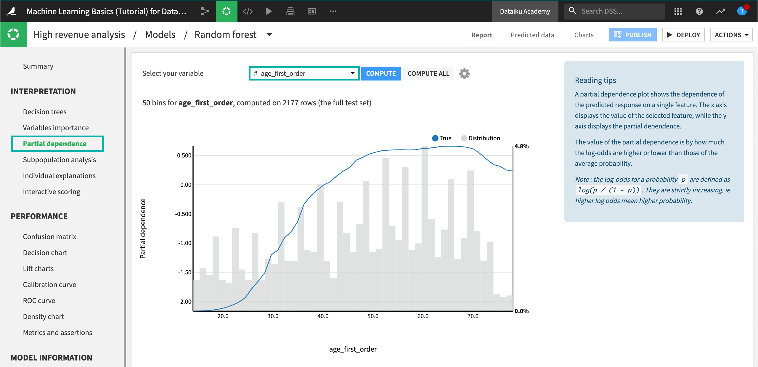
The partial dependence plot shows the dependence of high_revenue on the age_first_order feature, computed on the test set (2177 rows).
A negative partial dependence value represents a negative dependence of the predicted response on the feature value.
A positive partial dependence value represents a positive dependence of the predicted response on the feature value.
For example, the partial dependence plot shows that high_revenue being “True” has a negative relationship with age_first_order for ages below 39 years. The relationship reaches a plateau between ages 50 and 70, but then drops off until age 78.
Underneath the trend line, the plot also displays the distribution of the age_first_order feature. From the distribution, you can see that there is sufficient data to interpret the relationship between the feature and the target.
Let’s see what the partial dependence plot looks like for a categorical feature gender.
Select gender as the variable.
Click Compute.
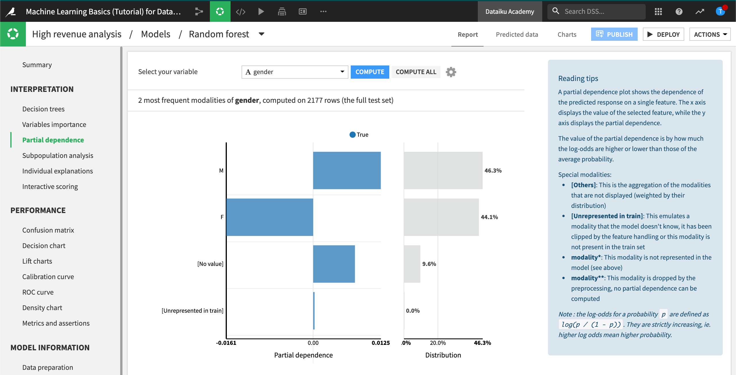
The partial dependence plot shows that high_revenue being “True” has a negative relationship with gender being “F”. In the cases where gender is “M” or has no value, then the relationship is positive. The gender distribution (on the right) is roughly equal between males and females, and it accounts for about 90% of the data.
Subpopulation Analysis
Another useful tool to better understand the model is subpopulation analysis. Using this tool, we can assess if the model behaves identically across subgroups or if the model shows biases for certain groups.
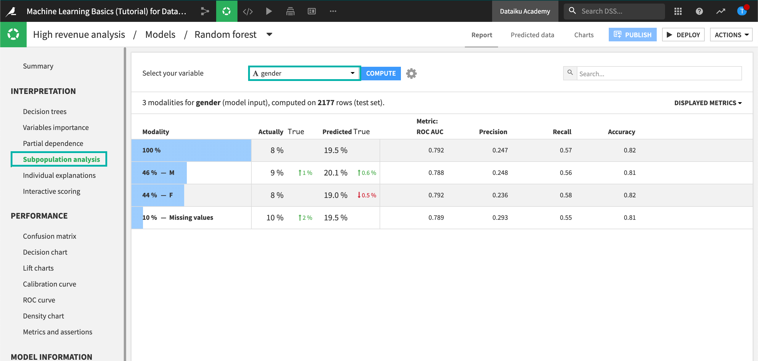
Let’s use a subpopulation analysis to understand how our model behaves across different gender groups.
Click Subpopulation analysis in the left panel to open the subpopulation analysis page of the output.
Specify gender as the variable.
Click Compute.
Note
You might find that your actual results are different from those shown. This is due to differences in how rows are randomly assigned to training and testing samples.
The table shows a subpopulation analysis for gender, computed on the test set. The overall model predicted that high_revenue was true approximately 19% of the time when it was actually true only 8% of the time.
The model predicted “True” 20% of the time for the “M” subgroup, when the actual number was 9%.
For the “F” subgroup, the model predicted that high_revenue was true 19% of the time when the actual number was 8%.
Note
You might find that your actual results are different from those shown. This is due to differences in how rows are randomly assigned to training and testing samples.
The predicted probabilities for male and female are close, but not identical. We can investigate whether this difference is significant enough by displaying more metrics in the table and more detailed statistics related to the subpopulations represented by the “F” and “M” rows.
Click the Displayed Metrics dropdown at the top right of the table, and select F1 Score. Note that this metric considers both the precision and recall values. The best possible value is one, and the worst is zero.
Click anywhere on the “F” and “M” rows to expand them.
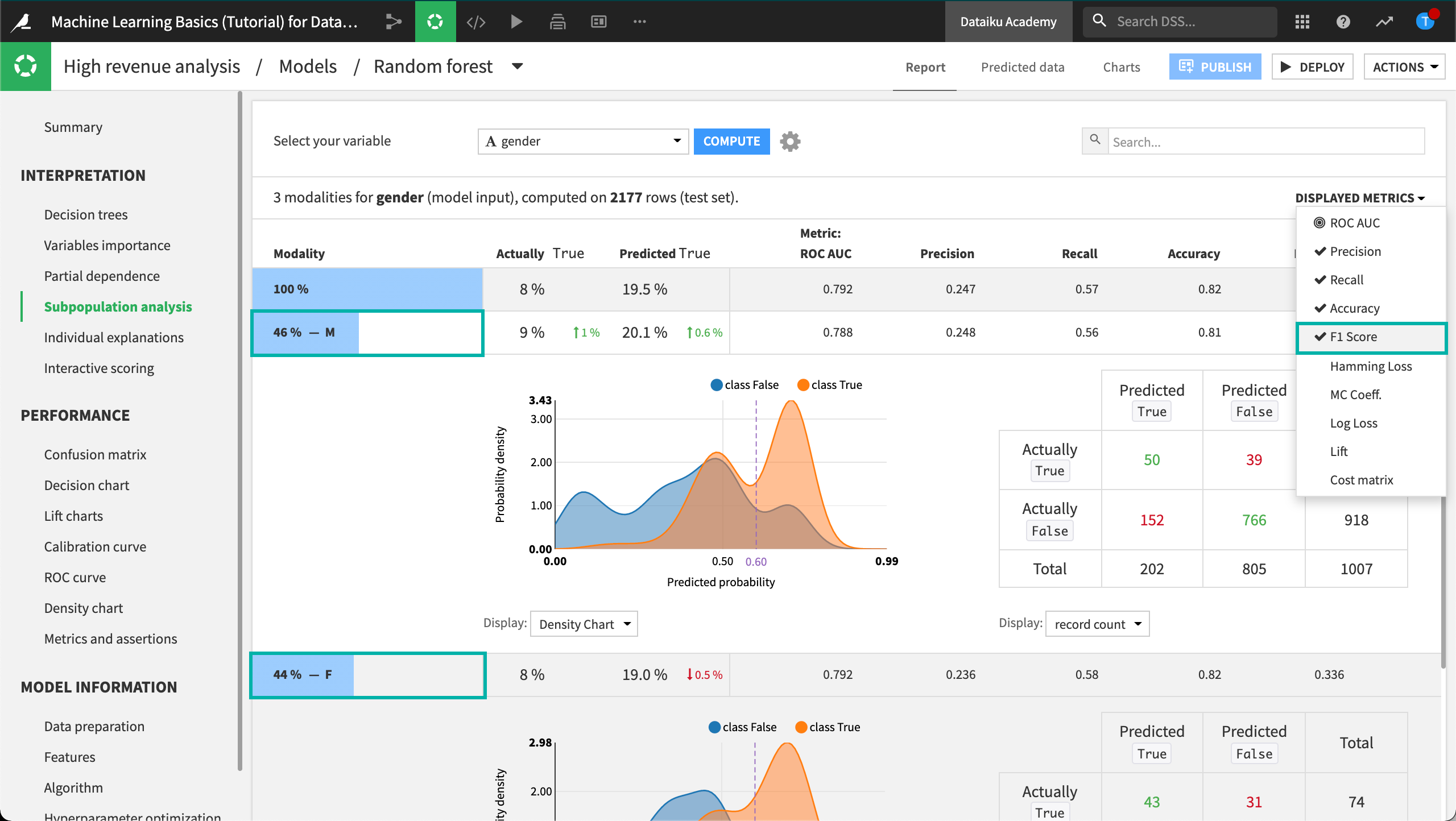
In this analysis, the male subgroup has the highest F1 score of all the groups, even though the score is quite low. Also, the confusion matrices (when displaying % of actual classes) for both the male and female groups show that the female subgroup does better (58%) at correctly predicting high_revenue to be true than the male subgroup (56%).
Individual Explanations
Apart from exploring the effects of features on the model, it can also be useful to understand how certain features impact the prediction of specific rows in the dataset. The individual prediction explanations feature allows you to do just this!
Note that this feature can be computed in two ways:
From the Individual explanations tab in the model results page.
Within a Scoring recipe (after deploying a model to the flow), by checking the option Output explanations. See the Scoring course for an example.
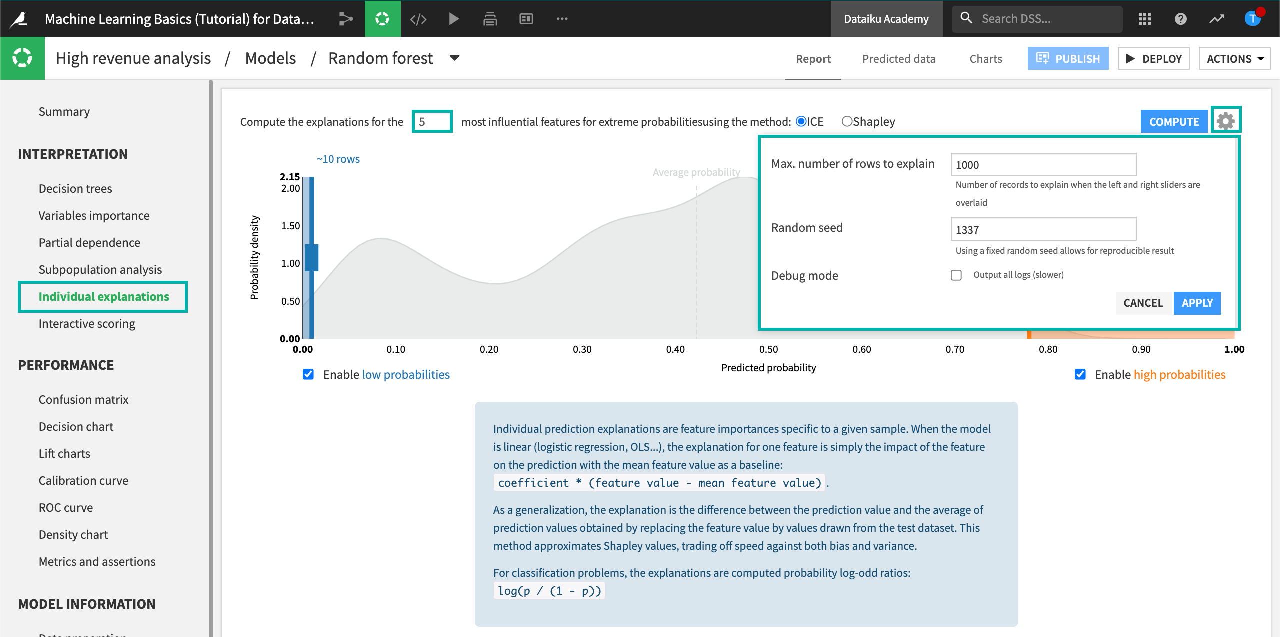
Let’s use the Individual explanations tab in the model results page to visualize the five most influential features that impact the prediction for specific samples in the dataset.
Click Individual explanations in the left panel to open the page.
Specify
5most influential features to use for the explanation.Keep the default ICE method.
Click the gear icon in the top right corner to see more settings, such as the sampling details. Keep the “Sample size” as
1000. This sample is drawn from the test set because the model implemented a simple train/test split. If the model implemented K-Fold validation, then the sample would be drawn from the entire dataset.
Move the left slider close to
0.10(corresponding to “~112 rows”) and the right slider close to0.70(corresponding to “~70 rows”) to specify the number of rows at the low and high ends of the predicted probabilities. Note that the probability density function in the background is an approximation based on the test set. The boxes to enable low and high probabilities are checked by default, so that you can move the sliders.
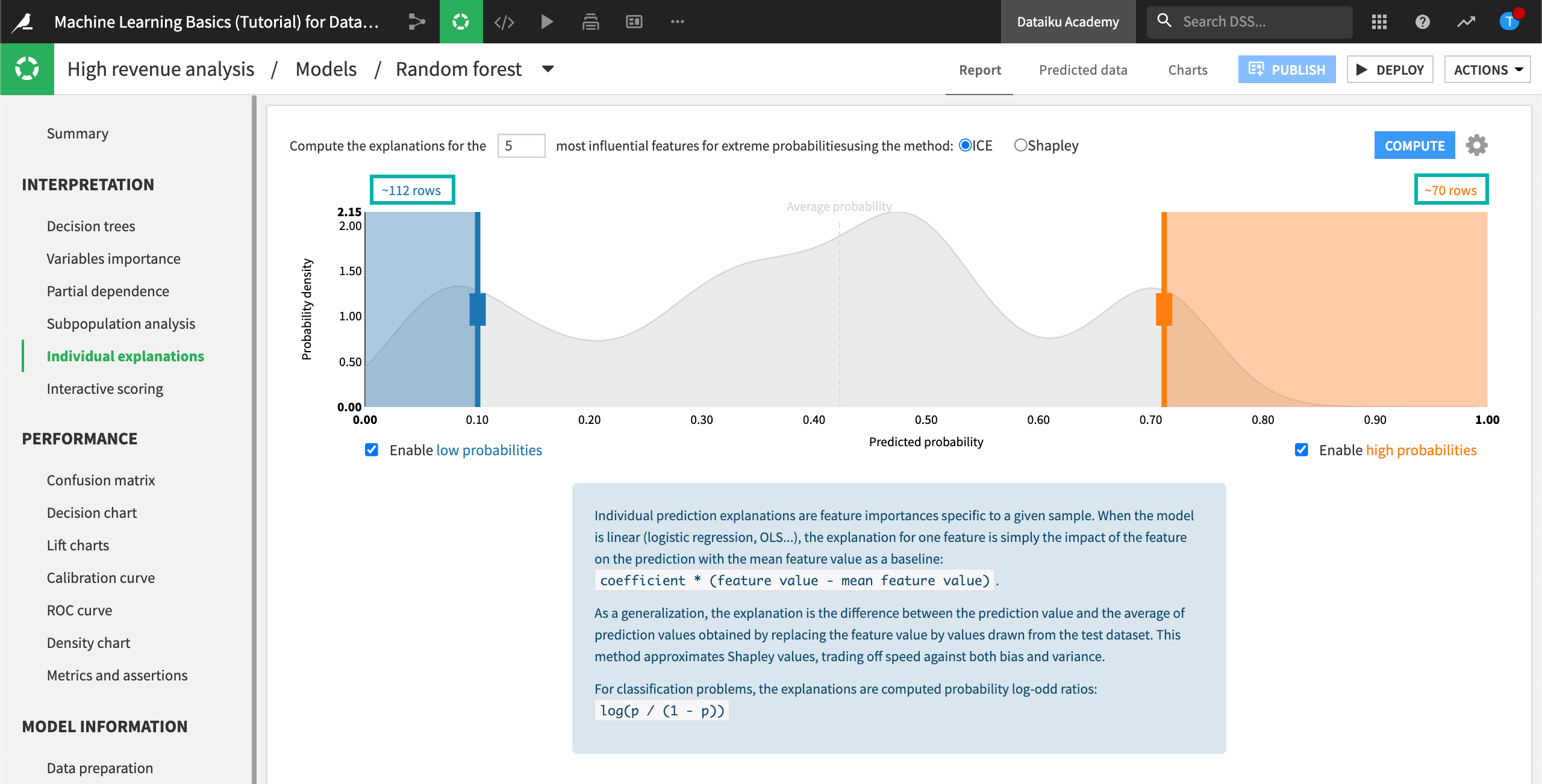
Click Compute.
Note
Depending on the exact location of the sliders, your values may be different from the ones shown in this analysis.
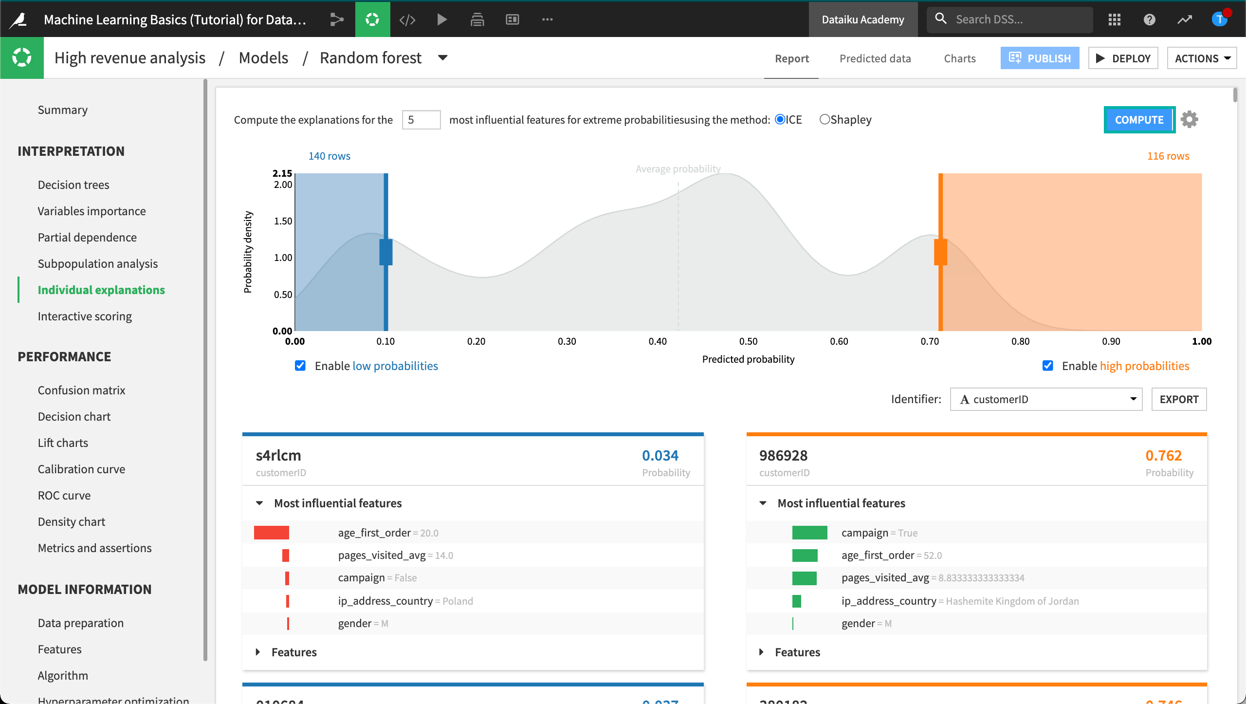
In our example, DSS returned 140 rows for which the output probabilities are less than 0.10, and 116 rows for which the output probabilities are greater than 0.70. Each row explanation is represented in a card below the probability density plot. Notice that DSS has selected customerID as the identifier, but you can change this selection.
On the left side of the page, the cards have low probabilities of high_revenue being “True” and are sorted in order of increasing probabilities. In contrast, the cards on the right side of the page have high probabilities of high_revenue being “True” and are sorted in order of decreasing probabilities. For each card, the predicted probability is in the top right, and the “customerID” (card identifier) is in the top left.
For cards on the left side of the page, observe that all of the bars are red and oriented to the left. This reflects that the predicted probability is below average and the features negatively impact the prediction. In some cases, some of the bars may have counter effects (green and oriented to the right), even so, the net effect of the features will still be negative for cards on the left side of the page.
The opposite observation can be made for the cards on the right side of the page, where the bars are mostly — if not always — green and oriented to the right to reflect the positive impact of the features on the outcome.
You can click Features in a card to display the full list of all its features and their values.
Interactive Scoring
“What-if” analyses can be a useful exercise to help both data scientists and business analysts get a sense for what a model will predict given different input values. Let’s try out a “what-if” analysis and see the resulting predictions.
Click Interactive scoring in the Interpretation section.
Set the pages_visited_avg to 9.
Set campaign to True.
Set age_first_order to 40.
Set all other features to ignore by clicking the Ignore icon.
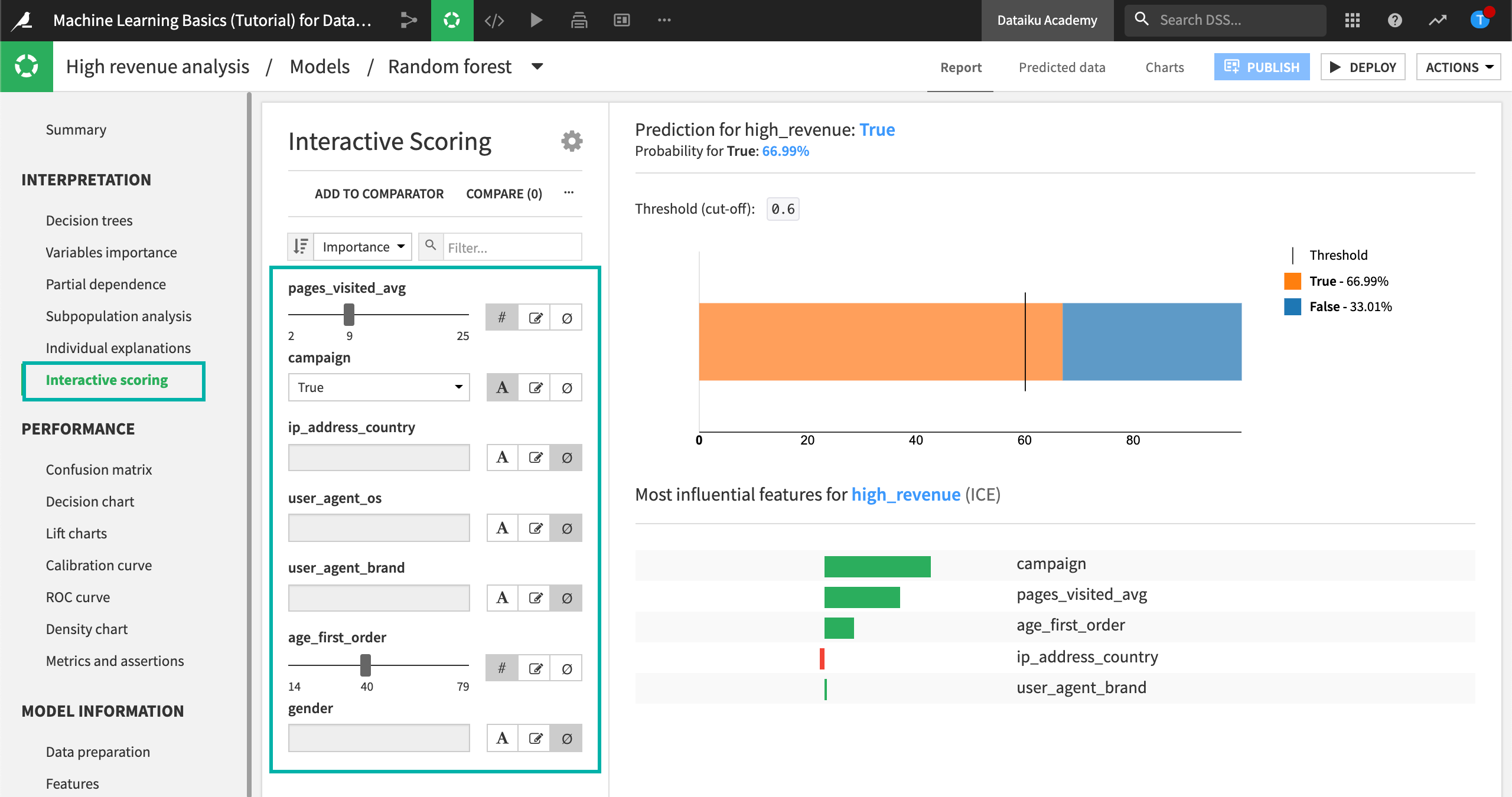
Given this analysis, the model would predict a high-revenue customer with a cut-off threshold of approximately 67%. This information could be useful for making assertions.
What’s Next?
Congratulations! In an effort to seek out unintended biases, you have performed several different kinds of analyses that can help you interpret your model.
If you want to see how far you can go with your model, or how you can actually use it in an automated way to score new data as it arrives, complete the Scoring course.