How to display non-aggregated metrics in charts
Some types of data visualizations plot raw (or non-aggregated) values, while other visualizations calculate some kind of aggregation. A scatter plot, for example, plots raw values, while a histogram plots bin counts.
The type of chart determines whether displaying raw values is possible.
Native Charts
The drag-and-drop interface for creating charts in Dataiku has five native chart types:
Basics
Pivot tables
Scatters
Maps (geographic)
Others (such as boxplot or 2D distribution)
Dataiku natively supports using non-aggregated values in scatter plots. For creating other types of charts, it is possible to plot non-aggregated values when grouping by a dimension with unique values. This is often most useful when the data is already in a summarized format.
In cases where the grouping variable does not have unique values, be sure to select the correct aggregation through the interface. For example, should DSS sum the values? Take an average? Or plot the minimum or maximum value in the group?
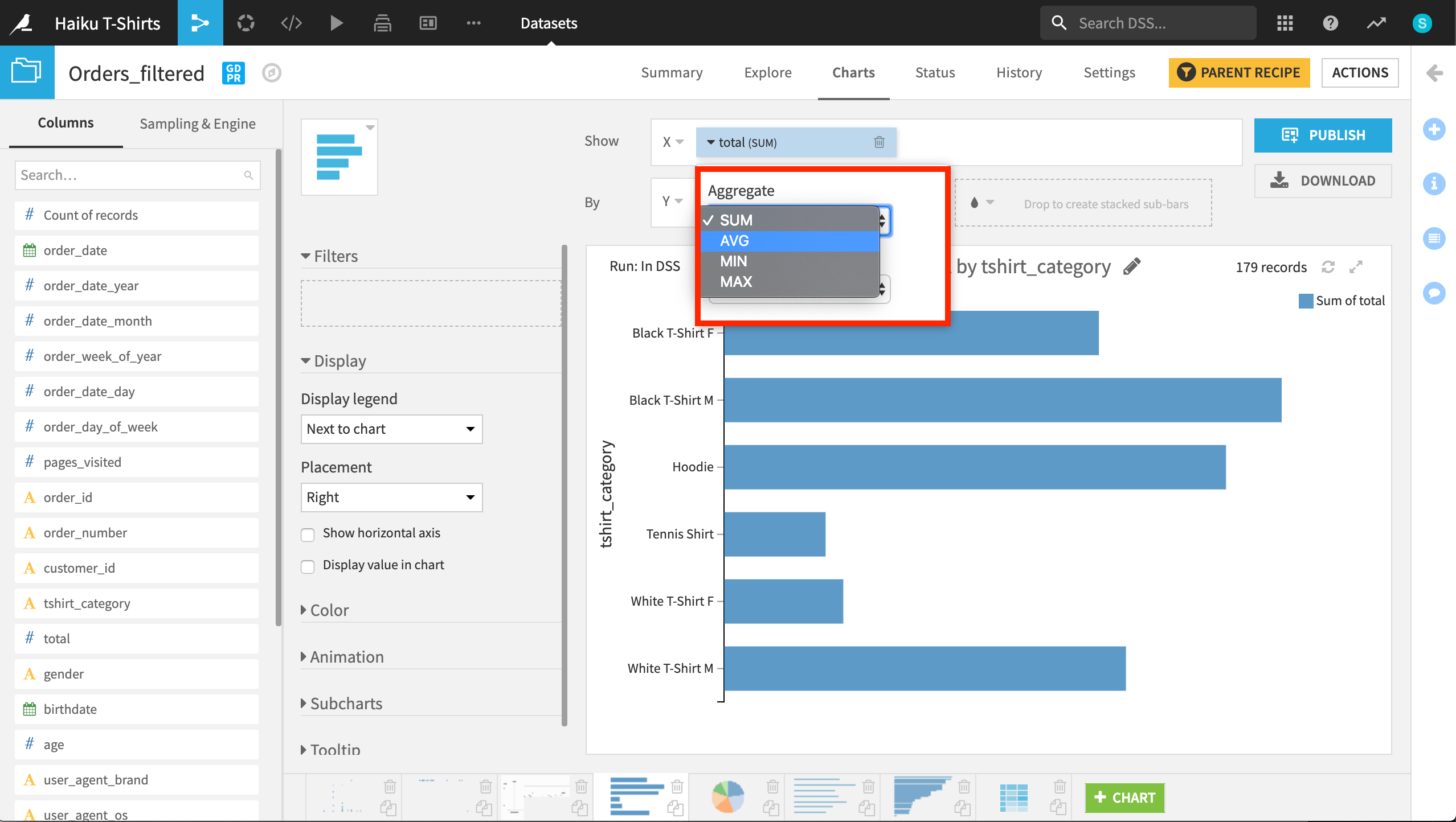
If “total” is the amount spent in dollars, should Dataiku DSS plot the sum or average for each type of t-shirt category?
Advanced Visualizations
More advanced visualizations can be created by developing web apps within Dataiku DSS. Several types of web apps are possible:
HTML + CSS + JS + optional Python
Shiny (R)
Bokeh (Python)
You can also publish visualizations from various Python and R libraries (such as matplotlib or ggplot2) as static insights on dashboards. For more information on embedding charts into dashboards as static insights, please see the relevant documentation for Python or R libraries.
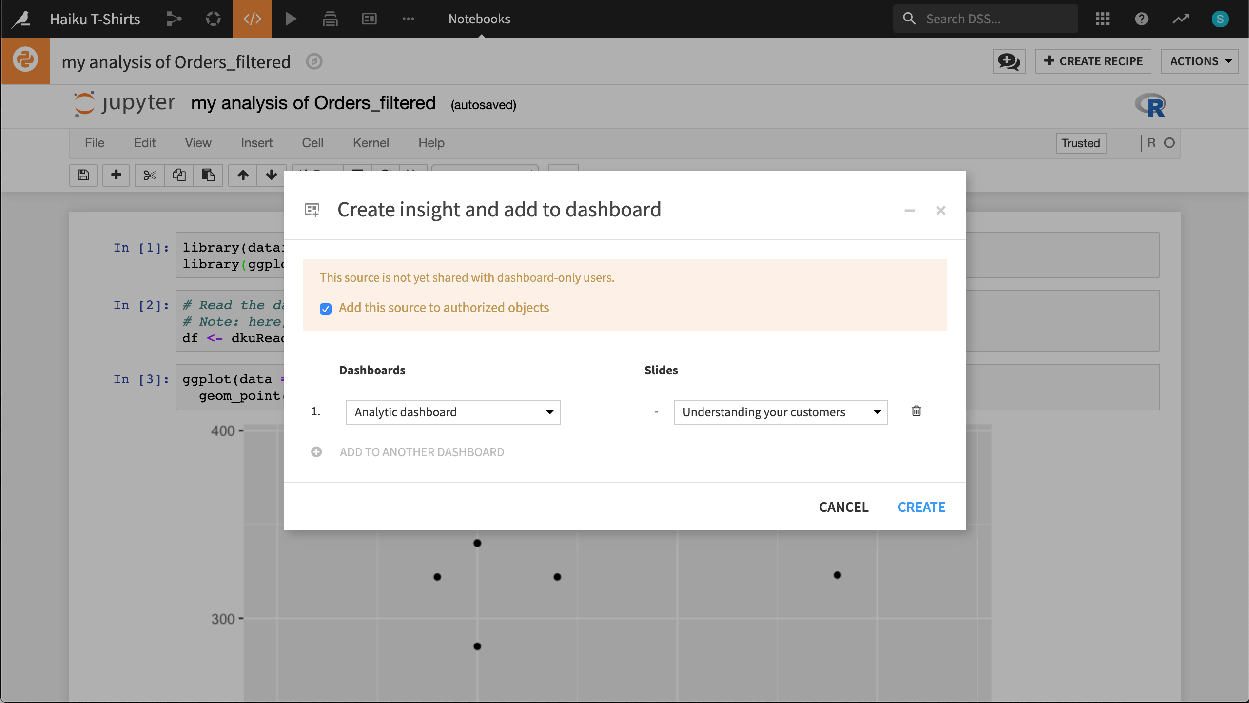
You can publish chart output from a notebook as a static insight on any slide of a dashboard.
What’s next?
Try out some hands-on tutorials for creating charts in Dataiku DSS.