AI Consumer Quick Start
Getting Started
Dataiku is a collaborative, end-to-end data science and machine learning platform that unites data analysts, data scientists, data engineers, architects, and business users in a common space to bring faster business insights.
In this quick start tutorial, you will learn about the data exploration and visualization capabilities of Dataiku by walking through a simple use case: credit card transaction fraud analysis.
In just an hour, you will:
Discover the Dataiku interface and reorganize the way that project insights are displayed for your convenience;
Explore a Dataiku project, its Flow, and Flow items to get a better understanding of its purpose and function;
Discover machine learning insights on dashboards;
Consume a Dataiku application in order to create your own instance of a project and modify its parameters to generate insights on new data;
Explore and analyze a dataset using metrics;
Create insights, such as metrics and charts, and publish them on a dashboard.
At the end of the tutorial, you will have gained an understanding of the project below and all of its components:
Note
This quick start is geared primarily towards data or line-of-business team leaders who are entirely new to Dataiku, as well as other new or potential business insights consumers and/or users of the Dataiku Explorer license. The tutorial will therefore focus on using the point-and-click interface for data exploration and visualization, as well as on Dataiku’s project collaboration capabilities.
If you are more interested in using Dataiku for creating data pipelines and doing advanced analytics, check out the Business Analyst quick start tutorial.
Alternatively, if you are more interested in what Dataiku offers for coders, you might prefer to check out the quick start tutorials for a Data Scientist or a Data Engineer.
Prerequisites
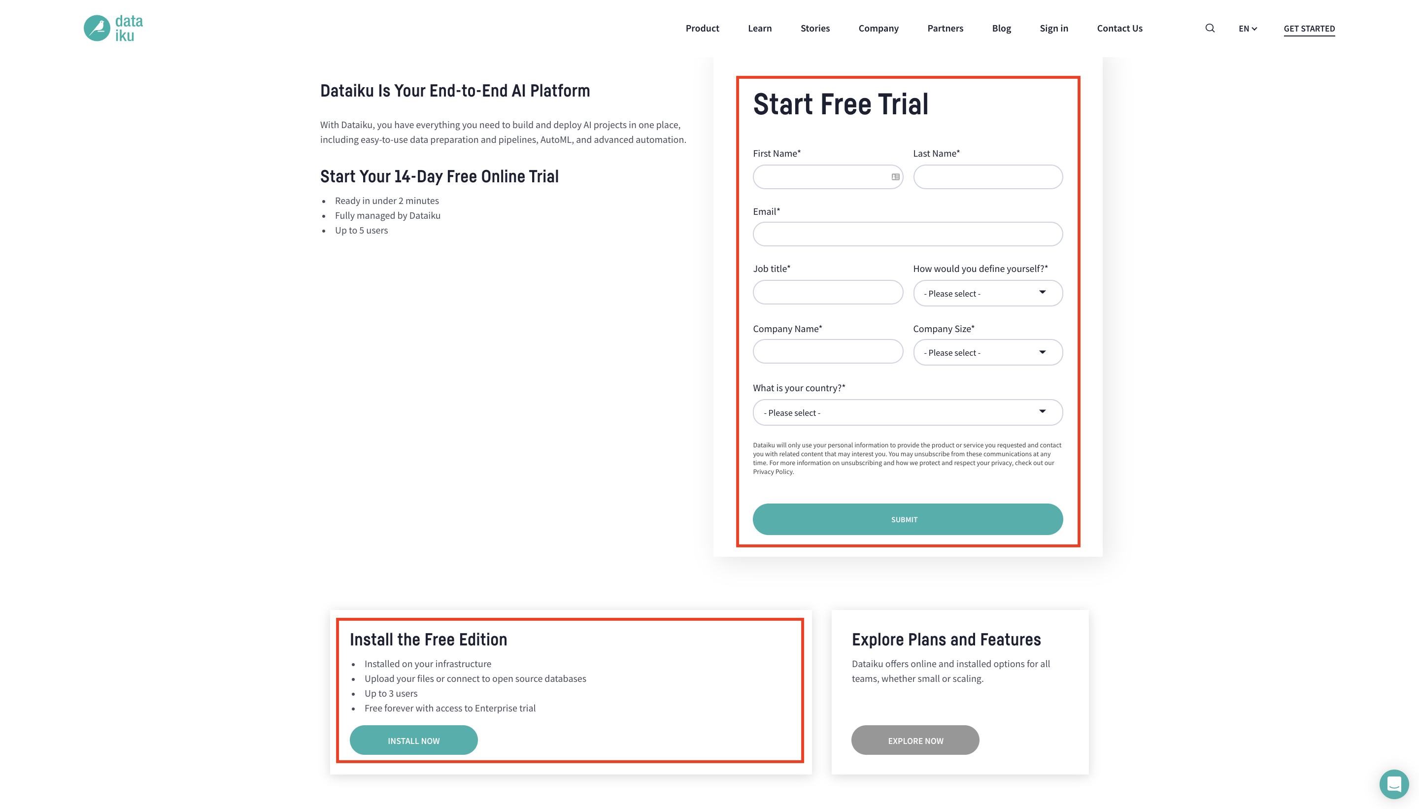
To follow along with the steps in this tutorial, you will need access to an instance of Dataiku (version 9.0 or above). If you do not already have access, there are two ways to get started. From the Dataiku website, you can:
install the free edition,
or start a 14-Day free Online trial.
For each section below, written instructions are recorded in bullet points, but you can also find screenshots and/or screencasts at the end of each section that demonstrate the actions described. Be sure to use these screenshots and videos as your guide!
Tip
Keep these instructions open in one tab of your browser and your Dataiku instance open in another.
Create the Project
Let’s get started! After logging in, the first page you will see is the Dataiku homepage. From this page, you’ll be able to browse projects, recent items, dashboards, and applications shared with you.
Note
A Dataiku project is a holder for all work on a particular activity. From the homepage, you will be able to access projects shared with you based on the user groups to which you belong.
When using an Explorer license, you will not be able to create projects yourself. You’ll simply be collaborating on projects created by your coworkers. For the purpose of this tutorial, however, you can use the 14-Day free Online trial or the free edition in order to create the example project.
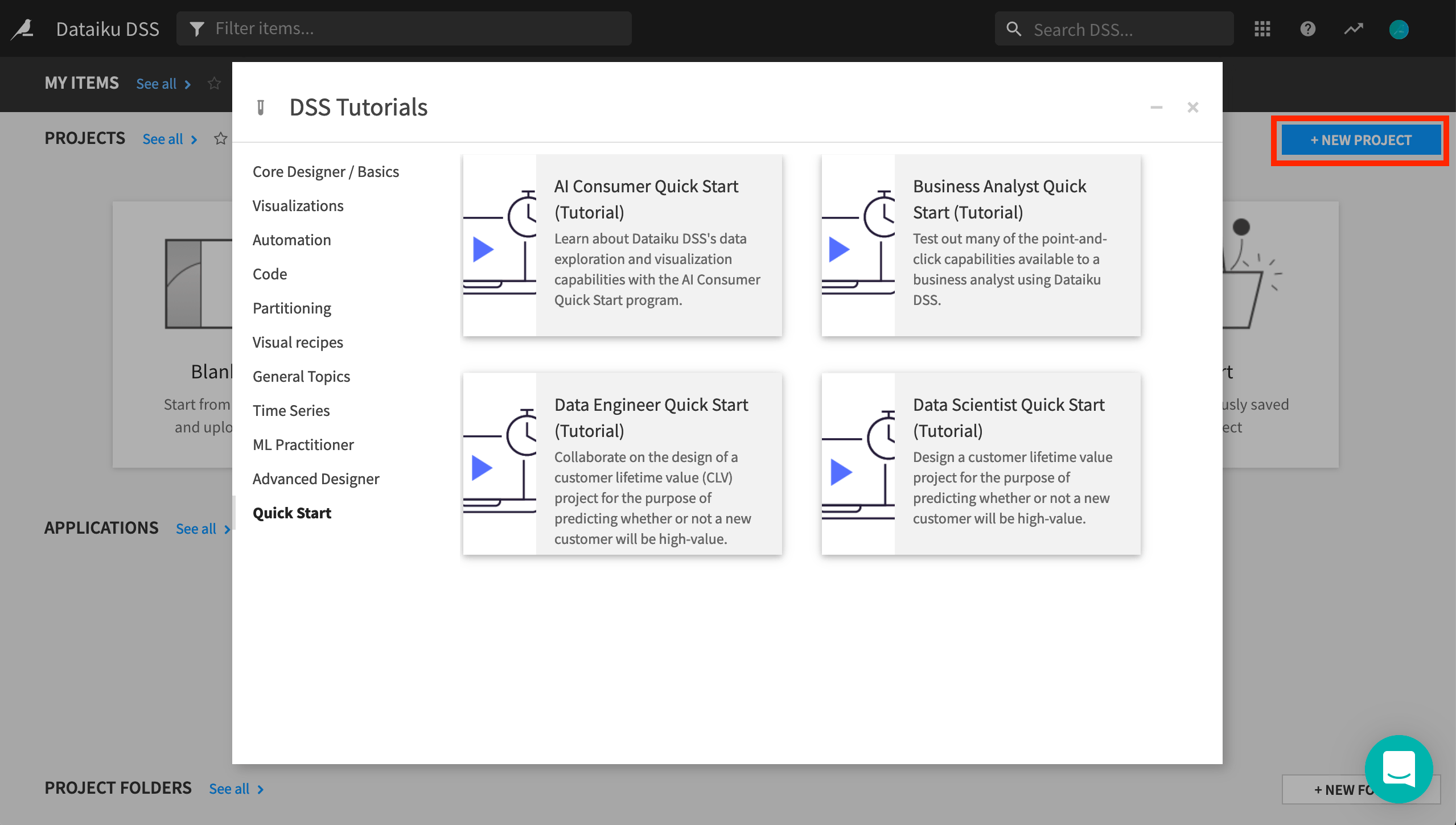
From the Dataiku homepage, click on +New Project > DSS Tutorials > Quick Start > AI Consumer Quick Start (Tutorial).
Click OK when the tutorial has been successfully created.
Note
You can also download the starter project from this website and import it as a zip file.
Explore and Configure Your View of the Dataiku Homepage
After creating the project, you’ll find the project homepage. Before exploring it, let’s go back to the Dataiku homepage to observe and modify the display of the different items that have been shared with you as part of the project.
Return to the Dataiku homepage by clicking the bird icon in the top left corner of the screen.
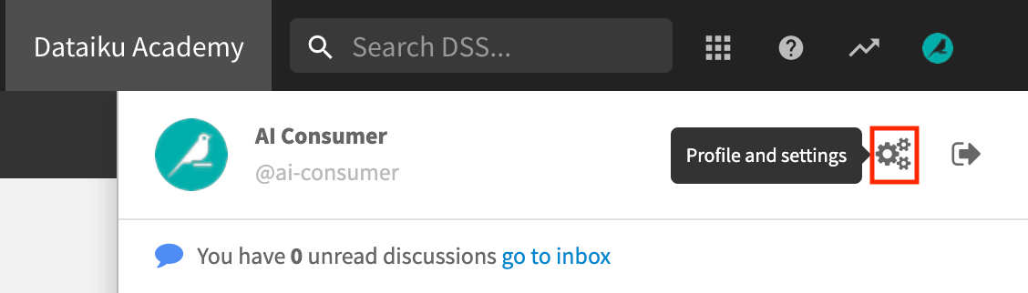
Click the profile icon in the top right corner of the page.
Click the Profile and Settings gear icon.
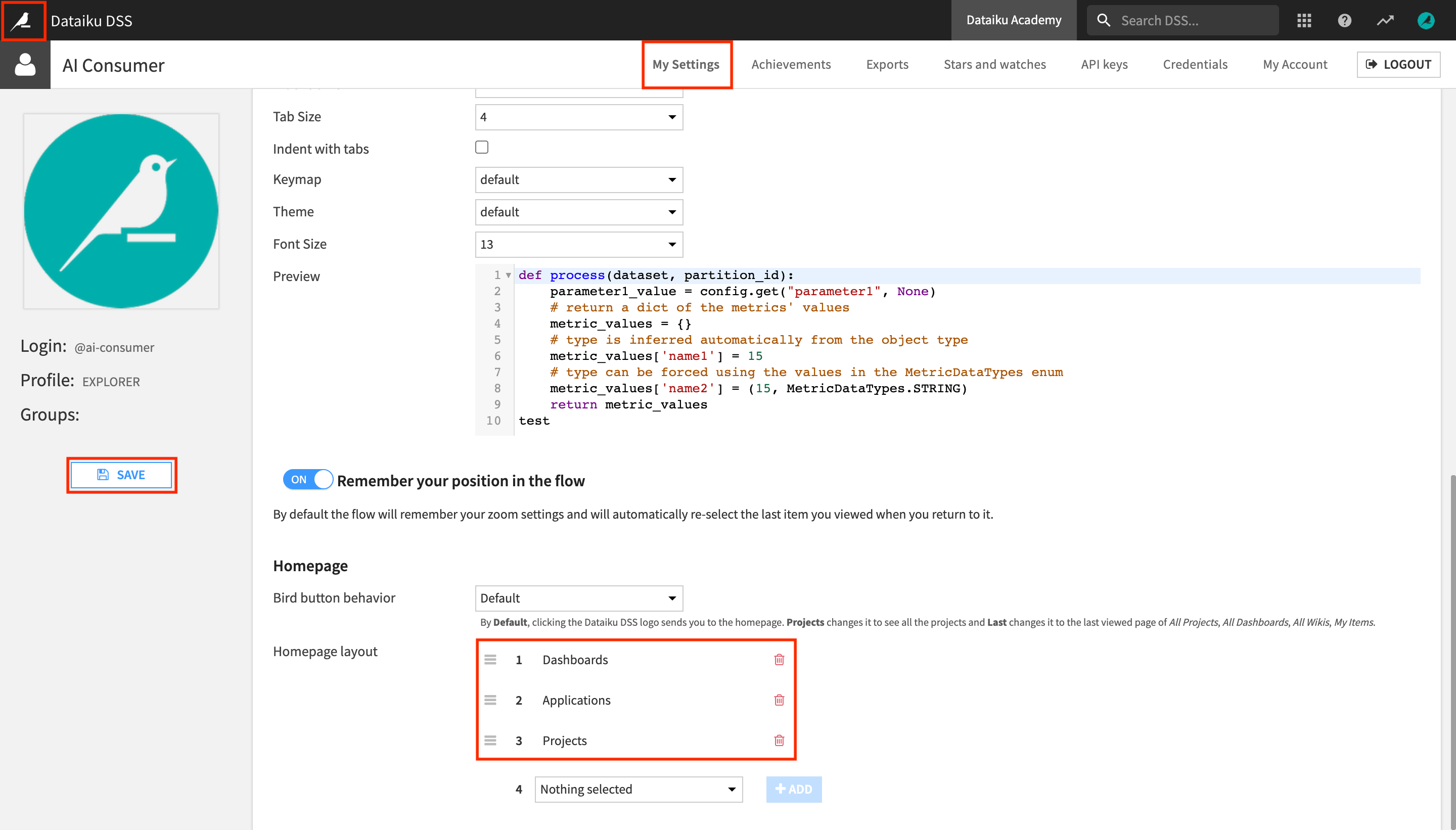
In the My Settings tab, scroll down, and locate the Homepage section.
This setting lets you modify the items displayed on the Dataiku homepage. Let’s arrange them so that the homepage only displays the items you’ll be working with, and in a logical order.
Under Homepage layout, remove Project Folders and Wikis.
Reorder the remaining items in the following order so that the readily consumable insights appear at the top:
Dashboards
Applications
Projects
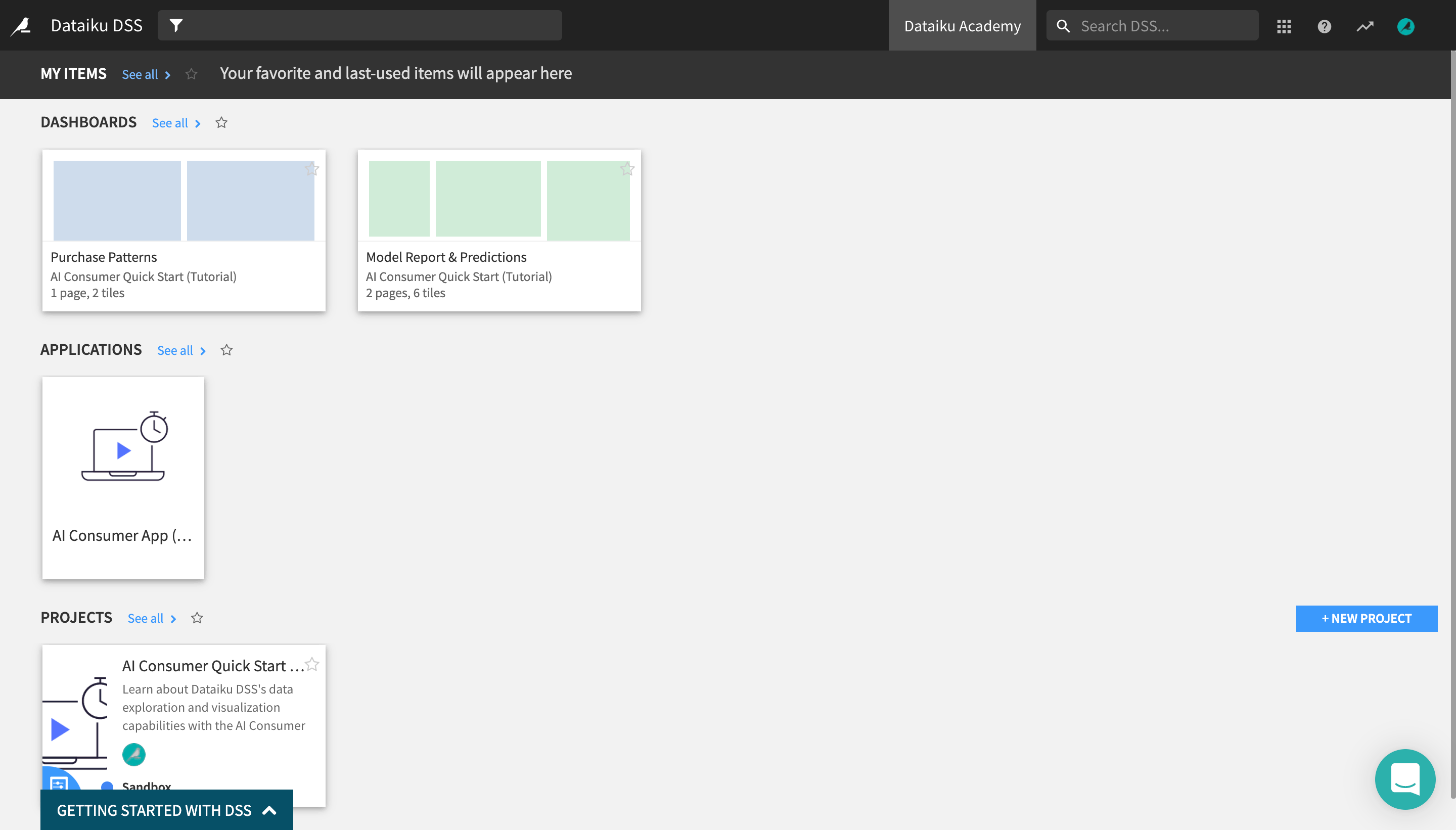
Click Save and return to the Dataiku homepage.
The Dashboards section now appears at the top, above the Applications and the Projects sections.
Consume Insights in a Dashboard
In this section, you will learn about data and machine learning (ML) insights in Dataiku and how you can consume them as a business user, without having to perform machine learning tasks yourself.
You will do this by exploring the contents of a dashboard created by another user in this project.
Note
Dashboards allow users to share elements of a data project with other users, including those that may not have full access to the project.
A dashboard is made of slides. On each slide, you put tiles.
Tiles can be one of two types: “simple” tiles (static text, image, embedded page) or insight tiles, which are created from Dataiku objects such as charts.
We have now configured the Dataiku homepage so that the Dashboards section appears at the top. It contains all of the dashboards that have been shared with you: in this case, two dashboards coming from the “AI Consumer Quick Start (Tutorial)” project, Purchase Patterns and Model Report & Predictions.
Consume Data Insights from a Dashboard
Click on the Purchase Patterns tile to open the dashboard belonging to the “AI Consumer Quick Start (Tutorial)” project.
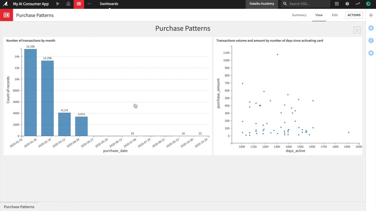
It contains two charts built with Dataiku’s native visualization tools. The charts represent insights on credit card transactions data from 2017 and 2018.
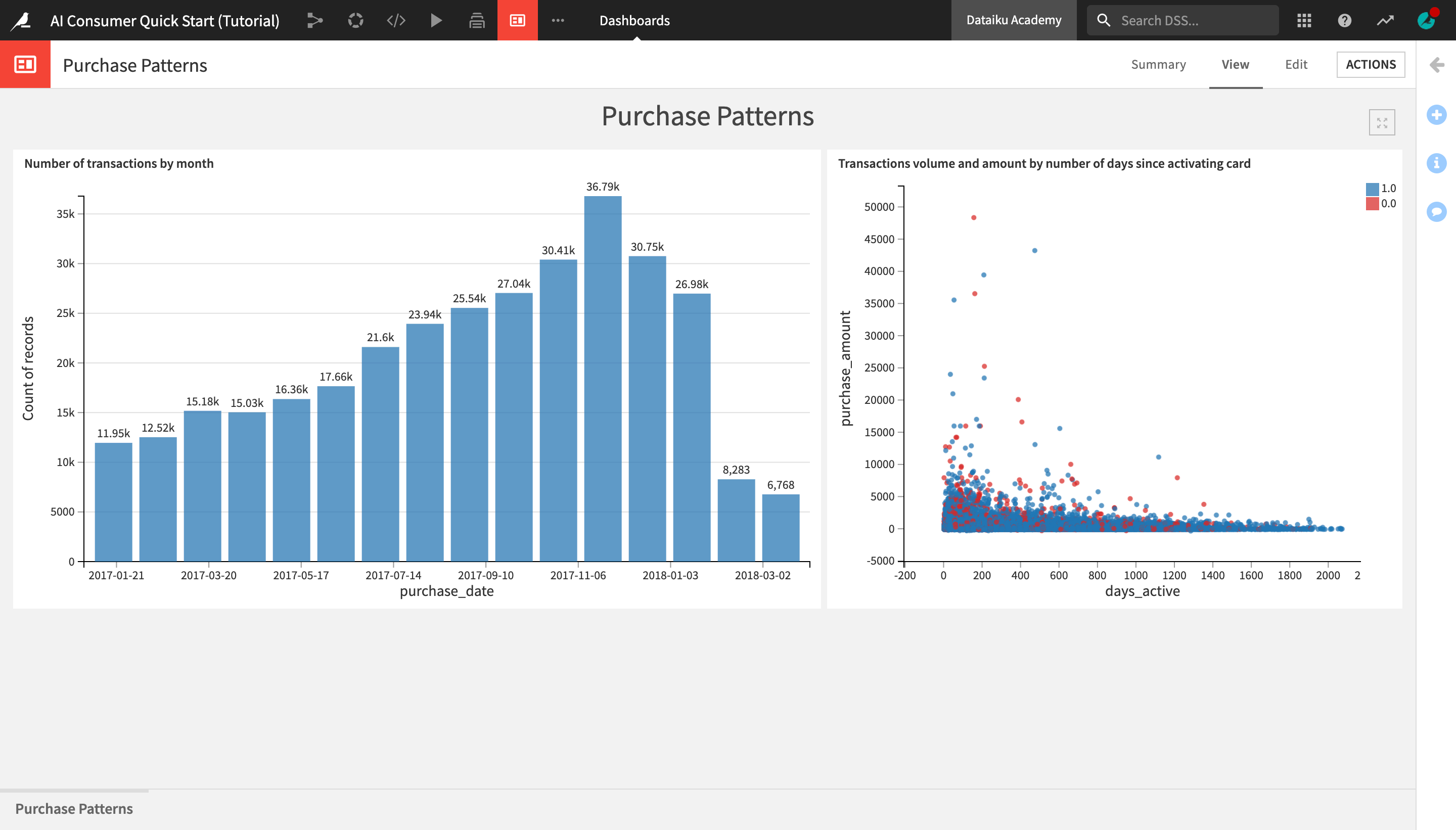
The “Number of transactions by month” bar chart on the left shows that the number of transactions made by month has been steadily increasing over time up until December 2017, when they start decreasing and then sharply drop in March of 2018.
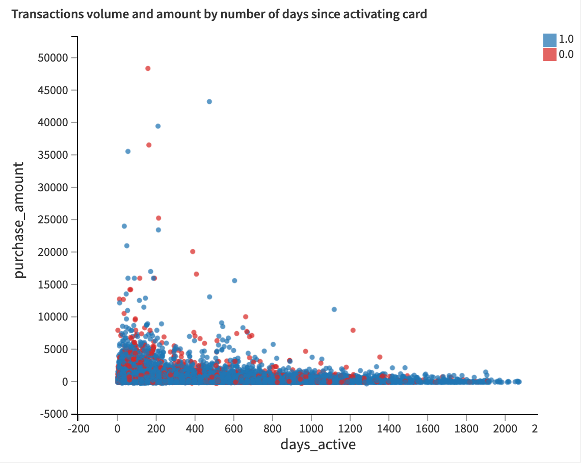
The “Transactions volume and amount by number of days since activating card” scatter plot on the right shows the distribution of the purchase amount and the volume of transactions based on the number of days that the credit card has been active. Blue dots represent authorized transactions, red dots represent unauthorized transactions.
Notice that for both authorized and unauthorized transactions, the purchase amounts tend to be highest in the first 200 days after a card has been activated, and steadily dropping from there.
However, it seems that the volume of unauthorized transactions is more heavily concentrated in the early days after card activation, while the volume of authorized transactions is a bit more evenly distributed.
Explore a Machine Learning Model Report
After exploring credit card purchase patterns in a dashboard, let’s discover another dashboard, Model Report & Predictions, in order to learn more about the ML model that predicts potential fraudulent transactions, as well as access the model predictions.
From the “Dashboards and Insights” menu in the top navigation bar, click on Dashboards.
From the Dashboards page, click on the Model Report & Predictions dashboard to open it.
You are navigated to the first slide of the dashboard, Model Report, which contains key information about the machine learning model used in the project, delivered in a comprehensible way for non-technical users.
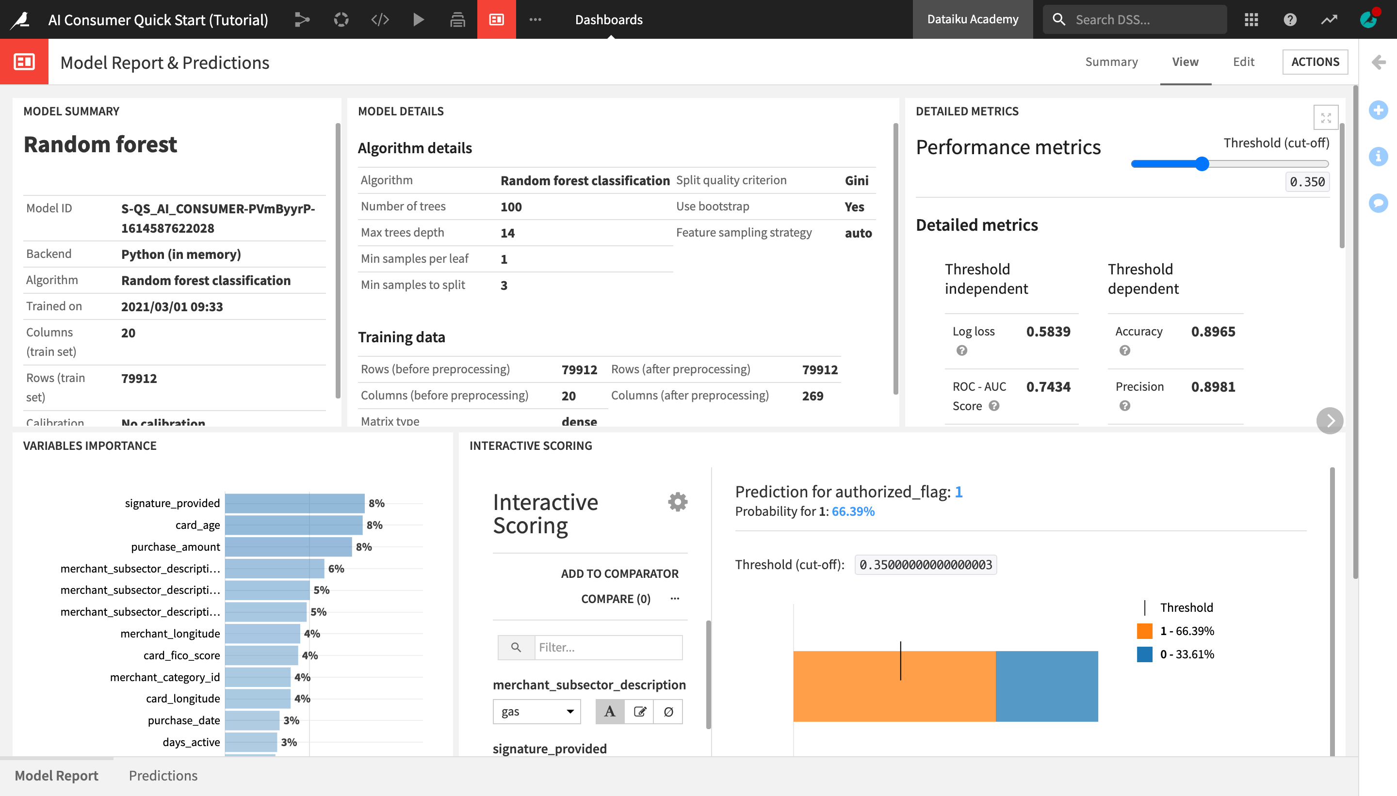
The Model Summary tile displays key general information about the model, such as the algorithm that was used and the last time it was trained.
The Model Details tile contains details about the algorithm and the data that was used to train the model.
The Detailed Metrics tile shows the model’s key performance metrics, which are standard metrics for evaluating models, and their meanings. You do not need to understand these in detail, but if you’re curious and want to learn more about the model’s performance, this tile is a good point of reference.
Tip
To learn about what a given metric represents, hover over the “?” icon next to its title and read the description.
The Variables Importance chart shows which variables, or features, have the biggest impact on the prediction results. In this case, the most important variables that explain whether a transaction was predicted to be authorized or fraudulent are:
signature_provided, or whether the cardholder provided a signature when doing the transaction;
the age of the credit cardholder;
and the amount of the purchase.
Finally, the Interactive Scoring tile allows dashboard consumers to explore visually how the different model features impact its predictions, and create different “what-if” scenarios.
Note
If the interactive scoring tile has errors in it, it is because the model has not been built yet. - Open the insight tile, and go to the source saved model. - In the Actions tab, click Retrain > Train Model. - When this job has finished, return to the “Model Report & Predictions” dashboard.
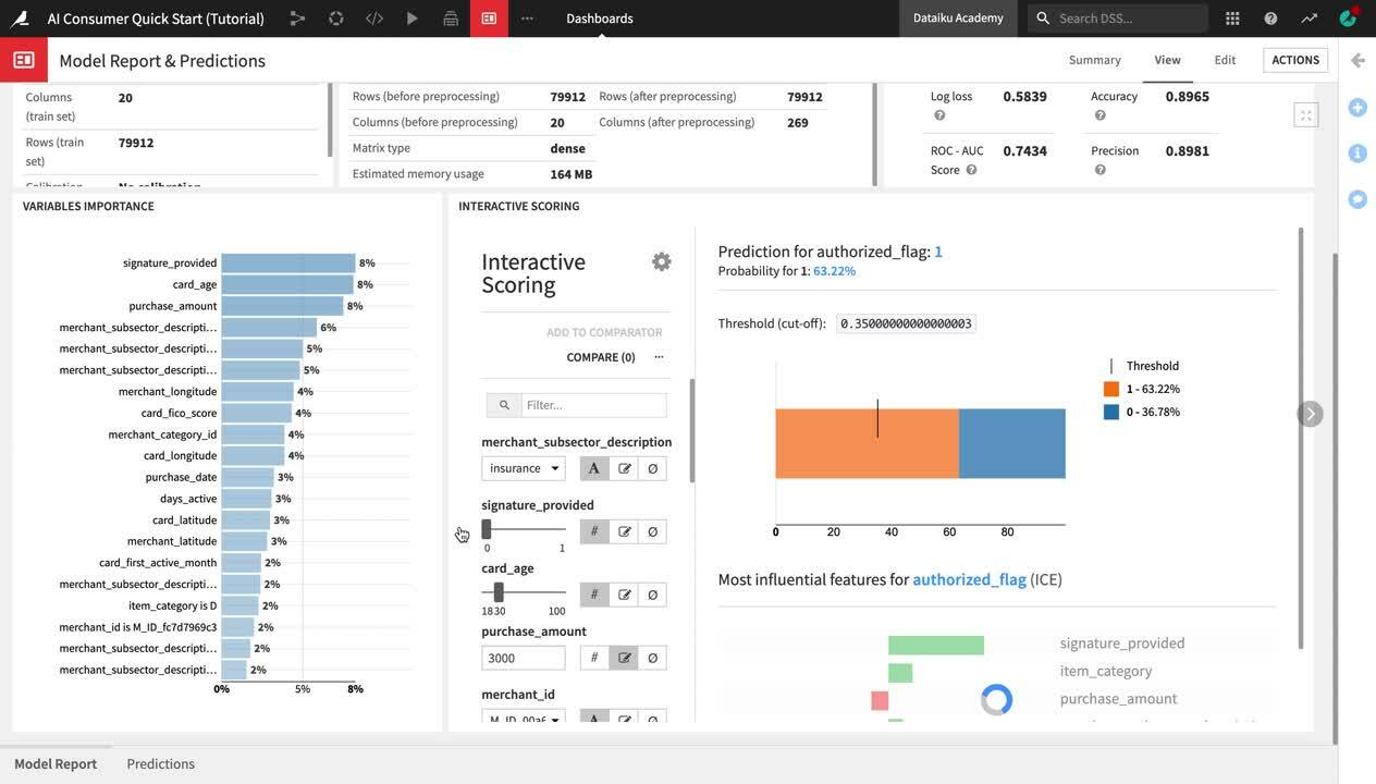
The Interactive Scoring tile displays a bar chart with the percentage of transactions that have been predicted as authorized (1) or fraudulent (0) for a given combination of features. In the left side panel, users can modify the values of different features to see how this would impact the results.
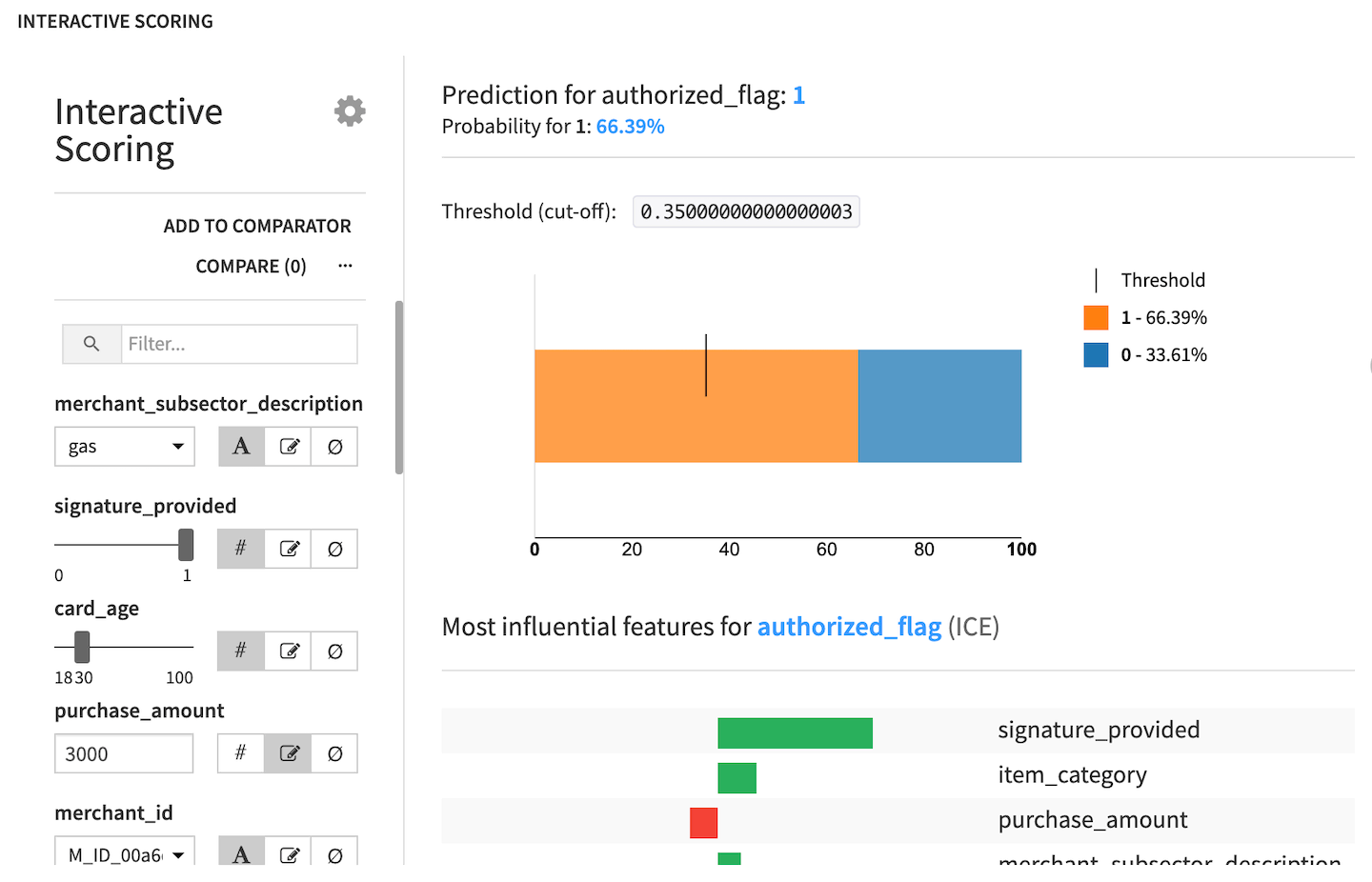
Let’s try this in practice:
From the merchant_subsector_description dropdown, change the merchant subsector to display results for from gas to
insurance.Set signature_provided to
0.
Notice that the predicted ratio of authorized vs. fraudulent transactions has now drastically changed to only ~45% authorized and ~55% unauthorized transactions. We have gained an immediate visual feedback showing that insurance-related transactions, where a signature was not provided, are much more likely to be flagged as fraudulent.
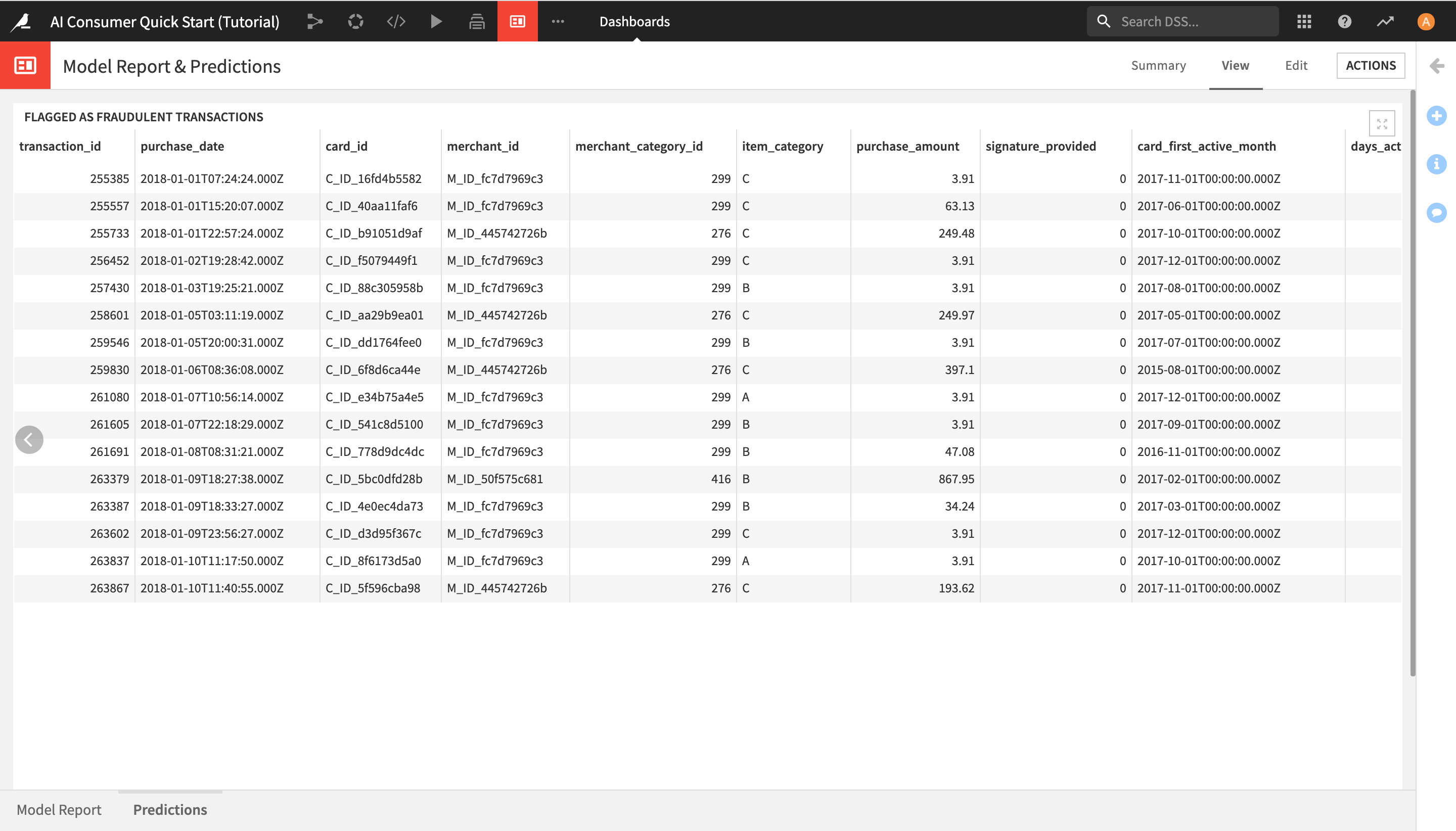
View Generated Predictions
After learning about the ML model and exploring its predictions through interactive scoring in the “Model Report” slide, you can now view the list of transactions that the model has detected as potentially fraudulent.
Click on Predictions in the lower left corner in order to open the Predictions slide and see the list of all potentially fraudulent transactions.
Use a Dataiku Application
In this section, you will learn how to consume Dataiku Applications.
Note
Dataiku Applications are a kind of customization that allows the user to reuse projects. A typical process for creating and using a Dataiku application is:
A user creates a Dataiku project and wants to share it with colleagues who need to apply the existing project’s workflow to new data, or a subset of the existing data, in order to consume insights, but don’t need to understand the details of the project;
The project owner (or app developer) converts the project into a Dataiku application;
Each colleague using the application creates their own instance of the Dataiku application.
Access a Dataiku Application from the Homepage
As an Explorer user, you cannot create Dataiku applications yourself, but you can consume the applications that others have built. Let’s see how this works.
Go to the Dataiku homepage by clicking on the bird logo in the top left corner.
From the Applications section of the homepage, click the AI Consumer App (Tutorial) application.
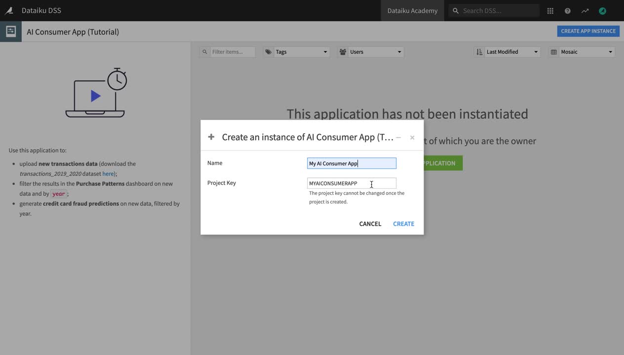
Click + Start Using the Application to create your own instance of the app.
Give your instance a name like
My AI Consumer App, and click Create.
Use a Dataiku Application to Add New Data & Filter Dashboard Results
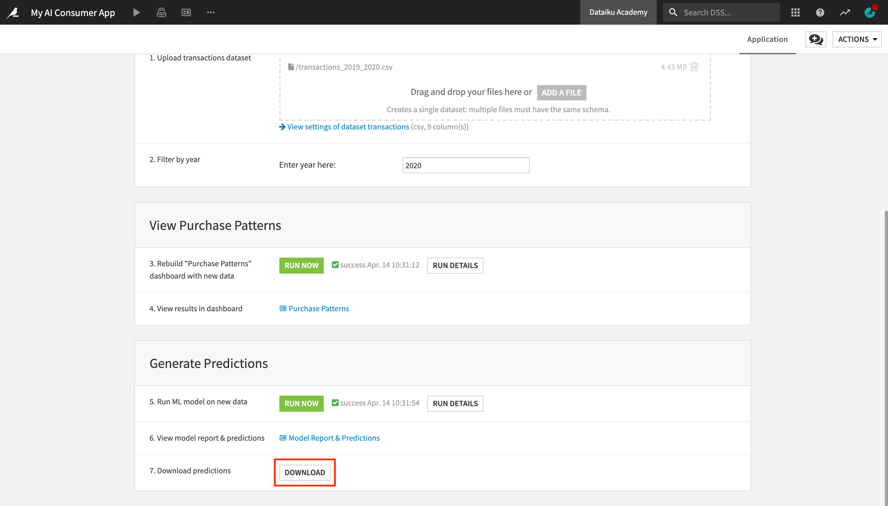
The application page contains three sections, “Upload New Data and Filter by Year”, “View Purchase Patterns”, and “Generate Predictions”.
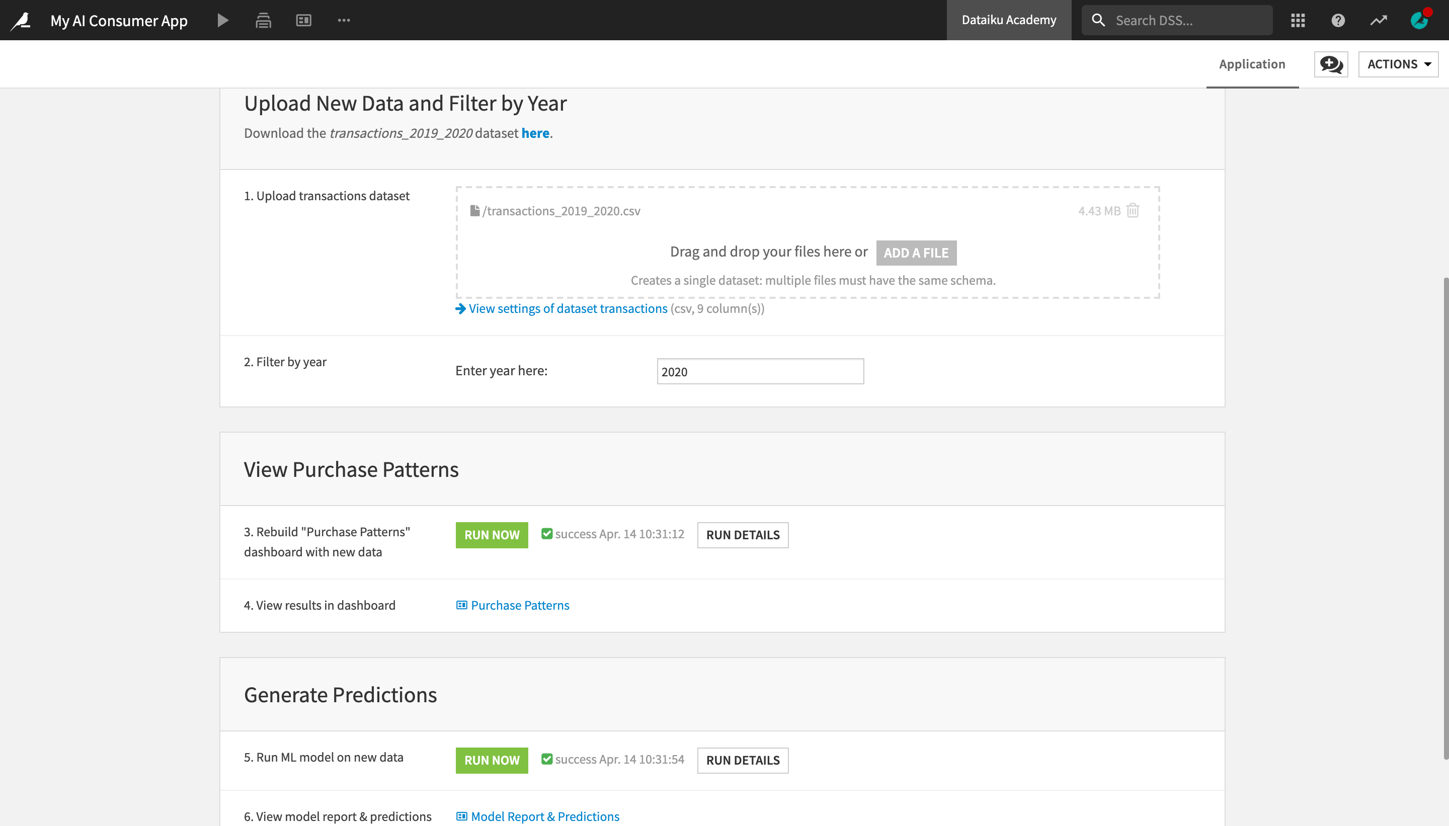
Let’s first upload a dataset with new transactions data.
Download the transactions_2019_2020 dataset here.
Under “Upload New Data and Filter by Year”, in the “Upload transactions dataset” tile, upload the transactions_2019_2020 dataset into the dropbox.
Delete the original transactions dataset from the dropbox, by clicking the “trash” button.
We have replaced the original transactions dataset with a new one, containing transactions from 2019 and 2020. We can further customize our view by filtering only the transactions made in 2020.
In the “Enter year here:” field, enter
2020.
Next, let’s rebuild the visualizations in the “Purchase Patterns” dashboard on the new data.
Under “View Purchase Patterns”, in the ‘Rebuild “Purchase Patterns” dashboard with new data’ tile, click the Run Now button.
This activates a scenario which rebuilds a part of the project, as well as the dashboard results, on the new data. Once the scenario has finished running, you will see a “Scenario finished” message pop up in the bottom right corner.
Once the scenario has finished running, click Purchase Patterns in the application to see the results in the dashboard.
You can see that the displayed results are different from the ones you saw in the same dashboard earlier. The Dataiku app uses the same project and dashboard, but it lets you modify certain parameters (such as the input data and the purchase year in this case) and output different results.
Use a Dataiku Application to Generate ML Predictions on New Data
Now that you have already uploaded the dataset containing new transactions data, you could also use the Dataiku application to “score”, or generate predictions on this new data with the machine learning model used in the project, and thus identify potentially fraudulent transactions made in 2020.
With Dataiku apps, you can use machine learning models built by your colleagues to generate predictions on new data with just a few clicks, without having to touch the model yourself! Let’s see how this works.
In the top navigation menu, click My Consumer App to go back to the application user interface.
In the “Generate Predictions” section, in the “Run ML model on new data” tile, click Run Now.
Once the scenario has finished running, click on Model Report & Predictions to display the dashboard.
As the Dataiku app is using the same version of the model, the insights in the “Model Report” slide are the same as the ones you already saw.
Click Predictions in the lower left corner to navigate to the Predictions slide.
Notice the results in this slide have changed, and it is now displaying the 2020 transactions that have been detected as potentially fraudulent by the ML model.
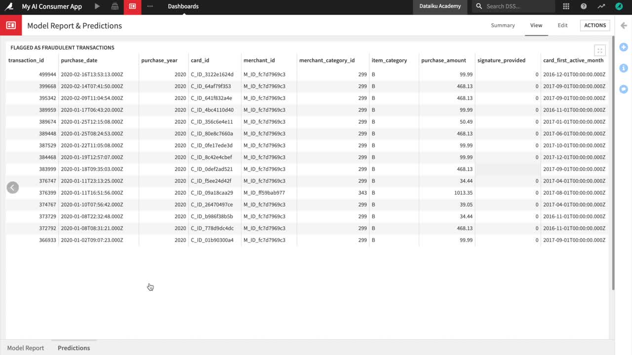
Finally, you can optionally use the Dataiku app to download a dataset containing all transactions from 2020 with the predictions that the model has made about whether they are fraudulent or not.
In the top navigation menu, click My Consumer App to go back to the application user interface.
At the bottom, in the “Download predictions” tile, click the Download button.
The transactions_unknown_scored dataset, which contains all the scored transactions from 2020, will be downloaded as a CSV file.
Explore the Flow
In this section, you will explore a Dataiku project and its Flow.
Explore the Project Homepage
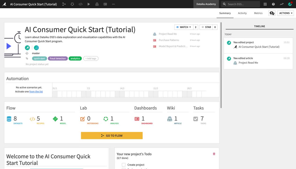
Let’s start by navigating to the project homepage to learn about its purpose and contents.
Go back to the Dataiku homepage, and open the AI Consumer Quick Start (Tutorial) project by clicking on its tile in the Projects section.
Click on the project title in the top left corner to navigate to the project homepage.
On the project homepage, you can see the project’s tags, description, status, to-do list, contributors, discussions, and recent activity.
Familiarize yourself with the project homepage.
Click the Wiki article to open the project README about the purpose and contents of the project.
Return to the project homepage by clicking the project title at the top left.
Explore Flow Items
From the project homepage, click Go to Flow. Alternatively, you can use the shortcut
G + F.
Note
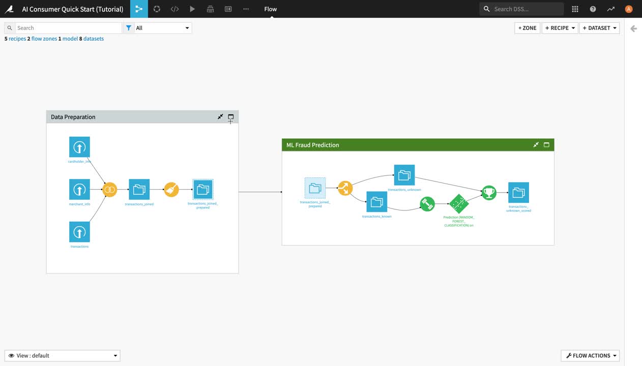
The Flow is the visual representation of how datasets, recipes (steps for data transformation), and models work together to move data through an analytical pipeline.
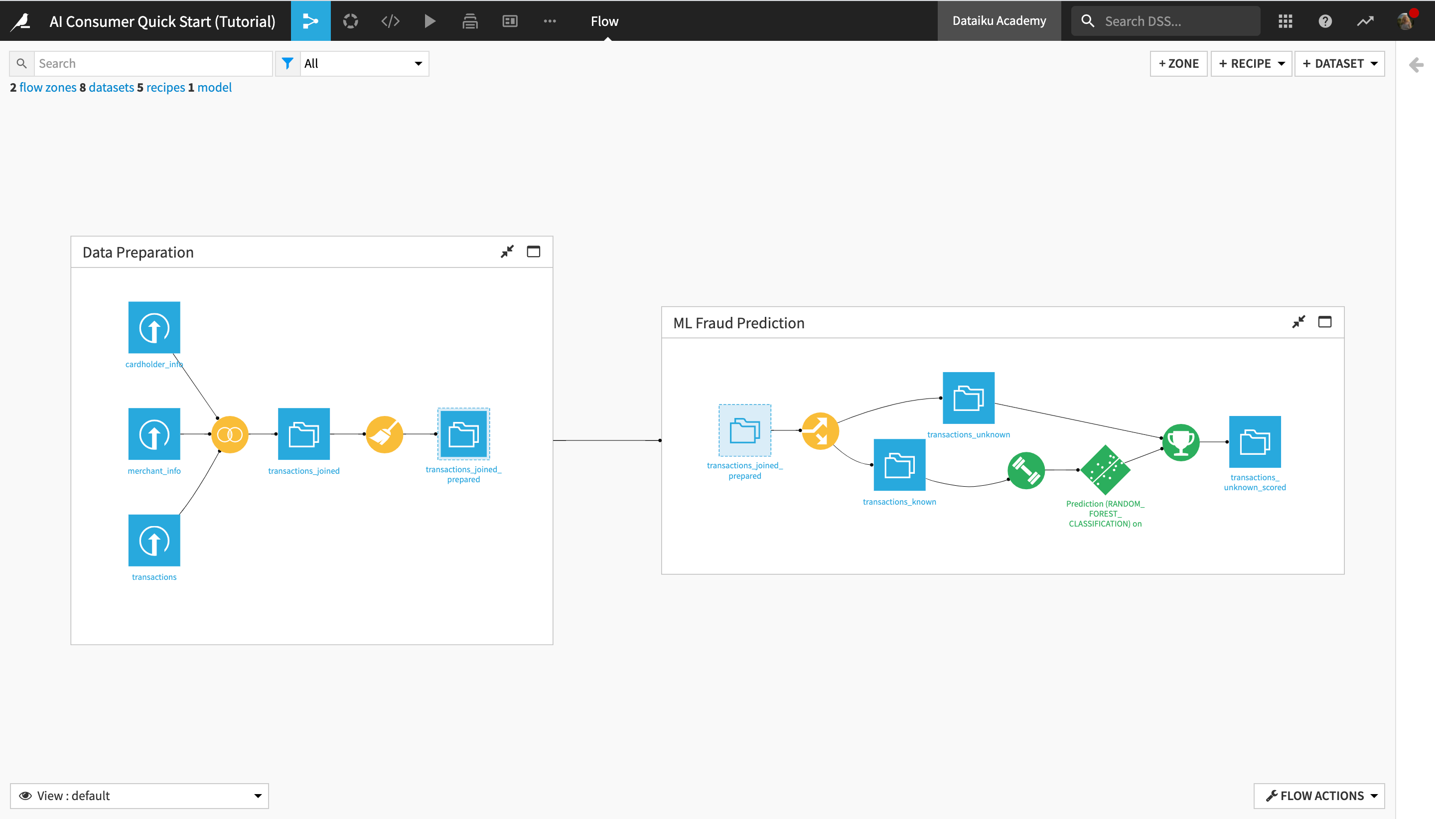
The Flow of this project is divided into two Flow zones, “Data Preparation” and “ML Fraud Prediction”. We will dig deeper into the concept of Flow zones in the next section.
Within a Flow zone, you’ll find several types of objects, or Flow items:
Blue squares represent datasets . The icon on the square represents the type of dataset or its underlying storage connection, such as a filesystem, an SQL database, or cloud storage.
Yellow circles represent visual recipes (or data transformation steps that don’t require coding and can be built with the Dataiku DSS visual UI).
Green elements represent machine learning (ML) elements, such as models.
Explore Flow Zones
Now, let’s discover the concept of Flow zones, and find out more about the operations performed in each Flow zone.
Note
Data science projects tend to quickly become complex, with a large number of recipes and datasets in the Flow. This can make the Flow difficult to read and navigate. Large projects can be better managed by dividing them into Flow zones.
Zones can be defined in the Flow, and datasets and recipes can be moved into different zones. You can work within a single zone or the whole Flow, and collapse zones to create a simplified view of the Flow.
First, let’s explore the “Data Preparation” Flow zone.
Click the full screen icon in the upper right corner of the “Data Preparation” Flow zone window, or double-click anywhere in the white space inside the window, in order to open the Flow zone.
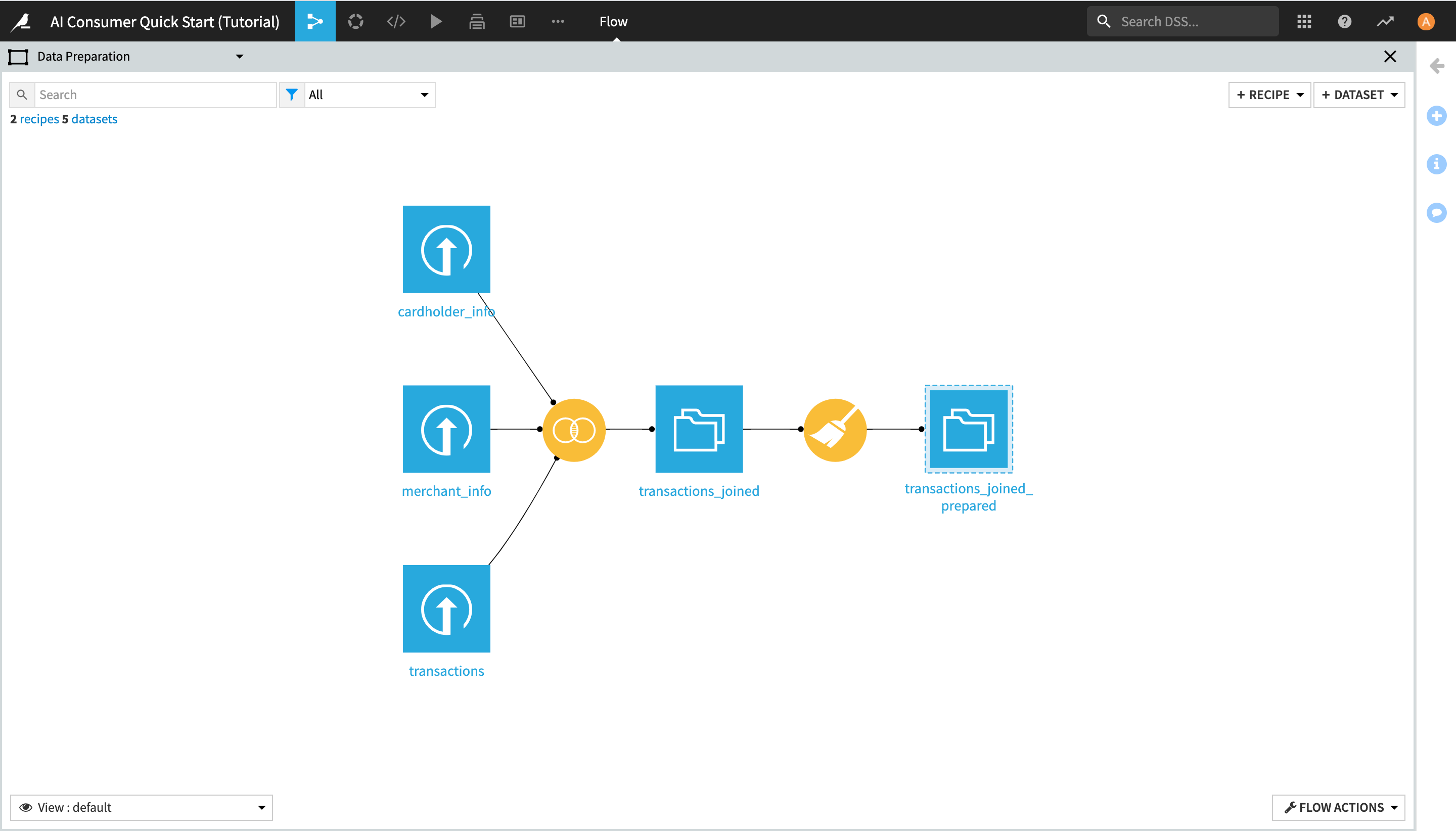
This Flow zone contains three input datasets, which are joined together using a Join recipe, and then prepared using a Prepare recipe, resulting in the transactions_joined_prepared dataset.
Notice the dashed lines around the transactions_joined_prepared dataset. Those lines indicate that this dataset is shared into another Flow zone–in this case, the “ML Fraud Prediction” one.
Before getting started with exploring the data, let’s also briefly look at the “ML Fraud Prediction” Flow zone.
Click the X button in the upper right corner of the screen to exit the “Data Preparation” Flow zone and go back to the entire Flow.
Click the full screen icon in the upper right corner of the ML Fraud Prediction Flow zone window, or double-click anywhere in the white space inside the window, in order to open the Flow zone.
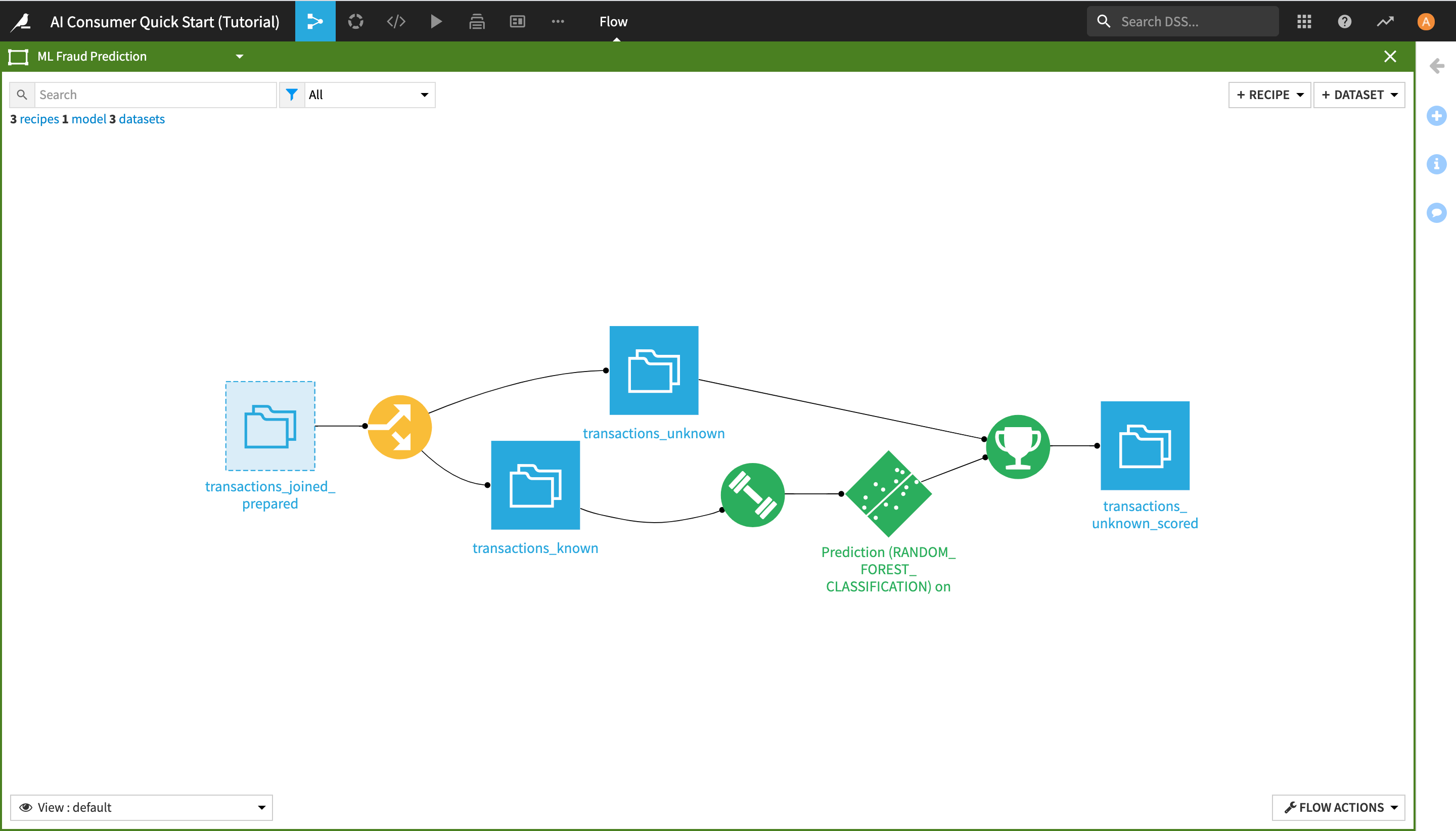
By doing this, you have navigated to another zone of the Flow, which starts from the transactions_joined_prepared dataset and contains all the downstream Flow items. As its name suggests, this Flow zone relates to the machine learning tasks in the project.
Note
As an AI Consumer, you do not interact directly with the machine learning (ML) elements of the Flow, and you do not need to understand their full extent, but you are nevertheless able to draw, consume, and manipulate actionable ML insights (as seen in the dashboards and the Dataiku app of the previous two sections).
In this Flow zone, the transactions_joined_prepared dataset is split into two datasets using a Split recipe:
transactions_known contains the transactions that have been identified as either authorized or unauthorized; and
transactions_unknown contains the transactions for which we don’t know whether they were authorized or not.
The transactions_known dataset is used to train a machine learning model to predict whether a transaction is authorized or not, and the output model is then applied to transactions_unknown, producing the transactions_unknown_scored dataset. This end dataset contains all of the previously “unknown” transactions, flagged by the model as either authorized or unauthorized (a.k.a. potentially fraudulent).
Click the X button in the upper right corner of the screen to exit the “ML Fraud Prediction” Flow zone and go back to the initial view.
View the Flow Using Tags
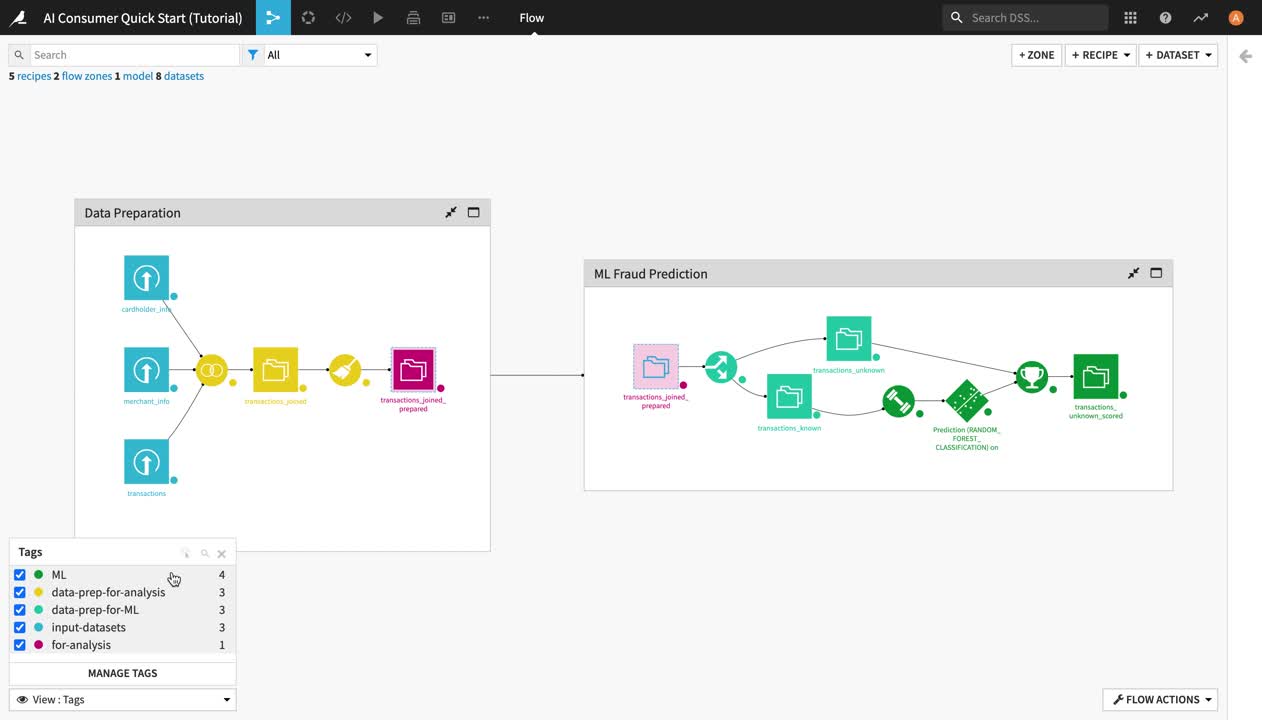
To enhance the interpretability of the Flow, you can use different Flow Views at the bottom left of the screen. For example, you can color your view based on Tags.
In this view, objects with an associated tag are highlighted depending on the selected tags. This view can be particularly helpful for understanding large or complicated Flows or when multiple people are working on the same Flow.
To use the Tags view:
Click View: default in the lower left corner, and select Tags from the dropdown menu.
Activate all tags and observe their effects in the Flow.
Experiment with a few other views, and then click the X to close the tags menu, and return to the default view.
Analyze a Dataset
In this section, you will learn how to analyze datasets in Dataiku.
From the Flow, double-click the transactions_joined_prepared dataset icon in order to open it.
Understand the Sampling Configuration
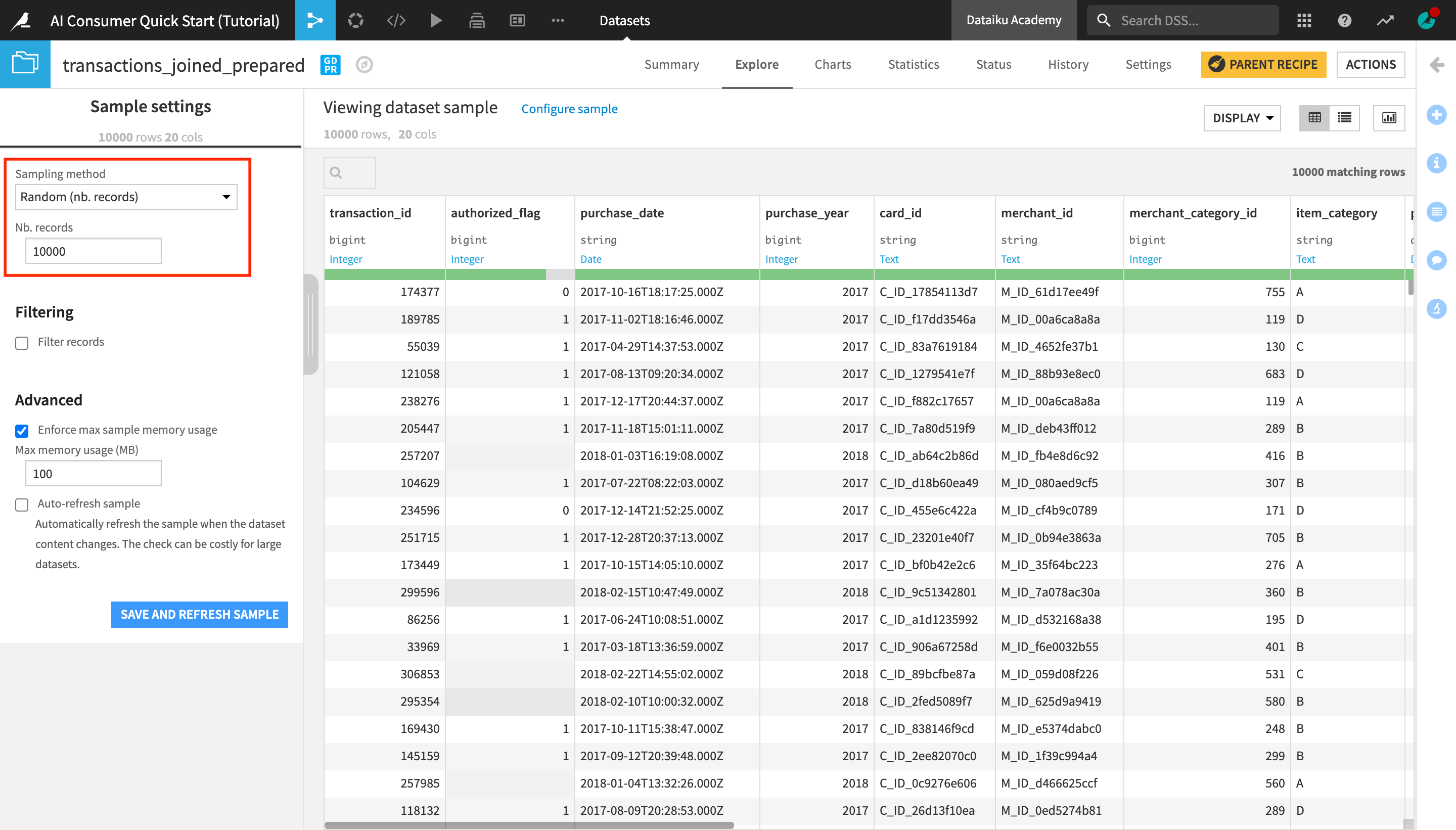
On opening the dataset, you’ll land in the Explore tab, which looks similar to a spreadsheet. Dataiku displays a sample of the dataset. Sampling helps to give you immediate visual feedback, no matter the size of the dataset.
Note
By default, if no other sampling configuration has been defined, the Explore tab shows the first 10,000 rows of the dataset, but many other configurations are possible. Working with a sample makes it easy to work interactively (filtering, sorting, etc.) on even large datasets.
To view the sampling of this dataset:
Near the top left of the screen, click on Configure sample.
Notice that the dataset has been configured to display a sample of 10,000 randomly selected rows.
Observe the Schema and Data Type
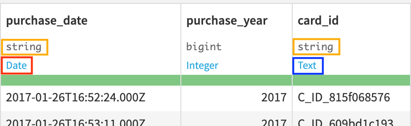
Let’s now look closer at the header of the table. At the top of each column is the column name, its storage type, and its meaning.
Note
Datasets in Dataiku have a schema, which consists of the list of columns, with their names and storage types.
The storage type indicates how the dataset backend should store the column data, such as “string”, “boolean”, or “date”.
In addition to the schema, Dataiku also displays the “meanings” of columns. The meaning is a rich semantic type automatically detected from the sample contents of the columns, such as Date, URL, IP address, etc.
Notice that the storage type of both the purchase_date and the card_id columns is a string, but their meanings are different. Based on the current sample, Dataiku detects the meaning of the purchase_date column as Date and that of card_id as Text.
Analyze Columns
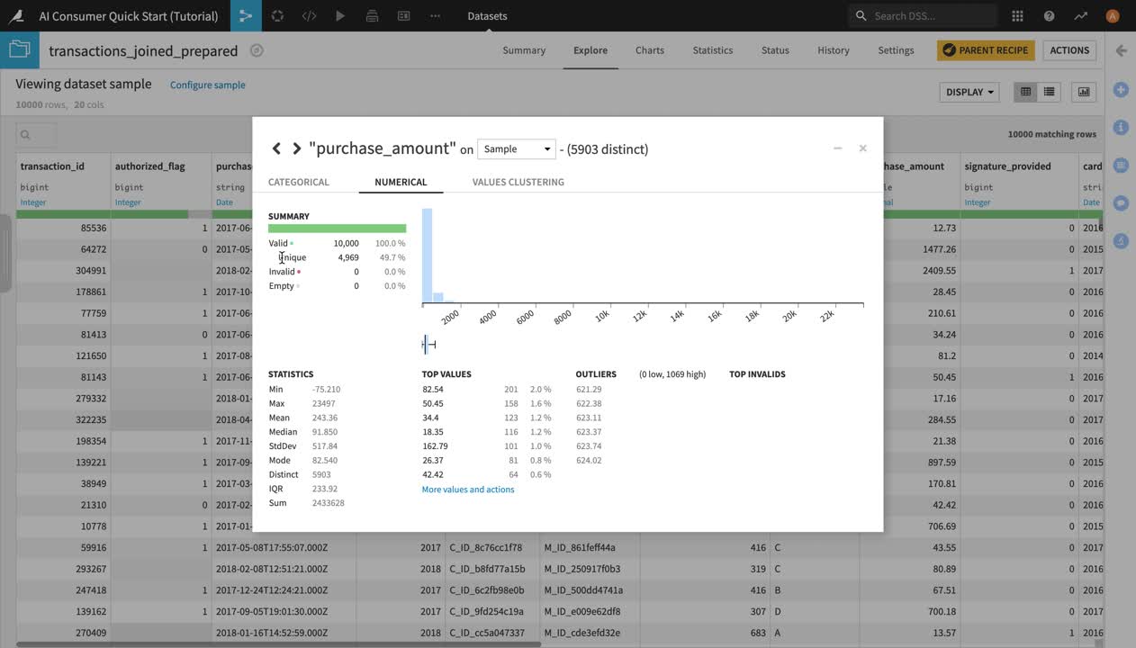
Let’s now analyze the purchase_amount column.
Click the dropdown arrow next to purchase_amount, and select Analyze.
The Analyze window will pop open. Notice it’s using the previously configured sample of the data.
Note
You could choose to compute the metrics shown in the Analyze window on the whole dataset, by selecting “Whole Data” instead of “Sample” in the dropdown menu, but for the purpose of the tutorial, we’ll stick to the configured sample.
Users of the Dataiku Explorer license should also bear in mind that they would not be able to change the sample of a dataset with this license.
In the Summary section of the Analyze window, you can see the number of valid, invalid, empty, and unique values in this column.
In the Statistics section, you can see the minimum, maximum, and average values of purchase_amount, as well as other key metrics.
Click X to close the Analyze window.
View Metrics
Another way to display key measurements on your data is by looking at the Status tab in the dataset, which contains metrics and checks.
Note
Metrics are metadata used to take measurements on datasets, managed folders, and saved models. They allow us to monitor the evolution of a Dataiku item. In a dataset, we could use them to compute, for example, the number of columns, the number of rows, the number of missing values of a column, or the average of a numerical value column, among other things.
Metrics are often used in combination with checks to verify their evolution. Checks are used to set conditions for the validity of a metric.
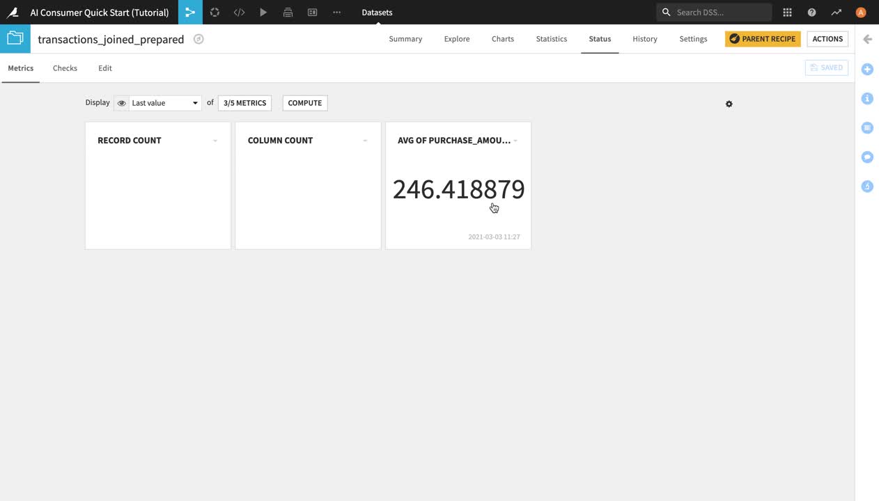
Navigate to the Status tab.
You are now in the Metrics view page. By default, the view mode is set to “Last value” and it displays tiles with the last computed value of the metrics. Presently, only two metrics appear in the form of tiles – the column count and the record (or row) count. Their tiles are blank because they haven’t been previously computed.
You can change the Metrics view mode by clicking on Last value and selecting another view option from the dropdown menu. You can also click the Metrics button to the right in order to select which metrics to display – by default, only a handful of the available metrics are displayed.
Click the Metrics button. A window will pop up where you can select which metrics to display.
Select Avg of purchase_amount and click Save. The “Avg of purchase_amount” metric, which had been previously created and computed by another person working on this project, now appears as a tile.
Warning
If you’re working with an Explorer license on Dataiku, you will not be able to compute metrics yourself, but you can use them for reference when exploring projects created by your colleagues.
Create and Publish Insights to a Dashboard
In addition to consuming insights from dashboards, applications, and datasets, users of the Dataiku Explorer license can also create and publish insights and dashboards of their own.
Warning
If you are using the legacy enterprise Reader license of Dataiku instead of the Explorer license, you will not be able to create insights or dashboards.
If this is the case, we recommend installing and using the 14-day free Online trial or the free edition, in order to be able to complete this last part of the tutorial.
Publish Metrics as Insights
In the previous section, you made the “Avg of purchase_amount” metric appear on the Metrics page. Now, you can also publish it as an insight to a dashboard.
To publish the “Avg of purchase_amount” metric to a dashboard:
Click the dropdown arrow next to Avg of Purchase_Amount in the metric tile, and select Publish.
In the pop-up window, you can choose on which dashboard to publish your insight.
Select Purchase Patterns from the dropdown menu.
Click Create.
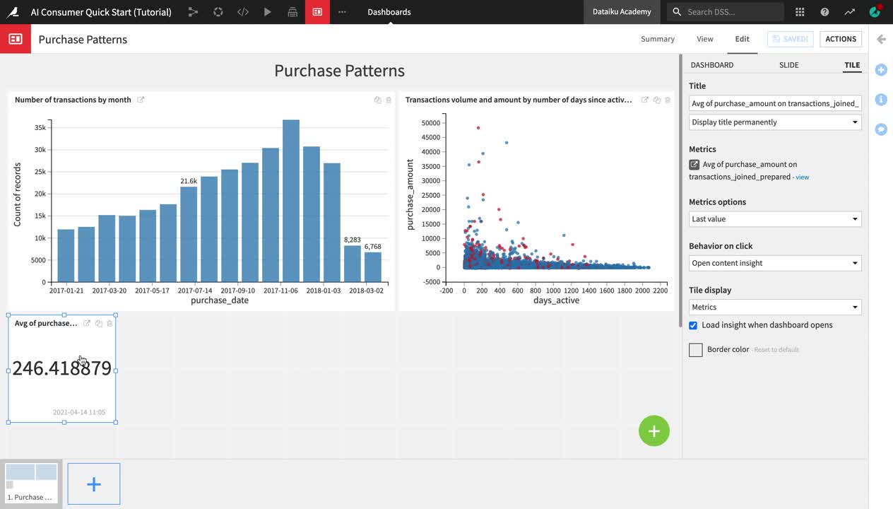
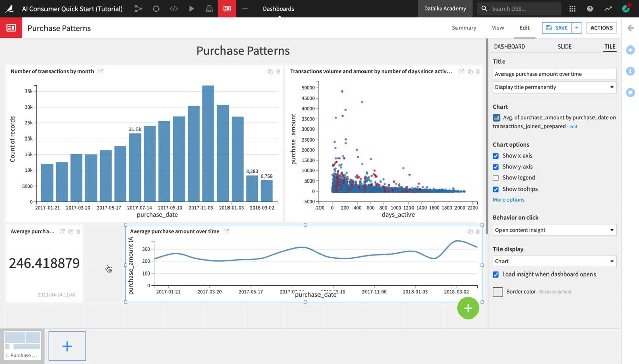
After creating and publishing the metric insight, Dataiku redirects you to the “Purchase Patterns” dashboard. You are currently in the Edit mode of the dashboard, and the insight is selected so that you can edit it.
From the right sidebar menu, change the default Title of the insight to
Average purchase amount.Click Save in the upper right corner, and then navigate to the View tab of the dashboard.
The Average purchase amount metric now appears on the “Purchase Patterns” dashboard, under the two charts that we previously explored.
Create and Publish Charts
In addition to metrics, another even more common type of insight frequently published on dashboards is Charts.
Note
The Charts and Statistics tabs of a dataset provide drag-and-drop tools for creating a wide variety of visualizations and statistical analyses.
To explore the Charts tab:
Return to the Flow.
Open the transactions_joined_prepared dataset again, and navigate to the Charts tab.
The left sidebar contains two panels: Columns and “Sampling & Engine”.
Click Sampling & Engine.
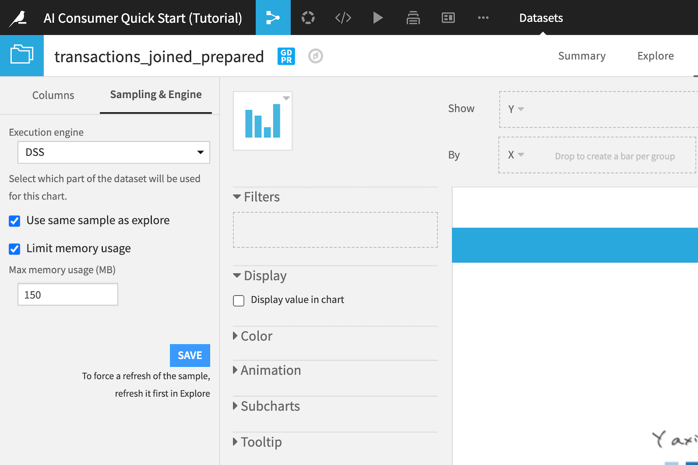
By default, charts in Dataiku use the same dataset sample as the one defined in the Explore tab, which in this case is a random sample of 10,000 rows. Since the chart we will be creating is going to display aggregated average values, we can use the same sample.
Click Columns to return to the Columns panel.
The Columns panel contains all the columns of the dataset, as well as the count of records (or rows) in the dataset. Notice that the icons to the left of the column titles indicate the data type:
the blue # icon represents numerical value columns;
the yellow A icon represents categorical value columns;
and the green calendar icon represents date columns.
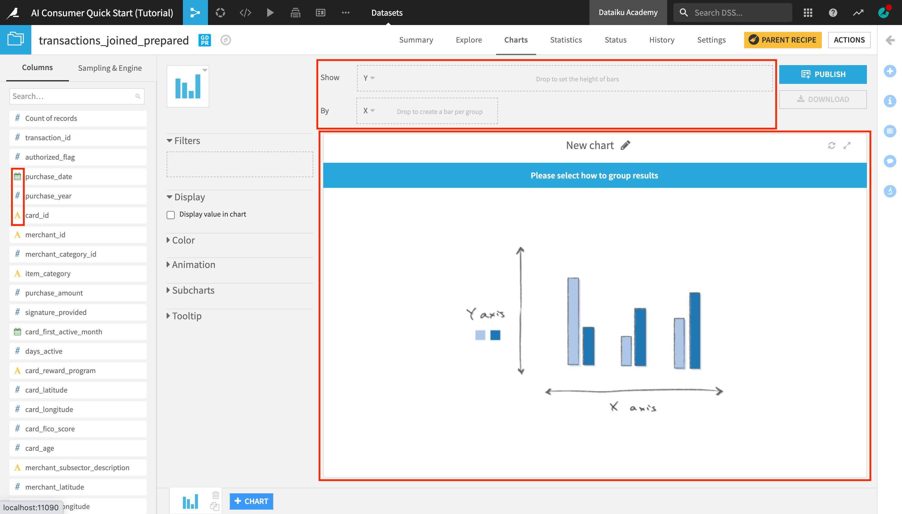
You can drag and drop columns into the Show and By dropboxes above the chart field, which are also known as the Y-axis and X-axis.
Create a Chart
Let’s now create a chart to analyze the evolution of the average purchase amount over time.
From the list of columns on the left, drag and drop purchase_amount into the Y-axis and purchase_date into the X-axis.
Notice that the aggregate on the purchase_amount column is automatically set to AVG. If we wanted to look at the evolution in the cumulative total transaction amount, as opposed to the average, we could change the aggregate to “SUM”, but since we are interested in the average, we can leave it like this.
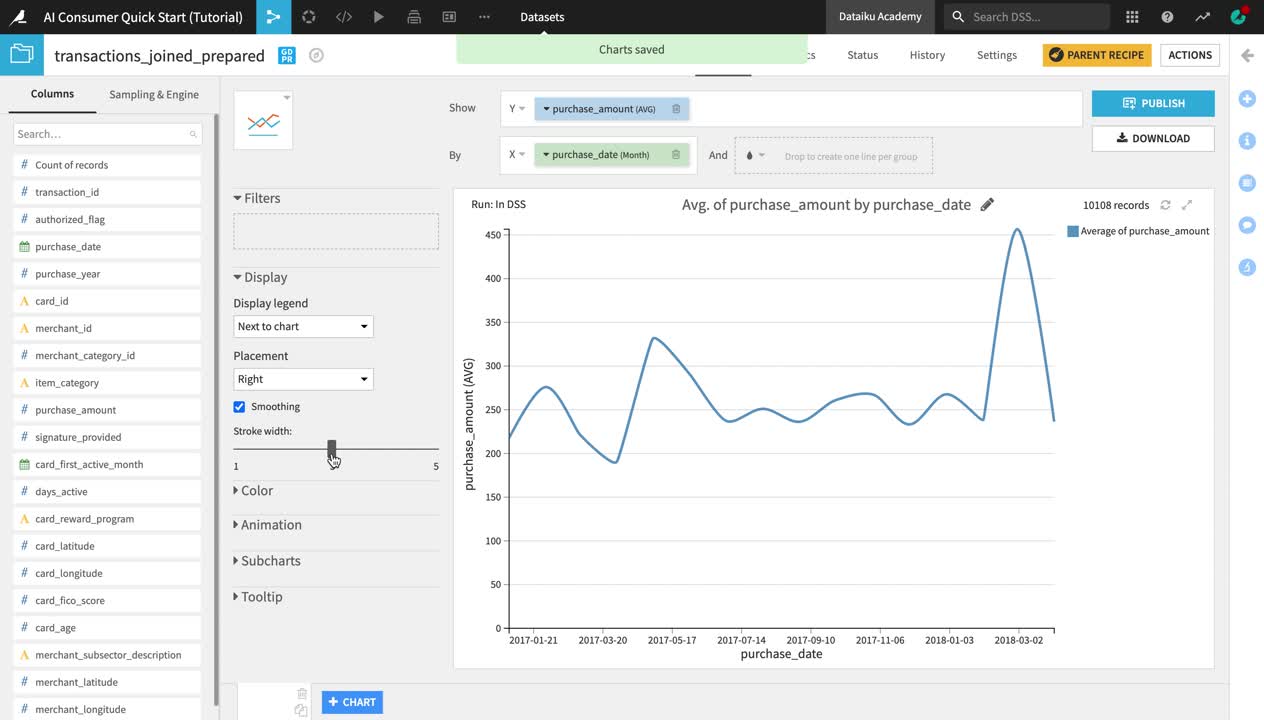
Click on the dropdown arrow next to purchase_date and change the date range from Automatic to Month.
Click the Chart type dropdown (the blue bar chart tile next to the Columns panel) to change the chart type.
Select the Lines type.
In the panel to the left of the chart preview, drag the Stroke width slider to increase the line width to
3.
You can see that despite the drop in the number of transactions by month in early 2018 (which we observed in one of the charts on the Purchase Patterns dashboard that we explored earlier), the average purchase amount has been relatively stable over time, with a peak in March 2018.
Publish a Chart on a Dashboard
Let’s now publish the chart we created on the Purchase Patterns dashboard.
Click Publish in the upper right corner of the Charts tab.
From the dropdown menu, select Purchase Patterns as the dashboard to publish your chart on, and then click Create.
Just like when publishing a metric, you are once again navigated to the Edit tab of the “Purchase Patterns” dashboard.
In the right side menu of the dashboard editor, change the chart insight Title to
Average purchase amount over time.Drag and resize the chart and the “Avg of purchase_amount” metric as shown in the video below.
Click Save, and navigate to the View tab to view your dashboard.
What’s Next?
Congratulations! In a short amount of time, you were able to:
Discover the Dataiku interface, create a project, and personalize your view of the product homepage;
Consume data and machine learning insights on dashboards;
Use a Dataiku application to generate insights and visualizations on new data;
Explore a Dataiku project and its Flow, and use different Flow views to gain a better understanding of the project;
Explore and analyze a dataset using metrics;
Publish a metric as an insight to a dashboard;
Create a chart to visualize data patterns and publish it to a dashboard.
Your path to Dataiku mastery doesn’t have to stop here. While this tutorial covers some of the most basic Dataiku capabilities offered in the Explorer license, you can download the free edition and/or use the 14-Day Free Online Trial to expand your knowledge and create your own data projects.
If you are interested in learning more about creating data pipelines and performing powerful data analytics with Dataiku, check out the Business Analyst quick start tutorial.
Tip
This quick start tutorial is only the tip of the iceberg when it comes to the capabilities of Dataiku. To learn more, please visit the Academy, where you can find more courses, learning paths, and certifications to test your knowledge.