Hands-On Tutorial: Charts, Pivot Tables & Dashboard Filter Tiles
Charts, pivot tables, and dashboards are key tools for visualizing data. Let’s explore how to use these native tools in Dataiku!
Let’s Get Started
In this tutorial, you will create:
charts, including editing display labels and formatting axes;
pivot tables with multiple levels of hierarchy;
dashboard filter tiles, including experimenting with different source datasets and sampling methods across insights.
Prerequisites
A Dataiku 11 instance
A basic level of knowledge about Dataiku is helpful. If you’ve never used Dataiku before, try the Core Designer learning path or a Quick Start tutorial!
Create the Project
We’ll reuse the Flow from the AI Consumer quick start.
From the Dataiku homepage, click +New Project > DSS Tutorials > Quick Start > AI Consumer Quick Start (Tutorial).
Use Case Summary
This project is a simplified credit card fraud use case. Using data about transactions, merchants, and cardholders, we have a model that predicts which transactions should be authorized and which are potentially fraudulent.
A score of 1 for the target variable, authorized_flag, represents an authorized transaction. A score of 0, on the other hand, is a transaction that failed authorization.
Create a Chart
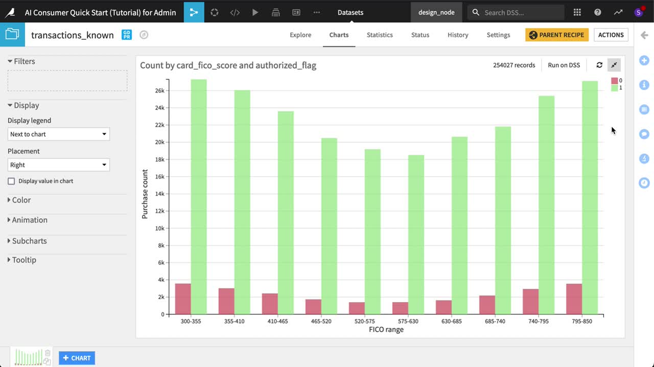
Let’s imagine that we are interested in the relationship between FICO score (a measure of creditworthiness in the US) and whether a purchase is authorized or not. To explore this relationship, we’ll investigate using the transactions_known dataset, which is the training data for the model in this Flow.
Open the transactions_known dataset, and navigate to the Charts tab.
Drag purchase_amount to the “Y axis” field.
Drag card_fico_score to the “X axis” field.
Drag authorized_flag to the “Color” field.
This video walks through all of the steps described in this section. Play and pause the video as you read the instructions and build your chart.
Refine Axis Labels and Other Settings
Already the average purchase amount for an unauthorized purchase seems much higher across all FICO scores, but let’s start refining the plot.
Click the authorized_flag dropdown to change the “Binning mode” to None, use raw values.
Before investigating average purchases, let’s start with counts first.
Click the purchase_amount dropdown to change the “Aggregation function” to Count non-null.
For card_fico_score, open the dropdown, and check the box to “Generate one tick per bin”.
We now have a basic chart plotting counts of authorized and unauthorized purchases by FICO range. Of course though, this is just a sample. Since this is a relatively small dataset, let’s view all of it.
In the “Sampling & Engine” tab on the left, uncheck “Use same sample as explore”.
Change the Sampling method to “No sampling (whole data)”.
Save and refresh the sample.
We now have the full data in the chart, but let’s make it more presentable.
Click the Y axis dropdown–to the left of the purchase_amount measure, and provide the cleaner axis label
Purchase count.In the same dropdown, change the Multiplier to “Thousands”.
Click the X axis dropdown, and provide a more presentable axis label:
FICO range.
Do you remember what the values 0 and 1 represent? Let’s change the colors to make it easier to recall.
Click the color droplet to the left of the authorized_flag dimension to adjust the palette.
Click on the colored circle to the left of the number, and change the 0 to red (for transactions that failed authorization).
Change the 1 to green (those that passed).
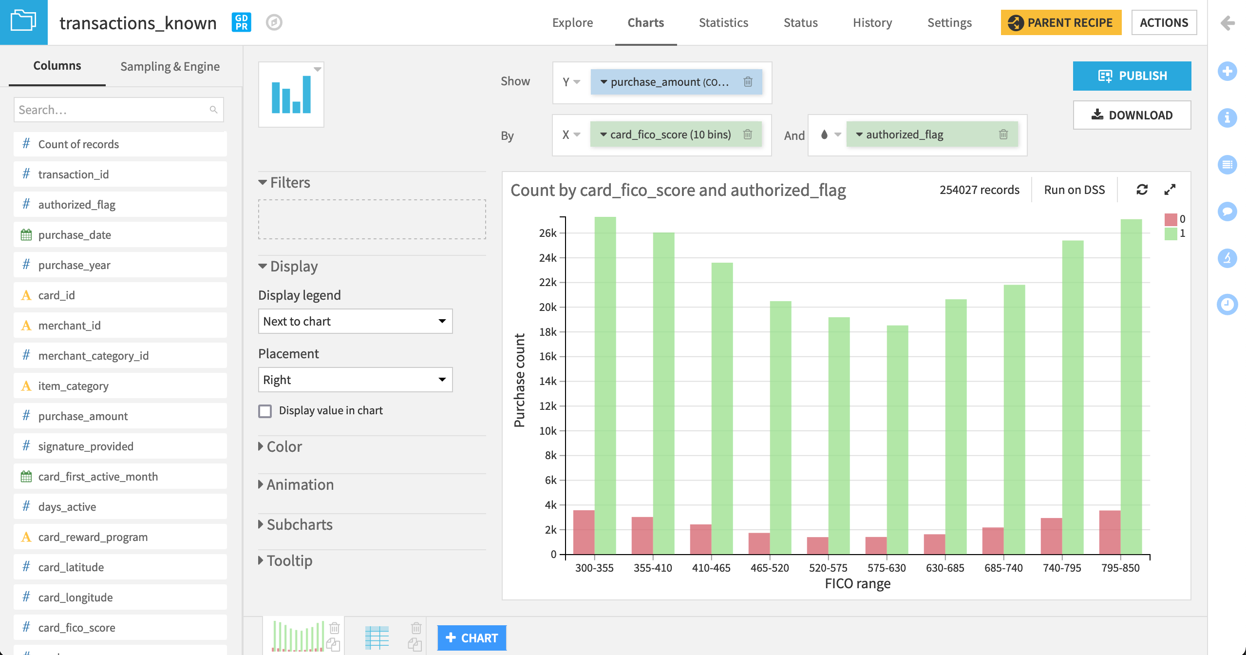
Not bad! As we’d expect, we have relatively few unauthorized transactions compared to those authorized–and this holds true for every level of FICO range.
Create a Pivot Table
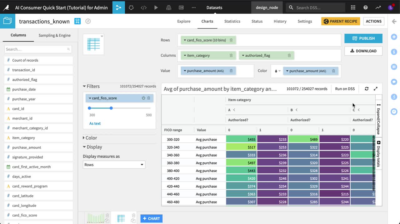
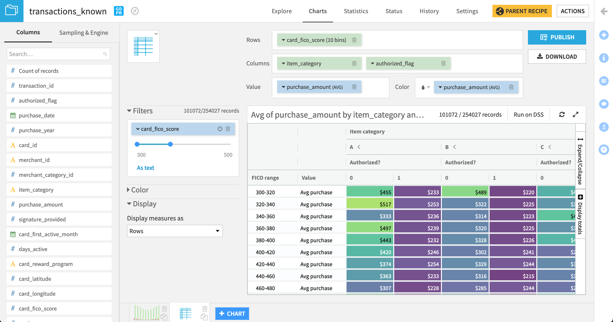
Counts aside, is there a difference in the average purchase amount between authorized and unauthorized transactions? Moreover, how does this differ not only by FICO score, but also item category? Let’s explore this question with a pivot table.
Still in the Charts tab of the transactions_known dataset, click the blue + Chart button at the bottom to create a new chart.
From the Chart type icon, choose a Pivot Table.
Drag purchase_amount to the “Value” field.
Drag authorized_flag to the “Columns” field.
Drag card_fico_score to the “Rows” field.
This video walks through all of the steps described in this section. Play and pause the video as you read the instructions and build your table.
Adjust Pivot Table Labels and Hierarchy
We have a pivot table! Let’s start refining it.
Click on the card_fico_score dropdown to change the number of bins to
10and the display label toFICO range.Change the “Binning mode” of authorized_flag to None, use raw values and the display label to
Authorized?.Add a
$prefix to the purchase_amount measure and change the display label toAvg purchase.
Note
If we were looking at another aggregation of purchase amounts, such as a sum, then the Multiplier dropdown might be useful to us, as we could format the output to be more readable.
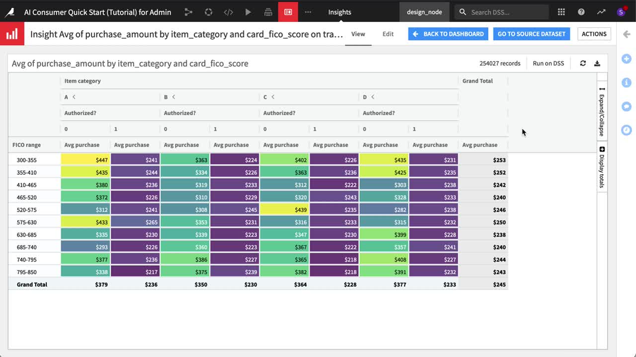
We now have a view of the average purchase between authorized and unauthorized transactions per FICO range. On top of this, let’s also explore variation by item_category. We can do this by adding extra levels of hierarchy to the pivot table (in either horizontal or vertical directions).
Drag item_category as the first item in the “Columns” field so it’s the left-most level of hierarchy in the table.
Click the item_category dropdown to change the sorting to Natural ordering and the display label to
Item category.
For any FICO range, we can now observe the average purchase amount per item category, as well as expand columns within each category to see the breakdown between authorized and unauthorized transactions.
In the table, click the “<” and “>” next to category “A” to collapse and expand the table for that category, hiding and revealing a side-by-side comparison of authorized and unauthorized average purchases only for items in category A.
Experiment with these settings using the “Expand/Collapse” menu on the right side of the table. When finished, click Expand all.
Note
Depending on your objectives, you may prefer to change the hierarchy of the table. Change the order of variables in the “Columns” field to view the impact. You can also add even more layers of hierarchy. Add a third variable like signature_provided to the “Columns” field to test this out! Remove it when done to match the rest of the instructions.
It’s easy to get lost in this table. Let’s add a color scale to help spot any outliers.
Drag purchase_amount to the “Color” field.
Click the color droplet, and change the color palette to Viridis to observe starker differences.
Let’s also remove the item_category subtotals for a clearer side-by-side comparison of authorized and unauthorized transactions.
On the right side of the table, click Display totals.
Uncheck the box for “Totals > Columns” so that only grand totals remain.
After expanding all item categories, unauthorized purchases tend to have a greater average purchase amount than those that were authorized (see the yellow and green cells compared to the purple). This seems particularly apparent among cardholders with lower FICO scores. Let’s drill down further.
Click on the first cell in the table to pin the tooltip.
Click the drill down icon next to FICO range.
Adjust the card_fico_score filter to include scores ranging from 300 to 500. Remember you can click on the value and rewrite it, instead of manually dragging the range endpoints.
We now have much narrower bin ranges for FICO scores. Let’s take a closer look.
Click the Expand chart icon at the top right of the table.
If you haven’t already done so, use the “Expand/Collapse” tool at the right of the table to expand all columns.
This is a pivot table we can share with stakeholders!
Reduce the table size, and click Download to generate an .xlsx file of the final table.
Note
Why are some chart fields in a blue box and others a green one? In charts, measures are blue, while dimensions are green. Compare this with the previous chart to confirm!
Publish on a Dashboard
Beyond creating an export file, we can also share charts on dashboards for an interactive experience within Dataiku.
The video at the end of this section walks through all of the steps described here. Play and pause the video as you read the instructions and edit the dashboard.
From the pivot table in the Charts tab of the transactions_known dataset, click Publish.
Change the dashboard to “Purchase Patterns”, and click Create to generate the pivot table insight (the box on the left should be checked), and add it to the dashboard in one step.
On the Edit tab of the dashboard, increase the size of the pivot table insight (the video below is one example layout), and click Save.
Navigate to the View tab of the dashboard to see it displayed.
Charts vs. Insights
Recall that the chart insight we just created is entirely independent of the original chart. Modifications to the original chart object do not impact the chart insight; modifications to the chart insight have no effect on the original chart object.
From the dashboard’s View tab, click the arrow next to the title of the pivot table to open the insight.
Navigate to the insight’s Edit tab, and delete the FICO score filter.
On the left, change the option to “Display measures as” rows to columns. Click Save.
Navigate back to the View tab of the insight or the dashboard to see the modified pivot table.
Note
If you return to transactions_known dataset and find the pivot table used to create the insight, that pivot table will not have these changes since insights and charts are independent objects. You can learn more about chart insights in the product documentation.
Add a Filter Tile to the Dashboard
We often need to provide the end user of a dashboard the ability to interact with the insights on display. You can add data filters to an individual insight on its Edit tab–just like you would for a chart.
However, it’s also often useful to have a filter that operates at the level of an entire dashboard slide. This way, multiple insights on the same dashboard slide can be subject to the same data filters.
Let’s demonstrate how a filter tile works at the dashboard slide level.
The video at the end of this section walks through all of the steps described here. Play and pause the video as you read the instructions and apply a filter tile.
From the dashboard’s Edit tab, click the green plus button to add a new tile.
Choose a Filters tile.
The filters we add to the dashboard slide must reference a source dataset, and so we can choose this dataset in two ways.
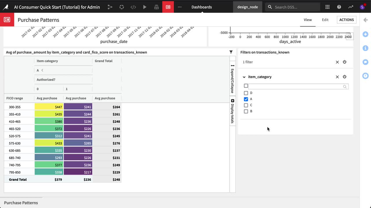
In this case, choose Existing tile, and select the chart insight for the pivot table on transactions_known.
Choose item_category as the column to use for the filter, and click Add.
Adjust the size of the filter tile as needed, and click Save.
Navigate back to the dashboard’s View tab to see the results.
Using a Filter Tile
Let’s see the filter tile in action!
From the dashboard’s View tab, click to remove categories “B”, “C”, and “D” from the filter tile.
It’s obvious that these categories have been removed from the pivot table, but the rows corresponding to these categories have also been removed from the bar chart and scatter plot since they are found on the same dashboard slide.
Deactivate the filter, and recognize how the data has been returned to the insights.
We might want to change the default selections for the filter tile, and we can do this in the Edit tab.
From the dashboard’s Edit tab, select the filter tile.
Within its Tile menu, we can adjust settings, including the default selections. Check only the box for category “A”, and click Save.
Navigate back to the View tab to see that the default filter has changed, but the user can still make new selections.
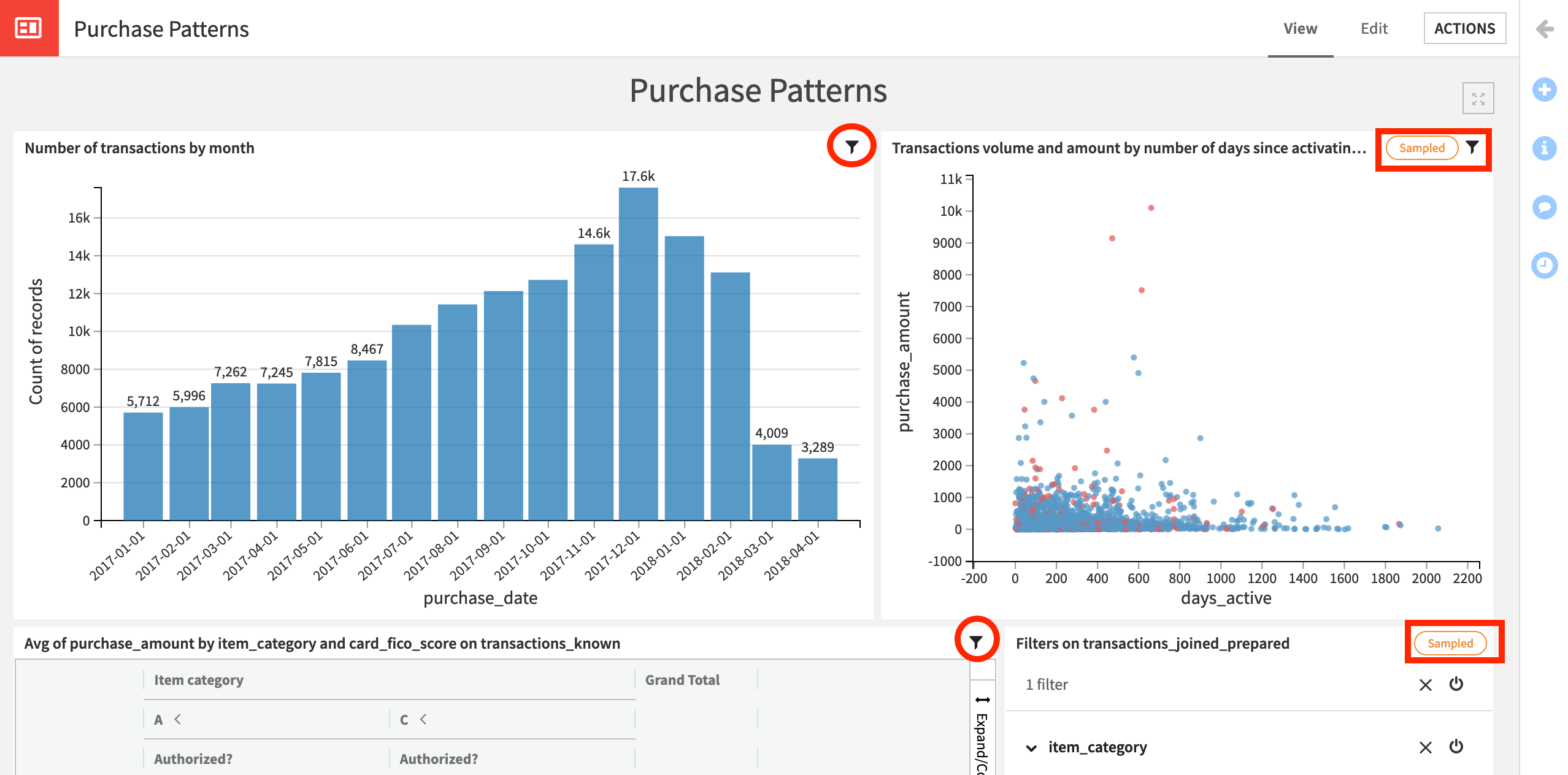
Source Datasets for Filter Tiles
These are the basics, but two more concepts about filter tiles are important to understand.
The values in a filter tile come from a chosen column (or columns) in one source dataset.
When this filter tile is activated, you’ll notice a filter icon in the top right corner of each insight.
Hover over the filter icon to see the tooltip for each insight.
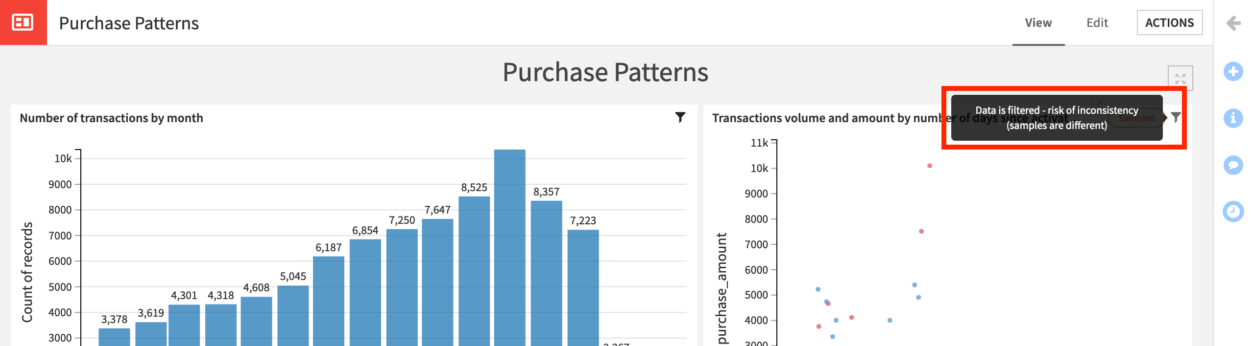
For the pivot table, the tooltip says “Data is filtered”, but, for the other two insights, the tooltip also notes a risk of inconsistency because the datasets are different.
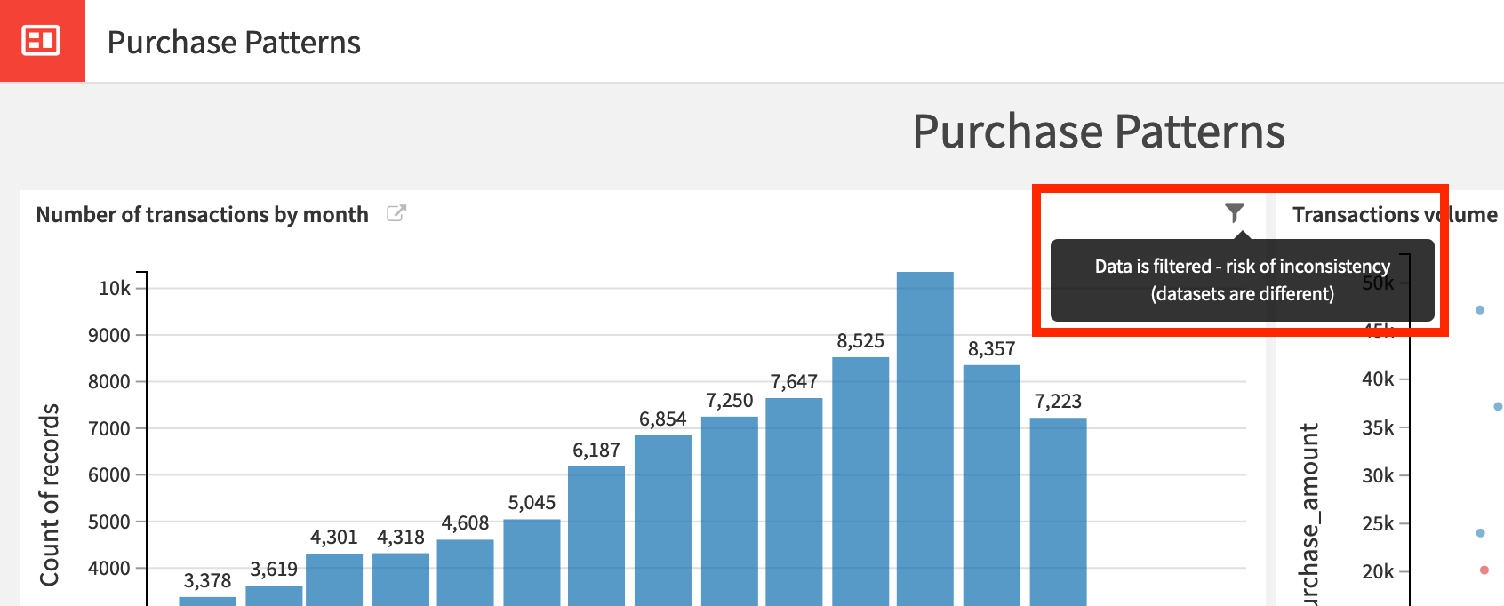
The tooltip alerts us to the fact that the source dataset of the filter tile is different from the source dataset of the other insights. The source dataset for the filter tile and the pivot table is transactions_known, while the source dataset for the bar chart and scatter plot is transactions_joined_prepared.
The filter tile, however, is applied to every insight on the dashboard slide. Is this a problem?
In this case, the values for item_category for transactions_known and transactions_joined_prepared happen to be the same (“A”, “B”, “C”, and “D”), but there is no guarantee that this will be true.
Imagine, for example, that the dataset transactions_joined_prepared had rows with a category “E” that were not found in transactions_known. Category “E” would not appear as an option in the filter tile (which is based only on the values found in transactions_known).
The insights on transactions_joined_prepared would not include any category “E” rows. They’d be filtered out without us explicitly knowing. Accordingly, we need to be particularly careful about using a filter tile on a dashboard slide with insights from different source datasets.
Let’s change the source dataset of the filter tile to be sure we understand the meaning of this message.
In the dashboard’s Edit tab, return to the Tile menu of the filter tile.
Click Change Source Dataset > Other Dataset .
Choose transactions_joined_prepared as the source dataset and item_category as the column.
Save the change, and navigate back to the View tab.
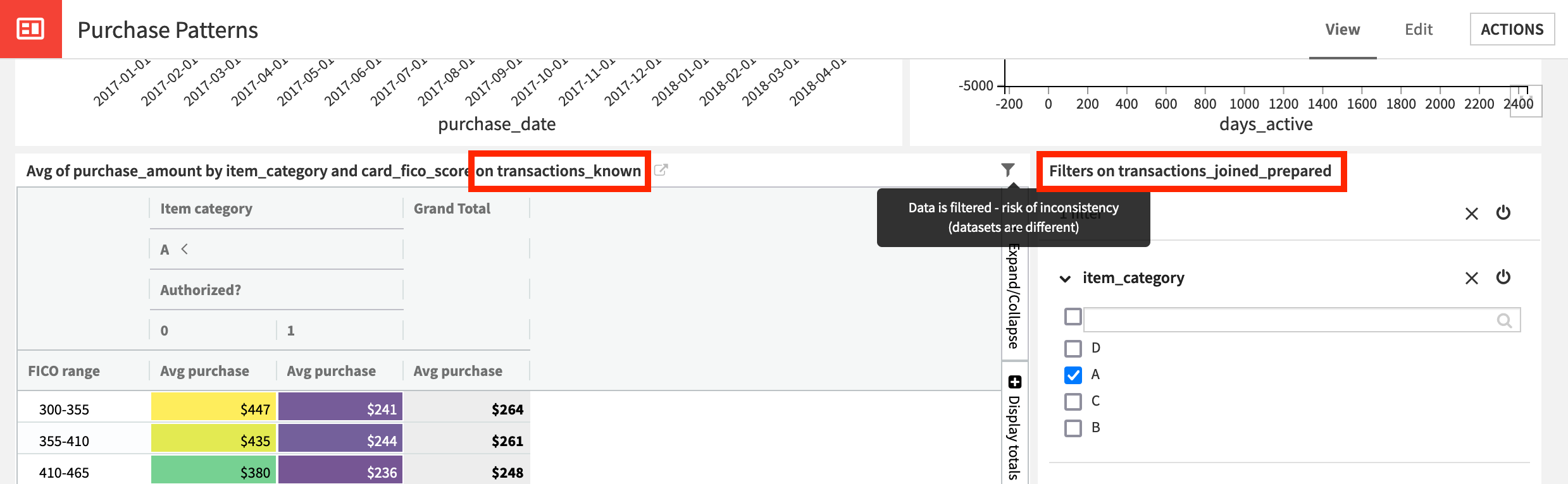
Note how the display label on the filter tile has changed, and the messages on the Filter icon tooltip are reversed. The pivot table insight is now at risk of inconsistency!
Sampling on Insights vs. Filter Tiles
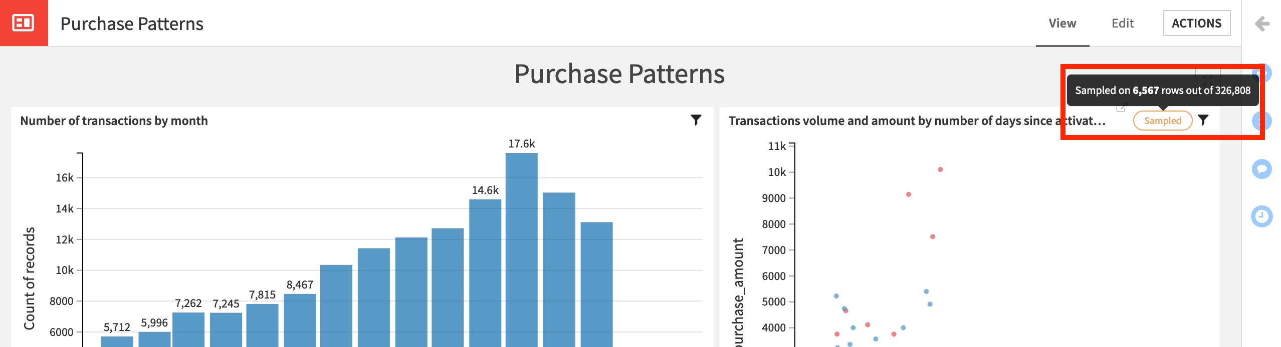
We know that the sampling method for a chart is independent from the sampling method for an insight produced from it. Filter tiles also have their own sampling method.
For example, to avoid too many overlapping points, we may prefer to use a sampling method on the scatter plot insight.
Navigate to the Edit tab of the scatter plot insight (Clicking the arrow next to the insight title opens the insight).
On the “Sampling & Engine” tab, change the Sampling method to Random (approx. ratio). Click Save and Refresh Sample.
Save the insight, and return to the dashboard’s View tab.
In the dashboard’s View tab, hover over the Sampled tag to see more information about the sample size for this insight.
How does this sample interact with the filter tile?
In the dashboard’s View tab, ensure that the filter tile is activated, and only values “A” are included for example.
Observe the filter icon tooltips for all three insights.
The scatter plot has a risk of inconsistency because the insight sample is different from the filter tile sample.
In this specific case, the risk may be manageable. We have a random sample in the insight, and the filter tile has removed any rows with an item_category other than “A”.
As a demonstration though, we could use the same sampling strategy in the filter tile itself.
Return to the Tile menu of the filter tile in the dashboard’s Edit tab.
In the “Sampling & Engine tab”, change the Sampling method to Random (approx. ratio).
Click Apply, save the result, and return to the dashboard’s View tab.
The filter tile now also has a sampled tag. The four categories, in this case, still happen to remain in the random sample.
Check the filter icon tooltips once more.
The tooltip on the pivot table still warns about a different dataset, but the tooltip on the bar chart notes the different sampling strategy.
What’s Next?
Congratulations! You’ve created not just exploratory charts and pivot tables, but polished versions that are ready to be presented to stakeholders.
The next step might be publishing the dashboard on a workspace.
Note
Consult the product documentation to learn more about charts, including pivot tables.
To learn more about visualization with code, such as webapps and static insights, you might want to check out the Academy course on Visualization.