Business Analyst Quick Start
Getting Started
Dataiku is a collaborative, end-to-end data science and machine learning platform that unites data analysts, data scientists, data engineers, architects, and business users in a common space to bring faster business insights.
In this quick start tutorial, you will be introduced to many of the essential capabilities of Dataiku DSS by walking through a simple use case: predicting customer churn. Working towards that goal, you will:
connect to data sources,
prepare training data,
build machine learning models,
use one to generate predictions on new, unseen records, and
communicate results in a dashboard.
Note
This hands-on tutorial is geared towards a Business Analyst entirely new to Dataiku DSS. It focuses on using the point-and-click interface. If you are more interested in what Dataiku DSS offers for coders, you might prefer to check out the quick start tutorials for a Data Scientist or a Data Engineer.
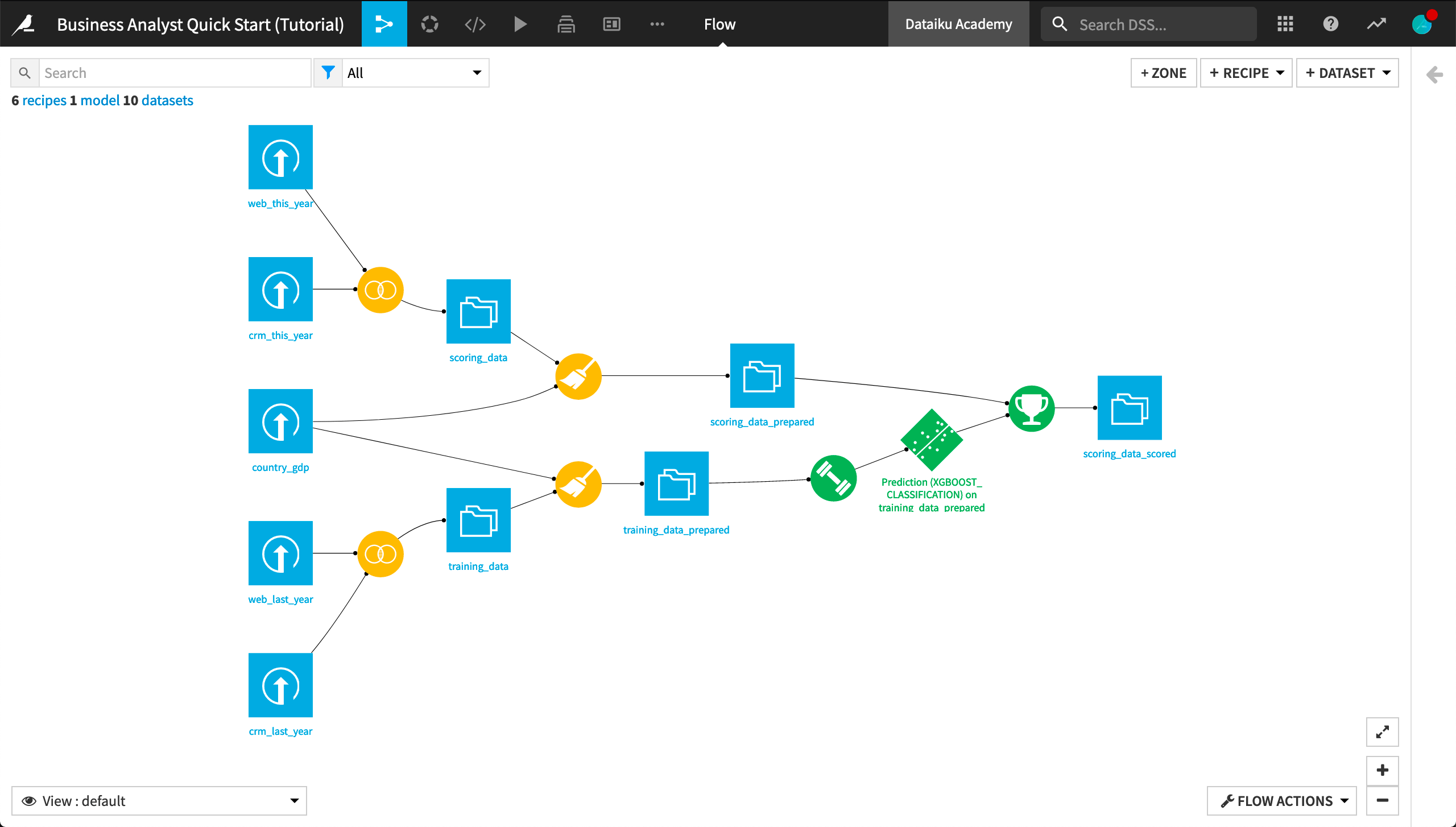
When you’re finished, you will have built the workflow below and understand all of its components!
Prerequisites
To follow along with the steps in this tutorial, you will need access to a Dataiku DSS instance (version 9.0 or above). If you do not already have access, you can get started in one of two ways:
install the free edition locally, or
start a 14-Day Free Online Trial.
You’ll also need to download this country_gdp.csv file to be uploaded during the tutorial.
Tip
Take a moment to arrange these instructions and your Dataiku DSS instance in the most productive way for your and your workstation–for example, using separate tabs or windows.
For each section below, written instructions are recorded in bullet points, but you can also find a screencast at the end of each section that records all of the actions described. Use these short videos as your guide!
You can also find a read-only completed version of the final project in the public gallery.
Create a Project
Let’s get started! After creating an account and logging in, the first page you’ll see is the Dataiku DSS homepage. From this page, you’ll be able to browse projects, recent items, dashboards, and applications shared with you.
Note
A Dataiku DSS project is a holder for all work on a particular activity.
You can create a new project in a few different ways. You can start a blank project or import a zip file. You might also have projects already shared with you based on the user groups to which you belong.
From the Dataiku DSS homepage, click on +New Project.
Choose DSS Tutorials > Quick Start > Business Analyst.
Click OK when the tutorial has been successfully created.
Note
You can also download the starter project from this website and import it as a zip file.
Connect to Data
After creating a project, you’ll find the project homepage. It is a convenient high-level overview of the project’s status and recent activity.
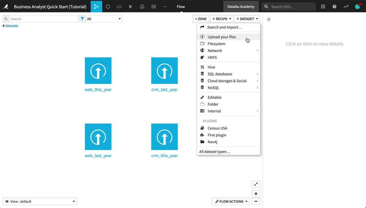
Let’s add a new dataset to the Flow, in addition to the existing four present in the initial starting project.
Note
The Flow is the visual representation of how data, recipes (steps for data transformation), and models work together to move data through an analytics pipeline.
A blue square in the Flow represents a dataset. The icon on the square represents the type of dataset, such as an uploaded file, or its underlying storage connection, such as a SQL database or cloud storage.
From the project homepage, click Go to Flow.
Click +Dataset in the top right corner of the Flow.
Click Upload your files.
Add the country_gdp.csv file by dragging and dropping or using the button to choose a file.
If using Dataiku Online, click Next, and observe a preview of the settings used to read the file.
If using the free edition or any other local instance, click Preview at the bottom left of the page to do the same.
Click the green Create button to create the dataset within Dataiku.
Navigate back to the Flow from the left-most menu in the top navigation bar (or use the keyboard shortcut
G+F).
Tip
No matter what kind of dataset the blue square represents, the methods and interface in Dataiku DSS for exploring, visualizing, and analyzing it are the same.
Explore and Join Data
Now we have all of the raw data needed for this project. Let’s explore what’s inside these datasets.
From the Flow, double click on the crm_last_year dataset to open it.
Configure a Sample
On opening a dataset, you’ll find the Explore tab. It looks similar to a spreadsheet, but with a few key differences. For starters, you are viewing only a sample of the dataset.
Note
By default, the Explore tab shows the first 10,000 rows of the dataset, but many other configurations are possible. Working with a sample makes it easy to work interactively (filtering, sorting, etc.) on even very large datasets.
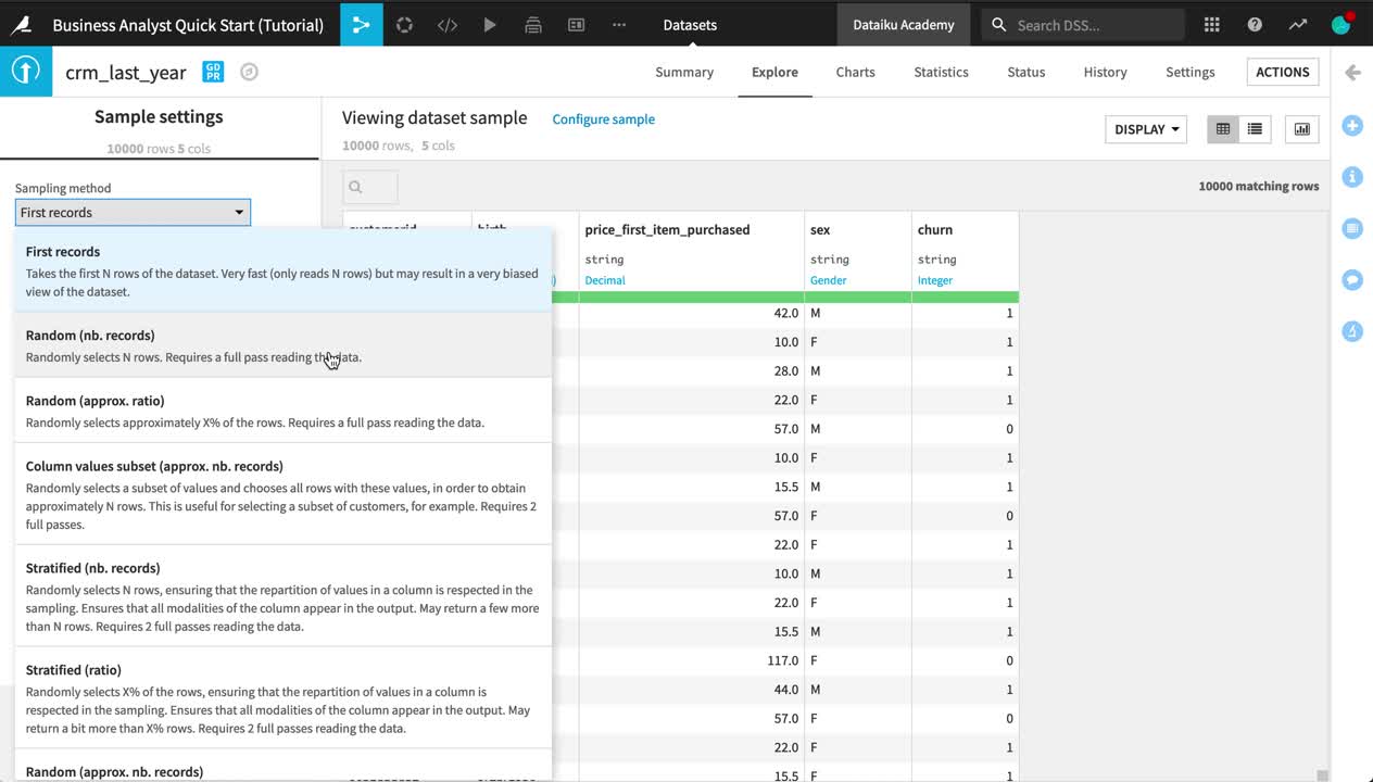
Near the top left of the screen, click on Configure sample.
Change the Sampling method from “First records” to Random (nb. records).
Click Save and Refresh Sample.
On the right sidebar, click to open the Details panel (marked with an “i”).
Under Status, click Compute. Refresh the count of records.
Tip
Although the sample includes only 10,000 records, the actual dataset is larger. Dataiku DSS itself imposes no limit on how large a dataset can be.
Observe the Schema
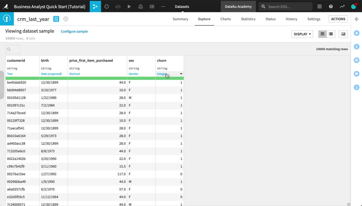
Look closer at the header of the table. At the top of each column is the column name, its storage type, and its meaning.
Note
Datasets in Dataiku DSS have a schema. The schema of a dataset is the list of columns, with their names and types.
A column in Dataiku DSS has two kinds of “types”:
The storage type indicates how the dataset backend should store the column data, such as “string”, “boolean”, or “date”.
The meaning is a rich semantic type automatically detected from the sample contents of the columns, such as URL, IP address, or sex.
Note how, at this point, the storage type of all columns is a string, but Dataiku DSS has inferred the meanings to be “Text”, “Date (unparsed)”, “Decimal”, “Gender”, and “Integer”.
Click the column heading of the customerid column, and then select Analyze from the menu.
Use the arrows at the top left of the dialog to scroll through each column.
Tip
Note how the Analyze tool displays different insights for categorical and numerical variables.
Join the Data
Thus far, your Flow only contains datasets. To take action on datasets, you need to apply recipes.
The web and CRM (customer relationship management) data both contain a column of customer IDs. Let’s join these two datasets together using a visual recipe.
Note
Recipes in Dataiku DSS contain the transformation steps, or processing logic, that act upon datasets. In the Flow, they are represented by circles connecting the input and output datasets.
Visual recipes (yellow circles) accomplish the most common data transformation operations, such as cleaning, grouping, and filtering, through a point-and-click interface.
You are also free to define your own processing logic in a code recipe (orange circle), using a language such as Python, R, or SQL.
A plugin recipe allows coders to wrap custom code behind a visual interface, thereby extending the native capabilities of Dataiku DSS.
Select the web_last_year dataset from the Flow.
Choose Join with from the “Visual recipes” section of the Actions sidebar near the top right of the screen.
Choose crm_last_year as the second input dataset.
Name the output dataset
training_datainstead of the default name.Leave the default options for “Store into” and “Format”.
If you are using Dataiku Online, these options will be “dataiku-managed-storage” and “Parquet”, as opposed to “filesystem_managed” and “CSV” if you are using a local instance.
Create the recipe.
Once the recipe is initiated, you can adjust the settings.
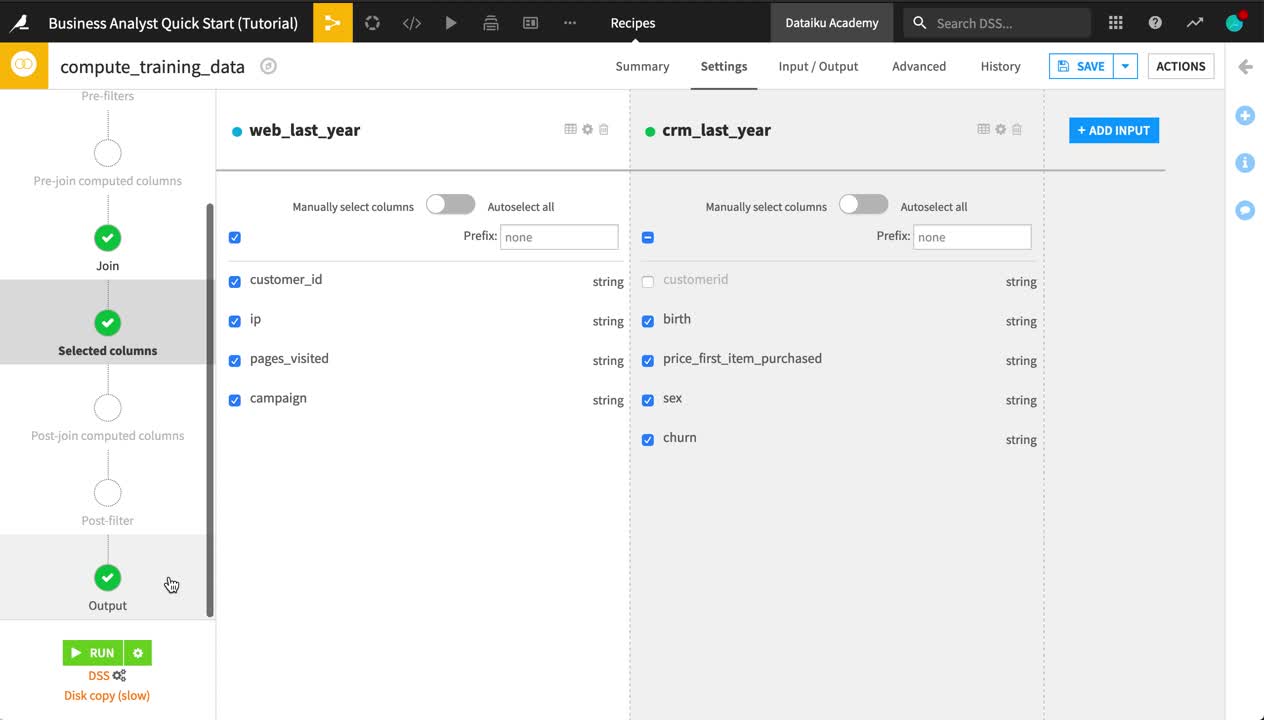
On the Join step, click on Left Join to observe the selected join type and conditions.
If using Dataiku Online, click Add a Condition, and then the plus icon. The Join condition should be a left join of the customer_id column of the left dataset and the customerid column of the right dataset.
If using the free edition or any other local instance, this should already be selected by default.
On the Selected columns step, uncheck the customerid column from the crm_last_year dataset.
On the Output step, note the output column names.
Before running it, Save the recipe.
Click Update Schema, and return to the Flow.
Tip
See how the Join recipe and output dataset are now represented in the Flow. The output dataset is drawn in an outline because it has not yet been built. You have only defined the instructions as to how it should be created.
Run a Recipe
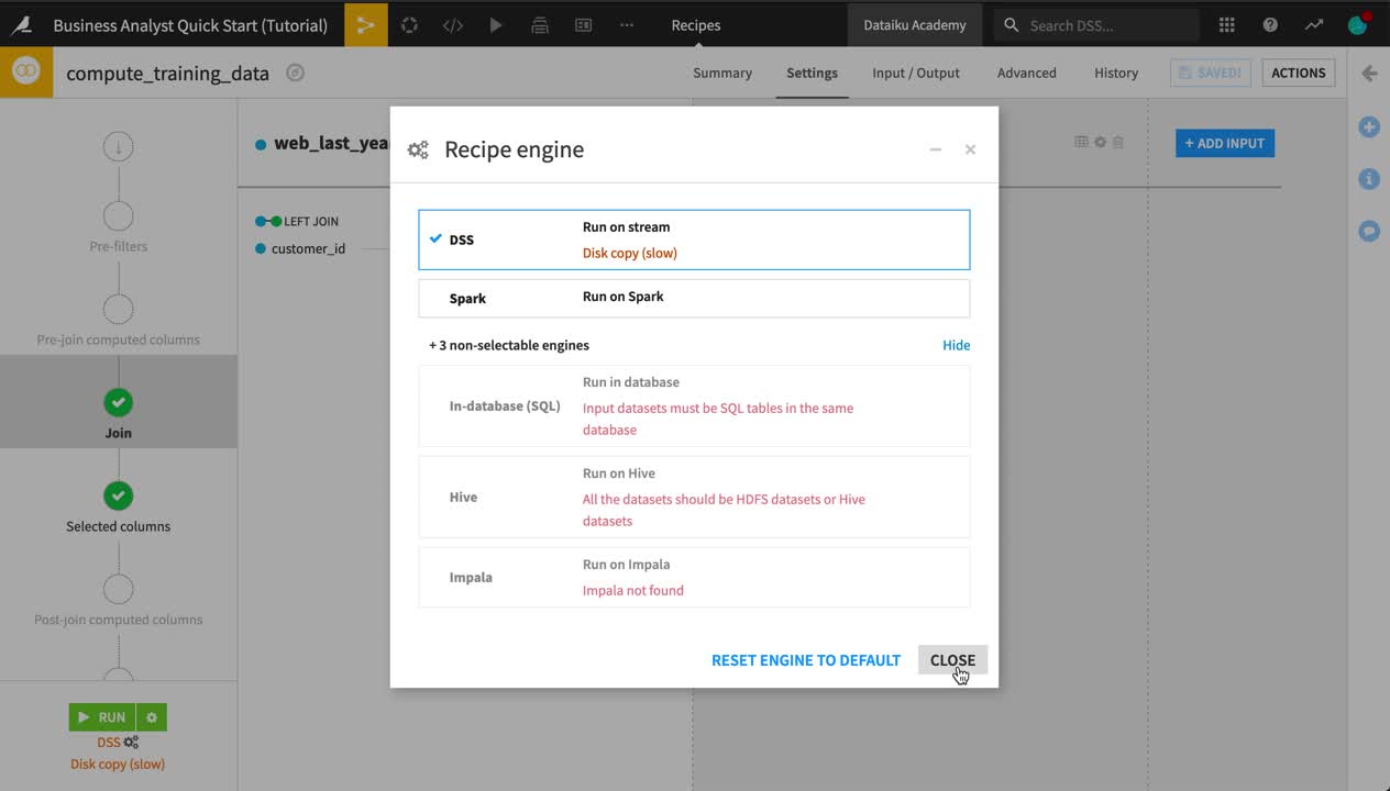
Now the recipe is ready to be run. However, you can choose to run the recipe with different execution engines, depending on the infrastructure available to your instance and the type of recipe at hand.
Note
By default, Dataiku DSS will select the available execution engine that it detects to be the most optimal. For this tutorial, that is the DSS engine.
If for example though, the input and output datasets were stored in a SQL database, and the recipe was a SQL-compatible operation, then the in-database engine would be chosen. This is not just for SQL code recipes. Many visual recipes and processors in the Prepare recipe can be translated to SQL queries.
In other situations, such as when working with HDFS or S3 datasets, the Spark engine would be available if it is installed.
From the Flow, double click to open the Join recipe.
In the Join recipe, click the gear icon at the bottom left of the screen to view the available (and not available) engines. Keep the DSS engine.
Click Run.
When the recipe is finished running, click to open the output dataset.
Tip
Note the icon on the output dataset to the Join recipe. If you are working on Dataiku Online, you will see an S3 icon, as that is where Dataiku is storing the output. If you are working on a local instance, however, you will see the icon for a managed filesystem dataset.
Investigate Missing Data
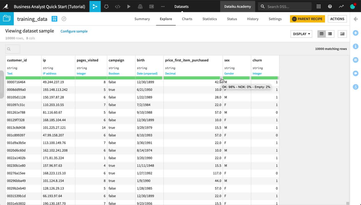
In datasets like crm_last_year and web_last_year, you’ll notice a completely green bar beneath the schema of each column. However, in training_data, this same bar has a small gray portion for columns birth, price_first_item_purchased, sex, and churn.
Note
For each column, this bar indicates the extent to which the current sample is not empty and matches the inferred meaning.
Green represents non-empty “OK” values that match the column’s inferred meaning.
Red indicates non-empty values that do not match the column’s inferred meaning.
Gray represents empty values.
Open training_data to confirm the empty values in columns like churn.
Click the column heading of the churn column, and then select Analyze from the menu.
Change “Sample” to “Whole data”, and click Save and Compute on this column to determine how many values are empty for this column.
Adjust a Recipe
The empty values in the output dataset result from rows in web_last_year not having a matching customer ID in crm_last_year. In this case, let’s just remove these rows.
From the training_data dataset, click Parent Recipe near the top right of the screen to return to the settings of the Join recipe.
On the Join step, click on Left Join.
Navigate to Join Type, and choose an Inner join to drop rows that do not have a match in both datasets.
All of the other settings remain the same so click Run to execute the recipe with the new join type.
Open the output dataset once more, and confirm that there are no longer any empty values in columns like churn.

Tip
The system of dependencies in the Flow between input datasets, recipes, and output datasets makes it possible to adjust or re-run recipes as needed without fear of altering the input data. As you will see later, it also provides the groundwork for a variety of different build strategies.
Prepare Data
Data cleaning and preparation is typically one of the most time-consuming tasks for anyone working with data. Let’s see how this critical step can be accomplished with visual tools in Dataiku DSS.
Note
You can use the Prepare recipe for data cleaning and feature generation in a visual and interactive way.
Parse Dates
In a Prepare recipe, the inferred meanings for each column allow Dataiku DSS to suggest relevant actions in many cases. Let’s see how this works for a date column.
With the training_data dataset selected, initiate a Prepare recipe from the Actions bar on the right.
The name of the output dataset,
training_data_prepared, fits well so just create the recipe.
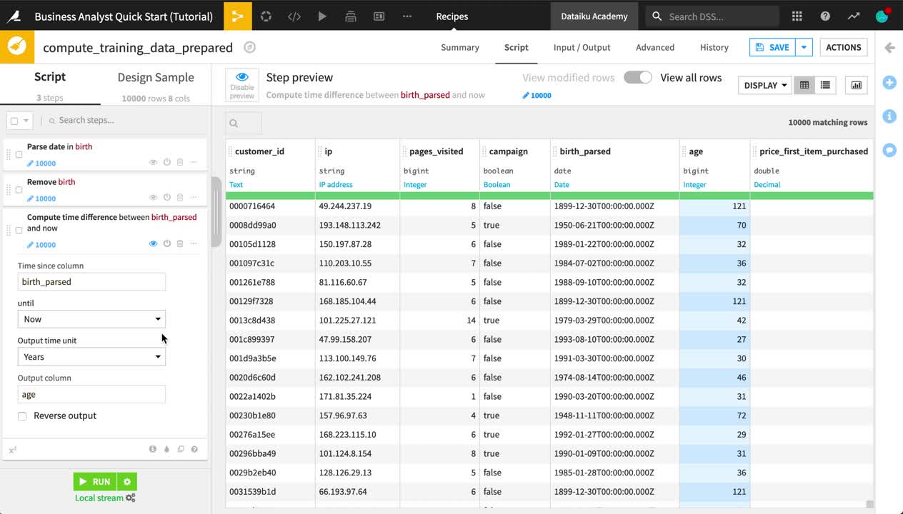
Dataiku DSS recognizes the birth column as an unparsed date. The format though is not yet confirmed.
From the birth column header dropdown, select Parse date.
In the “Smart date” dialog, click OK to accept the detected format (or Use Date Format if using Dataiku Online).
Return to the birth column header dropdown, and select Delete.
From the birth_parsed column header dropdown, select Compute time since.
Change the “Output time unit” to Years.
Change the name of the “Output column” to
age.
Tip
You deleted the birth column in the Prepare script above. However, this column remains in the input dataset. It will only be removed from the output dataset. Unlike a spreadsheet tool, this system of input and output datasets makes it easy to track what changes have occurred.
Handle Outliers
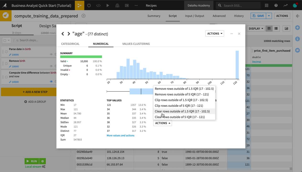
The age column has some suspiciously large values. The same Analyze tool used to explore data can also be used to take certain actions in a Prepare recipe.
From the age column header dropdown, select Analyze.
In the Outliers section, choose Clear rows outside 1.5 IQR from the Actions menu.
Tip
In addition to the suggested actions for each column, you can also directly search the processors library for more than 90 different transformations commonly needed in data wrangling by clicking +Add New Step at the bottom of the script.
Resolve IP Addresses
Let’s try out a few more processors to further enrich the dataset.
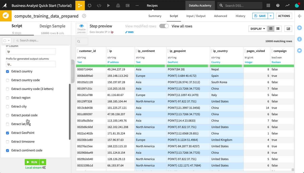
From the ip column header dropdown, select Resolve GeoIP.
Extract only the country, GeoPoint, and continent code.
Delete the original ip column.
Click Save and Update Schema.
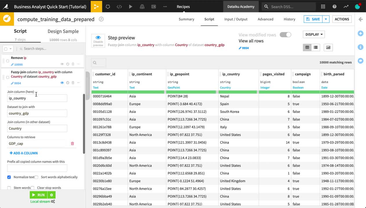
Fuzzy Join Data
In the earlier Join recipe, the customer IDs in each input dataset needed to match exactly. In some cases though, the ability to join based on a “close” match is what you really need.
Return to the Flow, and open the country_gdp dataset to remember what it contains.
Country names or abbreviations are one example where fuzzy matching may be a solution. For example, we would be able to match “UK” in one dataset with “U.K.” in another.
From the Flow, double click to open the Prepare recipe.
At the bottom of the recipe script, click to +Add a New Step.
Search for
fuzzy.Select Fuzzy join with other dataset.
Add
ip_countryas the “Join column (here)”.Add country_gdp as the “Dataset to join with”.
Add
Countryas the “Join column (in other dataset)”.Add
GDP_capas the “Column to retrieve”.Remove the prefix
join_.Select “Normalize text”.
Tip
As of version 9.0, there is also a more powerful Fuzzy Join recipe that works with larger datasets.
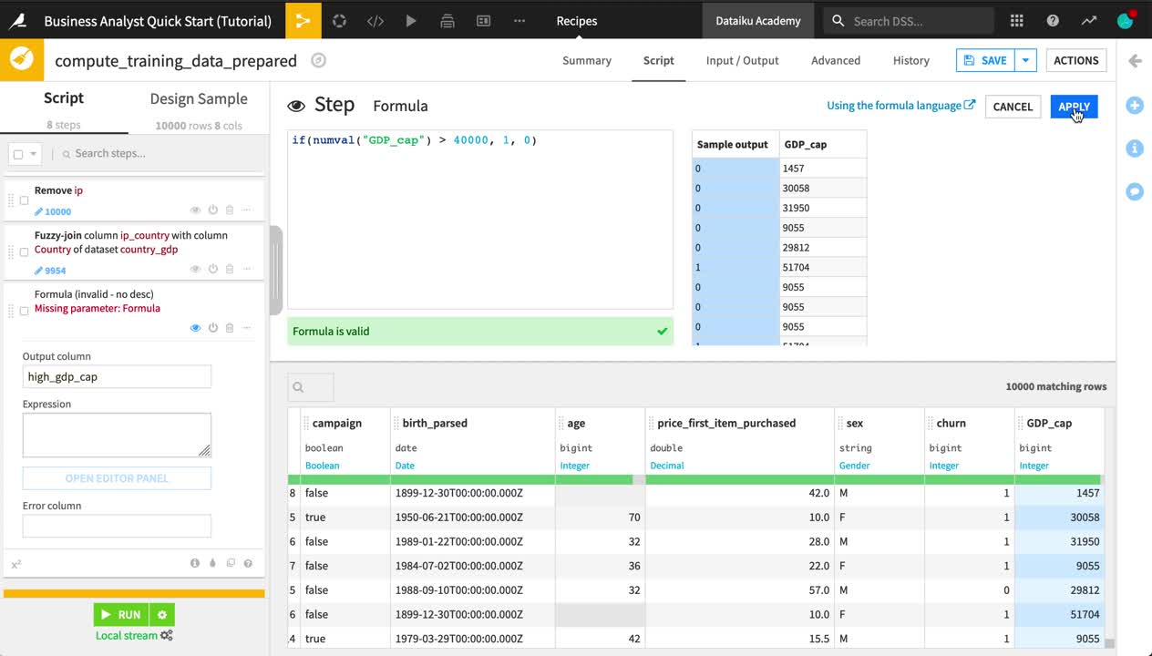
Write a Formula
You might also want to create new features from those already present. For this purpose, Dataiku DSS has a Formula language, similar to what you would find in a spreadsheet tool.
Note
Dataiku DSS formulas are a powerful expression language available in many places on the platform to perform calculations, manipulate strings, and much more. This language includes:
common mathematical functions, such as round, sum and max;
comparison operators, such as
>,<,>=,<=;logical operators, such as
ANDandOR;tests for missing values, such as
isBlank()orisNULL();string operations with functions like
contains(),length(), andstartsWith();conditional if-then statements.
At the bottom of the same recipe script, click to +Add a New Step.
Choose Formula.
Name the “Output column”
high_gdp_cap.Click Open Editor Panel to open the Formula editor.
Type the formula below, and click Apply when finished.
As this is the last step for now, click Run and Update Schema to execute the Prepare recipe and produce the output dataset.
if(numval("GDP_cap") > 40000, 1, 0)
Tip
This is only a small window into what can be accomplished in a Prepare recipe. See the Data preparation section of the product documentation for a complete view.
Visualize and Analyze Data
The ability to quickly visualize data is an important part of the data cleaning process. It’s also essential to be able to communicate results.
Note
The Charts and Statistics tabs of a dataset provide drag-and-drop tools for creating a wide variety of visualizations and statistical analyses.
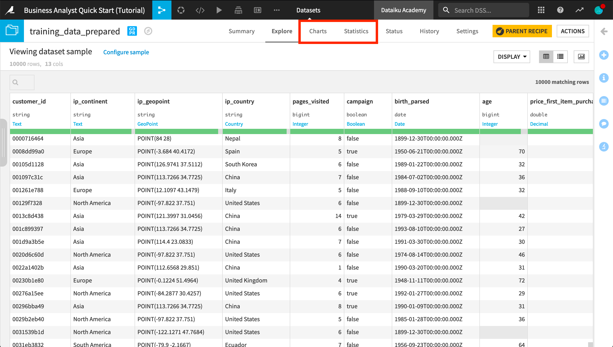
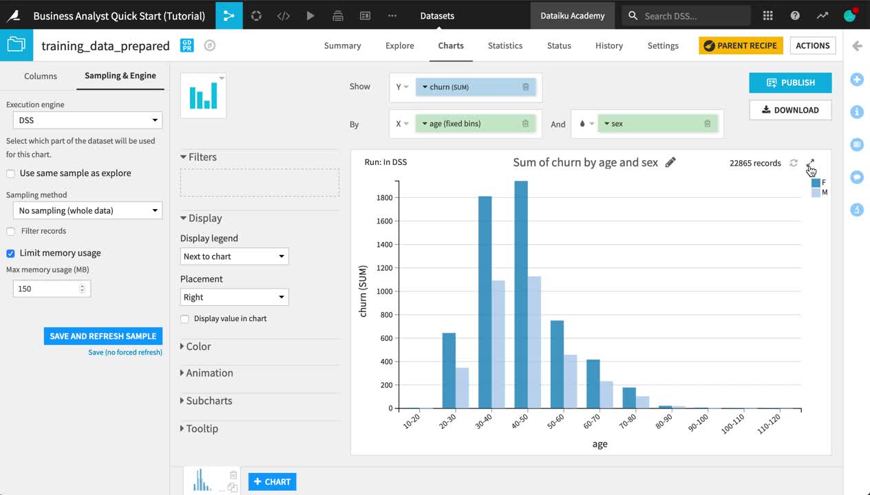
Create a Chart
Let’s visualize how churn differs by age and sex.
Open the training_data_prepared dataset.
Navigate to the Charts tab.
From the list of columns on the left, drag the churn column to the Y-axis and age to the X-axis.
Click on the churn dropdown in the Y-axis field to change the aggregation from AVG to SUM.
Click on the age dropdown in the X-axis field to change the binning method to “Fixed size intervals”.
Reduce the bin size to
10.Adjust the Ticks option to generate one tick per bin.
Add the sex column to the “And” field.
Be aware that charts, by default, are built on the same sample as in the Explore tab. To see the chart on the entire dataset, you need to change the sampling method.
On the left hand panel, switch from “Columns” to Sampling & Engine.
Uncheck “Use sample sample as explore”.
Change the Sampling method to No sampling (whole data).
Click Save and Refresh Sample.
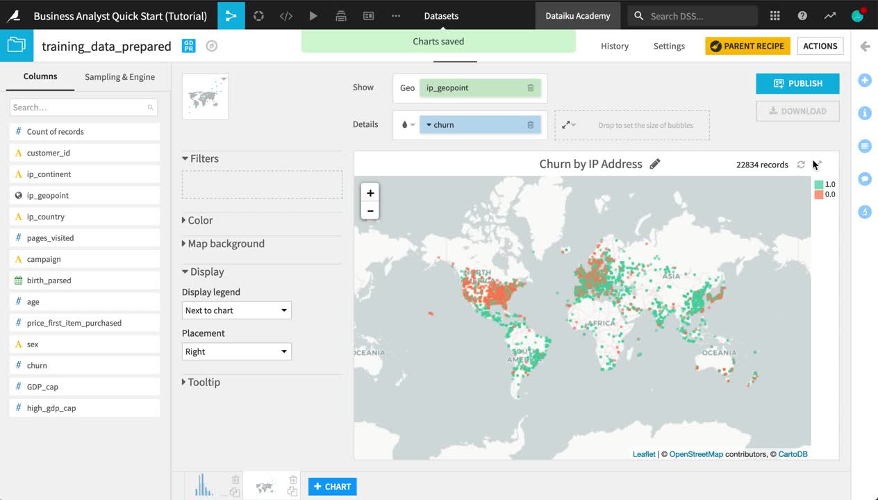
Create a Map
Let’s also explore the geographic distribution of churn.
At the bottom of the Charts tab, Click +Chart.
Click the Chart type dropdown, and choose the Globe icon. Then select a Scatter Map.
Drag ip_geopoint to the “Geo” field.
Drag churn to the “Details” field.
Click on the churn dropdown, and click to treat it as an alphanumeric variable.
Click on the color droplet to the left of the churn box, and change the palette to Set2.
In the empty field to the right of the “Details” field, reduce the base radius of the points to 2.
Change the chart title to
Churn by IP Address.
Tip
Note how the sampling method (none) remains the same when creating the second chart.
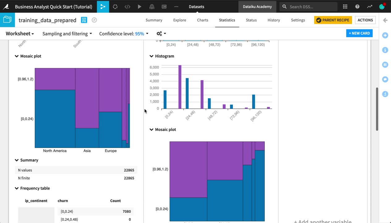
Create a Statistical Worksheet
You can also run a number of common statistical tests to analyze your data with more rigor. You retain control over the sampling settings, confidence levels, and where the computation should run.
Open the training_data_prepared dataset.
Navigate to the Statistics tab.
Click +Create your First Worksheet > Bivariate analysis.
From the list of available variables on the left, select ip_continent and price_first_item_purchased.
Click the plus to add them to the Factor(s) section.
Add churn to the Response section in the same way.
Click Create Card.
From the “Sampling and filtering” dropdown near the top left of screen, change the Sampling method to No sampling (whole data), and click Save and Refresh Sample.
Explore the output of your first card in your first statistical worksheet.
Tip
Feel free to add more cards to your existing worksheet or create a new one with a different kind of statistical analysis!
Build Machine Learning Models
Having explored and prepared the training data, now let’s start building machine learning models.
Note
Dataiku DSS contains a powerful automated machine learning engine that allows you to create highly optimized models with minimal user intervention.
At the same time, you retain full control over all aspects of a model’s design, such as which algorithms to test or which metrics to optimize. A high level of customization can be accomplished with the visual interface or expanded even further with code.
Train a Model
In order to train a model, you need to enter the Lab.
Note
The Lab is the place in Dataiku DSS optimized for experimentation and discovery. Keeping experimentation (such as model training) in the Lab helps avoid overcrowding the Flow with unnecessary items that may not be used in production.
From the Flow, select the training_data_prepared dataset.
From the Actions sidebar, click on the Lab.
Under “Visual analysis”, choose AutoML Prediction.
Select churn as the feature on which to create the prediction model.
Leave the “Quick Prototypes” setting and the default name, and click Create.
Without reviewing the design, click Train to start building models.
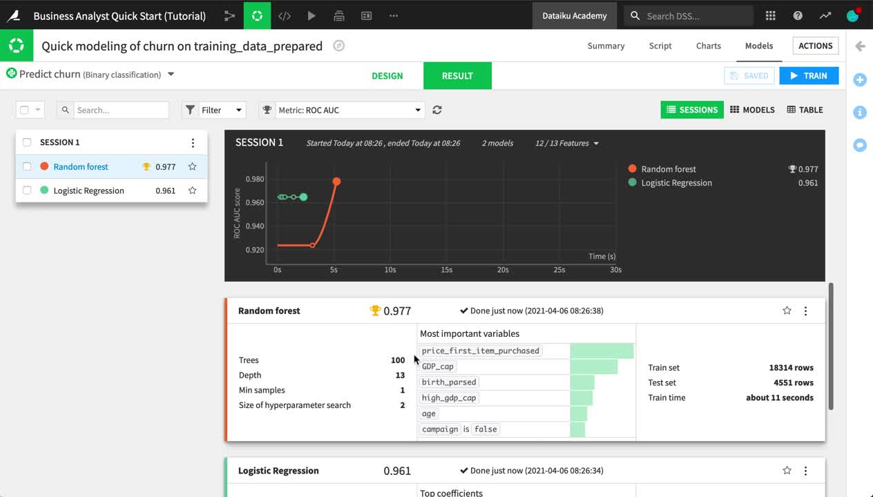
Inspect a Model
You have full transparency into how the random forest and logistic regression models were produced in the Design tab, as well as a number of tools to understand their interpretation and performance in the Result tab.
Let’s explore the results of the initial model training session.
From the Result tab of the visual analysis “Quick modeling of churn on training_data_prepared”, see the two results in Session 1 on the left side of the screen.
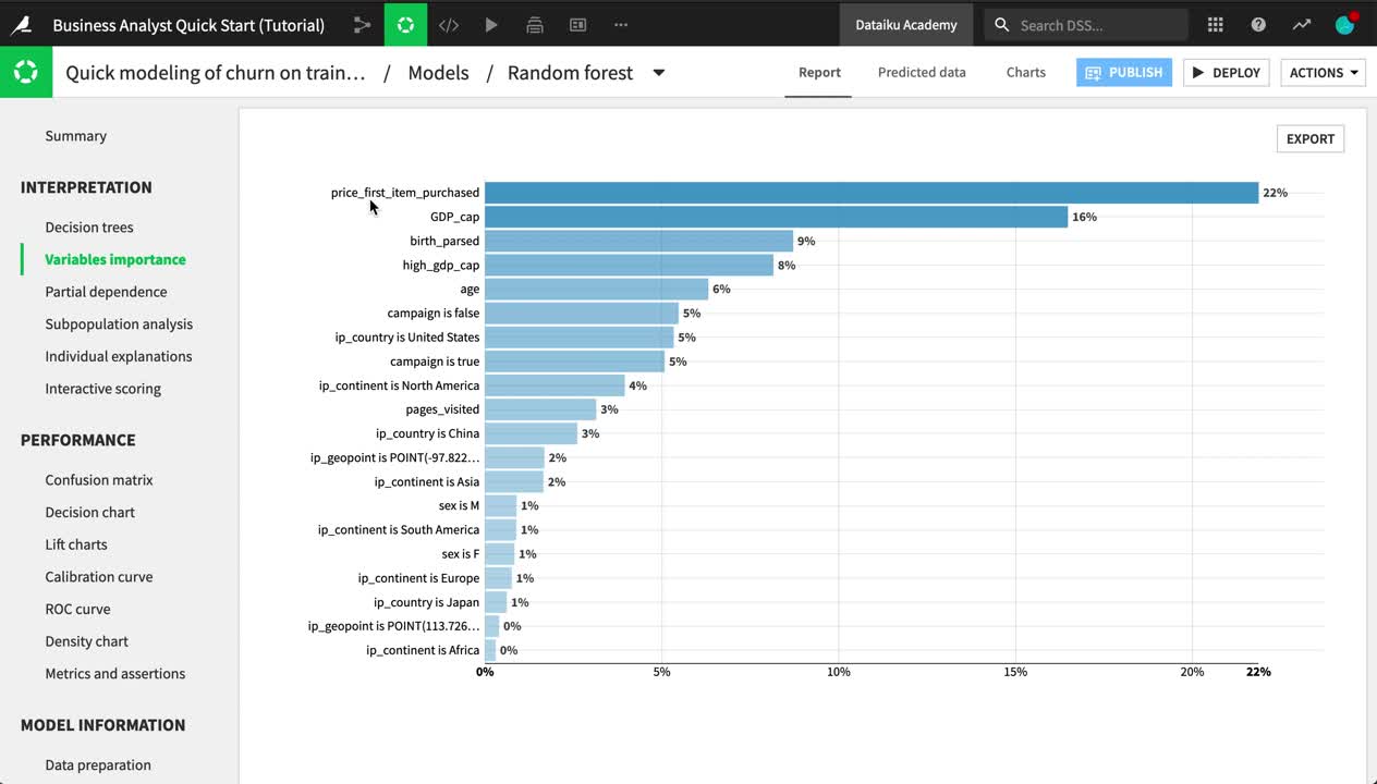
Click Random forest, which happened to be the highest-performing model in this case.
Explore some of the model report, such as the variables importance, confusion matrix, and ROC curve.
Navigate to the Subpopulation analysis panel.
Choose sex as the variable.
Click Compute to examine whether the model behaves identically for male and female customers.
Tip
The contents of this report change depending on the algorithm and type of modeling task. For example, a random forest model includes a chart of variable importance, and a K-Means clustering task has a heatmap.
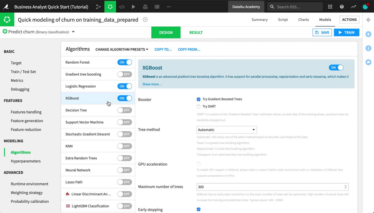
Iterate on a Model
You now have a baseline model, but you may be able to improve its performance by adjusting the design in a myriad number of ways.
When finished viewing the model report, click on Models near the top of the page to return to the results of the training session.
Navigate from the Result tab to the Design tab near the top center of the page.
Examine some of the conditions under which the first models were trained, such as the split of the train and test sets.
In the Features handling panel, turn off two features (ip_geopoint and birth_parsed) for which we have already extracted their information into ip_country and age.
In the Feature generation panel, add an explicit pairwise interaction between ip_country and sex.
In the Algorithms panel, add a new algorithm to the training session, such as “XGBoost”.
When satisfied with your changes, click Train near the top right corner.
On the Training models dialog, click Train to build models once again with these new settings.
Tip
When training models, you can adjust many more possible settings covered in the product documentation.
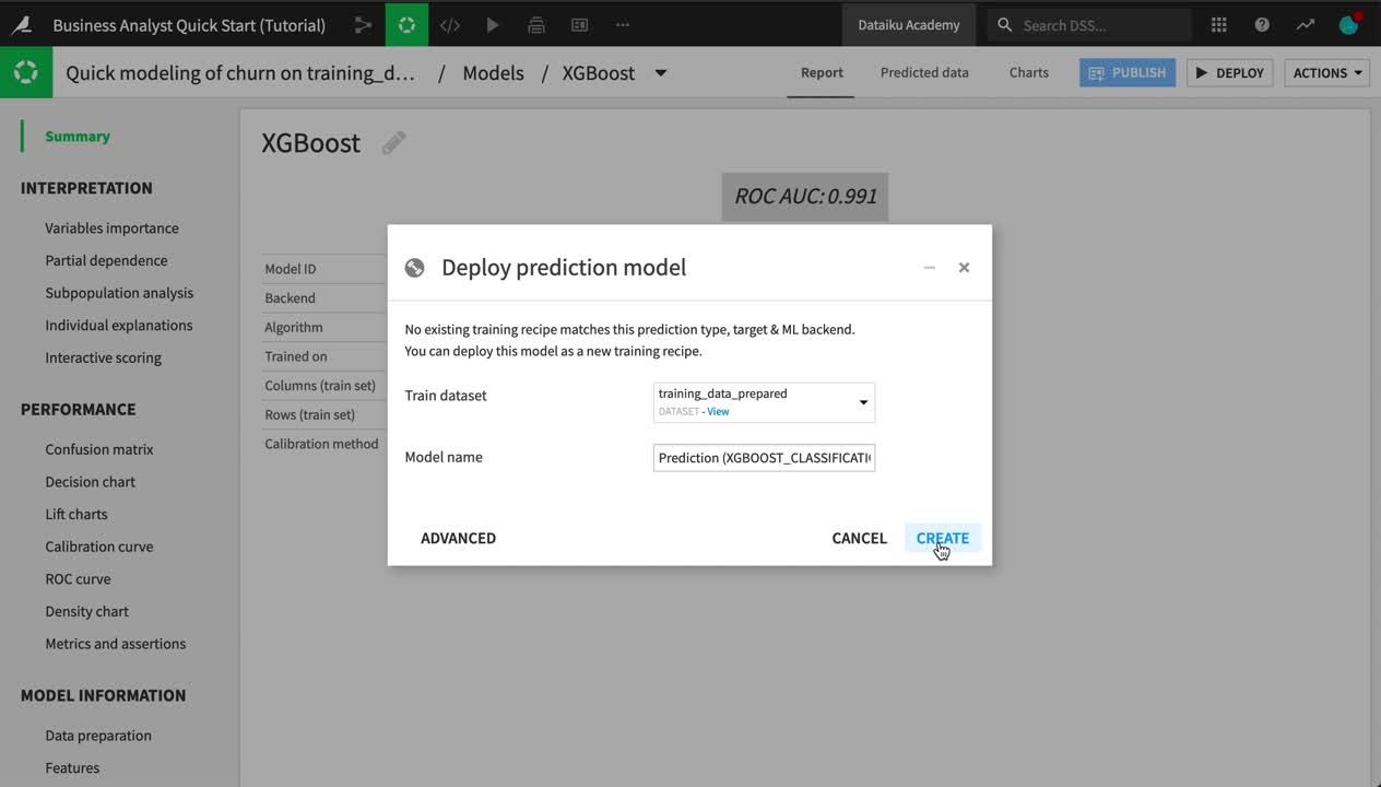
Deploy a Model
The amount of time devoted to iterating the model design and interpreting the results can vary considerably depending on your objectives. In this case, let’s assume you are satisfied with the best performing model, and want to use it to generate predictions for new data that the model has not been trained on.
From the Result tab of the analysis, click to open the report of the best performing model (in this case, the XGBoost model from Session 2).
Click Deploy near the top right corner.
Click Create on the following dialog.
Observe two new green objects in the Flow:
a training recipe (green circle), and
a deployed or saved model (green diamond)
Double click to open the saved model from the Flow.
Tip
The model deployed to the Flow has one active version. As new data becomes available, you might retrain the model and deploy updated versions. If performance degrades for any reason, you can revert to an earlier version. You can also automate this process with scenarios.
Score New Data
Once you have a model deployed to the Flow, you can use it to generate predictions on new, unseen data. This new data, however, first needs to be prepared in a certain way because the deployed model expects a dataset with the exact same set of features as the training data.
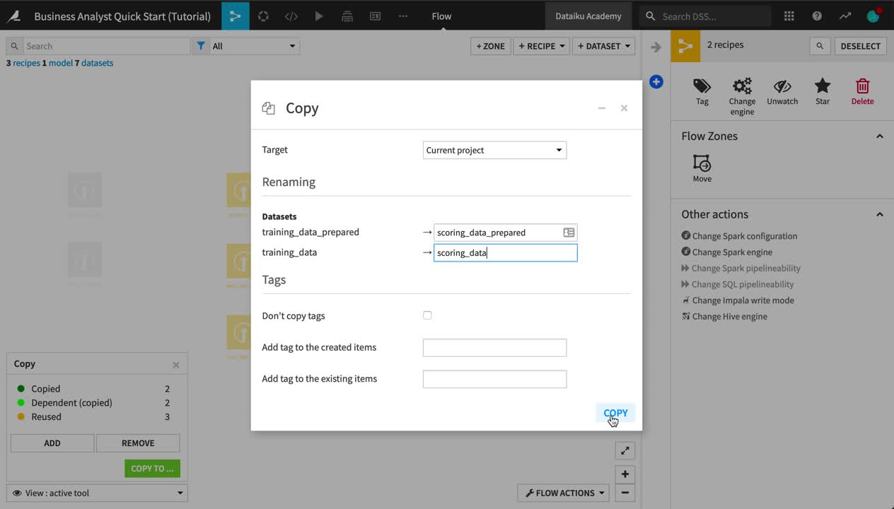
Copy Recipes
Although there are more sophisticated ways of preparing a dataset for scoring (such as using the Stack and Split recipes), let’s keep things simple and send the new data through the same pipeline by copying recipes.
Note
You can copy recipes from the Flow for use in the same project or another one on the instance. You can also copy individual steps from a Prepare recipe for use elsewhere.
From the Flow, select both the Join and Prepare recipes. (On a Mac, hold Shift to select multiple objects).
From the Actions sidebar, choose Copy.
From the Flow View menu, choose Copy To.
Rename training_data_prepared_1 as
scoring_data_prepared.Rename training_data_1 as
scoring_data.Click Copy.
The recipes have been copied to the Flow, but the inputs need to change.
Open the copied Join recipe (compute_training_data_1).
Replace the input datasets:
Click on web_last_year, and choose web_this_year as the replacement.
Click on crm_last_year, and choose crm_this_year as the replacement.
Instead of running the recipe right away, click Save, and update the schema.
Return to the Flow to see the pipeline for the scoring data.
Warning
When designing a Flow under normal circumstances, a better practice would be to build the dataset after copying the Join recipe by itself. If you open the copied Prepare recipe, you’ll notice errors due to the schema changes. This is done only to introduce the concept below.
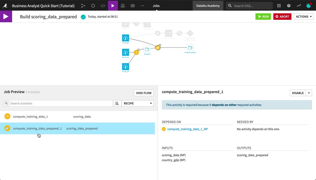
Build a Pipeline
Now you have a pipeline created for the scoring data, but the datasets themselves are empty (note how they are transparent with a blue dotted outline). Let’s instruct Dataiku DSS to build the prepared scoring data, along with any upstream datasets needed to make that happen.
Note
When you make changes to recipes within a Flow, or if there is new data arriving in your source datasets, you will want to rebuild datasets to reflect these changes. There are multiple options for propagating these changes.
A non-recursive option builds only the selected dataset using its parent recipe.
Various recursive options, such as smart reconstruction, check upstream for changes in the Flow and rebuild only those datasets necessary to produce the requested output.
From the Flow, open the outlined scoring_data_prepared dataset.
Dataiku DSS tells you that it is empty. Click Build.
Choose Recursive instead of the default Non-recursive option.
Leave “Smart reconstruction” as the Build mode, but choose Preview instead of “Build Dataset”, just for the purpose of demonstration.
Clicking Preview computes job dependencies and shows the Jobs menu.
Note
Actions in Dataiku DSS, such as running a recipe or training a model, generate a job. You can view ongoing or recent jobs in the Jobs menu from the top menu bar or using the shortcut G+J.
Examine the two activities in this job:
One runs the copied Join recipe.
Another runs the copied Prepare recipe.
At the top right, click Run to initiate the job that will first build scoring_data and then scoring_data_prepared.
When the job has finished, view the scoring_data_prepared dataset.
Return to the Flow to see the previously outlined pipeline now fully built.
Tip
The system of dependencies between objects in the Flow, teamed with these various build strategies, makes it possible to automate the process of rebuilding datasets and retraining models using scenarios.
Apply a Score Recipe
You now have a dataset with the exact same set of features as the training data. The only difference is that, in the data ready to be scored, the values for the churn column, which is the target variable, are entirely missing, as we do not know which new customers will churn.
Let’s use the model to generate predictions of whether the new customers will churn.
From the Flow, select the scoring_data_prepared dataset.
From the sidebar, click on the schema button. Observe how it is the same schema as the training_data_prepared dataset.
Open the scoring_data_prepared dataset. Observe how the churn column is empty as expected.
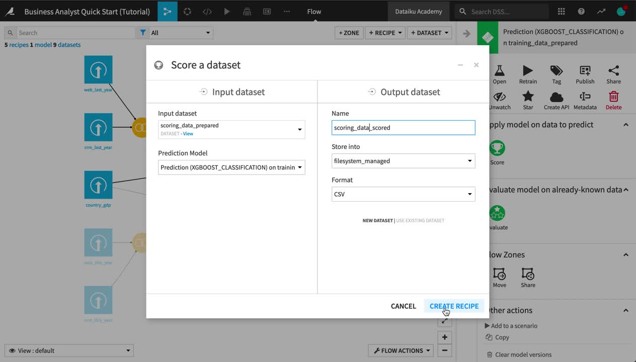
From the Flow, select the deployed prediction model, and add a Score recipe from the Actions sidebar.
Choose scoring_data_prepared as the input dataset.
Name the output scoring_data_scored.
Click Create Recipe.
Leave the default recipe settings, click Run, and then return to the Flow.
Inspect the Scored Data
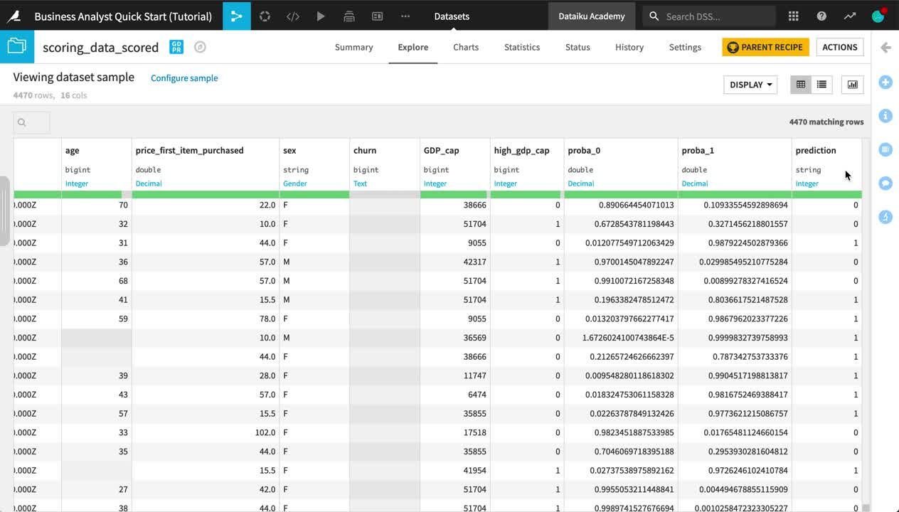
Let’s take a closer look at the scored data.
Open the scoring_data_scored dataset, and observe the three new columns appended to the end:
proba_0 is the probability a customer remains.
proba_1 is the probability a customer churns.
prediction is the model’s prediction of whether the customer will churn.
Use the Analyze tool on the prediction column to see what percentage of new customers the model expects to churn.
Hint
How does the predicted churn rate on the new data compare to the churn rate observed in the training data?
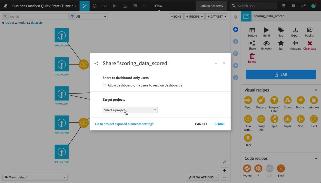
Share Results
Let’s share the results using a dashboard so they are more accessible to other stakeholders.
Note
Dataiku DSS allows users to drag and drop insights (such as charts, metrics, webapps, and more) onto dashboards.
The groups-based permissions framework that governs access to Dataiku DSS projects makes it possible to define at a granular level the nature of access to project materials, including dashboards.
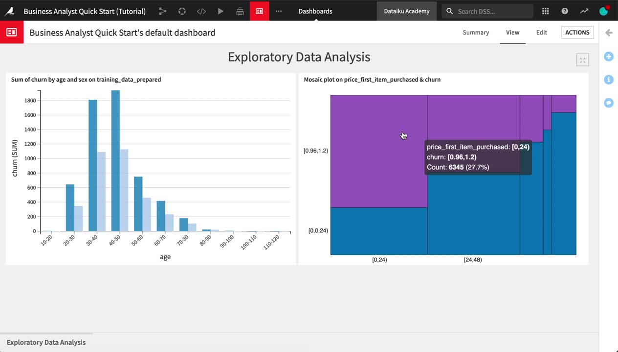
From the Flow, select the training_data_prepared dataset.
In the Details panel of the right sidebar, click on the “Sum of churn by age and sex” chart.
For the bar chart, click the Publish button near the top right of the screen.
Click Create to create the insight, and add it to Slide 1 of the default dashboard.
Adjust the size of the chart as needed.
On the Slide tab, rename Slide 1
Exploratory Data Analysis.Use the slide title as a header on the slide.
Save your work.
Now let’s add one of the mosaic plots from the statistical analysis.
Return to the Details sidebar of the training_data_prepared dataset.
Select the Statistics Worksheet.
Publish the mosaic plot of churn by price_first_item_purchased to the “Exploratory Data Analysis” slide of the default dashboard.
Tip
Feel free to continue building out your dashboard. For example, you might add a second slide displaying the model report and its AUC metric.
What’s Next?
Congratulations! In a short amount of time, you were able to:
connect to data sources;
prepare training data;
create visualizations and statistical analyses;
train a model and apply it to new data; and
communicate results.
Note
This simple example was completed using only the native visual tools. However, each of these steps could have been extended or customized with your own code.
If you are interested to learn about coding within Dataiku DSS, please check out the Data Scientist or Data Engineer quick start tutorials.
Your project does not have to stop here. Following this point, you might want to:
create a scenario to rebuild the datasets and retrain the model on a time-based or event-based trigger;
document your workflow and results on a wiki;
create webapps and/or Dataiku apps to make assets reusable;
share the output datasets with other Dataiku DSS projects; sync them to other connections; or use plugins to export them to tools like Tableau, Power BI, or Qlik.
Tip
This quick start tutorial is only the tip of the iceberg when it comes to the capabilities of Dataiku DSS. To learn more, please visit the Academy, where you can find more courses, learning paths, and certifications to test your knowledge.