Paneled and Animated Charts
The previous tutorial demonstrated how to create basic charts in Dataiku DSS. This tutorial showcases creating paneled charts and vibrant animations with playback control.
Supporting Data
This tutorial uses the Orders_enriched_prepared dataset from the Haiku T-Shirts project, found in the gallery.
This dataset is the result of enriching the orders data with customer data and preparing it to be visualized. The CSV file can be directly downloaded here.
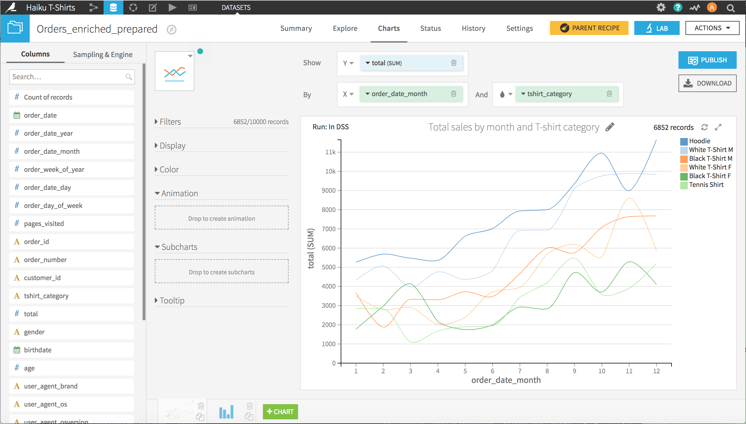
A basic line chart
We’ll start from a basic line chart that shows the total sales (y-axis) by month of the year (x-axis) and separate lines by the category of T-shirt sold. This is a useful way to look at the patterns of purchases over the course of a year, but we’d also like to see the breakdown by gender.
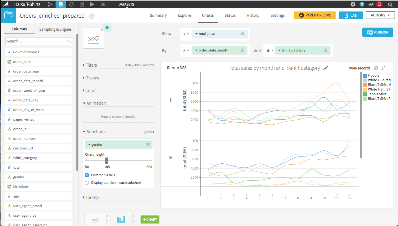
Paneling a chart
One way to see the breakdown by gender is by paneling, or creating subcharts. Creating a paneled chart is as simple as adding gender as the column to define subcharts.
This is a useful way to look at the breakdown by gender, but now we’d like to gain further insight by looking at how the monthly patterns of purchases change from year-to-year.
Animating a chart
A video below goes through the content of this section.
One way to see the year-to-year change is to animate the chart. This is done in Dataiku DSS by:
Adding order_date_year as the column to define animations
Setting the binning to use None, use raw values
Clicking the play button
You can set the speed of playback, pause the playback, step through years individually at your own pace, or select a specific year to examine.
What’s next
You can view the final animated, paneled chart in the Dataiku gallery.