Hands-On Tutorial: Visualization Enhancements
In this tutorial, you’ll discover the latest enhancements to some of the native visualization features in Dataiku DSS. In particular, you will learn about:
custom color assignment in charts;
number formatting in charts;
chart axis ranges; and
dashboard filters.
Getting Started
You will work on visualizing credit card fraud analysis data in a sample data project.
To complete this tutorial, you’ll need the following:
Prerequisites
Basic understanding of the Dataiku DSS visual interface.
Technical Requirements
Access to a Dataiku DSS instance - version 10.0 or above.
If you don’t have a Dataiku DSS 10 instance readily available, you can download the free edition.
Create the Project
To create the project:
Sign in to your instance of Dataiku DSS.
From the Dataiku DSS homepage, click +New Project > DSS Tutorials > General Topics > Credit Card Fraud (Tutorial).
Note
You can also download the starter project from this website and import it as a zip file.
Explore the Data
You are navigated to the project homepage.
Click Go to Flow.
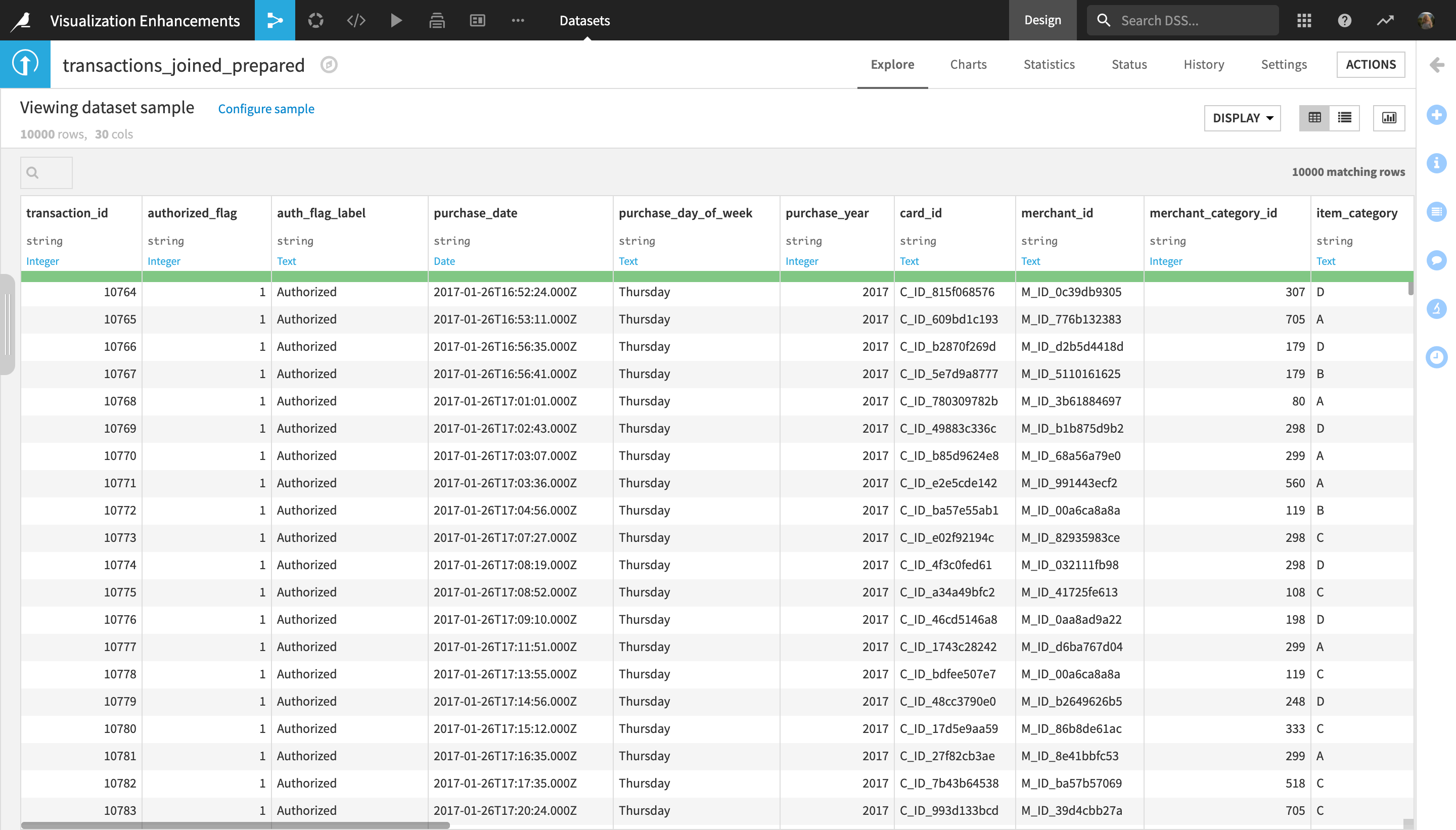
Double click on the transactions_joined_prepared dataset to open it.
The transactions_joined_prepared dataset contains information about credit card transactions. Each row represents one transaction, and contains information such as:
the transaction_id;
the purchase_date;
the amount of the transaction, purchase_amount;
the item category of the transaction, item_category_labels;
the ID of the merchant, merchant_id;
the state where the merchant is located, merchant_state;
whether the transaction was Authorized or Not Authorized, indicated in the auth_flag_label column;
among other information.
Assign Custom Colors to a Chart
In this section, you will discover how you can assign custom colors to charts in Dataiku DSS.
Click Charts in the dataset navigation menu to open the Charts tab.
Note
Throughout this tutorial, we will use the default sample (which corresponds to the first 10,000 rows of the dataset) to create all the visualizations, for the sake of simplicity. In a real-life project, however, when creating charts, you may want to change the sampling.
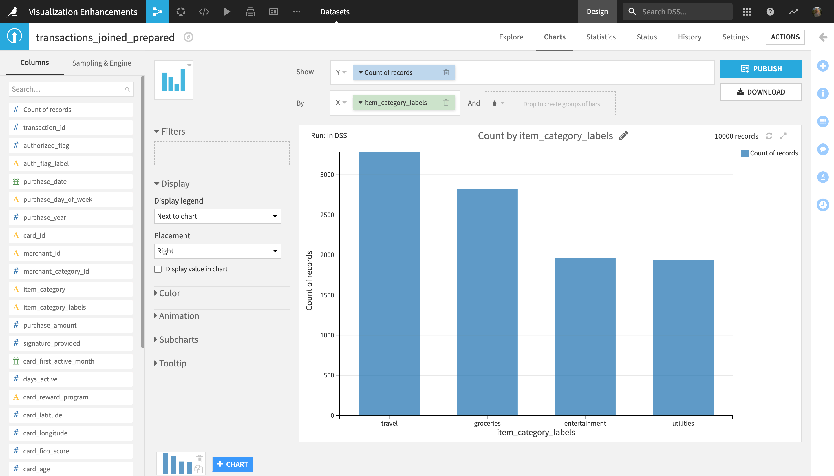
From the list of Columns in the left-most sidebar, drag the Count of records field and drop it into Y (“Show”) axis.
Drag the item_category_labels column into the X (“By”) axis.
The newly created chart displays the number of transactions per item category.
Let’s now add an additional column in the color field of the Y axis in order to break down the transactions within each item category into Authorized and Not Authorized.
Drag the auth_flag_label into the color (“And”) field of the X axis.
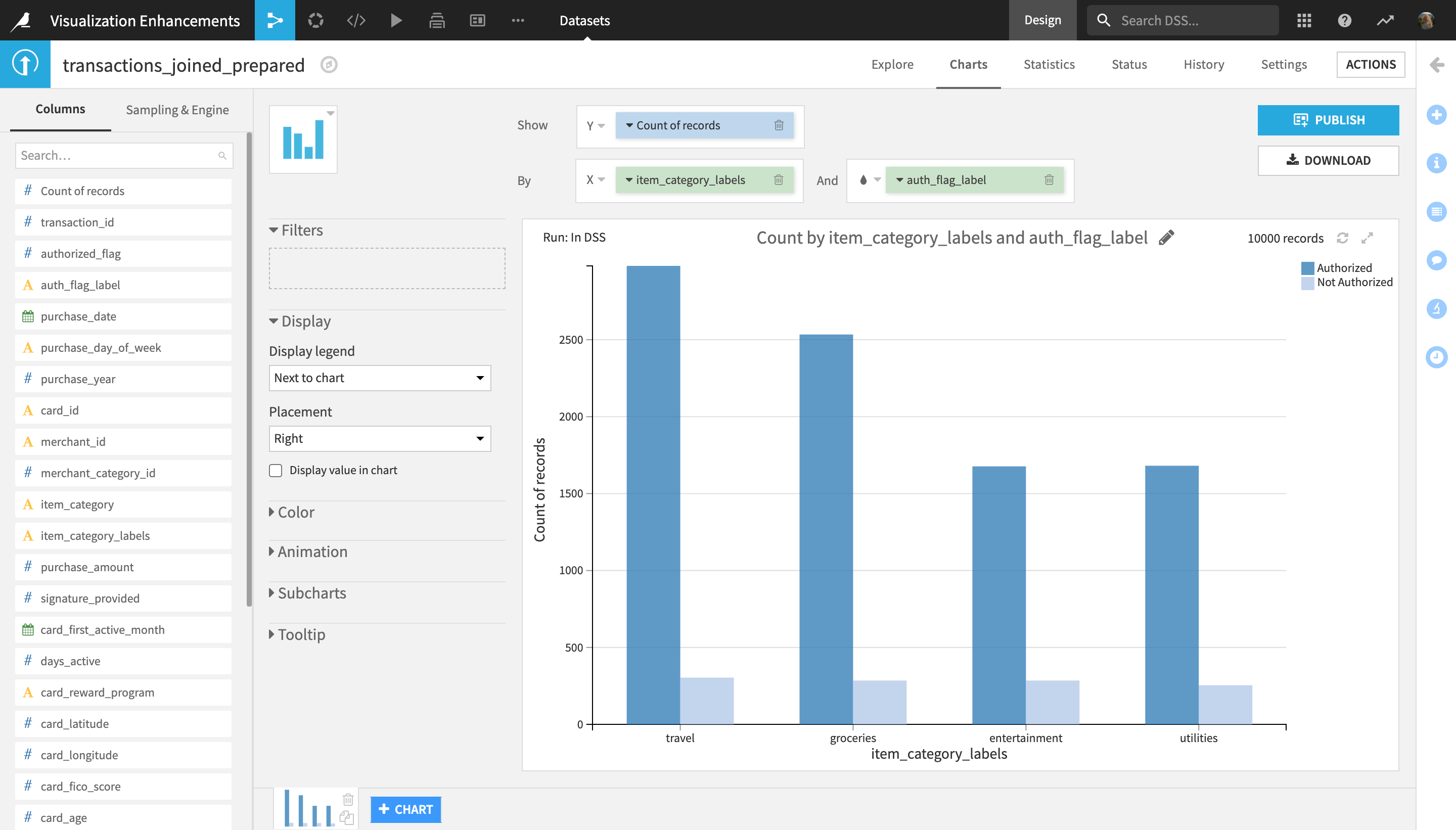
The chart now displays the number of transactions per item category, additionally broken down by authorization status. Each authorization status (Authorized and Not Authorized) is indicated via a different color, assigned from the default chart color palette.
In order to make the chart easier to understand, you might want to assign a specific color to each value which better indicates its meaning. To do this:
In the left-hand menu next to the chart display, click the Color dropdown to expand it.
Click the circle indicating the color for the Authorized transactions to change it.
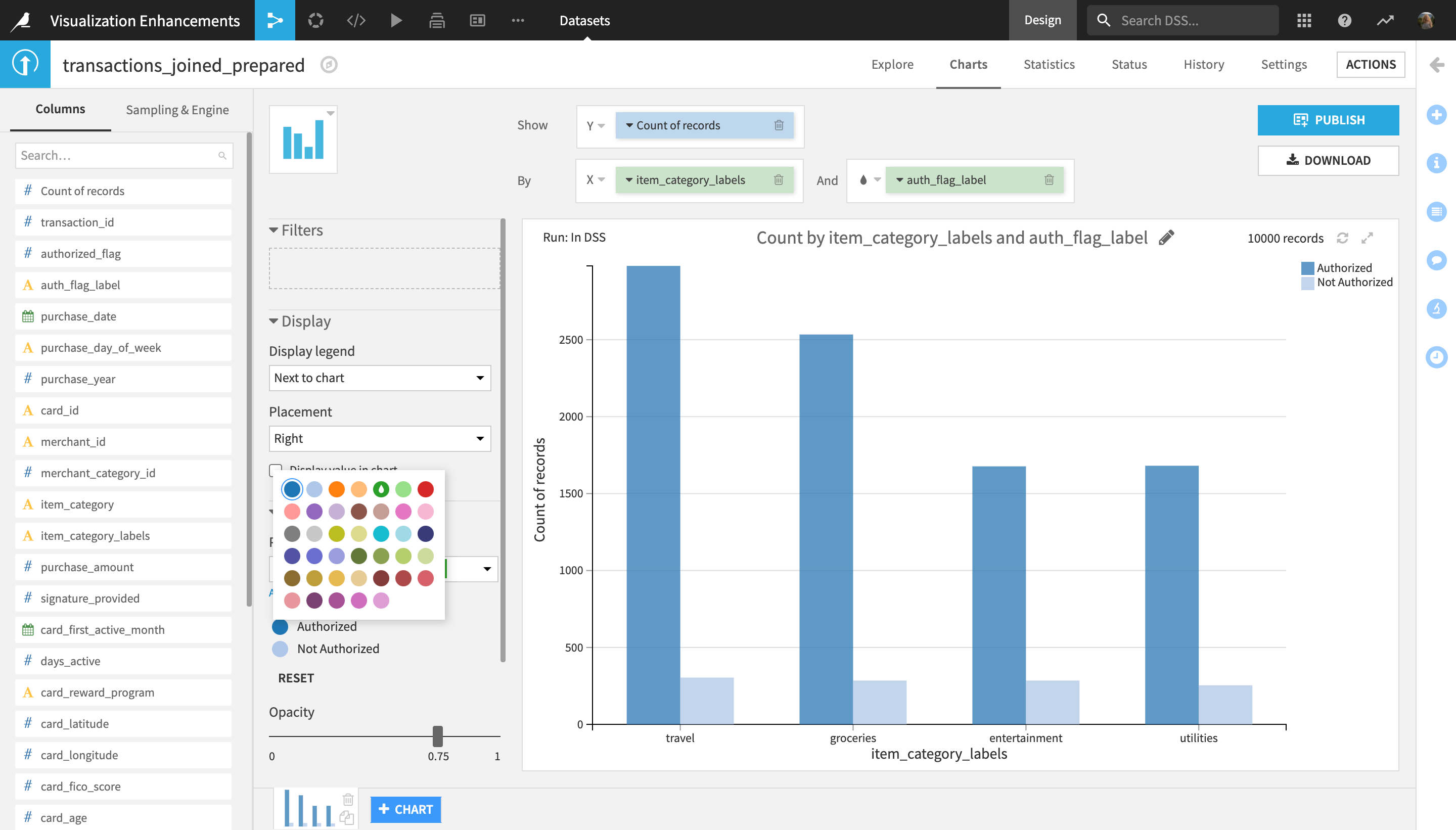
Select the dark green color from the palette that appears.
Repeat the previous two steps for the Not Authorized value, selecting the dark red color.
Finally, clicking the pencil icon in the chart display, rename the chart to
Transactions by item category and authorization status.
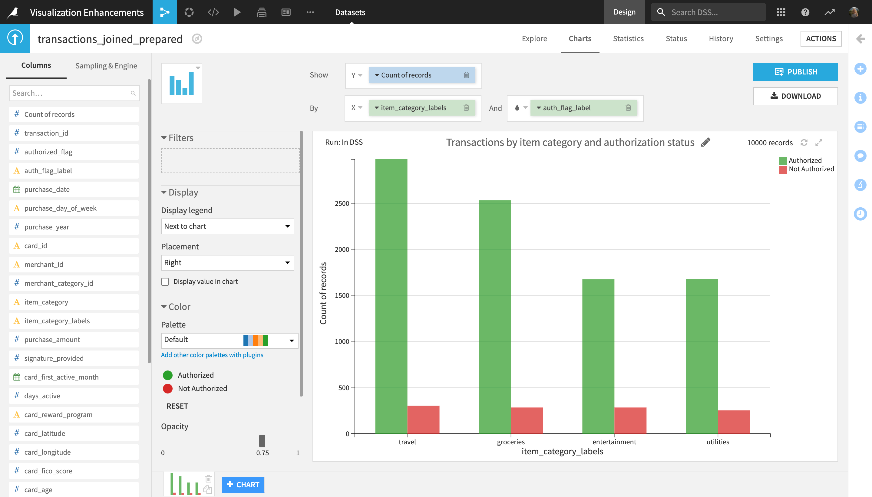
Using the custom color assignment functionality, you can now add more context to your natively built charts in Dataiku DSS.
Define Custom Axis Ranges
You will now clone and filter the chart built in the previous section to display data specific to given locations, then use the custom axis range functionality to better visualize range differences when comparing two charts.
Near the bottom of the screen, click the “Duplicate this chart” icon in the bottom right corner of the chart preview to clone it.
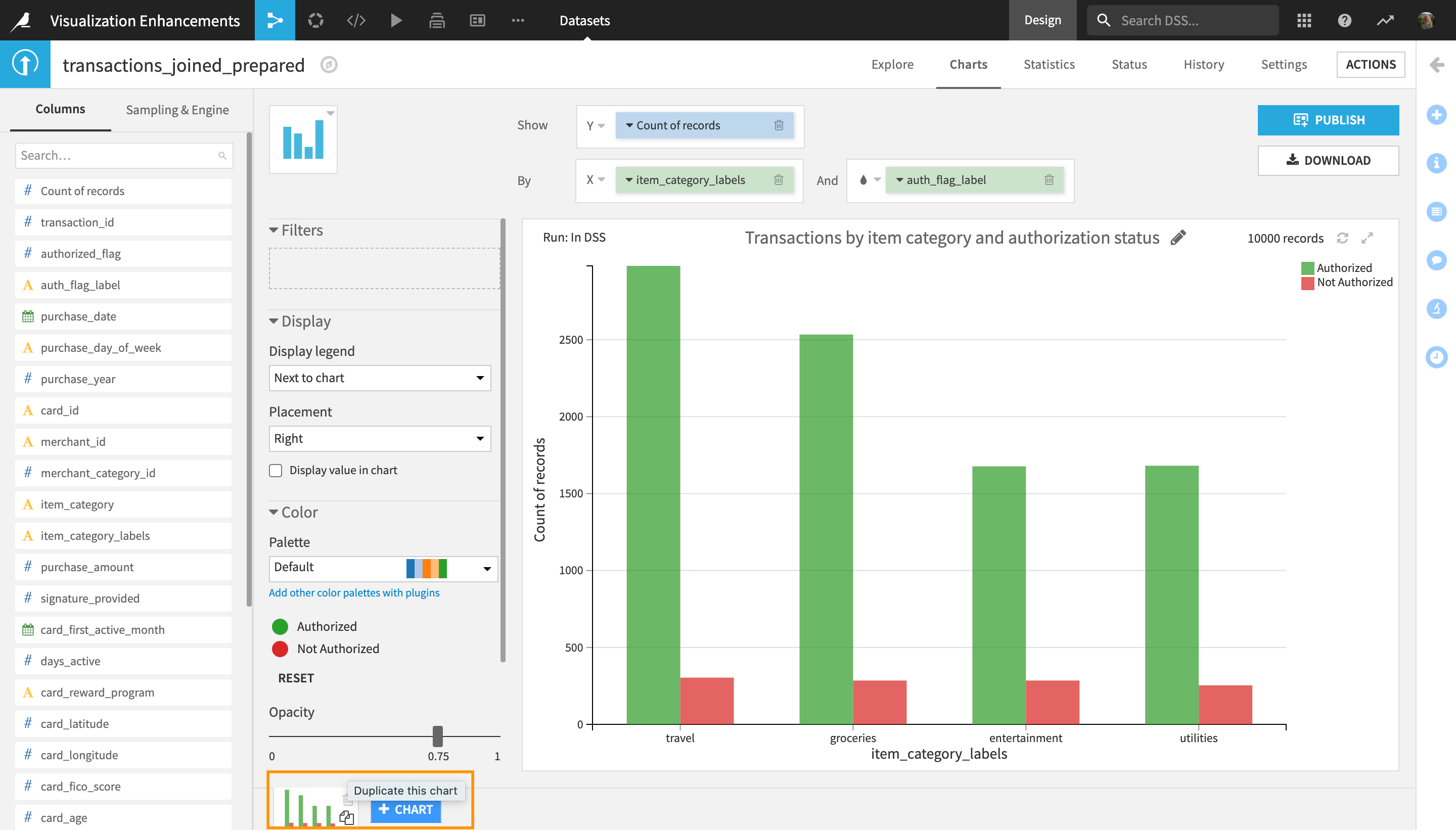
In the left-hand menu next to the preview of the newly duplicated chart, locate the Filters section and dropbox.
Drag and drop the merchant_state column into the Filters dropbox to filter the chart by state.
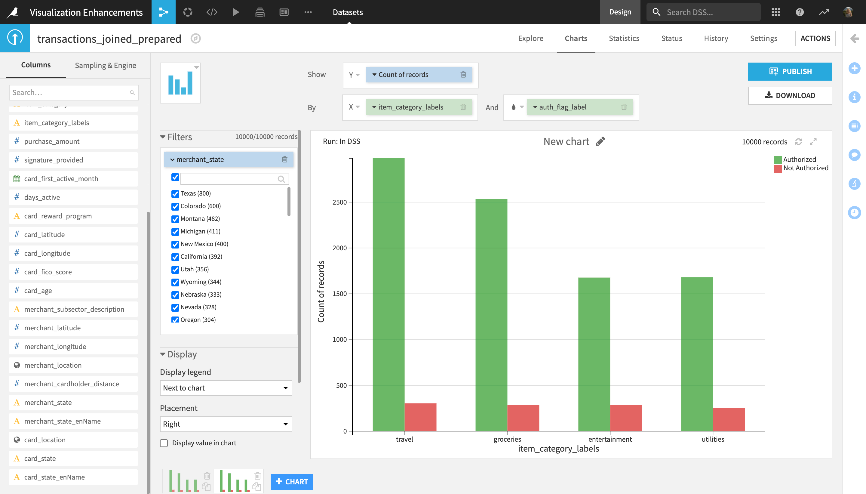
All values of the merchant_state column are selected by default.
Uncheck the main checkbox at the top of the filter, next to the search bar, in order to unselect all states.
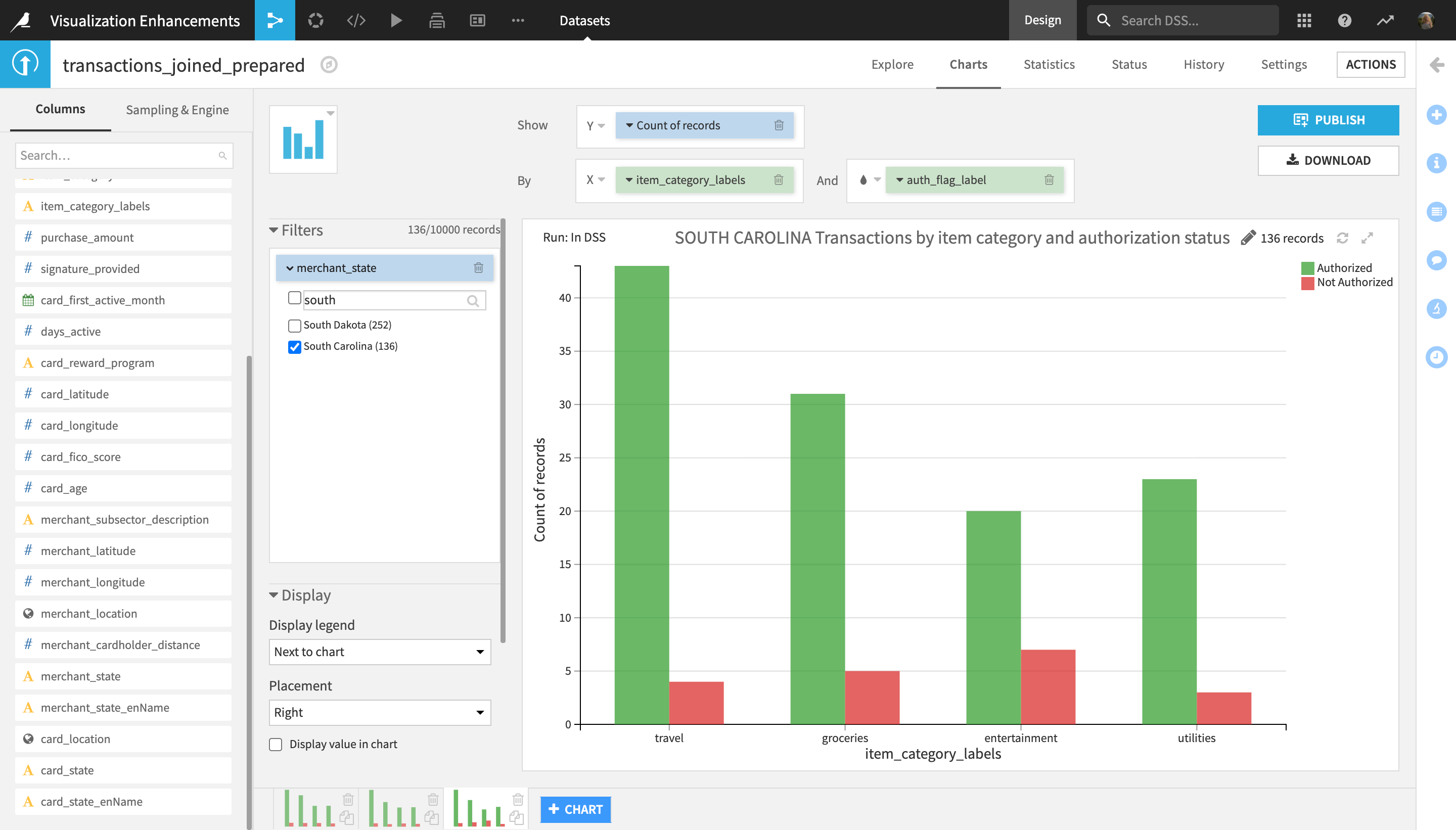
From the list of options, select only
Texas.Rename the chart to
TEXAS Transactions by item category and authorization status.
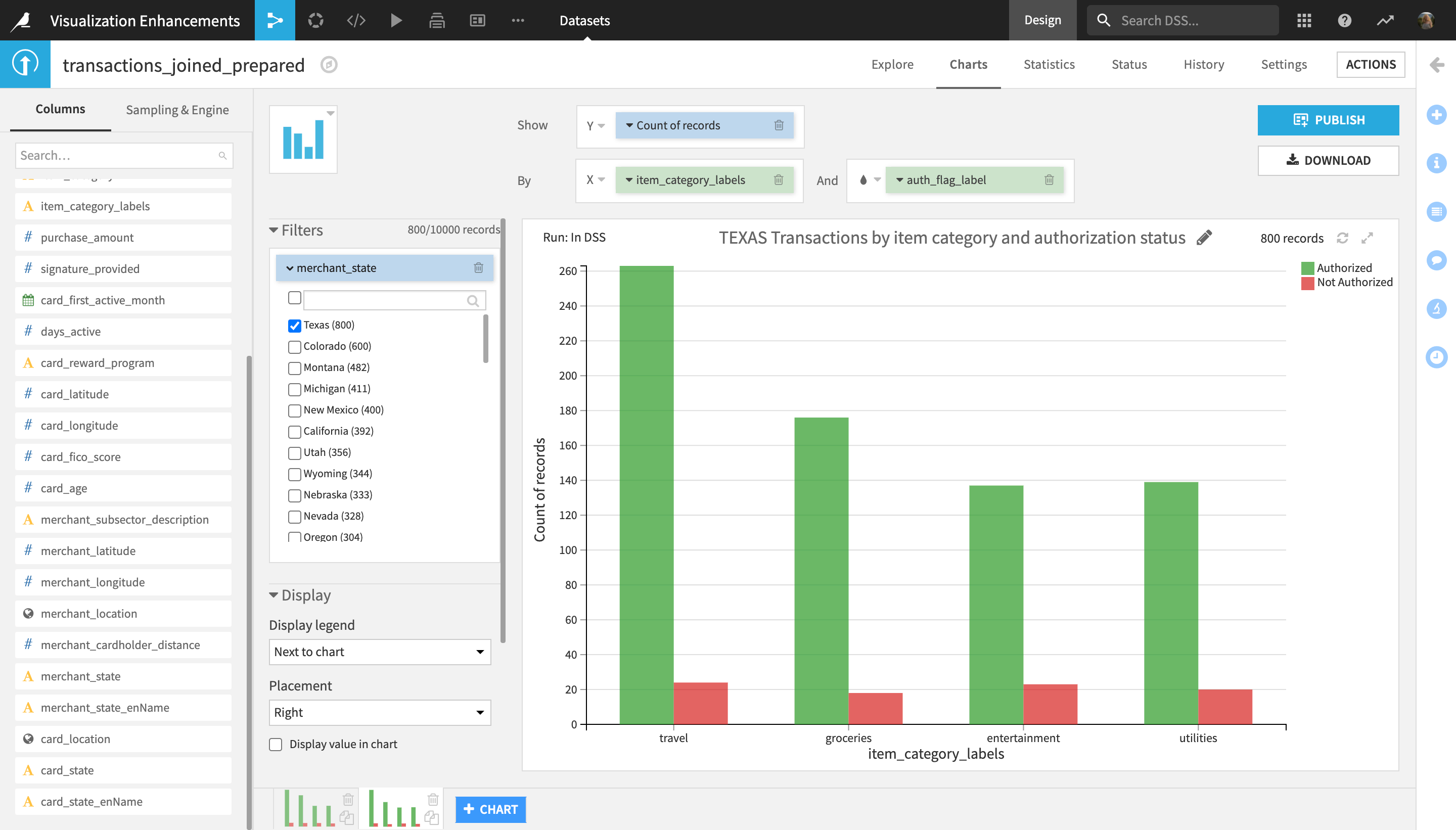
The chart now displays the number of authorized and unauthorized transactions by item category for the state of Texas. Let’s generate the same chart, but for another state, in order to compare the two.
Click the “Duplicate this chart” icon in the bottom right corner of the current chart preview to clone it.
In the “Filters” menu, unselect “Texas” from the list of options for the merchant_state filter, and select
South Carolinainstead (use the search box if needed).Rename the chart to
SOUTH CAROLINA Transactions by item category and authorization status.
Let’s now compare the two charts side-by-side.
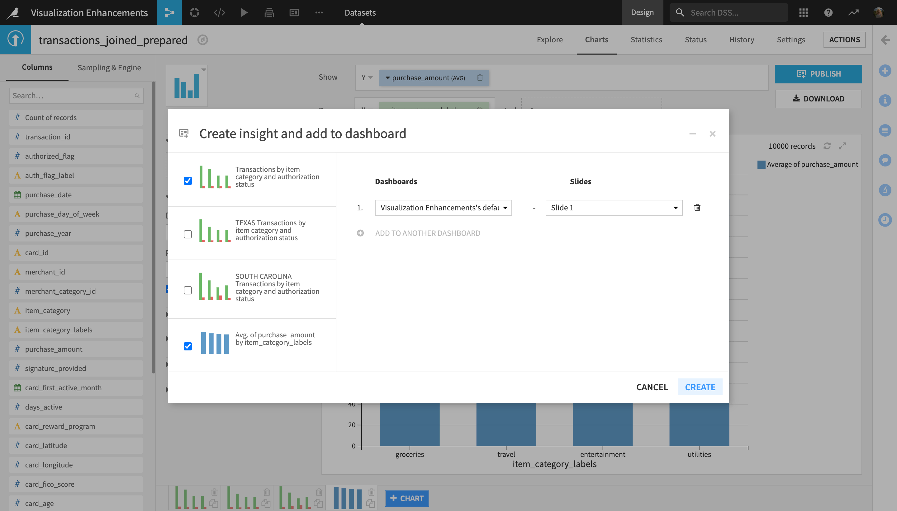
Near the top right corner of the screen, click the Publish button.
Use the checkboxes next to the chart previews to select the second and the third chart (the two state-specific ones), and then click Create.
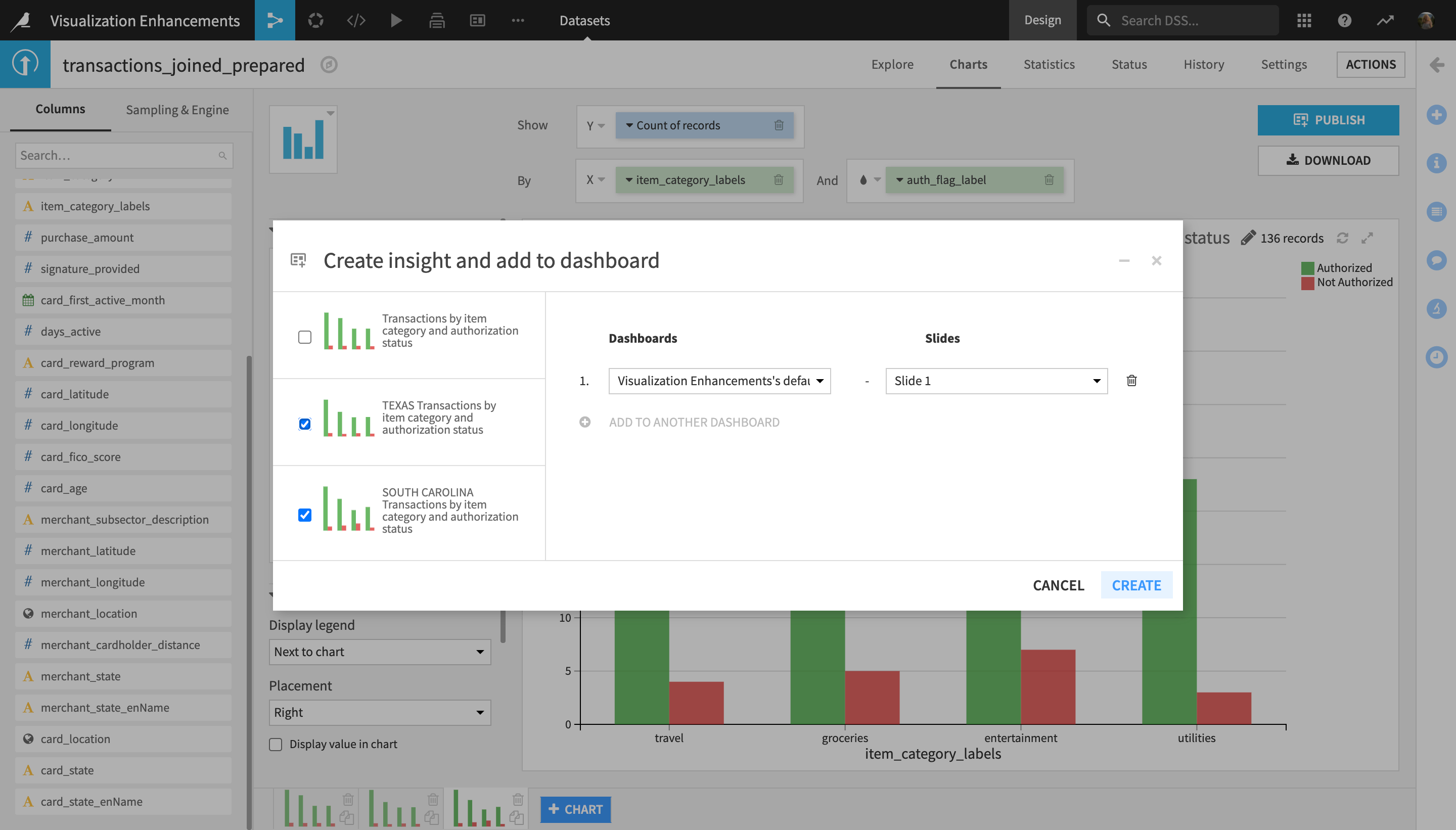
You are navigated to edit mode of the project’s default dashboard where the two charts were just published.
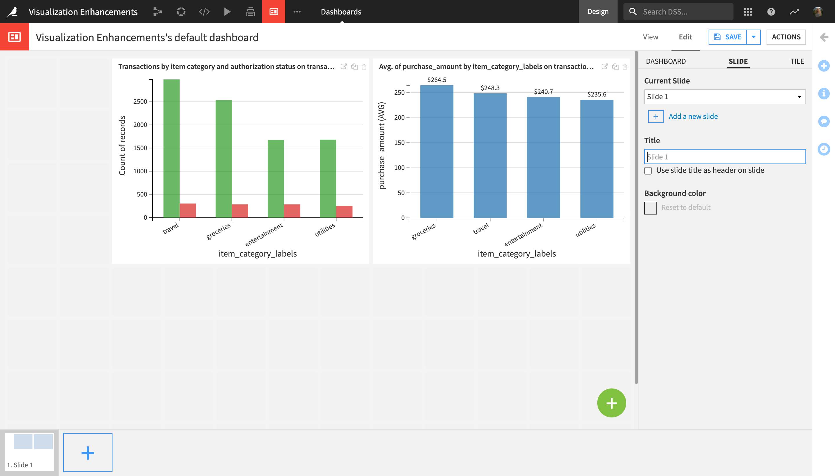
Adjust the sizes and positions of the two charts so that they are of equal sizes, side by side, and fill the entire dashboard horizontally (as shown in the screenshot below).
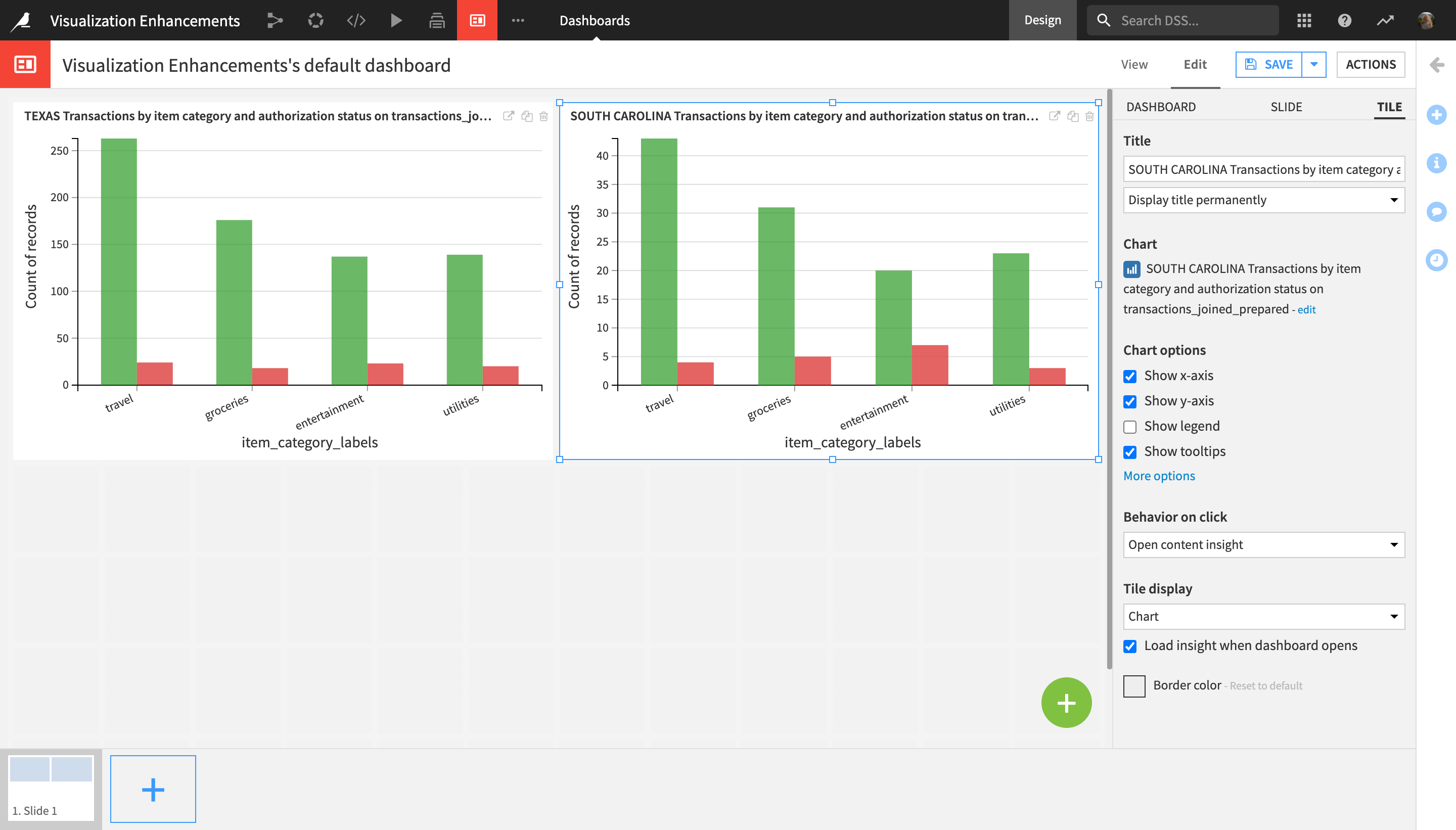
Near the top right corner of the screen, click Save.
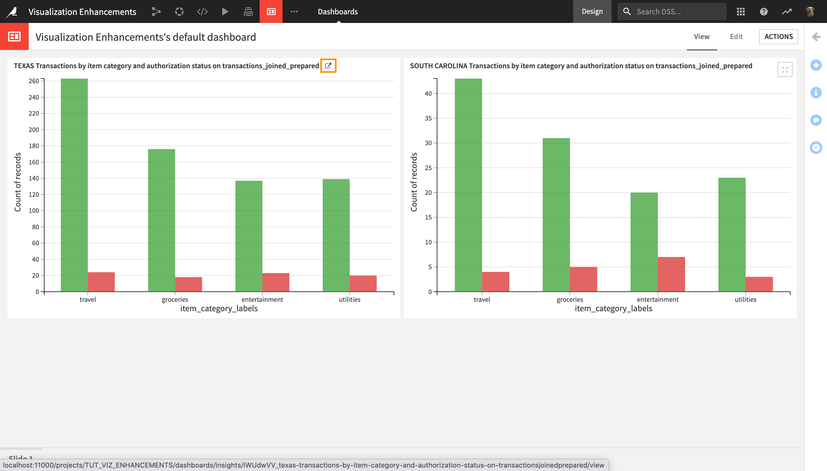
Notice that the quantity distributions look similar for both graphs, but the total number of transactions is much higher for Texas than for South Carolina.
Notice that both graphs have a similar distribution, but the total number of transactions is much higher for Texas than for South Carolina.
In order to give a more accurate side-by-side comparison, let’s adjust the axis ranges for both charts.
Click View in the dashboard’s top navigation menu to go to the View tab.
Hover over the chart title and click the redirect button near the top right corner of the Texas chart in order to open it.
Click Edit in the chart’s top navigation tab to access the edit mode.
Click the Y axis dropdown (not the “Count of records” dropdown), and change the Range dropdown from Auto to
Manual.Set the “Min” range value as
0and the “Max” range value as300.
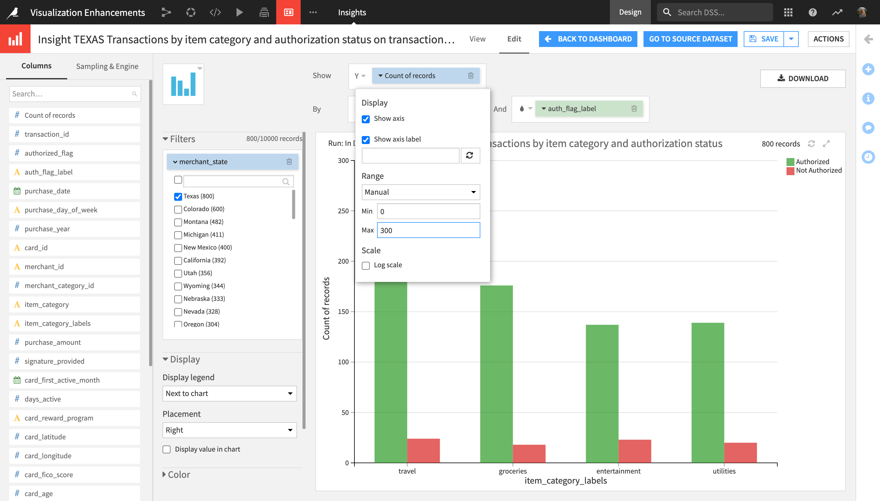
Click Save, and then Go Back to Dashboard.
Repeat the last five steps for the second chart, setting the custom Y axis “Min” value to
0and the “Max” value to300once again.
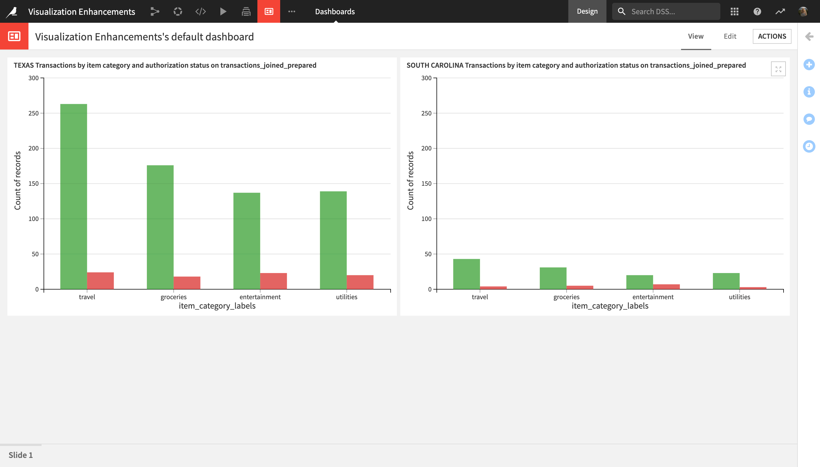
Notice that after setting the custom axis ranges of the two charts to the same values, from 0 to 300, the difference in the total number of card transactions between Texas and South Carolina is now immediately visible.
Apply Number Formatting
In this section, you will explore another visualization enhancement feature: number formatting.
Go back to the Flow, and open the transactions_joined_prepared dataset.
Navigate to the Charts tab.
Near the bottom of the screen, click the + Chart button to create a new chart.
Drag and drop the purchase_amount column into the Y axis, and the item_category_labels chart into the X axis.
In the left-hand menu next to the chart display, under Display, check the “Display value in chart” box.
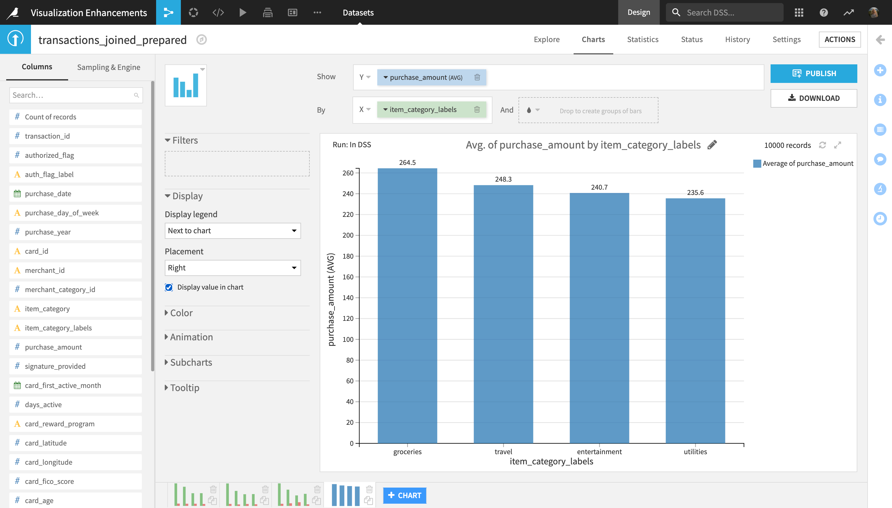
The newly created chart displays the average transaction amount per item category. As this is a monetary value, let’s use number formatting to display the currency sign.
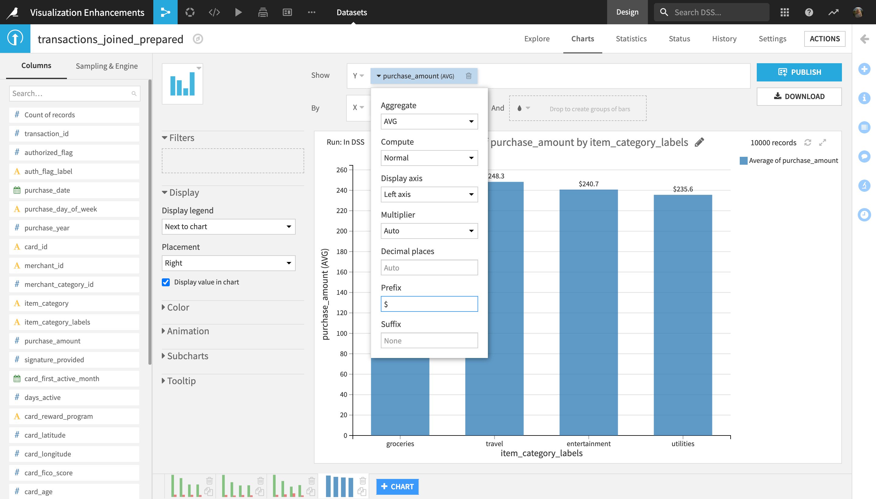
In the Y axis field, click the purchase_amount dropdown, and type
$in the Prefix field.
Rename the chart to
Average purchase amount per item category.
The chart now displays the average transaction amount by item category in U.S. dollars.
Apply a Dashboard Filter
In this final section, you will discover dashboard filters in Dataiku DSS.
In the Charts tab, near the top right corner of the screen, click Publish.
Select the Average purchase amount per item category chart and the very first chart you created, Transactions by item category and authorization status.
Click Create.
Once landed in the Edit tab of the default project dashboard, delete the first two charts that you had previously published (the Texas- and South Carolina-specific ones), by clicking the trash can icons in the top right corner of the charts.
Adjust the sizes and positions of the two newly published charts as shown below.
The reason why we deleted the two state-specific charts from the dashboard is that we will now use a single dashboard filter that will allow us to filter all charts by state. To do this:
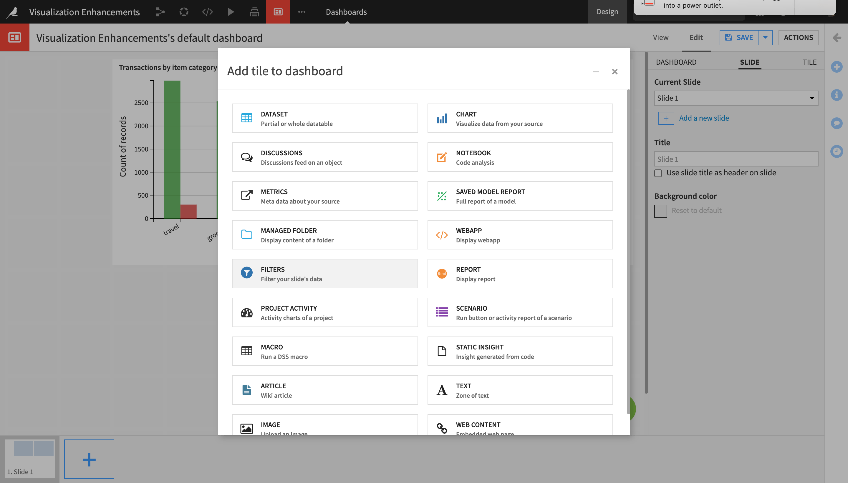
Click the green “+” button near the bottom right corner of the screen to add a new tile to the dashboard, and select Filters as the tile type.
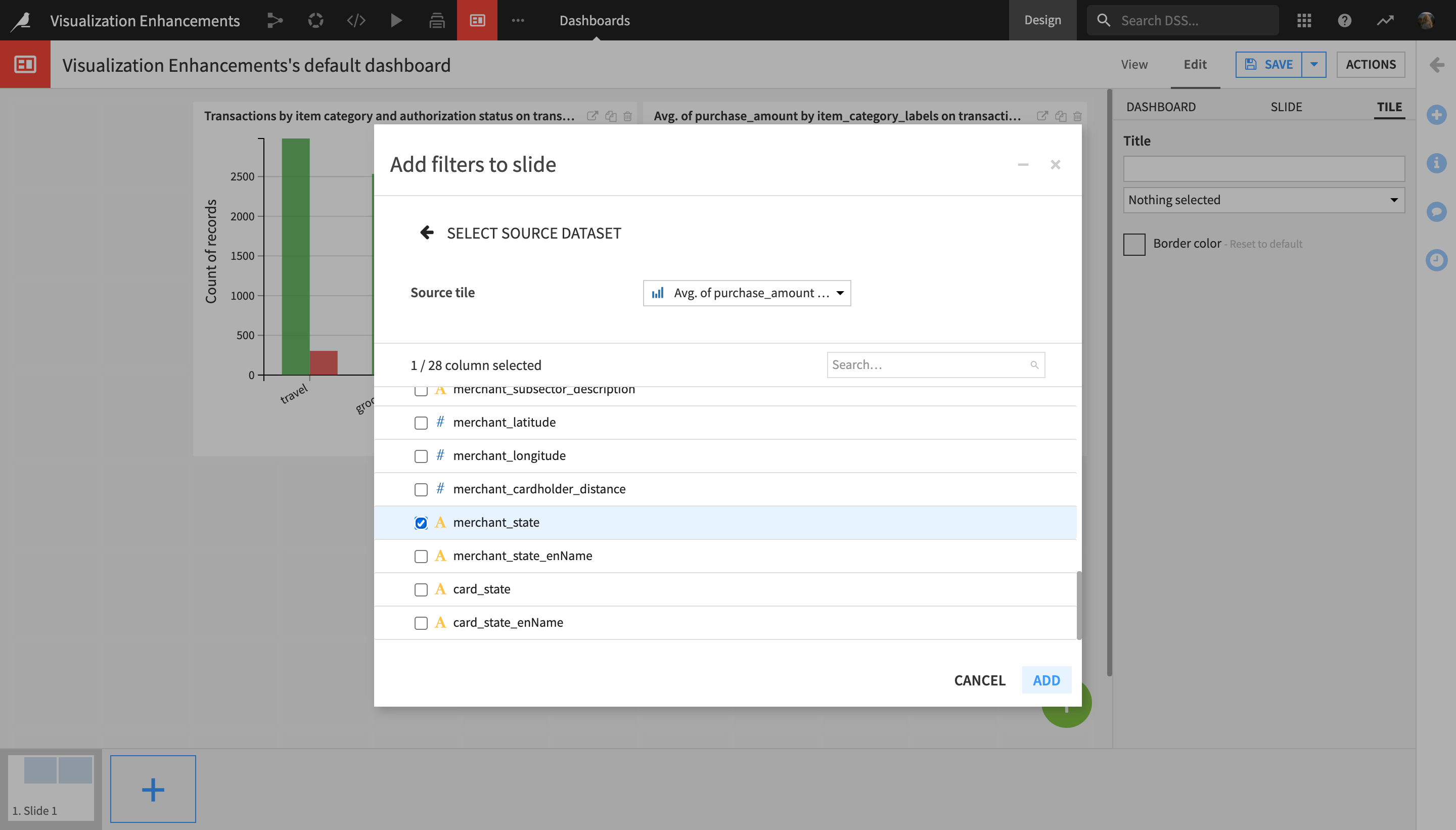
On the “Select Source Dataset” step, click Existing Tile.
Since the source dataset is the same for both chart tiles, and they are both on the same slide, select either one of the two charts from the Source tile dropdown menu.
In the Select columns step, select merchant_state, and click Add.
The newly created filter tile now appears on the dashboard.
In the right-most sidebar, change its title to
Filter results by U.S. state.Adjust the size and position of the filter as shown below.
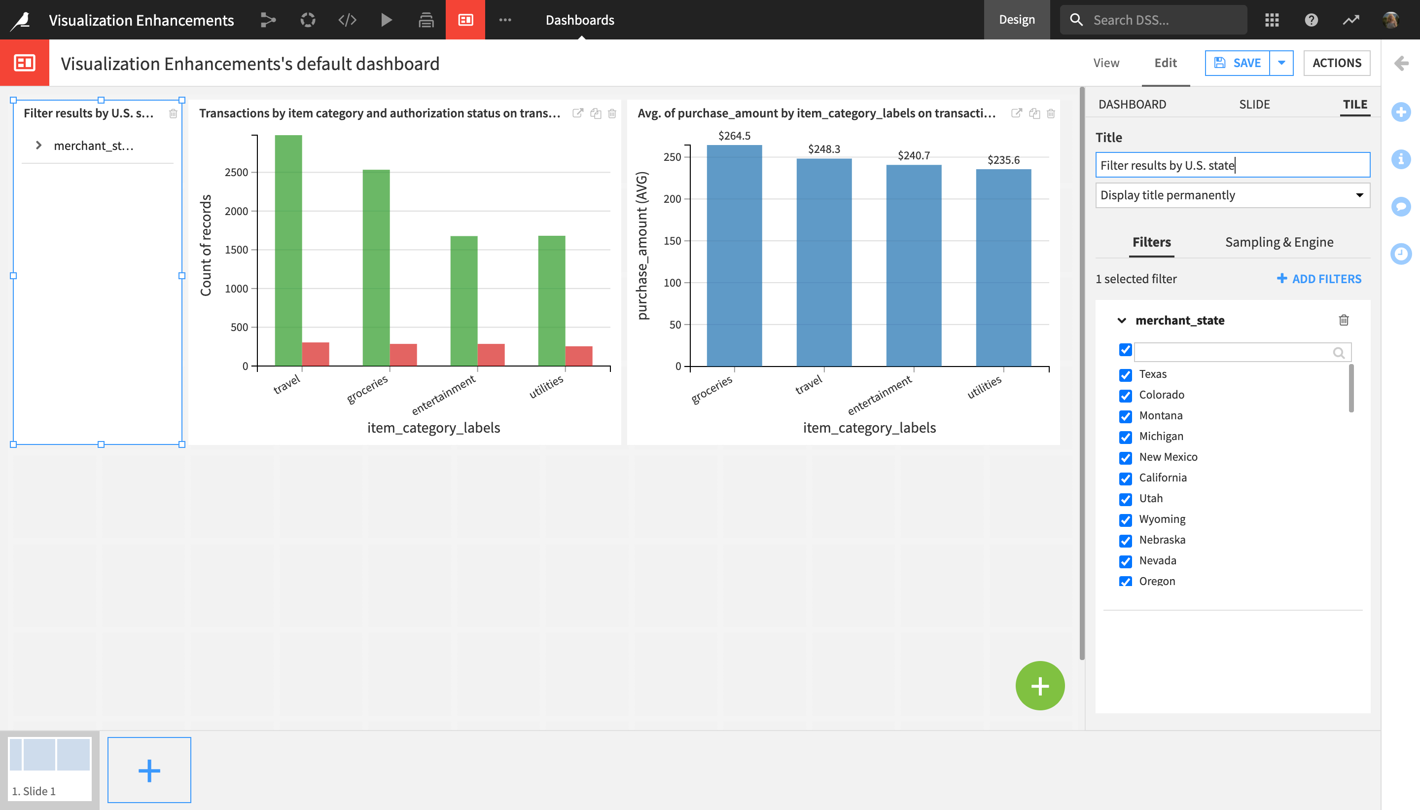
Click Save, and navigate to the View tab.
You can now use the filter tile to filter both charts on the dashboard. Let’s try this:
Uncheck the top main checkbox to deselect all states, which had been selected by default.
Check the Texas box.
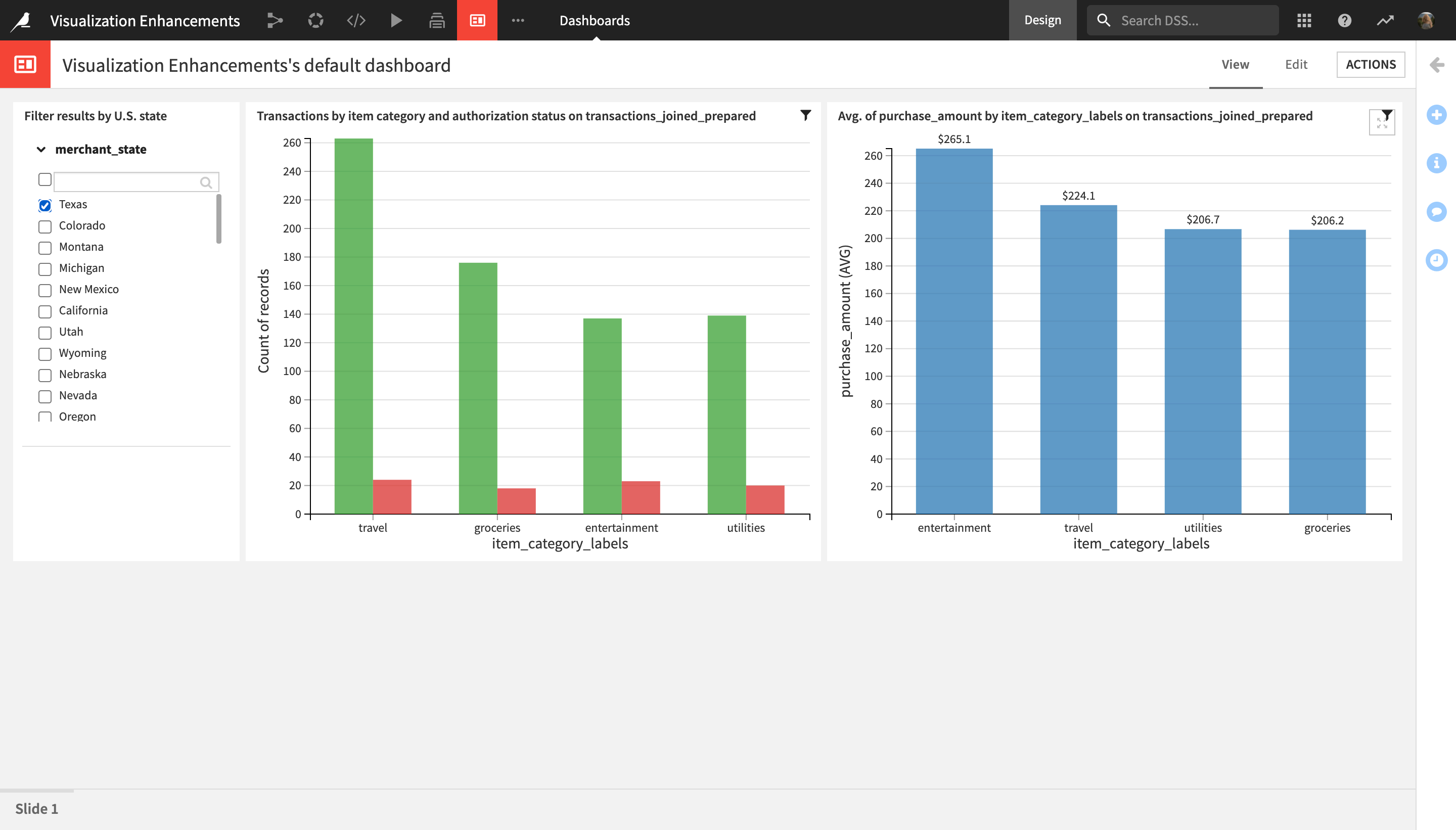
The charts on the dashboard now display credit card transaction data relevant to only the state of Texas.
Learn More
Congratulations! In a short period of time, you have discovered how to use custom color assignment, number formatting, and custom axis ranges in charts, as well as how to apply dashboard filters in Dataiku DSS.
To go further:
Continue on the Crash Course in Dataiku 10 to discover more new features and functionalities;
Visit the Dataiku Knowledge Base for more articles and tutorials on data visualization; or
Take your data viz skills to the next level with the Academy course on visualization with code in Dataiku DSS.