Monitoring model drift with Dataiku
Monitoring machine learning models in production is an important, but often tedious task for data scientists. Conventional model retraining strategies are often based on monitoring model metrics.
However, for many use cases, monitoring model metrics, such as AUC, may be insufficient. This may be particularly true in cases where long periods of time pass before receiving feedback on the accuracy of the model’s predictions.
This short video provides an overview of the Model Drift Monitoring plugin:
Warning
The functionality included in this plugin has been natively incorporated into Dataiku 10. For any new project, see this article to learn more about the Model Evaluation Store and Model Comparisons features or visit the product documentation to learn more about evaluating Dataiku models.
The Model Drift Monitoring Plugin
The Model Drift Monitoring plugin provides insight into this problem by shortening the feedback loop. This plugin allows you to examine if new data waiting to be scored has diverged from the training data.
If the new data waiting to be scored is significantly different from the data used to train the model, it is likely that the model will no longer perform well, and may need to be retrained.
For any deployed model, this plugin provides a new model view with the following visual elements.
Drift Score
In order to detect drift between the test dataset used by the model and new data, the plugin runs a Random Forest classifier that aims at predicting the data’s origin. If this model is successful in its task, it implies that the two datasets can be distinguished from one another and that data drift must have occurred.
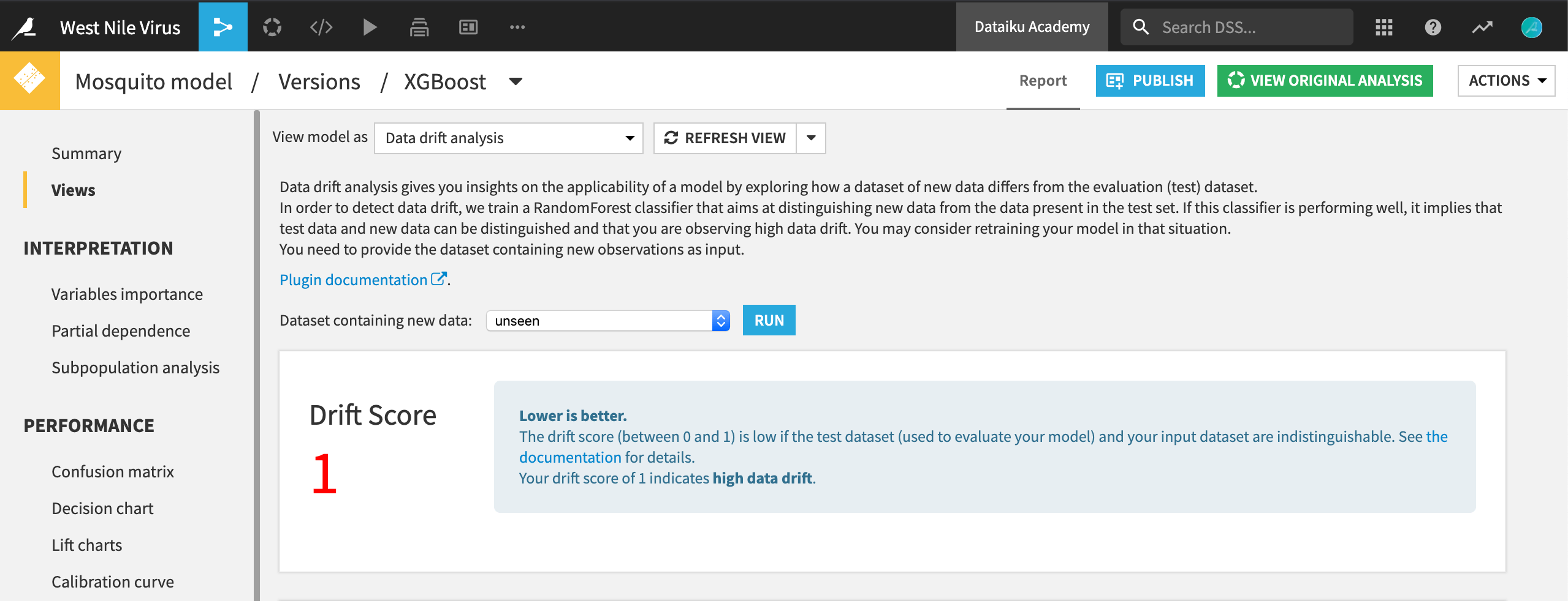
The score of 1 indicates high data drift here.
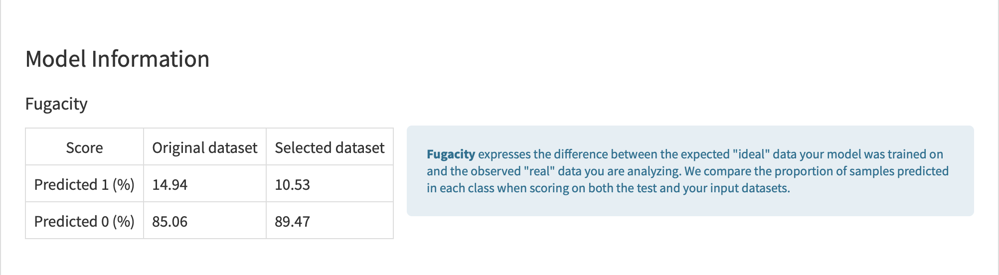
Fugacity
In addition to a drift score, the plugin provides a number of other insights. The Fugacity table expresses the difference between expected and observed samples. It compares the proportion of samples predicted in each class when applying the model on both the test and the input datasets.
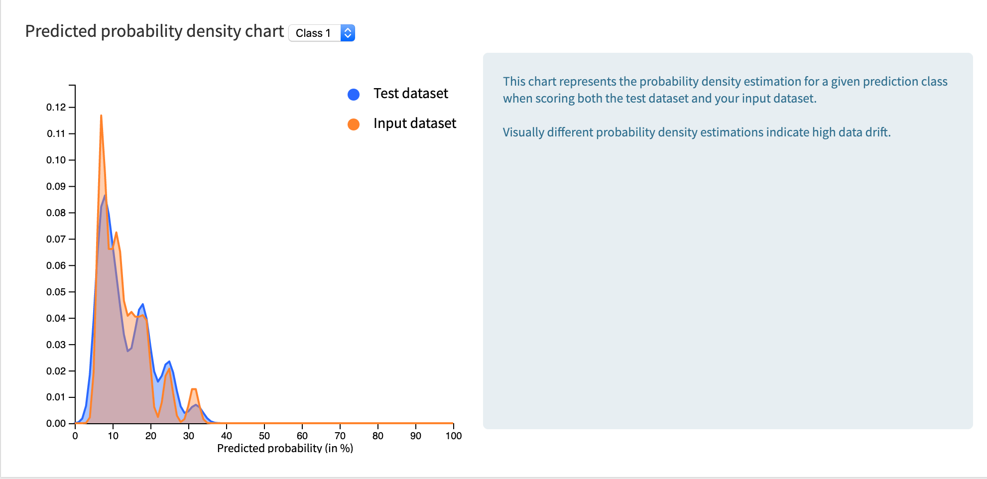
Density Chart
The density chart illustrates the extent to which the predicted probability distribution of the test dataset differs from that of the data waiting to be scored. The density functions show the probability density of predicted rows in the test dataset (as positive) versus predicted rows in the selected dataset (as positive). A highly drifted model fully separates the density functions.
Scatter Plot
It is important to consider the data drift score in the context of the importance of certain features. For example, if the data drift score is high, but the features responsible for the drift are of low importance, the behavior of the model may remain the same.
The scatter plot shows feature importance for the original model on the x-axis versus feature importance for the (data classifying) drift model on the y-axis. Features in the top right quadrant of this scatter plot are highly drifted (i.e. they are powerful in distinguishing test data from new observations), but also of high importance for the original model. In this situation, you can expect the performance of the model to degrade as the model does not apply to your new observations.
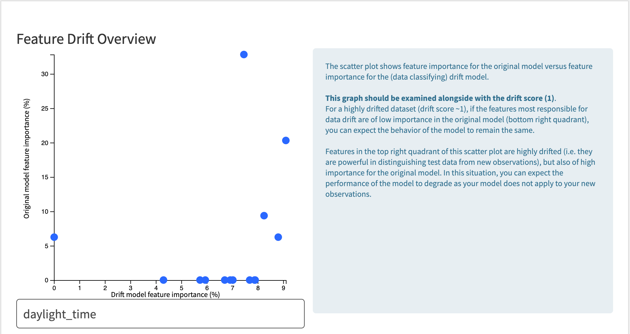
The feature “daylight_time” is important in the original model and is highly drifted.