Excel to Dataiku DSS Quick Start
Getting Started
Dataiku DSS is a collaborative, end-to-end data science and machine learning platform that unites data analysts, data scientists, data engineers, architects, and business users in a common space to bring faster business insights.
A main objective of Dataiku DSS is to help users and data teams to collaborate better on data projects. One of the key success factors for these users and teams is to allow analysts to work on large datasets as easily as they do on smaller datasets with Excel, as well as to help them find new use cases specific to the data available and the tools at hand.
In this quick start tutorial, you will be introduced to many of the essential capabilities of Dataiku DSS by walking through a simple use case: connecting to, preparing, and analyzing CRM and web sales data. Working towards that goal, you will:
connect to data sources;
explore, prepare, and enrich large datasets;
analyze data using intuitive visual tools; and
communicate results in a dashboard.
Note
This hands-on tutorial is geared towards business analysts and other Excel users entirely new to Dataiku DSS. It focuses on using the point-and-click interface and performing some of the most common Excel data processing and analysis tasks in a more efficient and scalable way with Dataiku DSS.
For a slightly more advanced data analytics tutorial, including visual machine learning tasks, check out the Business Analyst Quick Start.
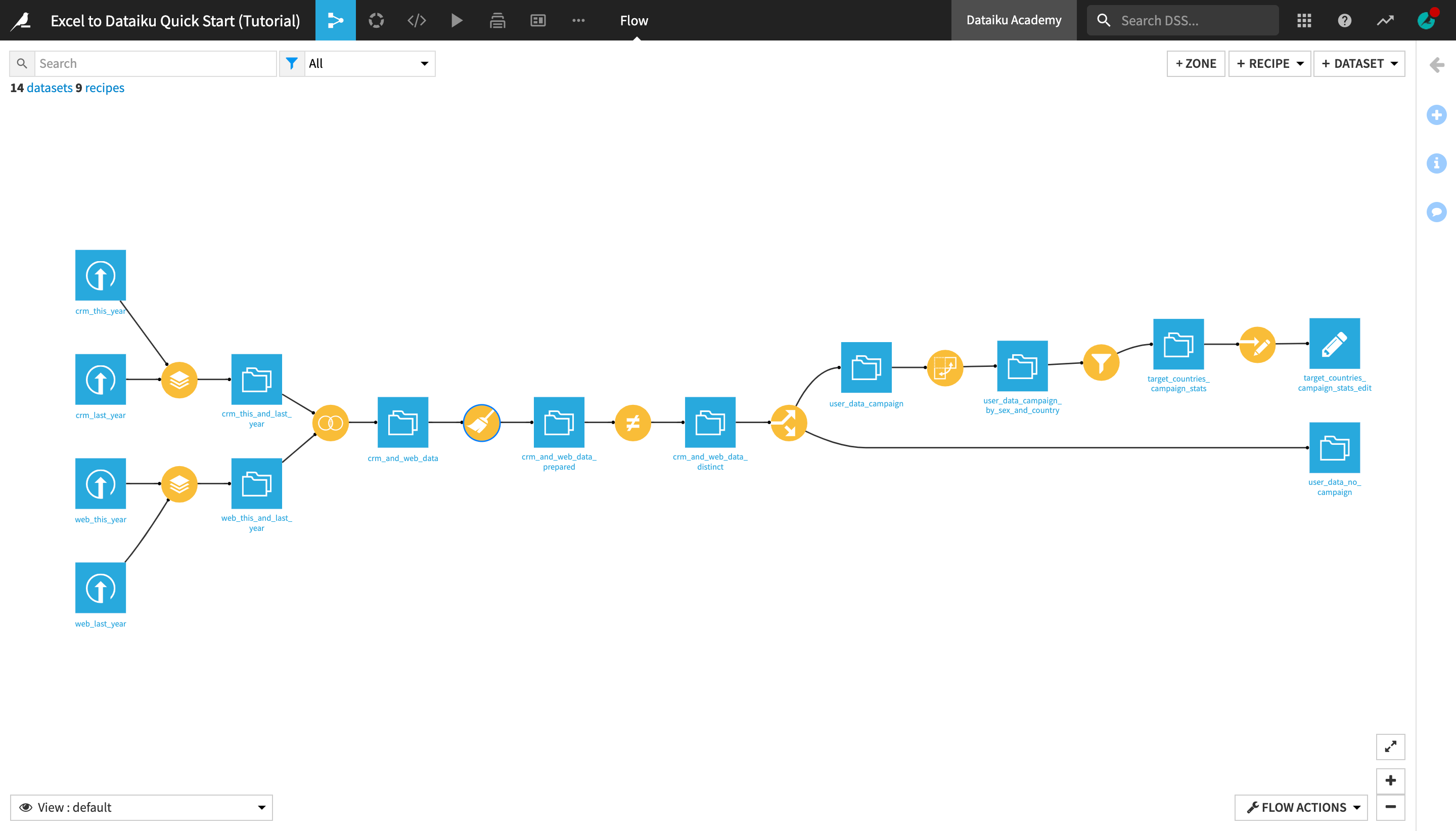
When you’re finished, you will have built the workflow below and understand all of its components.
Prerequisites
To follow along with the steps in this tutorial, you will need access to a Dataiku DSS instance (version 9.0 or above). If you do not already have access, you can get started in one of two ways:
start a 14-day free Dataiku Online trial; or
install the Free Edition locally.
You’ll also need to download this crm_last_year.xlsx file to be uploaded during the tutorial.
Tip
For each section below, written instructions are recorded in bullet points, but you can also find a screencast at the end of each section that records all of the actions described. Use these short videos as your guide!
You can find a read-only completed version of the final project in the public gallery.
Create a Project
Let’s get started! After creating an account and logging in, the first page you’ll see is the Dataiku DSS homepage. From this page, you’ll be able to browse projects, recent items, dashboards, and applications shared with you.
Note
Dataiku DSS is organized in projects. A project is a holder for all work on a particular activity.
You can create a new project in a few different ways. You can start a blank project or import a zip file. For this tutorial, we will import a pre-built starter project.
From the Dataiku DSS homepage, click on +New Project.
Choose DSS Tutorials > Quick Start > Excel to Dataiku Quick Start (Tutorial).
Click OK when the tutorial has been successfully created.
Note
You can also download the starter project from this website and import it as a zip file.
Connect to Data
After creating a project, you’ll find the project homepage. It is a convenient high-level overview of the project’s status and recent activity.
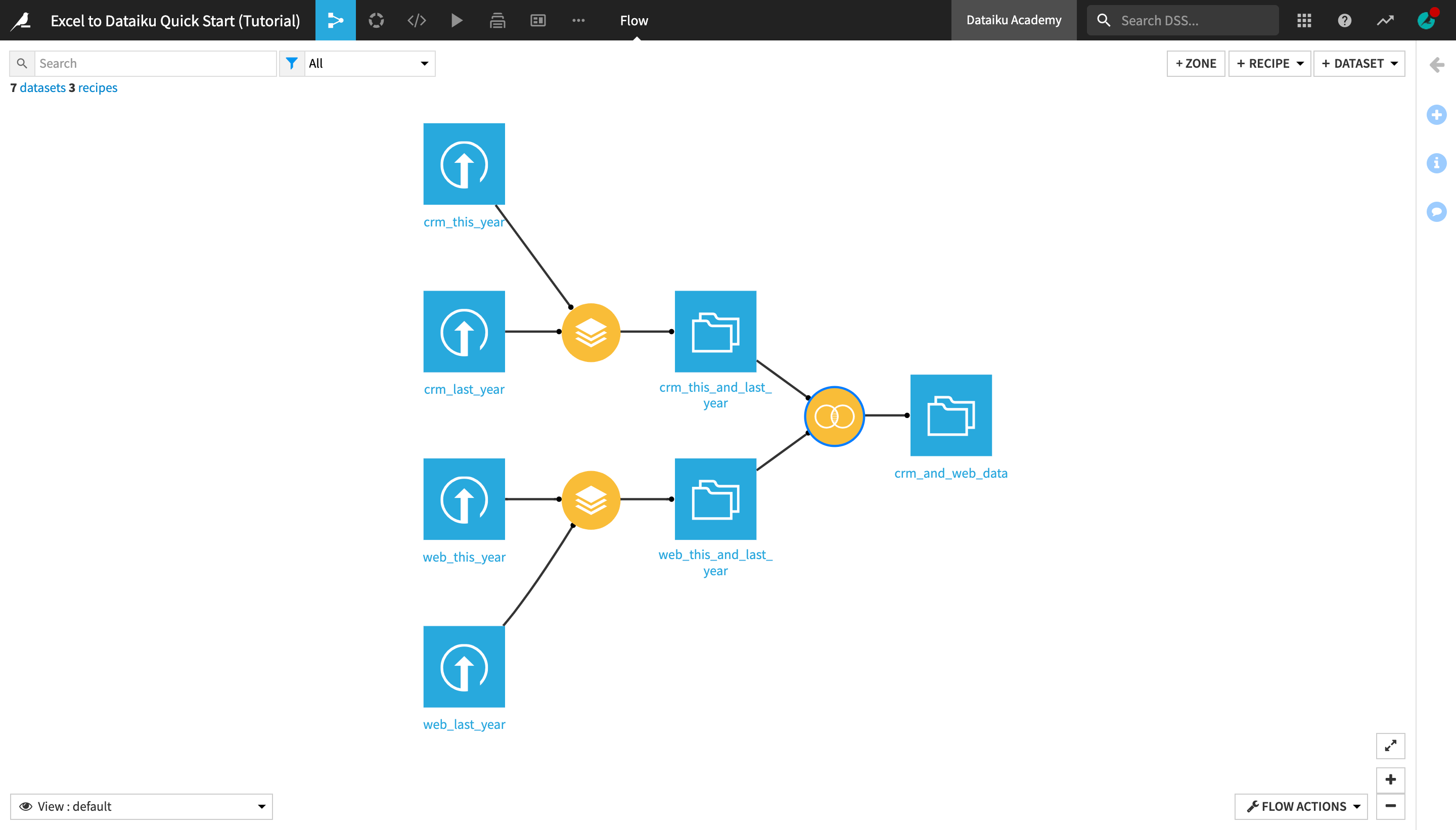
Let’s add a new dataset to the Flow, in addition to the existing three present in the initial starting project.
Navigate to the Flow, by clicking the Flow icon in the top navigation bar or by using the shortcut
G+F.
Note
The Flow is the visual representation of how data, recipes (steps for data transformation), and models work together to move data through an analytics pipeline.
A blue square in the Flow represents a dataset. The icon on the square represents the type of dataset, such as an uploaded file, or its underlying storage connection, such as a SQL database or cloud storage.
Dataiku DSS allows you to upload datasets in a variety of formats, including Excel files.
If you didn’t do it in the previous section, download the crm_last_year.xlsx file.
Click +Dataset in the top right corner of the Flow.
Click Upload your files.
Add the crm_last_year.xlsx file.
Click the green Create button in the top right corner of the page (if you’re using a local Dataiku DSS instance) OR the blue Save and Explore button in the middle of the page (if you’re using Dataiku Online).
Explore and Enrich Data
Now that we have all of the raw data needed for this project, let’s explore what’s inside these datasets.
Explore a Dataset
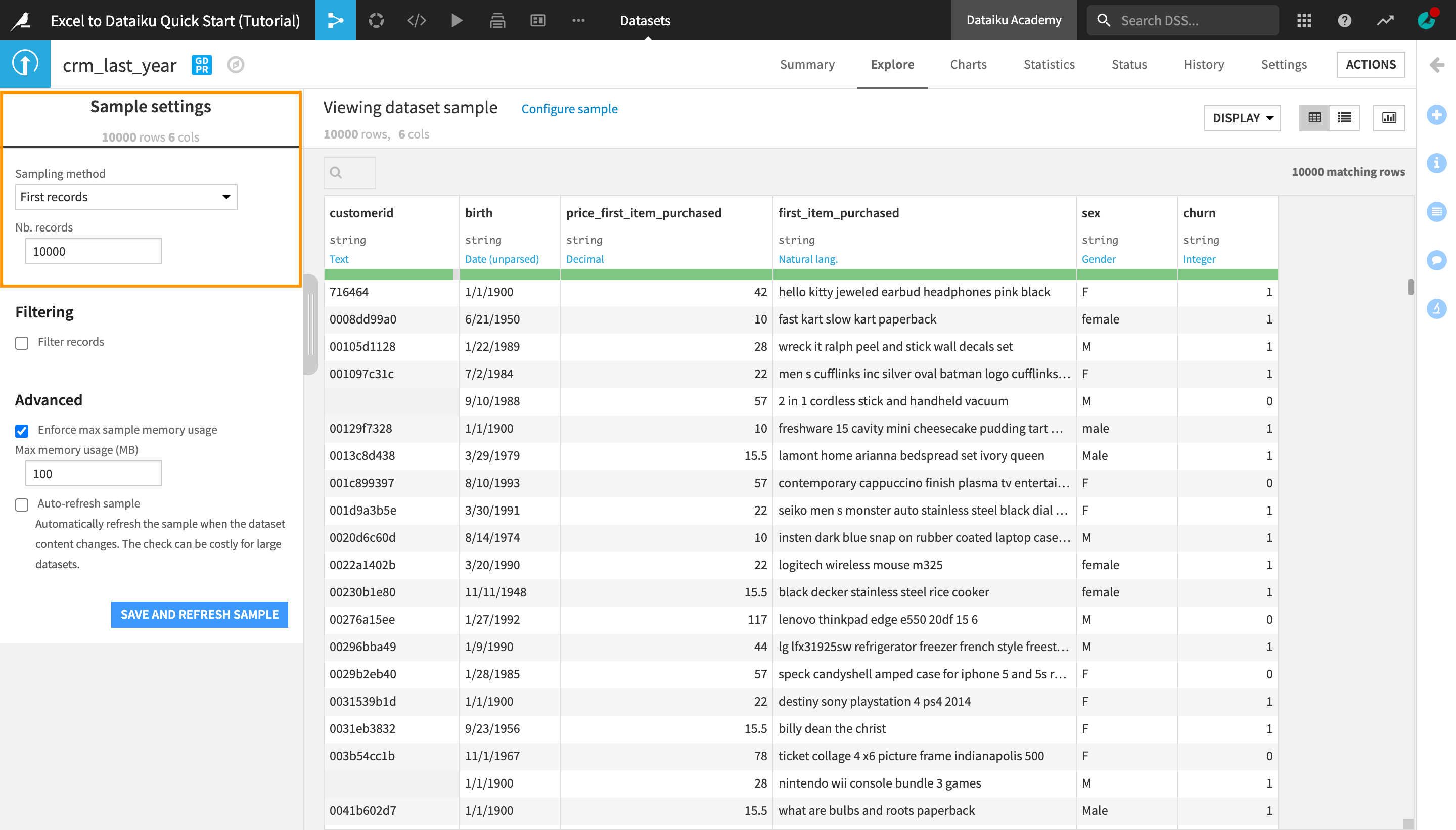
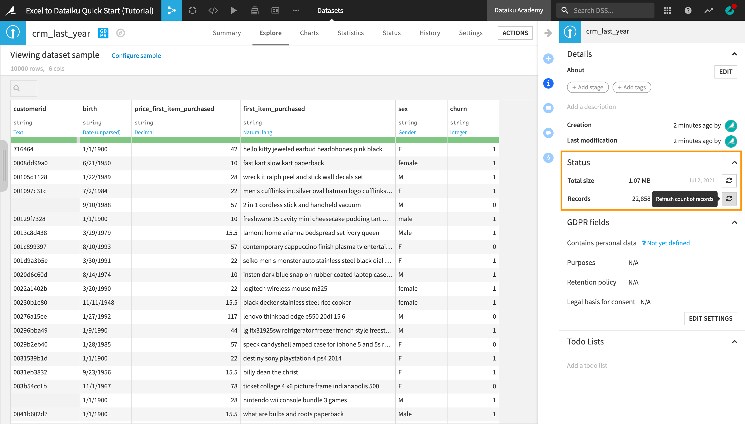
After uploading the crm_last_year dataset, you are navigated to the dataset’s Explore tab. It looks similar to a spreadsheet, but with a few key differences. For starters, you are viewing only a sample of the dataset.
Note
A dataset in Dataiku DSS can be any piece of data in a tabular format. Examples of possible DSS datasets include:
an uploaded Excel spreadsheet;
an SQL table;
a folder of data files on a Hadoop cluster;
a CSV file in the cloud, such as an Amazon S3 bucket.
Dataiku DSS establishes a connection with a source of data (e.g. a database) that can be stored locally, on the cloud, etc. This removes the limitations that most spreadsheet tools impose on the size of the data and files.
Regardless of the origins of the source dataset, the methods for interacting with (reading, writing, visualizing, etc.) any Dataiku DSS dataset are the same.
Observe the Sample
To see what sample the dataset preview is currently using:
Near the top left of the screen, click on Configure sample.
Notice that the “Sampling method” dropdown is set to First records and the “Nb. records” is set to 10000.
Note
By default, the Explore tab shows the first 10,000 rows of the dataset, but many other configurations are possible. Working with a sample makes it easy to work interactively (filtering, sorting, etc.) on even very large datasets.
For the purpose of this tutorial, we will stick to this default sample, but if you need to change the sample of a dataset for future projects, you can choose from the different sampling methods and indicate the number (or in some cases, percentage) of rows to include in it.
On the right sidebar, click to open the Details panel (marked with an “i”).
Under Status in the right-hand sidebar, click Compute. Refresh the count of records. This is the actual number of rows, or records, in the dataset (as opposed to the sample).
Note
Although the sample includes only 10,000 records, the actual dataset is larger. Dataiku DSS itself imposes no limit on how large a dataset can be. It allows users to visualize and preview the changes on a smaller sample of the dataset before applying them to the whole dataset, thus optimizing time and computation efficiency.
Observe the Schema
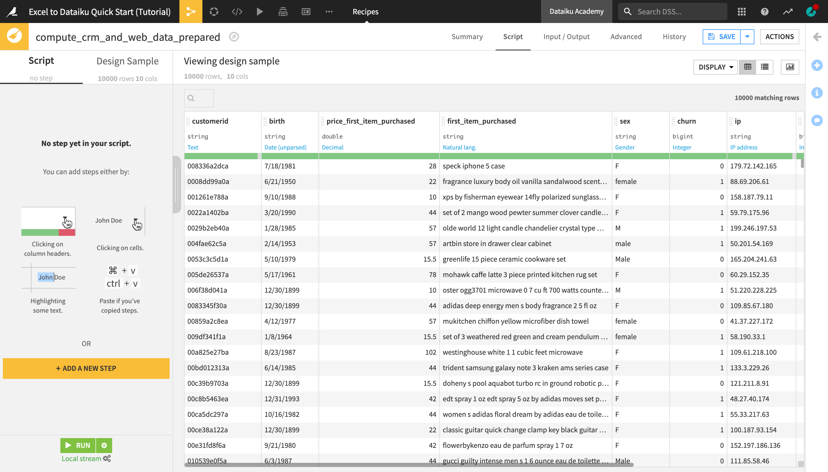
Look closer at the header of the table. At the top of each column you can find the column name, its storage type, and its meaning (written in blue).
Note
Datasets in Dataiku DSS have a schema, which consists of the list of columns, with their names and storage types.
The storage type indicates how the dataset backend should store the column data, such as “string”, “boolean”, or “date”.
In addition to the schema, Dataiku DSS also displays the “meanings” of columns, which are similar to the Excel-defined data types. The meaning is a rich semantic type automatically detected from the sample contents of the columns, such as Date, URL, IP address, gender, etc.
Note how, at this point, the storage type of all columns is a string, but Dataiku DSS has inferred the meanings to be “Text”, “Date (unparsed)”, “Decimal”, “Natural lang.” (short for “natural language”), “Gender”, and “Integer”.
Analyze Columns
Let’s analyze the contents of a column.
To start analyzing data in Excel, you’d have to create charts or write formulas to make calculations. With Dataiku DSS, you can use the Analyze window for quick insights.
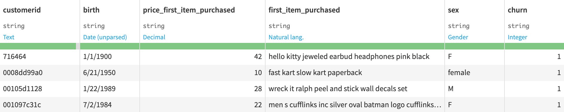
Click the column heading of the price_first_item_purchased column, and then select Analyze from the menu.
The Analyze window will pop open. Notice it’s using the previously configured sample of the data. You could change this by selecting “Whole data” from the Sample dropdown menu.
Navigate to the Numerical tab of the Analyze window.
In the Summary section of the Analyze window, you can see the number of valid, invalid, empty, and unique values in this column. In the Statistics section, you can see the minimum, maximum, and average values of purchase_amount, as well as other key metrics.
Use the arrows at the top left of the dialog to scroll through the different columns.
Tip
Note how the Analyze tool displays different insights for categorical and numerical variables.
Click “X” to close the Analyze window,
Return to the Flow by clicking the Flow icon in the top navigation bar (or by using the shortcut
G+F).
Optionally, you could open and explore the contents of the other datasets in the Flow using the tools you just learned about.
Use Recipes to Enrich Data
Now that you have an understanding of the datasets you’re working with, it’s time to combine them in order to enrich the data that you’ll be processing and analysing.
When preparing data in a spreadsheet, as the project advances and the operations become more and more complex, it’s increasingly hard to keep track of all the changes made to the original data.
In Dataiku DSS, rather than directly working on the final datasets, you create recipes, or a set of transformation instructions, that can be applied to input datasets and produce new output datasets whenever needed. The visual representation of the interactions between datasets and recipes produces the Flow, in which you can easily trace the changes in the data at any stage of the process.
We will prepare and enrich the data using two visual recipes - the Stack recipe and the Join recipe.
Note
Recipes in Dataiku DSS contain the transformation steps, or processing logic, that act upon datasets. In the Flow, they are represented by circles connecting the input and output datasets.
Visual recipes (yellow circles) accomplish the most common data transformation operations, such as cleaning, grouping, and filtering, through a point-and-click interface.
You are also free to define your own processing logic in a code recipe or a plugin recipe.
Stack Datasets
First, we will “stack” two datasets that have the same column structure but contain rows from different time periods into one single dataset.
Tip
This is similar to merging sheets in Excel by moving or copying them, or by using the Consolidate command, but made easier since you don’t need to navigate back and forth between multiple spreadsheet files or perform manual operations. This makes it easier to stack large datasets.
Select the web_this_year dataset by clicking on it.
Click the arrow near the top right corner of the screen to open the Actions menu, and select the Stack visual recipe.
In the window that opens, under “Inputs”, click the blue +Add button, and select the web_last_year dataset from the options.
Name the output dataset
web_this_and_last_yearinstead of the default name.Click Create Recipe.
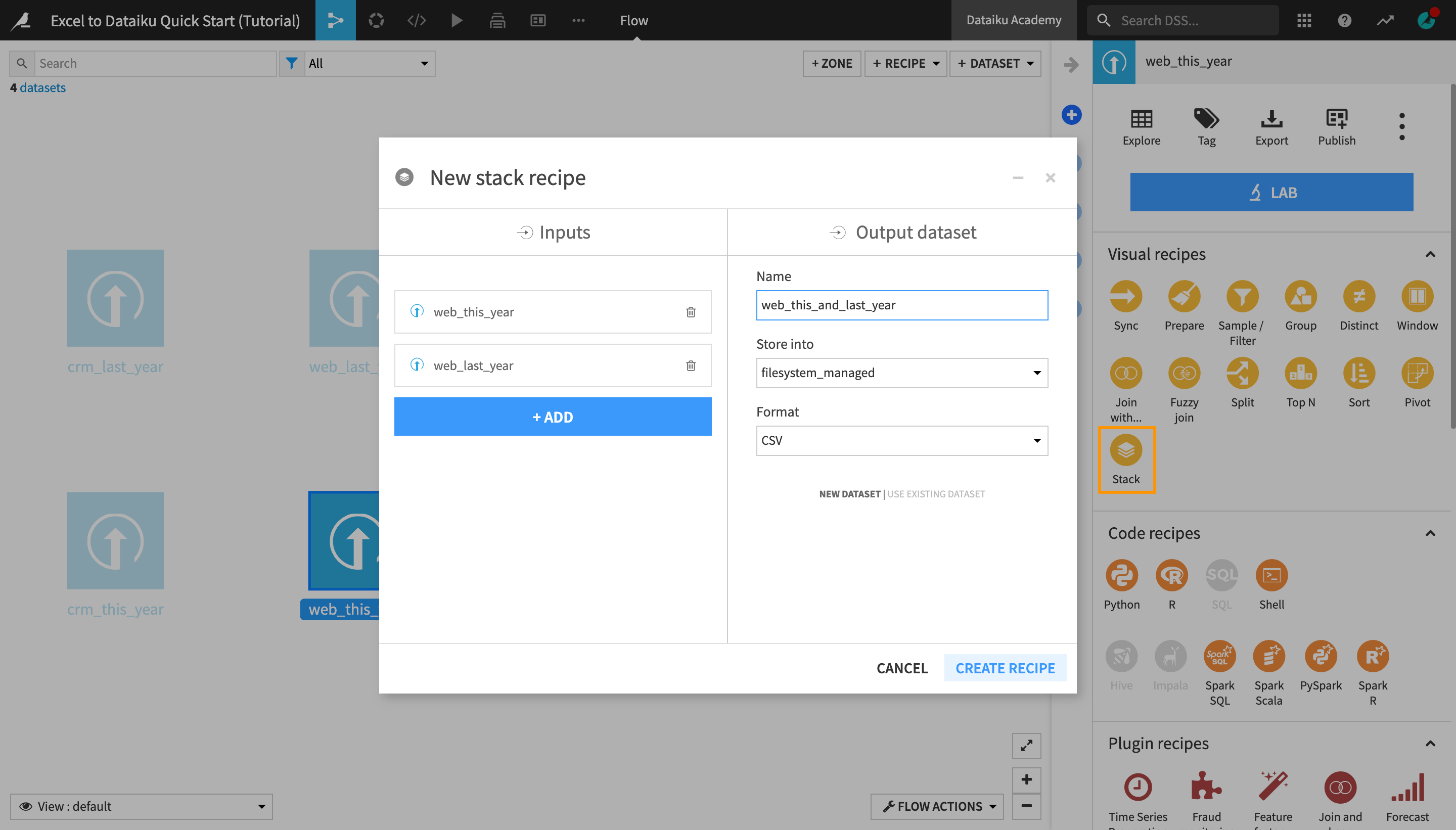
Once the recipe is initiated, you can observe or modify the settings before running it.
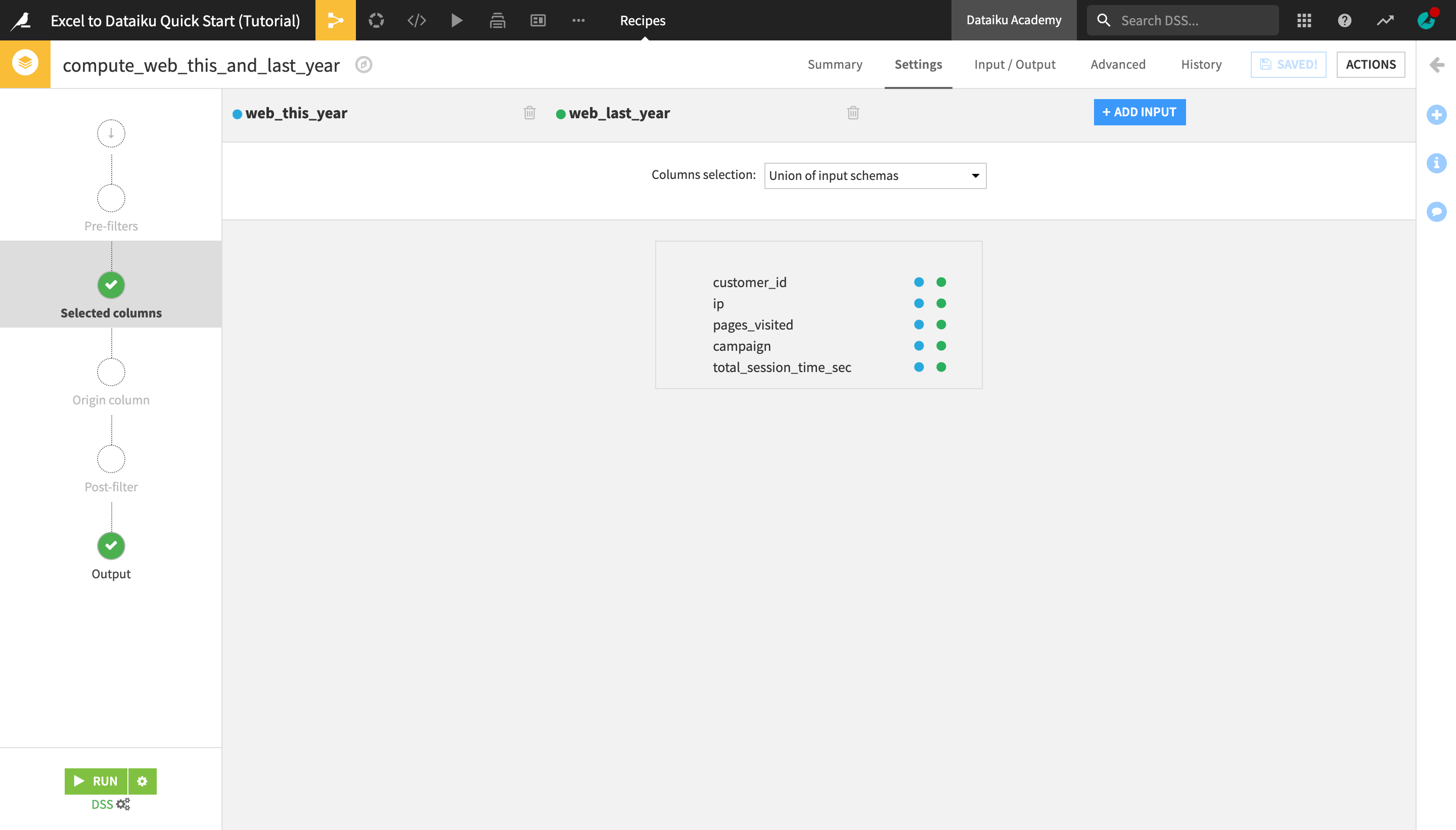
Navigate to the Origin column step on the left hand side, and activate the Off/On button.
This will create an additional original_dataset column in the output dataset indicating for each row, which dataset (i.e. which year) it comes from.
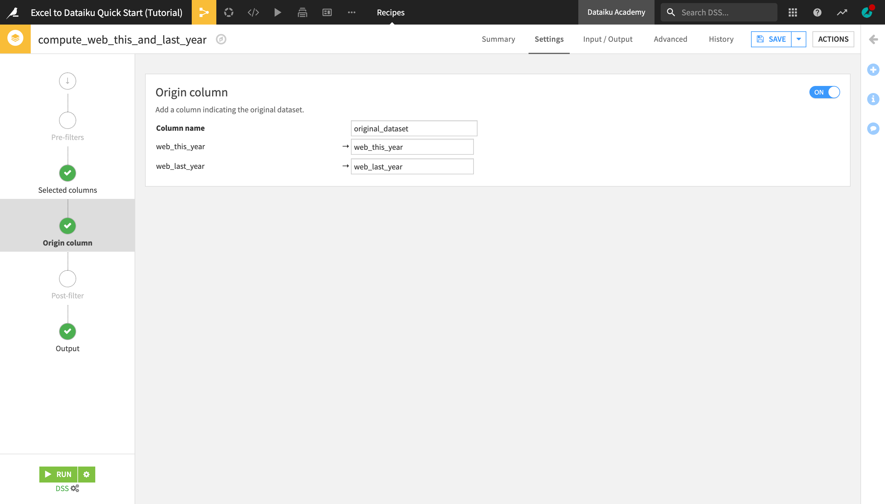
Click the green Run button in the bottom left corner of the screen to run the Stack recipe.
Tip
If you want to save the settings before running the recipe (for example to pause and come back to make more adjustments later), you can always click Save in the top right corner.
Click Update Schema in the pop-up window that appears in the bottom of the page.
Note
Throughout this tutorial, whenever you run a recipe that results in a change in the “schema” of the input or output dataset (for example, the number of columns or their names or types), you will need to “accept the schema change”.
When the recipe is finished running, a green Job succeeded panel will appear.
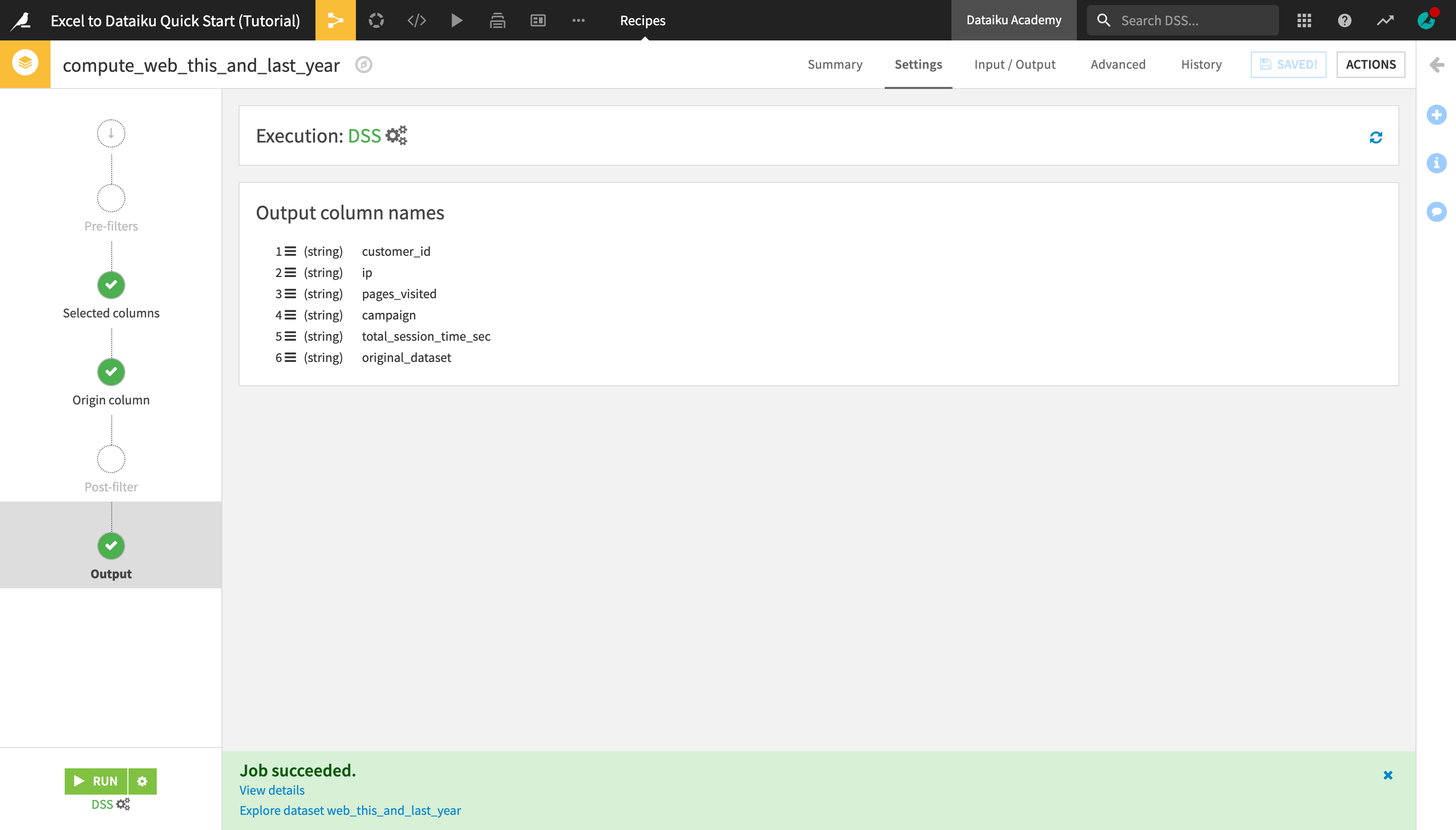
In the panel, click Explore dataset web_this_and_last_year to open the output dataset.
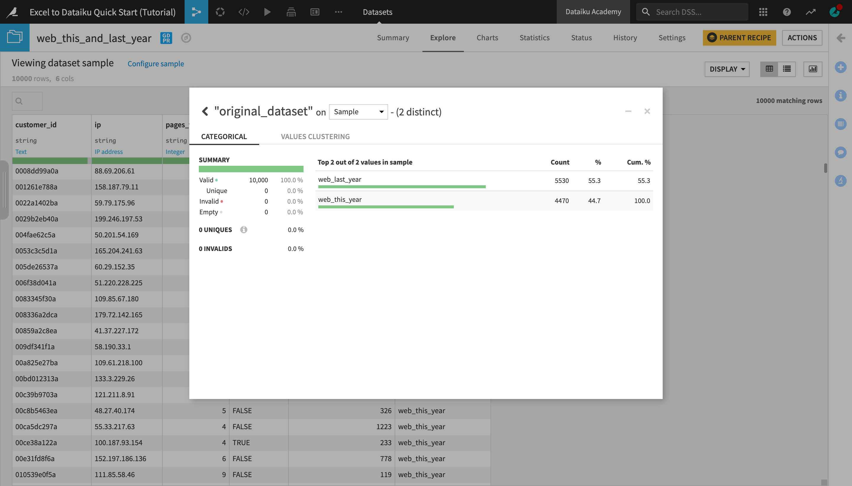
Analyze the original_dataset column.
Notice that the newly created dataset contains all the rows from the web_this_year and web_last_year datasets.
Return to the Flow and follow the same process to stack the crm_this_year and crm_last_year datasets:
Select the crm_this_year dataset, and initiate a Stack recipe from the Actions menu on the right.
Add crm_last_year as the second input dataset.
Name the output dataset
crm_this_and_last_year.This time, in the recipe settings, DO NOT activate the Origin column setting. Instead, simply preview the Output step, and run the recipe.
Return to the Flow.
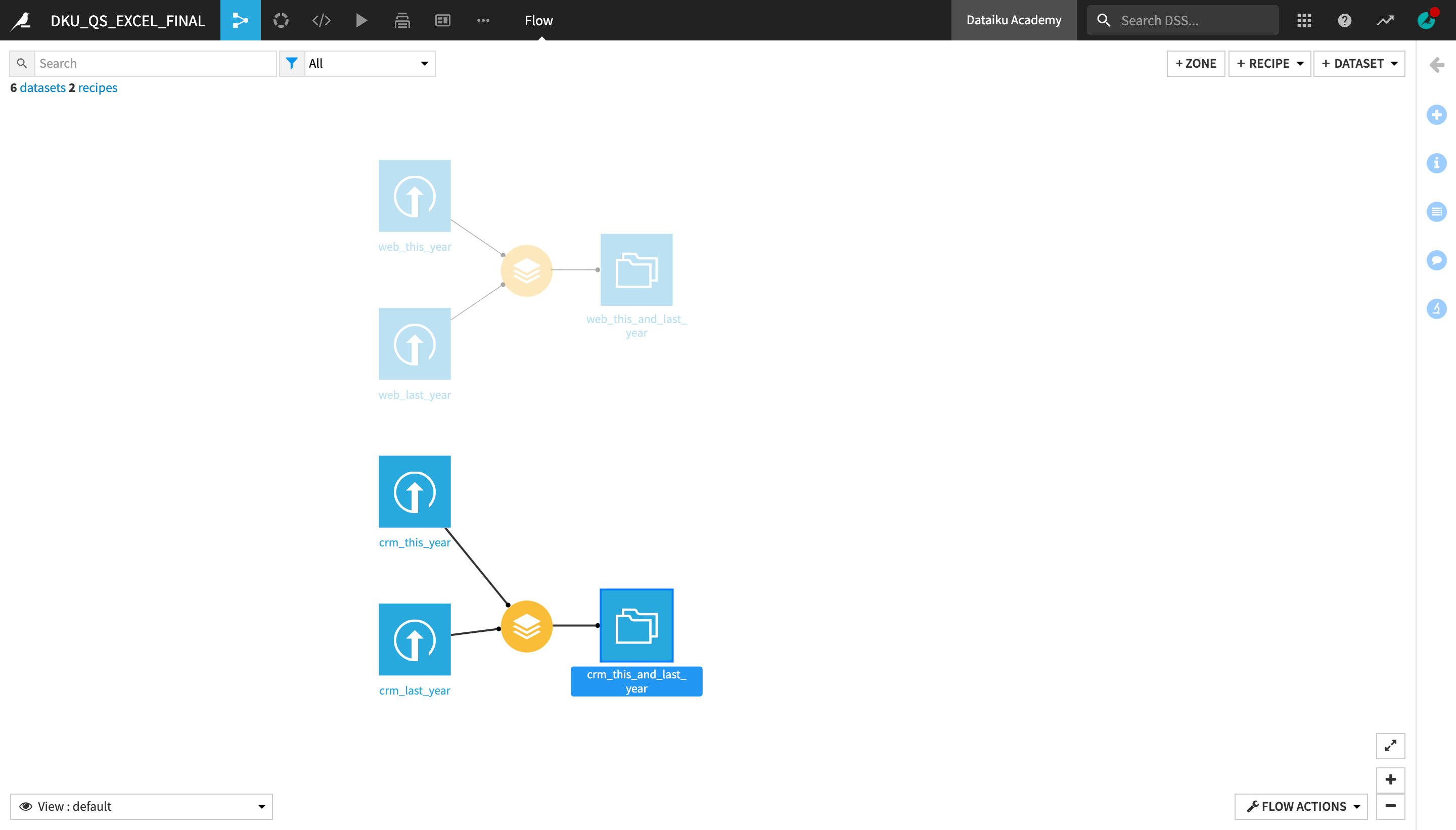
Join Datasets
We will now join the crm_this_and_last_year and web_this_and_last_year datasets, which both contain data about the same customer base, into one consolidated dataset.
Note
The Join recipe is used to enrich one dataset with columns from one or more datasets. Dataiku DSS matches values using a key column found in both datasets. It has a similar purpose to the Excel VLOOKUP function.
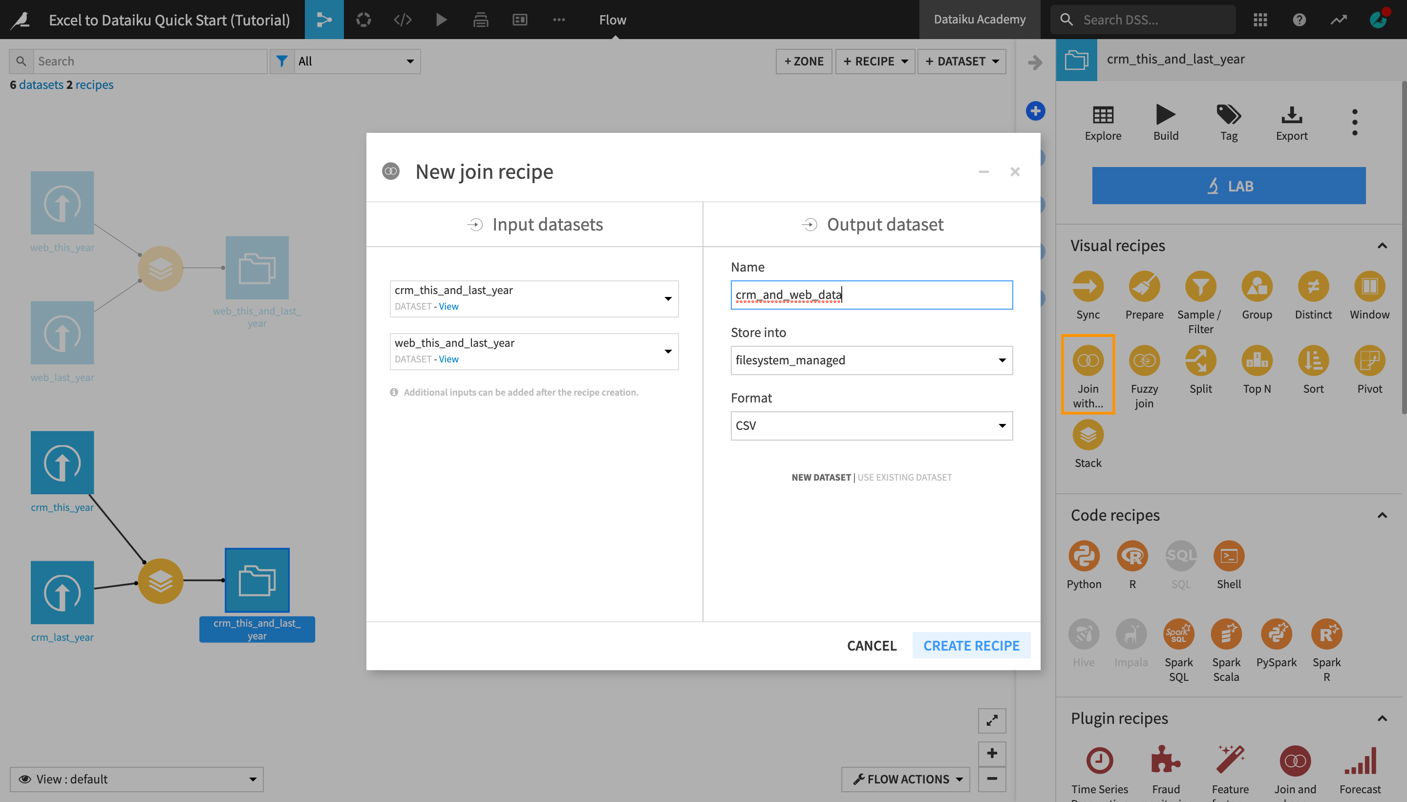
From the Flow, select the crm_this_and_last_year dataset, and then click Join with… in the Actions menu.
Under “Input datasets”, click the second dataset dropdown that currently says “No dataset detected”, and select web_this_and_last_year.
Name the output dataset
crm_and_web_data.Create the recipe.
Similarly to the Stack recipe, you are navigated to a recipe settings page.
On the Join step, notice the equality sign between the customerid column from the crm_this_and_last_year dataset and the customer_id column from the web_this_and_last_year dataset.
Dataiku DSS has automatically detected the two columns containing the customer ID as the join keys.
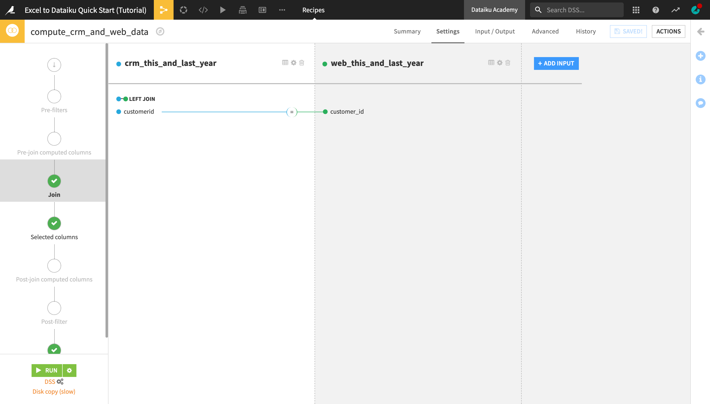
Notice also the LEFT JOIN sign above the join key columns. This is the default join type in DSS, which keeps all the rows from the “left”, or first, dataset (in this case, crm_this_and_last_year) and adds to it the relevant columns from the “right”, or second, dataset (web_this_and_last_year).
As our goal is to enrich the CRM customer data with a few additional columns from the “web” data, we will stick to using the left join.
Tip
The Left Join is the join type we want in this case, but you can click on Left Join > “”Join Type** to read more about the other available join types.
On the Selected columns step, uncheck the customer_id column from the web_this_and_last_year dataset. We don’t need it, since the customerid column from the crm_this_and_last_year dataset contains the same information.
Uncheck the original_dataset column as well.
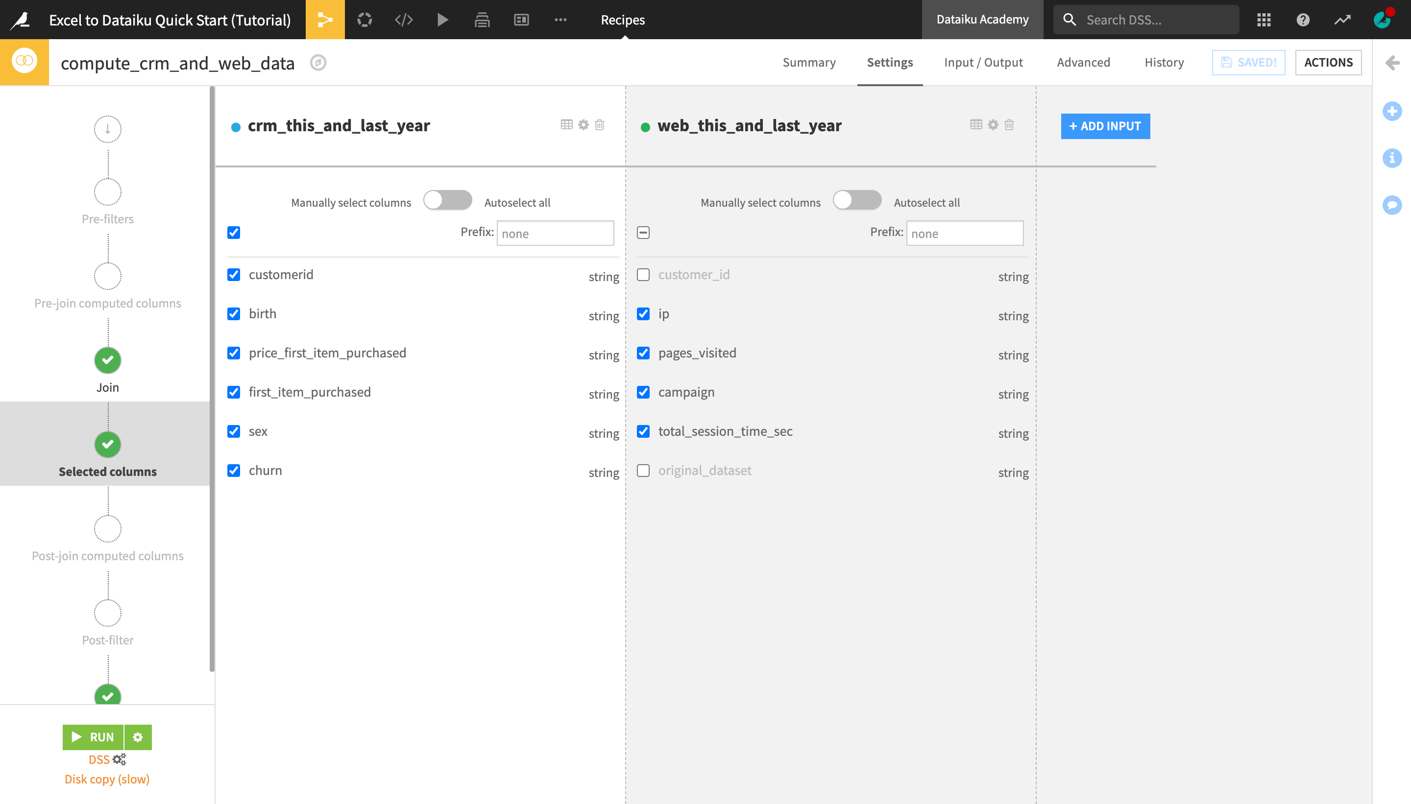
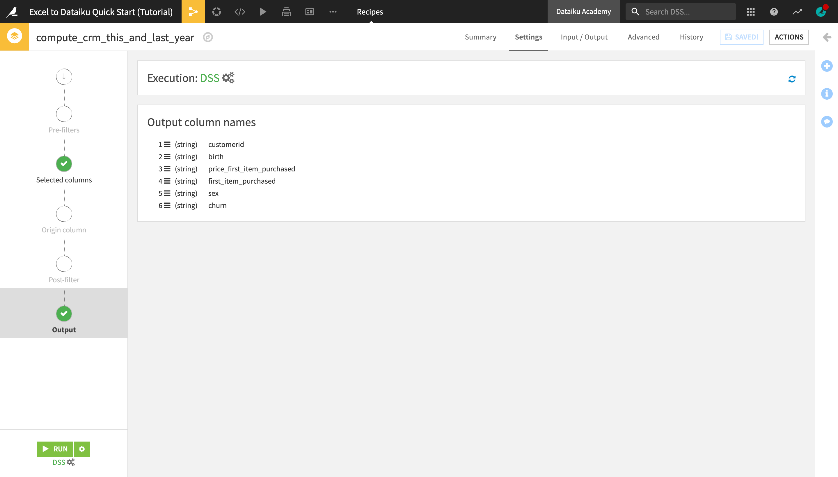
On the Output step, preview the list of columns that will appear in the joined output dataset.
Save and run the recipe.
Once it’s successfully run, preview the output dataset.
Prepare Data
Data cleaning and preparation is typically one of the most time-consuming tasks for anyone working with data. Let’s see how this critical step can be accomplished with visual tools in Dataiku DSS.
Return to the Flow.
With the crm_and_web_data dataset selected, initiate a Prepare recipe from the Actions bar on the right.
The name of the output dataset, crm_and_web_data_prepared, fits well so just create the recipe.
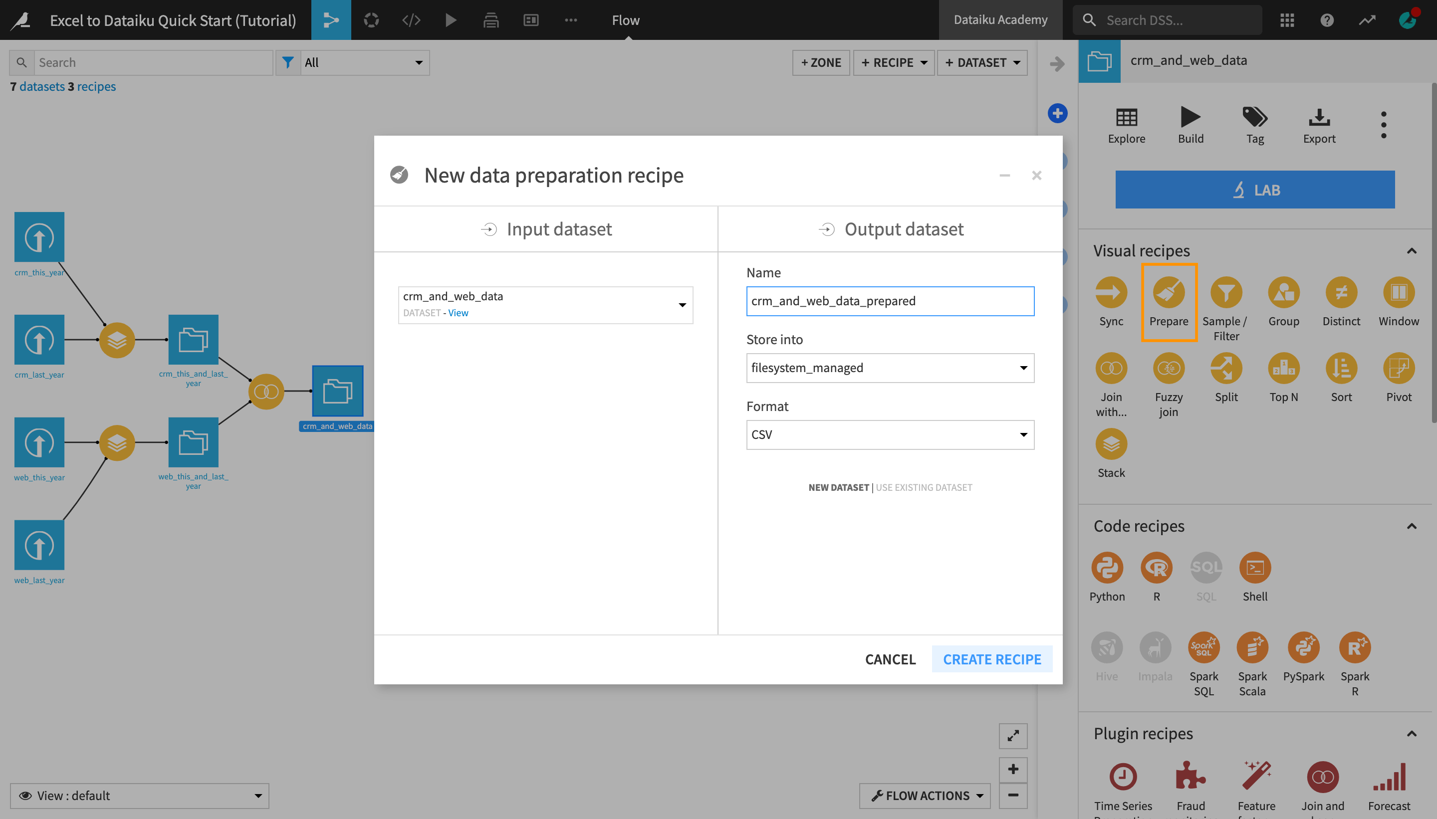
Note
The Prepare recipe is a visual recipe in Dataiku DSS that allows you to create data cleansing, normalization, and enrichment scripts in an interactive way.
This is achieved by assembling a series of transformation steps from a library of more than 90 processors. Most processors are designed to handle one specific task, such as filtering rows, rounding numbers, extracting regular expressions, concatenating or splitting columns, and much more.
Find and Replace Cell Values
One of the most common operations when working with a spreadsheet tool is finding and replacing cell values. Dataiku DSS allows you to do this in several ways.
Analyze the sex column using the Analyze window that you discovered in the Explore view of a dataset.
Notice that the same gender is represented by multiple text values:
“male”, “Male” and “M”; and
“female” and “F”.
Merge Cell Values
One way to replace all occurrences of one cell value with another in one simple step is to merge two cell values into one.
From the Analyze window, check the “female” and “F” value boxes.
Click the “Mass Actions” dropdown and select Merge selected.
Type
Fin the “Replace with” field.Click Merge and close the Analyze window.
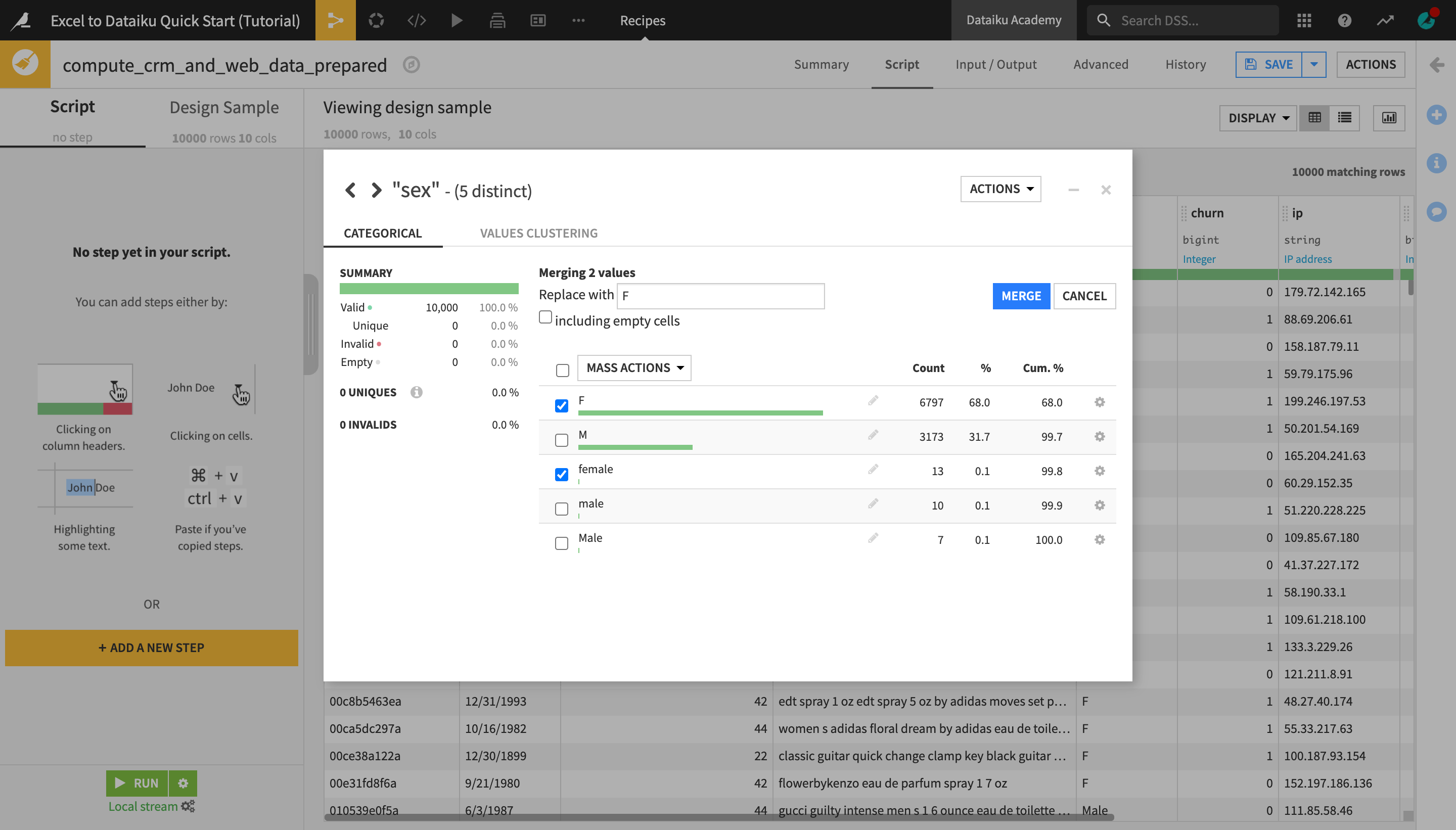
This creates a new “step” in the Prepare recipe Script on the left, “Replace female by F in sex.
With the Prepare recipe, you can also explore visually the impact of each transformation step in the dataset preview on the right.
Tip
This is similar to working in a spreadsheet, with the key difference being that the changes are not actually applied to the whole dataset until you run the recipe. In addition, you have a “log” of all the transformations in the Script panel and can easily disable, rearrange, duplicate steps, etc.
Another key difference when working with Dataiku DSS recipes is that the original dataset remains intact, thus allowing you to apply many different transformations without worrying about losing the original data, and being able to easily go back to an earlier version.
Select and Replace Values from a Dataset Preview
Let’s use another method to replace the “male” values.
Highlight the word “male” in one of the cells of the sex column that it appears in.
From the dropdown menu that appears, select Replace male by….
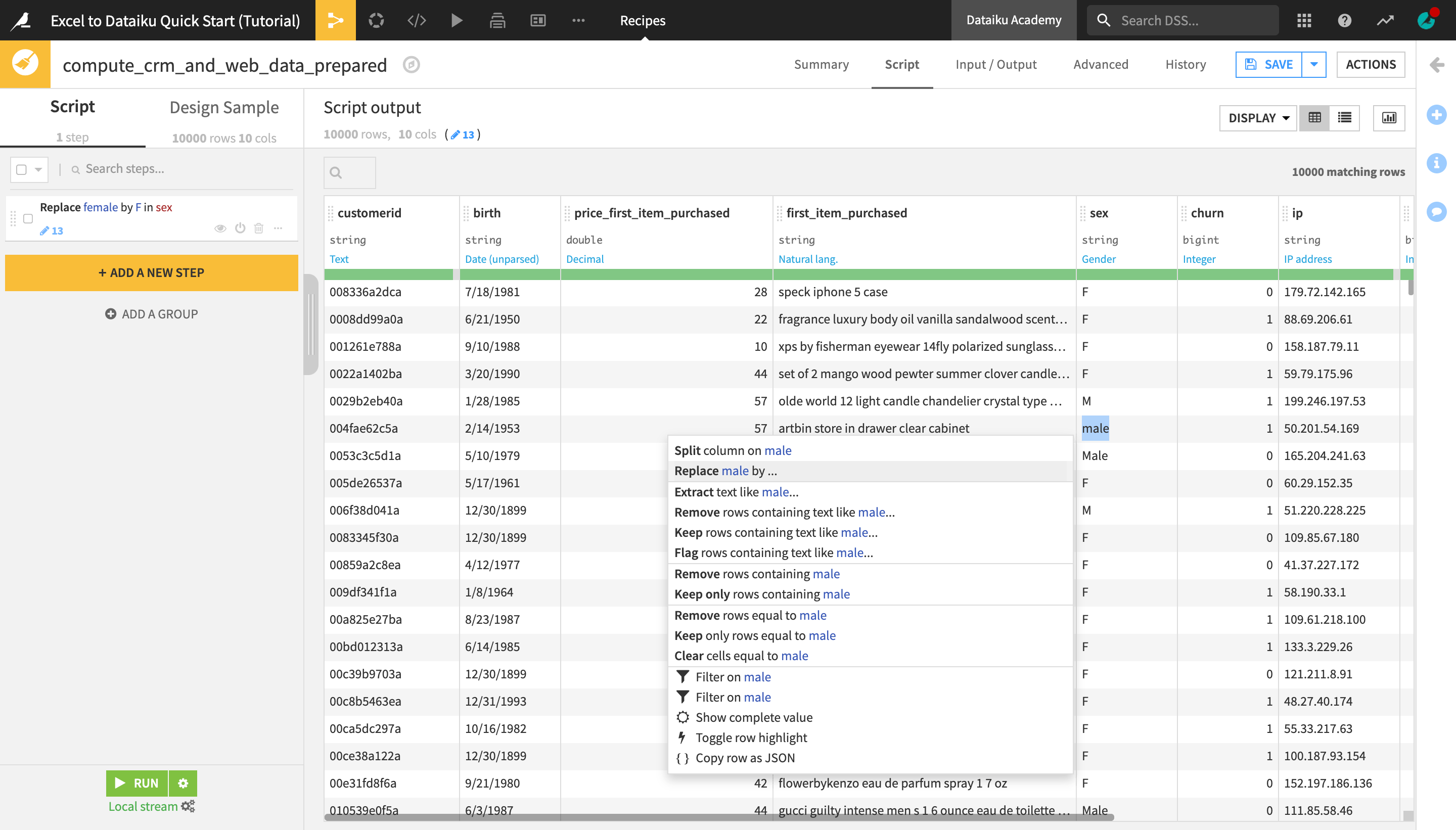
Similarly to the previous method, this creates a new Find and Replace step in the script. The replace key field on the left has been automatically filled with the value you selected in the dataset preview, “male”.
In the value field on the right, type
M.From the “Matching mode” dropdown, select Complete value.
From the “Normalization mode” dropdown, select Lowercase.
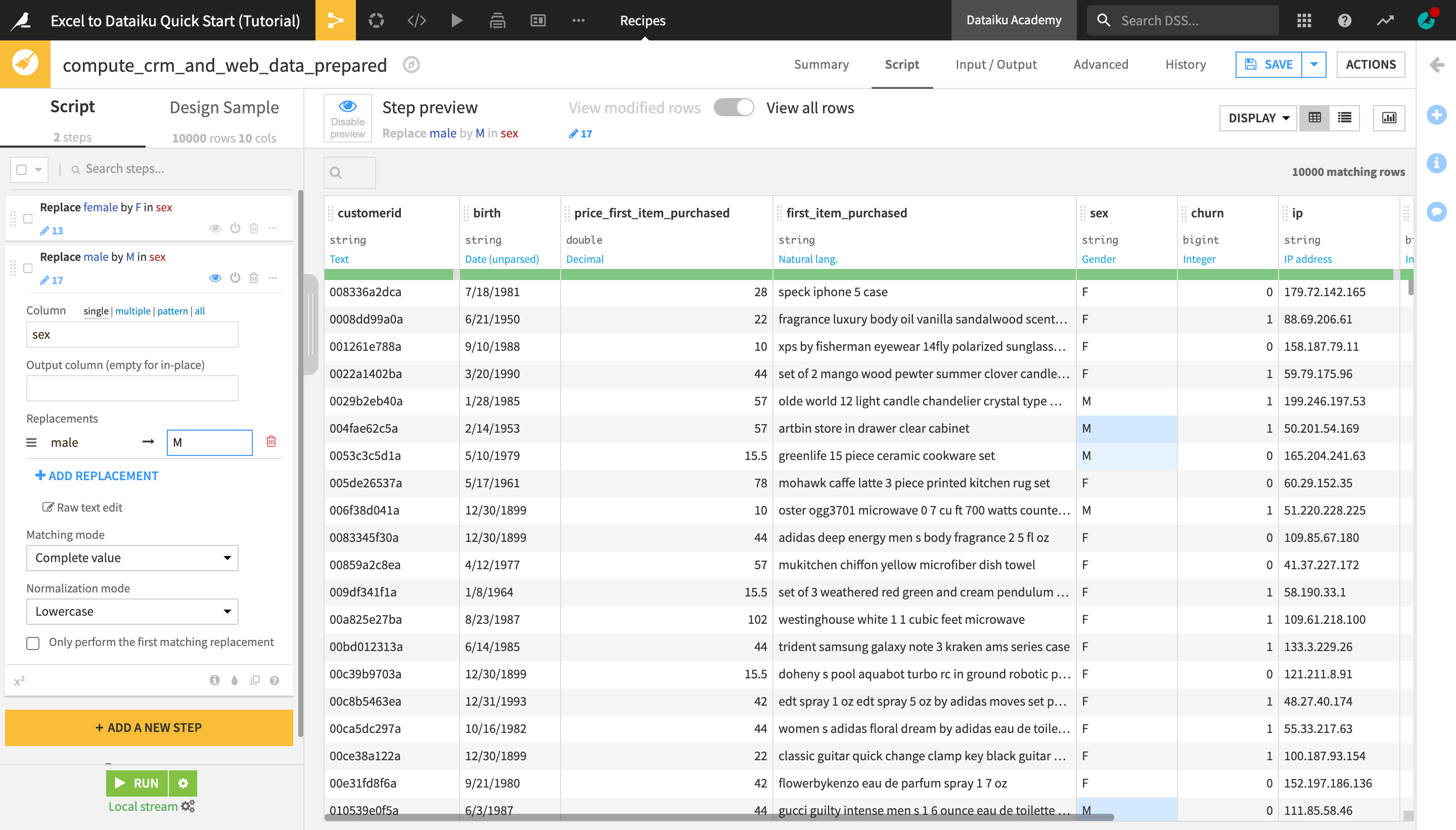
Observe the changes in the dataset preview. All cells in the sex column that previously contained “male” or “Male” have now been replaced with “M”, just as all the “female” values were replaced with “F” in the previous step.
Note
Both of these methods are essentially shortcuts for using the same Prepare recipe processor, Find and Replace. You can also use it by clicking +Add a New Step and selecting it from the processors library.
Parse Dates
In a Prepare recipe, the inferred meanings for each column allow Dataiku DSS to suggest relevant actions in many cases. Let’s see how this works for a date column.
Note
In Excel, Date values are stored as integers, but are displayed in a format of your choice.
In Dataiku DSS, however, the value displayed is the value that is stored, and while text like “1/5/17” may be clear to the human eye – or not; is that January 5 or May 1? – Dataiku DSS must parse text dates, taking into account their format and time zone, in order to create a true date column.
Dataiku DSS recognizes the birth column as an unparsed date. The format though is not yet confirmed.
From the birth column header dropdown, select Parse date….
In the “Smart Date” dialog, click Use Date Format to accept the detected format.
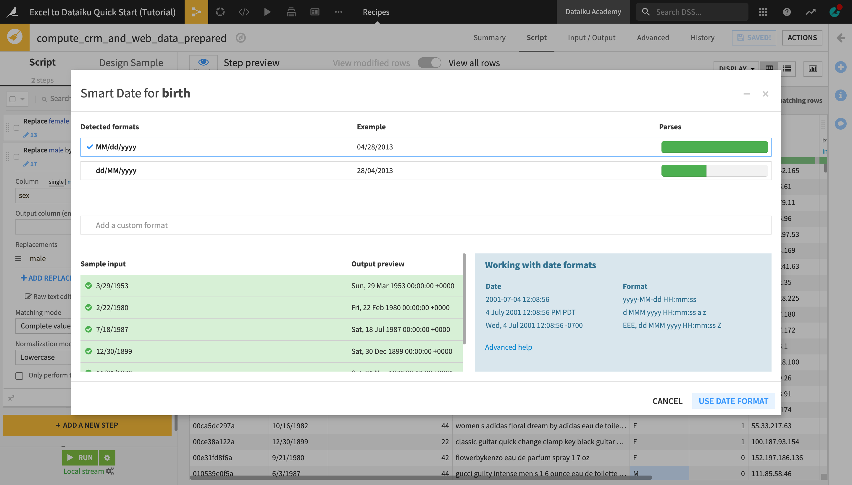
As with the previous operations, this creates a new “step” in the Prepare script on the left.
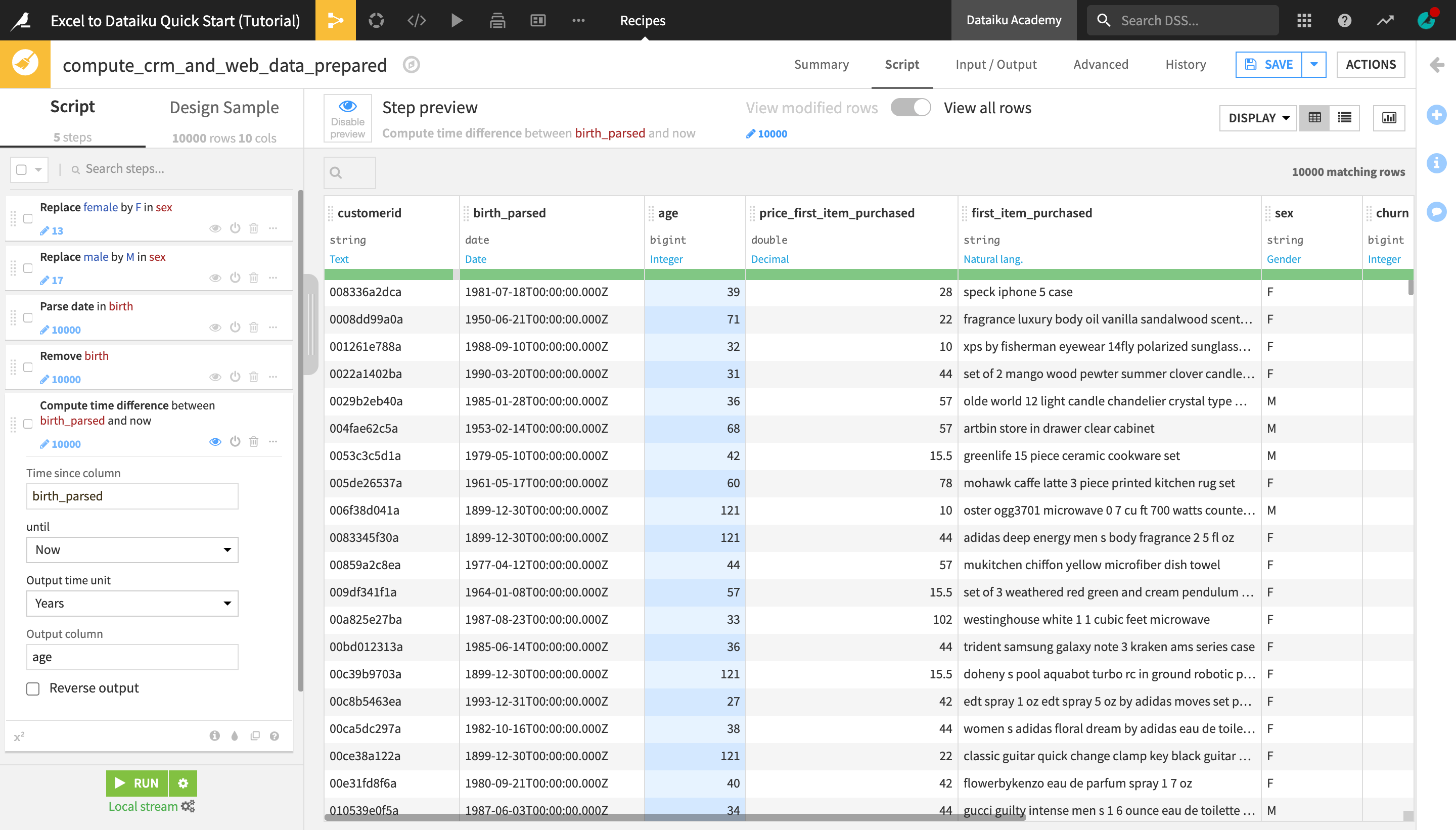
Compute Time From Date Columns
By applying the “Parse date” step to the birth column, we have created a new birth_parsed column in our dataset. We can now use this column to compute the customer age.
Return to the birth column header dropdown, and select Delete.
From the birth_parsed column header dropdown, select Compute time since.
In the Script, change the “Output time unit” to Years.
Change the name of the “Output column” to
age.
Tip
You deleted the birth column in the Prepare script above. However, this column remains in the input dataset. It will only be removed from the output dataset. Unlike a spreadsheet tool, this system of input and output datasets makes it easy to track what changes have occurred.
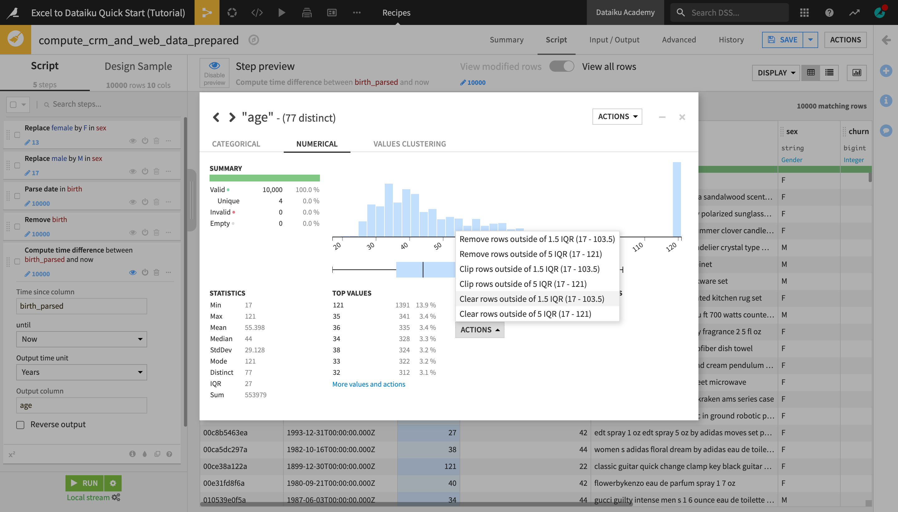
Handle Outliers
The age column has some suspiciously large values. The same Analyze window tool used to explore data can also be used to take certain actions in a Prepare recipe.
From the age column header dropdown, select Analyze.
In the Outliers section, click Actions and select “Clear rows outside 1.5 IQR”.
Close the Analyze window.
Resolve IP Addresses
Let’s try out another processor to further enrich the dataset with geolocation data.
Note
Dataiku DSS provides a number of tools to assist with tasks for geospatial analytics. The Resolve GeoIP processor uses the GeoIP database to resolve an IP address to the associated geographic coordinates. It produces two kinds of information:
Administrative data (country, region, city, …);
Geographic data (latitude, longitude).
From the ip column header dropdown, select Resolve GeoIP.
On the left, in the prepare step, extract only the country and continent code.
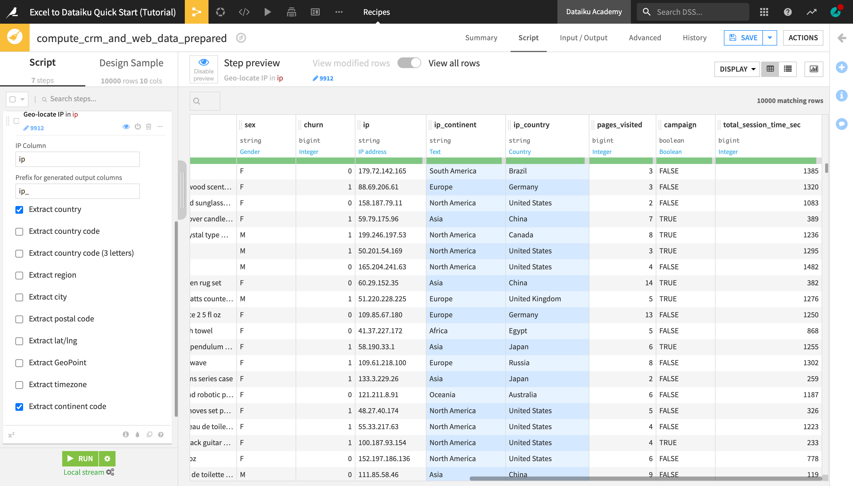
Delete the original ip column from the column header dropdown.
Click Save and then Update Schema.
Write a Formula
Dataiku DSS has a Formula language, similar to what you would find in a spreadsheet tool like Excel.
Note
Dataiku DSS formulas are a powerful expression language available in many places on the platform to perform calculations, manipulate strings, and much more. This language includes:
common mathematical functions, such as round, sum and max;
comparison operators, such as >, <, >=, <=;
logical operators, such as AND and OR;
tests for missing values, such as isBlank() or isNULL();
string operations with functions like contains(), length(), and startsWith();
conditional if-then statements.
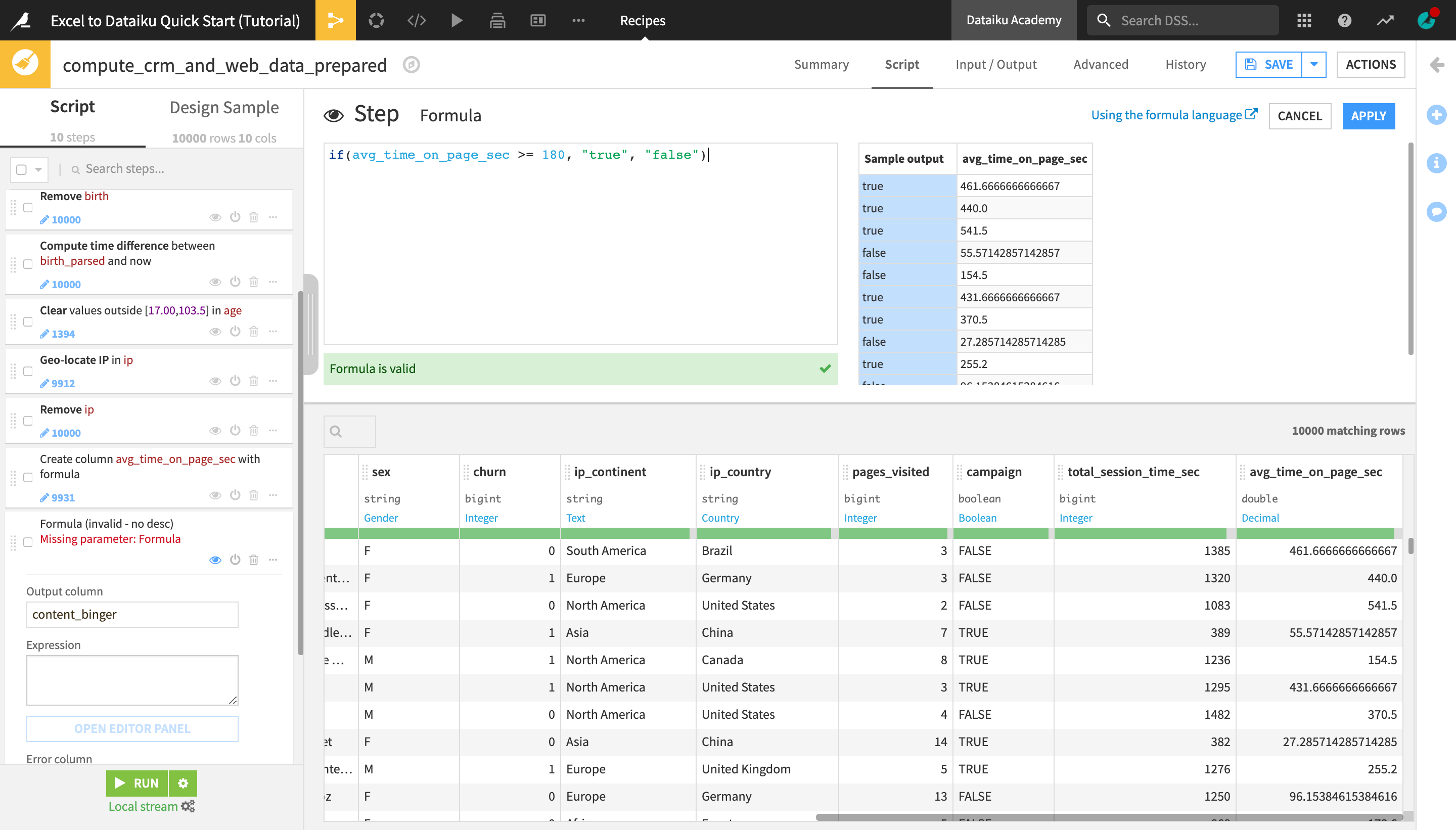
At the bottom of the recipe script, click +Add a New Step.
Choose Formula.
Change the default “Output column” name from “newcolumn_expression” to
avg_time_on_page_sec.Click Open Editor Panel to open the Formula editor.
Type the formula below and click Apply when finished.
total_session_time_sec / pages_visited
Note
You can also directly type the formula inside the expression field, but the editor panel allows you to preview the formula results interactively.
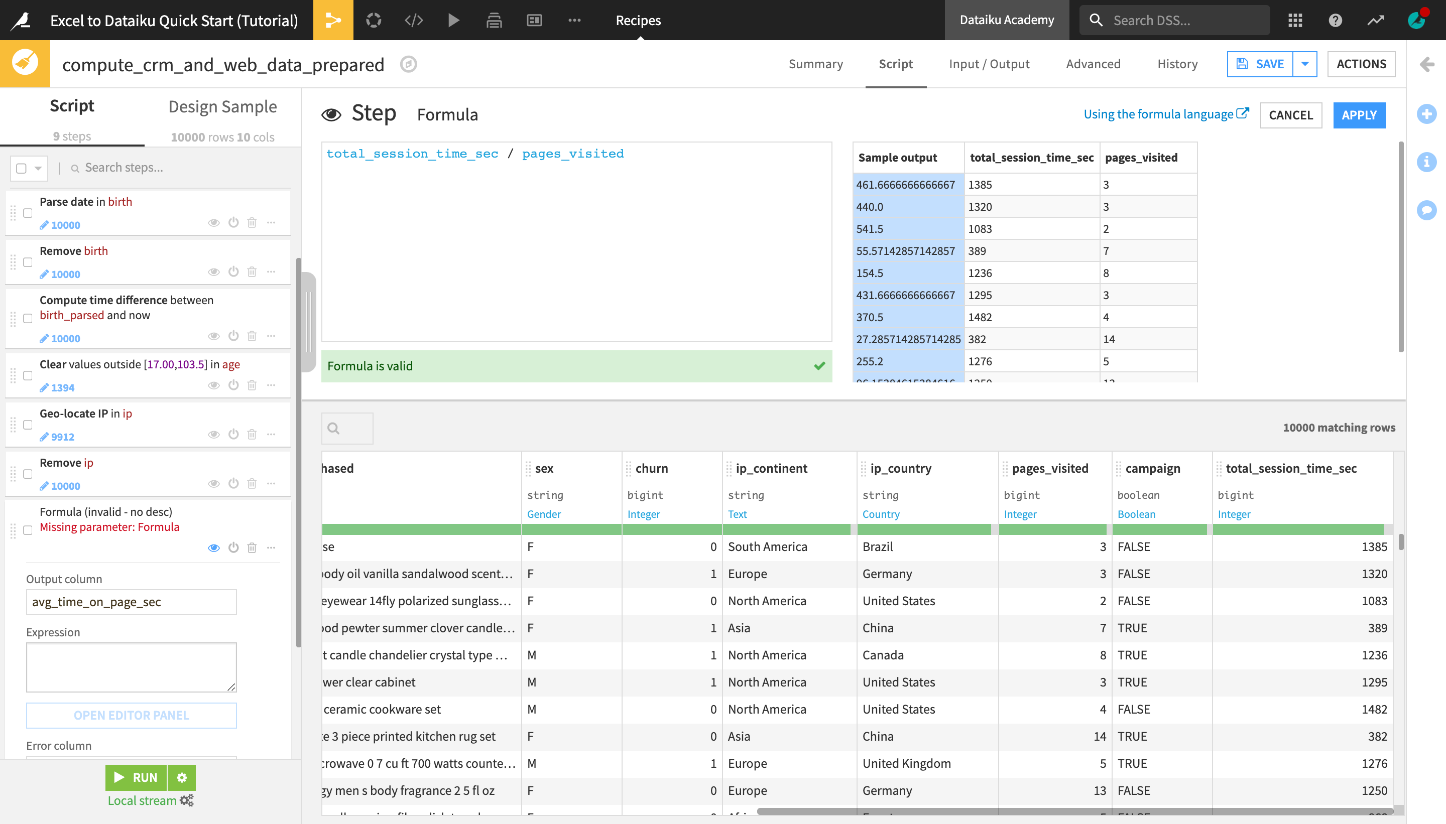
Using a very simple formula, we have enriched the dataset with a new column containing the computed average time spent on a page for each user (in seconds). We can now use this value to compute another column using an if statement in a formula.
At the bottom of the recipe script, click +Add a New Step.
Choose Formula.
Name the “Output column”
content_binger.
We will create a column that indicates whether someone is a “content binger” or not based on the average time they spend on a page of our website.
Click Open Editor Panel, type the formula below, and click Apply when finished:
if(avg_time_on_page_sec >= 180, "true", "false")
Extract Text Patterns
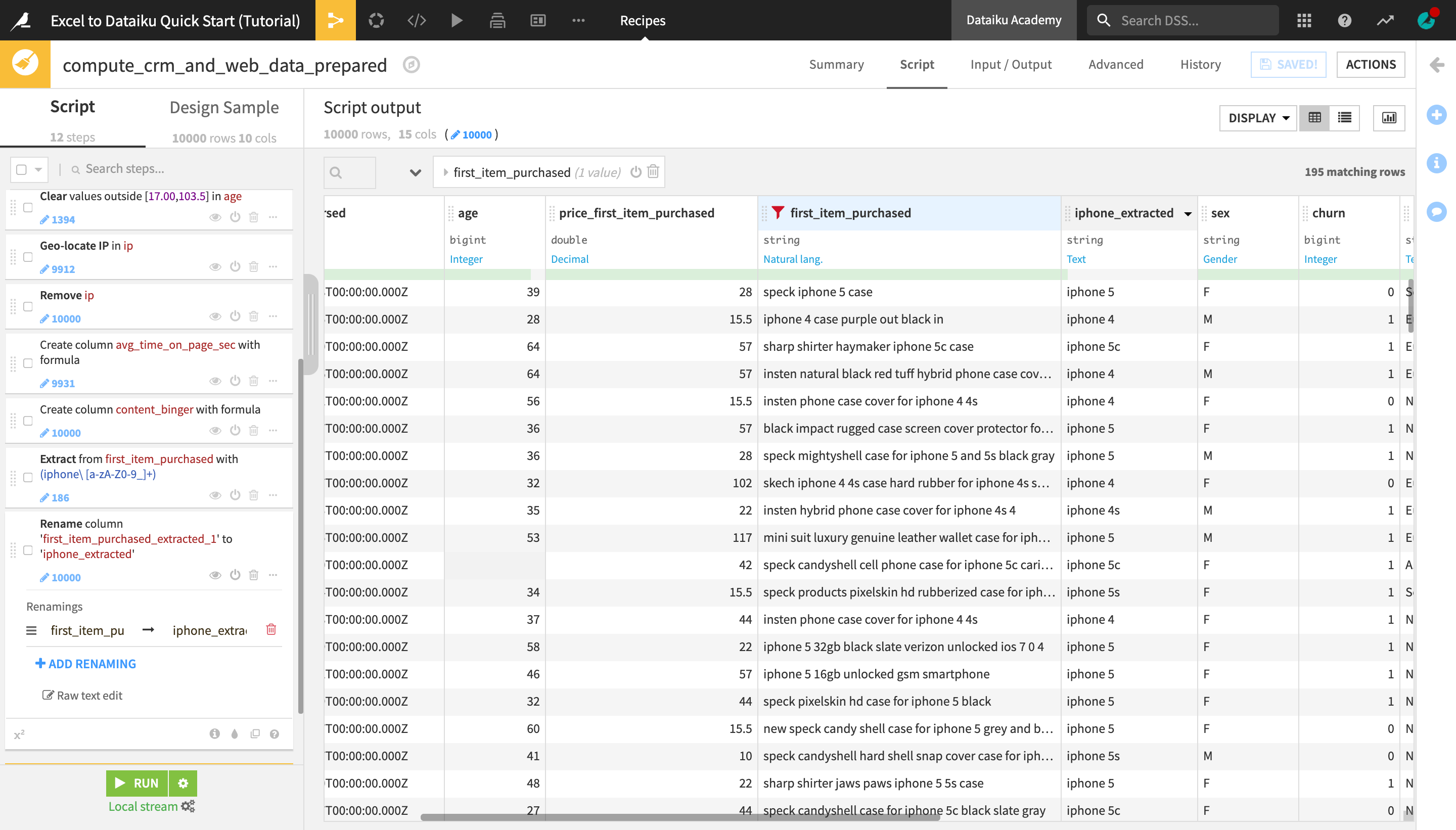
Let’s use another processor to extract substrings that match a given pattern from a text column. We will use the Dataiku DSS smart pattern builder to automatically generate a regular expression (regex) that finds mentions of “iphone”, along with the iPhone version, in the first_item_purchased column.
Note
Regular expression, or regex, is a sequence of characters arranged in a pattern so that you can find and manage sets of strings in your dataset. Dataiku DSS offers a number of useful processors to take advantage of their power.
Click the first_item_purchased dropdown, and select Filter.
Click the text (“T”) icon, and then click +Add Value.
Type
iphoneand change the “Match mode” to Substring.
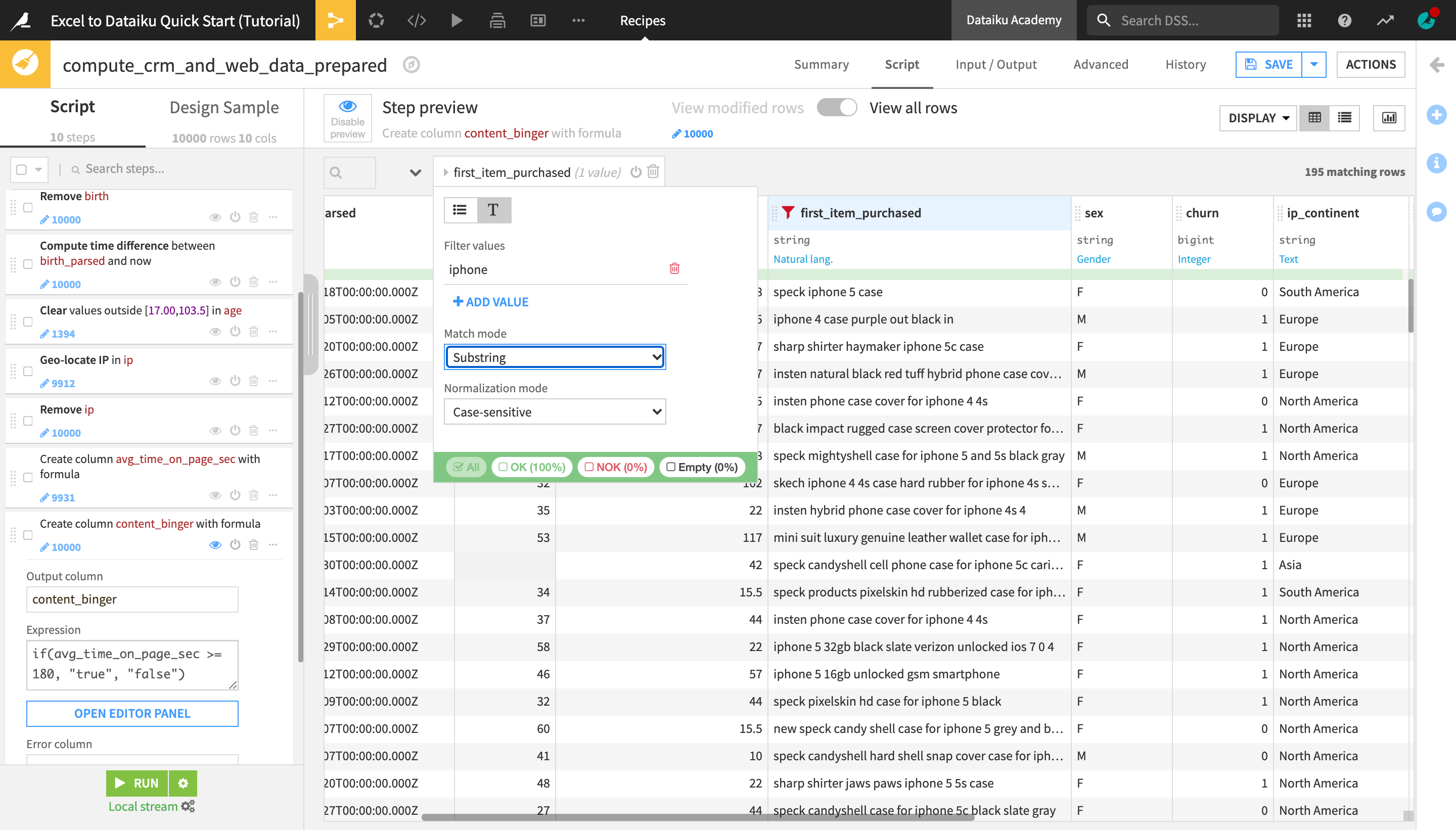
The dataset preview is now filtered to display rows that contain “iphone”, which makes it easier to find a suitable example that the smart pattern builder will use to generate the regex we need.
Find a row that says “iphone 5c” and click Extract text like iphone 5c…. Your sample may differ from the screenshot below.
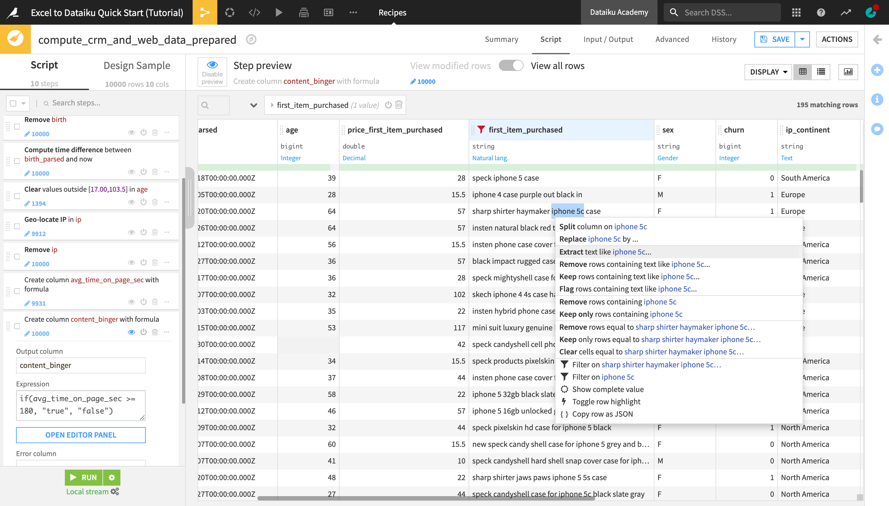
Under Input sample, find and highlight the row iphone 4 to provide the smart pattern builder with an additional example.
If you scroll down through the displayed rows, you will notice that the proposed regular expression manages to detect the mentions of “iphone ” plus the iPhone version in each row, so it fits our use case.
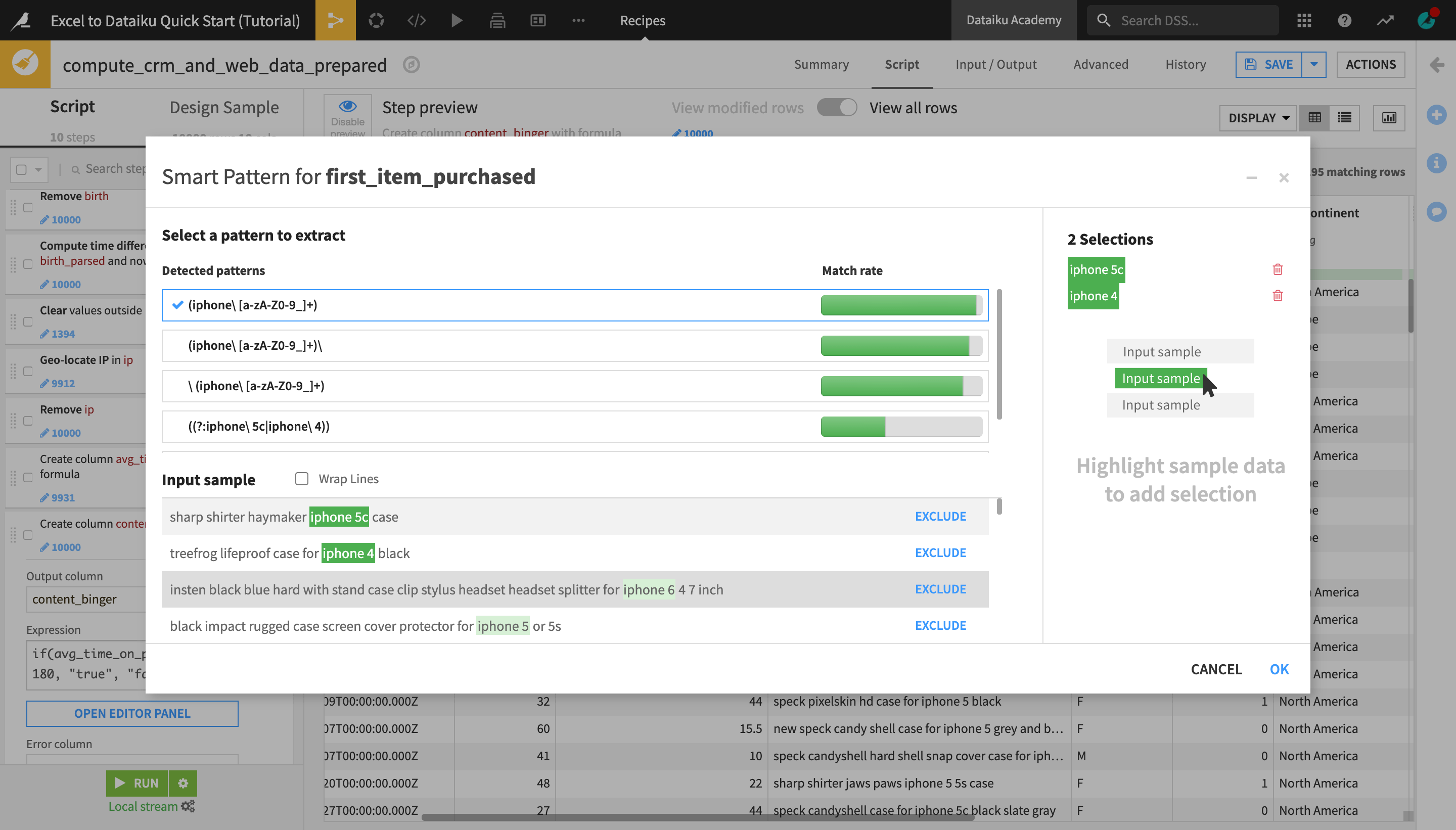
Click OK to add the step to the Prepare script.
Rename the newly created first_item_purchased_extracted_1 column to
iphone_extracted.As this is the last step for now, click Run, and then Update Schema to execute the Prepare recipe and produce the output dataset.
Remove Duplicate Rows with the Distinct Recipe
Now that we have prepared and enriched the dataset using the Prepare recipe, let’s apply another data cleaning step.
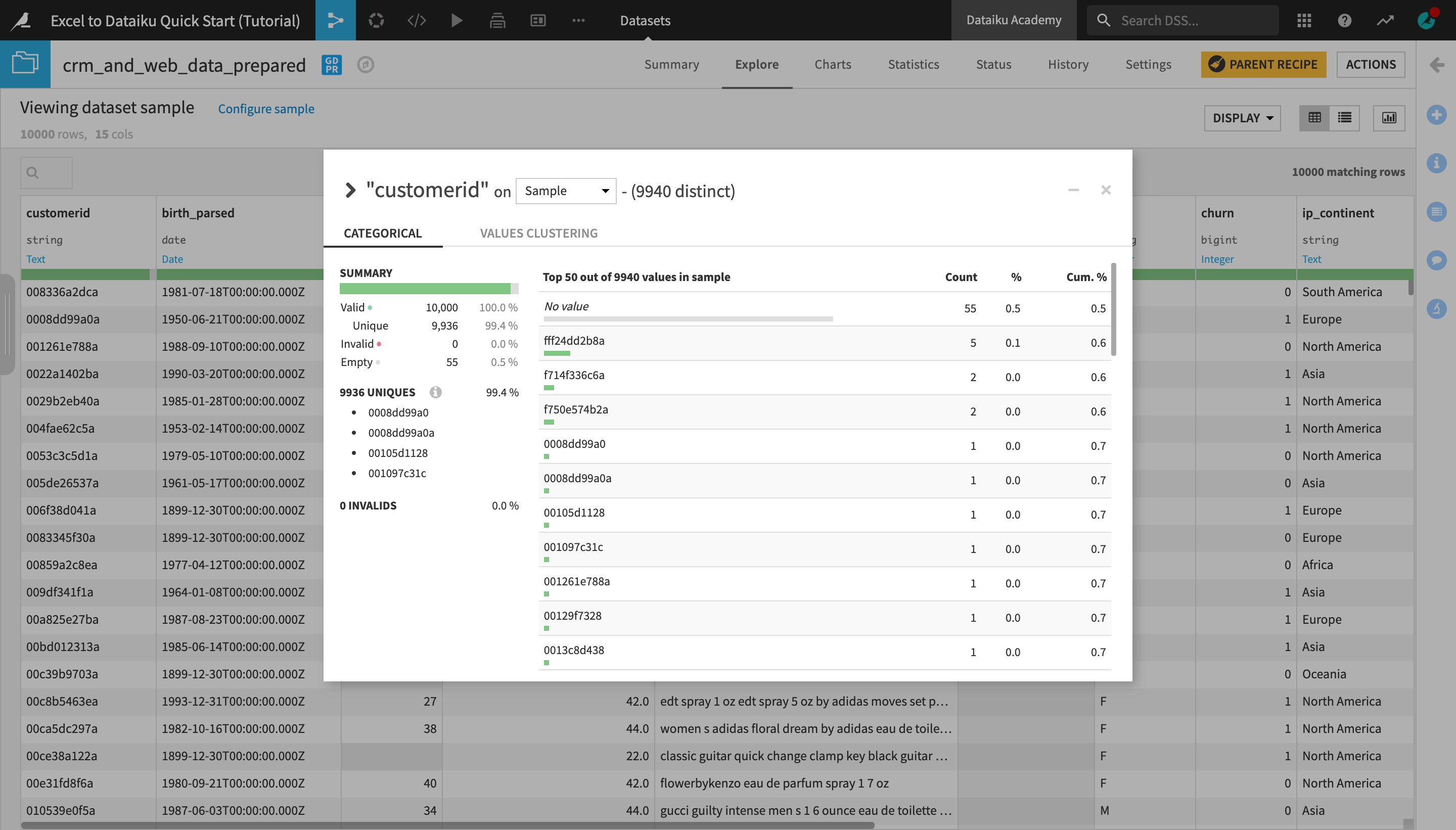
Open the output dataset, crm_and_web_data_prepared, and analyze the customerid column.
Notice that for several customer IDs there are multiple rows, which means there are duplicates in the data.
Notice that there are also a number of columns with empty values for customerid.
Close the window.
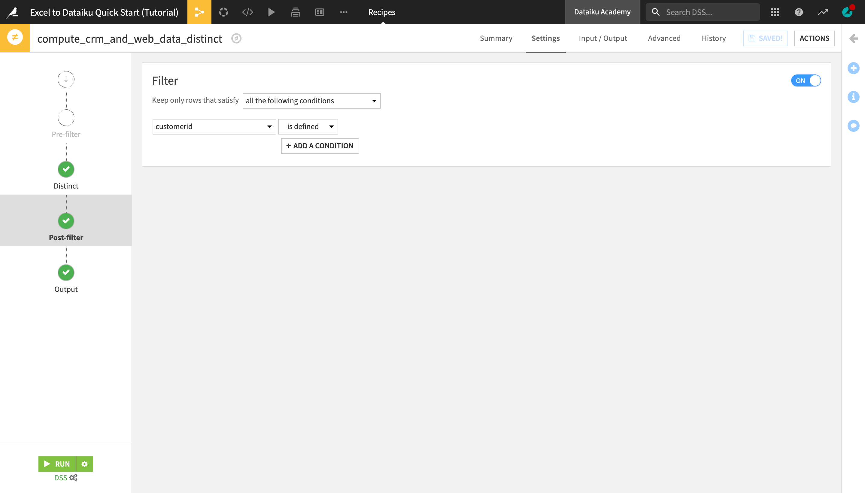
Open the Actions menu and select Distinct from the Visual recipes section.
Name the output dataset
crm_and_web_data_distinctand click Create Recipe.
You are navigated to the Distinct step, which contains the recipe settings. The recipe is set to remove all exact row duplicates (i.e. where the values in each column are the same).
Navigate to the Post-filter step and activate the Filter.
Select to keep only rows that satisfy the following condition: “customerid is defined”.
Run the recipe.
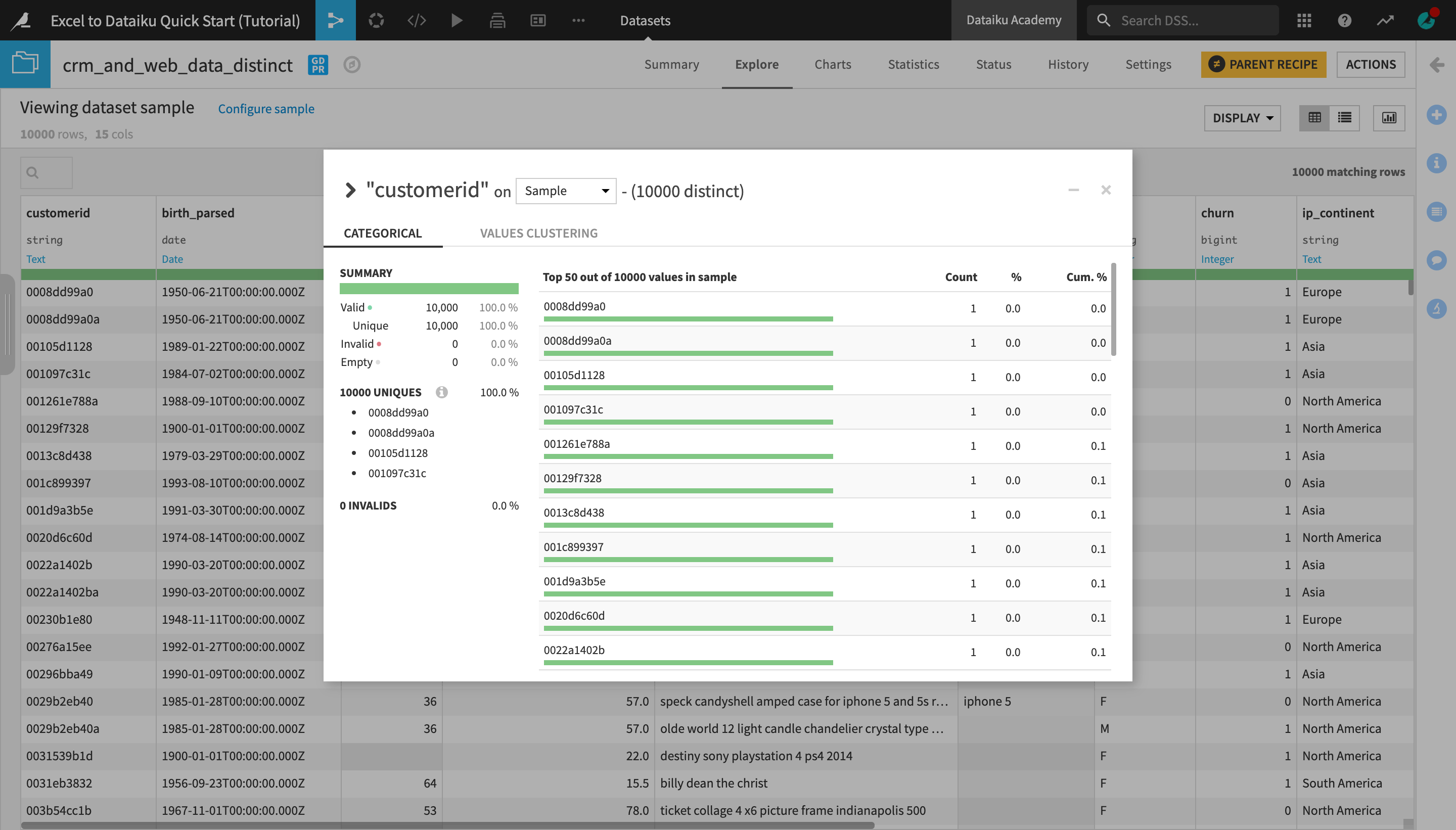
Open the output dataset and analyze the customerid column again. Notice that there is now only one row per customer ID.
Transform Datasets
In this section, we will use a number of visual recipes in order to first split our dataset into two separate ones based on a single column value, and then pivot, filter, and edit one of the output datasets to produce aggregate results for a given set of metrics.
Split a Dataset
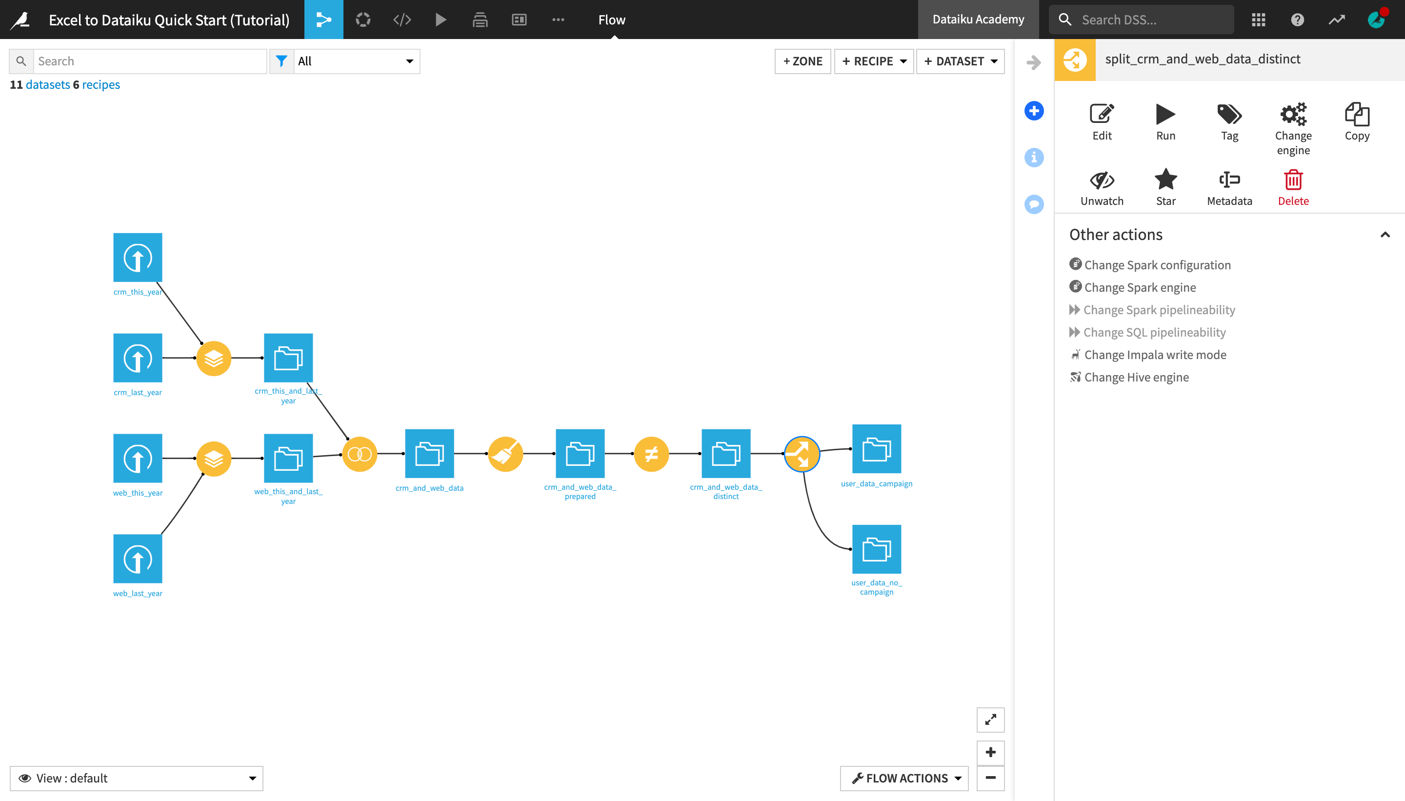
Let’s split the crm_and_web_data_distinct dataset in two datasets, one containing all the users that were part of a marketing campaign, and the other containing all the users who were not part of the campaign.
With the crm_and_web_data_distinct dataset opened or selected in the Flow, create a new Split recipe from the Actions menu.
Under “Output”, click +Add, and add two output datasets, naming them
user_data_campaignanduser_data_no_campaign.Create the recipe.
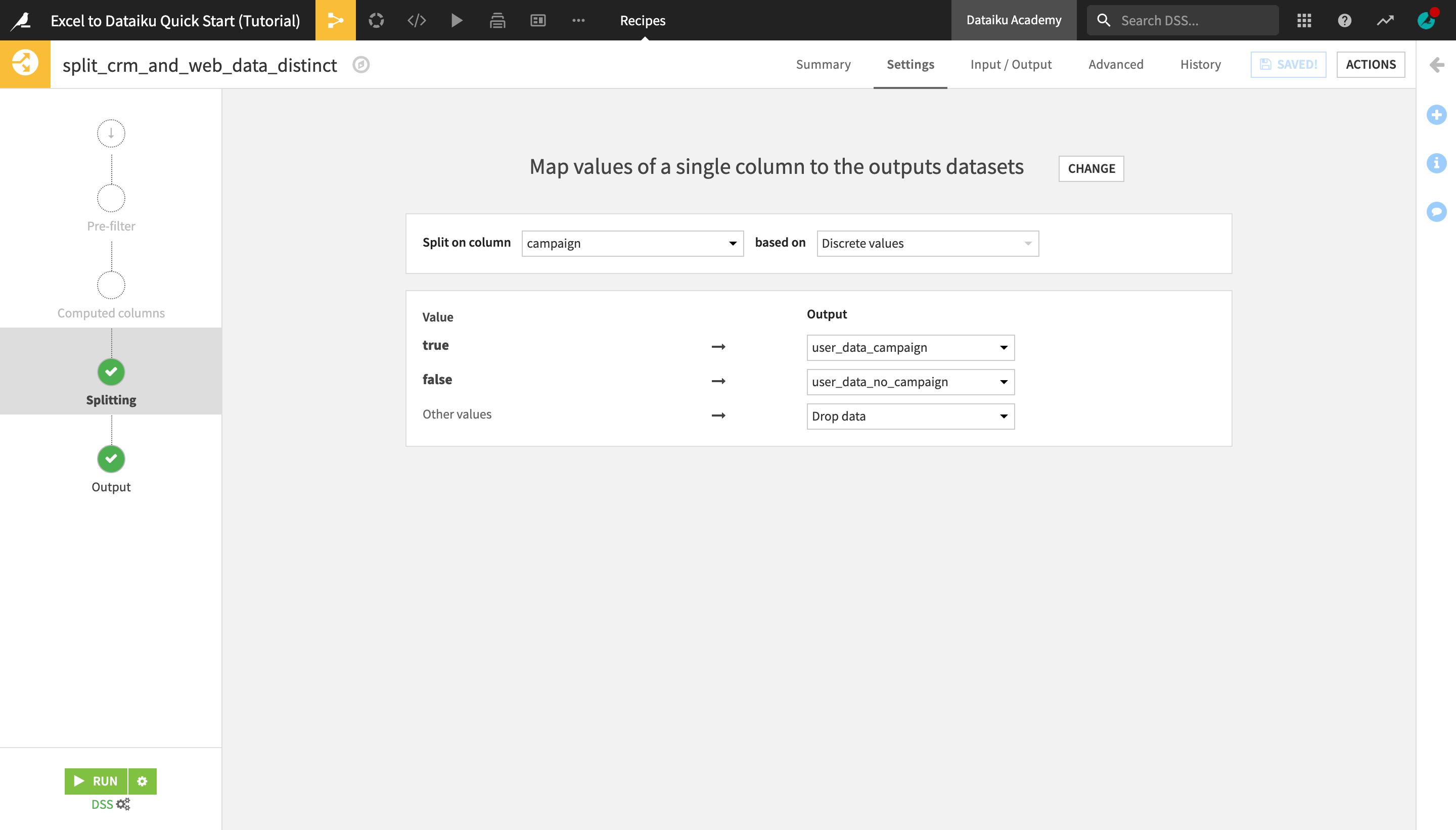
In the recipe settings, select Map values of a single column as the Splitting method.
Select campaign as the column to split on based on Discrete values.
Map the true value to the user_data_campaign output dataset and the false value to the user_data_no_campaign output dataset.
We know these are the only two possible values, but select Drop data as the output for “Other values” to be sure.
Run the recipe and return to the Flow.
The two output datasets of the Split recipe now appear as separate “branches” of the Flow.
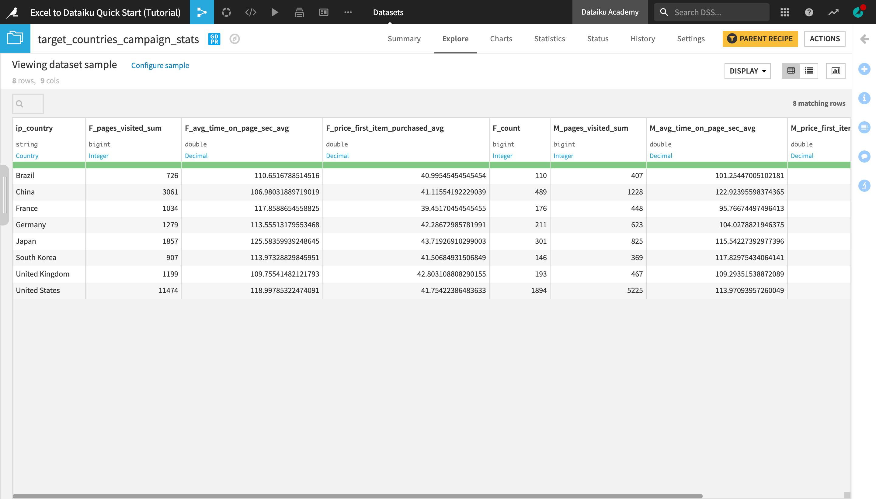
Create a Pivot Table
Let’s now use the Pivot recipe to compute aggregate values on a set of metrics for the user_data_campaign dataset. This operation is similar to creating a pivot table in Excel.
Note
A pivot table allows you to summarize selected columns and rows of data into a meaningful report.
In Dataiku DSS, to produce a dataset equivalent to an Excel pivot table, you can use the Pivot recipe.
The Group Recipe can also produce aggregated statistics, but no columns are pivoted. Think of it as creating an Excel pivot table without specifying any Column fields.
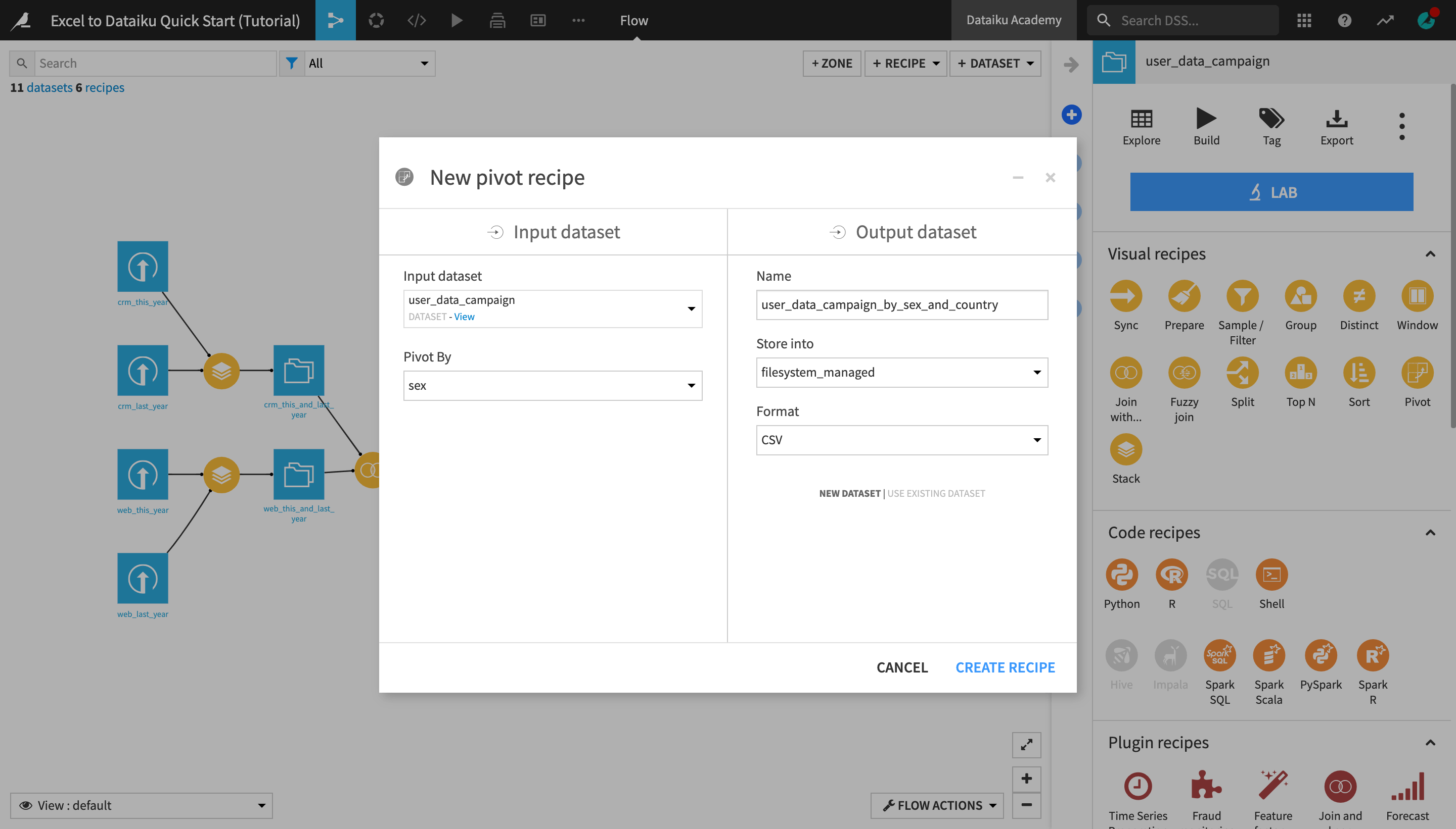
With the user_data_campaign, create a new Pivot recipe.
Select sex as the column to Pivot by.
Name the output dataset
user_data_campaign_by_sex_and_country, and click Create Recipe.
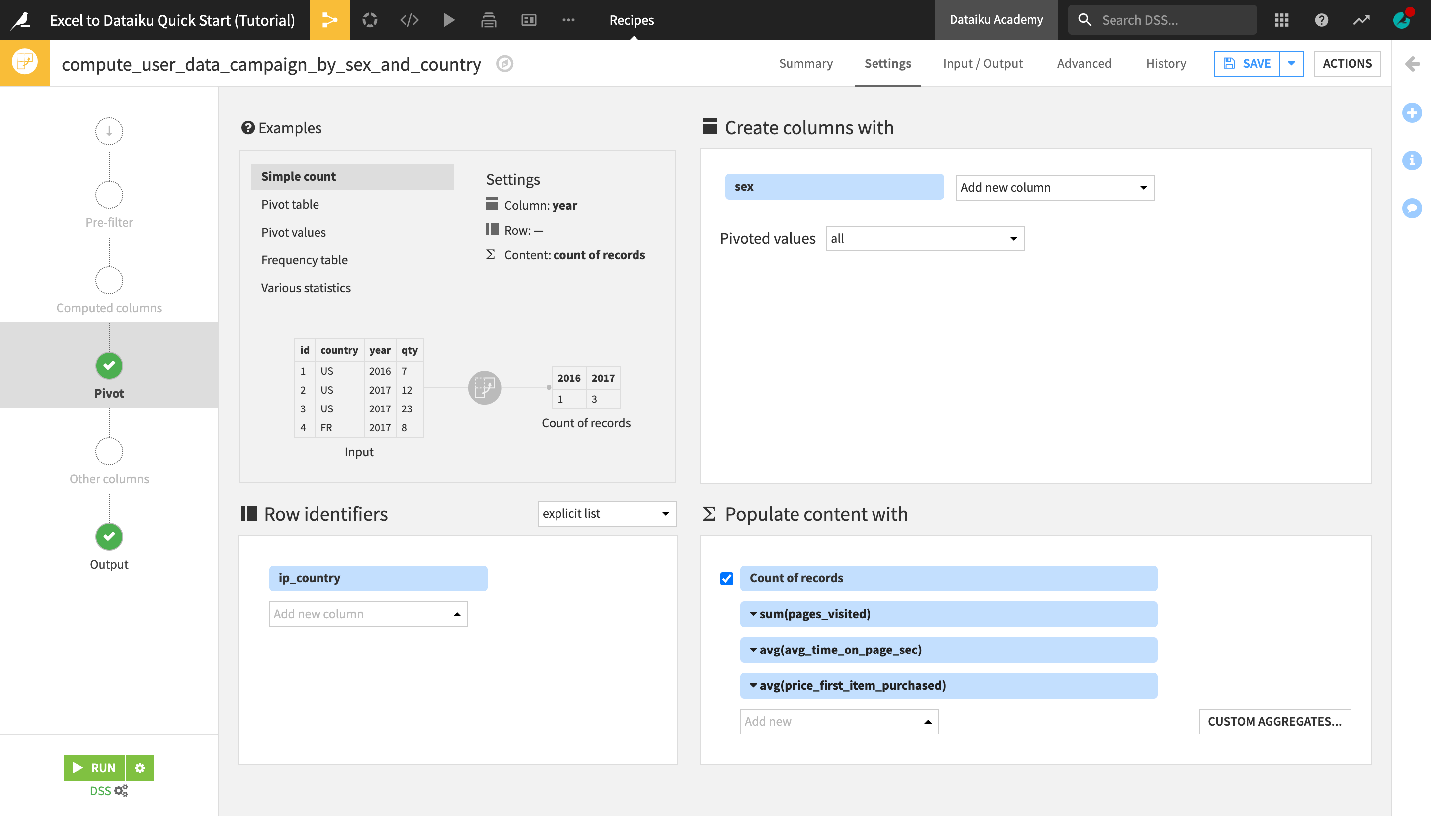
Now in the top left panel of the Pivot recipe settings, you can interactively explore examples of different pivot table configurations. You can then modify the settings in the other three panels.
In the Create columns with panel, change the number of “Pivoted values” from “most frequent 20 values” to all.
Under Row identifiers, select ip_country.
This will create a pivot table where each row represents a country and each column value is a computed metric aggregated by country and broken down by sex. Now, let’s define these metrics.
Under Populate content with, in addition to “Count of records”, select:
pages_visited, with the aggregation mode set to SUM (click the dropdown arrow next to the column name to change the aggregation mode);
avg_time_on_page_sec, with the aggregation mode set to AVG; and
price_first_item_purchased, with the aggregation mode set to AVG.
Run the recipe and explore the output dataset.
Filter a Dataset
Next, we will filter the pivot table so that it only displays results for certain “target” countries that we are interested in.
With the user_data_campaign_by_sex_country dataset opened or selected, open the Actions menu, and create a new Sample / Filter recipe.
Name the output dataset
target_countries_campaign_stats, and create the recipe.Set the “Sampling method” to No sampling (whole data). As this is the final data transformation step, we want the output dataset to contain summary statistics about the whole data.
Activate the Filter and select to keep rows that satisfy all of the following conditions:
F_count >= 50; andM_count >= 50.
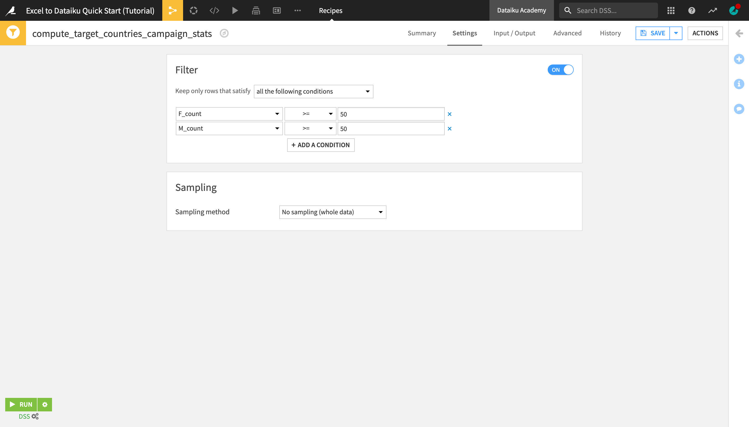
This ensures that the output dataset contains information only about the countries that have at least 50 male and at least 50 female customers.
Run the recipe and explore the output dataset.
Tip
Optionally, you could choose to sort the dataset based on a certain criteria (e.g. in descending order of F_pages_visited_sum and/or M_pages_visited_sum. There are two ways to do this:
Sort only the dataset preview by selecting Sort from the header dropdown of the column you wish to sort by. This is useful for getting a quick preview of the rows sorted in a certain way, but it does not actually sort the dataset–only its preview for the chosen sample.
Use the Sort recipe to apply a “permanent” sorting of your choice to the entire dataset.
Edit a Dataset Manually
As you have seen in the course of this tutorial, one of the key differences between Dataiku DSS and a spreadsheet tool is that most edits and transformations of the underlying data are applied and recorded in recipes, separately from the datasets themselves (in this case, using the visual interface, but they could also be done through code). This is a more scalable and error-proof way of working with large datasets compared to manually editing spreadsheets.
However, for certain specific use cases that require manual data inputs, Dataiku DSS makes it possible to make datasets editable. Let’s try this now.
With the target_countries_campaign_stats dataset opened or selected, open the Actions menu.
Under “Other recipes” near the bottom, click Push to editable.
Name the output datasets target_countries_campaign_stats_edit, and click Create Recipe.
Select ip_country as the unique key identifier.
Check “Add rows in the output if their keys are in the input” and “Add columns in the output if they are in the input”.
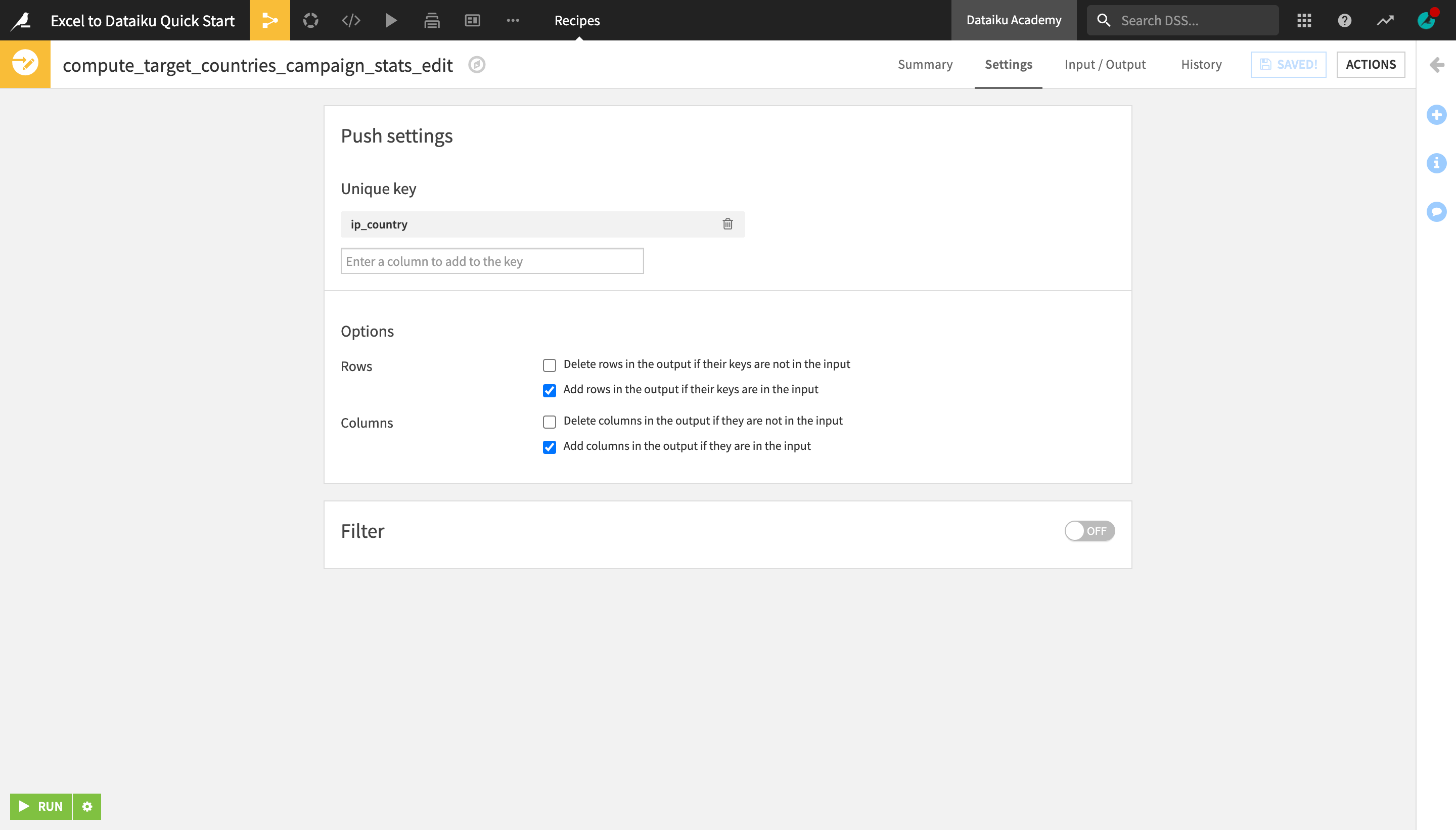
Run the recipe and explore the output dataset.
Notice that an extra Edit tab has been added to the dataset preview and its icon in the Flow has changed to a pencil.
Open the Edit tab.
Right-click the ip_country column header and select Insert column after.
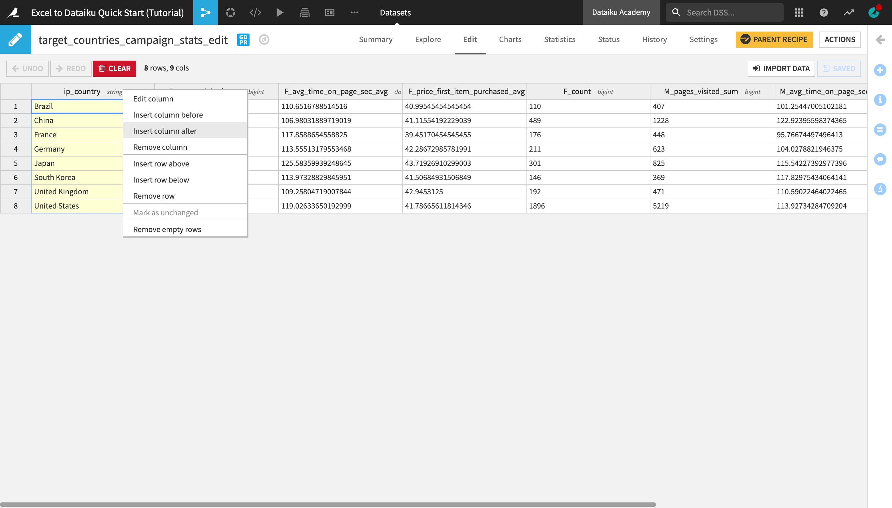
Double-click the newly created new_column header, change the column name to
sales_territoryand click OK.
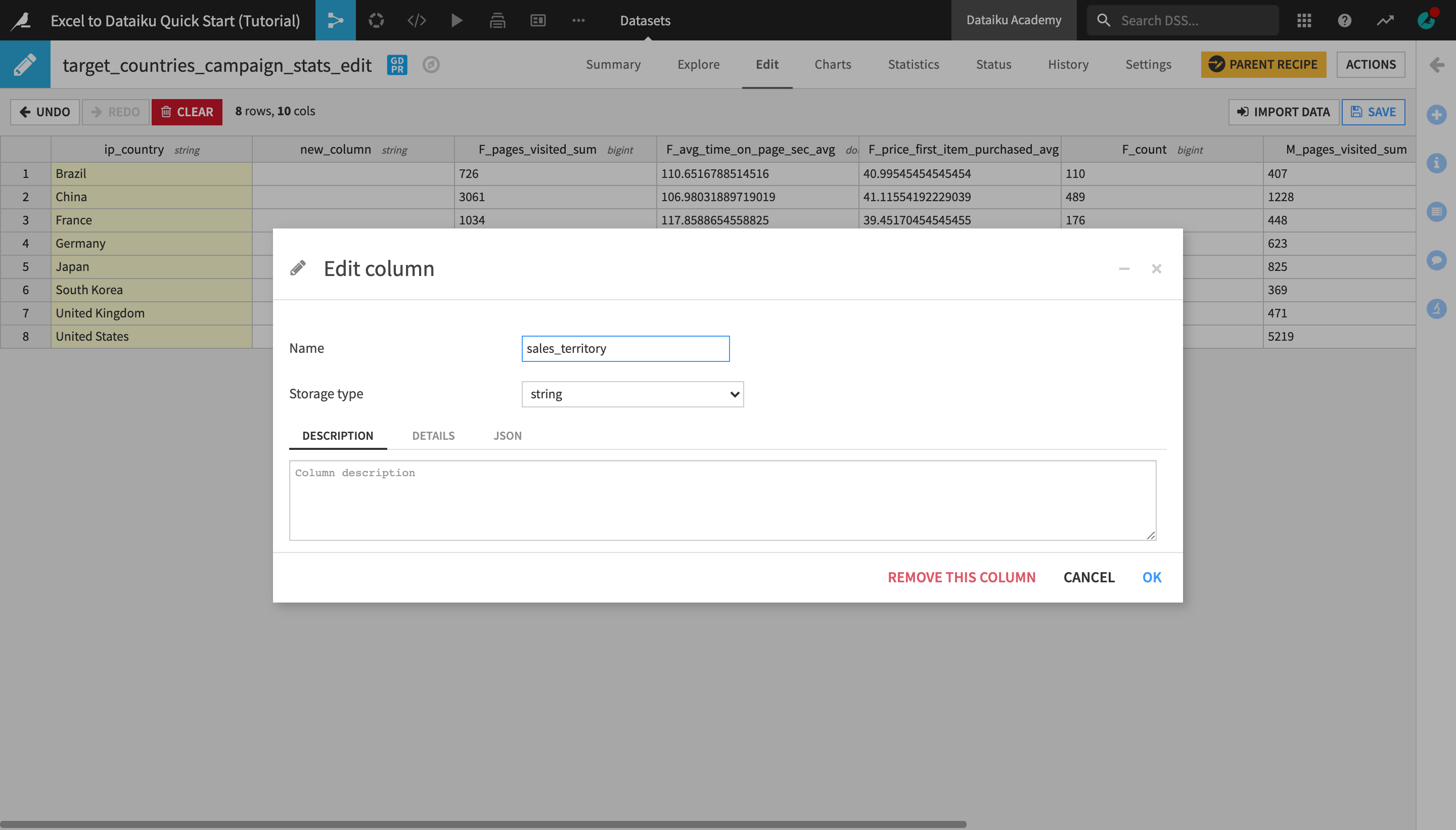
Type the following values in the corresponding column cells for each country row:
for Brazil, type
LATAM;for China, Japan, and South Korea, type
APAC;for France, Germany, and the United Kingdom, type
EMEA;for the United States, type
NAM.
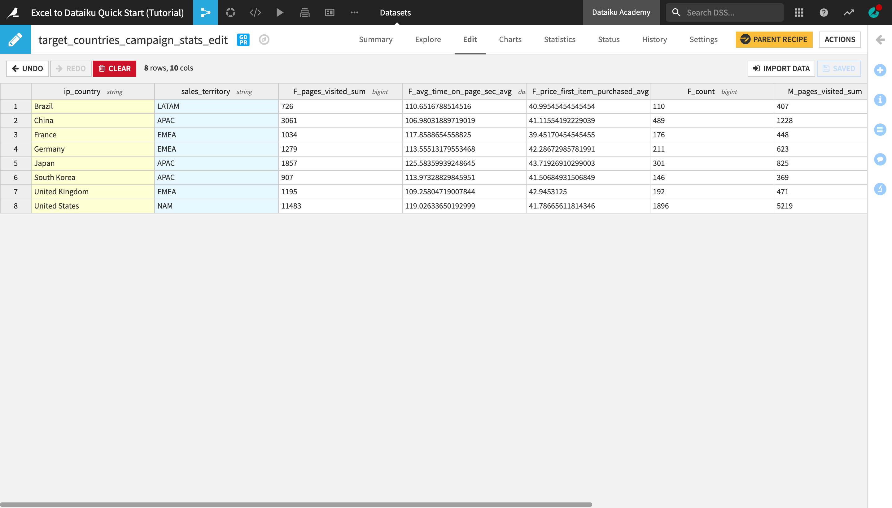
Click Save and return to the Explore tab to observe the changes made.
Warning
While editable datasets can be useful where manual user inputs are necessary, they are not a recommended way of working with datasets when applying data transformations on a larger scale. For example, a more reproducible solution to this problem would be creating a separate table of countries and sales territories, and then joining it to the main dataset.
Create and Publish Insights
The ability to quickly visualize data and communicate results is an important part of any data project.
Note
Dashboards allow users to share elements of a data project with other users, including ones that may not have full access to the project.
A Dataiku DSS project can contain multiple dashboards. Each dashboard is made of multiple slides. Each slide is made of multiple tiles.
Tiles can be one of two types: “simple” tiles (static text, image, embedded page) or “insight” tiles. Each “insight” tile displays a single insight.
An insight is a piece of information, such as a chart or table, that can be shared on a dashboard.
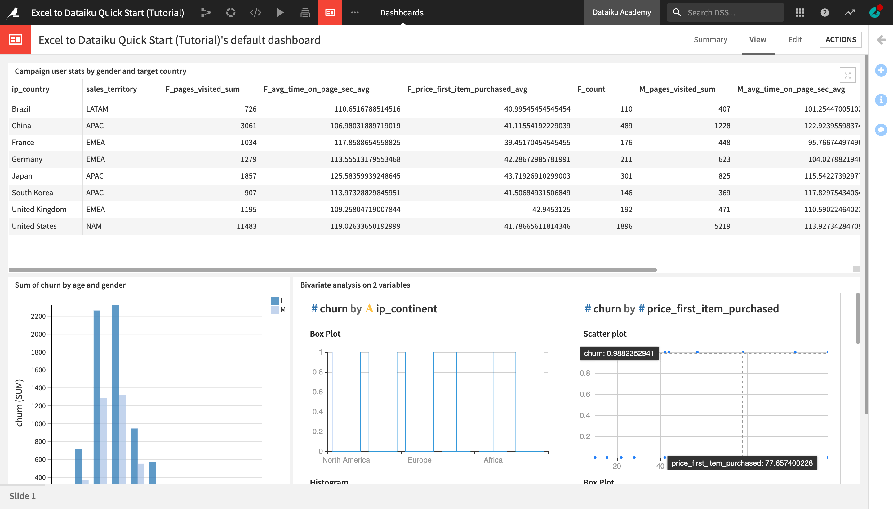
Publish a Table on a Dashboard
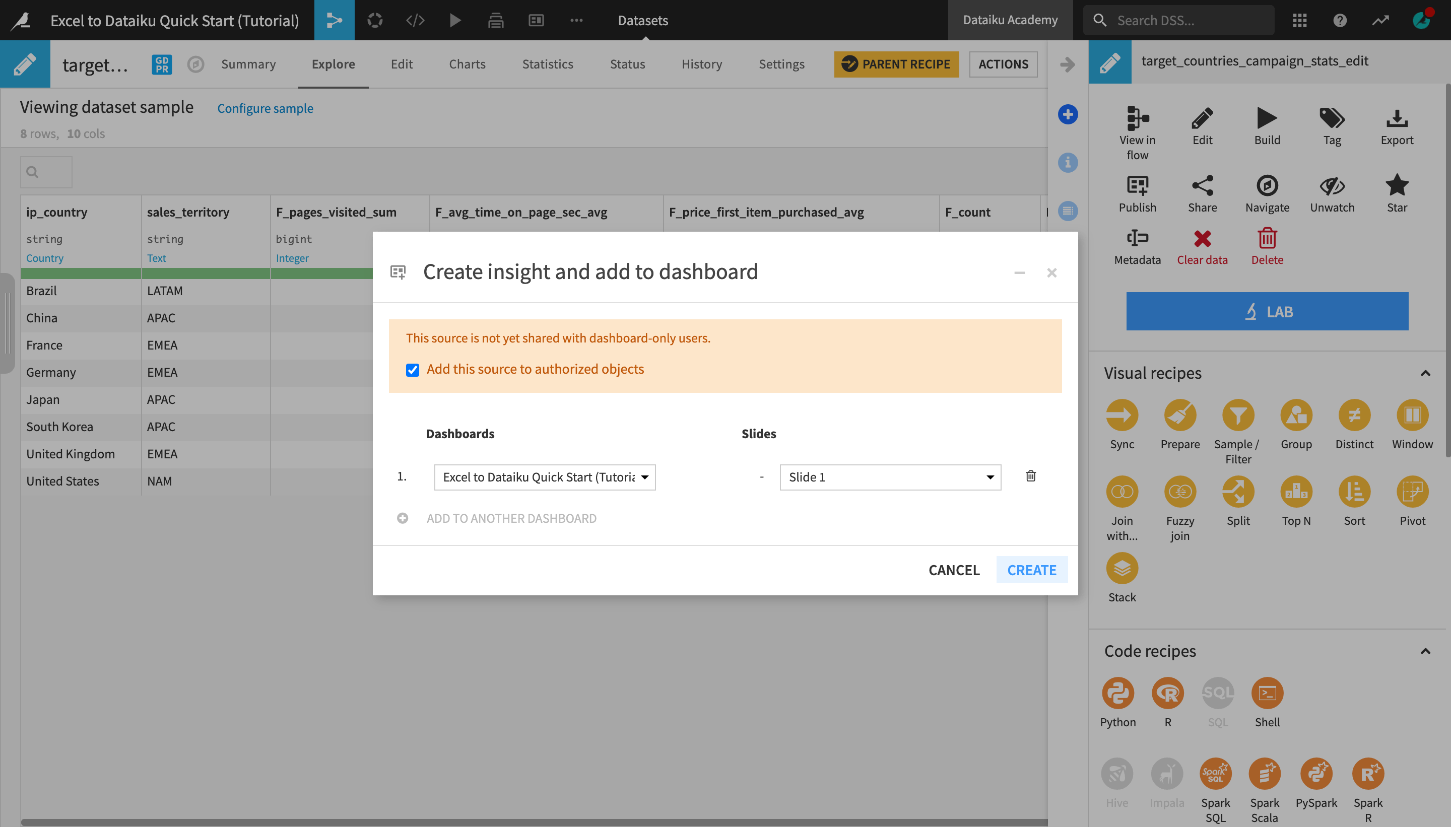
With the target_countries_campaign_stats_edit dataset opened or selected, open the Actions menu.
Click the “More actions” (the three vertical dots) icon and select Publish.
Click Create to create a table insight from the dataset and publish it on the project’s default dashboard.
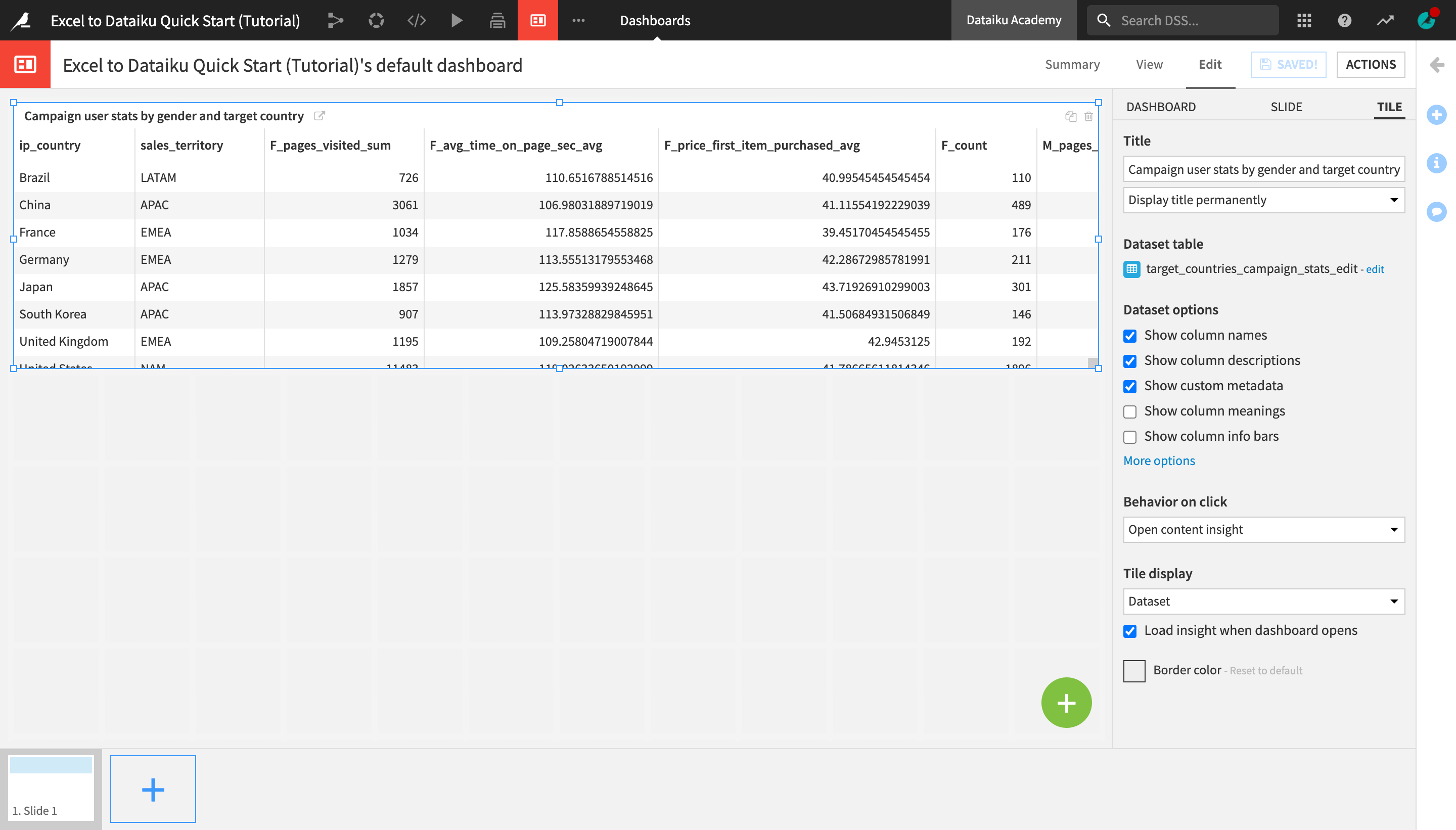
You are navigated to the dashboard where the insight was published. You can edit the insight or drag and resize it in a way that makes the most sense.
In the right sidebar, change the Title to
Campaign user stats by gender and target country.Optionally, resize and/or readjust the position of the table on the dashboard.
Click Save when you’re done.
Open the View tab to see how the insight appears on the dashboard.
Create and Publish Charts
Let’s now use Dataiku DSS’s native visualization tools to discover patterns in the data.
Note
The Charts and Statistics tabs of a dataset provide drag-and-drop tools for creating a wide variety of visualizations and statistical analyses.
Create a Bar Chart
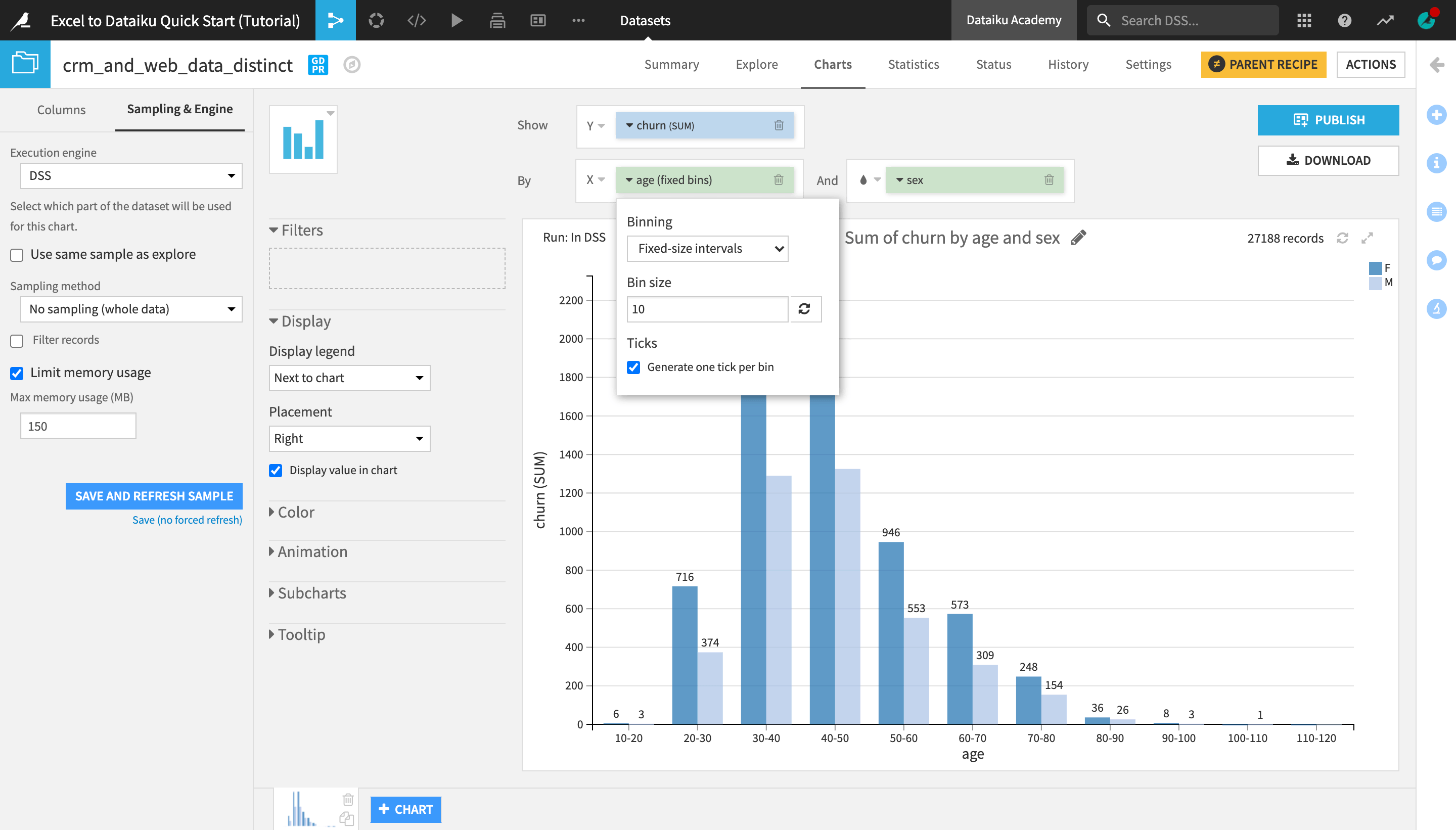
Let’s visualize how churn differs by age and sex.
Go to the Flow, and open the crm_and_web_data_distinct dataset.
Navigate to the Charts tab.
From the list of columns on the left, drag the churn column to the Y-axis and age to the X-axis.
Click on the churn dropdown in the Y-axis field to change the aggregation from AVG to SUM.
Click on the age dropdown in the X-axis field to change the binning method to Fixed size intervals.
Reduce the bin size to
10.Adjust the Ticks option to generate one tick per bin.
Under “Display” in the left sidebar, check Display value in chart.
Add the sex column to the And field.
Tip
Optionally, you can change the default color palette of the chart (or set up custom colors) from the “Color” section of the left sidebar.
Be aware that charts, by default, are built on the same sample as in the Explore tab. To see the chart on the entire dataset, you need to change the sampling method.
On the left hand panel, switch from “Columns” to Sampling & Engine.
Uncheck “Use same sample as explore”.
Change the Sampling method to No sampling (whole data).
Click Save and Refresh Sample.
Publish a Chart
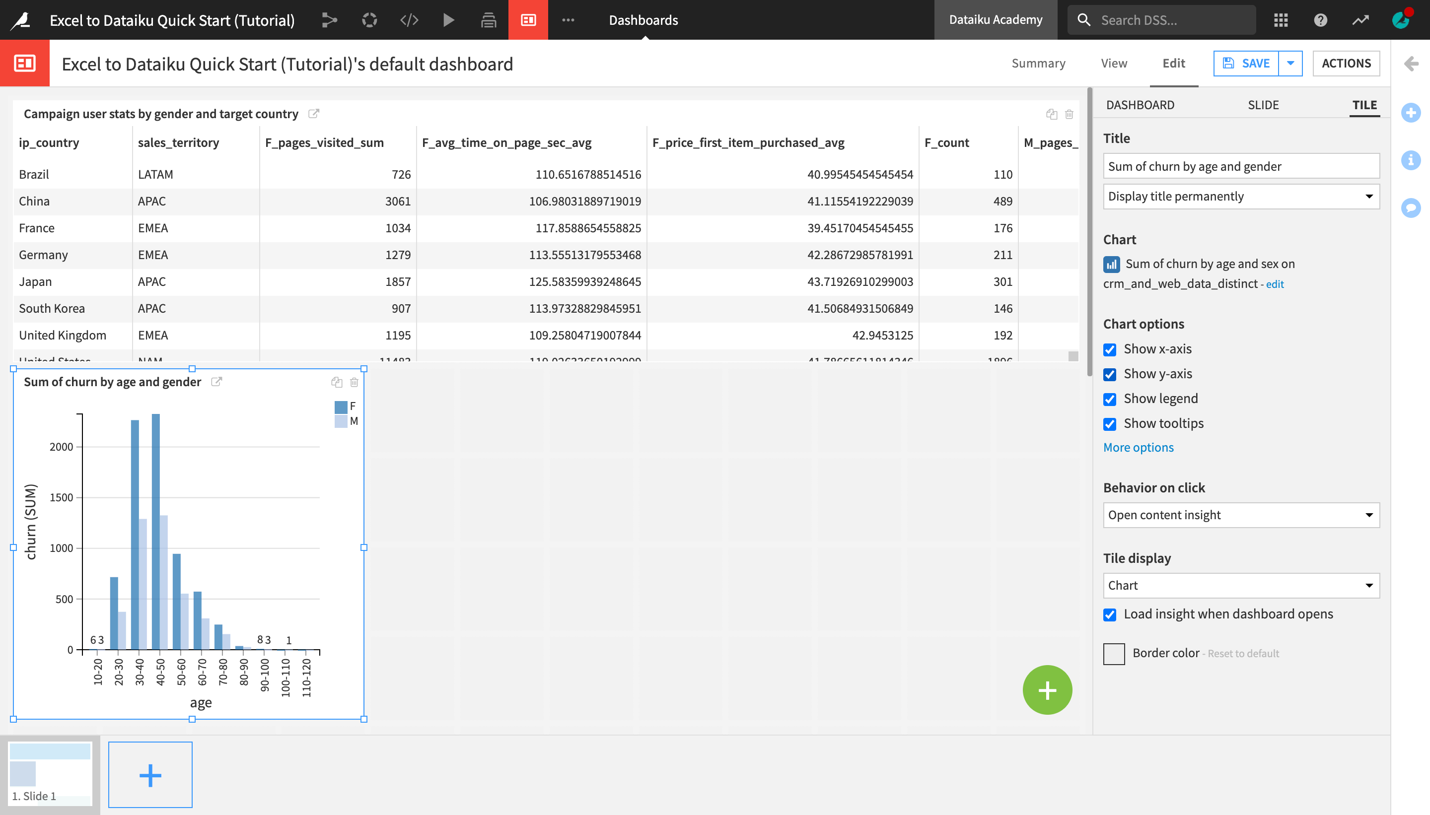
Let’s now publish the chart we created on the dashboard.
Click Publish in the upper right corner of the Charts tab.
Click Create.
Just like when publishing a dataset, you are once again navigated to the Edit tab of the dashboard.
From the right sidebar, check Show legend.
You can also optionally rename, resize, and/or rearrange the chart on the dashboard.
Create a Statistical Worksheet
You can also run a number of common statistical tests to analyze your data with more rigor. You retain control over the sampling settings, confidence levels, and where the computation should run.
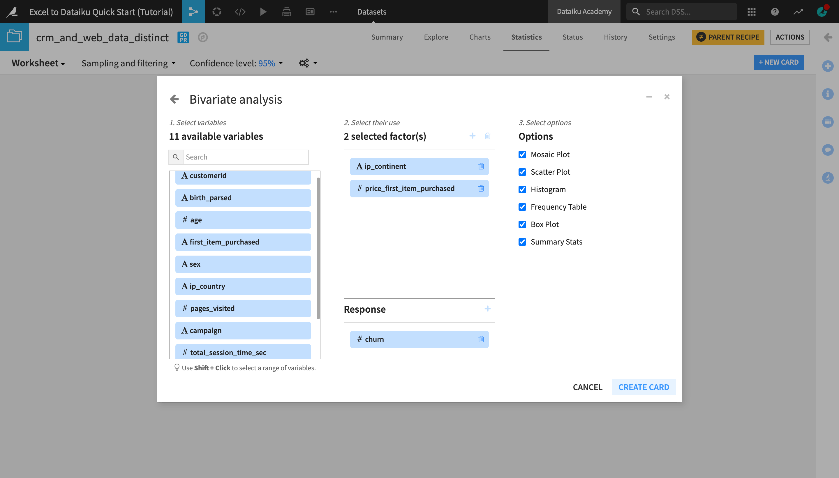
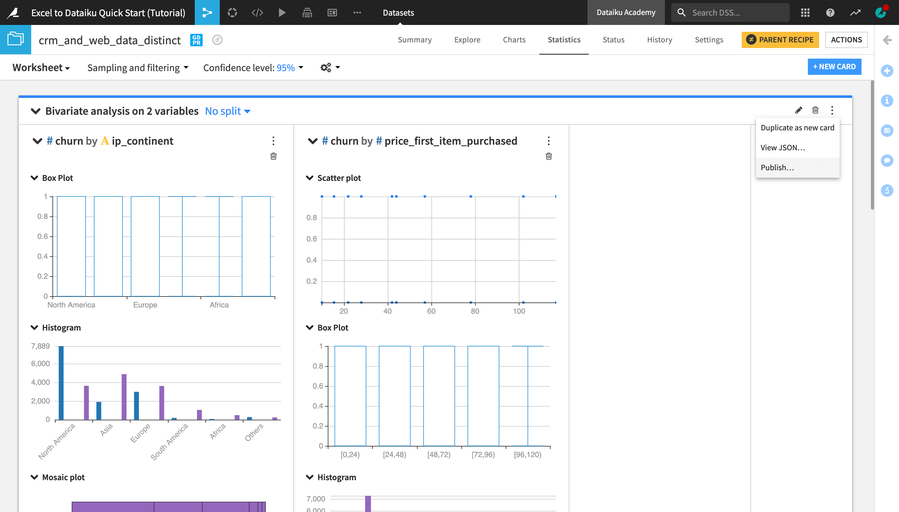
Create a Bivariate Analysis Statistics Card
Open the crm_and_web_data_distinct dataset.
Navigate to the Statistics tab.
Click +Create your First Worksheet > Bivariate analysis.
From the list of available variables on the left, select ip_continent and price_first_item_purchased.
Click the plus to add them to the Factor(s) section (or drag them to the Factors box).
Add churn to the Response section in the same way.
Click Create Card.
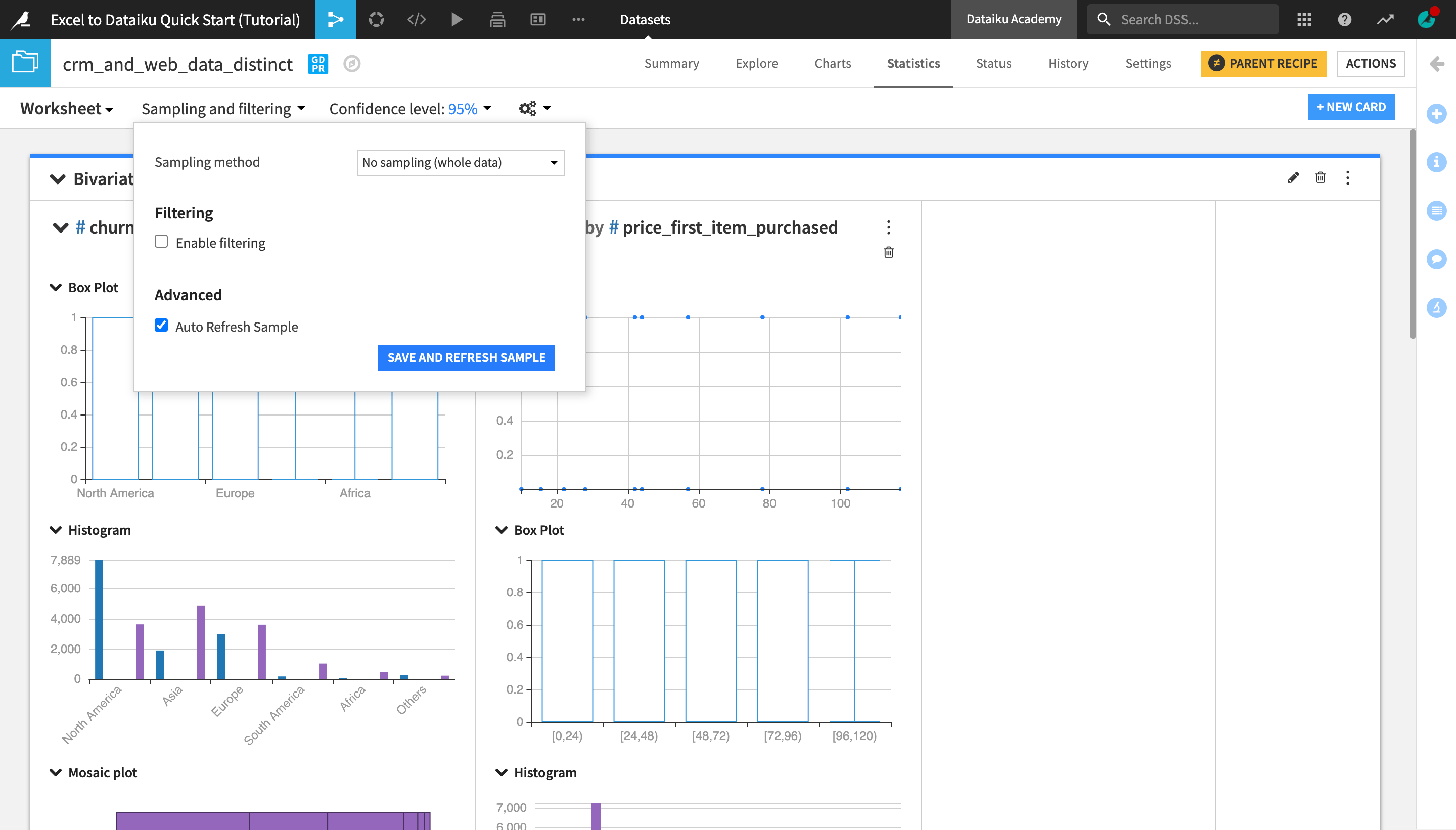
From the Sampling and filtering dropdown near the top left of screen, change the Sampling method to No sampling (whole data) and click Save and Refresh Sample.
Explore the output of your first card in your first statistical worksheet.
Tip
Feel free to add more cards to your existing worksheet or create a new one with a different kind of statistical analysis!
Publish a Statistics Card
To publish the statistics card you just created to a dashboard:
Click the “More Options” (the three vertical dots) icon at the top right corner of the screen.
Select Publish… and click Create.
Optionally, you can rename and/or adjust the size and position of the statistics card from the Edit tab of the dashboard, and then view the finished dashboard in the View tab.
Export Reports and Data
After building an analytics project and creating a dashboard or other report in Dataiku DSS, you might want to export it, its elements or the underlying data in order to share with stakeholders or perform further analysis outside of DSS.
Export a Dashboard
Warning
If you are not working in Dataiku Online, you will need to run an installation script (or ask an administrator of your instance to enable the feature) in order to be able to export dashboards.
To export a dashboard as a PDF, JPEG or PNG file:
Open the dashboard’s Actions menu and select Export.
Optionally, modify the default File type, Size and Orientation from the dropdown menus.
Click Export Dashboard.
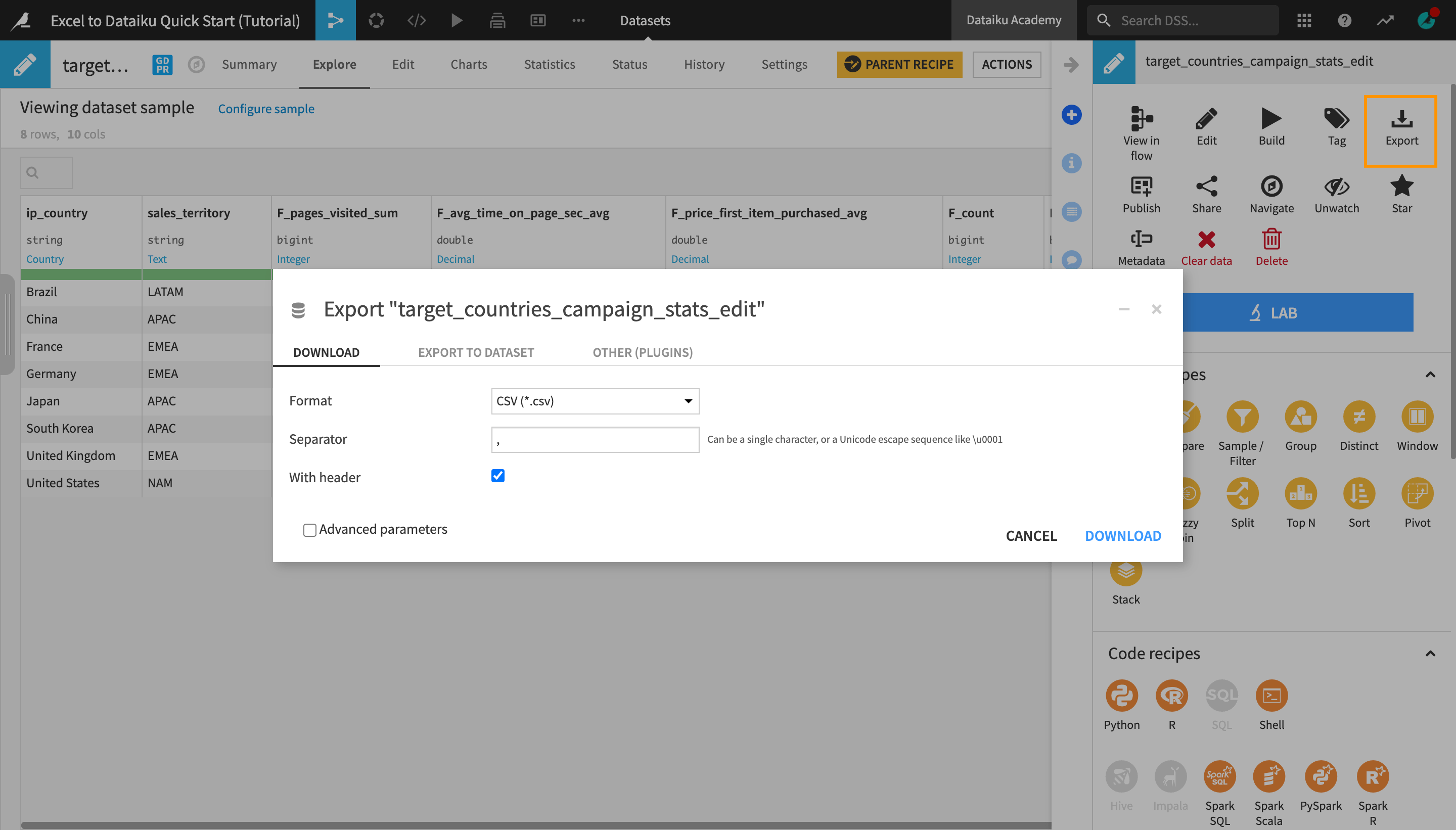
Export a Dataset
To export a dataset as a CSV or Excel file, among other formats:
Navigate to the Flow.
Select the end dataset that you would like to export, in this case, target_countries_campaign_stats_edit.
Optionally, modify the default format and settings from the dropdown menus.
Click Download.
Tip
In addition to exporting datasets as static CSV or Excel files, there are multiple plugins and other integrations that allow you to export and synchronize data to other tools, such as Google Sheets, Power BI, etc.
Next Steps
Congratulations! In a short amount of time, you were able to:
Connect to and join datasets;
Explore, prepare, and enrich data using Dataiku DSS’s visual tools;
Transform datasets and create a pivot table, all while keeping a trace of each transformation stage in the Flow;
Visualize data using Dataiku DSS’s native charts and statistics tools; and
Publish insights on a dashboard.
The work of a Dataiku DSS advanced analytics user doesn’t have to stop here. This simple example used static data sources (Excel files) but in real life, you’ll often have daily incoming new data and/or would need to go back and make changes to earlier stages of your workflow and then propagate them “downstream”.
In order to make sure that your final outputs and reports are up-to-date, Dataiku DSS offers easy to use and robust workflow management and automation tools. To learn more about these, complete the Core Designer learning path and certification, and then move on to the following advanced courses:
the Flow Views & Actions course; and
the Automation course.
Tip
This quick start tutorial is only the tip of the iceberg when it comes to the capabilities of Dataiku DSS. To learn more, please visit the Academy, where you can find more courses, learning paths, and certifications to test your knowledge.