Hands-On: Dash Webapp
In this tutorial, we’ll create a simple Dash webapp in Dataiku DSS. We’ll use sample sales data from the fictional Haiku T-shirt company, similar to the data used in the Basics tutorials.
Let’s Get Started!
Prerequisites
Some familiarity with Python;
Some familiarity with Plotly is recommended but not required.
Technical Requirements
An instance of Dataiku DSS - version 9.0 or above (Dataiku Online can also be used);
A Python code environment that includes the dash package.
Note
If you are using Dataiku Online, you can use the “dash” code environment. Otherwise, you can follow the instructions in this article to create a code environment compatible with all courses in the Developer learning path.
This tutorial was tested using a Python 3.6 code environment. Other Python versions may be compatible.
Webapp Overview
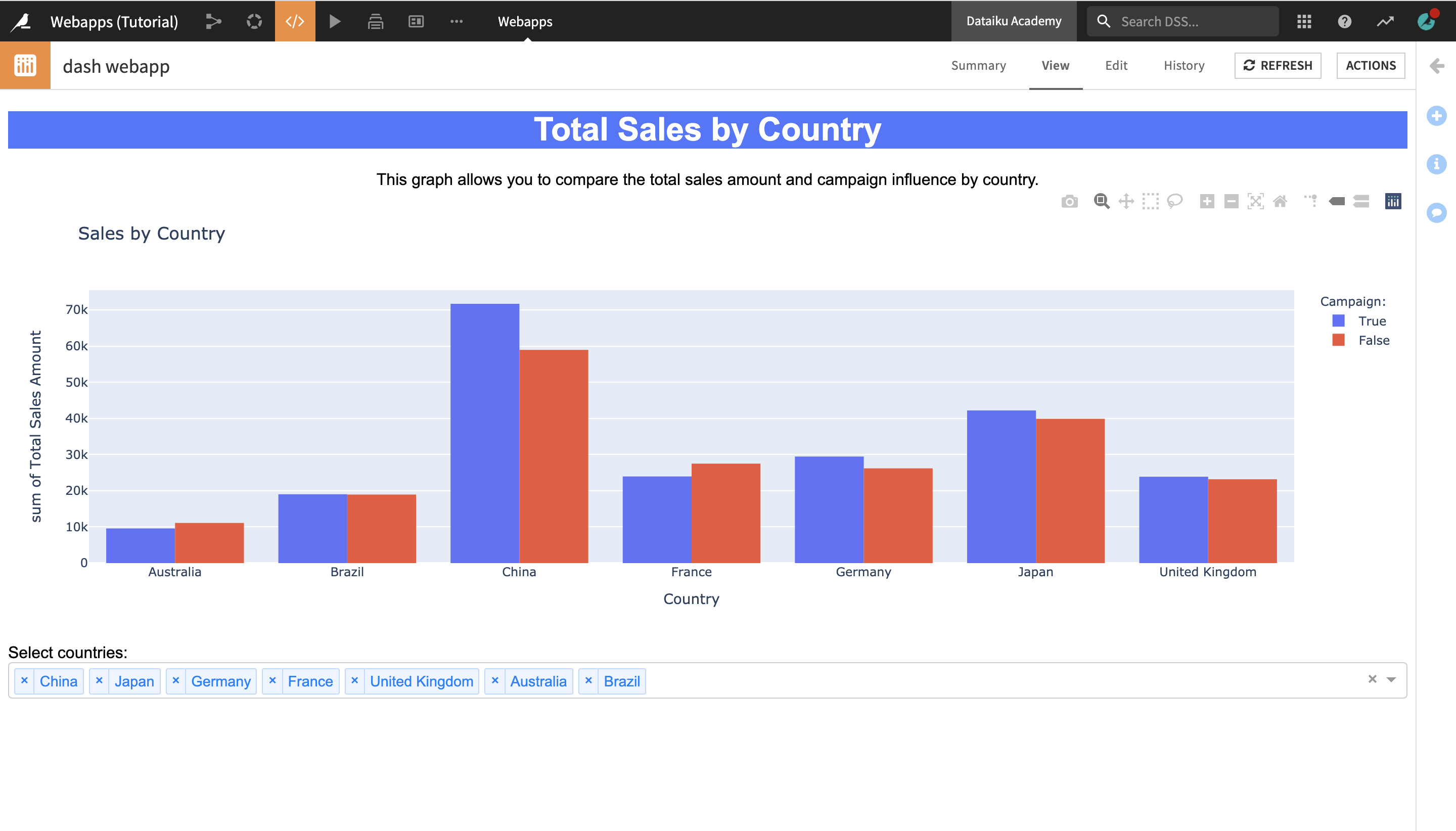
We will create a webapp which displays a histogram allowing to compare the sales of Haiku T-shirt items in different countries, as well as what part of the sales were influenced by a marketing campaign. The webapp will include a dropdown menu to select which countries to display.
The finished webapp is shown below.
Create Your Project
Create your project by selecting one of these options:
Import a Starter Project
From the Dataiku homepage, click +New Project > DSS Tutorials > Developer > Visualization (Tutorial).
Download and Import Dataset Into New Project
Alternatively, you can download the Orders_by_Country_sorted dataset and import it into a new project.
Create a New Dash Webapp
To create a new empty Dash webapp:
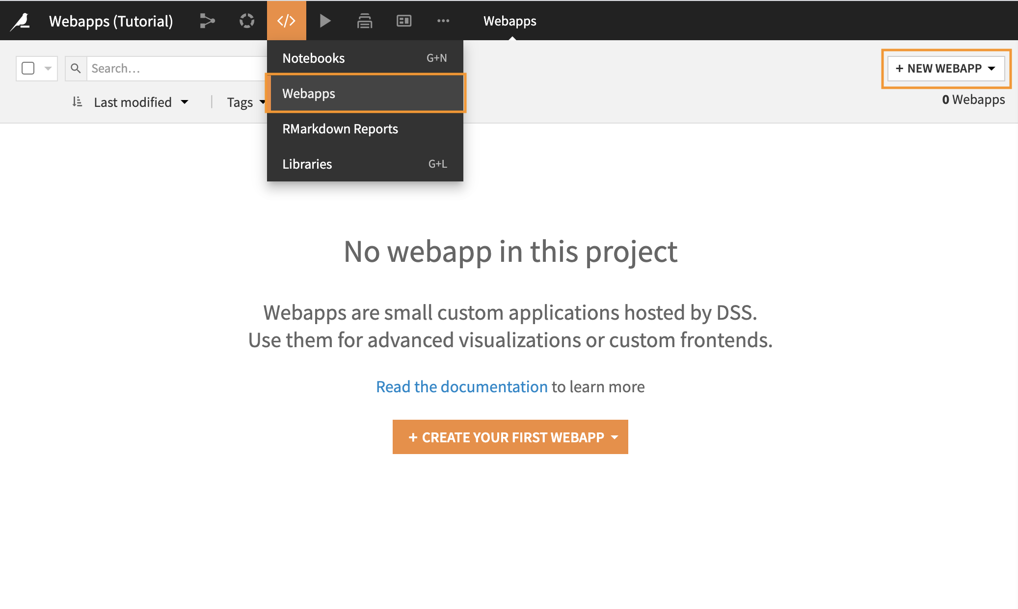
In the top navigation bar, select Webapps from the Code (</>) menu.
Click +Create Your First Webapp (in the center of the page) or + New Webapp (in the top right corner of the page).
Click Code Webapp > Dash > An empty Dash app
Type a simple name for your webapp, such as
dash webapp, and click Create.
You will land on the Edit tab of the webapp.
Explore the Webapp Editor
The webapp editor is divided into two panes.
The left pane allows you to see and edit the Python code underlying the webapp.
The right pane gives you several views on the webapp.
Tip
You can drag the line separating the two panes to adapt their width according to your preference.
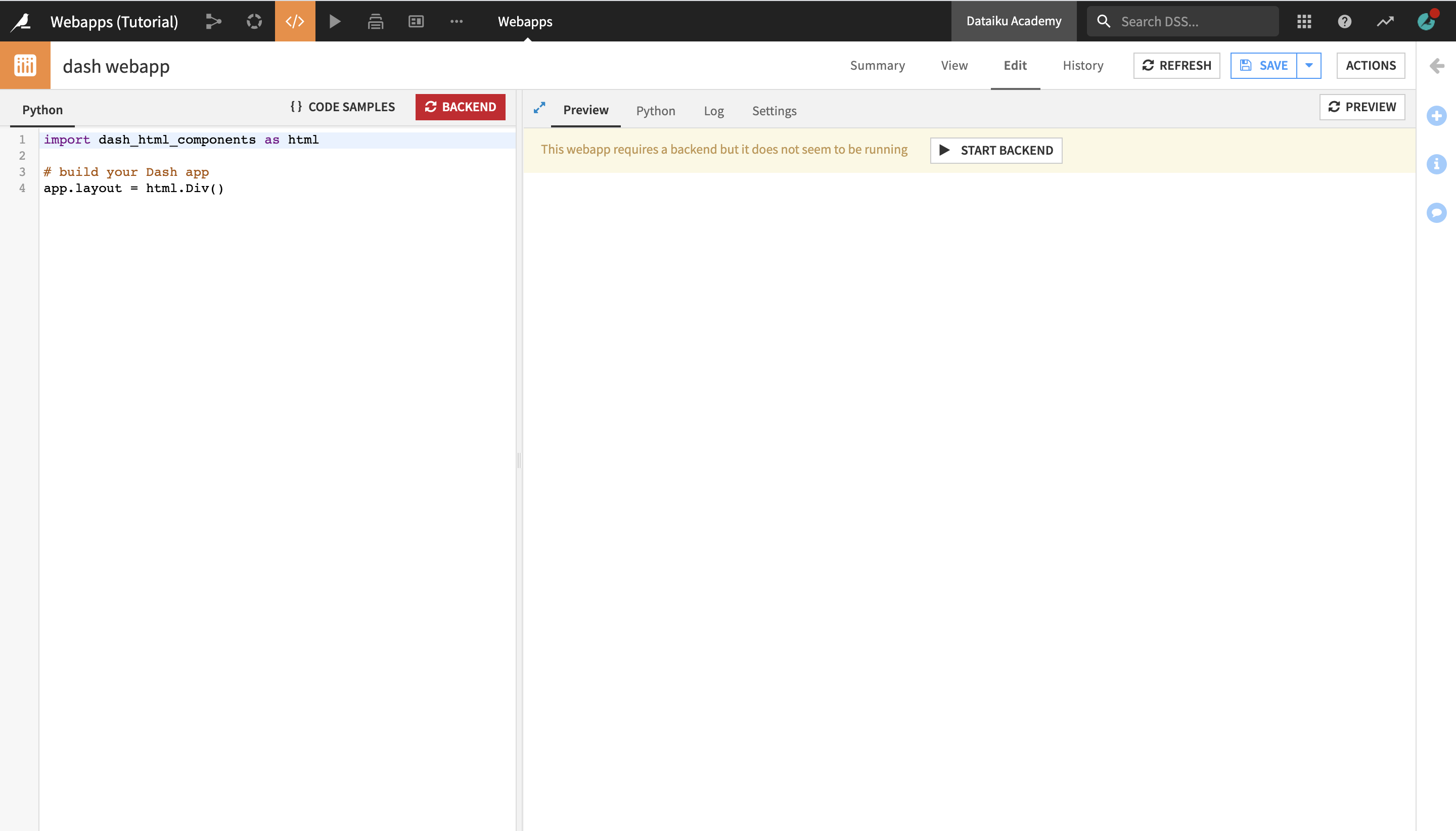
The Preview tab allows you to write and test your code in the left pane while having immediate visual feedback in the right pane. At any time you can save or reload your current code by clicking on the Save button or the Reload Preview button.
The Python tab allows you to look at different portions of the code side-by-side in the left and right panes.
The Log is useful for troubleshooting problems.
The Settings tab allows you to set the code environment for this webapp, if you want it to be different from the project default.
Change the Code Environment
Notice the message highlighted in yellow in the Preview tab, which informs that “This webapp requires a backend but it does not seem to be running”.
Before starting the backend, you will need to change the code environment that the webapp is using from the default environment to the one that includes the dash package.
Note
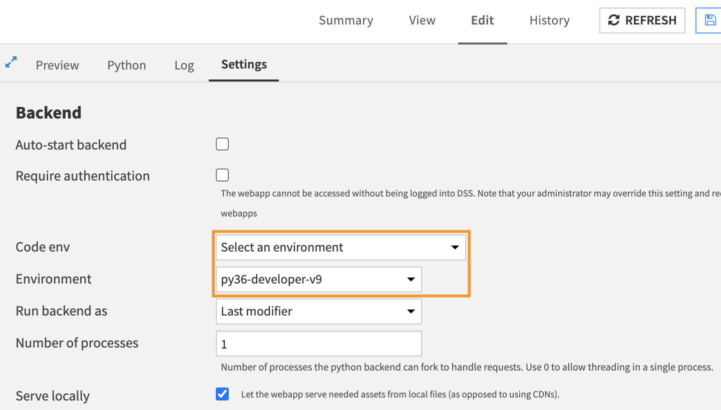
In the Settings Tab, under Code env, you can see the code environment that the webapp is using. It’s currently set to inherit the project default environment. You can change this and select another code environment.
To change the code environment:
Navigate to the Settings tab.
Locate the Code env dropdown menu and select Select an environment.
In the newly displayed Environment dropdown menu, select the name of the environment that includes the dash package.
Click Save.
The backend is now running, and you will be navigated back to the Preview tab, which is empty for the moment.
In the Python tab on the left, you can see a few lines of sample code. Since we’ll be starting from scratch, you do not need them.
Delete the sample code in the Python editor.
Code the Webapp
Now, we can start building the code behind the Dash webapp.
Import Packages
Insert the following code into the Python tab so that we’ll have the necessary tools to create the webapp:
import dataiku

import pandas as pd
import plotly.express as px

import dash_core_components as dcc
import dash_html_components as html
from dash.dependencies import Input, Output
Set Up the Data
Next, we need to access the dataset that the webapp will be using.
Add the following code to the Python tab to access the Dataiku dataset Orders_by_Country_sorted as a pandas dataframe:
# READ DATASET
dataset = dataiku.Dataset("Orders_by_Country_sorted")
df = dataset.get_dataframe()
Define Styles
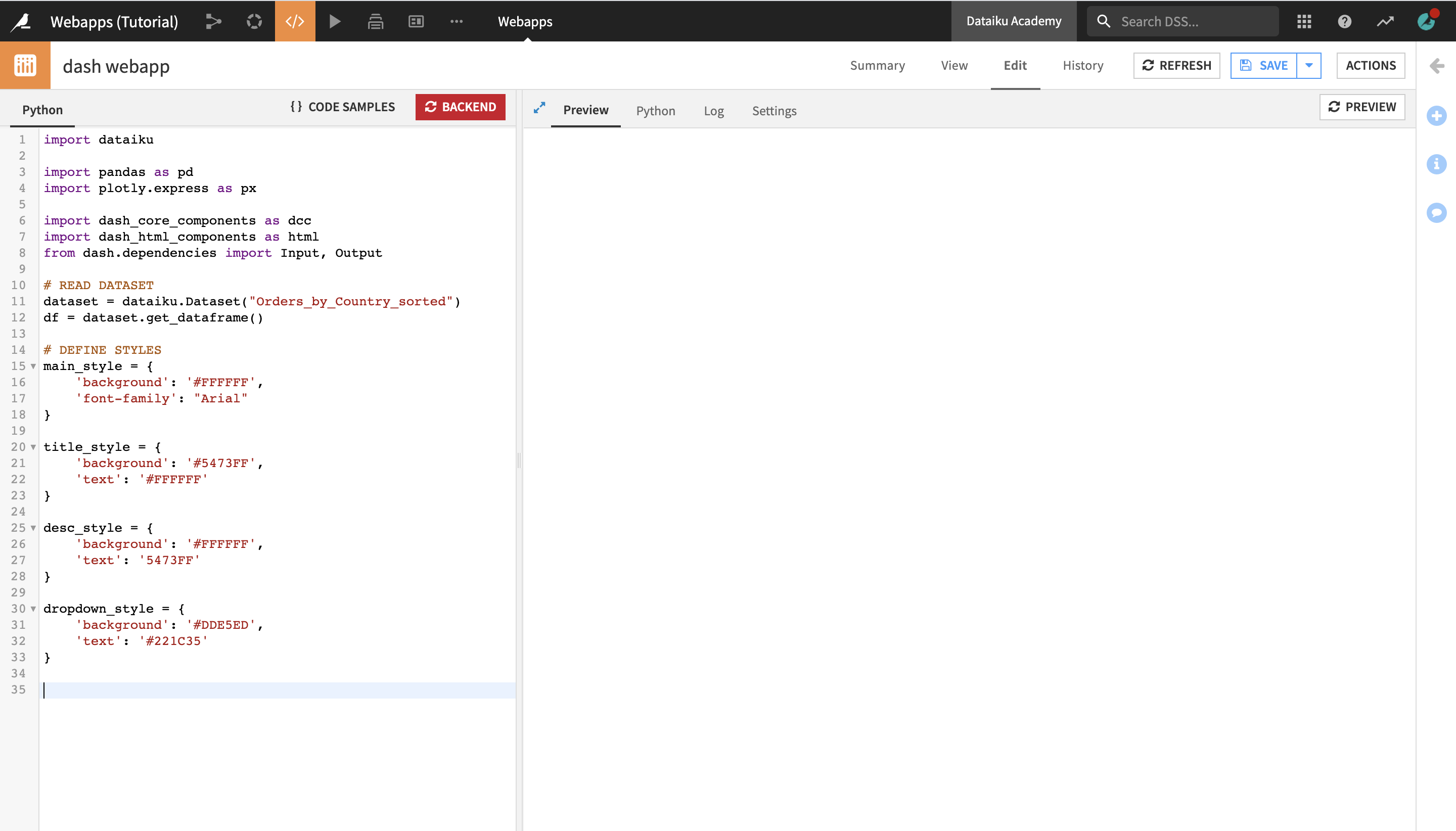
Before we proceed with creating the app layout, we will define a set of style variables that we will then use in various parts of the layout:
main_stylefor the main style elements of the app, such as the app background color and the font;title_stylefor the style components which of the app title;desc_stylefor the style components of the app description;dropdown_stylefor the style components of the app dropdown menu.
# DEFINE STYLES

main_style = {
    'background': '#FFFFFF',
    'font-family': "Arial"
}

title_style = {
    'background': '#5473FF',
    'text': '#FFFFFF'
}

desc_style = {
    'background': '#FFFFFF',
    'text': '5473FF'
}
dropdown_style = {
    'background': '#DDE5ED',
    'text': '#221C35'
}
By defining the style components of the app all in one place in the beginning of the page, you can easily go back and change them if you decide to update the look and feel of your app, without having to search for them in the app layout code.
Define the App Layout
Next, we will define the app layout. The app will contain four main elements:
a title;
a short description;
a bar graph (or histogram) showing the amount of sold items by country, with an additional color parameter to indicate whether the sales were influenced by a marketing campaign or not;
a dropdown menu with the list of countries (this will later be used to make the app interactive, and allow the end user to select which combination of countries to display in the chart).
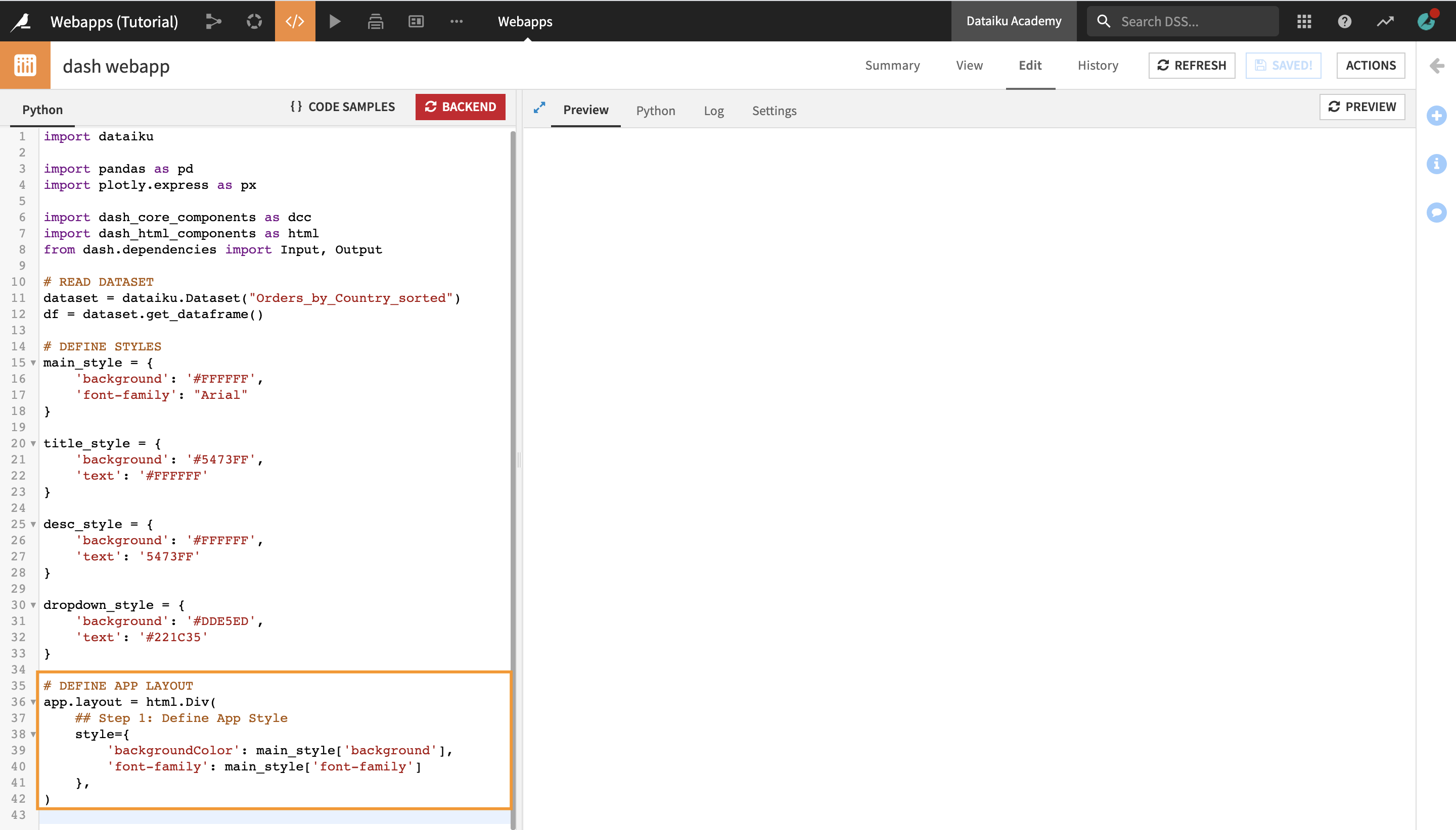
First, enter the following code into the Python editor in order to define the main app style parameters (the background color and the text font):
# DEFINE APP LAYOUT
app.layout = html.Div(
    ## Step 1: Define App Style
    style={
        'backgroundColor': main_style['background'],
        'font-family': main_style['font-family']
    },
)
Click Save in the upper right corner of the page.
Nothing is displayed yet because we haven’t created any of the app content yet, but there are no errors in the log.
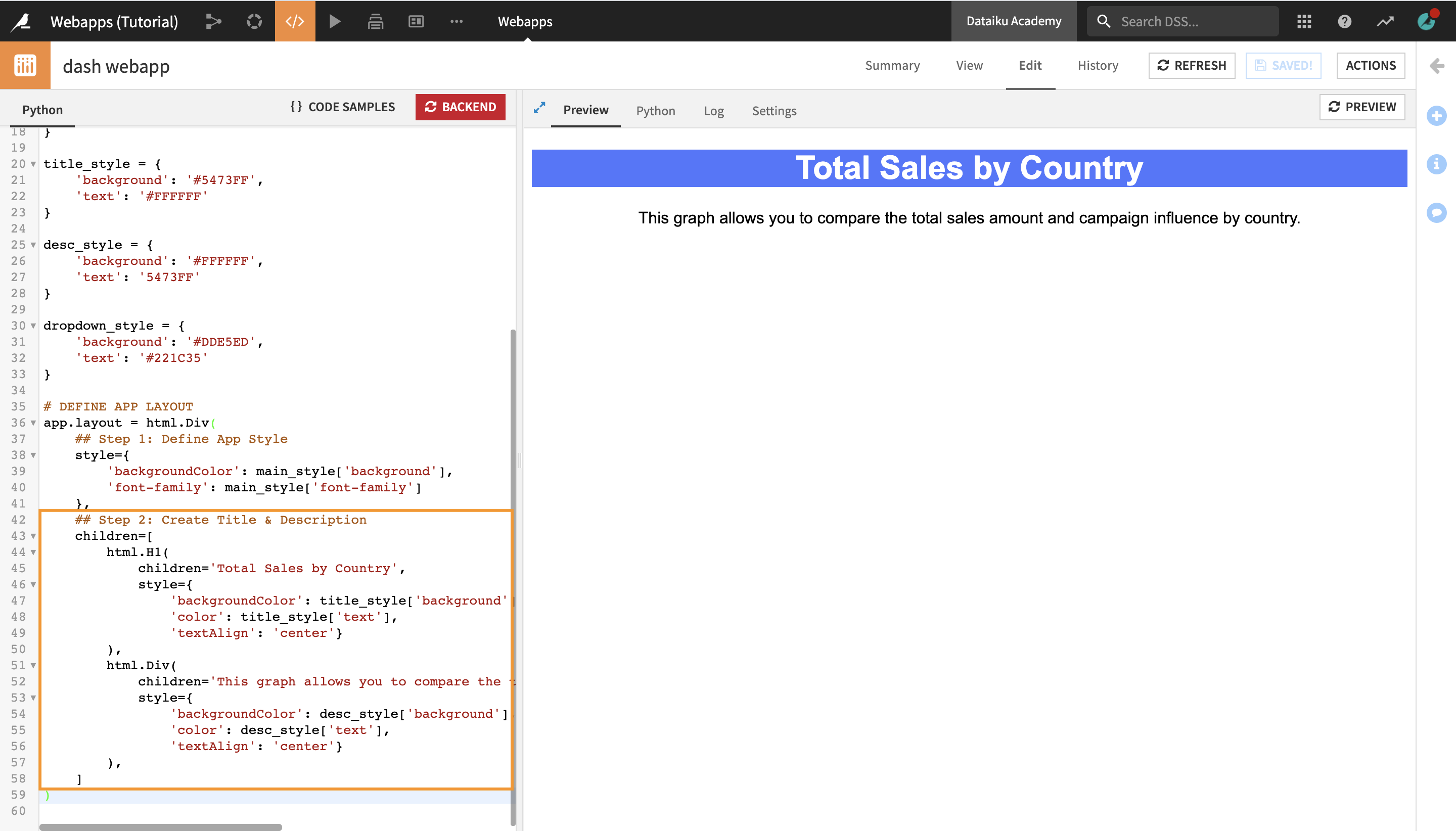
Next, in the line above the last closing
)parenthesis, insert the following code in order to create the app title and description as “children” of the app layout:
## Step 2: Create Title & Description
children=[
    html.H1(
        children='Total Sales by Country',
        style={
            'backgroundColor': title_style['background'],
            'color': title_style['text'],
            'textAlign': 'center'}
    ),
    html.Div(
        children='This graph allows you to compare the total sales amount and campaign influence by country.',
        style={
            'backgroundColor': desc_style['background'],
            'color': desc_style['text'],
            'textAlign': 'center'}
    ),
]
Click Save.
The Preview tab should now display the title and description of the app.
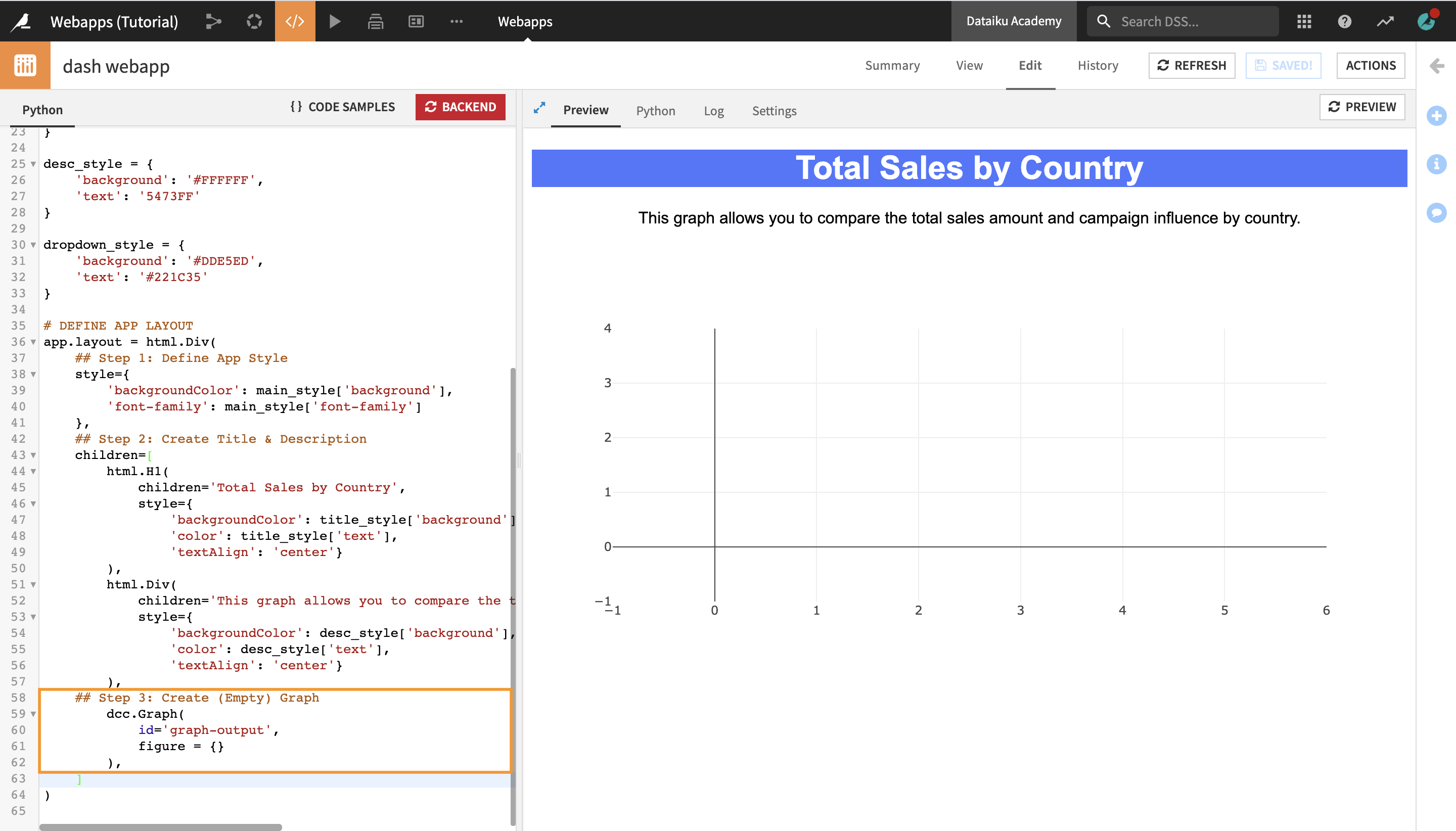
Next, we will create an empty graph as a placeholder of where the actual graph will appear once we set up the interactivity.
As we will need to set up a callback and a function to update the graph later, we need to define the ID of the graph here to be able to reference it further down.
Since the graph will be part of the “children” of the webapp, you need to insert the following code in the line above the last closing
]bracket:
## Step 3: Create (Empty) Graph
    dcc.Graph(
        id='graph-output',
        figure = {}
    ),
Click Save.
The Preview tab now displays an empty graph below the app title and description.
Finally, we’ll create the dropdown menu with the list of countries. Just like the graph placeholder, we’ll also need to define the ID of the dropdown here in order to reference it later.
Insert the following code in the line above the last closing
]bracket:
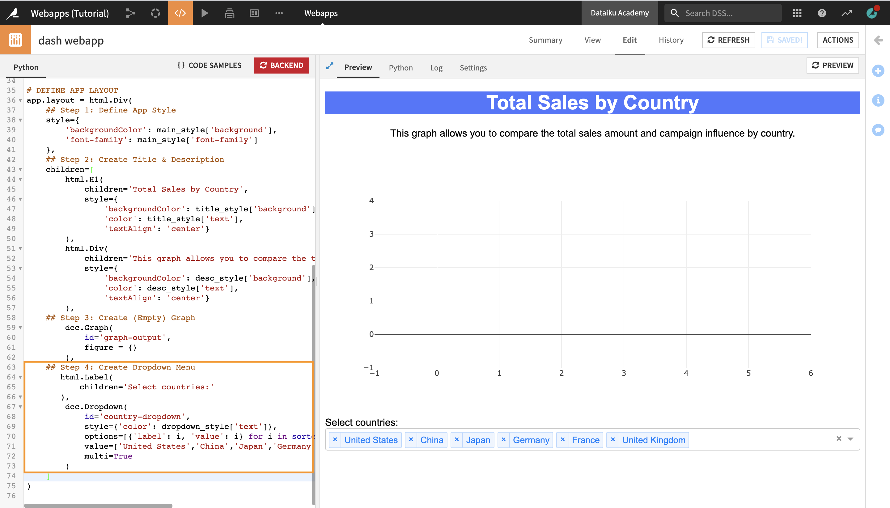
## Step 4: Create Dropdown Menu
   html.Label(
       children='Select countries:'
   ),
    dcc.Dropdown(
        id='country-dropdown',
        style={'color': dropdown_style['text']},
        options=[{'label': i, 'value': i} for i in sorted(df.country.unique())],
        value=['United States','China','Japan','Germany','France','United Kingdom'],
        multi=True
    )
The html.Label component defines the label of the dropdown menu, and the ddc.Dropdown component creates the dropdown menu itself.
The options property, which defines the list of selectable options in the dropdown, is set to include each unique country name from the df pandas dataframe.
The value property, which defines the values, or countries that would be pre-selected in the app by default, is set to contain a list of six countries (United States, China, Japan, Germany, France, and United Kingdom).
Click Save.
The updated preview now displays the countries dropdown menu.
You can click on the dropdown arrow to display and select countries from the list of options, or remove some of the pre-selected ones, but this has no impact on the graph yet. In order to achieve this, we would need to add interactivity to our app.
Add Interactivity
In order to add interactivity and generate an interactive histogram chart in the app, we will use a simple callback and a function to update the graph.
We will need the IDs that we previously defined for the app components that we want to make interactive:
graph-output: the ID of the graph;country-dropdown: the ID of the country dropdown.
Set Up a Callback
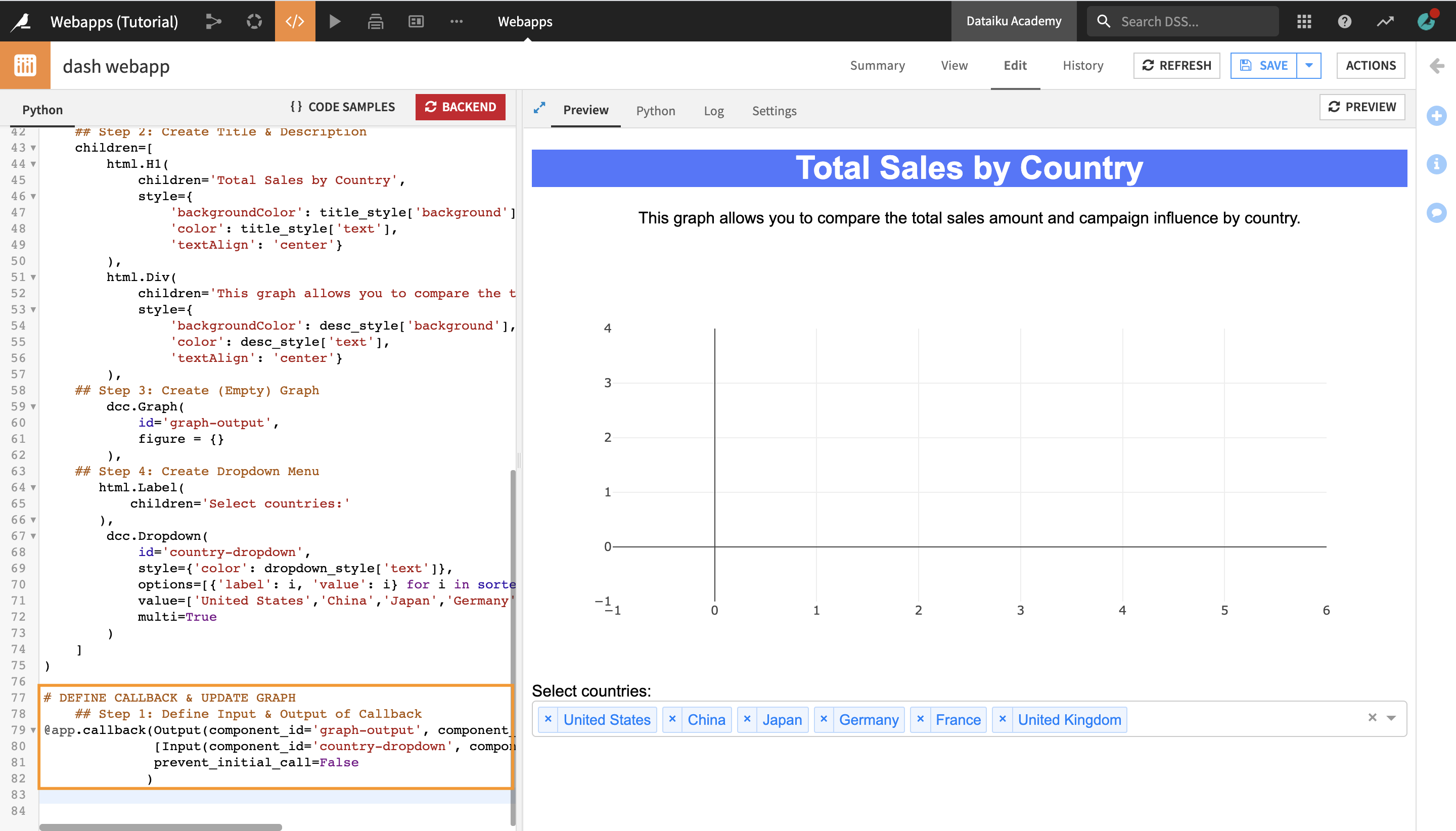
To set up the callback, enter the following code at the very end:
# DEFINE CALLBACK & UPDATE GRAPH
    ## Step 1: Define Input & Output of Callback
@app.callback(Output(component_id='graph-output', component_property='figure'),
            [Input(component_id='country-dropdown', component_property='value')],
            prevent_initial_call=False
            )
The callback defines:
the
valueproperty ofcountry-dropdownas the input of the app (meaning that the user will interact with the app by selecting one or multiple countries from the dropdown options);and the
figureproperty ofgraph-outputas the output (meaning that the graph will update based on the user inputs).
Define Function to Update Graph
Finally, we need to define a function which will update the graph based on the user input.
For this, we will:
define an
update_graphfunction which takesinput_valueas an argument;define an
ifstatement which triggers a set of actions if the length ofinput_valueis more than 0 (i.e. if the user selects at least one country as an input);define an
updated_dfvariable, which takes the schema and values of thedfdataframe, with the exception of the `country` column, which takes the user inputs as values;- define and return
fig, which creates a histogram with the data fromupdated_df, with `country` as the X axis, `total_amount` as the Y axis, and *`campaign` as the coloring; we will also define the barmode, the title and labels of the histogram;
- define and return
finally, we will define an
elifstatement to prevent the graph from updating wheninput_valueequals 0 (i.e. when there are no user inputs).
Enter the following code at the very end to define the function which creates and updates the graph:
## Step 2: Define Function to Create and Update Graph
def update_graph(input_value):
    if len(input_value) > 0:
        updated_df = df[df['country'].isin(input_value)]
        fig = px.histogram(updated_df,
                        x="country",
                        y="total_amount",
                        color="campaign",
                        barmode="group",
                        title="Sales by Country",
                        labels={
                            "country": "Country",
                            "total_amount": "Total Sales Amount",
                            "campaign": "Campaign:"
                        }
                        )
        return fig
    elif len(input_value) == 0:
        raise dash.exceptions.PreventUpdate
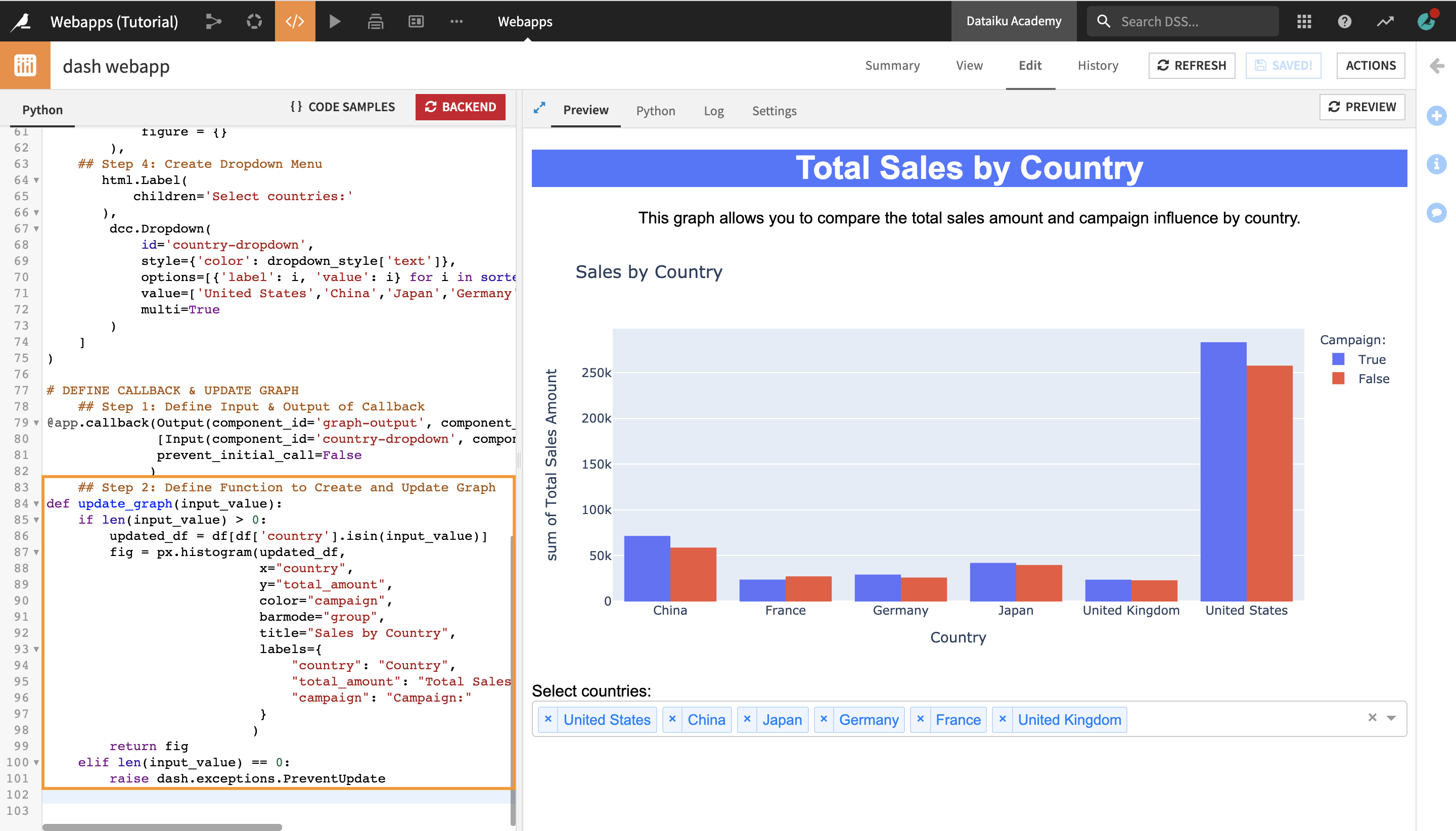
The Preview tab now displays the finished Dash app. You can test its interactivity by adding or removing countries from the dropdown.
Navigate to the View tab to view your finished webapp.
Remove
United Statesfrom the selected countries.From the dropdown options, select
AustraliaandBrazilto visualize these countries’ sales amounts and the impact of the campaign on sales.

Note
To further interact with your graph, you can also use the Plotly Express builtin functionalities by clicking the icons in the upper right corner of the graph. You can perform actions such as zoom in, zoom out, pan, or download the graph as a PNG file, among other things.
Publish the Webapp on a Dashboard
When you are done with editing, you can publish your webapp on a dashboard.
Click Actions in the top-right corner of the screen.
From the Actions menu, click Publish.
Select the dashboard and slide that you wish to publish your webapp on.
Click Create.
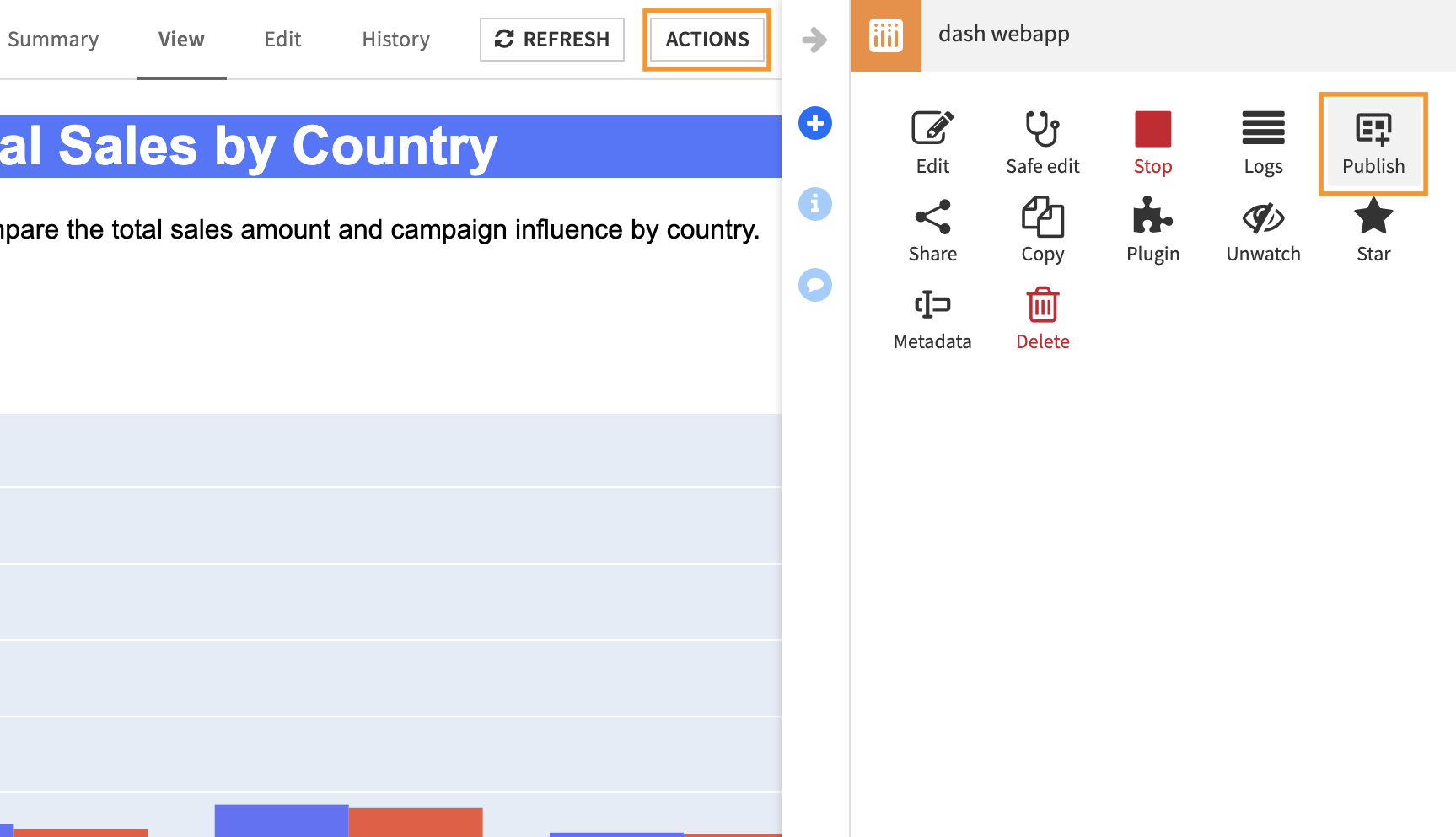
You are navigated to the Edit tab of the dashboard.
Note
In the Edit tab of a dashboard, you can edit the way your webapp appears, or add other webapps, as well as other types of insights.
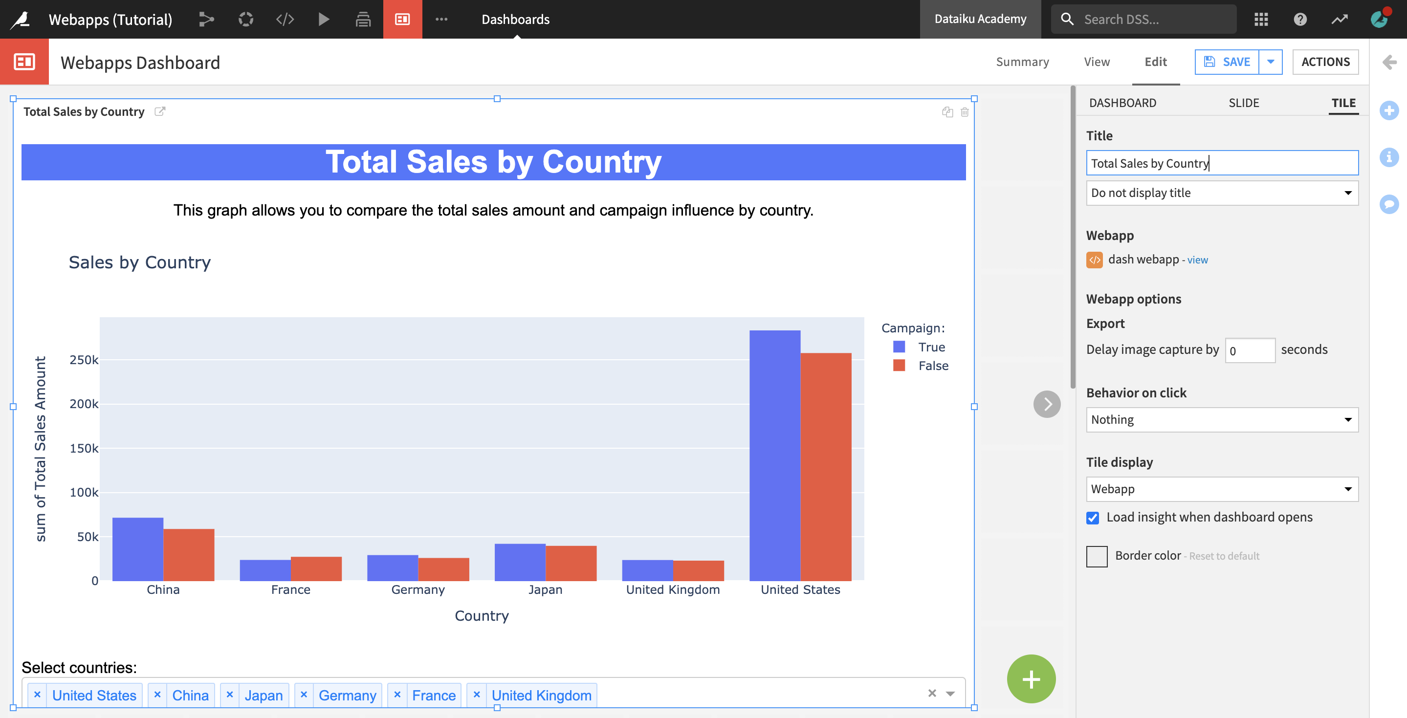
Optionally, you can drag and resize your webapp, or change its title and display options from the Tile sidebar menu. Click Save when you’re done.
Click View to navigate to the View tab and see how your webapp is displayed on the dashboard.

What’s Next
Using Dataiku DSS, you have created an interactive Dash webapp and published it to a dashboard.
To continue learning about webapps, you can:
see the reference doc for further details on using Dash in Dataiku.