Why don’t the values in the Visual ML chart match the final scores for each algorithm?
When training a model using the Visual ML interface, have you ever noticed that the reported value of your optimization metric for a given algorithm does not always exactly match the final value in the line chart, or that the algorithm that visually performs the best in the chart is not necessarily the one that is reported as the model champion for that session?

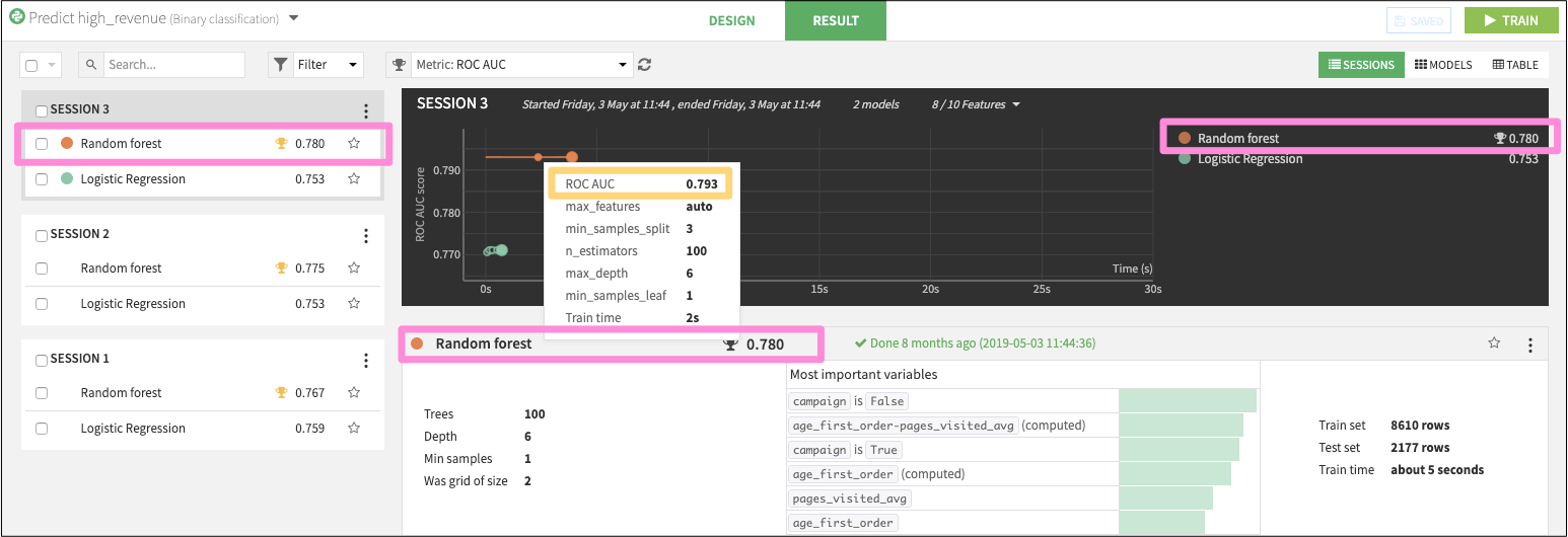
For example, in the image above, the Random Forest algorithm show an AUC of 0.780, beating out the Logistic Regression’s AUC of 0.753. You can see this score of 0.780 in three places (highlighted with pink boxes), but yet if you hover over the individual data points in the line chart, the AUC is reported 0.793 (gold box). Why the difference?
This is because the line chart is plotting the cross-validation scores for each individual experiment–executed with a specific set of hyperparameters–on the cross-validation set, which is a subset of the train data.
Once grid-search is complete and Dataiku DSS finds the optimal set of hyperparameters, it retrains the model on the whole train set and scores the holdout sample to produce the final results for that session (pink boxes).
Therefore, the values in the line chart cannot be directly compared to the test scores that you see on the other parts of the page, because:
They are not computed on the same data set. The grid-search is computed on a subset of the train set, and the final scores are computed on a holdout / test sample.
They are not computed with the same model. After grid-search, Dataiku DSS retrains the model on the whole train set.
So while it is likely that the algorithm that looks best on the chart will also perform best on the holdout data and that the metric values will match, it is not always the case.
We suggest you instead use this line chart to guide you in the following ways:
Review the optimal set of hyperparameters found during grid search optimization on the training subset using the fly-over tooltips.
Use the slope of the line to evaluate the relative gains across each epoch in the optimization process.
Compare the relative training time various algorithms required in order for the model to converge.
Visit our documentation for a complete description of the visualization of grid search results.
What’s next?
Dataiku DSS offers many settings to tune how the search for the best hyperparameters is performed. Consult the reference documentation to learn more about advanced models optimization.