Creating Maps in Dataiku DSS without Code
Dataiku DSS includes a drag and drop interface for creating a wide range of visualizations, including maps.
This tutorial walks through how to create interactive scatter, binned and administrative maps in DSS, without any code.
The final project, which encompasses this tutorial and the following one on Geographic Processing in DSS, can be found on the Dataiku gallery.
Technical Requirements
The Reverse Geocoding / Admin maps plugin is required to produce administrative maps.
Supporting Data
The example data for this exercise comes from data.gouv.fr, the open platform for French public data. It concerns services available at French post offices, and can be downloaded as a CSV file here.
Data Preparation
We only need a few steps to get our data ready for map-making, most importantly, building geopoints from latitude and longitude coordinates.
From the Dataiku homepage, create a new blank project. In this case, we’ve named it
French Post Offices.Upload the “laposte_poincont.csv” file. Rename it
post_offices.Enter the Lab and create a new Visual Analysis.
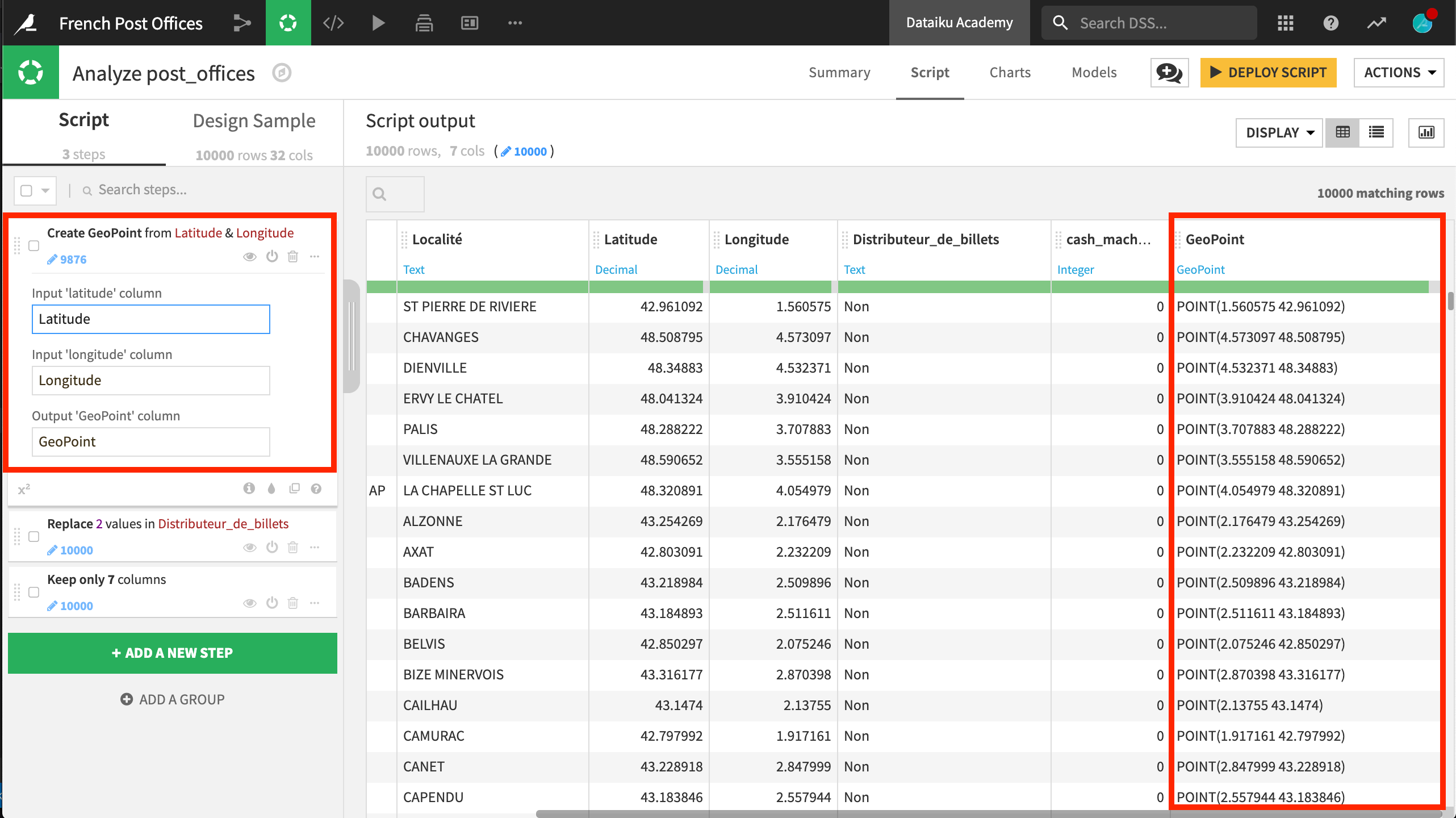
Add the first step to the script using the Create GeoPoint from lat/lon processor.
Specify Latitude and Longitude as the input latitude and longitude columns.
Name the output column
GeoPoint.
Use the Find and replace processor on the Distributeur_de_billets column.
Replace “Non” (No) with 0 and “Oui” (Yes) with 1.
Name the output column
cash_machine, which is the English translation.
For simplicity, keep only the seven columns we will use: Libellé_du_site, Localité, Distributeur_de_billets, cash_machine, GeoPoint, Latitude, and Longitude.
Note
When mapping in DSS, it is important to take note of the meaning assigned to columns. Some fields may be able to handle text or numeric columns, while others may be designed only for numeric data.
Drag and Drop Maps
Navigate to the Charts tab. Select the chart type dropdown menu and choose the Globe icon to see a menu of built-in map types.
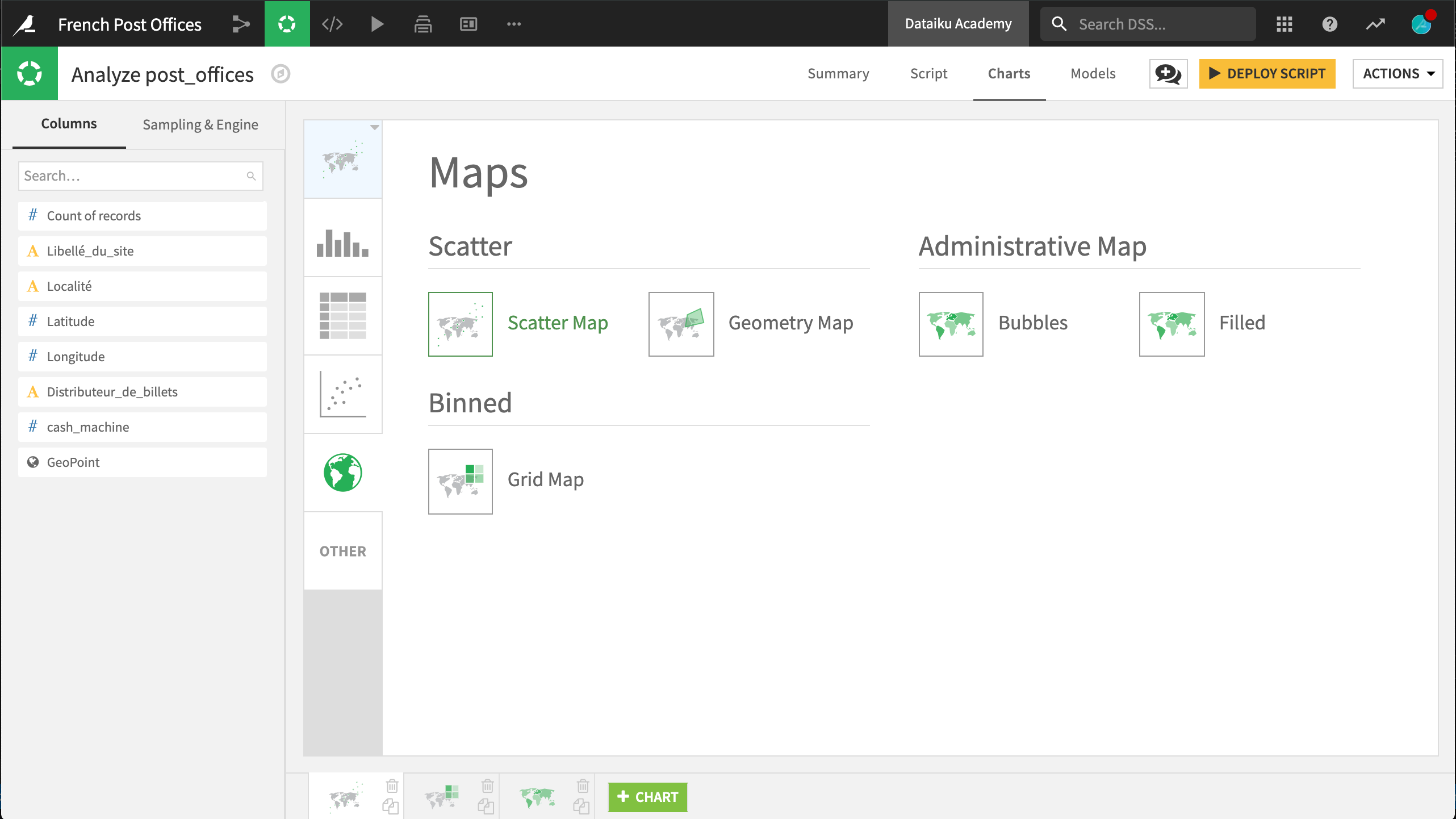
DSS provides built-in scatter, binned, and administrative maps (with the installation of the Reverse Geocoding / Administrative Maps plugin).
Scatter Map
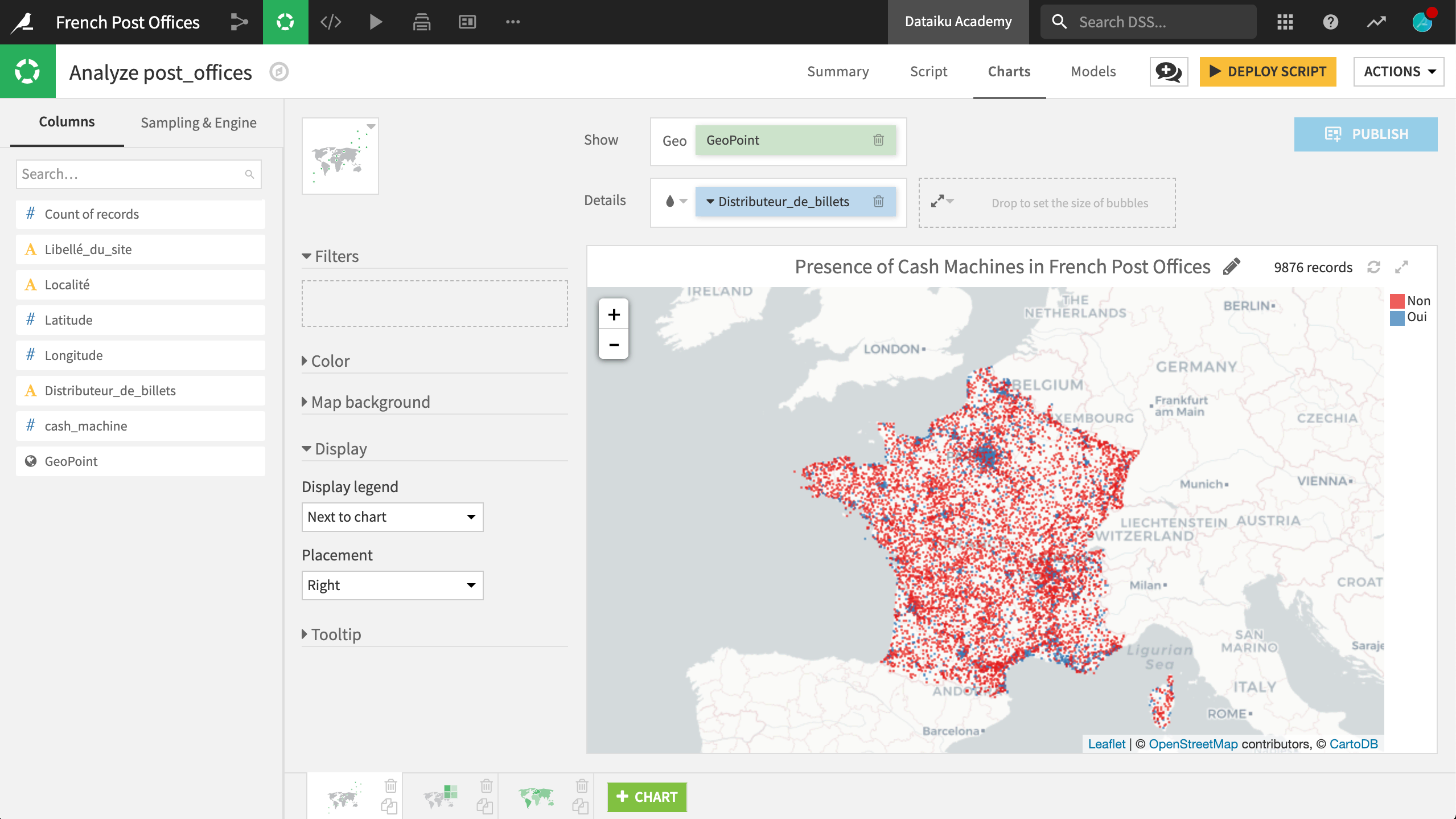
Initiate a Scatter map and drag the GeoPoint column to the Geo field.
In the chart area, DSS has plotted the location of the GeoPoints using Leaflet, a popular JavaScript library for interactive maps, over OpenStreetMap base tiles. Surprisingly, there are many outside of “continental” France!
Zooming in on Western Europe, we can get a better sense of the distribution of points by reducing the base radius of the points to 1.
Under Details, drag Distributeur_de_billets to the color droplet field. Now points are colored by the presence or absence of a cash machine in the post office. Adjusting the color palette to a categorical scheme, such as Set 1, makes this easier to see.
We can enhance this map in other ways, for example, dragging Libellé_du_site to the Tooltip field.
Binned Map
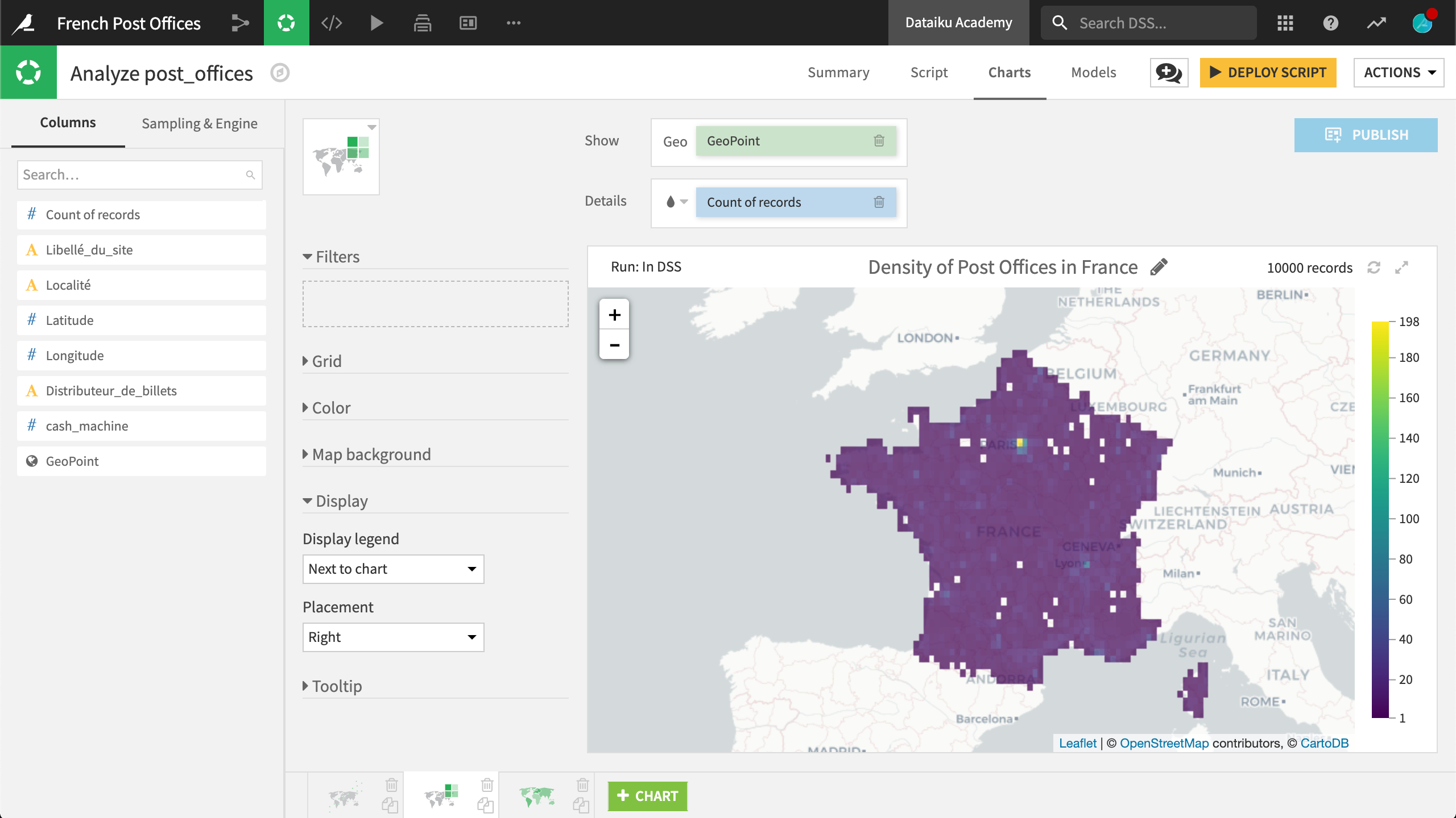
From the scatter map, we can observe a density of post offices in major metropolitan areas, such as Paris. However, different opacity settings can obscure this fact. A better way to observe the density of post offices in France may be with a binned map.
Create a new chart, and select a Grid map. Again, drag GeoPoint to the Geo field, and this time, Count of records into the color droplet field.
Count of records is not a column in the dataset, but is a common aggregation, and so DSS provides it for us.
This map divides territory into rectangular boxes, the size of which we can adjust, and colors the boxes according to the number of observations inside that grid. Not surprisingly, a grid covering Paris is marked in bright yellow, well above the rest of the country. By reducing the size of the boxes, we can find small areas of France without a single post office.
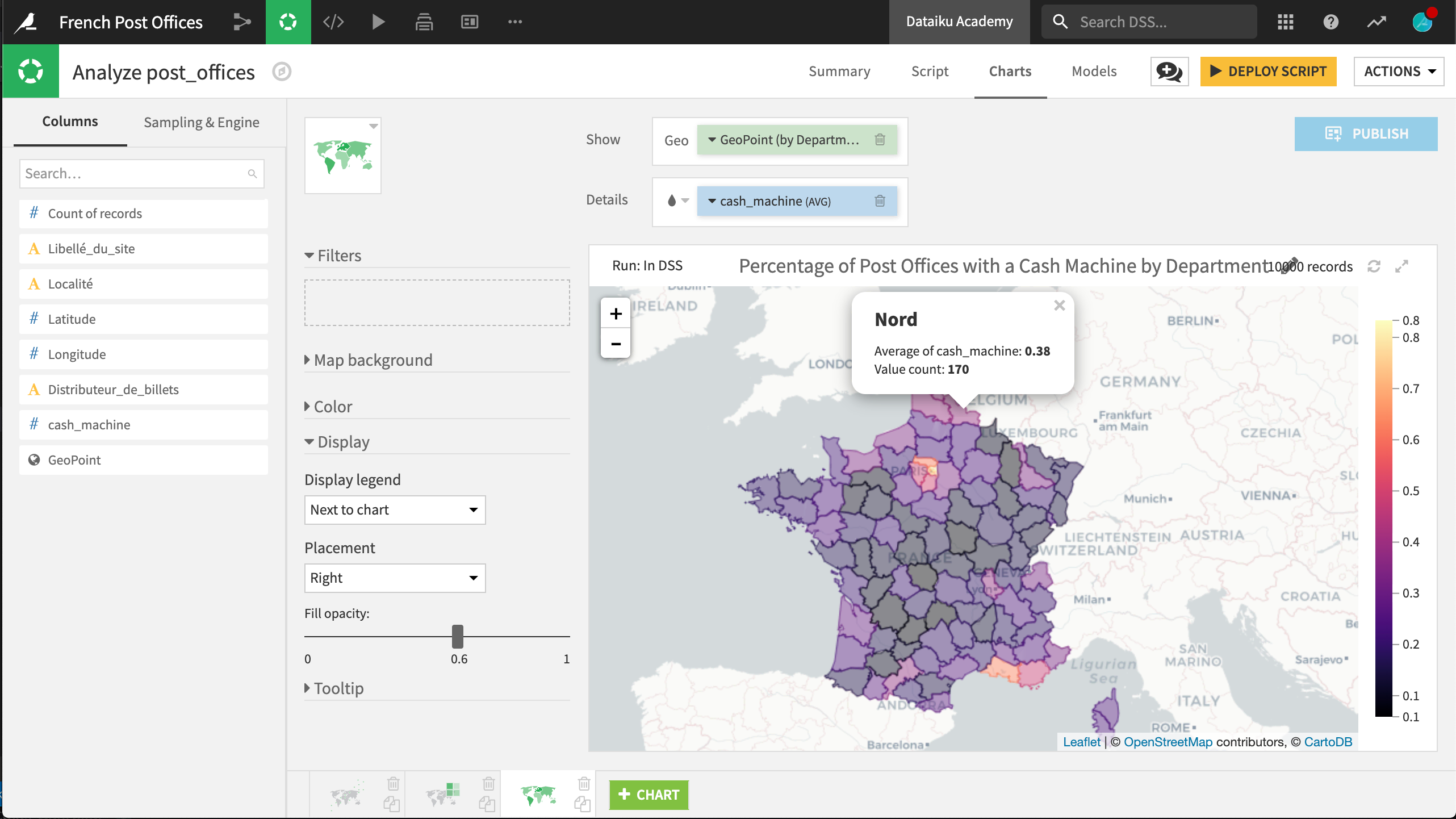
Administrative Map
Instead of looking at the count of records within an arbitrarily-defined grid, we may be more interested in the distribution of a statistic within official administrative boundaries.
In a Filled Administrative map, drag the GeoPoint column to the Geo field. The highest admin level, Country, is selected. Clicking on this field, we can specify lower admin levels, such as “Department/County”.
Dragging cash_machine to the color droplet field produces a map depicting the percentage of post offices in a Department with a cash machine present.
What’s Next?
Congratulations! You have built three different types of charts in DSS, without writing a line of code. Depending on the nature of the data, one of these map types can help you visualize geospatial data.
If we deploy this script, we can save these charts as insights and add them to dashboards.
A read-only version of these maps can be found in the Dataiku gallery.
More information about maps in DSS can be found in the reference documentation.