Bike Sharing Usage Patterns
Overview
Business Case
A “smart city” initiative has received data from the Washington DC bike sharing system. They want to use this data to gain a better understanding of the usage patterns across the city. Any discovered patterns can be used to improve the bike sharing system for customers and the city’s overall transit efforts.
As a first step towards this goal, we will try to identify clusters of “similar” bike stations. Station similarity will be based on the types of users beginning trips from each station.
Supporting data
This use case incorporates the following data sources:
Trips
Capital Bikeshare provides data on each bike trip, including an index of the available data. We will use a Download recipe in the walkthrough to create datasets from 2016 and 2017 files.
Bike Stations
Capital Bikeshare provides an XML file with the list of bike stations and associated information about each station. We will use a Download recipe in the walkthrough to create a dataset from this file.
Demographics
We can use US census data to enrich the bike stations dataset with demographic information at the “block group” geographic level. Its archive can be downloaded here.
Workflow Overview
The final Dataiku DSS pipeline appears below. You can also find a completed version of the project in the Dataiku gallery.
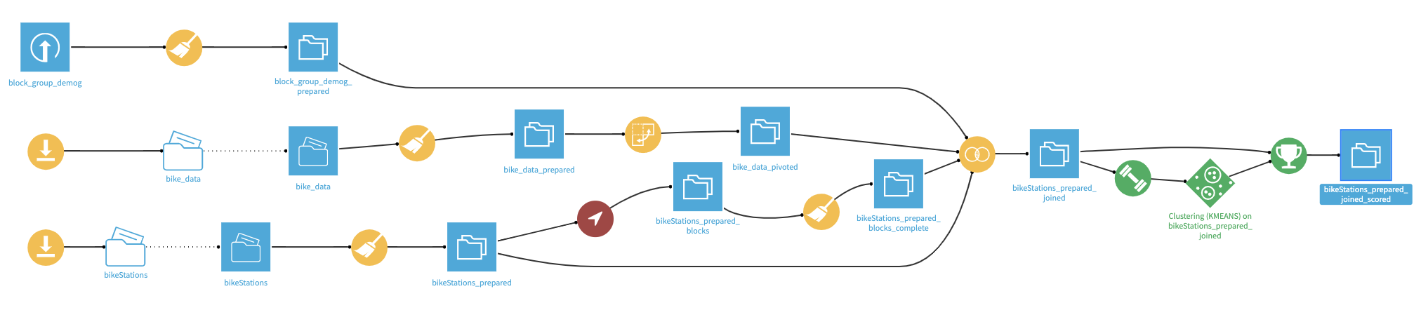
The Flow has the following high-level steps:
Collect the data to form the input datasets
Clean the datasets
Join the datasets based on census blocks and station IDs
Create and deploy a clustering model
Update the model based upon new data
Prerequisites
You should be familiar with:
The Basics courses,
The Pivot recipe,
Machine Learning in Dataiku DSS
Technical Requirements
The Get US census block plugin is required to enrich the bike station data with its US census block, so that it can be joined with the per-block demographic information.
Create a New Project
Create a new Dataiku DSS project and name it Bike Sharing.
Prepare the Bike Stations Dataset
The first dataset provides a map of the bike station network.
In the Flow, select + Recipe > Visual > Download.
Name the output folder
bikeStationsand create the recipe.Add a new source and specify the following URL:
http://capitalbikeshare.com/data/stations/bikeStations.xml.Run the recipe to download the files.
Note
As this data comes directly from Capital Bike Share, the exact number of rows in your dataset may differ slightly from the project displayed in the Gallery. While this should not have an impact on the overall results, do be aware that your own results may not be exactly the same.
Having downloaded the raw data, let’s now read it into Dataiku DSS by creating a Files in Folder dataset.
From the bikeStations folder, click on Actions > Create a dataset (found in the upper-right corner).
Click Test to let Dataiku detect the XML format and parse the data accordingly.
Accept the dataset name
bikeStationsand create it.
In the new dataset, go to the Lab and create a new Visual Analysis. Accept the default name, and add the following steps to the script:
In order to geographically map the bike stations, we need to create a GeoPoint from the latitude and longitude of each station. Notice, however, that a small number of bike stations have extraordinarily precise geographic coordinates. A quick Google search suggests that six decimal places gets you to within 11 cm! So entries with coordinates to 14 decimal places surely seem like an error.
Let’s round these extraordinarily precise values to a more reasonable level without adding any unwarranted precision to other values.
Using the Copy columns processor, copy the long column into a new column,
long_round.Round the long_round column to 6 decimal places using the Round numbers processor.
With a Formula, redefine the column long with the expression
if (length(long) > 10, long_round, long).Select these three steps and move them into a Group called
Fix lon/lat data.Copy and paste the steps within the group just created. Change instances of long to lat. The group should have a total of 6 steps.
Now we can create GeoPoints from the clean lat and long columns.
Use the Create GeoPoint processor with the lat and long columns as the inputs and
geopointas the output column.
Delete 13 columns we won’t use. This means removing all columns except for nbBikes, long, name, lat, and geopoint.
Rename the column name to the more-specific
station_nameto avoid naming conflicts later.
Switch to the Charts tab and create a new Scatter Map:
Use geopoint as the “Geo” column.
Use nbBikes as the “Details” column to color the bubbles.
To make the stations with the most bikes more visible, change the palette color to “Green-red” from the Color dropdown menu.
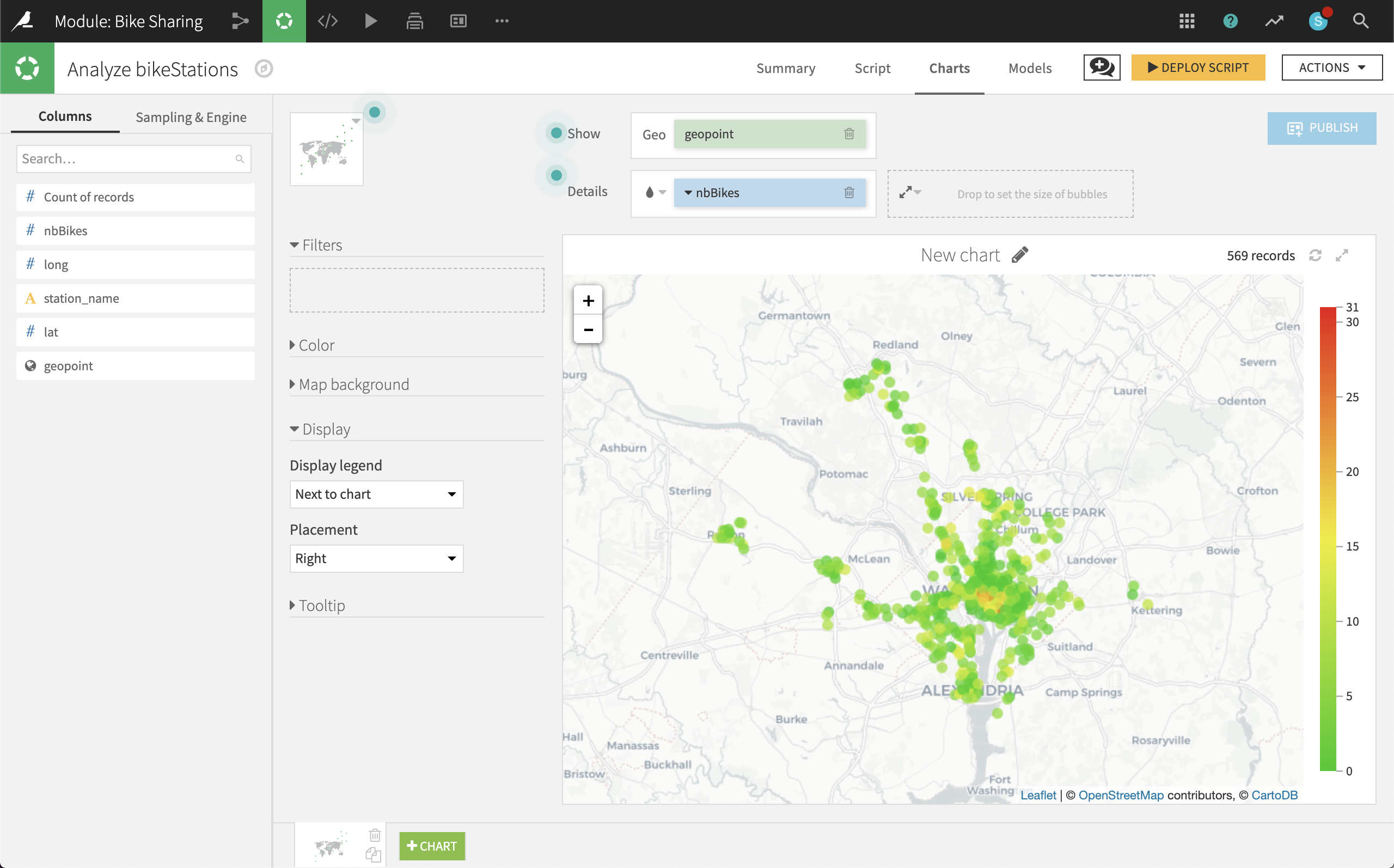
At first glance, it appears that a very small number of stations in central DC have a large number of bikes, while a much larger number of surrounding stations have very few bikes (even 0).
Deploy the Visual Analysis script, accepting the default output name, bikeStations_prepared. Check the boxes to create charts on the new dataset and build it now.
We now have a clean dataset of the geographic locations of all bike stations and the number of bikes they hold.
Prepare the Demographics Dataset
With the bike station data in place, let’s prepare data on the number of people living in DC at a granular level.
Create a new Uploaded Files dataset from the Demographics file. Accept the default name block_group_demog.
This dataset contains the number of people in the US Census ACS5Y 2013 at the block group level. For reference, note that the US Census generally follows a hierarchy of States > Counties > Census Tracts > Block Groups > Census Blocks.
The fully qualified block group identification is contained within the geoid column. We can split this column to obtain the block group.
Note
We could alternatively build up the block group from the state, county, tract, and blkgrp columns. As a stretch goal, see if you can figure out how to do that. Then consider which method you prefer. There are many means to an end in data science, and you will need to assess what works best in each situation.
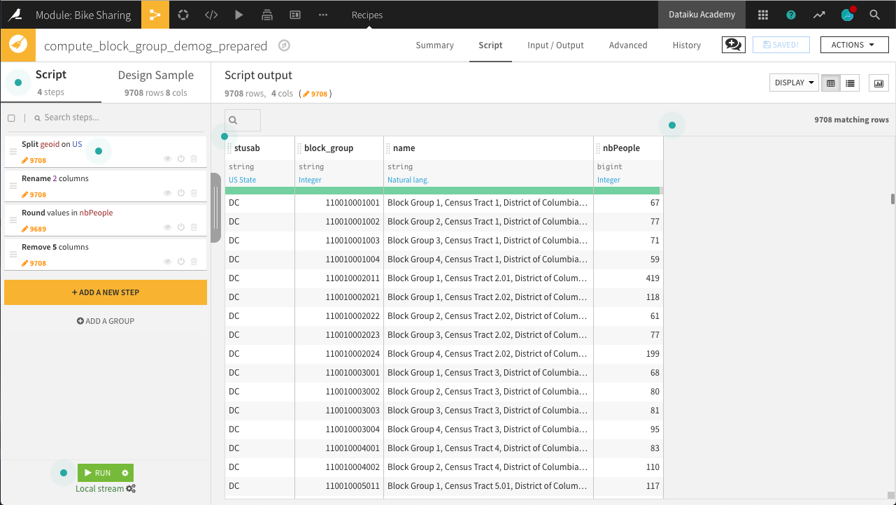
Create a new Prepare recipe from this dataset with the default output block_group_demog_prepared and the following steps in its Script:
Use the Split column processor on the geoid column with
USas the delimiter. Choose to Truncate, keeping only one of the output columns, starting from the End.The new geoid_0 column should keep everything after the “US”.
Use the Rename columns processor on a few columns:
Old name
New name
geoid_0
block_group
name
block_name
BOOOO1_001E
nbPeople
Ensure the block_group column storage type is set to “string” and NOT “bigint” by editing the schema from the menu directly beneath the column header.
Use the Round numbers processor on the nbPeople column to round values to integers (0 significant digits, 0 decimal places).
Remove five more columns that will no longer be required: state, county, tract, blkgrp, and geoid
Run the recipe, updating the schema to four columns.
Now that we have the number of people in every census block group in DC, the demographic data is ready!
Prepare the Trips Dataset
We now have data on bike stations and population counts, but what we are really interested in is the bike trips themselves. Let’s now explore the bike trips data.
In order to prepare the bike trips data so that it can be joined to station-level data, we will need to:
Download the raw trips data from the Capital Bikeshare website for years 2016 and 2017.
Prepare the trips data to extract the day of the week for each trip.
Pivot by customer type and day of the week to aggregate the individual trips. Doing so will allow you to compute the average trip duration by each customer type and day of the week.
Download the Raw Trips Data
First, let’s download the raw trips data in the same manner as the bike station data. Although we’ll work only with 2016 data first, download them both at this stage.
In the Flow, select + Recipe > Visual > Download.
Name the output folder
bike_dataand create the recipe.Add a new source with the following URL:
https://s3.amazonaws.com/capitalbikeshare-data/2016-capitalbikeshare-tripdata.zip.Add another source with the following URL:
https://s3.amazonaws.com/capitalbikeshare-data/2017-capitalbikeshare-tripdata.zip.Run the recipe to download both files.
Now read the 2016 data into Dataiku DSS.
Create a new Files in Folder dataset from the bike_data folder.
Within the Files tab, click on Show Advanced options and change the “Files selection” field from “All” to “Explicitly select files”.
Use the list files button on the right to display the contents of the folder.
Supply the name of the 2016 file (
1_2016-capitalbikeshare-tripdata.zip) to the “Files to include” field.Click Test to let Dataiku detect the CSV format and parse the data accordingly.
Rename the dataset
bike_dataand create it.
Note
Be mindful that the Gallery project is the “completed” version, and so has 2017 data loaded into the Flow.
Prepare the Trips Data
Just a few steps are needed to clean this data on bike trips.
In the Lab, create a new Visual Analysis on the bike_data dataset, accepting the default name, with the following steps in its script:
Parse in-place the Start date column into a proper date column in the format of
yyyy-MM-dd HH:mm:ss.Use the Extract date components processor on Start date to create one new column,
dow, representing the ‘Day of week’.
Note
Has Sunday been encoded as 1 or 7? You can find answers to questions like this by searching the help documentation in a number of ways. The Question icon at the top right provides one way to search in help. The full documentation can also always be found at doc.dataiku.com.
On the Charts tab, create a new histogram with:
Duration on the Y-axis
dow on the X-axis. Change the binning to “Treat as alphanum”.
Member type defining subgroups of bars.
Hint
Adjust the sample size to include enough data to populate the chart for each day of the week. For example, in the project shown in the screenshot below, the sample has been increased to the first 100,000 rows.
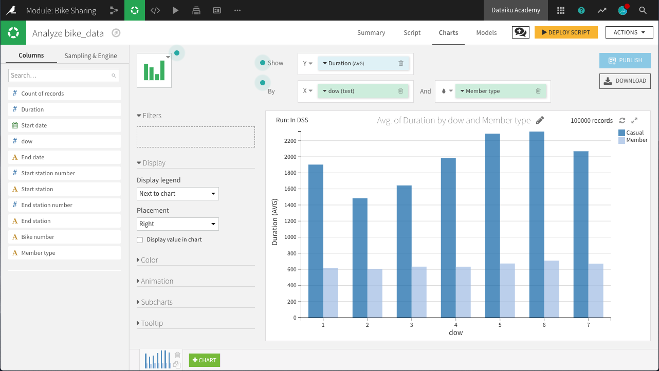
The chart above reveals a few interesting insights.
“Casual” customers tend to take trips that are significantly longer than “Member” users: approximately 40 minutes versus 12 minutes.
“Member” customers do not show much day-to-day variation in the duration of trips, while “Casual” customers make their longest trips on Friday, Saturday, and Sunday, and shortest trips on Tuesday and Wednesday: a difference of about 10 minutes.
Deploy the Visual Analysis script. Accept the default output name, bike_data_prepared. Build the new dataset now when deploying the script.
Now we have clean data on unique trips, but we need to aggregate it to the level of unique stations so that it can be merged with the station and block group demographic data. A Pivot recipe can help here!
Create pivoted features
In this step, we’ll create new features to support our analysis. More specifically, for each station, we want to compute the count of trips and average trip duration by member type and day of week.
From the bike_data_prepared dataset, create a Pivot recipe.
Choose to pivot by Member type.
Name the output dataset
bike_data_pivoted.
In the Pivot step of the recipe:
Add dow as a second pivoting column (under “Create columns with”).
Choose to pivot all values instead of only the most frequent.
Select Start station as a row identifier.
Select Duration as a field to populate content with and choose Avg as the aggregation. Leave “Count of records” selected.
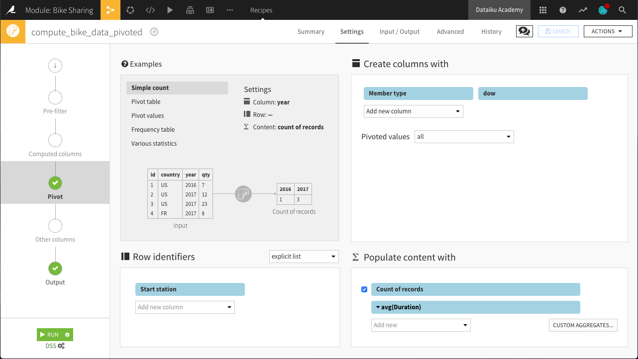
Run the recipe. The resulting dataset should have 29 columns:
1 for the Start station (the row identifier)
28 for the 7 days of the week x 2 member types x 2 statistics (count and average)
Here, we can interpret a column like Casual_1_Duration_avg as the average number of seconds of a bike trip by a Casual user on Day 1 (Monday).
Enrich the Station Dataset with Demographics and Trip Data
We now have three sources of data needing to be joined into a single dataset:
Bike station-level data about the stations
Bike station-level data aggregated from individual trips
Block group-level demographic data.
Get US Census Block Plugin
We have geographic coordinates of bike stations, but we do not know in which block groups they are located. Accordingly, in order to enrich the bike station data with the demographic (block group) data, we need to map the geographic coordinates (lat, lon) of each bike station to the associated block group ID from the US census.
We can do this mapping with a Plugin recipe.
From the Flow, select + Recipe > Get US census block > From Dataset - get US census block_id from lat lon.
Choose bikeStations_prepared as the input dataset and name the output dataset
bikeStations_prepared_blocks. Create the recipe.In the recipe, select lat and long as the latitude and longitude columns.
Under Options, choose “Use an id column” as the param_strategy. Select station_name as the “Input Column ID:”. Adding this will retain station_name in the output dataset, making it easier to identify than geographic coordinates.
Run the recipe.
Note
As the plugin utilizes a free API, it may take several minutes (+10) to complete. To avoid rebuilding any dataset by mistake, you can write-protect it. With a dataset open, navigate to Settings > Advanced. Under Rebuild behavior, select Write-protected to instruct the dataset to never be rebuilt, even when explicitly asked.
Due to recent changes in the API, columns like county and state names are no longer returned. However, because we still have their numeric codes, we can easily fix this with a quick Prepare recipe.
Create a Prepare recipe with bikeStations_prepared_blocks as the input dataset. Name the output bikeStations_prepared_blocks_complete.
Remove the four empty columns: block_id, county_name, state_code, and state_name.
Use the Find and replace processor on the state_id column to create a new column, state_name according to the table below.
Current
Replacement
11
District of Columbia
24
Maryland
51
Virginia
Use the same processor on the county_id column to create a new column, county_name according to the table below.
Current
Replacement
001
District of Columbia
013
Arlington
031
Montgomery
059
Fairfax
510
Alexandria
033
Caroline
610
Falls Church
Edit the schema as necessary so that columns are stored appropriately. block_group should be a string. lat and lon should be double.
Note
The red highlighting in county_id are because Dataiku has predicted a meaning of US State. In this case, it does not apply. When this happens, feel free to change the meaning to Text to remove the warning.
Run the recipe, updating the schema to nine columns. Note that in the output dataset, we now know, for each unique bike station, the corresponding geographic coordinates, block group, county, and state.
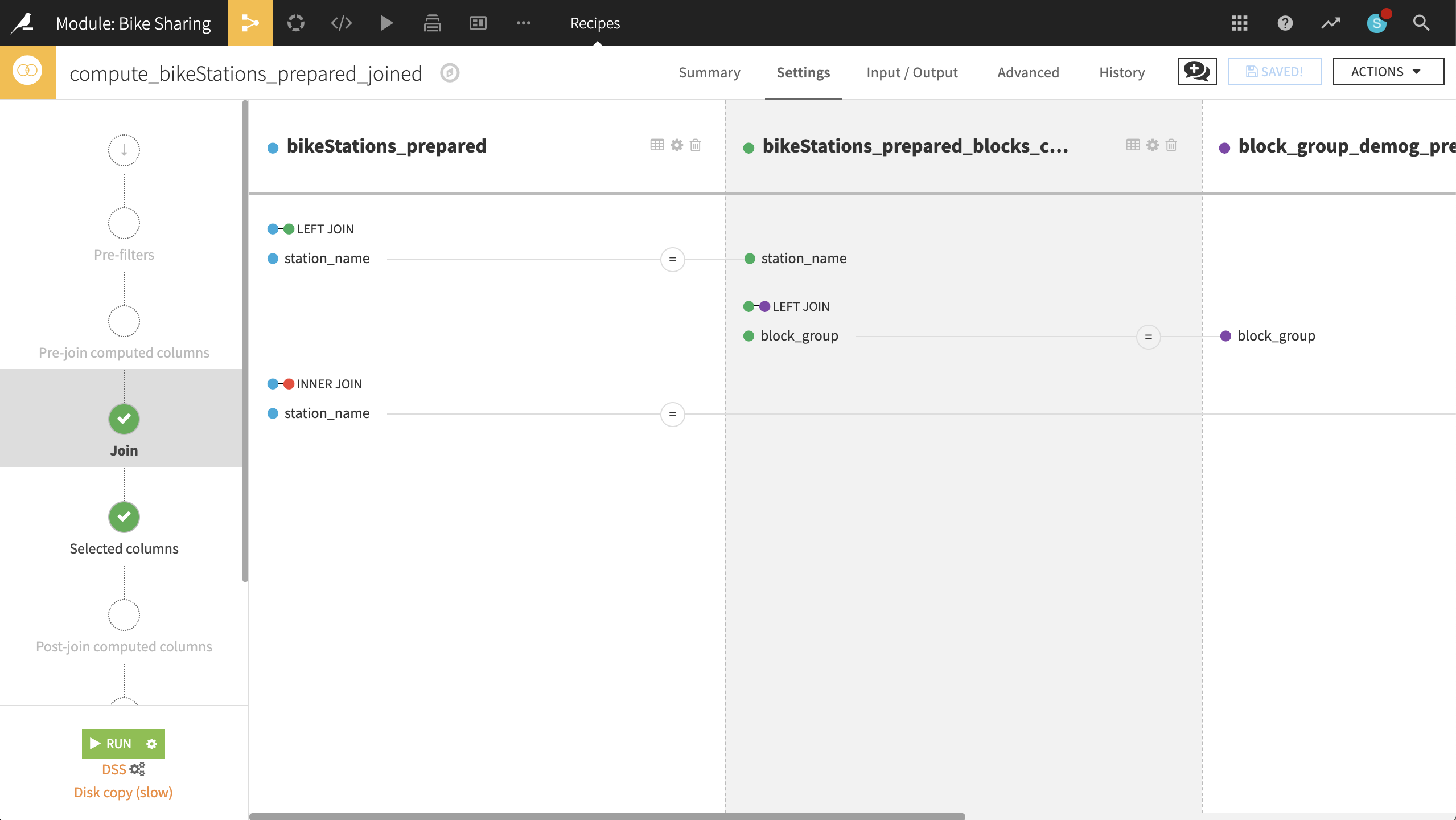
Join all data
Returning to the bikeStations_prepared dataset, create a Join recipe and select bikeStations_prepared_blocks_complete as the dataset to join with. Accept the default output bikeStations_prepared_joined. In the recipe settings:
In the Join step:
station_name is unique in both datasets, and so should be the only join condition necessary. Keep the left-join.
This step just adds back the missing columns nbBikes and geopoint.
Add block_group_demog_prepared as a third input dataset, left-joined to bikeStations_prepared_blocks_complete as the existing input dataset.
If stored as strings in both, Dataiku should automatically find block_group as the join key. If it does not, please make sure that block_group is set as the join key for both datasets.
Most importantly, this join adds the number of people in a block group to the larger dataset.
Add bike_data_pivoted as a fourth input dataset, joined to bikeStations_prepared as the existing input dataset.
Set the type of join to an “Inner Join”, and the join key to station_name and Start station.
This enriches the bike station data with the aggregated trip data.
In the Selected columns step, we can drop some columns we won’t need.
From bikeStations_prepared, keep only nbBikes, station_name and geopoint.
From bikeStations_prepared_blocks_complete, keep only county_name and state_name.
From block_group_demog_prepared, keep only block_name and nbPeople.
From bike_data_pivoted, drop Start station.
Run the recipe, updating the schema to 35 columns.
Our station dataset is now enriched with demographic and trip information! For every station, we have the number of bikes, the associated census block group and the number of people living in it, and data on the duration and count of bike trips by casual and member riders each day of the week.
Identify Similar Bike Stations
Now we are ready to identify “similar” stations with a clustering model.
From the Lab of the bikeStations_prepared_joined dataset, choose Quick Model > Clustering > Quick Models > K-Means, accepting the default output name.
Before training any model, in the Features handling section of the ML task Design tab:
Set the Roles of nbBikes, county_name, state_name, and nbPeople to Use for display only.
Then Train the model. Open the resulting model and navigate to the Heatmap to gain a better understanding of the clustering results.
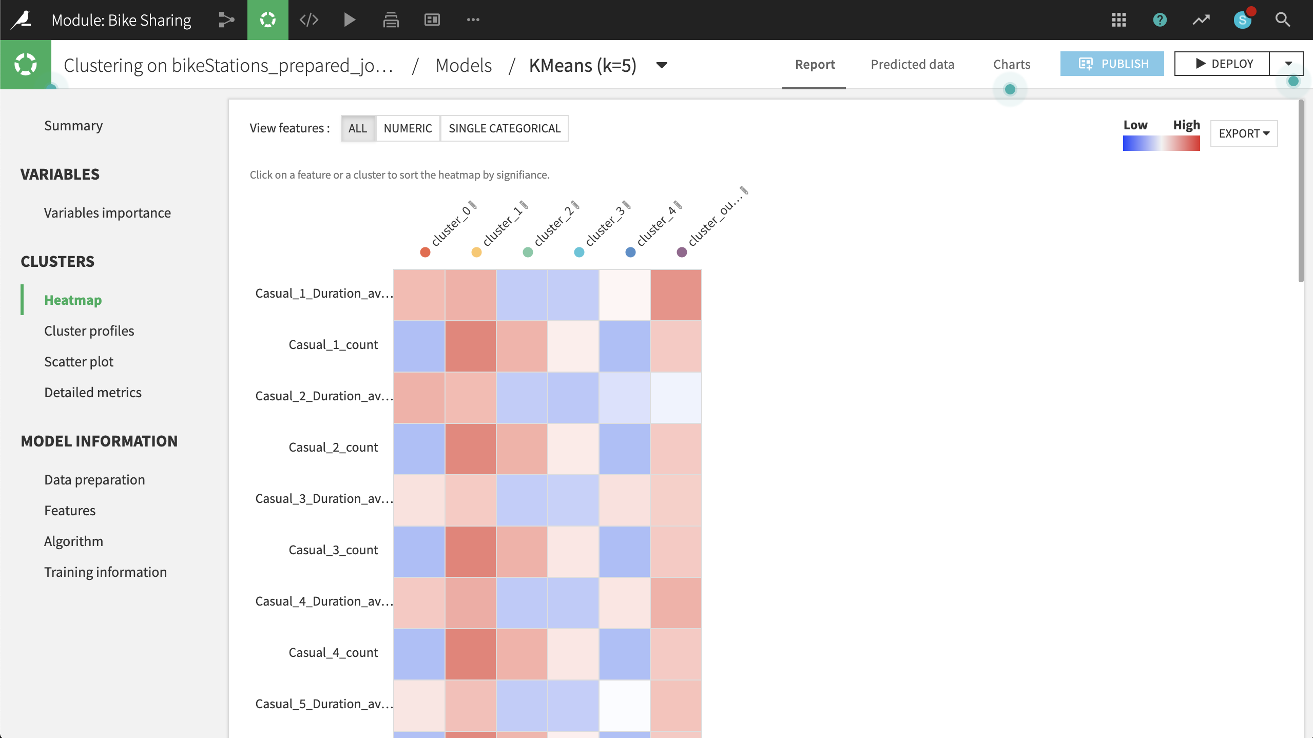
Based on the heatmap and other metrics, such as the Summary observations, we can suggest naming the clusters according to the table below:
Cluster
Strongest Association
Rename
0
High concentration of Maryland; low counts, but long duration of trips
MD
1
Longer trips by casual users in DC, esp. on the weekend
DC Tourists
2
Shorter trips by members in DC on the weekend
DC Weekenders
3
Short trips by members in DC on weekdays
DC Commuters
4
High concentration of Virginia; low counts and low duration of trips
VA
Let’s visualize the clustering results on a map. To do this, at the top right:
Click Deploy > Deploy a retrainable model to flow.
The input dataset is the default bikeStations_prepared_joined.
Keep the default model name and select Create.
Select the model from the Flow and use the Apply recipe to score the bikeStations_prepared_joined dataset.
Accept the default output name, and run the recipe.
Note that the output dataset now has one additional column, cluster_labels, including the model’s predicted groupings.
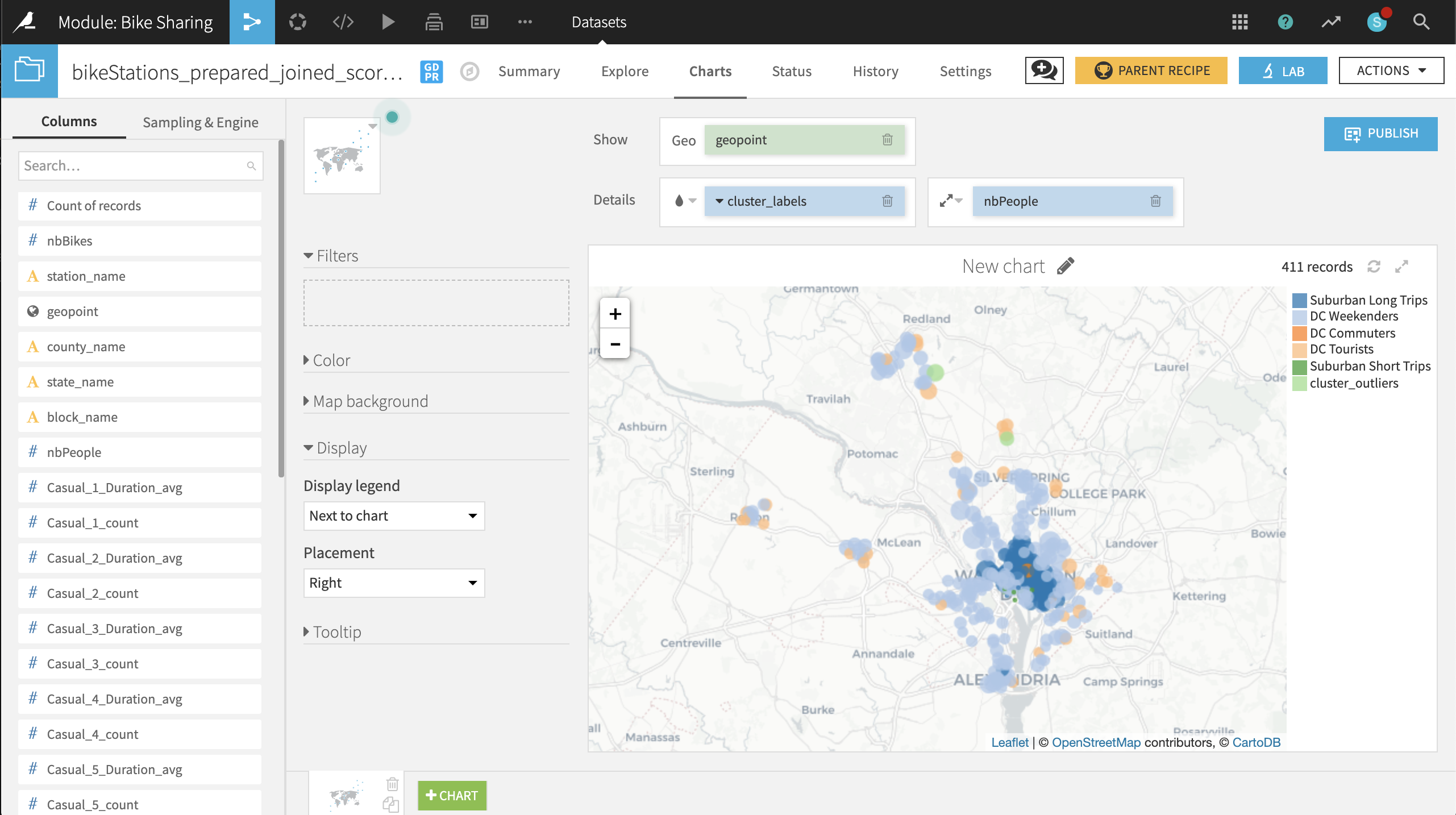
Now on the Charts tab of the same output dataset, create a Scatter Map with:
geopoint as the column identifying the location of points
cluster_labels as the column to color the points
nbPeople as the column to set the size of points. With the icon to the left of the nbPeople box, reduce the base radius so that the points don’t overlap too much.
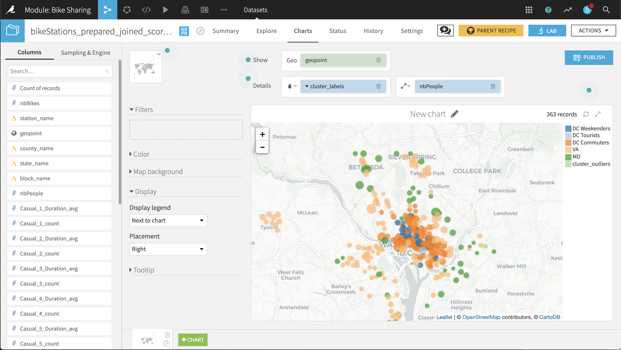
The placement of labeled clusters on the map gives us even more insight:
The VA and MD clusters have a number of points outside those states. It might be better to respectively rename these clusters Suburban Short Trips and Suburban Long Trips, respectively.
The DC Tourists cluster is clustered, not surprisingly, around the Mall and other sites of interest to tourists.
The DC Commuters cluster is spread across the downtown of DC, in blocks with large numbers of people.
The DC Weekenders cluster is interspersed among the DC Commuter locations.
These general shapes make sense. The map helps increase our confidence in the clusters. From here, it can be useful to look at individual points that seem out of place.
For example, there are three stations just north of the Constitution Gardens Pond in DC that are in the VA cluster. What makes them different from the nearby DC Commuters points? Perhaps these stations are under-performing, and should be closed, relocated, or have the number of available bikes reduced.
Before retraining the model with 2017 data, take a few screenshots of the 2016 map to make it easier to compare before and after results.
Retrain the Model with New Data
New Capital Bikeshare data is periodically being created and uploaded to the site. Recall that the bike_data folder already contains data from 2017. We can incorporate this new data into the Flow and retrain our clustering model to account for changing usage of the Bikeshare system.
Return to the bike_data dataset, and navigate to the Settings tab.
Within the Files tab, select List Files to display the names of the two files available in the folder.
On the left, click on Show Advanced options and change the “Files to include” field to the 2017 data.
Click Test. Refreshing List Files should reflect the change.
After saving, return to the Explore tab. The Start date column should have 2017 dates.
Note
Depending on the situation, we might want to keep the 2016 data and analyze the combined data. For the purposes of this use case, we’ll retrain the model on just the 2017 data.
With the bike_data dataset now holding 2017 data, let’s retrain the model using the same workflow.
From the Clustering (KMEANS) on bikeStations_prepared_joined recipe, click Retrain from the Actions menu of the right sidebar.
For handling of dependencies, select Build & train required. This will perform a recursive build of the pipeline and pull the 2017 data through to the cluster model retraining.
Note
To see exactly which computations will be executed, clicking Preview takes one to the Jobs panel, where you can inspect the queue of activities awaiting any job.
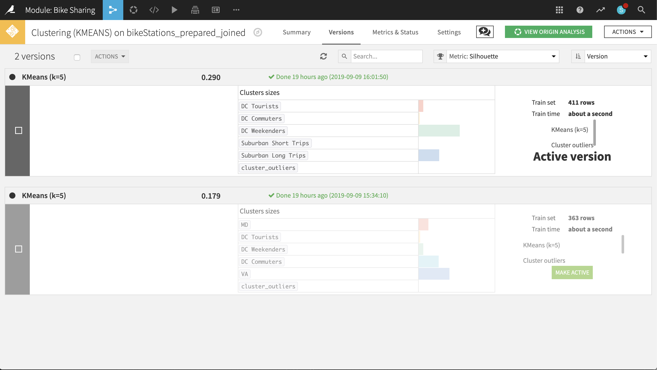
From the Flow, double-click on the model to see both versions. At the top-left corner of the Active version, click on KMeans (k-5) to inspect the updated metrics.
Looking at the updated heatmap, it appears that the clusters have shifted slightly. After studying the metrics, it may make more sense to label the clusters accordingly:
Rename VA to
Suburban Long Trips.Rename MD to
DC Tourists.Rename DC Commuters to
Suburban Short Trips.Rename DC Tourists to
DC Commuters.
Rebuild the final scored dataset (a non-recursive build should be sufficient). Navigate to the map in the Charts tab to see what has changed.
Just eyeballing, it’s difficult to see any significant changes from 2016 to 2017. A couple of stations in the outlier cluster now appear in Maryland, far away from downtown DC. It is now your role to identify and understand any other changes. :-)
Wrap-up
Congratulations! We created an end-to-end workflow to examine the geographic patterns of usage in a bike sharing system and retrained our clustering model on new data.
You can always compare your results with a completed version of the project in the Gallery.
With the aim of better understanding public mobility in a congested metropolitan area, we:
Utilized many common data preparation recipes such as Download, Prepare, Join and Pivot
Leveraged visualization tools like charts and interactive maps to guide our analysis
Demonstrated features like adjusting sample sizes, previewing jobs and write-protecting datasets
Built (and re-built) a clustering model to identify similar stations in DC
Thank you for your time working through this use case. Next, you might try downloading more recent data from Capital Bikeshare and exploring how the clusters further evolve!