Concept: Correlation Matrix
Let’s summarize what we just learned in the concept video. Then, we’ll continue with the hands-on lesson where you can apply your knowledge.
Correlation Coefficients
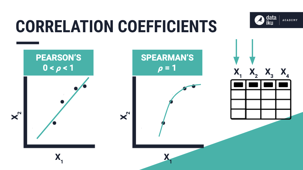
Recall that a correlation coefficient represents how pairs of numerical columns in a data set are related, as well as the strength of the relationship,
using a value between -1 and +1.
Pearson’s linear correlation coefficient provides a measure of the strength and direction of linear relationships, while Spearman’s rank correlation coefficient can measure the strength of nonlinear monotonic relationships between variables.
Correlation Matrix Card
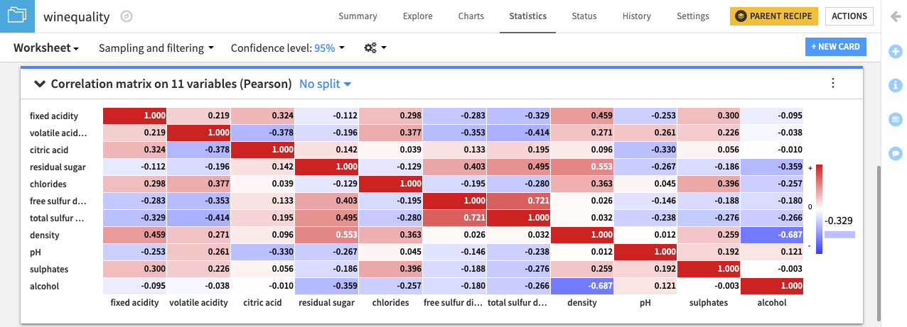
A correlation matrix is useful for displaying the pairwise correlation coefficient values when there are many columns in a data set.
When creating a Correlation matrix card in the worksheet, Dataiku DSS prevents you from adding categorical variables. Therefore, if your data consists of ordinal variables for which you want to compute Spearman’s correlation, you must first map the categories to numbers, and treat them as numerical variables.
The correlation matrix is displayed as a heatmap with a legend that tells us the values corresponding to the colors. Notice that the correlation matrix is square, symmetric, and has a diagonal whose elements are all equal to 1, as any variable must be perfectly correlated with itself.
To configure the visualization of the correlation matrix, click the menu (⋮) button for options to:
Show absolute values
Show values as colors
Show values as text
Set a threshold for values to be displayed in the matrix.