Concept: Charts

Tip
This content is also included in the free Dataiku Academy course, Basics 101, which is part of the Core Designer learning path. Register for the course there if you’d like to track and validate your progress alongside concept videos, summaries, hands-on tutorials, and quizzes.
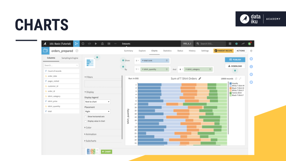
Visualization is a key tool in the data exploration and discovery process. To meet this need, the Charts tab of a DSS dataset houses a drag-and-drop interface for visual exploration. Many different types of charts are natively available including bar charts, line graphs, pivot tables, and scatterplots.
The Chart builder has many other features to assist in the exploration of your data. For example, with time series, you can zoom in on different periods, change the aggregated date interval, explore multiple series within the same chart, examine them side-by-side in subcharts, or create basic animations.
When working with large numbers of groups of categorical data, you can easily control the number of displayed values by grouping less-prevalent categories into an “other” bucket. You can also drill down into a dataset by adding filters to the chart from a tooltip.
By default, charts in DSS use the same sample found in the Explore tab.
You can also select an execution engine when working with certain types of datasets, such as those stored in SQL databases. Such a chart can be executed in-database to improve performance.
Learn More
In this lesson, you learned to use the Charts tab of a Dataiku dataset for visualization. Get more practice with this and other features of Dataiku DSS by visiting the Hands-On Tutorial: Create the Project.