Help on Active Learning Webapp
The webapp covers 2 main usages: Object detection and simple classification. The two usages have a different user interface.
Simple classification
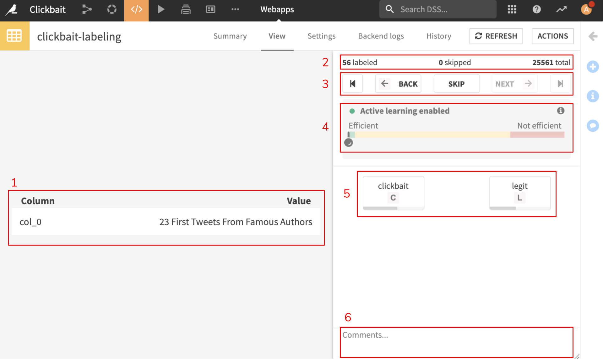
- Sample display (1)
Tabular samples are shown in a table with column title on the left and value on the right, as seen in this example. Images are simply displayed. For sounds, basic controllers (play / pause / stop) are proposed to be able to listen the samples several times.
- Labeling progress (2)
Displays how samples have been labeled so far, number of samples skipped, and the total number of samples.
- Sample navigation bar (3)
Allows one to navigate among labeled samples. From left to right:
Go to first sample
Go to previous samples
Skip current sample
Go to next sample
Go to the last sample
- Halting hint (4)
This color bar is an indication of whether or not the samples are interesting for the model. This heuristic does not come with any guarantee. Color meanings are:
Green means that these samples uncertainty score stands out from the rest of the samples. It does not mean that they will bring value to the model for sure.
Orange means that the sample is located in a group that looks like random (uniform) sampling. It means that we believe labeling samples in this area is the same as if you used random sampling. We advise the user to generate new queries as soon as possible when entering this area.
Red means that the model is almost sure of the class of this sample. It means that the sample is very similar to an already labeled one. We discourage users to label these samples.
- Class selection (5)
This area displays one button for each class. Buttons can be clicked, but they can also be triggered using the hotkeys displayed in each button in a grey square. Clicking a class will automatically move on to the next sample.
- Comment section (6)
Free text area used to add a personalized comment to the labeling. The comment is saved whether the sample is classified or skipped. It can be accessed by other annotators to understand the choice made by one or discuss a tricky sample.
Object detection
The object detection webapp has a lot in common with the previous one. We do not detail again those elements.
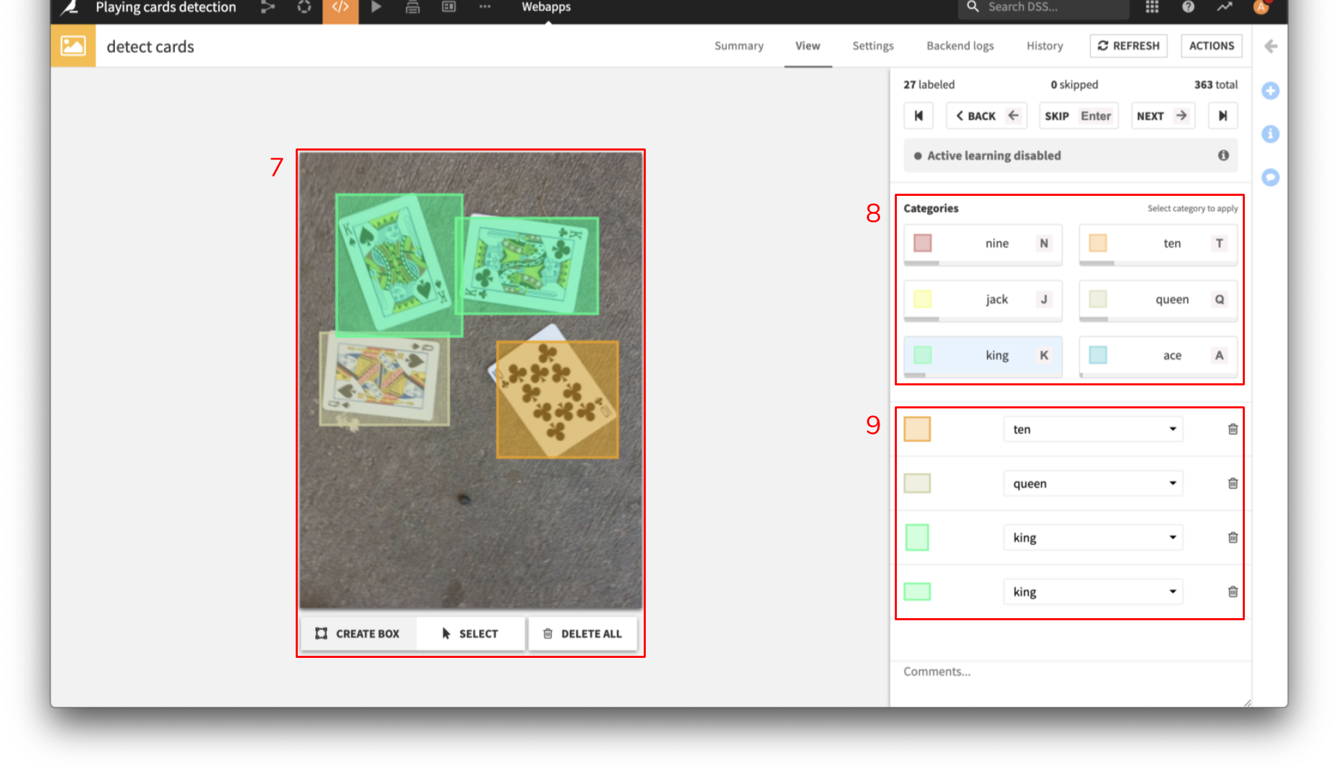
- Drawing area (7)
The display area now allows you to draw bounding boxes. For now, only rectangle that cannot be rotated are allowed. Bounding box can be drawn by clicking, holding the click, and moving the mouse. Bounding boxes can then be selected to be resized. The selection mode can be enabled at the bottom and allows to select several boxes in order to perform mass actions (mass movement or mass deletion).
- Class selection (8)
In the object detection webapp, the buttons of this area also display a color that is the display color of objects for this class. Note that the class must be selected before drawing the bounding box to be taken into account.
- List of objects (9)
A list of already selected objects is kept on the bottom right to help the user performing mass actions on the labellings. It also allows to change the class of a bounding box or delete it.

