Tutorial: Create an HTML/JavaScript Webapp to Draw the San Francisco Crime Map
In this tutorial, you will learn how to create a webapp in Dataiku DSS, using HTML and JavaScript (and later adding a Python backend), to draw a map of San Francisco with information on the number of crimes by year and location.
The final webapp can be found in the SFPD Incidents project on the Dataiku gallery.
Prerequisites
Some familiarity with HTML and JavaScript
Some familiarity with Python (to use the Python backend)
Supporting Data
We will work with the San Francisco Police Department Crime Incidents data. The SFPD crime data is used under the Open Data Commons PDDL license.
Create Your Project
From the Dataiku homepage, click +New Project > DSS Tutorials > Visualizations > SFPD Incidents.
Alternatively you can download the full dataset from the San Francisco Open Data Portal and import it into a new blank project.
Prepare the Dataset
On the map, we are going to display the data with year-based filters. In order to do that efficiently, we are going to start by creating a new enriched dataset with a “year” column.
Select the dataset and create a new Prepare recipe with
sfpd_enrichedas the output.Parse the Date column as a new step in the script.
From the parsed date, add a new Extract date components step to the script. Only extract the year to a new column named year (empty the column names for month and day).
Rename column X to
longitudeand column Y tolatitude.Click Run, updating the schema.
Create a New Webapp
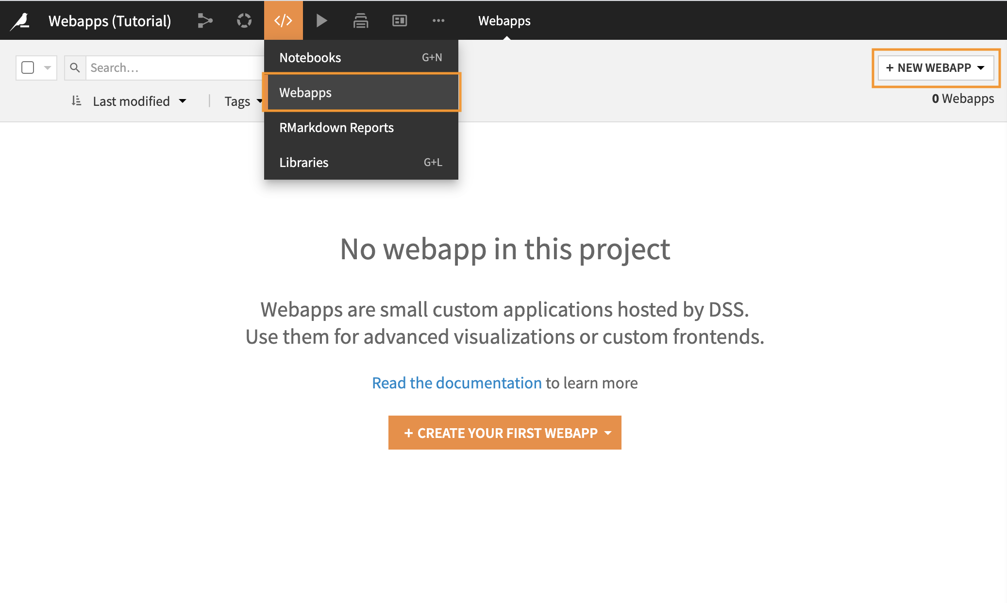
In the top navigation bar, select ‘</>’ > Webapps.
Click + New Webapp (or + Create Your First Webapp).
Select Code Webapp > Standard.
Choose Starter code for creating map visualizations and type a name like
sfpdfor the webapp.
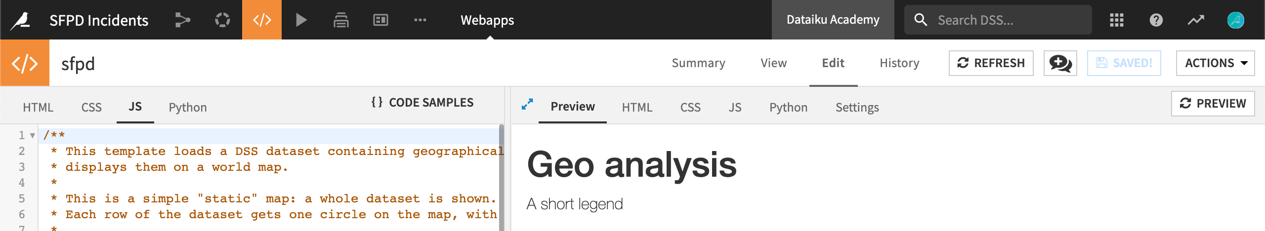
The Webapp Interface
Webapps, like other objects in DSS, have a number of tabs, such as Summary and History, containing different types of information.
The View tab displays the present state of the webapp, as generated by the code found in the Edit tab.
The Edit tab is divided into two panes, the size of which can be adjusted.
Within the Edit tab, the left side panel contains the code for the webapp:
A standard webapp will have tabs for HTML, CSS, JavaScript (JS), and Python.
A Shiny app will have tabs labeled UI and Server.
A Bokeh app will just have Python.
The right side panel additionally has tabs for Preview, Log and Settings.
Webapp Settings
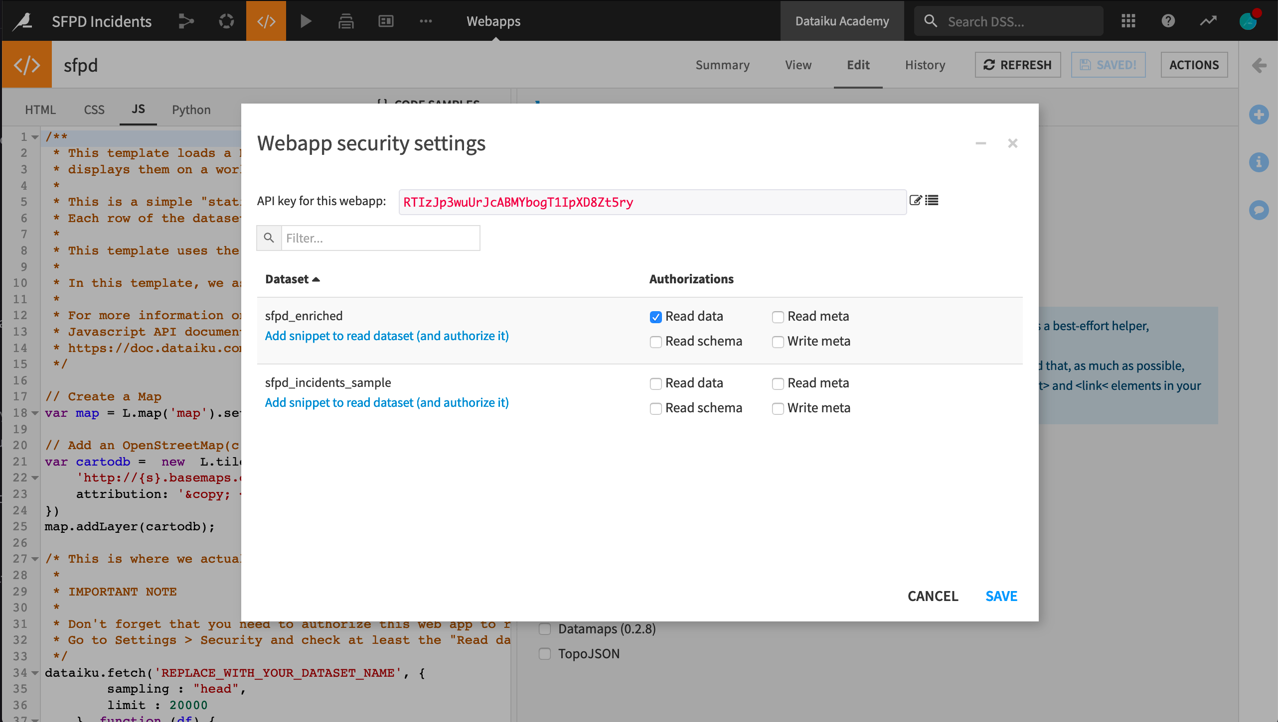
Since we’ll be reading a dataset, we first need to authorize it in the security settings.
Navigate to the Settings tab in the webapp editor.
Click Configure under the Security heading.
Select Read data for the enriched dataset.
Note
Often we might click the link “Add snippet to read dataset”. However, because we have the starter code for creating map visualizations, we don’t need to do this.
We are going to use the JavaScript libraries Leaflet to draw the map, jQuery to add a slider to select the year, and d3.js to tune colors. On the Settings tab, ensure that these three libraries are selected.
Return to the Preview tab.
Create a Map with Leaflet
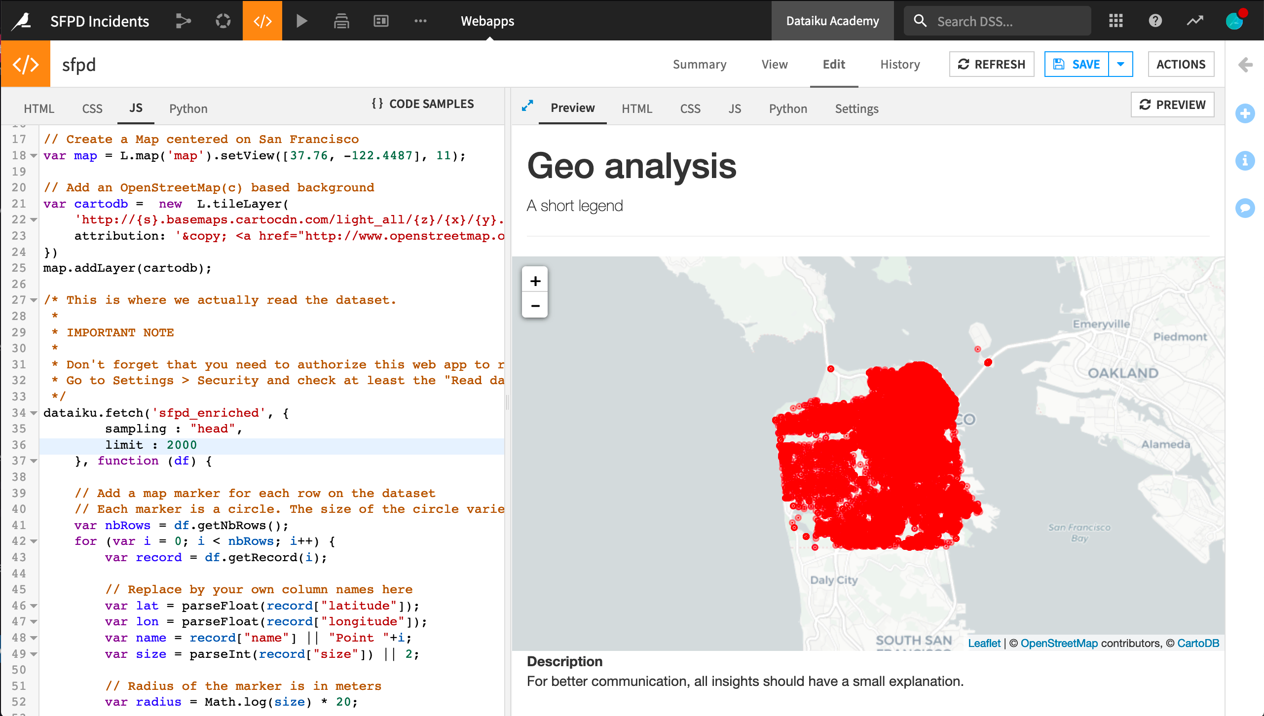
The starter code provides us with a default map, with no data, centered on France. We want it to be centered on San Francisco. In the JavaScript code, find the line where map is defined and change it to the following.
// Create a Map centered on San Francisco
var map = L.map('map').setView([37.76, -122.4487], 11);
Click Save to update the preview output.
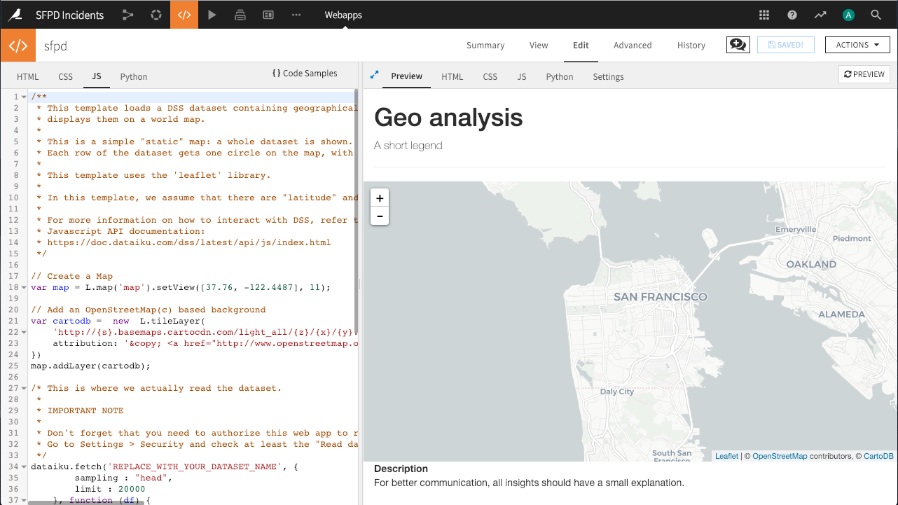
Perfect! A beautiful map now appears. Let’s add some data to it.
Note
The map is displaying data from OpenStreetMap, a free and open world database, and the tiles (the actual images) are provided courtesy of CartoDB.
Add Static Data through the fetch() Method
Still in the JavaScript code, in the dataiku.fetch() call:
Change
REPLACE_WITH_YOUR_DATASET_NAMEtosfpd_enriched.To improve performance, change the value of
limitfrom20000to2000(optional).
Click Save to update the preview output.
Load Data in the Python Backend
While our webapp can retrieve the contents of a dataset in JavaScript, this dataset has a lot of data, and it would not be realistic to load it all in the browser.
We are going to use a Python backend to load the dataset into a pandas dataframe, filter it by year, and aggregate it by area.
In the Python tab, click to Enable the Python backend.
Remove all of the automatically generated code from the Python tab.
In the JS tab, leave the creation of the
mapandcartodbvariables and the linemap.addLayer(cartodb);. Remove all of the remaining code, including thedataiku.fetch()call.
Then paste the code below in the Python tab. This code creates a square lattice on the city. Inside each square, it counts the number of incidents. The result is returned in a JSON that will be used by our JavaScript code to add information to the map.
Note
Notice below how we use the app.route decorator before the count_crime() function declaration to define a backend entry point that will execute the function.
import dataiku
import pandas as pd

# import dataset - NB: update this to fit your dataset name
sfpd = dataiku.Dataset("sfpd_enriched").get_dataframe()
# Only keep points with a valid location and only the criminal incidents
sfpd= sfpd[(sfpd.longitude!=0) & (sfpd.latitude!=0) & (sfpd.Category !="NON-CRIMINAL")]

@app.route('/Count_crime')
def count_crime():
    year = 2014
    # filter data for the chosen year
    tab = sfpd[['longitude','latitude']][(sfpd.year == year) ]

    #group incident locations into bins
    X_B = pd.cut(tab.longitude, 25, retbins=True, labels=False )
    Y_B = pd.cut(tab.latitude,25, retbins=True, labels=False)

    tab['longitude'] = X_B[0]
    tab['latitude'] = Y_B[0]
    tab['C'] = 1

    # group incident by binned locations
    gp = tab.groupby(['longitude','latitude'])
    # and count them
    df = gp['C'].count().reset_index()
    max_cr = max(df.C)
    min_cr = min(df.C)
    gp_js = df.to_json(orient='records')

    #return a  JSON containing incident count by location and location limits
    return json.dumps({
        "bin_X" : list(X_B[1]) ,
        "bin_Y": list(Y_B[1]),
        "NB_crime" : eval(gp_js),
        "min_nb":min_cr, "max_nb":max_cr
    })
When you run the webapp, the Python backend automatically starts. You can find the logs of the Python backend in the Log tab next to your Python code. You can click on the Refresh button to get up-to-date logs.
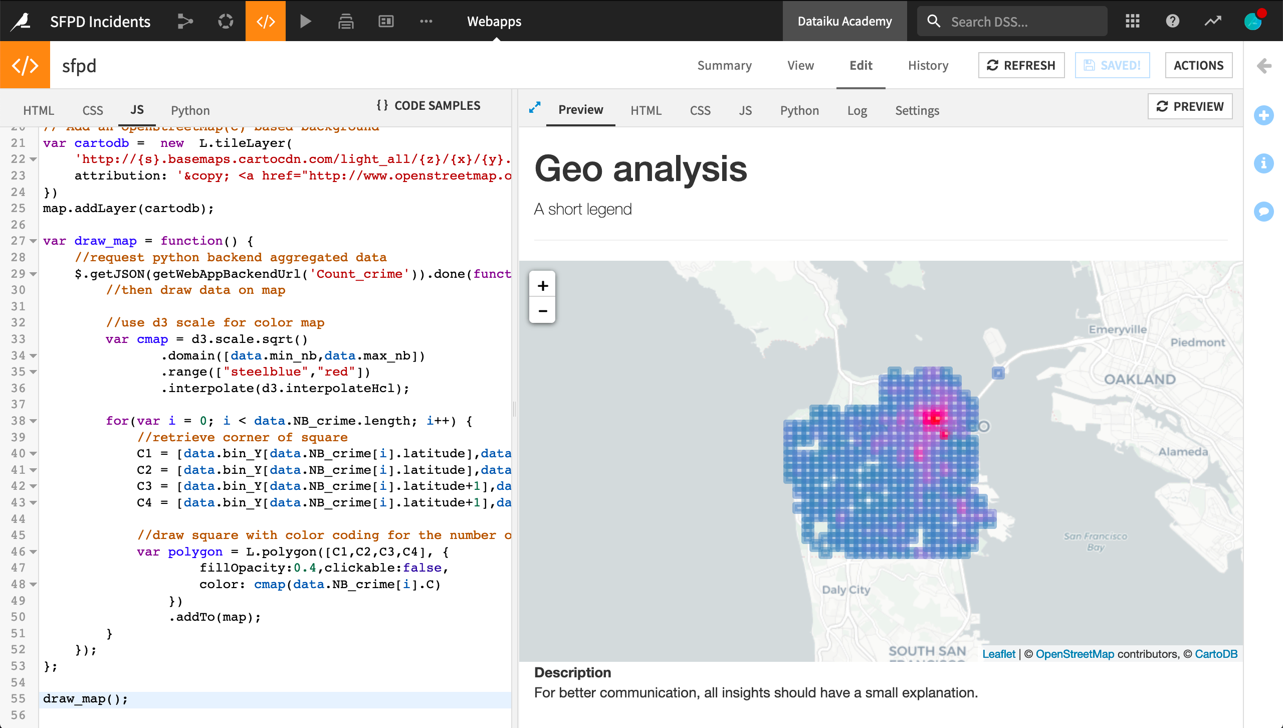
Query data from the backend and draw it on the map
Add the following code to the JS tab to query the Python backend and draw it on the map.
The function draw_map() calls the Python backend to retrieve the lattice and goes through each lattice square to draw it on the map with a proper color (the more red the more crimes).
var draw_map = function() {
    //request python backend aggregated data
    $.getJSON(getWebAppBackendUrl('Count_crime')).done(function(data) {
        //then draw data on map

        //use d3 scale for color map
        var cmap = d3.scale.sqrt()
               .domain([data.min_nb,data.max_nb])
               .range(["steelblue","red"])
               .interpolate(d3.interpolateHcl);

        for(var i = 0; i < data.NB_crime.length; i++) {
            //retrieve corner of square
            C1 = [data.bin_Y[data.NB_crime[i].latitude],data.bin_X[data.NB_crime[i].longitude]];
            C2 = [data.bin_Y[data.NB_crime[i].latitude],data.bin_X[data.NB_crime[i].longitude+1]];
            C3 = [data.bin_Y[data.NB_crime[i].latitude+1],data.bin_X[data.NB_crime[i].longitude+1]];
            C4 = [data.bin_Y[data.NB_crime[i].latitude+1],data.bin_X[data.NB_crime[i].longitude]];

            //draw square with color coding for the number of crime
            var polygon = L.polygon([C1,C2,C3,C4], {
                    fillOpacity:0.4,clickable:false,
                    color: cmap(data.NB_crime[i].C)
                })
                .addTo(map);
        }
    });
};

draw_map();
Excellent! We have the map of San Francisco with a transparent lattice representing the number of crimes by area for the year 2014.
Note
What if it does not work?
If the lattice does not appear, you can check for errors in two places:
Backend errors will appear in the “Log” tab. Don’t forget to refresh the logs to get the most recent logs
Frontend (JavaScript) errors will appear in the JavaScript console of your browser.
Chrome: View > Developer Tools > JavaScript Console.
Firefox: Tools > Web developer > Web Console
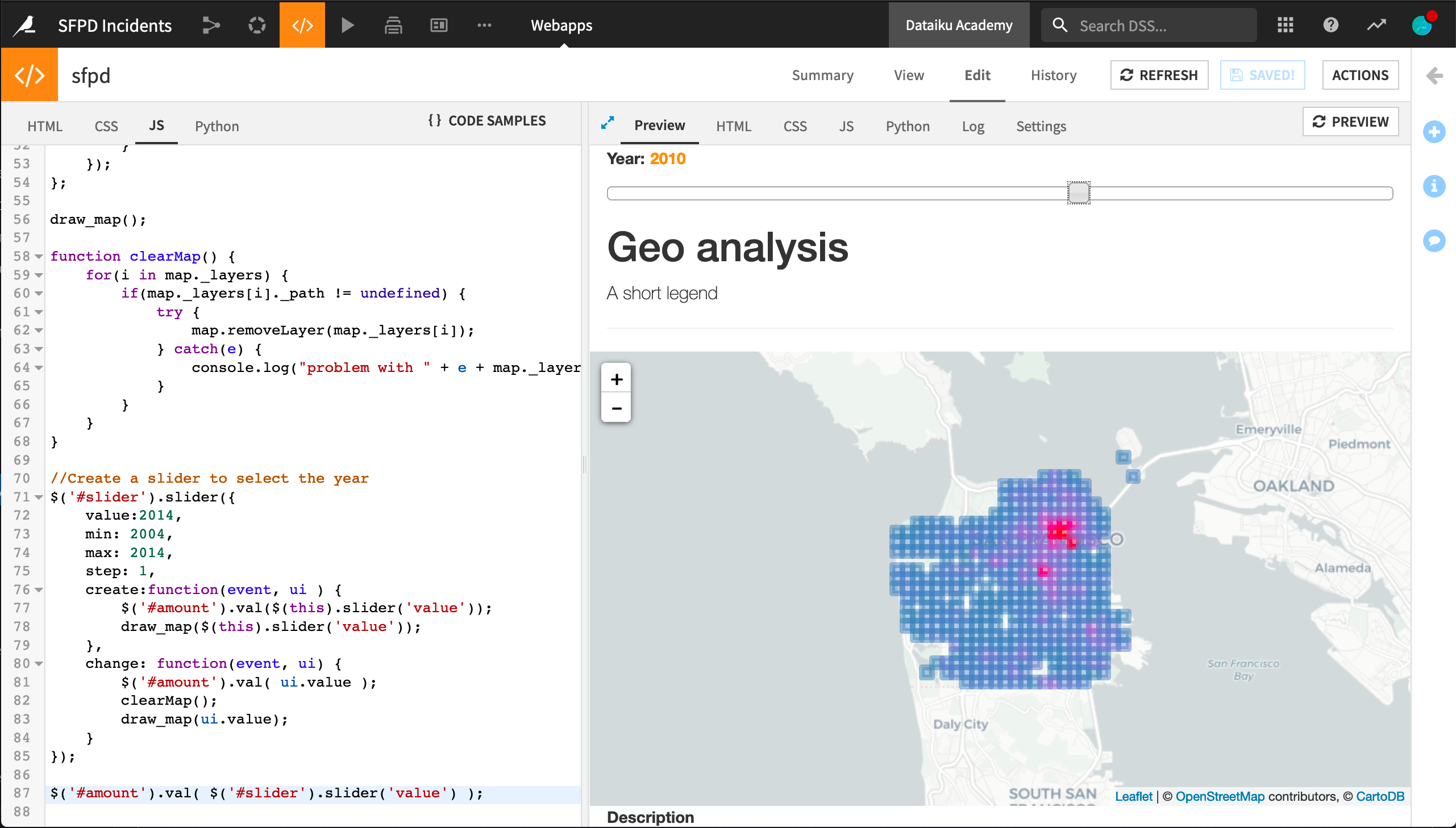
Although we can adjust the map’s zoom level, our application is not very interactive. We are going to add a slider that allows the user to select the year displayed. Each time we move the slider, the backend is called to process data for the selected year.
Add Interactivity
First add the following code to the top of your HTML tab. This sources jQuery add-ons:
<!-- sourcing add-ons for jquery-->
<link rel="stylesheet" href="//code.jquery.com/ui/1.11.4/themes/smoothness/jquery-ui.css">
<script src="//code.jquery.com/ui/1.11.4/jquery-ui.js"></script>
Still in the HTML tab, add an anchor for the slider and an input to display the year selected. The exact placement is up to you. We have placed it directly above the h1 heading.
<p>
    <label for="amount"> Year:</label>
    <input type="text" id="amount" readonly style="border:0; color:#f6931f; font-weight:bold;">
</p>
<div id ='slider'></div>
Now, in the JS tab, we are going to change slightly the draw_map() function to pass the selected year to the Python backend. As shown below, two changes are required:
Pass the argument year to the
draw_map()function.Add the JSON
{year:year}in the request to the backend. In the backend, we’ll retrieve the passed argument and modify thecount_crime()function.
var draw_map = function(year) {
    //request python backend aggregated data
    $.getJSON(getWebAppBackendUrl('Count_crime'), {year:year})
        .done(
            function(data) {
                ...
            });
          }
The “routes” in the backend are made with Flask. In the Python tab, let’s import the functions to access the parameters.
from flask import request
Still in the Python tab, modify the count_crime() function, replacing year = 2014 with the line below:
def count_crime():
    year = int(request.args.get("year"))
    # more python code
Finally, append this sample to the JavaScript part. It adds a slider and a function to clear the map each time we change the year.
function clearMap() {
    for(i in map._layers) {
        if(map._layers[i]._path != undefined) {
            try {
                map.removeLayer(map._layers[i]);
            } catch(e) {
                console.log("problem with " + e + map._layers[i]);
            }
        }
    }
}

//Create a slider to select the year
$('#slider').slider({
    value:2014,
    min: 2004,
    max: 2014,
    step: 1,
    create:function(event, ui ) {
        $('#amount').val($(this).slider('value'));
        draw_map($(this).slider('value'));
    },
    change: function(event, ui) {
        $('#amount').val( ui.value );
        clearMap();
        draw_map(ui.value);
    }
});

$('#amount').val( $('#slider').slider('value') );
We now have a beautiful interactive map of hot areas in San Francisco.
What’s Next
Congratulations! Using Dataiku DSS, you have created a basic interactive HTML/JS webapp. You might now publish it to a dashboard.
Recall you can find the completed version of this webapp in the Dataiku gallery.
Take this project further by adding more information or selectors to the app. You could try to correlate business areas with thefts or see if trees have a calming effect on criminal activity.
For further information on standard webapps, please consult the reference documentation.