Concept: Principal Component Analysis (PCA)
Let’s summarize what we just learned in the concept video. Then, we’ll continue with the hands-on lesson where you can apply your knowledge.
PCA
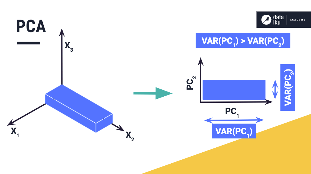
Recall that PCA is useful for representing and visualizing data in a reduced dimensional space of uncorrelated variables that maximize the existing variations in the data. For data represented in PCA dimensions, the largest variation occurs in the direction of the first principal component, followed by the second principal component, and so on.
These attributes of PCA also make it useful for data pre-processing (or feature processing) prior to model building, because reducing the features in a dataset can improve the training performance.
Principal Component Analysis Card
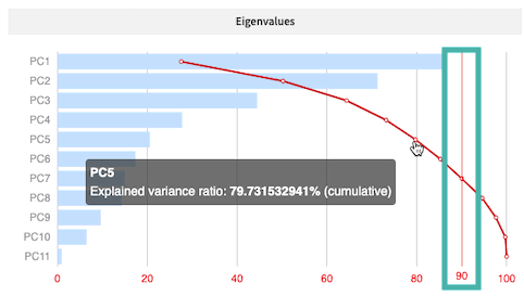
The PCA card displays a plot of eigenvalues and their corresponding principal components. The curved line across the plot shows how the cumulative explained variance of the data increases with the number of principal components. Keeping all the principal components retains 100% of the variance in the data.
For dimensionality reduction applications, we set a cut-off value, such as 90%, for the explained variance, so that the minimum principal components required to attain this cutoff are then used to represent the data.
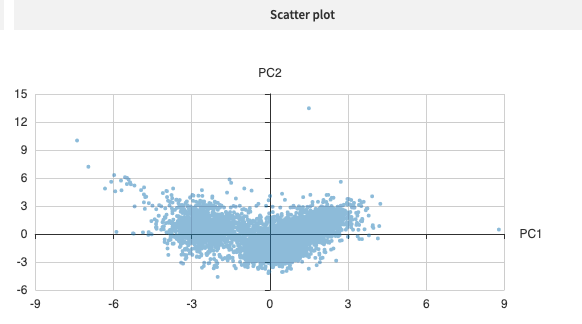
Next, the 2-dimensional scatter plot represents the data set in the dimensional space of the first two principal components. Notice that the variation is largest in the direction of the first principal component.
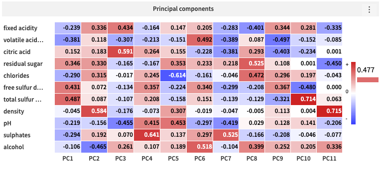
Lastly, the heatmap shows the principal component loading vectors, used in the linear transformation of the data from its original dimension to the reduced PCA dimension.