Hands-On: Evaluate the Model
In Hands-On: Create the Model, you built your first model. Before trying to improve its performance, let’s look at ways to interpret it, and understand its prediction quality and model results.
Objectives
In this section, we’ll evaluate our baseline machine learning model and look for ways we can tune it to both improve its performance and meet business objectives.
To return to where we left off, you need to find the Summary of the random forest model from the lesson, Hands-On: Create the Model.
One way to find it:
In the Flow, open the customers_labeled dataset and then click Actions in the top right corner.
Click Lab and find High revenue analysis.
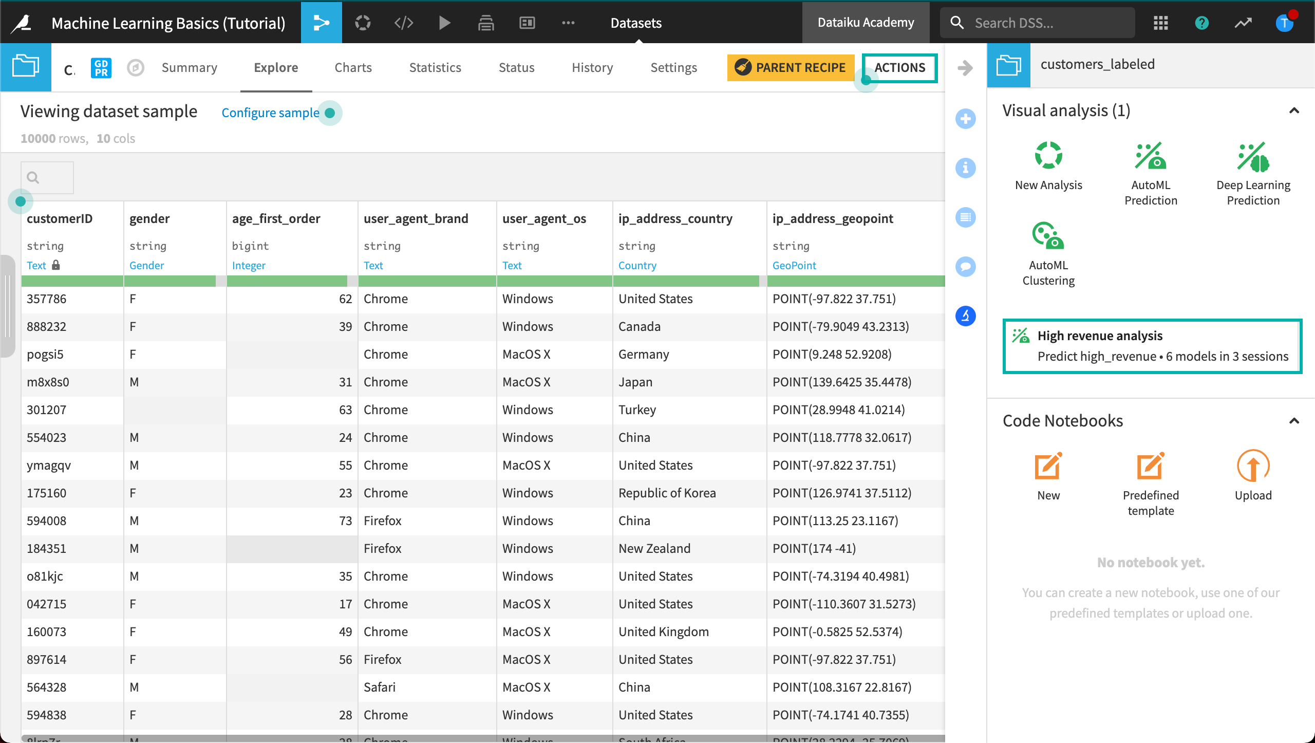
Open the visual analysis, and then navigate to the Models tab.
Model Interpretation
Open the random forest model from Session 1.
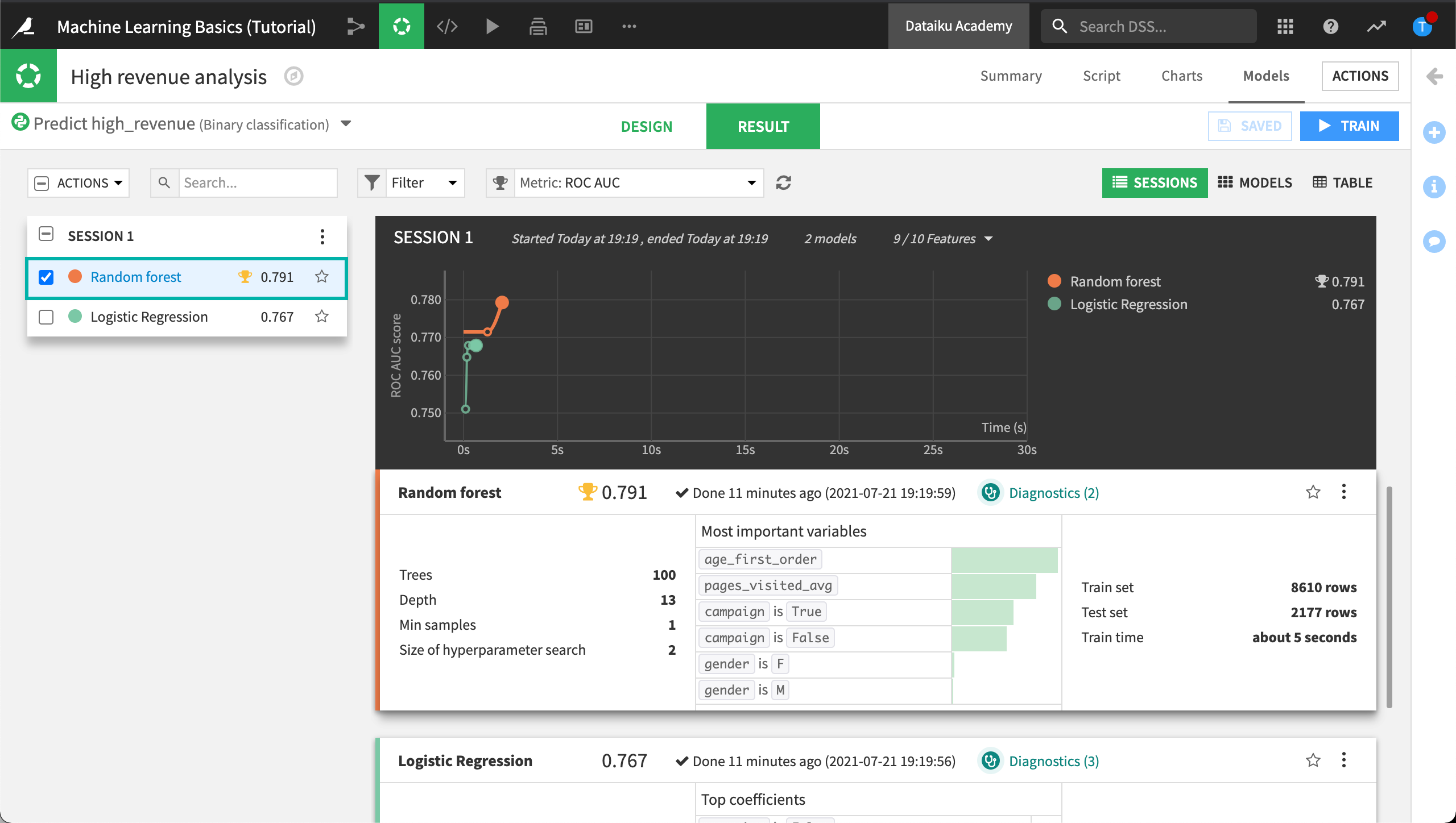
In the model report, you will find a left sidebar panel with tabs that provide different insights into the model, beginning with a Summary.
Interpretation Section
Going down the list in the left panel, you will find a first section called Interpretation. This section provides information for assessing the behavior of the model and the contribution of features to the model outcome.
Some of the panels in this section are algorithm-dependent; for example, a linear model will display information about the model’s coefficients, while a tree-based model will display information about decision trees and variable importance.
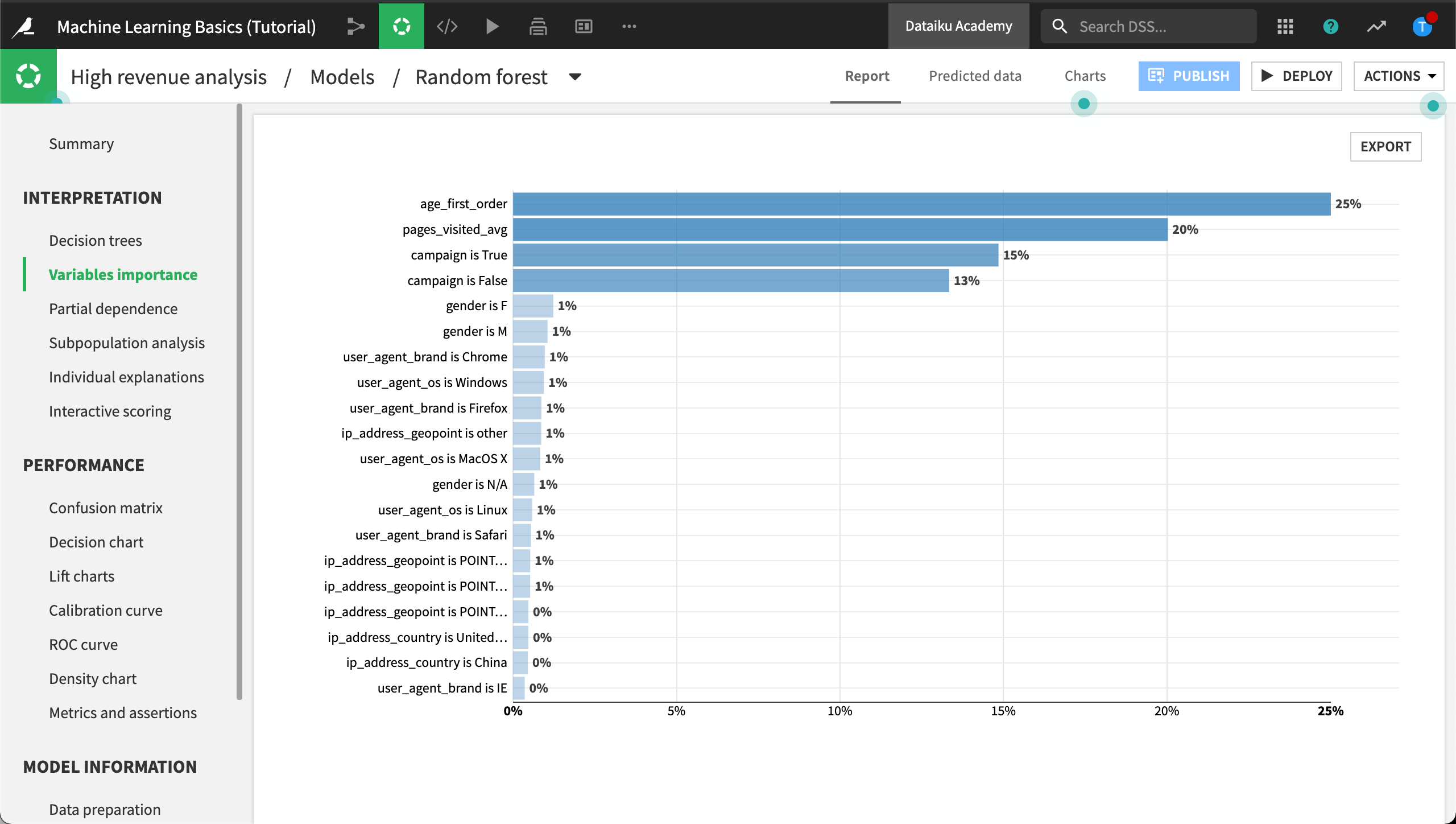
In the Interpretation section, click Variables importance.
Note
You might find that your actual results are different from those shown. This is due to differences in how rows are randomly assigned to training and testing samples.
The Variables importance chart reveals the relationship between the variables used to train the model and the target, high_revenue. We notice that some variables seem to have a stronger relationship than others. Notably, the age at the time of first purchase, age_first_order, seems to be a good indicator along with the number of pages the customer visited, pages_visited_avg.
We can use this information to both evaluate the model’s performance and help meet business objectives. To share this information, you can click Export to export the variables importances.
Meeting Business Objectives
For the purposes of this tutorial, let’s say a business analyst has reviewed the baseline model’s performance along with variables importances. The business analyst then analyzed the labeled dataset to make specific assertions about the model’s performance. For example, the business analyst closely analyzed the relationship between the top two variables and the target high_revenue and has decided that whenever a new observation (a row in the unlabeled dataset) meets certain conditions, the model should label the observation as a high-revenue customer within a certain threshold. In the section on tuning the model, we’ll add conditional statements to automatically check for these assertions.
Note
The Interpretation section also contains a panel for creating partial dependence plots plots, performing subpopulation analysis, providing individual explanations at a row-level, and performing interactive scoring.
We’ll cover these in detail in the Explainable AI section.
Model Performance
Performance Section
Following the Interpretation section, you will find a Performance section.
Note that some sections are algorithm-dependent. Here we discuss options for our classification task, but a regression task would include a scatterplot and error distribution. A clustering task would have a heatmap and cluster profiles.
Confusion Matrix
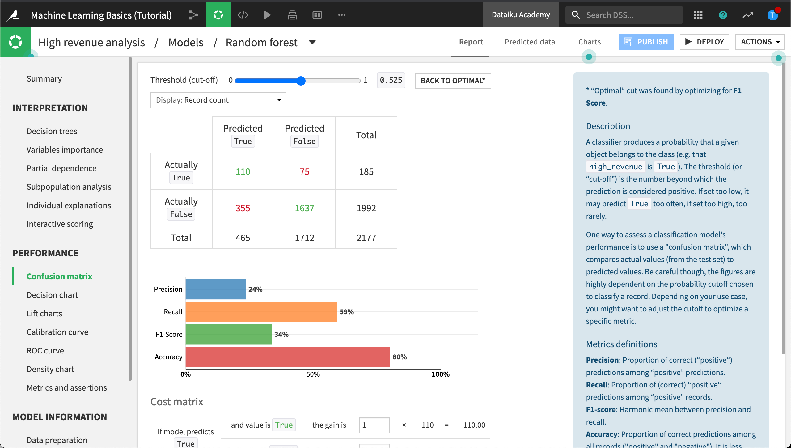
A classification machine learning model usually outputs a probability of belonging to one of the two groups. The actual predicted value depends on which cut-off threshold we decide to use on this probability; e.g., at which probability do we decide to classify our customer as a high revenue one? The Confusion matrix is dependent on the given cut-off threshold.
Click Confusion matrix to view it.
The Confusion matrix compares the actual values of the target variable with predicted values (hence values such as false positives, false negatives…) and some associated metrics: precision, recall, f1-score.
Cost Matrix
In the Confusion matrix, scroll down or zoom out to see the Cost matrix section.
Recall from the business objectives that one of our goals is to detect the “high revenue” customers as best as possible, therefore minimize the error where we mis-classify “high revenue” customers as “non-high-revenue customers”. In other words, we want to minimize the false negatives.
Using the Cost matrix, we can allocate a cost for every incorrect prediction, thereby giving more weight to when the model incorrectly predicts that a high-revenue customer is not high revenue.
To evaluate the average gain (or loss) per record that our model would yield, we simply specify a gain for each of the four scenarios.
Configure the Cost matrix weights as follows:
If the model predicts True and the value is True, the gain is
5.If the model predicts True but the value is False, the gain is
-1.If the model predicts False and the value is False, the gain is
0.5.If the model predicts False, but the value is True, the gain is
-10.
With this configuration, we win $10 for each correct prediction of True, but we lose $10 for each incorrect prediction of False.
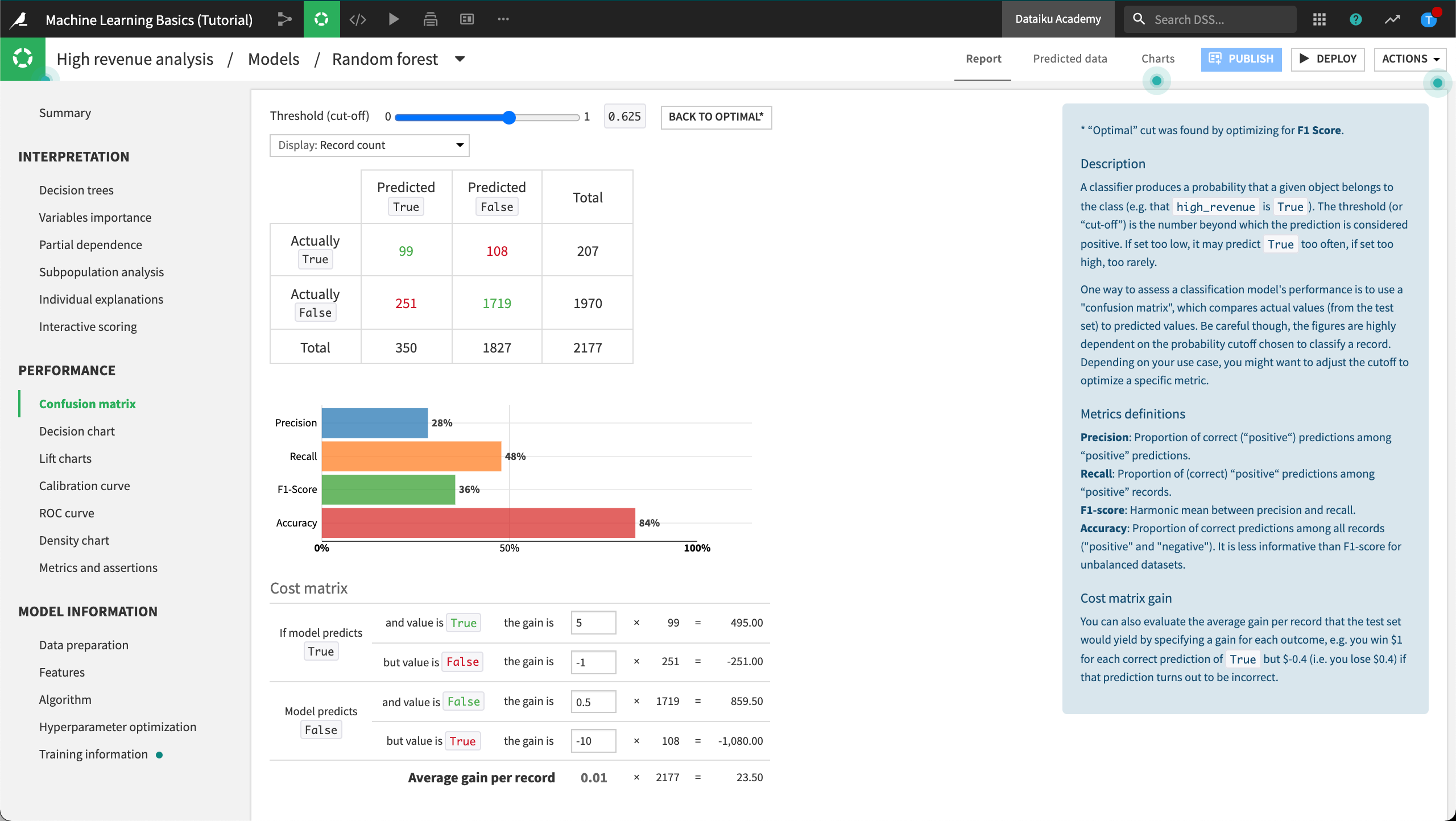
With our Cost matrix weights in place, we could adjust the cut-off threshold using the slider at the top of the Confusion matrix until the Cost matrix reaches an Average gain per record that satisfies our business use case. In our example, our cut-off threshold is set to optimal which corresponds with an Average gain per record of “-0.5”. For each correct prediction of True we are losing an average of $0.5.
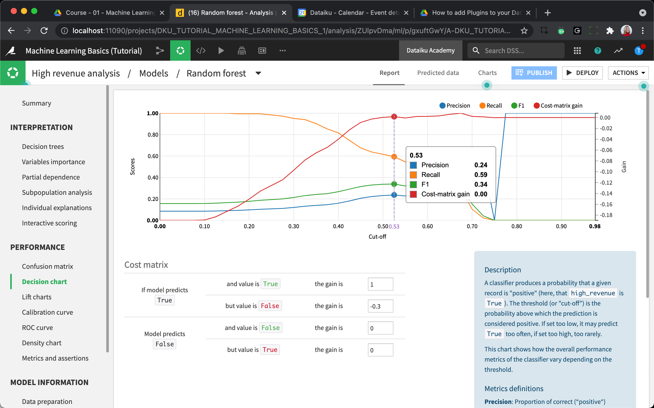
Decision Chart
The Decision Chart represents precision, recall, and f1 score for all possible cut-offs.
Click Decision chart then hover over different cut-off thresholds along the graph to view the resulting metrics.
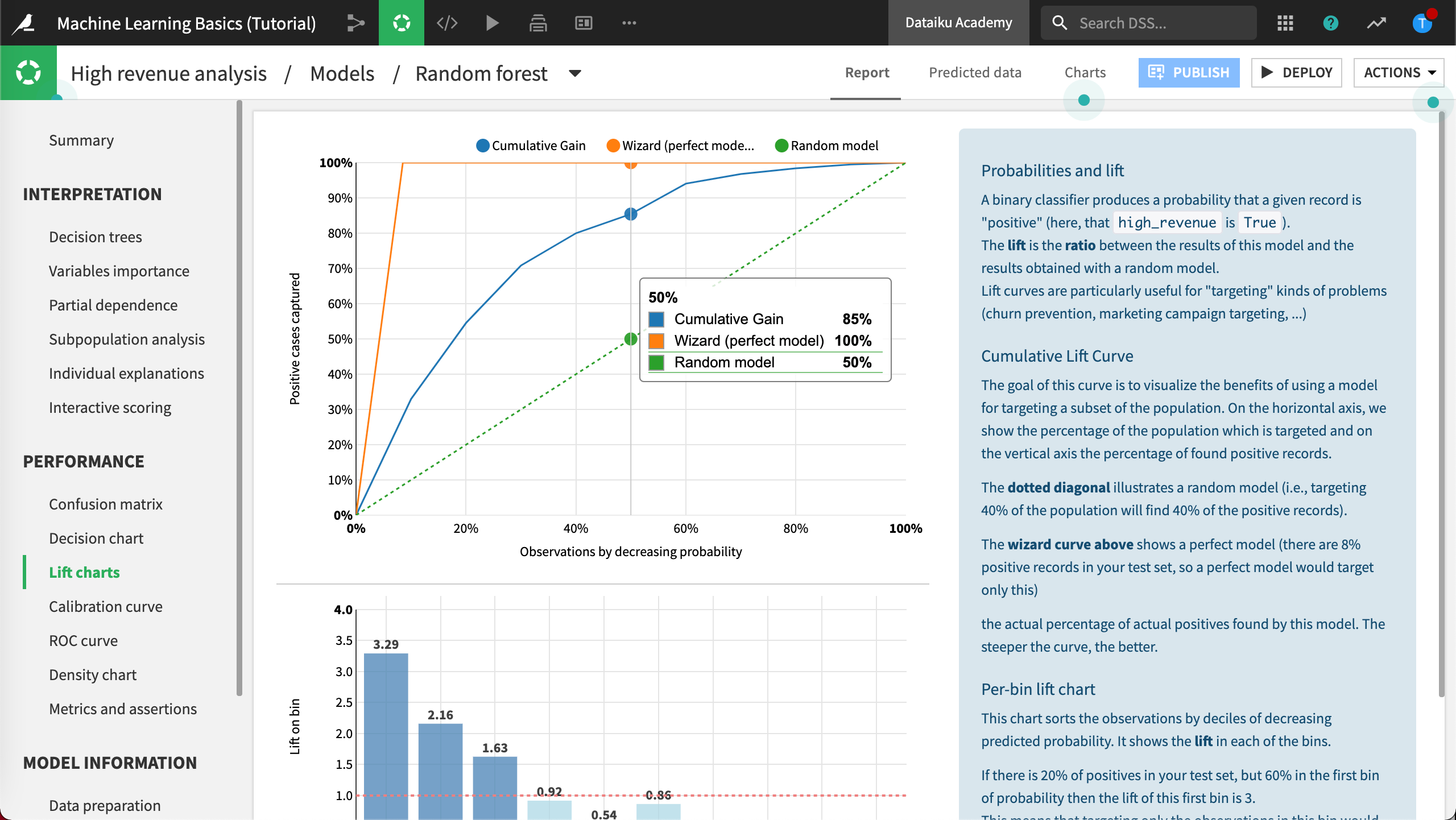
Lift Charts and ROC Curve
The Lift charts and ROC curve are visual aids, perhaps the most useful, to assess the performance of your model. In both cases, the steeper the curves are at the beginning of the graphs, the better the model.
Click Lift charts to view the chart.
Click ROC curve to view the chart.
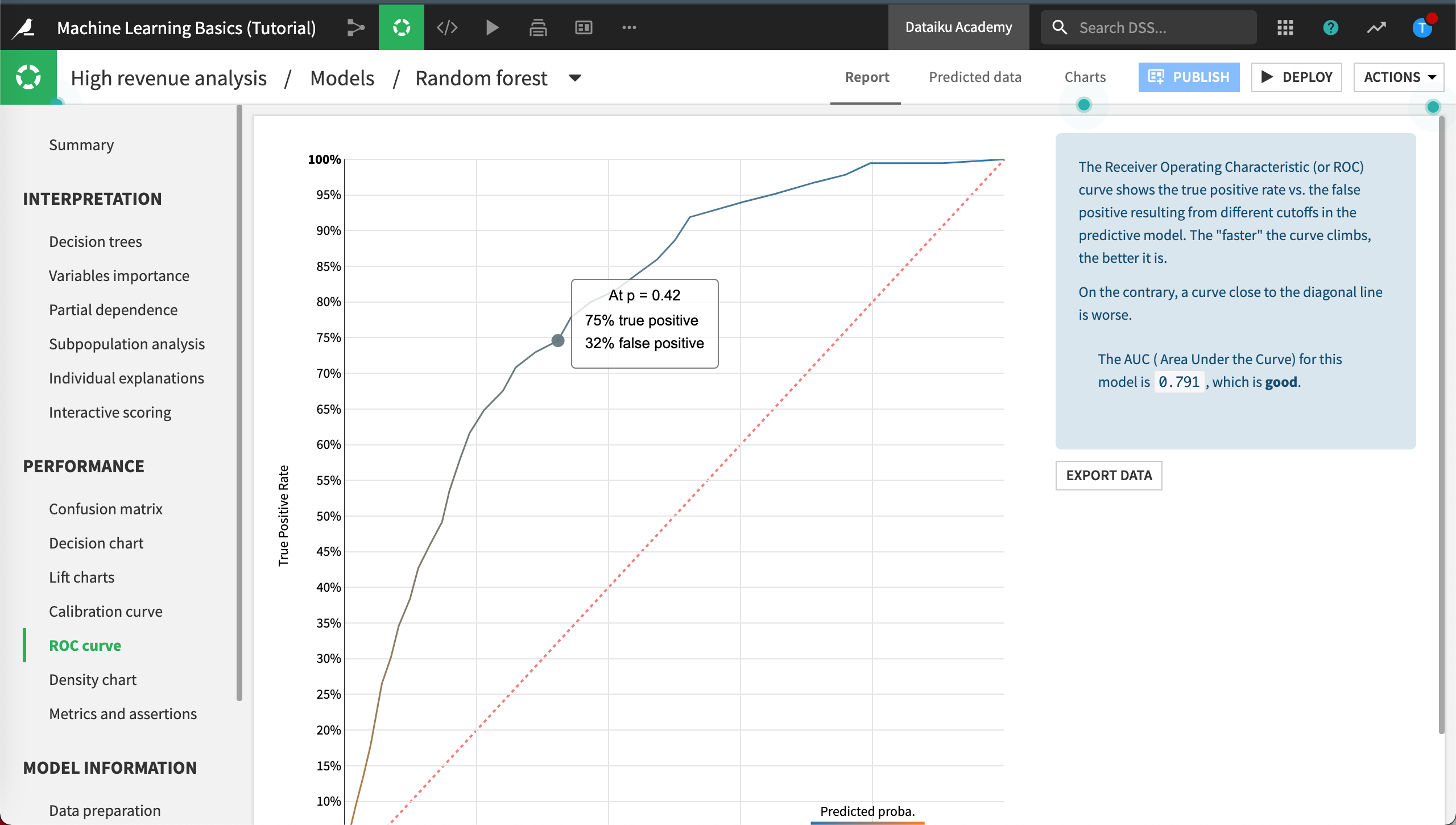
You can visit the model evaluation lesson that is part of the Dataiku Academy course Intro to Machine Learning to learn more about these and other model evaluation tools.
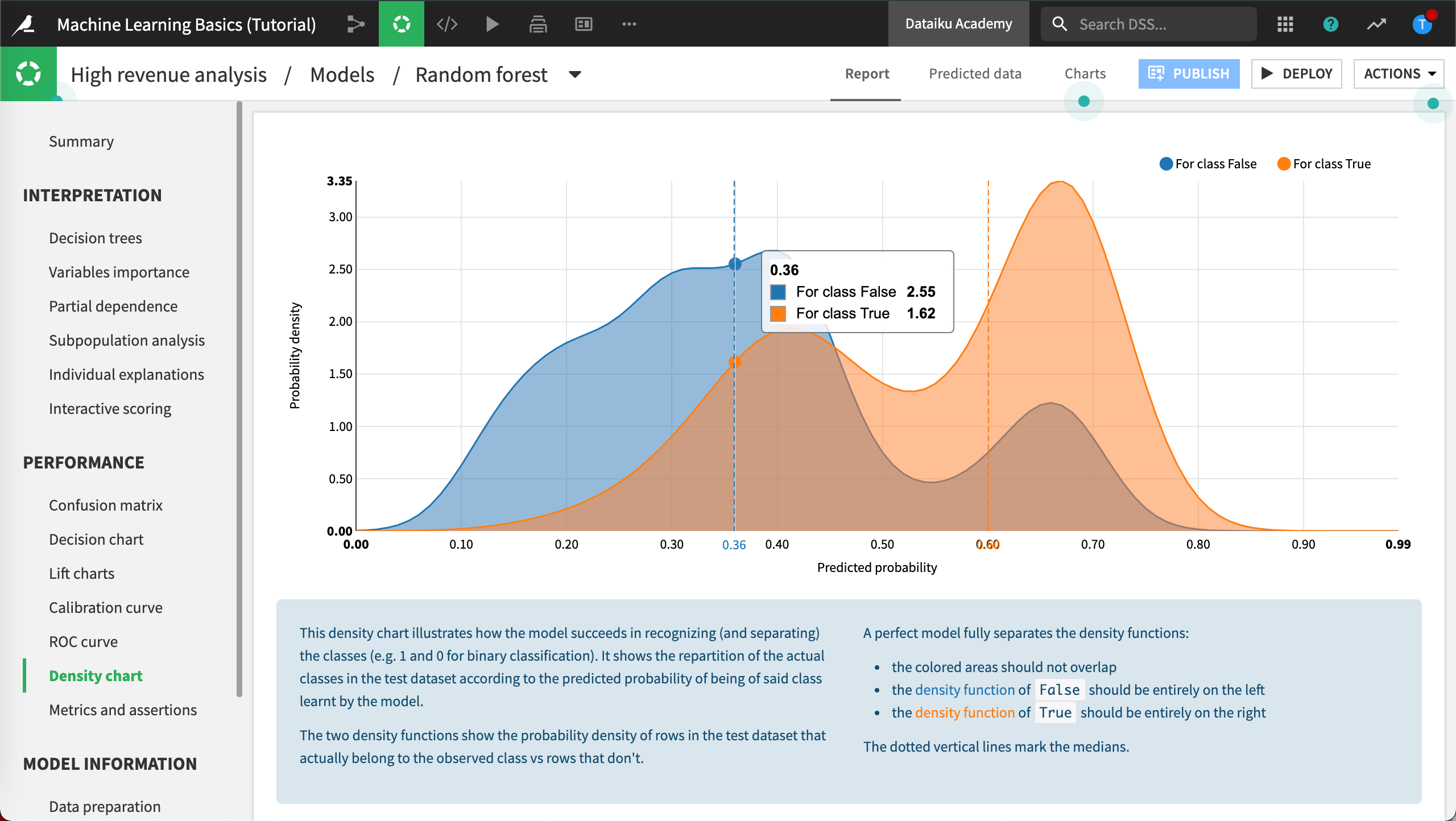
Density Chart
The Density chart shows the distribution of the probability to be high-value customer, compared across the two actual groups.
Click Density chart.
A good model will be able to separate the two curves as much as possible, as we can see here.
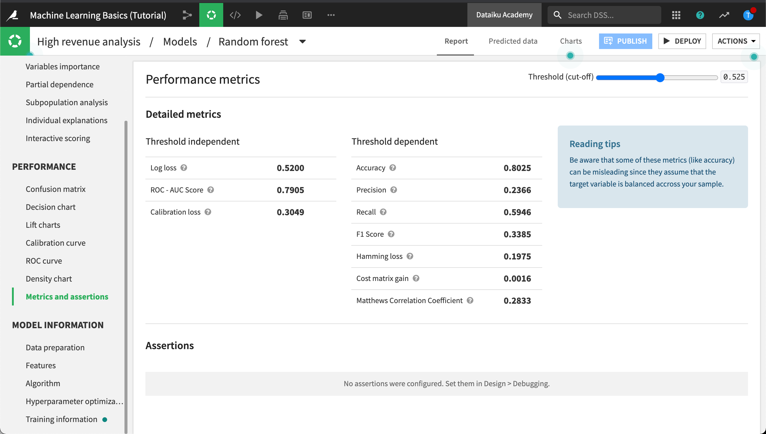
Metrics and Assertions
Recall from our business objectives that the business analyst wants to define built-in checks for ML assertions. In Metrics and assertions we can find out detailed performance metrics, dependent and independent of a cut-off threshold, and the results of ML assertion checks.
Click Metrics and assertions.
ML assertions are sanity checks, performed to ensure predictions align with expectations, for certain known cases. Assertions can save time in the development phase of our model, speed up model evaluation, and help us improve the model when needed.
We don’t have any assertions defined yet. We’ll do that in the section on Tune the Model.
Model Information Section
Model Information, is a recap about how the model has been built and includes ML diagnostics.
Features
Click Features.
In the Features tab, you will notice some interesting things.
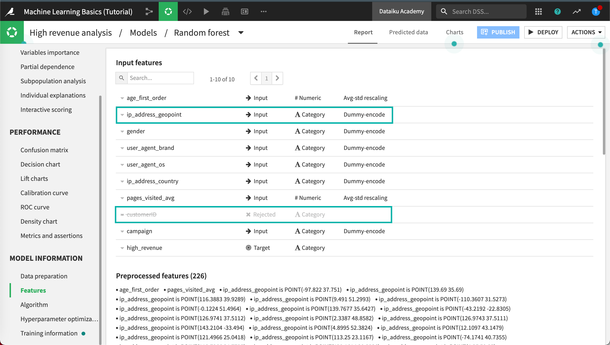
By default, all the variables available except customerID have been used to predict our target. Dataiku DSS has rejected customerID because this feature was detected as an unique identifier and was not helpful to predict high-value customers.
Furthermore, criteria like the geopoint is probably not really interesting in a predictive model, because it will not generalize well on new records.
Note
To work with geospatial information, you could always use the Prepare recipe to extract information such as country, region, and city from the geopoint values. To find out more about working with geospatial data in Dataiku, visit Geospatial Analytics on the Academy, or Geographic Processing in the Reference Documentation.
We’ll modify feature handling when we tune the model.
Training Information
In the Training information panel, DSS displays the results of ML diagnostics including dataset sanity checks. It looks like, in our case, the train and test datasets are imbalanced. This is common in machine learning.
The train and test datasets are rarely completely balanced in machine learning, yet, DSS still alerts us about the level of imbalance. If the level of imbalance becomes too large, the model’s performance could be impacted.
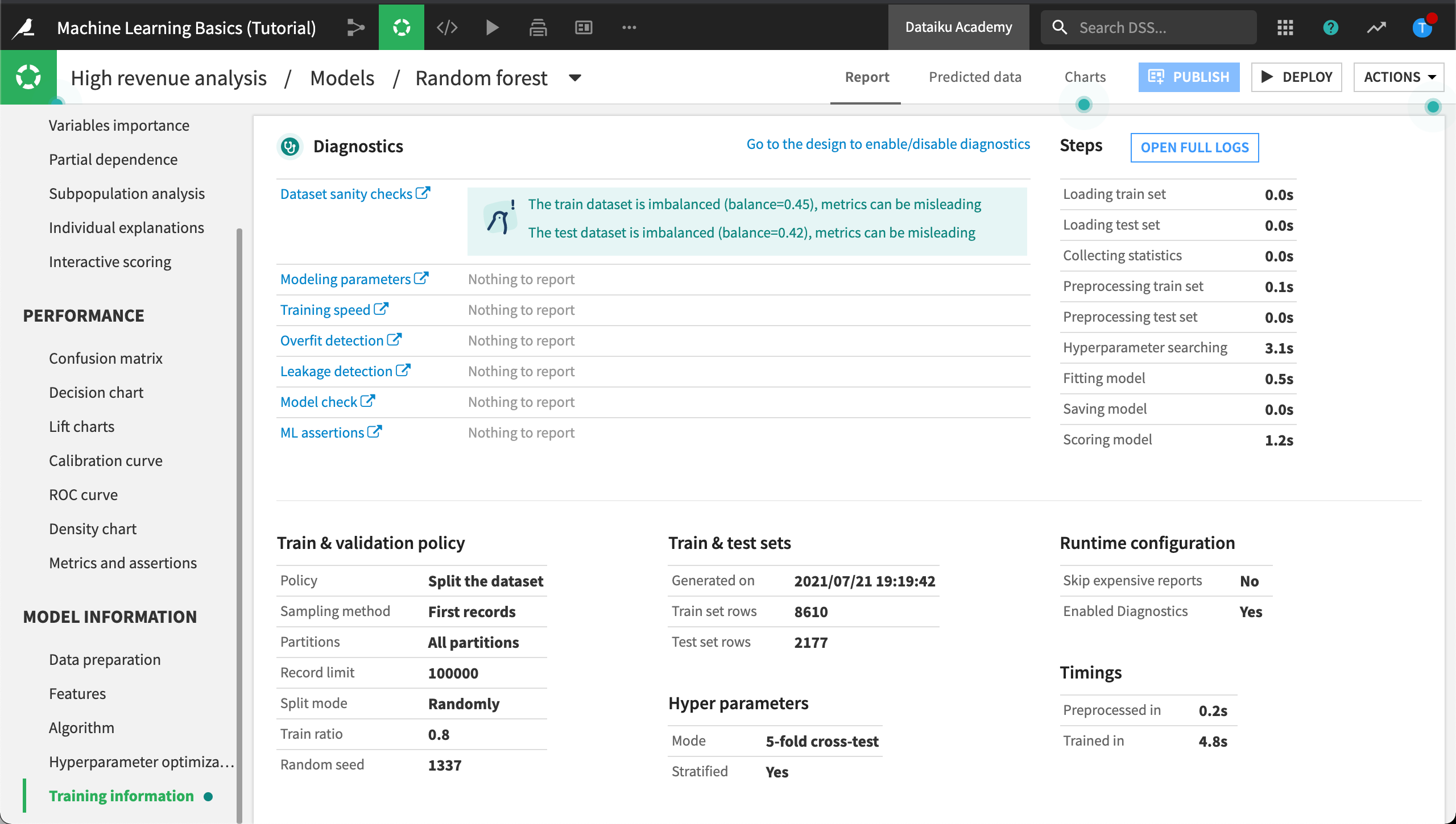
In the next section, we’ll tune the model. We’ll visit the Design tab to do this. We’ll refine the model’s settings, rebalance the train and test datasets, and configure ML assertions.
What’s Next?
You have discovered ways to interpret your model and understand prediction quality and model results. Next, we’ll look at ways to improve your model’s performance and speed up the evaluation process.