Charts
Without any further data transformation steps, the accidents_joined dataset has information we can use to create visualizations of the current network. Within the Charts tab of the accidents_joined dataset, create the following charts:
Note
Recall that the Explore tab only displays a sample of the data. For the Charts to display all of the data, see the Sampling & Engine tab on the left sidebar. Unchecking the box “Use same sample as explore” allows the user to change the sampling method here.
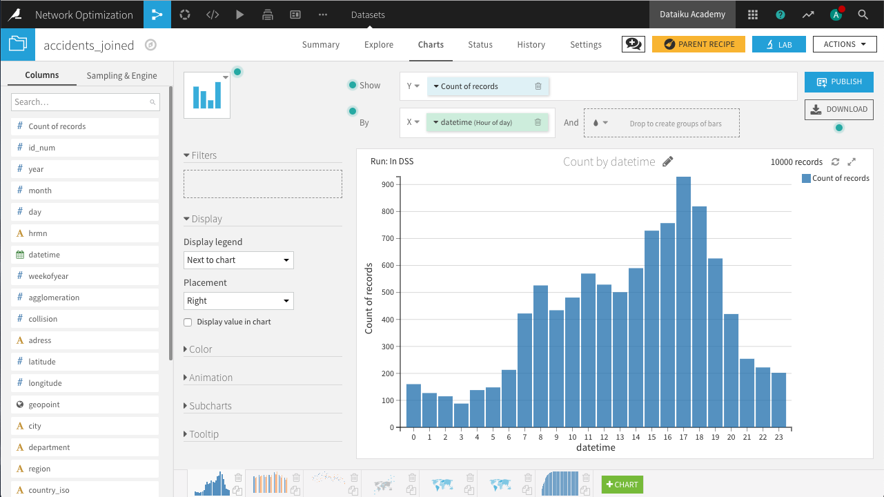
Distribution of accidents by hour of the day
In a histogram, drag Count of records to the Y-axis and datetime to the X-axis, with “Hour of day” selected as the date range.
Distribution of accidents by day of week and year
In a histogram, drag Count of records to the Y-axis, datetime to the X-axis, with “Day of week” selected as the date range, and subgroups defined by year.
For binning, year should use raw values.
Weekly comparison of accidents count on the past 4 years
In a line chart, drag Count of records to the Y-axis, weekofyear to the X-axis, and subgroups defined by year.
For binning, weekofyear and year should use raw values.
Geographic distribution of accidents, filtering out for low collision scores
In a scatter map, drag geopoint to define the points and collision to define the color of each point, with more collisions creating a darker color.
Add the collision column as a filter, limiting points to where collision is greater than 3.
Choropleth of number of accidents
In a filled administrative map, drag geopoint to define the tile shapes; select Department/County as the Admin level. Count of records defines the color of each polygon.
The resulting map shows the highest number of accidents occur in Bouches-du-Rhône on the southeastern coast.
Choropleth of average distance between accidents and agencies
In a Filled Administrative map, let geopoint at the Department/County admin level define the polygon shapes. Let station_join_distance define the color of each polygon.
The resulting map shows the greatest average distance to stations occurs in Corsica.
Cumulative distribution of accidents based on distance to agencies (5 km bins)
In a stacked bar chart, drag Count of records to the Y-axis and station_join_distance to the X-axis.
The Compute setting for Count of records should be set to “Cumulative values”, and binning for station_join_distance should be set to “Fixed-size intervals” of bin size 5.

This last chart is a first step towards capacity planning. We can see a significant number of accidents that are more than 15km from the closest rental station. In order to account for the effect of partner garages, we need to create some new columns.
In the Lab, create a new Visual analysis for accidents_joined, named Analyze_accidents_joined, and add the following steps to the script.
Use the Formula processor to create the column effective_network with the expression below. It creates a rule where if the distance between the collision and the nearest rental station is over 15km, and the nearest garage is closer, the garage will handle the request; otherwise the station will.
if(station_join_distance > 15 && garage_join_distance < station_join_distance,
    "garage","station")
Use the Formula processor to create the colum effective_distance with the expression below. Given the rule above for determining where the request is handled, this computes the actual distance between the collision and the location that will handle the request.
if(effective_network=="garage",garage_join_distance,station_join_distance)
Now in the Charts tab of the same Visual Analysis, create the following chart.
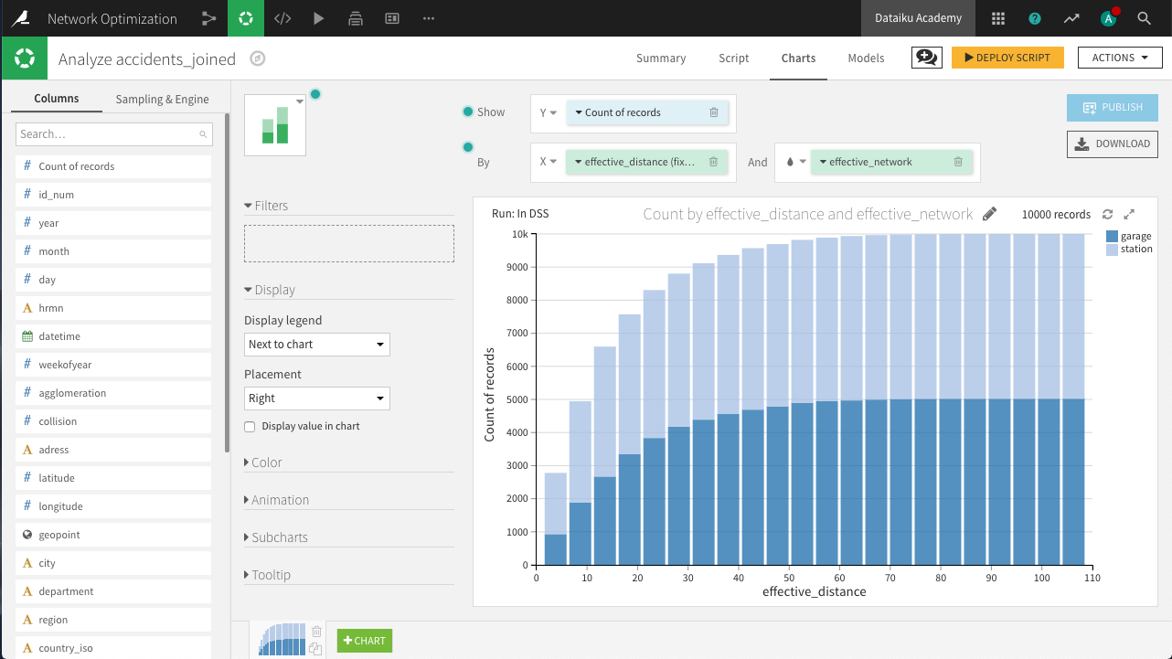
Cumulative distribution of effective distance
In a stacked bar chart, drag Count of records to the Y-axis, effective_distance to the X-axis, and subgroups defined by effective_network.
The Compute setting for Count of records should be set to “Cumulative values”, and binning for effective_distance should be set to fixed-size intervals of size 5.
Notice that partnering with the garage network would allow us to effectively cover many more collisions than we otherwise would be able to without the garages.

From the yellow icon at the top right, Deploy the script as a Prepare recipe, making sure to check both the options Create graphs on the new dataset and Build the dataset now. Accept the default output name, accidents_joined_prepared.
This first set of charts is ready!