Create and Publish Insights to a Dashboard
In this section, you will learn how to create and publish insights to a dashboard.
In addition to consuming insights from dashboards, applications, and datasets, users of the Dataiku DSS Explorer license can also create and publish insights and dashboards of their own.
Warning
If you are using the legacy enterprise Reader license of Dataiku DSS instead of the Explorer license, you will not be able to create insights or dashboards.
If this is the case, we recommend installing and using the 14-day Free Online Trial or the free edition, in order to be able to complete this last part of the tutorial.
Publish Metrics as Insights
In the previous section, you made the “Avg of purchase_amount” metric appear on the Metrics page. Now, you can also publish it as an insight to a dashboard.
To publish the “Avg of purchase_amount” metric to a dashboard:
Click the dropdown arrow next to AVG OF PURCHASE_AMOUNT in the metric tile, and select Publish.
In the pop-up window, you can choose on which dashboard to publish your insight.
Select Purchase Patterns from the dropdown menu.
Click Create.
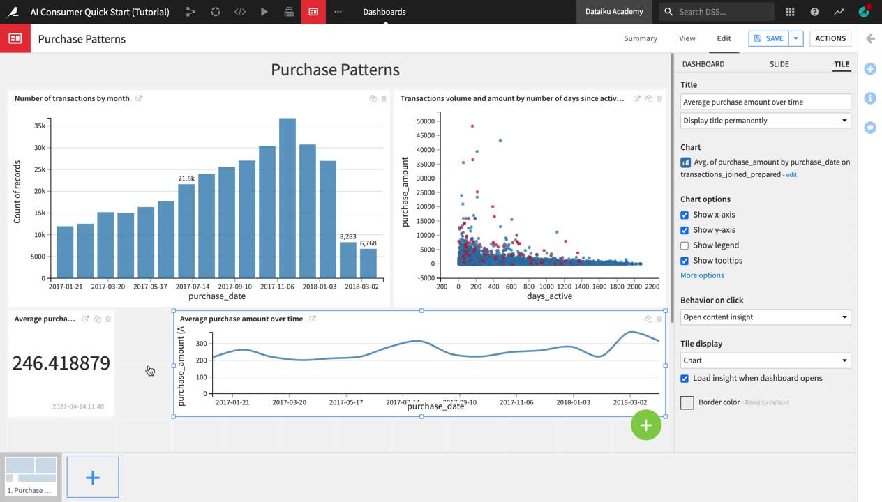
After creating and publishing the metric insight, Dataiku DSS redirects you to the Purchase Patterns dashboard. You are currently in the Edit mode of the dashboard, and the insight is selected so that you can edit it.
From the right sidebar menu, change the default Title of the insight to
Average purchase amount.Click Save in the upper right corner, and then navigate to the View tab of the dashboard.
The Average purchase amount metric now appears on the Purchase Patterns dashboard, under the two charts that we previously explored.
Create and Publish Charts
In addition to metrics, another even more common type of insight frequently published on dashboards is Charts.
Note
The Charts and Statistics tabs of a dataset provide drag-and-drop tools for creating a wide variety of visualizations and statistical analyses.
To explore the Charts tab:
Return to the Flow.
Open the transactions_joined_prepared dataset again, and navigate to the Charts tab.
The left sidebar contains two panels: Columns and Sampling & Engine.
Click Sampling & Engine.
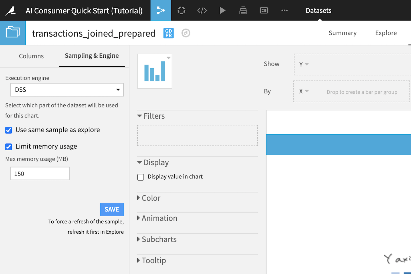
By default, charts in Dataiku DSS use the same dataset sample as the one defined in the Explore tab, which in this case is a random sample of 10,000 rows. Since the chart we will be creating is going to display aggregated average values, we can use the same sample.
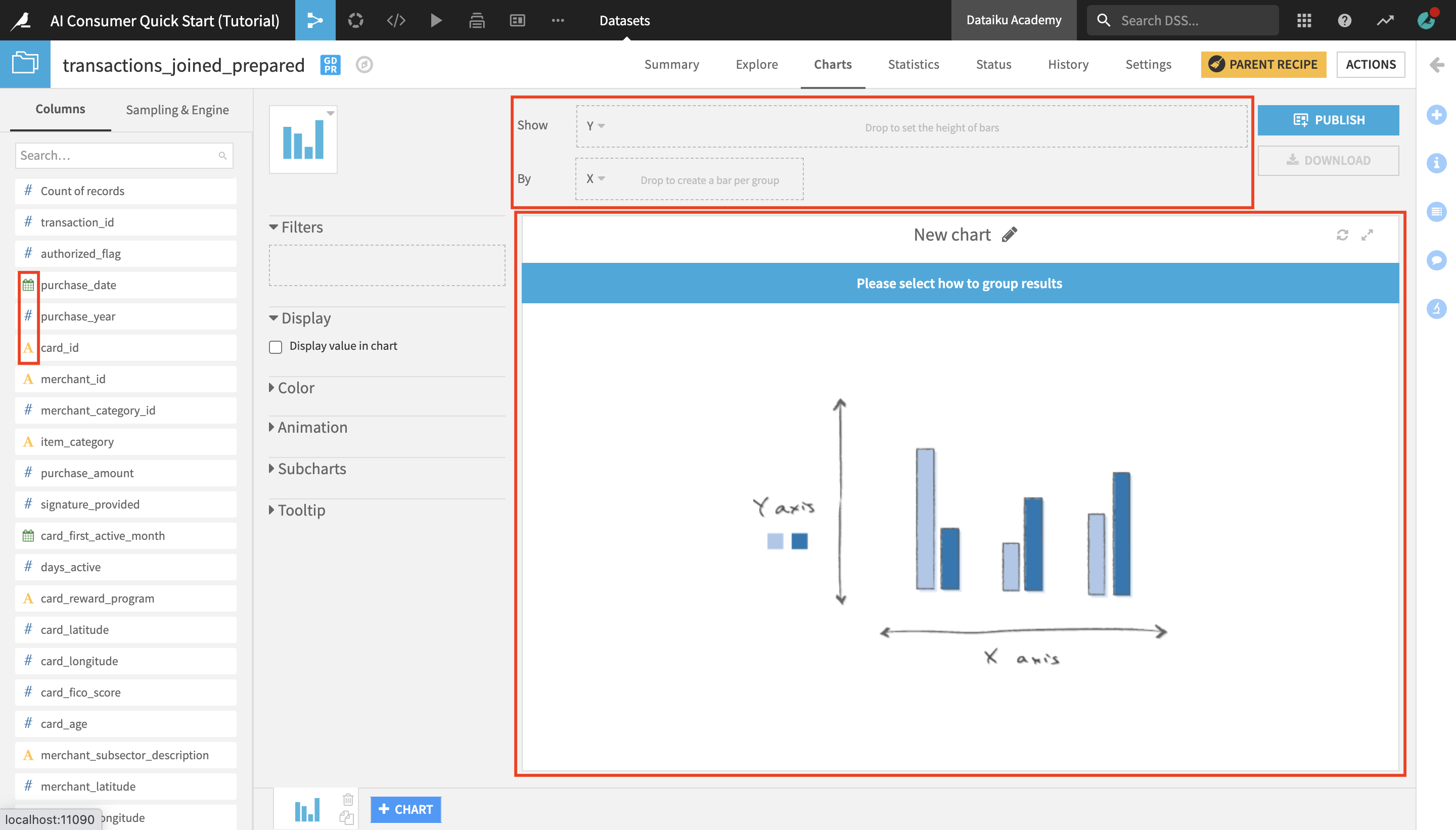
Click Columns to return to the Columns panel.
The Columns panel contains all the columns of the dataset, as well as the count of records (or rows) in the dataset. Notice that the icons to the left of the column titles indicate the data type:
the blue “#” icon represents numerical value columns;
the yellow “A” icon represents categorical value columns;
and the green calendar icon represents date columns.
The large white rectangle field is where your chart will appear once it’s created.
You can drag and drop columns into the Show and By dropboxes above the chart field, which are also known as the Y-axis and X-axis.
Create a Chart
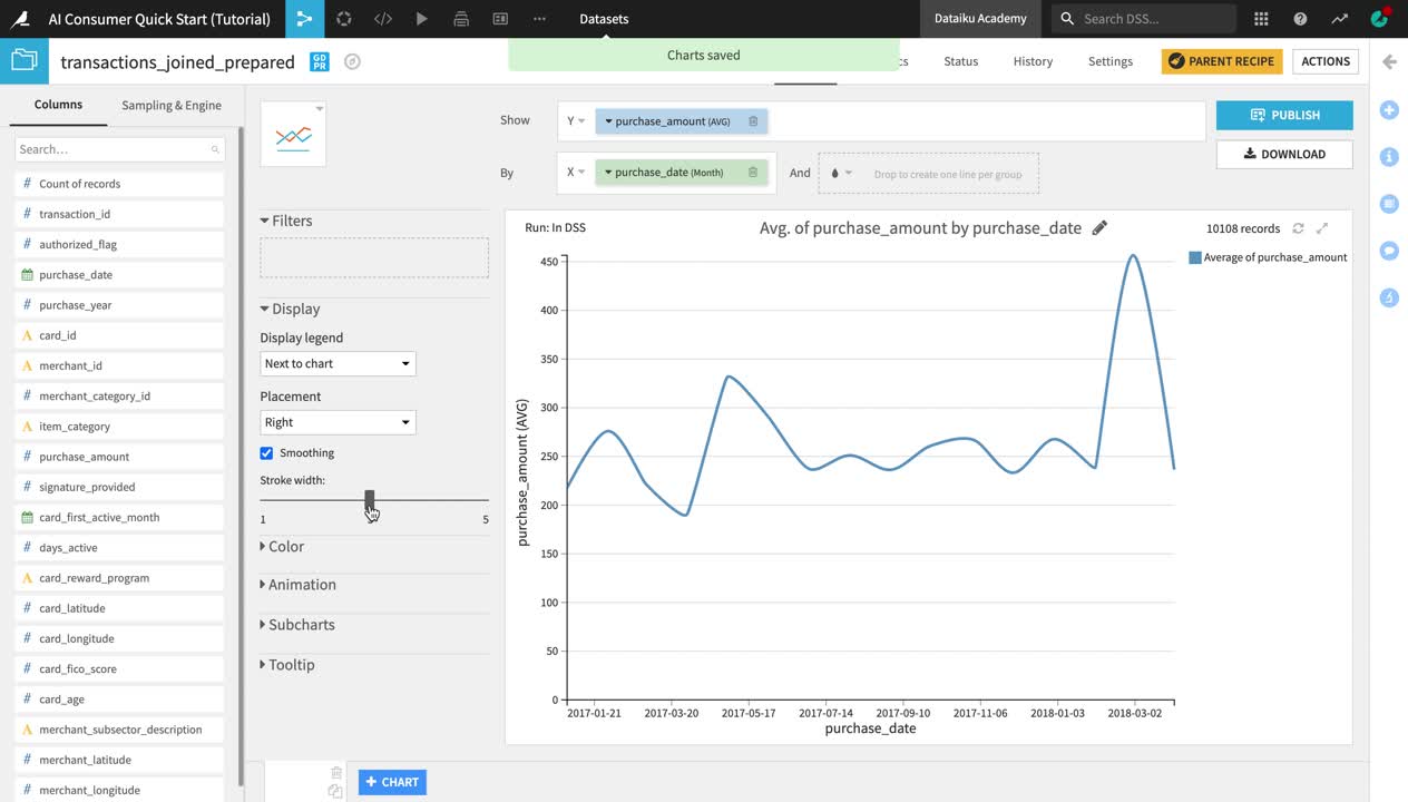
Let’s now create a chart to analyze the evolution of the average purchase amount over time.
From the list of columns on the left, drag and drop purchase_amount into the Y-axis and purchase_date into the X-axis.
Notice that the aggregate on the purchase_amount column is automatically set to “AVG”. If we wanted to look at the evolution in the cumulative total transaction amount, as opposed to the average, we could change the aggregate to “SUM”, but since we are interested in the average, we can leave it like this.
Click on the dropdown arrow next to purchase_date and change the date range from Automatic to Month.
Click the Chart type dropdown (the blue bar chart tile next to the Columns panel) to change the chart type.
Select the Lines type.
In the panel to the left of the chart preview, drag the Stroke width slider to increase the line width to
3.
You can see that despite the drop in the number of transactions by month in early 2018 (which we observed in one of the charts on the Purchase Patterns dashboard that we explored earlier), the average purchase amount has been relatively stable over time, with a peak in March 2018.
Publish a Chart on a Dashboard
Let’s now publish the chart we created on the Purchase Patterns dashboard.
Click Publish in the upper right corner of the Charts tab.
From the dropdown menu, select Purchase Patterns as the dashboard to publish your chart on, and then click Create.
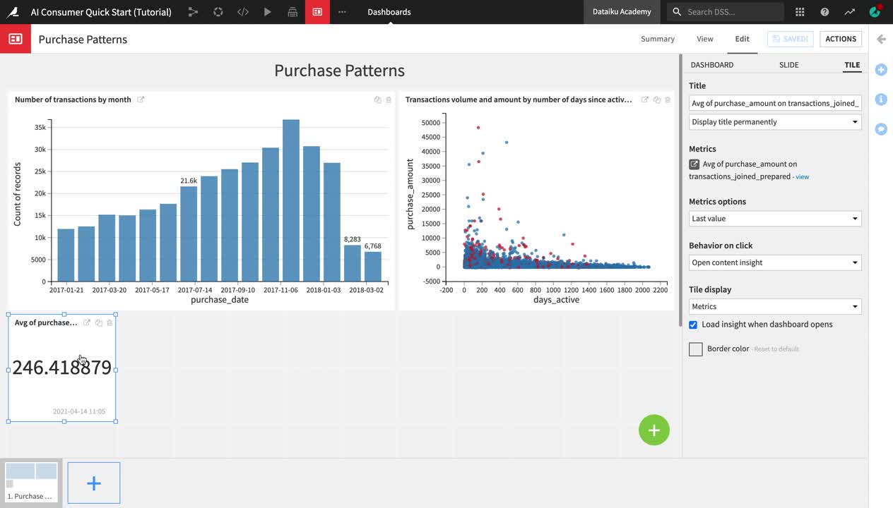
Just like when publishing a metric, you are once again navigated to the Edit tab of the Purchase Patterns dashboard.
In the right side menu of the dashboard editor, change the chart insight Title to
Average purchase amount over time.Drag and resize the chart and the “Avg of purchase_amount” metric as shown in the video below.
Click Save and navigate to the View tab to view your dashboard.