Visualize and Analyze Data
The ability to quickly visualize data is an important part of the data cleaning process. It’s also essential to be able to communicate results.
Note
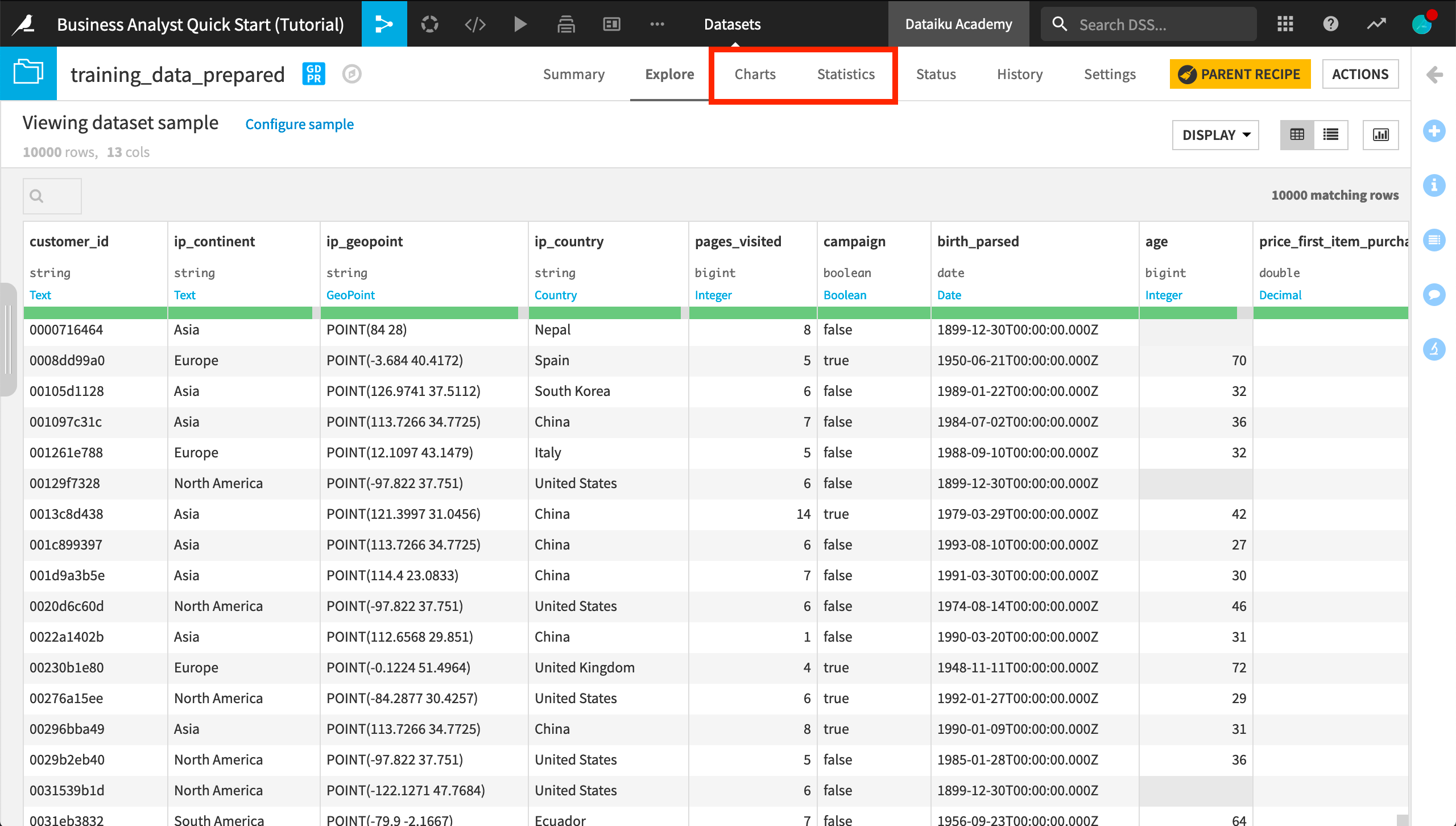
The Charts and Statistics tabs of a dataset provide drag-and-drop tools for creating a wide variety of visualizations and statistical analyses.

Create a Chart
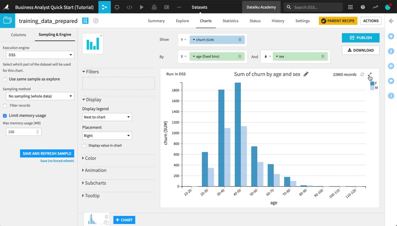
Let’s visualize how churn differs by age and sex.
Open the training_data_prepared dataset.
Navigate to the Charts tab.
From the list of columns on the left, drag the churn column to the Y-axis and age to the X-axis.
Click on the churn dropdown in the Y-axis field to change the aggregation from AVG to SUM.
Click on the age dropdown in the X-axis field to change the binning method to “Fixed size intervals”.
Reduce the bin size to
10.Adjust the Ticks option to generate one tick per bin.
Add the sex column to the “And” field.
Be aware that charts, by default, are built on the same sample as in the Explore tab. To see the chart on the entire dataset, you need to change the sampling method.
On the left hand panel, switch from “Columns” to Sampling & Engine.
Uncheck “Use sample sample as explore”.
Change the Sampling method to No sampling (whole data).
Click Save and Refresh Sample.

Create a Map
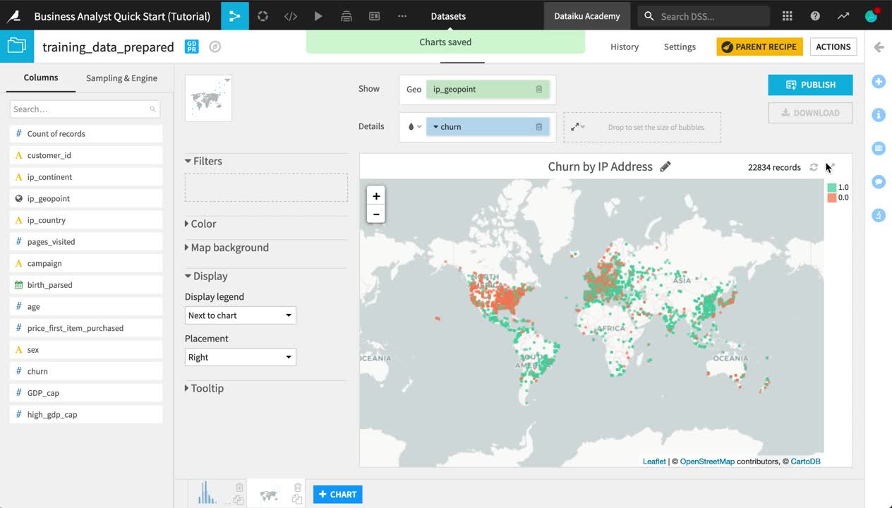
Let’s also explore the geographic distribution of churn.
At the bottom of the Charts tab, Click +Chart.
Click the Chart type dropdown, and choose the Globe icon. Then select a Scatter Map.
Drag ip_geopoint to the “Geo” field.
Drag churn to the “Details” field.
Click on the churn dropdown, and click to treat it as an alphanumeric variable.
Click on the color droplet to the left of the churn box, and change the palette to Set2.
In the empty field to the right of the “Details” field, reduce the base radius of the points to 2.
Change the chart title to
Churn by IP Address.

Tip
Note how the sampling method (none) remains the same when creating the second chart.
Create a Statistical Worksheet
You can also run a number of common statistical tests to analyze your data with more rigor. You retain control over the sampling settings, confidence levels, and where the computation should run.
Open the training_data_prepared dataset.
Navigate to the Statistics tab.
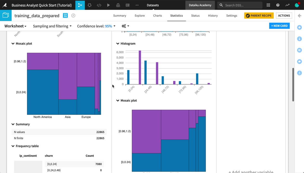
Click +Create your First Worksheet > Bivariate analysis.
From the list of available variables on the left, select ip_continent and price_first_item_purchased.
Click the plus to add them to the Factor(s) section.
Add churn to the Response section in the same way.
Click Create Card.
From the “Sampling and filtering” dropdown near the top left of screen, change the Sampling method to No sampling (whole data), and click Save and Refresh Sample.
Explore the output of your first card in your first statistical worksheet.

Tip
Feel free to add more cards to your existing worksheet or create a new one with a different kind of statistical analysis!