Hands-On: Visualizing Time Series Data
Over the next few hands-on lessons, you’ll learn to use each one of the recipes in the Time Series Preparation plugin. But before doing so, you first need to learn how to visualize time series data with Dataiku DSS.
Let’s Get Started!
In this hands-on lesson, you will learn to visualize time series data prior to performing analysis and preparation steps with the recipes in the Time Series Preparation plugin.
Prerequisites
This series of tutorials assumes basic knowledge of working with Dataiku DSS datasets and recipes.
Completion of the Basics courses or the Core Designer Learning Path is recommended.
The Time Series Basics course contains highly relevant material, but is not strictly required to complete these lessons.
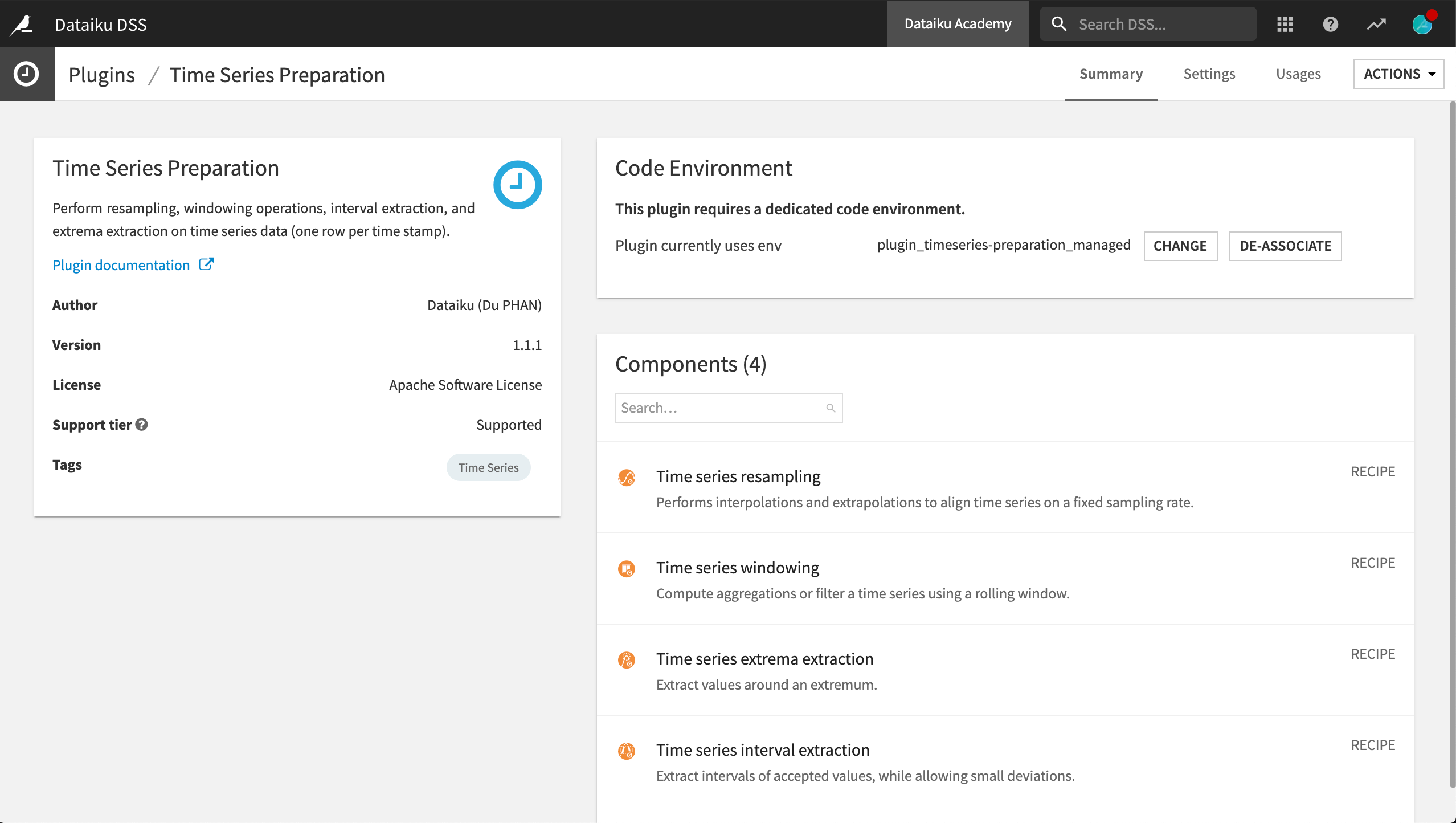
With the exception of this present lesson, you will need to have the Time Series Preparation plugin installed on your Dataiku DSS instance (see Instructions for installing plugins) for all other hands-on lessons in the Time Series Preparation course.
These tutorials were created with version 1.1.1 of the plugin.
Workflow Overview
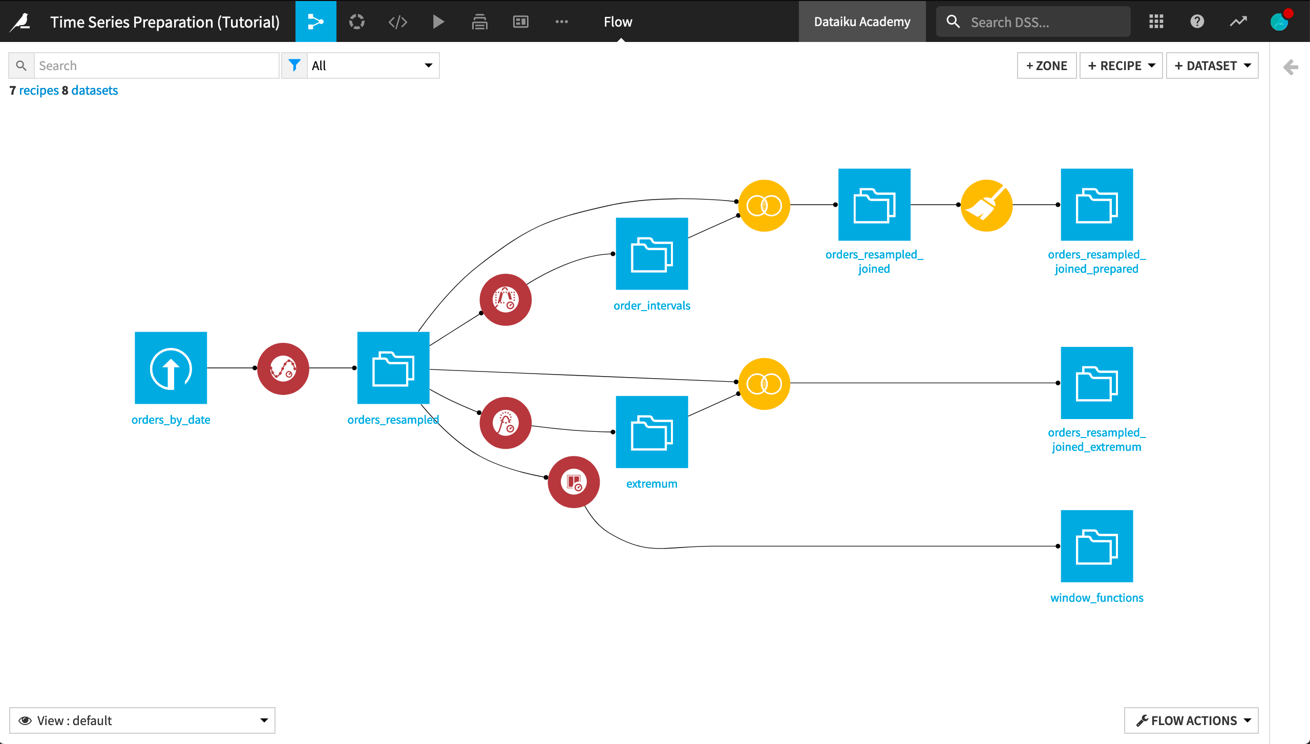
The final pipeline in Dataiku DSS is shown below. Although you can follow along with the completed project in the Dataiku gallery, we encourage you to create your own project implementing the steps described in this tutorial.
Create Your Project
From the Dataiku DSS homepage, click +New Project > DSS Tutorials > ML Practitioner > Time Series Preparation (Tutorial). Click on Go to Flow.
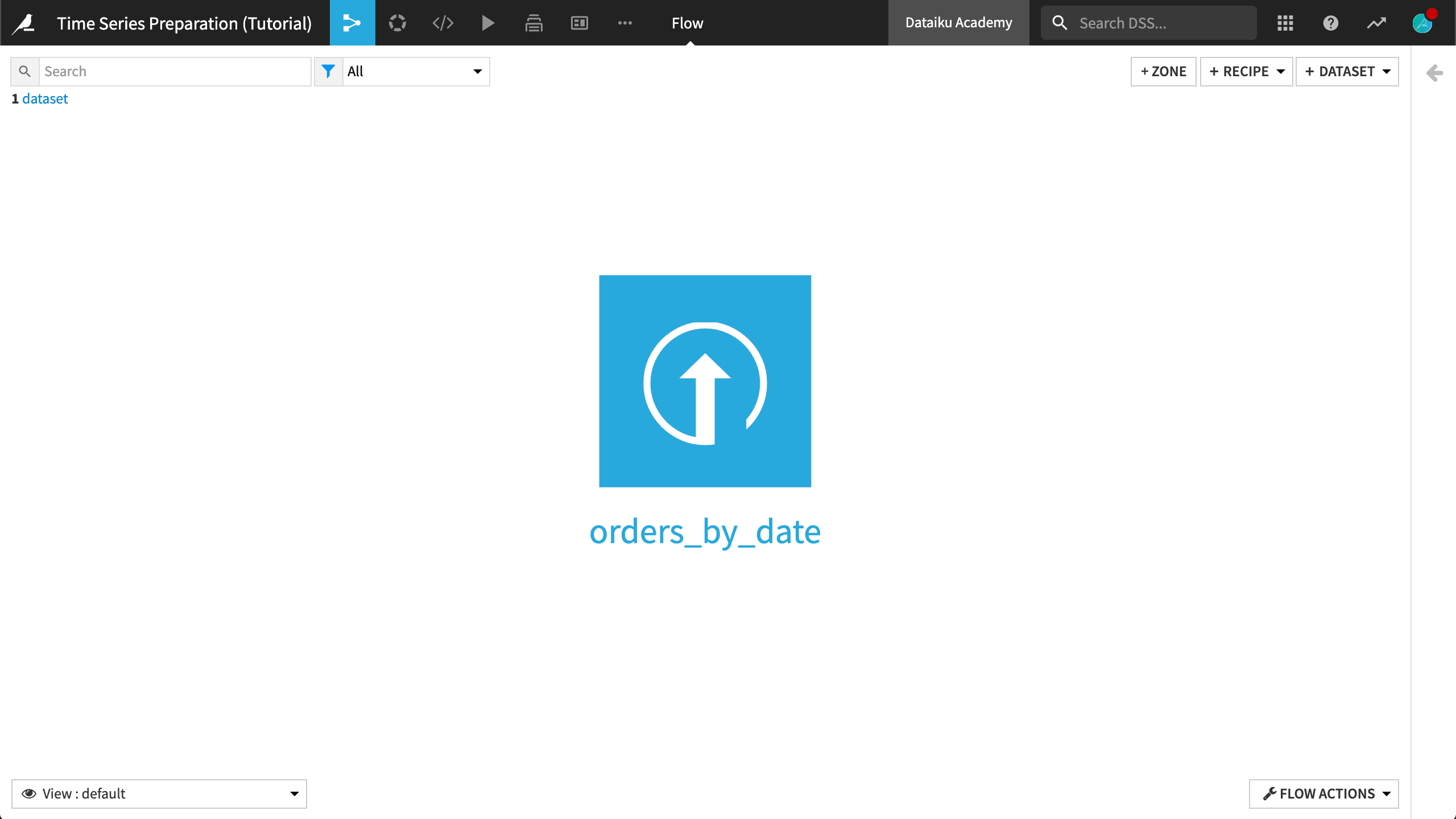
In the Flow, you can see the orders_by_date dataset already uploaded.
Alternatively, you can create a new +Blank Project in Dataiku DSS, and then upload the orders_by_date.csv time series dataset.
Note
If using this second method, you’ll also need to change the storage type of the order_date column from “string” to “date”.
Inspect the Data
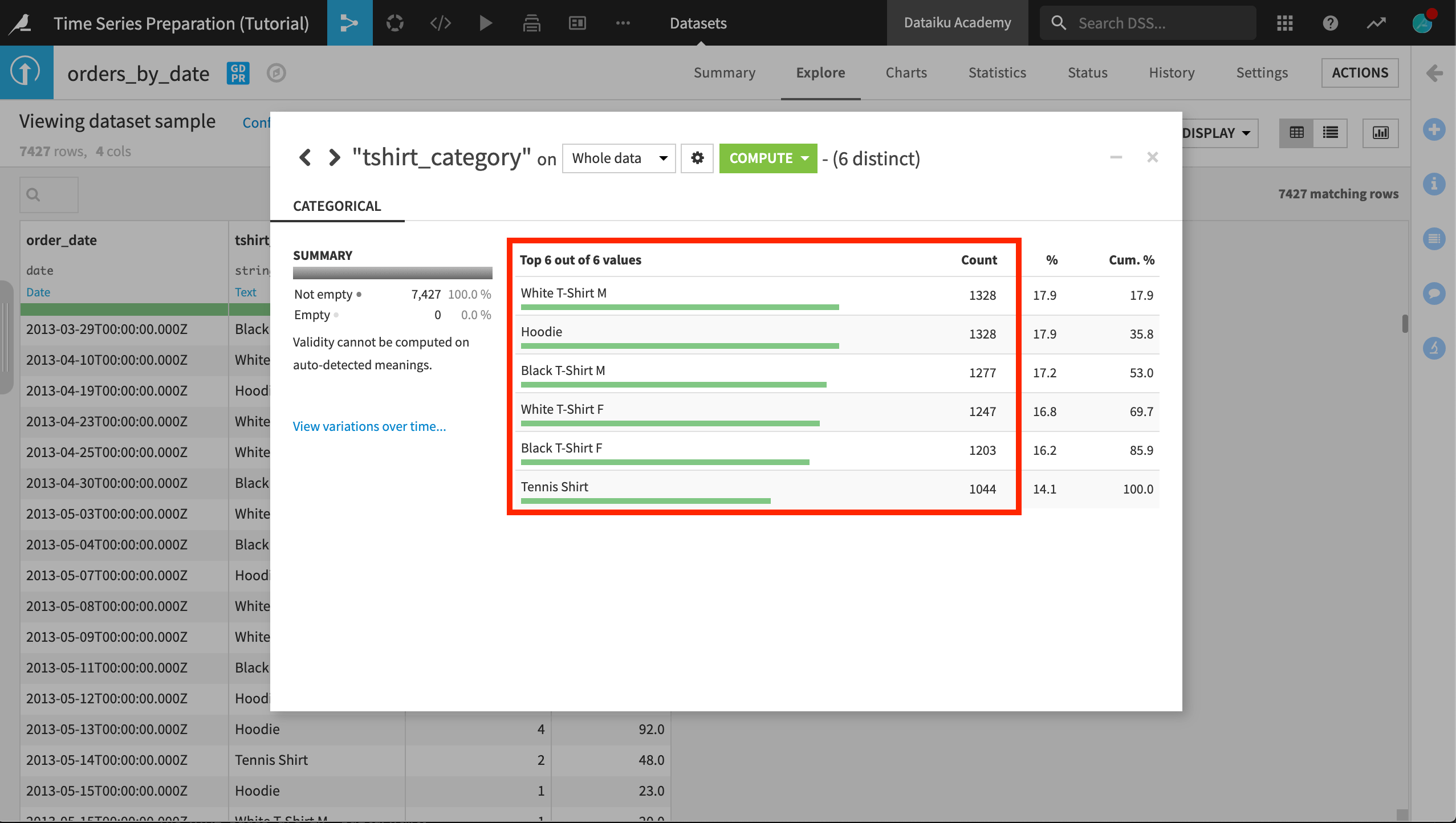
The orders_by_date dataset consists of four columns:
order_date, which has been parsed as a date
tshirt_category, an identifier that labels each row as belonging to one of six t-shirt categories
tshirt_quantity, the daily number of items sold in a category
amount_spent, the daily amount spent on a t-shirt category
What can we learn about each column?
First, we can note that the order_date column is not equally spaced. Many dates appear to be missing, and there are large gaps in the timestamps.
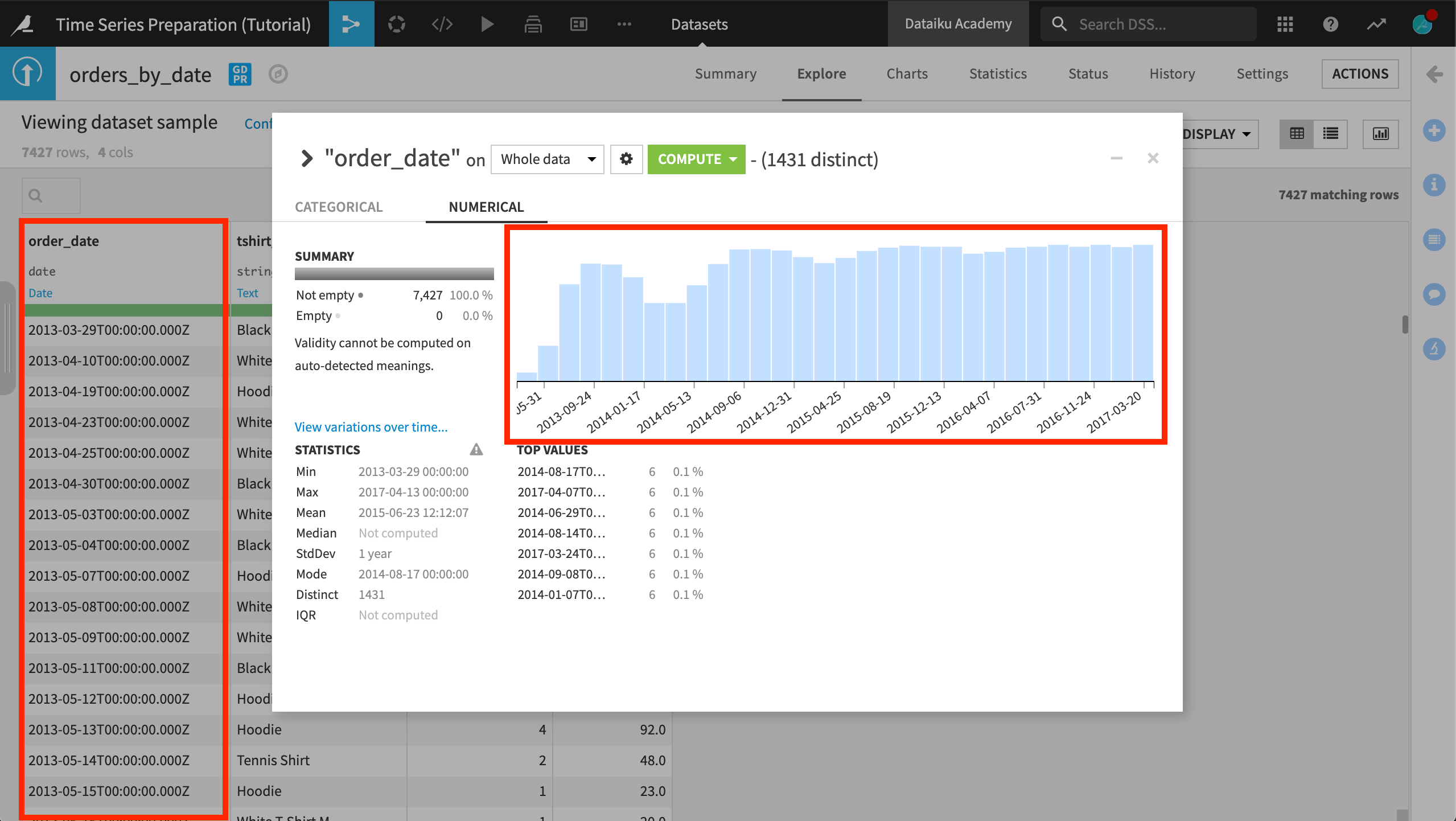
The dataset consists of six different independent time series (one for each value of the tshirt_category column), the length of which is not exactly the same for all.
Each time series consists of two variables (or dimensions): tshirt_quantity and amount_spent. There is a simple, mathematical relationship between these two variables.
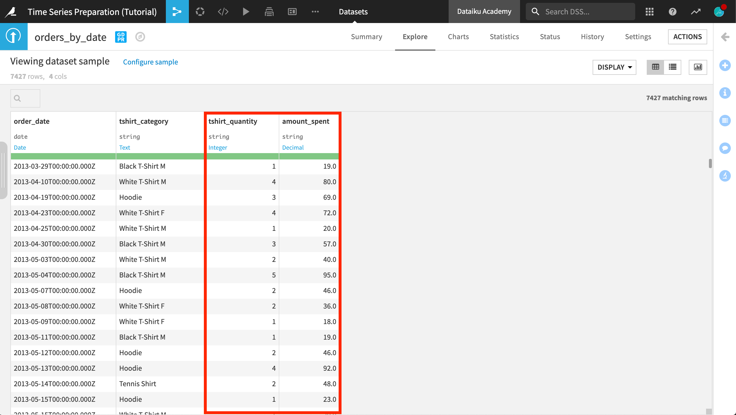
Note that the data is stored in long format.
Tip
For your own practice, convert this dataset from long format to wide format using a Pivot or Prepare recipe.
Visualize the Time Series Dataset
You are likely already familiar with the Charts tab in Dataiku DSS. There are a few more features specifically for visualizing parsed date columns.
To visualize time series data, you have the option of two kinds of aggregations for the X axis:
Timeline, where data is presented during a lapse of time. You can choose between: a “Dynamic timeline” (automatic) or a “Fixed timeline” (based on year, quarter, month, etc.).
Regroup, where data is aggregated by date elements, such as quarter of year, month of year, week of year, etc.
The automatic aggregation mode allows you to display arbitrarily large time series with aggregation pushed down to the database. This mode works with a parsed date column.
Create Line Plots
Create a line chart of the daily amount_spent for each time series. To do this,
Open the orders_by_date dataset and go to the Charts tab.
Select the Lines chart.
Drag and drop amount_spent as the Y variable, and order_date as the X variable. Notice that the “Display timeline” option appears and is enabled.
Drag and drop tshirt_category as the categories to use for grouping.
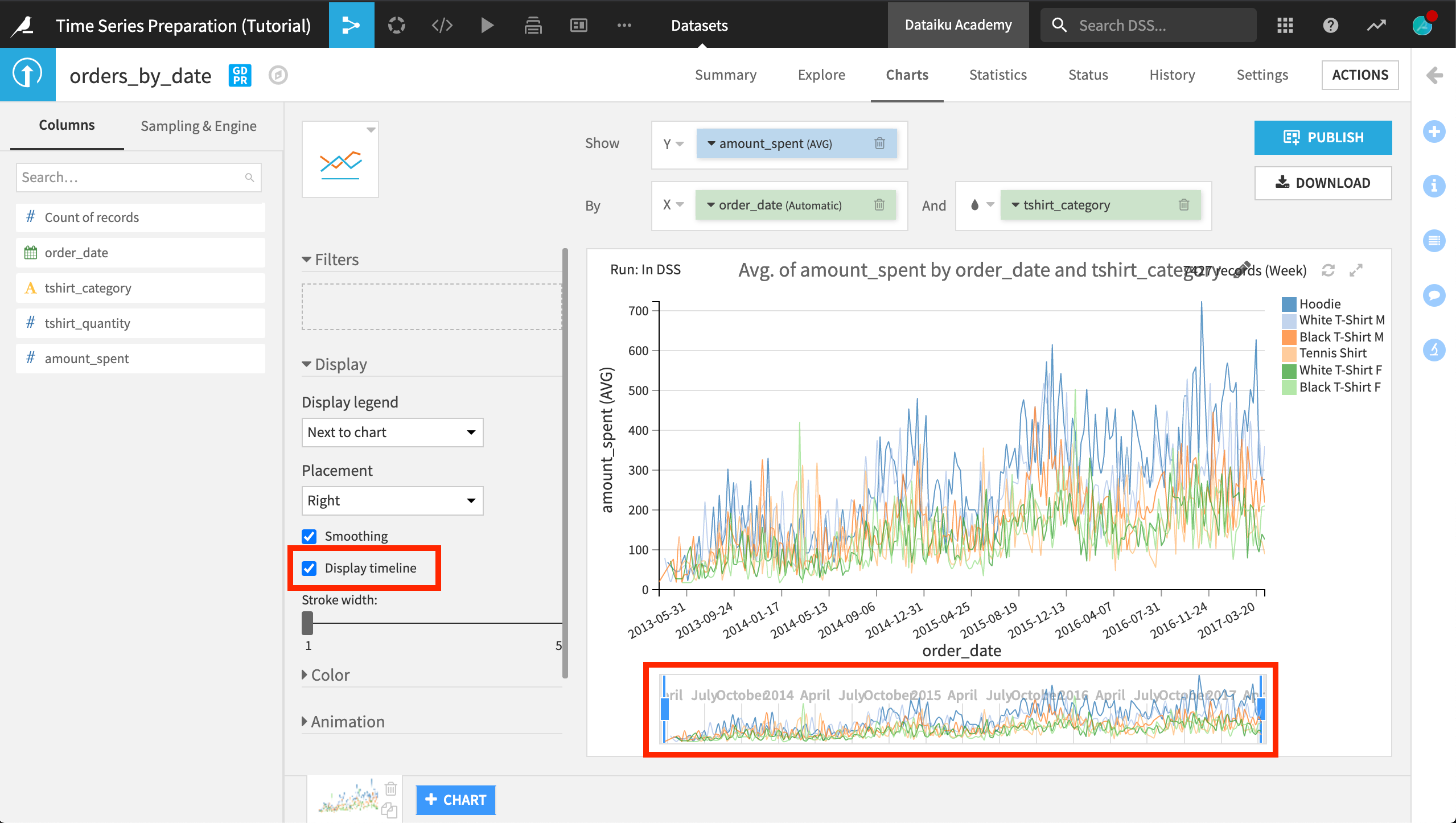
Below the main chart in the display area is a timeline that is enabled by selecting the Display timeline option. This option is available for line charts when you use a date in the X axis, and it is useful for providing an overview of the whole data, the current zoom level, and an observation window into the data.
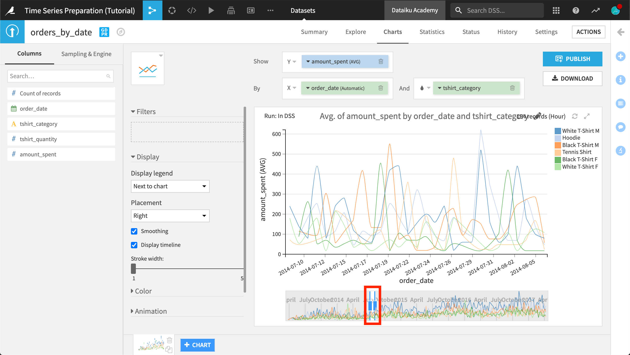
The current line plot is quite noisy. Using the timeline, zoom into the main chart to see a clearer picture for a smaller interval of time.
Note
Notice that the vertical bars in the timeline adjust to show a smaller window that highlights the current interval selection in the main chart. You can also perform panning on the chart by dragging the selected interval left or right. Double clicking in the selected interval expands it to cover the whole data interval.
Create Bar Plots
To change the aggregation key for the X axis, click the drop-down arrow next to “order_date (Automatic)” and select a value other than Automatic for “Date ranges”.
For example, let’s create a chart that shows the total amount spent per Quarter of year.
Click +Chart to add a new chart. Keep the default histogram plot.
As before, drag and drop amount_spent as the Y variable, and order_date as the X variable. Notice that the “Display timeline” option is not available for the histogram plot.
Drag and drop tshirt_category to use for grouping.
Click the drop-down arrow next to “order_date (Automatic)” and select Quarter of year as the value for “Date ranges”.
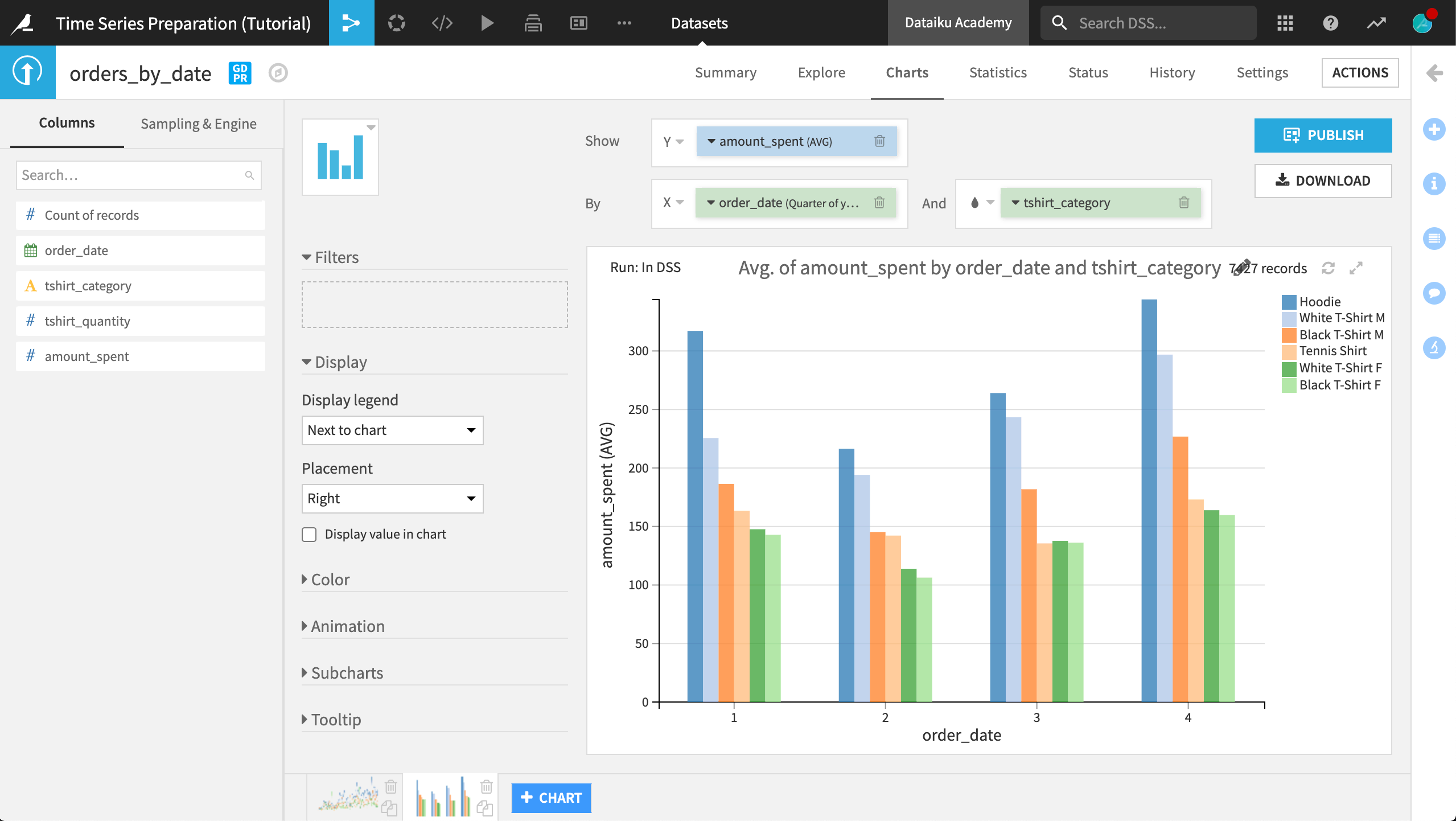
The plot shows the data aggregated by quarter of year. Over the years, you can see that sales are typically lowest in the second quarter of the year for any t-shirt category.
You can explore the Charts tool further to gain more insight into your data.
What’s next?
Congratulations! Now that you have spent some time visualizing your dataset, you are ready to move on to the next step of preparing your times series data.
See also