Dashboards
Every Dataiku project starts with a default dashboard. Rename it to Network Optimization Dashboard by navigating to the Summary tab and clicking the pencil icon next to the project title. Then, follow the steps below to publish your work to the dashboard:
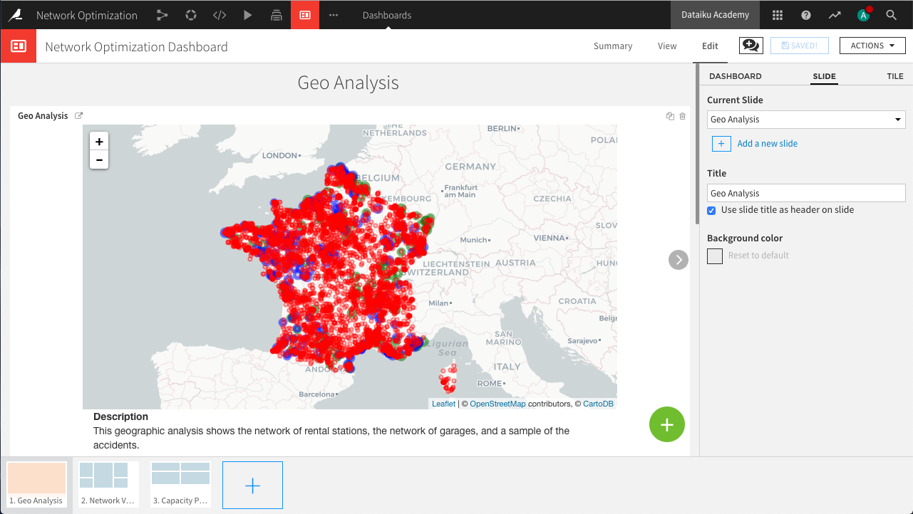
In the Edit tab, create three slides called
Geo Analysis,Network Visualization, andCapacity Planning. Check the box to use the slide title as the header on each slide.On the “Geo Analysis” slide, click the green plus icon to add a tile. Choose Webapp and select the previously created Geo Analysis webapp.
Publish the charts from accidents_joined (with the exception of the cumulative distribution chart) to the “Network Visualization” slide. This is most easily done by returning to the dataset’s Charts tab, clicking the blue Publish button, and selecting the desired charts and the corresponding dashboard and slides to which they belong.
Publish the remaining charts to the “Capacity Planning” slide.
Hint
Feel free to adjust, resize, and reorganize the individual charts within the dashboard to improve the layout and display of each slide.