Group and Window Recipes
In this section, we use the Group and Window recipes to create visualizations for capacity planning at the station and regional level.
Regional Level Analysis
Which regions have the greatest need for expansion? To answer this, we have to identify the regions with the highest number of accidents per rental agency. Additionally, we want to see the extent to which these figures vary seasonally.
Starting from the accidents_joined_prepared dataset, initiate a Group recipe. Choose to group by month and keep the default output name. In the recipe settings:
In the Pre-filter step, create a filter to keep only rows where the value of year is greater than
2012.In the Group step, add region as a second group key, keep “Compute the count for each group” selected, and add the following aggregations:
For collision: Avg
For station_agency_name: Distinct
For station_join_distance: Avg
For garage_name: Distinct
For garage_join_distance: Avg
In the Post-filter step, keep only the rows where region is defined.
Run the recipe, updating the schema to eight columns.
From here, we can draw the monthly load curves by region, so as to identify areas where we need to increase our capacity, and possibly identify seasonal effects that can help us optimize the rotation of our vehicles.
In the Lab, create a new Visual analysis with the default name. On the Script tab, use the Formula processor to create a new column, capacity_ratio, from the expression count/station_agency_name_distinct.
On the Charts tab, create a new Lines chart with capacity_ratio on the Y-axis, month on the X-axis, and subgroups defined by region. Set the aggregation for capacity_ratio to “MAX”, the binning for month to use raw values, and the sorting for region to display the 7 regions with the highest monthly ratios.
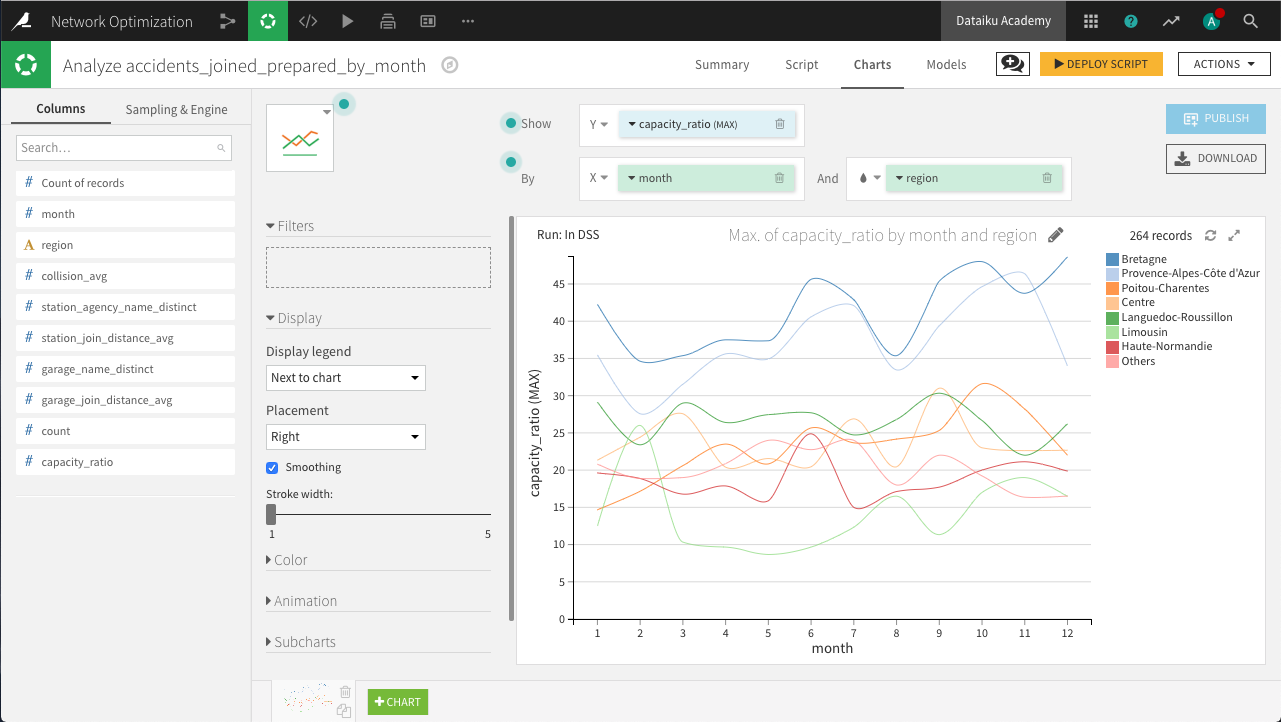
The resulting chart above shows that Bretagne and Provence-Alpes-Côte d’Azur are most in need of extra resources. Among the regions, there are suggestions of seasonal spikes, but further analysis would be needed to determine whether these are significant or spurious variations.
Deploy the script as a Prepare recipe, making sure to check both options Create graphs on the new dataset and Build the dataset now. Keep the default output name.
Station level analysis
The goal here is to create a dataset with one record per station, and columns showing the monthly load values as well as a 3-month sliding average. We can do this with a Group recipe followed by a Window recipe.
Note
For a more detailed explanation of the Window recipe, please see the reference documentation or the Visual Recipes Overview course.
Starting again from the accidents_joined_prepared dataset, create a Group recipe. Choose to group by month and name the output accidents_by_station.
In the Group step, add station_agency_name as a second group key, keep “Compute the count for each group” selected, and choose the following aggregations:
For station_join_distance: Avg
Run the recipe, updating the schema to four columns.
From the resulting dataset, create a Window recipe. Keep the default output name.
In the Windows definitions step, identify station_agency_name as the partitioning column and month (ascending) as the ordering column. In order to create a 3-month sliding window, set the window frame to limit the number of preceding rows to
3and the number of following rows to0.In the Aggregations step, select the following aggregations:
For month: Retrieve
For station_agency_name: Retrieve
For station_join_distance_avg: Retrieve, Max
For count: Retrieve, Avg, LagDiff: 1
The LagDiff 1 aggregation gives, for each agency, the difference between the number of accidents nearest the agency in the current month and the number of accidents in the previous month.
Run the recipe, updating the schema to seven columns.
In the Charts tab of the output dataset, create a new Lines chart with count_lag_diff on the Y-axis, month on the X-axis, and subgroups defined by station_agency_name. Set the aggregation for count_lag_diff to AVG, the binning for month to use raw values, and the sorting for station_agency_name to display the 5 agencies with the highest average lag-difference.
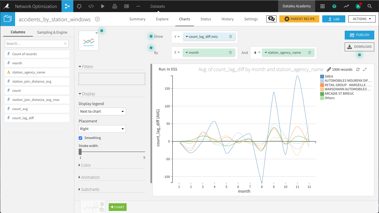
The resulting chart above shows us the rental stations with the most volatile demand, with SMEA experiencing the largest changes month-to-month.