Forecasting Time Series Data with R and Dataiku DSS
R has several great packages built specifically to handle time series data. Using these packages, you can perform time series visualization, modeling, and forecasting.
Let’s Get Started!
In this tutorial, you will learn how to use R in DSS for time series analysis, exploration, and modeling. You will also learn to deploy a time series model in DSS. Let’s get started!
We will use the passenger dataset from the U.S. International Air Passenger and Freight Statistics Report. This dataset contains data on the total number of passengers for each month and year between a pair of airports, as serviced by a particular airline.
Prerequisites
Access to a DSS instance with the R integration installed
An R code environment including the forecast and zoo packages
Workflow Overview
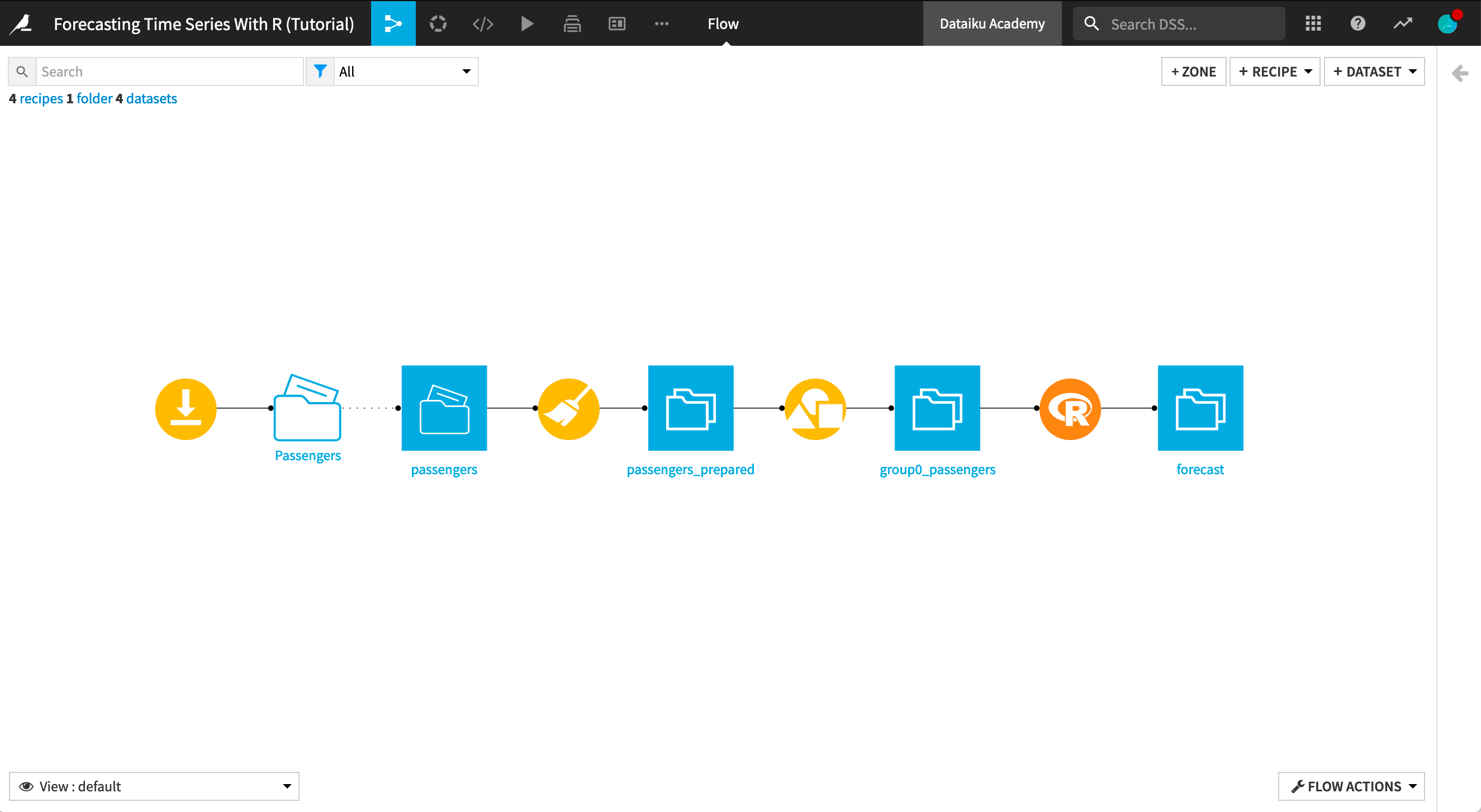
The final Flow in Dataiku DSS is shown below. You can follow along with the completed project in the Dataiku gallery, or you can create the project within DSS and implement the steps described in this tutorial.
Create Your Project
From the Dataiku DSS homepage, click +New Project > DSS Tutorials > Time Series > Forecasting Time Series With R (Tutorial).
Notice that the Flow already performs the following preliminary steps:
A Download recipe imports the data from the URL:
https://data.transportation.gov/api/views/xgub-n9bw/rows.csv?accessType=DOWNLOADand creates the passengers dataset.A Prepare recipe modifies the dataset so that we are left with only those columns relevant to the analysis: Date, carriergroup, and Total.
A Group recipe creates a new dataset group0_passengers that contains the total number of travellers per month for carrier group “0”.
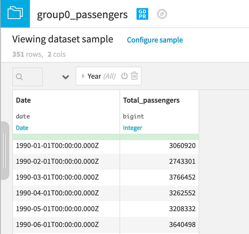
Now we can proceed to perform analysis and forecasting on the group0_passengers dataset.
Plot the Time Series Dataset
First, let’s create a Lines chart type to get a feel for the data. To do this:
Navigate to the Charts tab of the group0_passengers dataset.
Select the Lines chart.
Drag and drop Total_passengers as the Y variable and Date as the X variable.
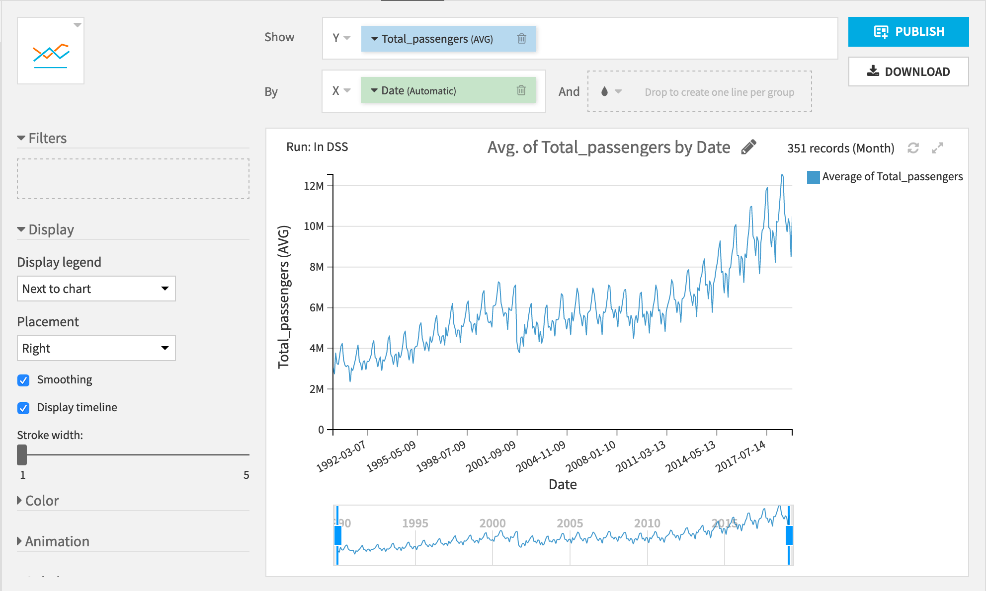
We see two really interesting patterns:
First, there’s a general upward trend in the number of passengers.
Second, there is a yearly cycle with the lowest number of passengers occurring around the new year and the highest number of passengers during the late summer.
Let’s see if we can use these trends to forecast the number of passengers after March 2019.
Perform Interactive Analysis with an R Notebook
For this part, we will use an R notebook.
From the Lab panel in the right sidebar, create a new R notebook.
Read the dataset in memory and select Create.
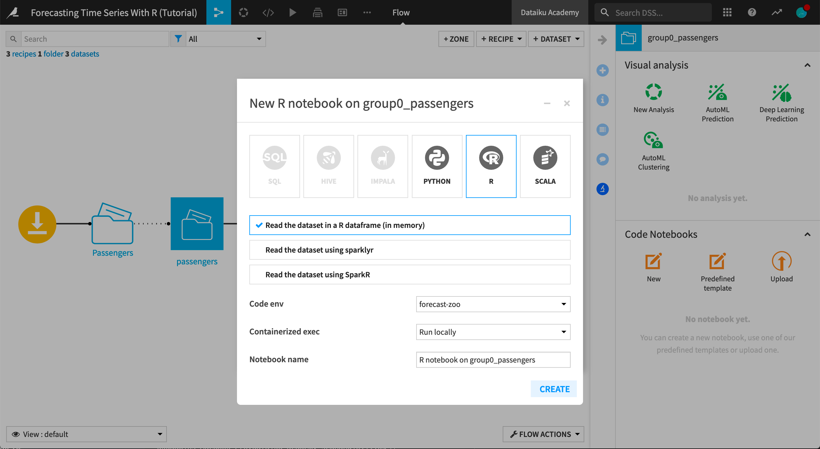
Dataiku DSS will then open an R notebook with the group0_passengers dataset read into an R dataframe using the internal R API.
Hint
If not already set at the project level, change the notebook kernel to a code environment containing the forecast and zoo packages mentioned in the prerequisites.
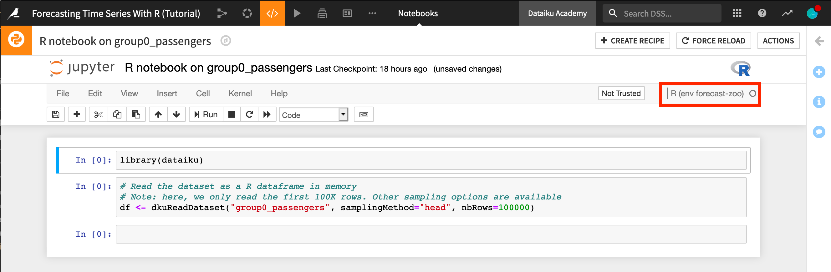
Begin by loading the additional R libraries needed for this analysis:
library(dataiku)
library(forecast)
library(dplyr)
library(zoo)
The dataiku package lets us read and write datasets to Dataiku DSS.
The forecast package has the functions we need for training models to predict time series.
The dplyr package has functions for manipulating data frames.
The zoo package has functions for working with regular and irregular time series.
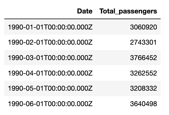
After reading in the data to an R dataframe using the R API, take a look at the first few rows with the head() function.
df <- dkuReadDataset("group0_passengers", samplingMethod="head", nbRows=100000)
head(df)
Now that we’ve loaded our data, let’s create a time series object using the base ts() function and plot it.
The ts() function takes a numeric vector, the start time, and the frequency of measurement. For our dataset, these values are:
Total_passengers,
1990(the year for which the measurements begin), anda frequency of
12(months in a year).
ts_passengers <- ts(df$Total_passengers, start = 1990, frequency = 12)
plot(ts_passengers)
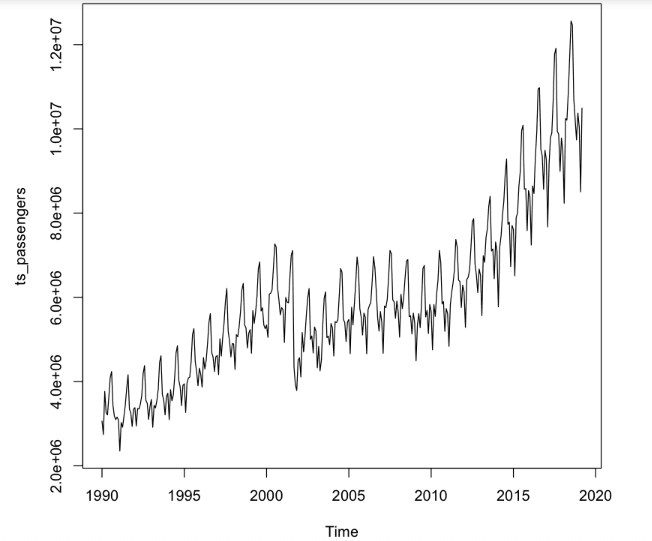
Not surprisingly, we see the same trends found in the plot using the native Chart builder in Dataiku DSS. Now let’s start modeling!
Choose a Forecasting Model
We are going to try three different forecasting methods and deploy the best one to DSS. In general, it is good practice to test several different modeling methods and choose the method that provides the best performance.
Model 1: Exponential Smoothing State Space Model
The ets() function in the forecast package fits exponential state smoothing (ETS) models. This function automatically optimizes the choice of model parameters.
Let’s use the function to make a forecast for the next 24 months.
m_ets <- ets(ts_passengers)
f_ets <- forecast(m_ets, h = 24) # forecast 24 months into the future
plot(f_ets)
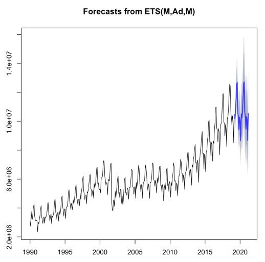
The forecast is shown in blue, with the gray area representing a 95% confidence interval. Just by looking, we see that the forecast roughly matches the historical pattern of the data.
Model 2: Autoregressive Integrated Moving Average (ARIMA) Model
The auto.arima() function from the forecast package returns the best ARIMA model based on performance metrics. Using the auto.arima() function is almost always better than calling the arima() function directly.
Note
For more information on the auto.arima() function, see an explanation in the Forecasting textbook.
Just as before, let’s use the function to make a forecast for the next 24 months.
m_aa <- auto.arima(ts_passengers)
f_aa <- forecast(m_aa, h = 24)
plot(f_aa)
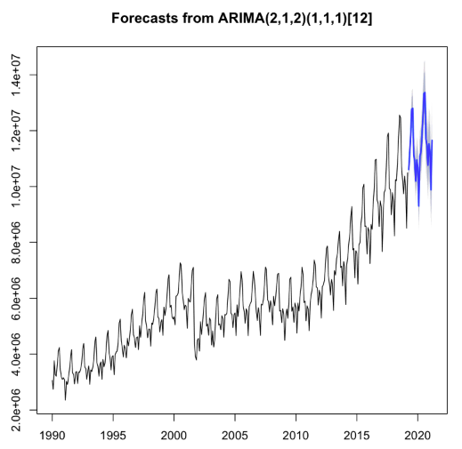
Observe that these confidence intervals are a bit smaller than those for the ETS model. This could be the result of a better fit to the data. Let’s train a third model and then do a model comparison.
Model 3: TBATS Model
The last model we are going to train is a TBATS model. This model is designed for use when there are multiple cyclic patterns (e.g. daily, weekly and yearly patterns) in a single time series. We’ll see if this model can detect complicated patterns in our time series.
m_tbats <- tbats(ts_passengers)
f_tbats <- forecast(m_tbats, h = 24)
plot(f_tbats)
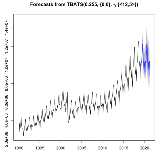
Now we have three models that all seem to give reasonable predictions. Let’s compare them to see which one performs best.
Compare Models
We’ll use the Akaike Information Criterion (AIC) to compare the different models. AIC is a common method for determining how well a model fits the data, while penalizing more complex models. The model with the smallest AIC value is the best fitting model.
barplot(c(ETS = m_ets$aic, ARIMA = m_aa$aic, TBATS = m_tbats$AIC),
        col = "light blue",
        ylab = "AIC")
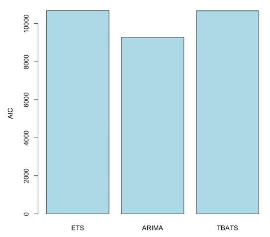
We see that the ARIMA model performs the best according to this criteria. Let’s now proceed to convert our interactive notebook into an R recipe that can be integrated into our DSS workflow.
To do this, we first have to store the output of the forecast() function from the chosen model into a data frame, so that we can pass it to Dataiku DSS. The following code can be broken down into three steps:
Find the last date for which we have a measurement.
Create a dataframe with the prediction for each month. We’ll also include the lower and upper bounds of the predictions, and the date. Since we’re representing dates by the year, each month is 1/12 of a year.
Split the date column into separate columns for year and month.
last_date <- index(ts_passengers)[length(ts_passengers)]
data.frame(passengers_predicted = f_aa$mean,
        passengers_lower = f_aa$lower[,2],
        passengers_upper = f_aa$upper[,2],
        date = last_date + seq(1/12, 2, by = 1/12)) %>%
    mutate(year = floor(date)) %>%
    mutate(month = round(((date %% 1) * 12) + 1)) ->
    forecast
Awesome! Now that we have the code to create the forecast for the next 24 months, and the code to convert the result into a dataframe, we are all set to deploy the model to DSS.
Note
Here we speak of deploying a model from a notebook (part of the Lab) to a recipe (part of the Flow). Note however that this is not the same as deploying a Dataiku-managed visual or custom model to the Flow. Our result will be an R recipe in the Flow and not a saved model (represented by a green diamond).
Deploying the Model to DSS
To deploy our model, we must create a new R recipe. In the notebook:
Click +Create Recipe > R recipe - native R language.
Ensure that group0_passengers dataset is the input dataset, and create a new managed dataset,
forecast, as the output of the recipe.
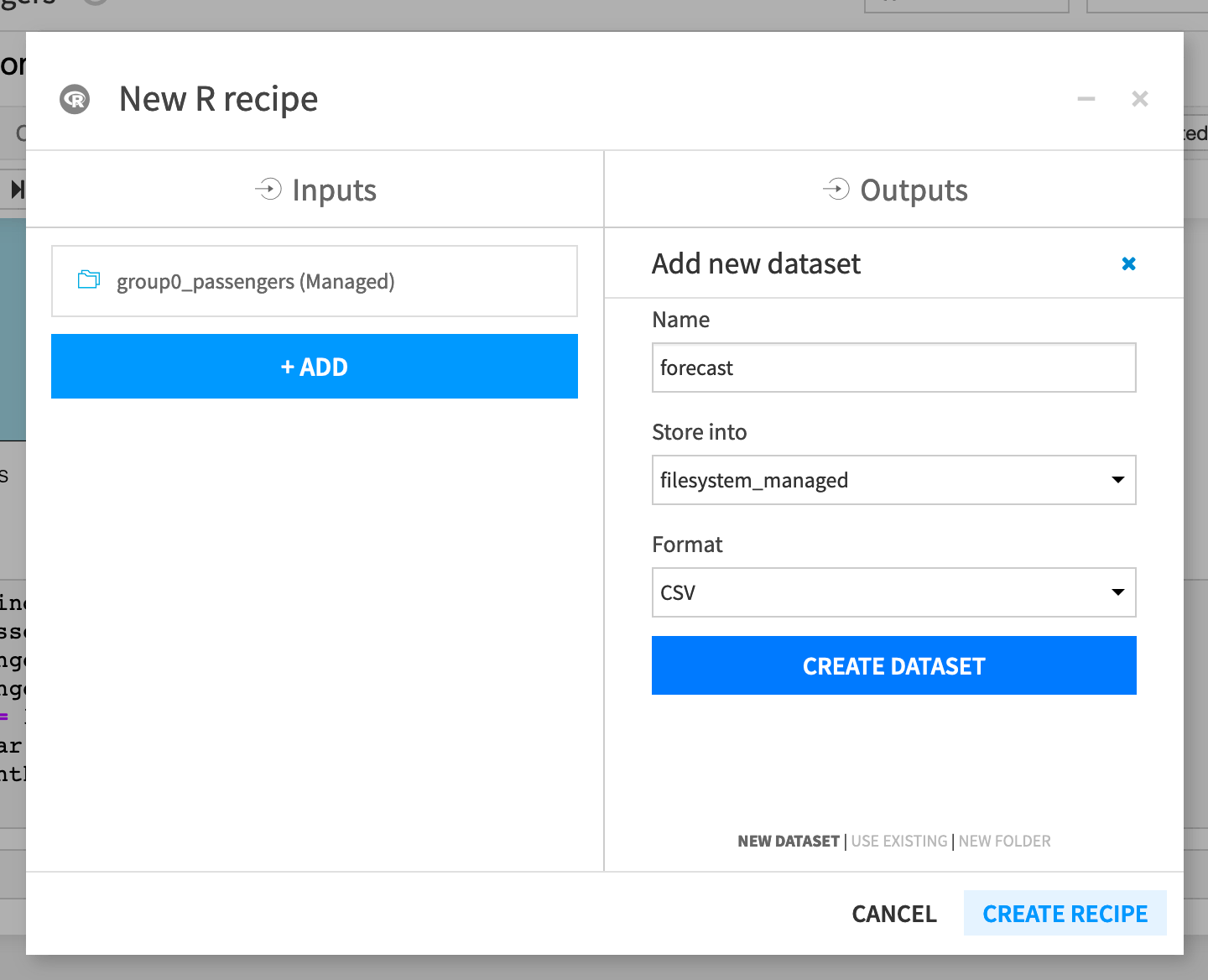
Create the recipe, and Dataiku DSS opens the recipe editor with the code from the notebook in the recipe.
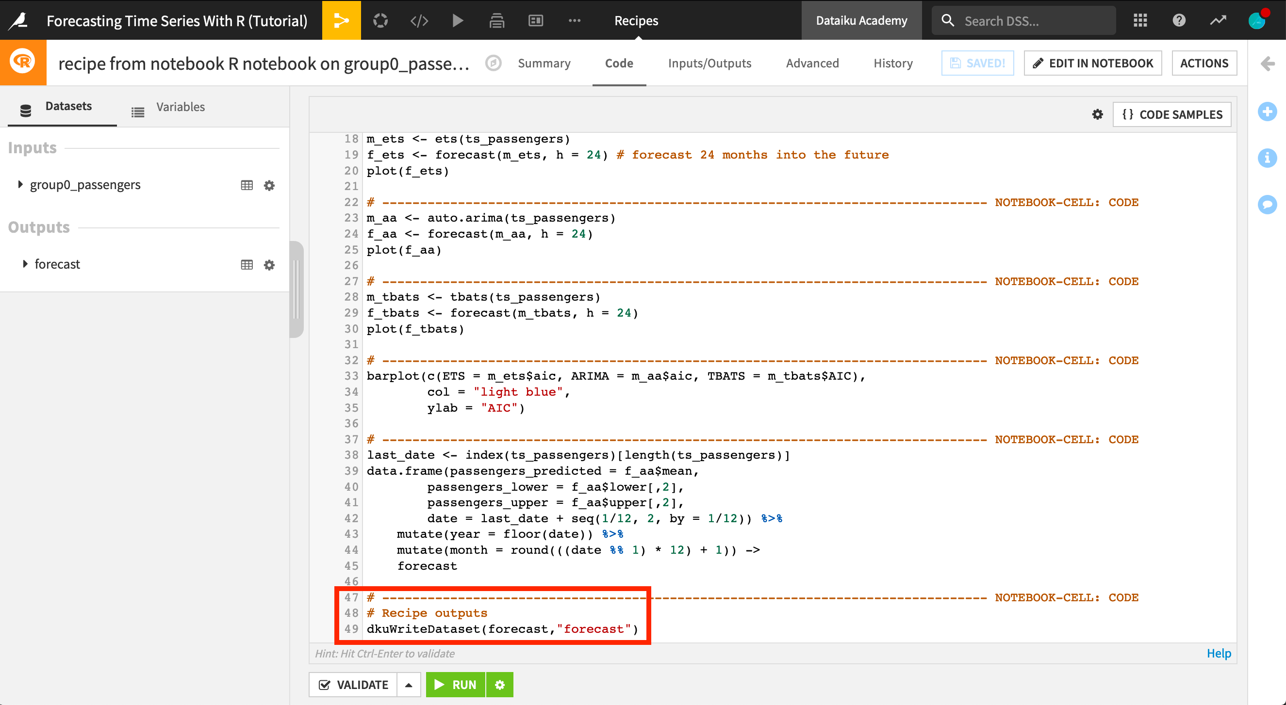
We could optimize the code in the recipe to only run the portions that will output the forecast dataset, but for now, simply run the recipe. Return to the Flow where you can see our newly created dataset.
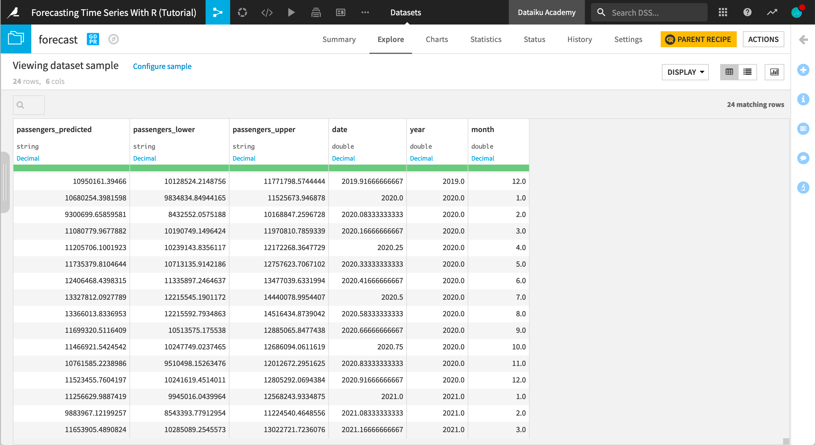
Open the forecast dataset to look at the new predictions.
Next Steps
Congratulations! Now that you have spent some time forecasting a time series dataset with R in Dataiku DSS, you may also want to practice using the Time Series Forecast plugin to repeat this tutorial without using code.