Consume Insights in a Dashboard
In this section, you will learn about data and machine learning (ML) insights in Dataiku DSS and how you can consume them as a business user, without having to perform machine learning tasks yourself.
You will do this by exploring the contents of a dashboard created by another user in this project.
Note
Dashboards allow users to share elements of a data project with other users, including ones that may not have full access to the project.
A Dataiku DSS project can contain multiple dashboards. Each dashboard is made of multiple slides. On each slide, you put tiles.
Tiles can be one of two types: “simple” tiles (static text, image, embedded page) or “insight” tiles. Each “insight” tile displays a single insight.
An insight is a piece of information that can be shared on a dashboard.
We have now configured the Dataiku DSS homepage so that the Dashboards section appears at the top. It contains all of the dashboards that have been shared with you: in this case, two dashboards coming from the AI Consumer Quick Start (Tutorial) project, Purchase Patterns and Model Report & Predictions.
Consume Data Insights from a Dashboard
Click on the Purchase Patterns tile to open the dashboard.
It contains two charts built with Dataiku DSS’s native visualization tools. The charts represent insights on credit card transactions data from 2017 and 2018.
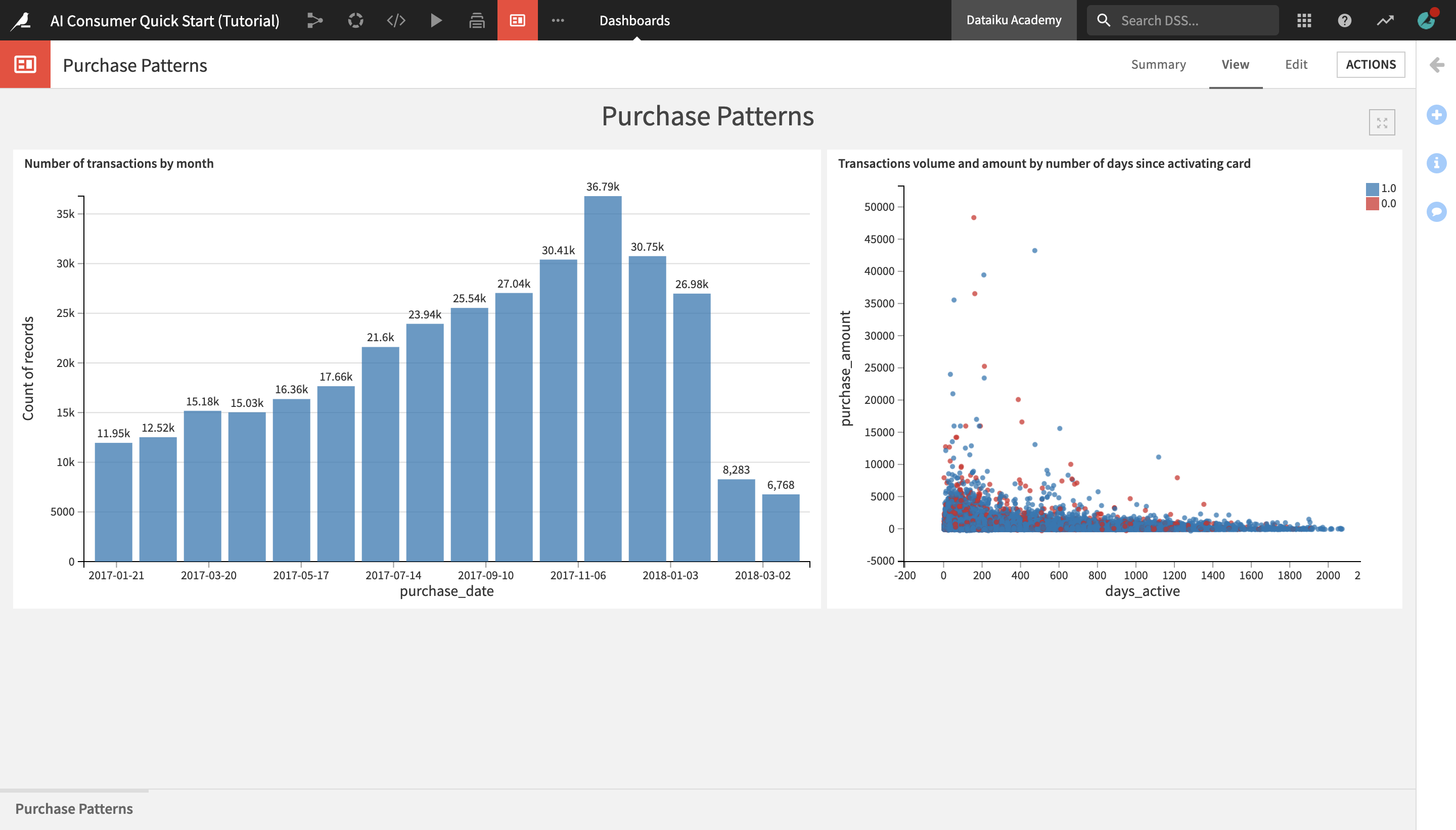
The Number of transactions by month bar chart on the left shows that the number of transactions made by month has been steadily increasing over time up until December 2017, when they start decreasing and then sharply drop in March of 2018.
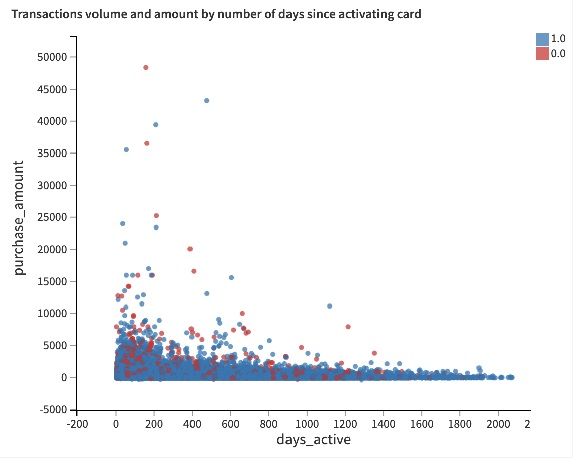
The Transactions volume and amount by number of days since activating card scatterplot on the right shows the distribution of the purchase amount and the volume of transactions based on the number of days that the credit card has been active. Authorized transactions are represented by blue dots, and unauthorized transactions – by red dots.
Notice that for both authorized and unauthorized transactions, the purchase amounts tend to be highest in the first 200 days after a card has been activated, and steadily dropping from there.
However, it seems that the volume of unauthorized transactions is more heavily concentrated in the early days after card activation, while the volume of authorized transactions is a bit more evenly distributed.
Explore a Machine Learning Model Report
After exploring credit card purchase patterns in a dashboard, let’s discover another dashboard, Model Report & Predictions, in order to learn more about the ML model that predicts potential fraudulent transactions, as well as access the model predictions.
From the Dashboards and Insights menu in the top navigation bar, click on Dashboards.
From the Dashboards page, click on the Model Report & Predictions dashboard to open it.
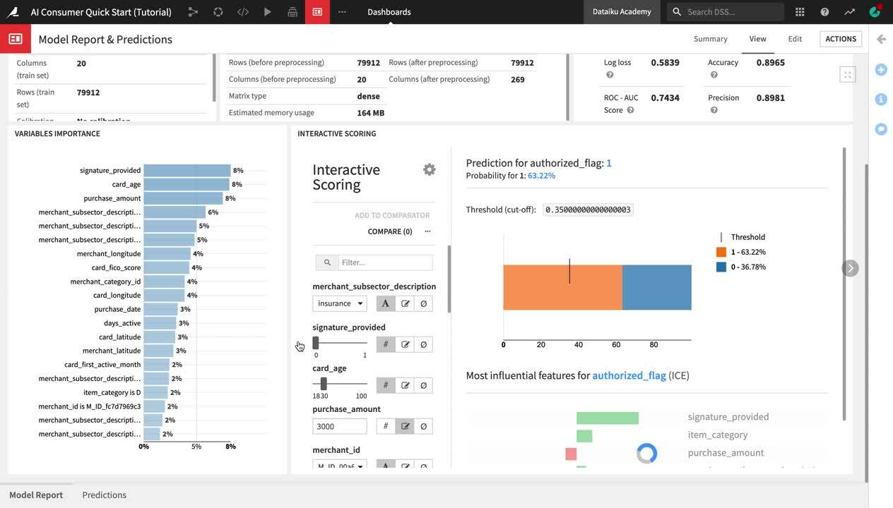
You are navigated to the first slide of the dashboard, Model Report, which contains key information about the machine learning model used in the project, delivered in a comprehensible way for non-technical users.
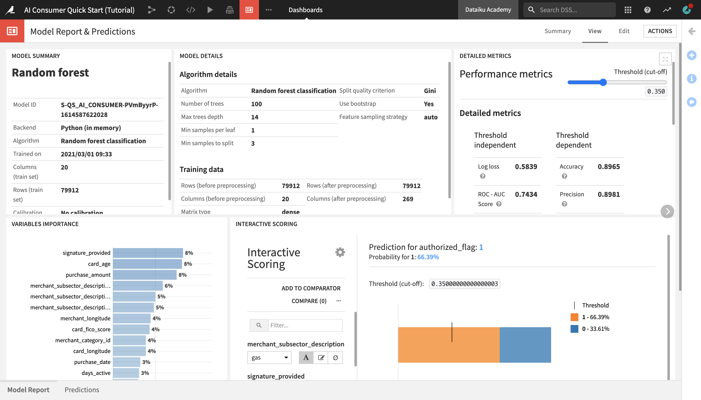
The Model Summary tile displays key general information about the model, such as the algorithm that was used and the last time it was trained.
The Model Details tile contains details about the algorithm and the data that was used to train the model.
The Detailed Metrics tile shows the model’s key performance metrics, which are standard metrics for evaluating models, and their meanings. You do not need to understand these in detail, but if you’re curious and want to learn more about the model’s performance, this tile is a good point of reference.
Tip
To learn about what a given metric represents, hover over the “?” icon next to its title and read the description.
The Variables Importance chart shows which variables, or features, have the biggest impact on the prediction results. In this case, the most important variables that explain whether a transaction was predicted to be authorized or fraudulent are:
signature_provided, or whether the cardholder provided a signature when doing the transaction;
the age of the credit card;
and the amount of the purchase.
Finally, the Interactive Scoring tile allows dashboard consumers to explore visually how the different model features impact its predictions, and create different “what-if” scenarios.
The Interactive Scoring tile displays a bar chart with the percentage of transactions that have been predicted as authorized (1) or fraudulent (0) for a given combination of features. In the left side panel, users can modify the values of different features to see how this would impact the results.
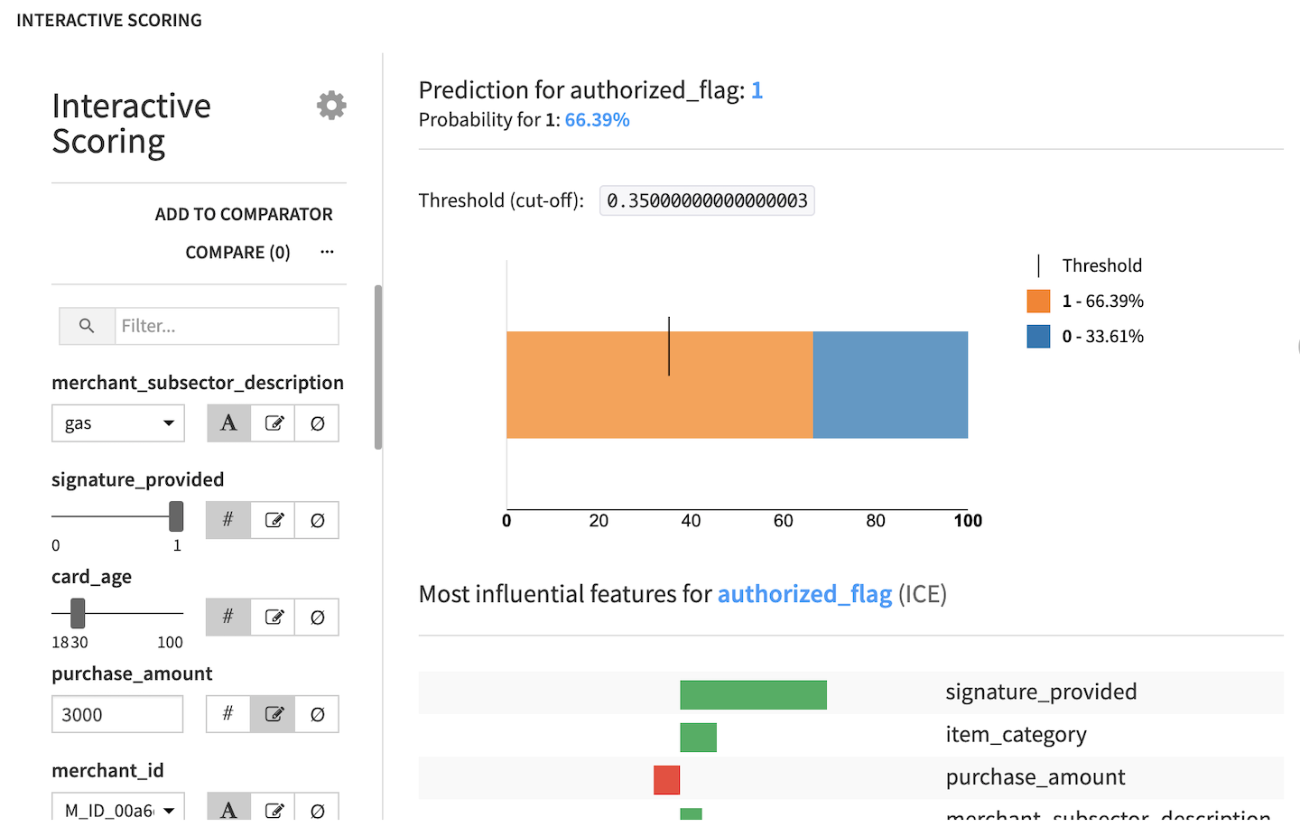
Let’s try this in practice:
From the merchant_subsector_description dropdown, change the merchant subsector to display results for from gas to
insurance.Set signature_provided to
0.
Notice that the predicted ratio of authorized vs. fraudulent transactions has now drastically changed to only 45% authorized and 55% unauthorized transactions. We have gained an immediate visual feedback showing that insurance-related transactions where a signature was not provided are much more likely to be flagged as fraudulent.
Next, drag the card_age slider and set it to
100.
After increasing the card age, we can observe a proportional increase in the percentage of authorized transactions, confirming the insight that we saw earlier in the Purchase Patterns dashboard, as well as in the Variables Importance chart.
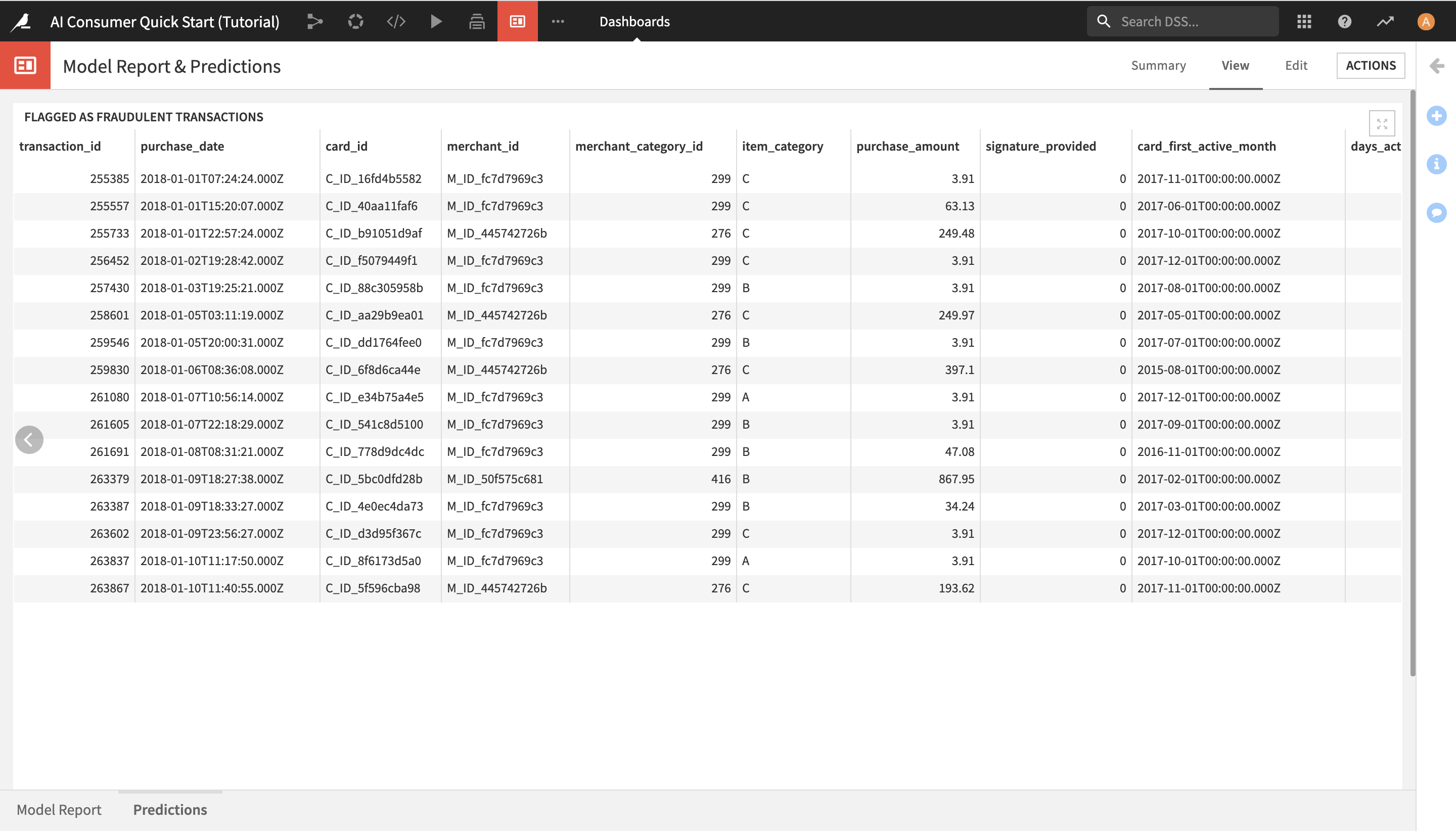
View Generated Predictions
After learning about the ML model and exploring its predictions through interactive scoring in the Model Report slide, you can now view the list of transactions that the model has detected as potentially fraudulent.
To do this:
Click on Predictions in the lower left corner in order to open the Predictions slide.
Here, you can see the list of all potentially fraudulent transactions.