Share Results
Let’s share the results using a dashboard so they are more accessible to other stakeholders.
Note
Dataiku DSS allows users to drag and drop insights (such as charts, metrics, webapps, and more) onto dashboards.
The groups-based permissions framework that governs access to Dataiku DSS projects makes it possible to define at a granular level the nature of access to project materials, including dashboards.
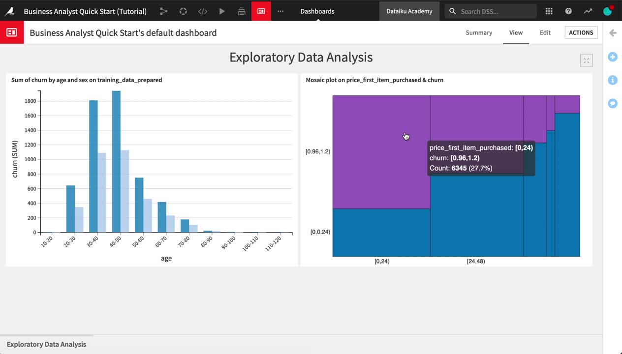
From the Flow, select the training_data_prepared dataset.
In the Details panel of the right sidebar, click on the “Sum of churn by age and sex” chart.
For the bar chart, click the Publish button near the top right of the screen.
Click Create to create the insight, and add it to Slide 1 of the default dashboard.
Adjust the size of the chart as needed.
On the Slide tab, rename Slide 1
Exploratory Data Analysis.Use the slide title as a header on the slide.
Save your work.
Now let’s add one of the mosaic plots from the statistical analysis.
Return to the Details sidebar of the training_data_prepared dataset.
Select the Statistics Worksheet.
Publish the mosaic plot of churn by price_first_item_purchased to the “Exploratory Data Analysis” slide of the default dashboard.
Tip
Feel free to continue building out your dashboard. For example, you might add a second slide displaying the model report and its AUC metric.