Identify Similar Bike Stations
Now we are ready to identify “similar” stations with a clustering model.
From the Lab of the bikeStations_prepared_joined dataset, choose Quick Model > Clustering > Quick Models > K-Means, accepting the default output name.
Before training any model, in the Features handling section of the ML task Design tab:
Set the Roles of nbBikes, county_name, state_name, and nbPeople to Use for display only.
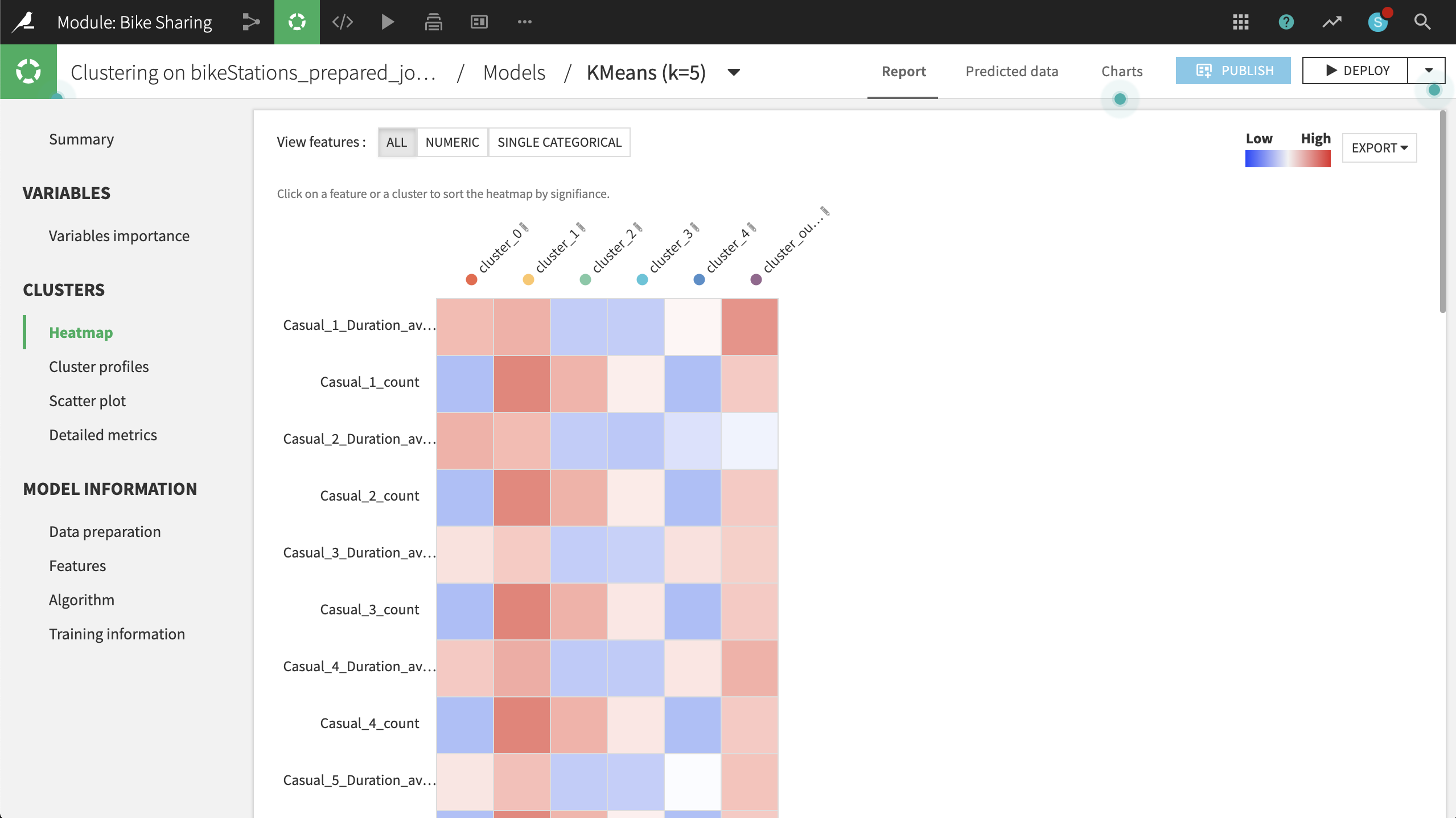
Then Train the model. Open the resulting model and navigate to the Heatmap to gain a better understanding of the clustering results.

Based on the heatmap and other metrics, such as the Summary observations, we can suggest naming the clusters according to the table below:
Cluster
Strongest Association
Rename
0
High concentration of Maryland; low counts, but long duration of trips
MD
1
Longer trips by casual users in DC, esp. on the weekend
DC Tourists
2
Shorter trips by members in DC on the weekend
DC Weekenders
3
Short trips by members in DC on weekdays
DC Commuters
4
High concentration of Virginia; low counts and low duration of trips
VA
Let’s visualize the clustering results on a map. To do this, at the top right:
Click Deploy > Deploy a retrainable model to flow.
The input dataset is the default bikeStations_prepared_joined.
Keep the default model name and select Create.
Select the model from the Flow and use the Apply recipe to score the bikeStations_prepared_joined dataset.
Accept the default output name, and run the recipe.
Note that the output dataset now has one additional column, cluster_labels, including the model’s predicted groupings.
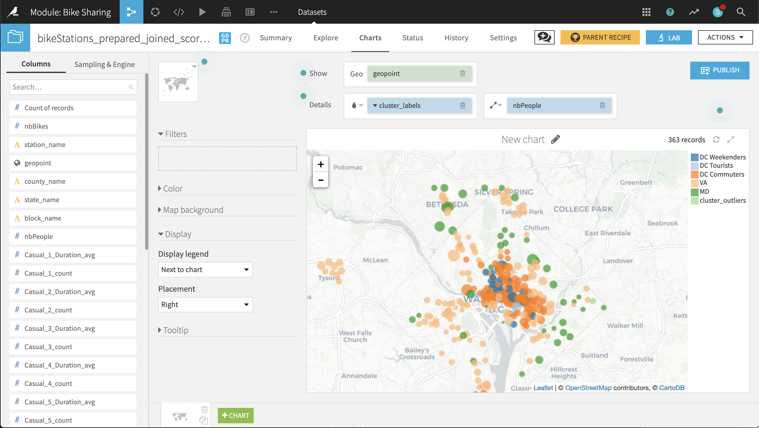
Now on the Charts tab of the same output dataset, create a Scatter Map with:
geopoint as the column identifying the location of points
cluster_labels as the column to color the points
nbPeople as the column to set the size of points. With the icon to the left of the nbPeople box, reduce the base radius so that the points don’t overlap too much.

The placement of labeled clusters on the map gives us even more insight:
The VA and MD clusters have a number of points outside those states. It might be better to respectively rename these clusters Suburban Short Trips and Suburban Long Trips, respectively.
The DC Tourists cluster is clustered, not surprisingly, around the Mall and other sites of interest to tourists.
The DC Commuters cluster is spread across the downtown of DC, in blocks with large numbers of people.
The DC Weekenders cluster is interspersed among the DC Commuter locations.
These general shapes make sense. The map helps increase our confidence in the clusters. From here, it can be useful to look at individual points that seem out of place.
For example, there are three stations just north of the Constitution Gardens Pond in DC that are in the VA cluster. What makes them different from the nearby DC Commuters points? Perhaps these stations are under-performing, and should be closed, relocated, or have the number of available bikes reduced.
Before retraining the model with 2017 data, take a few screenshots of the 2016 map to make it easier to compare before and after results.