
Tutorial | Generalized Linear Models#
Get started#
This tutorial introduces Generalized Linear Models (GLM) in a practical way—by modelling the car insurance claim risk. You’ll learn how to build, interpret, and apply the model directly within the webapp.
Objectives#
In this tutorial, you will:
Create the Visual GLM webapp.
Configure and train a GLM model.
Visualize the results.
Deploy the model.
Prerequisites#
To use the Generalized Linear Model, you’ll need:
Dataiku 14.2 or later.
An Advanced Analytics Designer or Full Designer user profile.
An installed Generalized Linear Models plugin.
Create the project#
From the Dataiku Design homepage, click + New Project.
Select Learning projects.
Search for and select Generalized Linear Model.
If needed, change the folder into which the project will be installed, and click Create.
From the project homepage, click Go to Flow (or type
g+f).
Note
You can also download the starter project from this website and import it as a ZIP file.
The GLM webapp#
Create the webapp#
The first thing you must do is create the visual webapp the plugin has provided.
Navigate to Code (
 ) > Webapps.
Click + New Webapp and select Visual Webapp.
Search for Visual GLM thanks to the search bar and select it.
In the Webapp name field, name it
GLM tutorial.Click Create.
Setting up#
The goal is to create a GLM to model claim frequency for a car insurance company. The exposure is the period of time during which the contract was held, expressed in years. You can set it up that way.
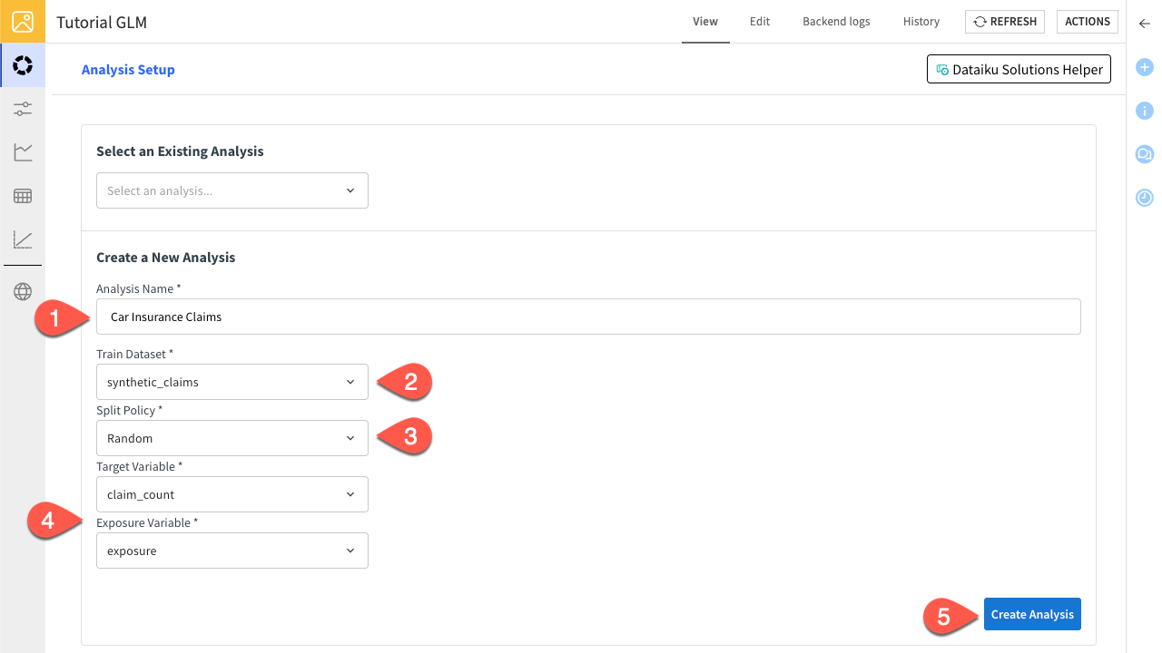
In the View tab, click Or create a new analysis… and enter
Car Insurance Claimsas the Analysis Name.In Train Dataset, select the synthetic_claims.
Select Random as the Splitting Policy.
Select claim_count as the Target Variable.
Click Create Analysis to confirm.
Train a model#
You have created an analysis in your project, you can now train a new model with the variables you want. You also need to configure your GLM with the relevant parameters. Here, you will create your first model to predict the claim count depending on bonus/malus and region variables.
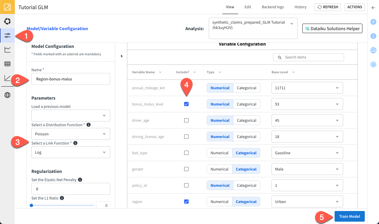
Navigate to the Model/Variable Configuration tab.
Name the model
Region-bonus-malus.You can leave the Poisson and Log functions as the Distribution and Link, respectively.
Check the bonus_malus_level and region variables in the Variable Configuration panel to include them in the model.
Click Train Model to confirm.
You should see a loading screen and a notification that the training job has been done properly.
Tip
You can find your different analysis and models in the Visual ML (Analysis) (![]() ) menu of your project.
) menu of your project.
Visualize results#
The webapp allows you to visualize the predictions alongside their observed counterparts.
Navigate to the Observed vs Predicted Chart tab.
Select the Region-bonus-malus model.
Select the region variable.
Run the analysis on the Test dataset.
Click Create Chart.
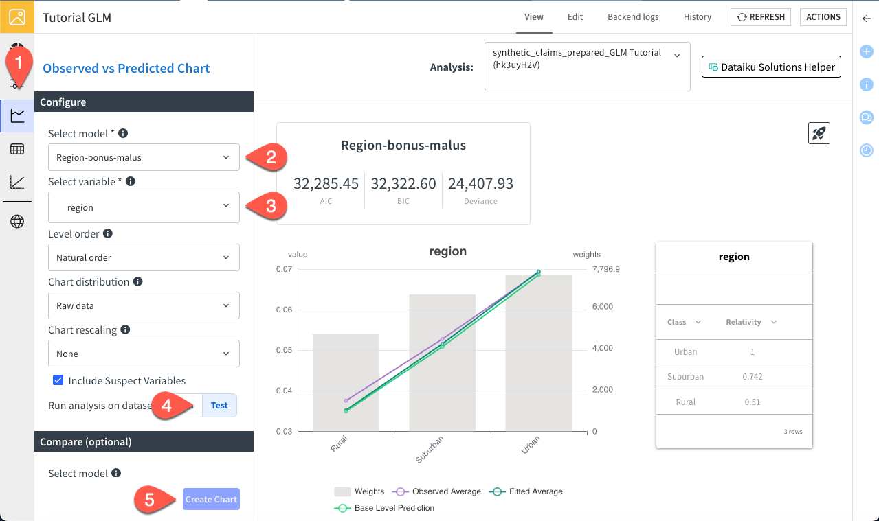
You can compare the model’s predictions with the actual observed values for the claim frequency, while displaying the total exposure per region. The model performs well and you can see that the claim frequency is way lower in rural region, which is expected given the lower density.
You can also visualize the results through statistics.
Navigate to the Variable-Level Statistics tab.
Select the Region-bonus-malus.
Note
You can click on the upload icon to export the statistics in a spreadsheet.
You can view key model outputs, including feature relevance, coefficients, and statistical metrics such as p-values and standard errors.
The final visualization available in the webapp is the lift chart, which helps evaluate model performance by comparing predictions with actual outcomes. The chart displays data sorted by predicted values and grouped into bins.
Observed values represent the ground truth, showing the actual average outcome within each bin.
Predicted values represent the model’s estimates, showing the average predicted outcome within each bin.
This chart allows you to assess how closely predictions align with observed values across the full prediction range and to identify where discrepancies occur.
In this example, the model demonstrates strong predictive power and effectively separates risk levels. However, minor calibration issues are visible, as observed values slightly deviate from predictions in the mid-range of risk.
Navigate to the Lift Chart tab.
Slide the number of bins to 10.
Switch to Test for the dataset.
Click Create Chart.
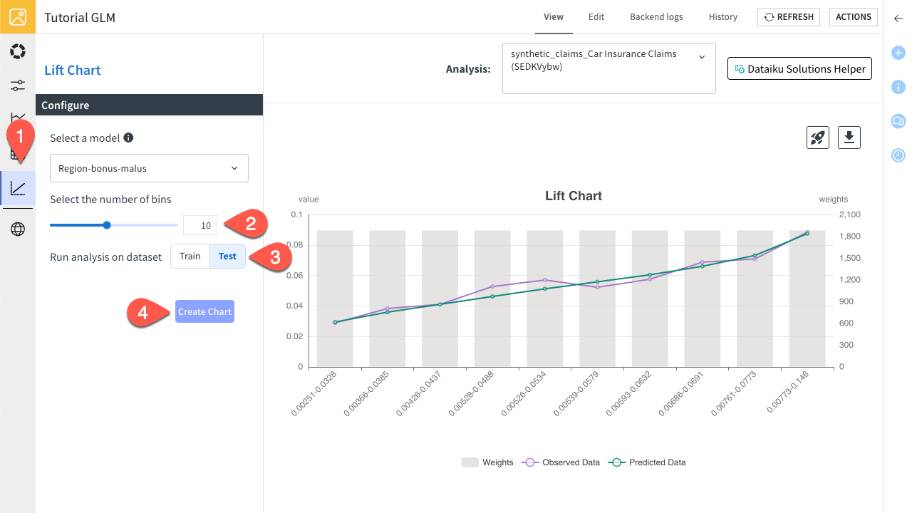
You can see that the fit is smooth.
Deploy your model#
Navigate to the GLM Model Management tab.
Click on the rocket icon to deploy the model.
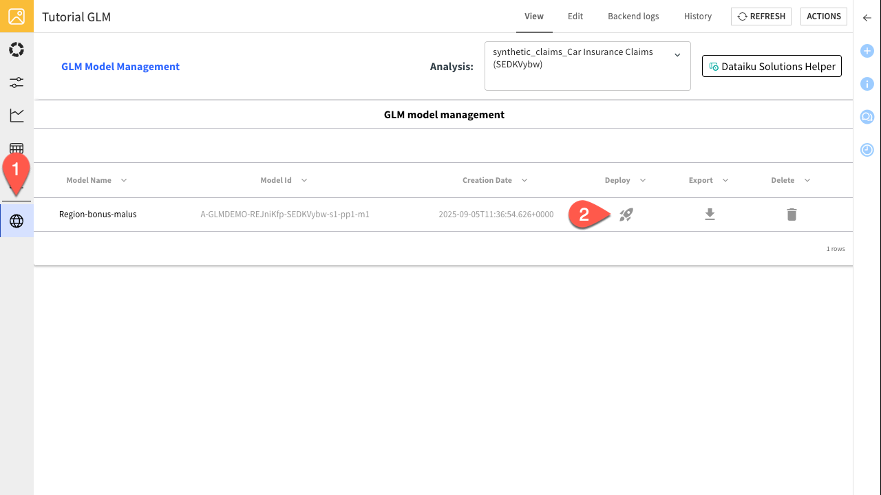
The model has been successfully deployed to the Flow, where it can now be used for scoring and further analysis.
Next steps#
Congratulations! In this tutorial, you’ve created the Visual GLM webapp, configured and trained a GLM model, visualized the results, and even deployed the model. You’re now ready to apply these skills to real-world car insurance claim prediction and beyond. You can explore the Solution | Insurance Claims Modeling for a complex case.