

Tutorial | Building and exploring a graph for patient data analysis#
Get started#
Graph analytics can be useful across many industries to help uncover hidden relationships in complex datasets.
In this tutorial, you’ll use the Dataiku Visual Graph plugin—a practical way to apply graph analytics—to transform complex, disconnected data into a clear visual network. This approach makes it possible for both technical and non-technical users to explore insights.
Important
You can follow the tutorial from start to finish, or focus only on your role:
If you are a data scientist (editor), start from the beginning to learn how to design graphs.
If you are a business analyst (explorer), you can jump ahead to the Explorer’s journey (for non-technical users) to work with a ready-made project. You’ll still need the Visual Graph plugin installed on your instance.
Objectives#
This tutorial supports two types of users:
Data scientists (editors) learn how to:
Interactively set up and build a graph using the Visual Graph editor webapp.
Analyze and explore the graph to answer specific business questions.
Publish a graph for non-technical users to explore.
Business analysts (explorers) learn how to:
Explore a published graph using the Visual Graph explorer webapp.
Search the graph to find specific entities.
Investigate relationships and patterns in the data.
If you are a business analyst (explorer), you can jump directly to the Explorer’s journey (for non-technical users). You’ll still need the Visual Graph plugin installed on your instance.
Prerequisites#
To complete this tutorial, you’ll need the following:
Dataiku 15.1 or later.
A Full Designer user profile for the editor’s journey (no specific profile requirement for the explorer’s journey).
Visual Graph plugin installed.
Basic knowledge of Dataiku (Core Designer level or equivalent).
Create the project#
If needed, from the Dataiku Design homepage, use the (
 ) icon to switch to the Designer view.
Click + New Project > Learning projects.
Search for and select Visual Graph Plugin.
If needed, change the folder into which the project will be installed, and click Create.
From the project homepage, click Go to Flow (or type
g+f).
Note
You can also download the starter project from this website and import it as a ZIP file.
Use case summary#
Imagine facing a common challenge: you have several datasets about patients, drugs, and diseases, but the relationships between them are hidden. A drug prescribed to a patient might conflict with another medication, yet this information is scattered across different tables.
Here are the datasets you’ll be working with:
Dataset |
Description |
|---|---|
Patients |
Contains patient data such as names, ages, and associated diseases. |
Drugs |
Lists drugs available on the market and the diseases they treat. |
Diseases |
Provides a taxonomy of diseases. |
DrugContraindications |
Identifies drug combinations that shouldn’t be prescribed together. |
Your datasets hold all the necessary clues—from patient names and ages to lists of drugs, diseases, and critical contraindication details. The difficulty is bringing these pieces together into a form that reveals the bigger picture.
By creating a graph from these datasets, you will be able to uncover connections that are otherwise invisible in spreadsheets—for example, which patients are at risk due to conflicting prescriptions.
This narrative highlights why graphs are valuable and sets the stage for both technical and non-technical users to explore them effectively.
Editor’s journey (for data scientists)#
As a data scientist, your journey begins with creating and configuring graphs. In this section, you’ll learn how to build the foundation of your graph, interact with it, and prepare it for collaboration with your business teams.
Set up the editor webapp#
The first step is to create and configure your editor webapp.
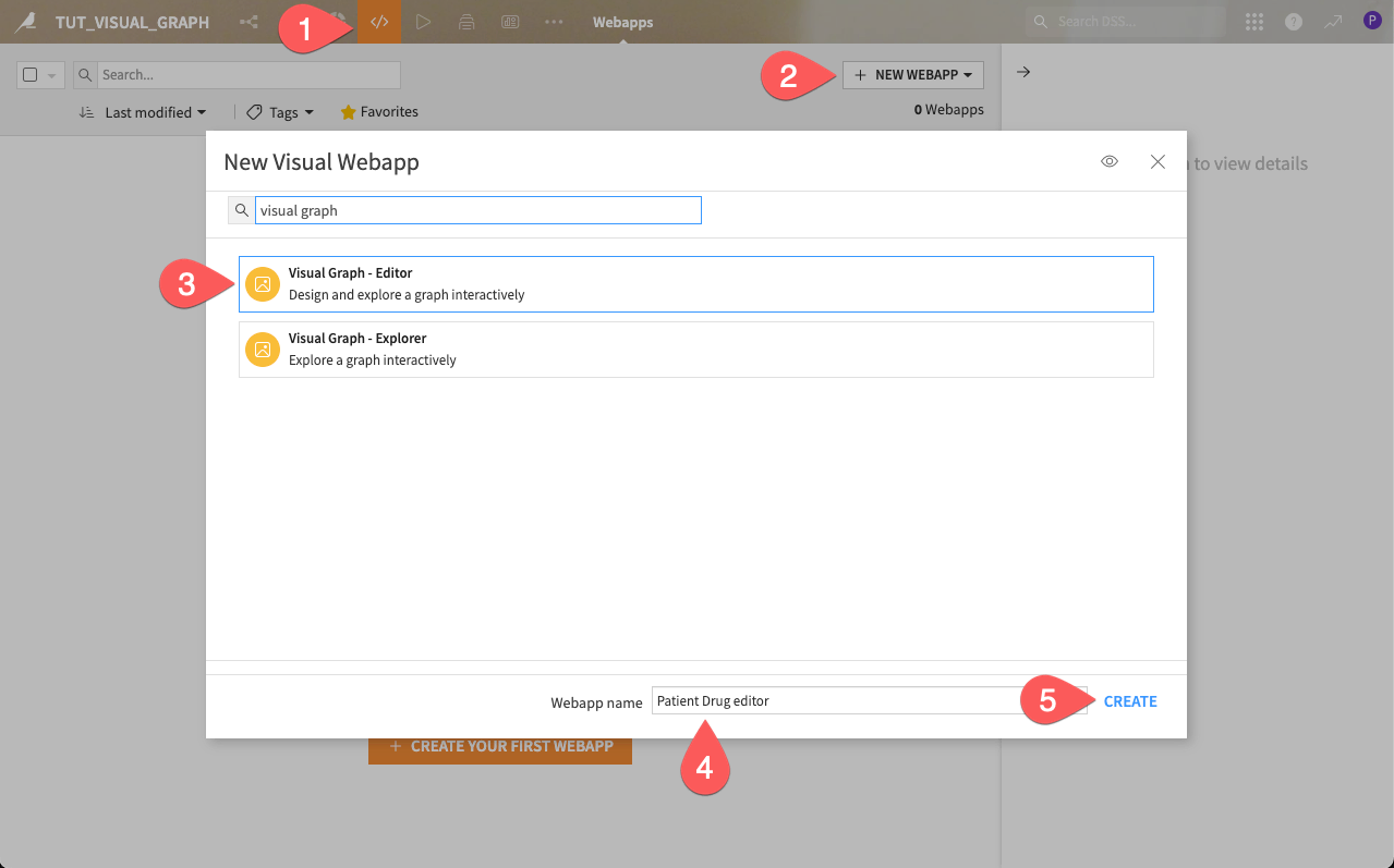
From the top navigation bar, open the Code menu (
 ) and click Webapps.
Click + New Webapp > Visual Webapp.
Select Visual Graph - Editor.
Name the webapp
Patient Drug editor.Click Create. This opens the Edit tab of the new webapp.
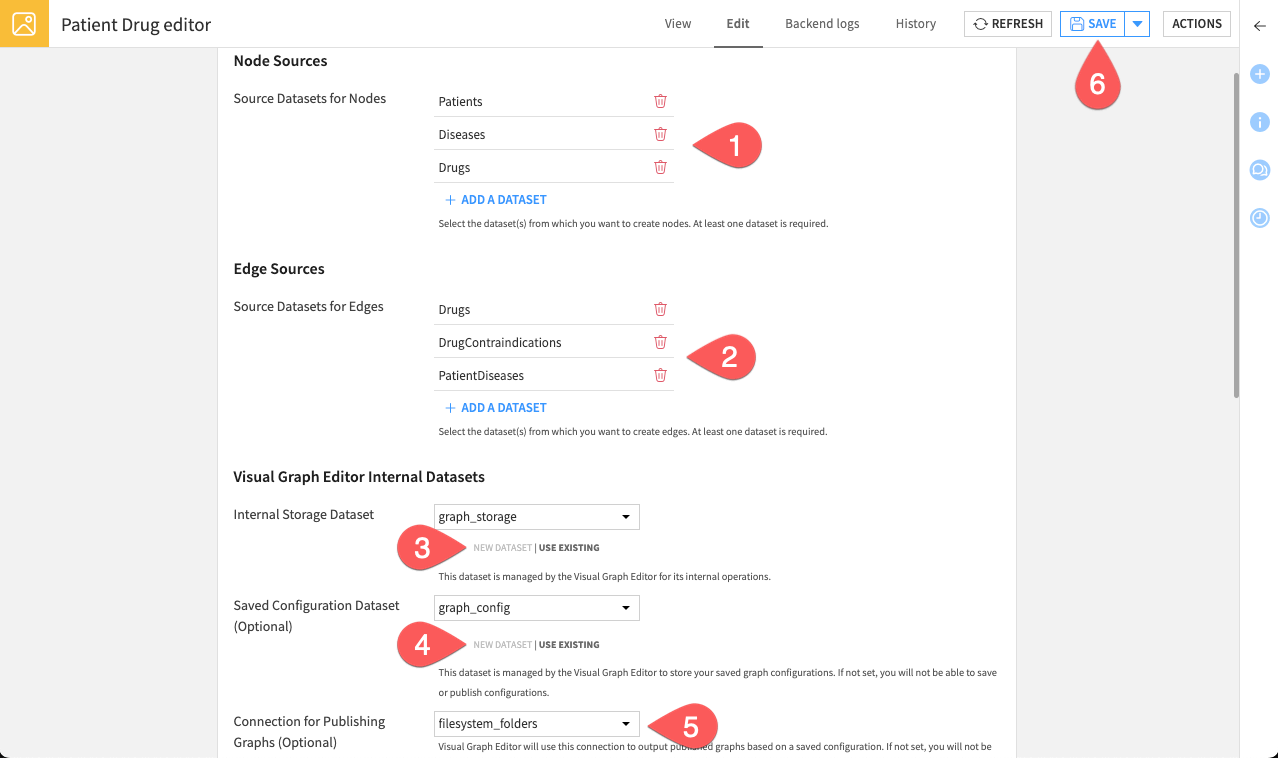
While you can start building graphs immediately, configuring a configuration dataset is required to publish your graphs for others to explore.
Set up this configuration to enable the end-to-end production workflow.
Under Graph publication, create a dataset of any type, named
graph_configas the Saved configuration dataset.For the Connection for publishing graphs, select the connection filesystem_folders.
Click Save to finish the configuration.
Your webapp is now fully configured. Switch to the View tab to start working with it.
Note
Optionally, you can enable the AI Assistant by selecting your preferred LLM Connection. This adds the AI search mode to the search bar, which answers questions written in plain language.
This feature requires a connection to at least one supported Generative AI model. Your administrator must configure them beforehand in the Administration panel > Connections > New connection > LLM Mesh. Supported model connections include models such as OpenAI, Hugging Face, Cohere, etc.
Interactive graph creation#
You are now inside the interactive workspace. Create a new graph to highlight drug contraindications.
Click Create a new graph.
From the left panel, click the More Options (
 ) menu and rename your graph to
 Drug Contraindications.
The next step is to configure the graph by adding nodes (the entities) and edges (the relationships).
Tip
The Graph built from sampled rows banner at the top of the left panel shows that, by default, the graph uses the first 1,000 rows of each dataset. The datasets in this tutorial are smaller than that, so every record is included and you can keep the default. When you work with larger datasets, click Change sampling to adjust how many rows the graph uses.
Create node groups#
Node groups define the entities that will appear in the graph. Create your first node group.
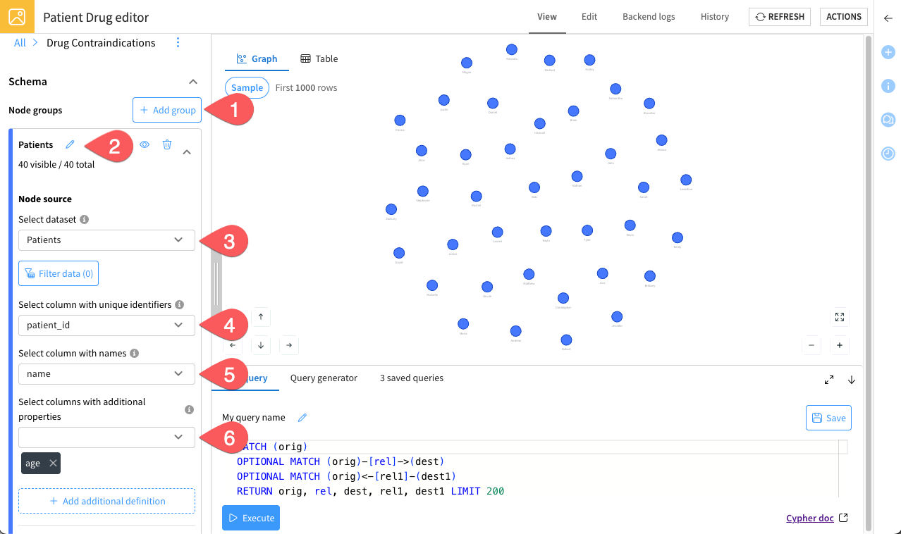
In the left panel, next to Node groups, click + Add node group.
Name it
Patients.Select the dataset Patients.
Select patient_id as the column with unique identifiers. It creates a node for each unique value in this column.
Select name as the column with names. This column’s values define the node names.
Add columns with additional properties by selecting the column age. This will attach the age property to the nodes.
Under Searchable properties, make sure the Allow keyword search on this node group option stays activated, with the name property selected.
Click Add.
Reiterate this process to create two additional groups, following these parameters:
Group name |
Source dataset |
Node IDs column |
Node names column |
Additional properties column |
|---|---|---|---|---|
|
Diseases |
disease_id |
name |
None |
|
Drugs |
drug_id |
name |
used_for_disease |
Note
Keyword search is available by default on every node group you create, using the name property. If explorers need to search on other values, add them under Searchable properties when you create or edit a group.
Tip
As you add groups, the graph updates in the center of the screen, letting you instantly visualize your nodes. You can also use the Customize section to adjust the color, icon, and size of groups.
Additionally, the palette icon in the top-left corner applies conditional styling to both node and edge groups. For example, you can color patient nodes by age range, or increase the width of an edge based on one of its properties. Conditional styling lives in your browser session: it survives a refresh, but a hard refresh clears it, and other users don’t see it.
Create edge groups#
With the same logic, let’s define an edge group. They represent how nodes are connected.
Create your first edge group.
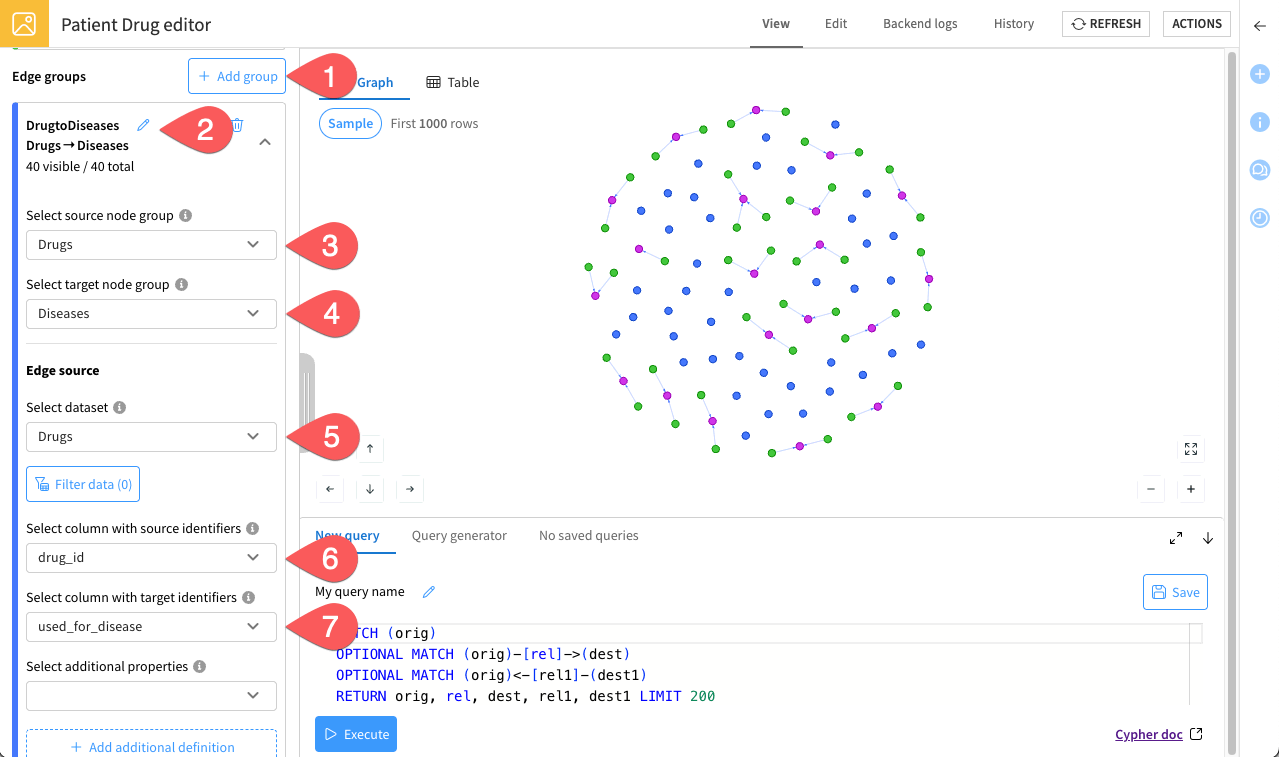
In the left panel, next to Edge groups, click + Add edge group.
Name it
DrugtoDiseases.As source node group, select the dataset Drugs.
As target node group, select Diseases.
Under Edge source, choose the Drugs dataset.
Select drug_id as the column with source identifiers. This column should contain identifiers of the source node group.
Select used_for_disease as the column with target identifiers. This column should contain identifiers of the target node group.
Leave the additional properties field empty and click Add.
Use the steps above to create two additional edge groups with the following parameters
Group name |
Source node group |
Target node group |
Edge source dataset |
Source IDs column |
Target IDs column |
Additional properties column |
|---|---|---|---|---|---|---|
|
Drugs |
Drugs |
DrugContraindications |
drug_id_1 |
drug_id_2 |
reason |
|
Diseases |
Patients |
PatientDiseases |
disease_id |
patient_id |
None |
Note
As with nodes, the graph updates as you add edge groups. This helps you uncover relationships across datasets in real time. You can also adjust the appearance of edges for readability, under the Customize section.
Well done—you’ve just designed your first graph!
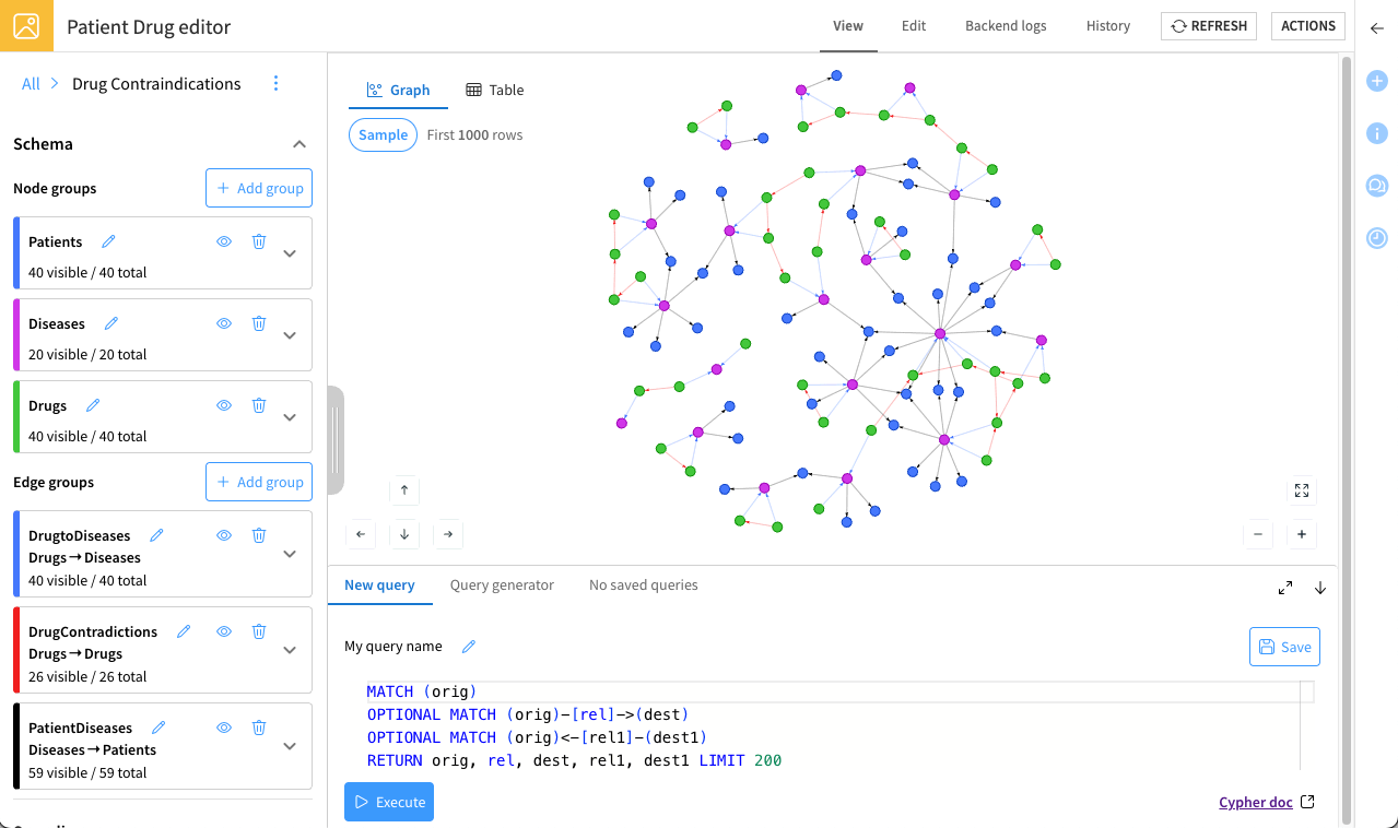
You can customize nodes and edges appearance at any time using the left panel.
Then, try zooming, dragging, and clicking on nodes and edges to explore the graph you’ve built.
You can also find a specific node from the search bar above the graph. Enter the name of one of your patients to check that the properties you made searchable return what explorers will expect.
Tip
Remember, you can create multiple graphs within the same project, each designed for a different purpose. For example, one graph could explore drug contraindications, another could analyze disease prevalence, and others could focus on specialized analyses. Take advantage of this flexibility to organize your insights efficiently.
Analyze the graph#
Now that you’ve designed the graph, you can begin analyzing it using the search bar above the graph.
Run Cypher queries#
To answer specific business questions, run Cypher queries and save them so business analysts (explorers) can easily reuse them.
Try an example. The goal is to identify drugs used for depression and check their contraindications. To do so:
From the Search dropdown, select Cypher query.
Paste the following Cypher query:
MATCH (d:Drugs)-[r1:DrugtoDiseases]->(dis:Diseases)
WHERE LOWER(dis.name) = LOWER("Depression")
OPTIONAL MATCH (d)-[r2:DrugContradictions]->(d2:Drugs)
RETURN d, r1, dis, r2, d2
Click Run to run the query.
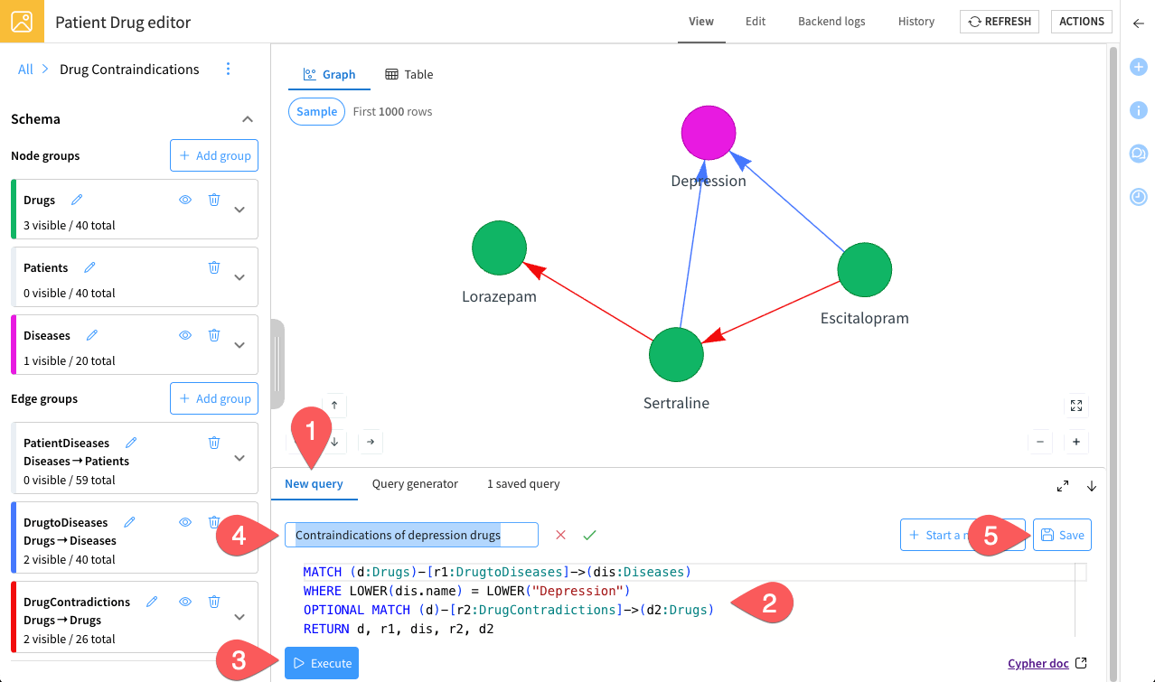
The query panel closes, and the graph updates to show only the nodes and edges your query returned.
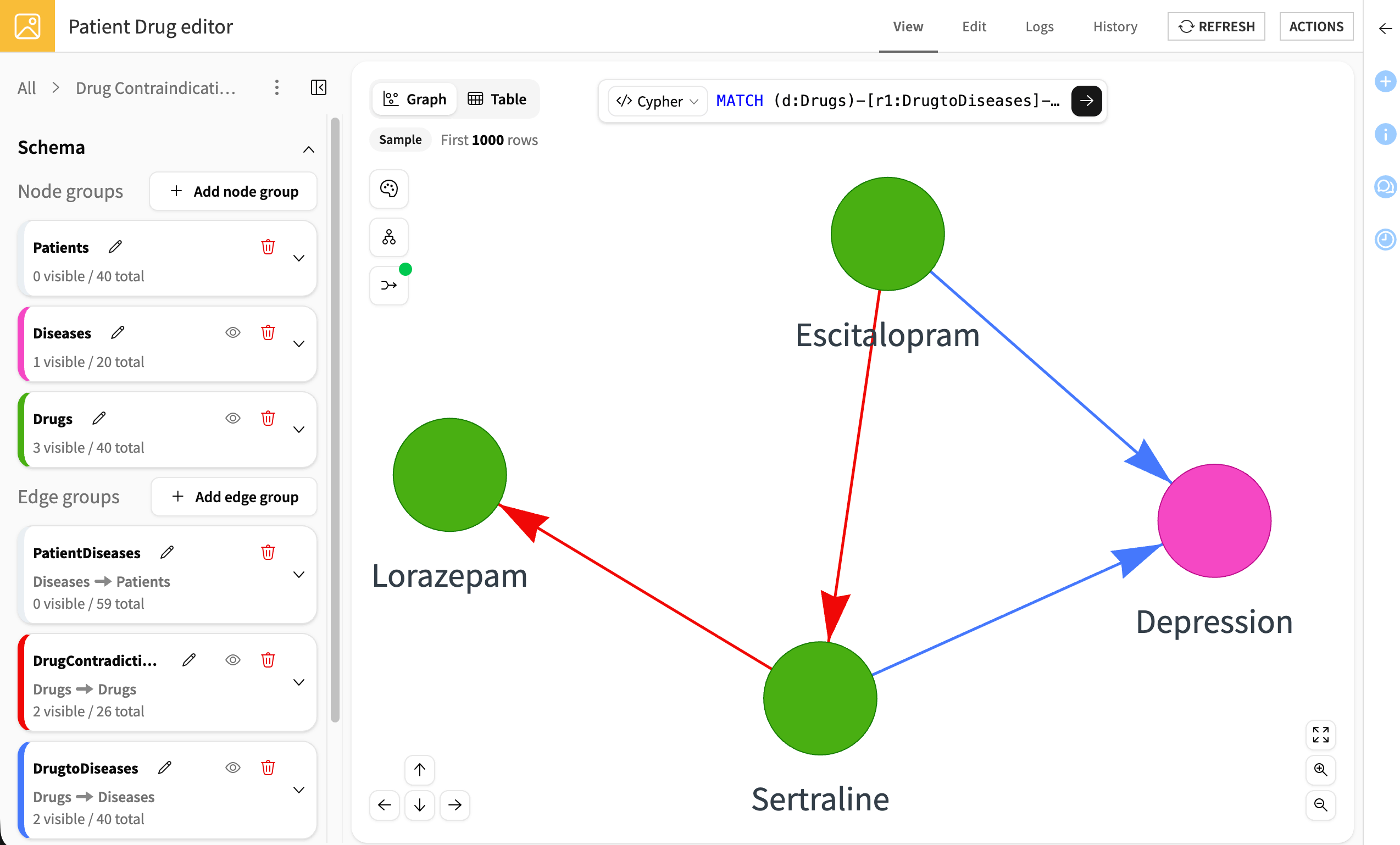
The results highlight that Sertraline and Escitalopram (used for depression) shouldn’t be taken together, and Sertraline has a contraindication with Lorazepam.
To dig deeper into the results, try the following:
Click the edge between Sertraline and Lorazepam to see the specific issues that occur if these drugs are prescribed together.
Click the Lorazepam node to open its popup. From there, go to the Neighbors tab and select Expand 2 remaining neighbors. This reveals that Lorazepam is used to treat Anxiety, along with another contraindication.
With this additional context, you see that while Sertraline is contraindicated with Lorazepam, a patient suffering from both depression and anxiety could safely take Escitalopram together with Lorazepam.
Now that the query answers a real question, save it so explorers can reuse it.
Click the search bar to bring the query back.
Name it
Contraindications of depression drugs.Click Save.
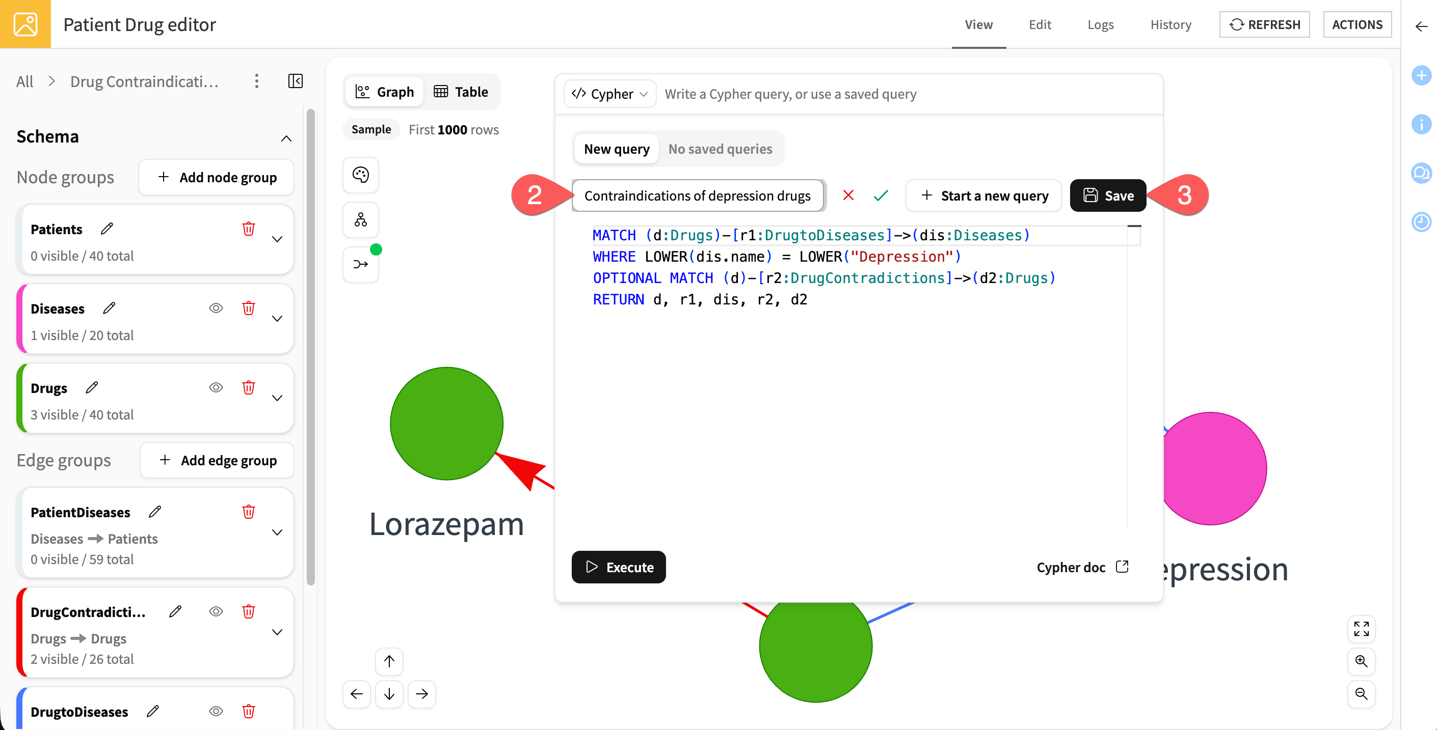
Next, go back to the New query tab, run the following additional queries and save each one:
Patients with diabetes:MATCH (d:Diseases)-[e:PatientDiseases]->(p:Patients) WHERE LOWER(d.name) = LOWER("diabetes") RETURN d, e, p
Number of patients with multiple diseases:MATCH (d:Diseases)-[r:PatientDiseases]->(p:Patients) WITH p, COUNT(d) AS disease_count WHERE disease_count > 1 RETURN COUNT(p) AS number_of_patients
Note
Since this query returns a numeric value, the results automatically display in the Table view of the webapp.
Saving these queries helps you build a reusable queries library for exploration and analysis by your team.
Tip
Need help writing or understanding queries? You can access the official Cypher documentation at any time by clicking the Cypher doc link ( ) in the bottom-right corner of the query panel.
Optional: Use AI search#
If you set an LLM connection when you configured the webapp, check that it works before publishing the graph. AI search answers a question written in plain language, with no Cypher to write:
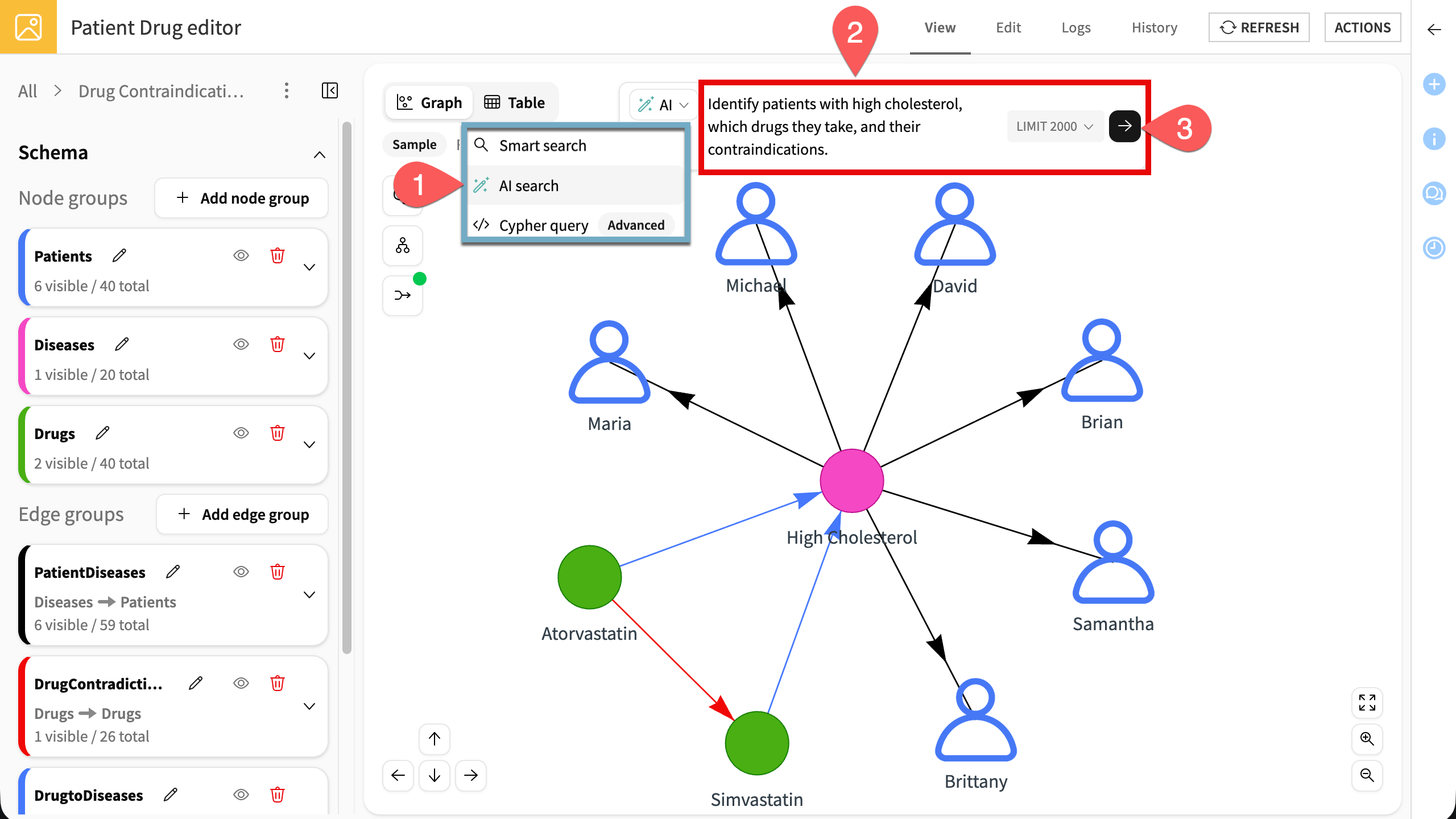
From the Search dropdown, select AI search.
Write a prompt describing the analysis you want to run, such as
Identify patients with high cholesterol, which drugs they take, and their contraindications.Click the arrow to run it. The graph updates with the results.
Publish the graph#
Once you’re satisfied with your graph and have saved useful queries, the final step is to publish the graph so that it can be reused and explored by others.
Export configurations#
Start by saving your graph configurations.
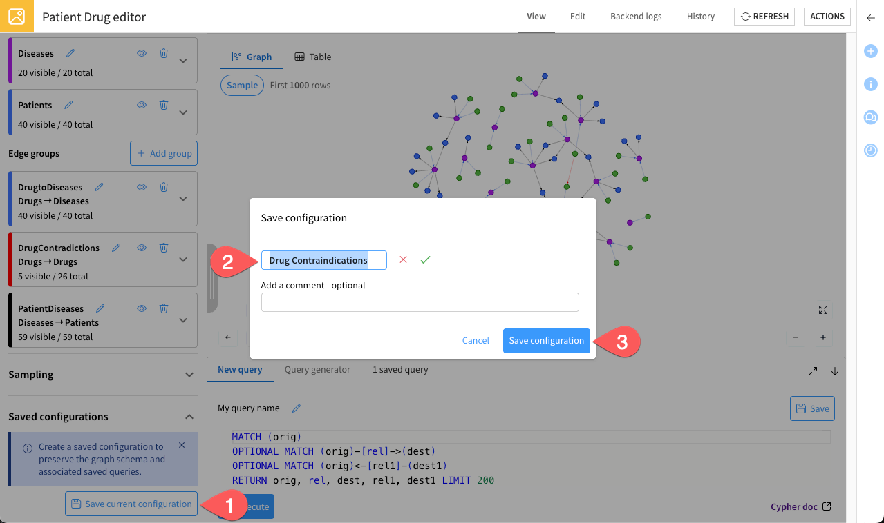
From the left panel, under Saved configurations, click Save current configuration.
Let the current name
Drug Contraindications.Click Save configuration.
Build and deploy#
Now that your graph configuration is ready, publish it using the Build graph plugin recipe.
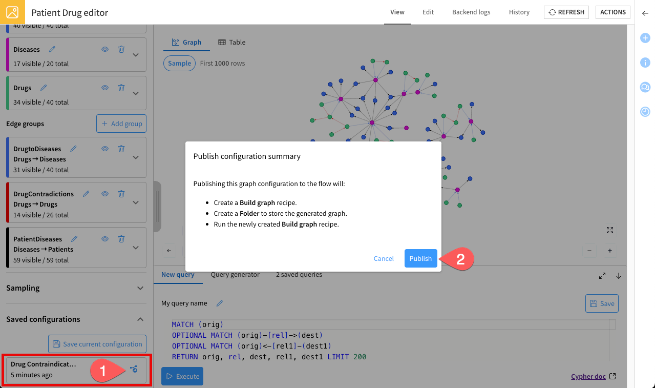
Normally, after clicking Save configuration, a popup appears automatically. Confirm the settings and click Publish. This deploys your graph directly into the Flow and makes it accessible in the Explorer webapp.
Note
If the popup doesn’t appear, or if you want to publish the graph later, follow these instructions:
Under Saved configurations, locate the graph configuration you just saved, and click the publish icon.
Confirm by clicking Publish.
Tip
Alternatively, you can publish a graph manually by going to the Flow (g + f), selecting the Build graph recipe, configuring the input datasets and saved configuration, and then running the recipe.
This method gives you more control over the publication settings.
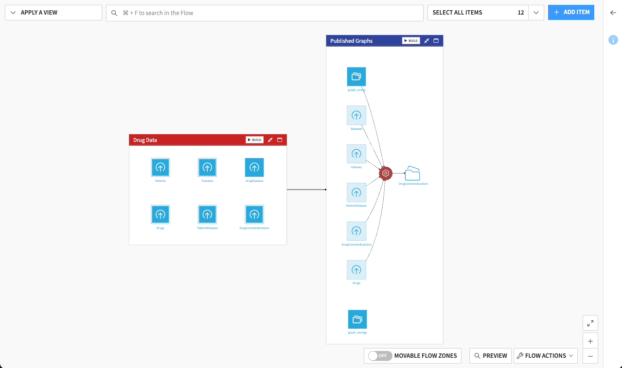
Your graph is now published:
It’s ready to be explored by non-technical users in the Explorer webapp.
It’s also available in the Flow for further analysis or integration with other recipes.
Note
This tutorial uses the default built-in Kuzu connection, but you can also connect to a Neo4j database for projects that require enterprise-grade scalability or specific Neo4j graph algorithms. For details on setting up and using the Neo4j connection, see the Visual Graph article in the reference documentation.
Set up the explorer webapp#
You’ve just built and published your graph. The last step is to prepare the Explorer webapp so analysts can interact with the published graph.
From the top navigation bar, under the code menu (
), click Webapps.Click on + New Webapp > Visual Webapp.
Select Visual Graph - Explorer.
Name it
Patient Drug explorer.Click Create. This will bring you to the Edit tab of the webapp.
Add your Drug Contraindications folder as Managed databases.
(Optional) If needed, set up an LLM connection to use. This would allow explorers to ask their own questions in plain language.
Click Save.
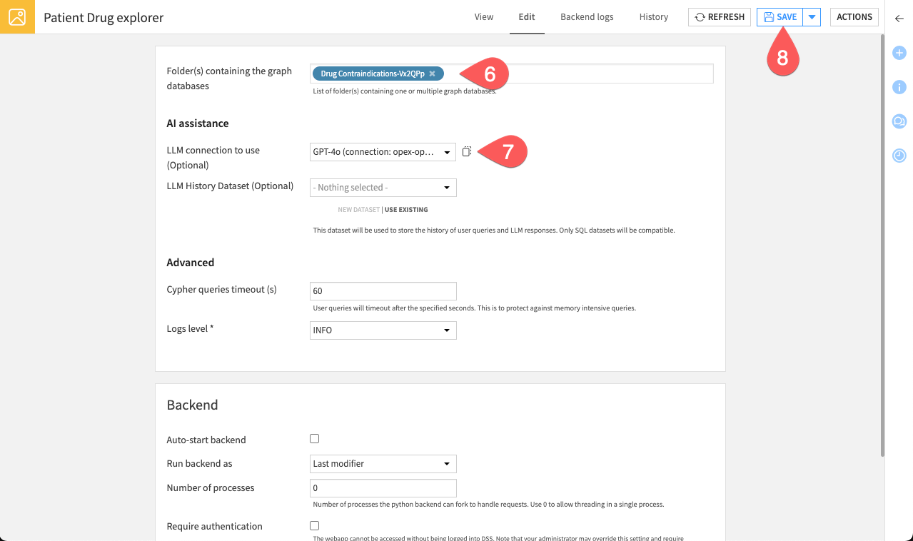
Go to the View tab and make sure your Drug Contraindications graph appears in the list. Your explorer webapp is now ready for interactive exploration.
Advanced analytics#
The graph you’ve built is more than just a visualization. It’s a source of structured insights that you can explore and analyze further in the Flow.
Once your graph is ready, you can try out different ways to gain deeper understanding:
Run graph algorithms: Use the Compute PageRank, Graph clustering, and Graph features recipes to measure node importance, identify hidden communities, or extract structural metrics from your network.
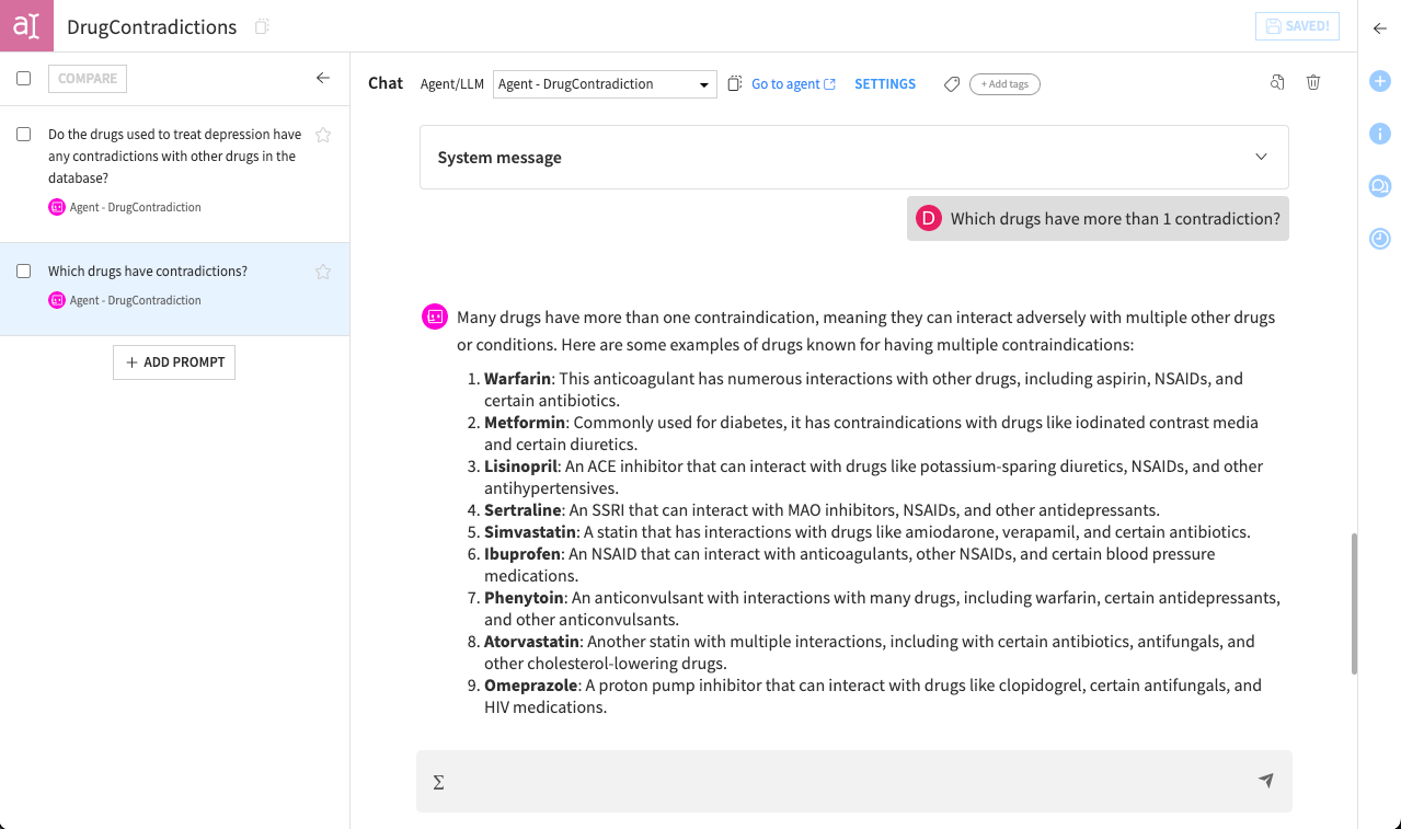
Interact with your graph using agents, including in Agent Hub: Ask questions in natural language and explore insights, including graph snapshots, directly from your data.
Leverage your graph in machine learning workflows: Use the extracted graph features to enrich datasets for predictive modeling or feature engineering.
Combine multiple queries and saved configurations to create a library of analyses that can be reused for reporting or further exploration.
Think of this section as an invitation to explore and experiment the tools and recipes provided by the Visual Graph plugin. Even without writing code, you can uncover patterns, test hypotheses, and see how your graph can support more advanced analytics.
Explorer’s journey (for non-technical users)#
Now that the data scientist has created and published the graph, the explorer’s journey begins. This section will guide you through exploring the published graph to answer business questions without writing any code.
Important
If you’re an analyst and have skipped the editor’s journey instructions, you can still join in. Download this prepared ZIP file, and import it directly into your Dataiku instance by clicking + New Project > Import project. You’ll need the Visual Graph plugin installed on your instance. This imported project will allow you to start with the published graph and follow only the explorer’s journey.
Access the explorer webapp#
Your first step is to open the Explorer webapp. This will be your workspace for graphs exploration.
From the top navigation bar, under the code menu (
), click on Webapps.Open the Patient Drug explorer webapp. You should see one available graph named Drug Contraindications.
Note
If the webapp displays a message saying the backend isn’t running, click Start Backend. This is common right after importing a project. If you don’t have permission to start it, ask the webapp owner or your administrator.
Click the graph to enter in the visualization area.
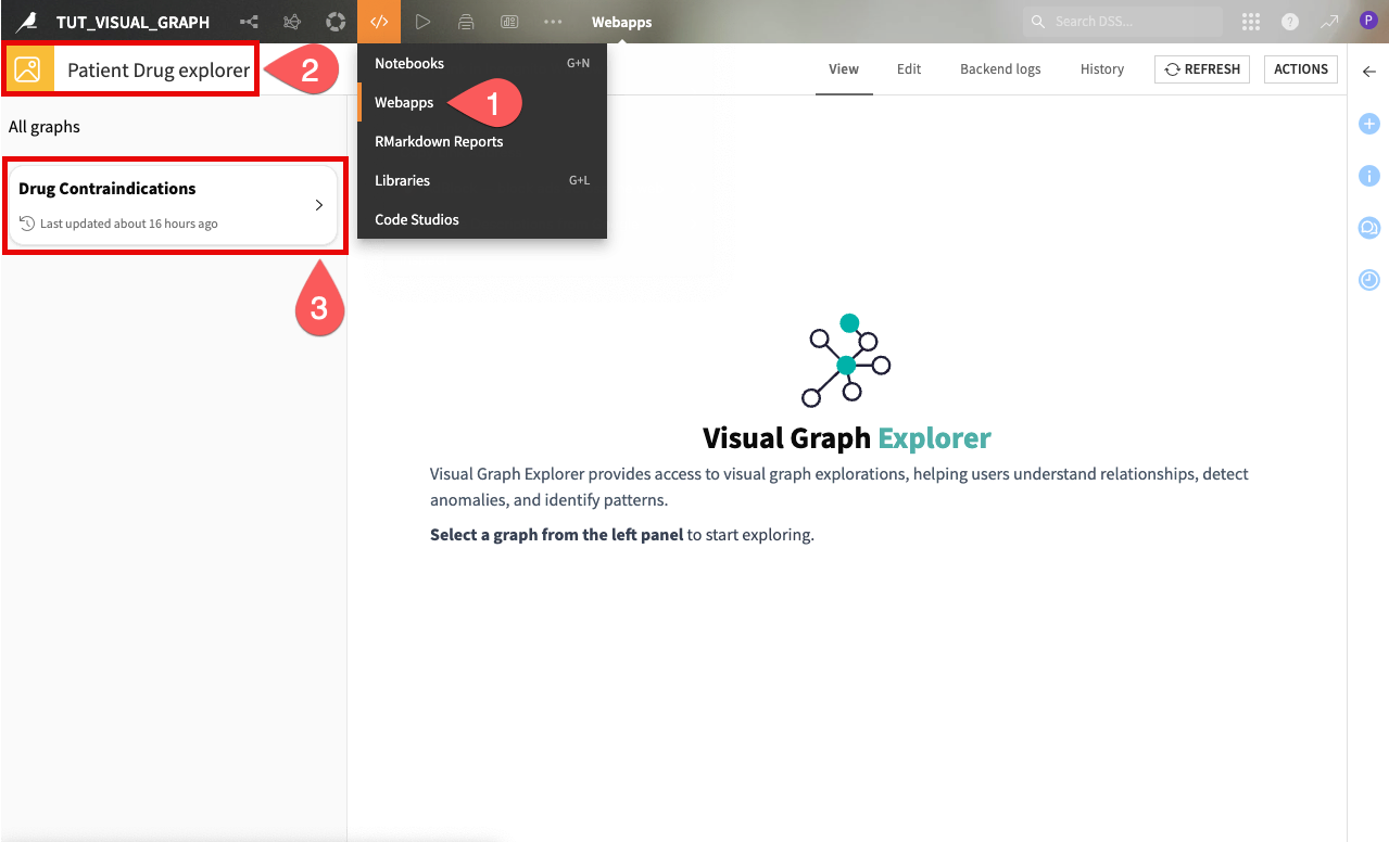
You’ll see the graph in the center of the screen.
Interact with the graph#
On the left panel, you can see the nodes and edges that were previously defined by the data scientists. Node groups represent entities such as patients, drugs, or diseases. Edge groups represent relationships between these entities, like which drugs are prescribed to a patient or which drugs have contraindications with each other.
You can interactively explore the network by:
Zooming in and out.
Clicking on individual nodes to view their properties (for example patient details, disease connections, prescribed drugs).
Clicking on edges to inspect relationships.
For example, clicking on a patient’s node will show you their information, as well as their connections to diseases and prescribed drugs.
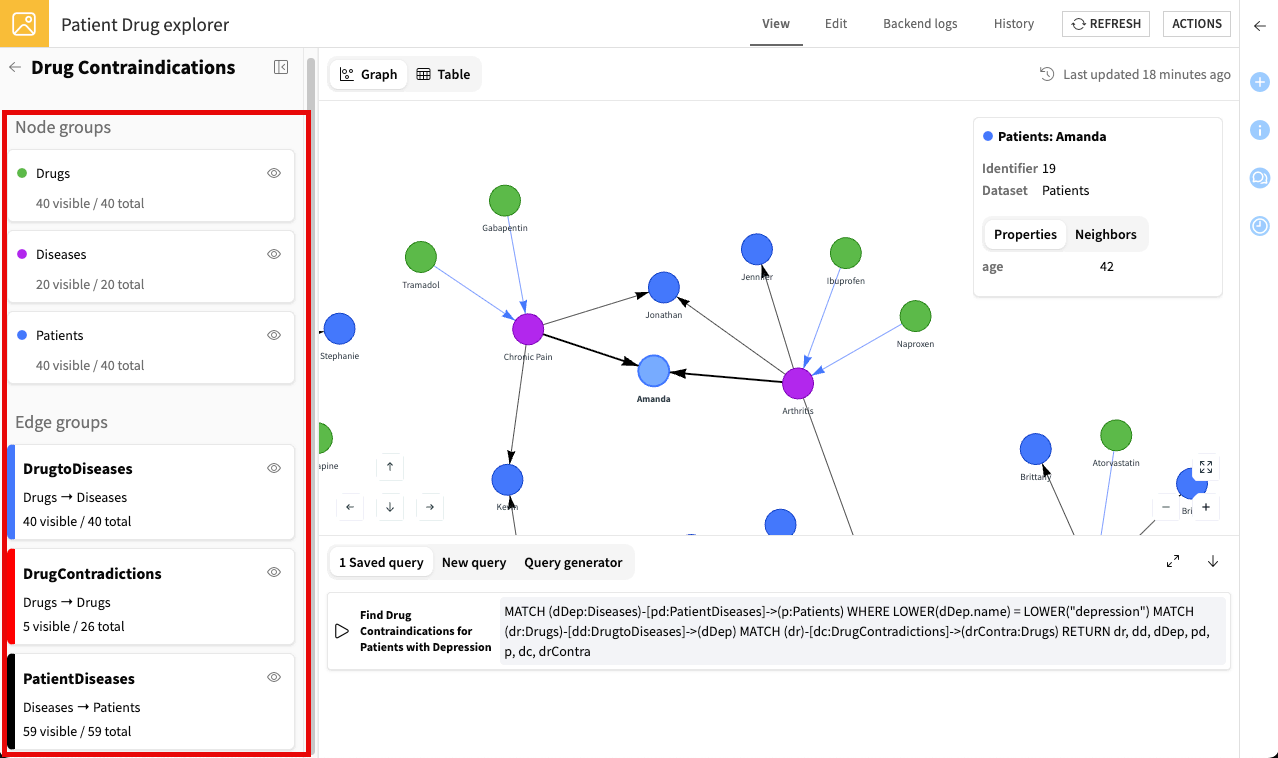
Try to explore the graph and click around—this is the best way to uncover insights and understand the data.
Tip
To make exploration easier, you can:
Temporarily hide nodes or edges by clicking the eye icons (
 ) next to their groups.
Use the palette icon in the top-left corner to apply conditional styling to node and edge groups based on their properties.
Use the layout icon in the top-left corner to switch layouts.
Use the merge edges icon to combine multiple edges between two nodes into a single labeled connection. This reduces visual clutter in dense graphs.
Search the graph#
Clicking around works well on a small graph, but the full patient network soon becomes crowded. The search bar lets you narrow the view down to what you’re looking for, without writing a query.
Browse a node group#
Start by isolating a single type of entity.
Click the search bar above the graph. The node groups that the data scientist made searchable appear as suggestions.
Select the Patients group, then press Enter. The graph updates to display only the patient nodes.
This gives you a quick overview of a single entity type.
Search for a keyword#
You can also look for a specific value across the searchable node groups.
In the search bar, remove the Patients group and enter
Amanda.Press Enter. The graph displays the matching patient nodes, along with their neighbors.
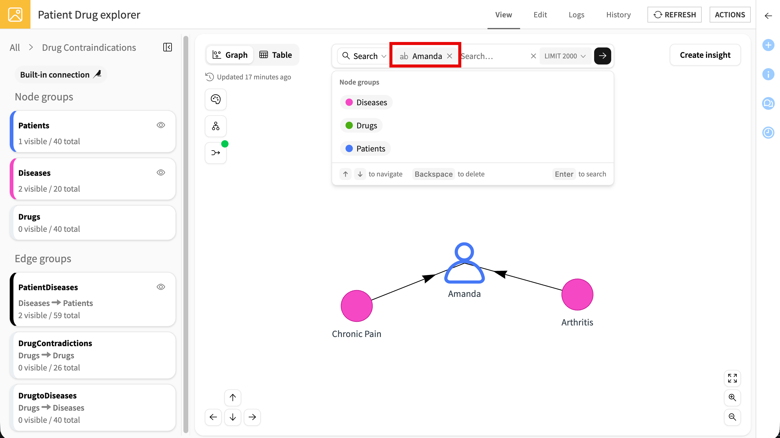
You can now work with this result as with any other view of the graph: click a node to inspect its properties, or open its Neighbors tab to expand the connections around it. Here, you can see at a glance which diseases Amanda has been diagnosed with.
Try other keywords, such as a drug or a disease name, to see how the graph responds.
Note
Search takes one keyword at a time and matches complete words. A partial term such as Aman doesn’t return Amanda.
Check the contents of the search bar before searching. A keyword alone returns matching nodes and their neighbors. Adding a node group limits the results to matching nodes in that group, without their neighbors.
Tip
Use search to locate a specific entity in the graph. For questions that involve conditions or counts, such as patients with more than one disease, use the queries described in the next section.
Run queries#
Beyond exploring and searching the graph visually, you can also query it to answer specific business questions. The explorer webapp offers different ways to do this, ranging from ready-to-use queries to fully custom ones.
Explore pre-built queries#
The explorer webapp includes pre-built Cypher queries that the data scientist has created and saved for you. These queries let you quickly answer common questions without writing any code.
To run a query:
From the Search dropdown, select Cypher query.
Open the Saved queries tab.
Execute a query.
The graph will update to show only the relevant nodes and edges, helping you focus on the information you need.
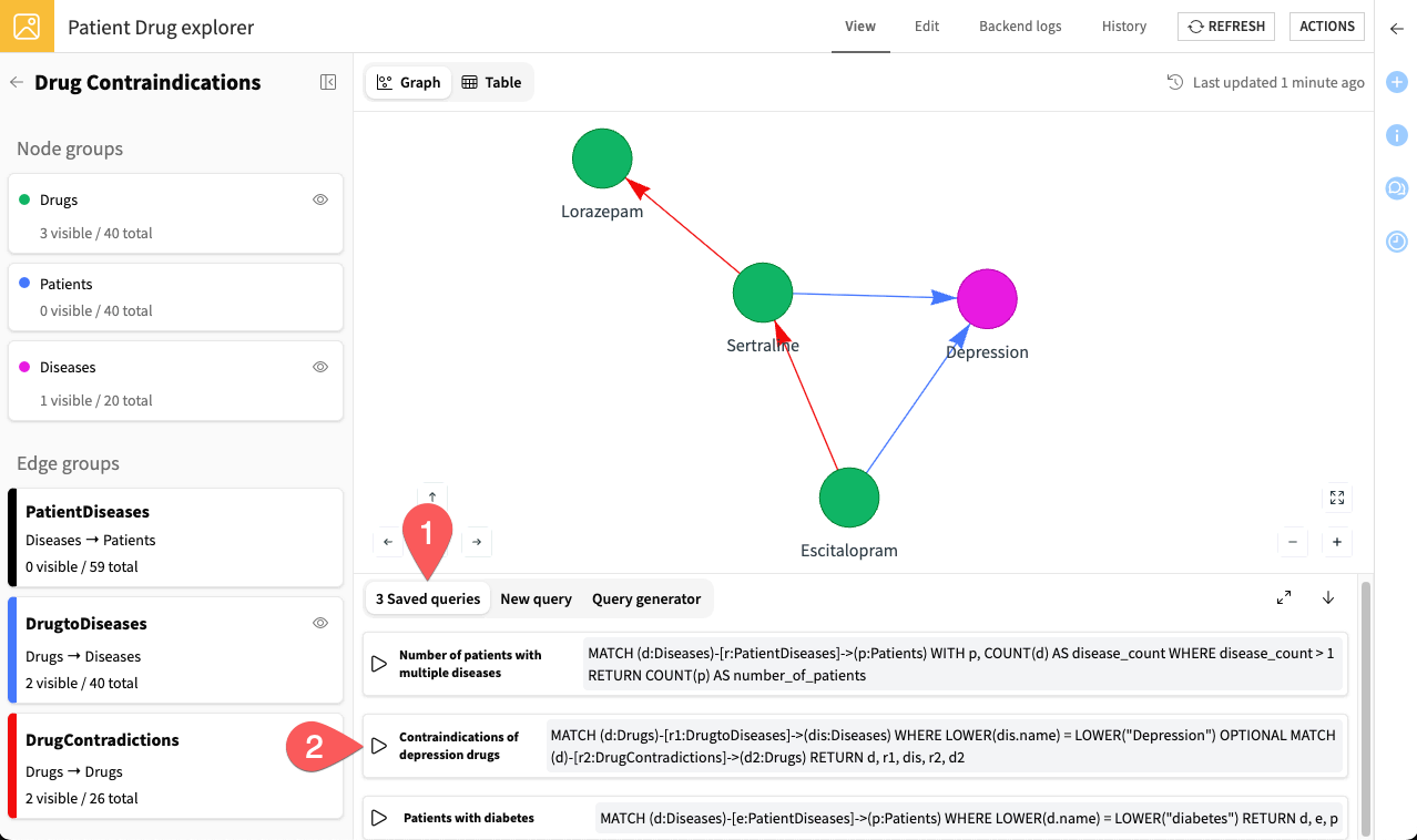
Try running the available queries and explore the results to see how the graph responds.
Tip
To dig deeper into results, you can click on nodes to see more information and use the Neighbors tab to expand connected nodes. You can also click on edges to inspect the relationships between nodes.
Note
Examples of pre-built queries include:
Count the number of patients with multiple diseases.
Analyze drug contraindications in depression treatment.
Identify patients with diabetes.
Create new queries#
In addition to these pre-built queries, you can also create your own at any time:
If you are familiar with Cypher, select Cypher query from the Search dropdown and write your own.
If enabled by the data scientists, select AI search and ask your question in plain language.
For example, you could ask: Show patients with migraine and their prescribed drugs.
The assistant then runs it against the graph and displays the matching nodes and edges.
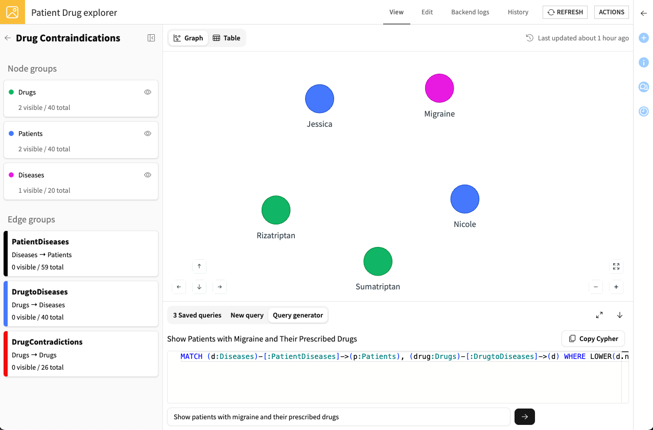
Tip
If the AI assistant isn’t available, you could use your own external LLM (such as ChatGPT) to craft Cypher queries. Select Cypher query from the Search dropdown, paste the generated query, and click Execute.
Continue exploring by writing queries yourself or using an LLM to answer different business questions.
Tip
From the Explorer webapp, click Create insight to publish the graph as an insight on a Dashboard. Anyone can then explore it there, though editing Cypher queries still requires the Explorer webapp.
Next steps#
Congratulations! You’ve successfully created and explored a graph with the Visual Graph plugin. Feel free to continue refining it and exploring other possible settings to meet your use cases.
See also
For more information, see the reference documentation on Visual Graph.