
Tutorial | Airport traffic by US and international carriers#
Note
This content was last updated using Dataiku 11.
Overview#
Business case#
As a research and analytics team at an international carrier, we need to create data pipelines to produce reports using publicly available U.S. Department of Transportation (USDOT) airport traffic data. Airline executives have been consuming this information indirectly through USDOT reports and additional assets produced by business analysts.
Our mandate is to create a data pipeline that drives a reporting system on international flights. The reporting system, including changes to the data pipeline, will be maintained by business analysts with help from the analytics team. Analysts often work on such pipelines that take larger datasets and shrink them into smaller dimensions. The goal of our team is to help them do so faster, more efficiently and in a reproducible manner.
Supporting data#
The data comes from the U.S. International Air Passenger and Freight Statistics Report. As part of the T-100 program, USDOT receives traffic reports of US and international airlines operating to and from US airports. Data engineers on the team ingest this publicly available data and provide us with the following datasets:
departures: Data on all flights between US gateways and non-US gateways, irrespective of origin and destination.
Each observation provides information on a specific airline for a pair of airports, one in the US and the other outside. Three main columns record the number of flights: Scheduled, Charter and Total.
passengers: Data on the total number of passengers for each month and year between a pair of airports, as serviced by a particular airline.
The number is also broken down by those in scheduled flights plus those in chartered flights.
We will start with data for 2017.
Workflow overview#
The final pipeline in Dataiku is shown below.
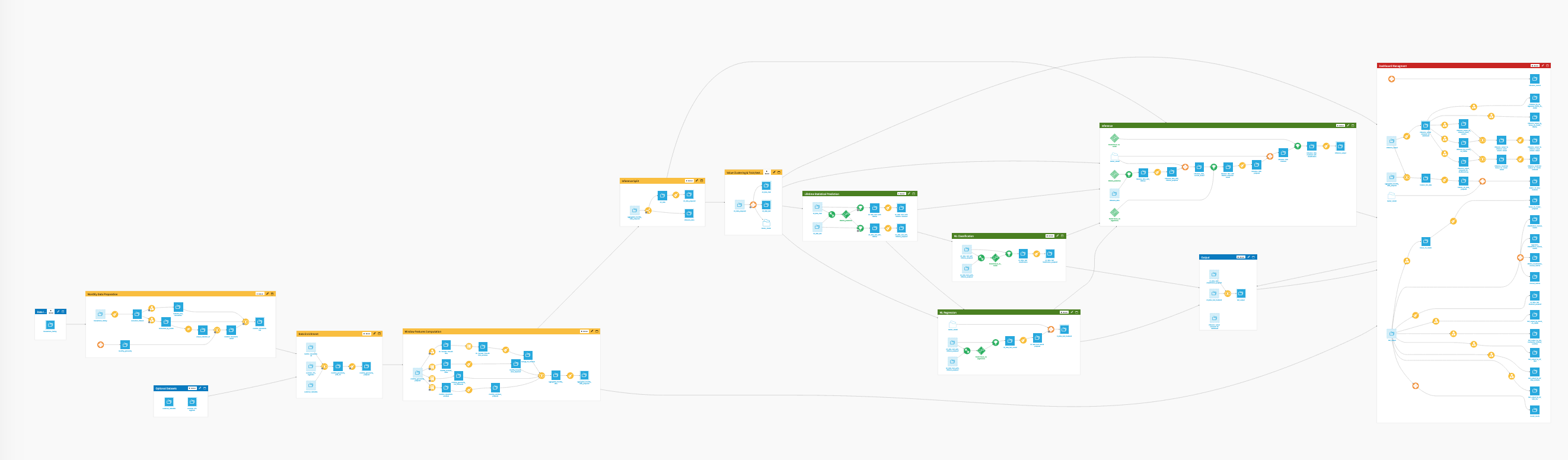
The Flow has the following high-level steps:
Download the datasets to acquire the input data.
Clean the passengers dataset, group by airport id, and find the busiest airports by number of passengers that year.
Clean the departures dataset and turn the monthly information on airport pairs into market share data.
Technical requirements#
To complete this walkthrough, you must meet the following requirements:
Have access to a Dataiku instance–that’s it!
Create the project#
Create a new blank Dataiku project, and name it International Flight Reporting.
Find the busiest airports by volume of international passengers#
Download recipe#
Let’s use a Download visual recipe to import the data.
In the Flow, select + Add Item > Recipe > Visual > Download.
Name the output folder
Passengersand create the recipe.+ Add a First Source and specify the following URL:
https://data.transportation.gov/api/views/xgub-n9bw/rows.csv?accessType=DOWNLOAD.Run the recipe to download the files.
Having downloaded the raw data, we now want to read it into Dataiku.
With the Passengers folder selected, choose Create dataset from the Actions menu in the top right corner. This initiates a new Files in Folder dataset.
Click Test to let Dataiku detect the format and parse the data accordingly.
In the top right, change the dataset name to
passengersand create.
Filter recipe#
Now let’s filter the data for our objectives.
With the passengers dataset as the input, create a new Sample/Filter recipe.
Turn filtering On and keep only rows where Year equals
2017.Under the Sampling menu, choose No sampling (whole data).
Prepare recipe#
After running the recipe to create the new dataset, let’s start to clean it. Start a Prepare recipe, naming the output passengers_prepared. Add the following steps in its script:
Parse the data_dte column into a proper date column. Dataiku should detect the correct date format as MM/dd/yyyy. If it doesn’t, go ahead select it manually in the Smart date editor. Rename the output column
date_parsed.Use the Find and replace processor to replace the numerical values in the Month column with the equivalent month names (for example January, February). Name the output column
month_name.Note
Because we will copy this recipe for use on another dataset, be sure to specify all 12 months. Moreover, the Match mode must be set to Complete value so that entries like
12are replaced with “December,” instead of “JanuaryFebruary”.Use the Concatenate columns processor to join the columns Year, Month and month_name using
-as the delimiter. Name the output columnyear_month.Change the storage type of the Scheduled, Charter, and Total columns to Integer.
Run the Prepare recipe.
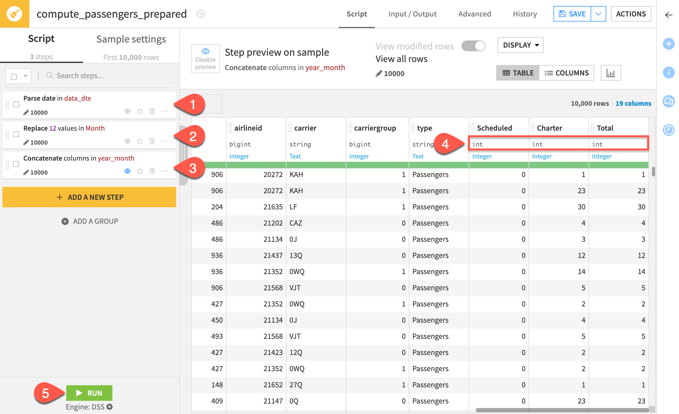
The output dataset should have 19 columns at this point.
Group recipe#
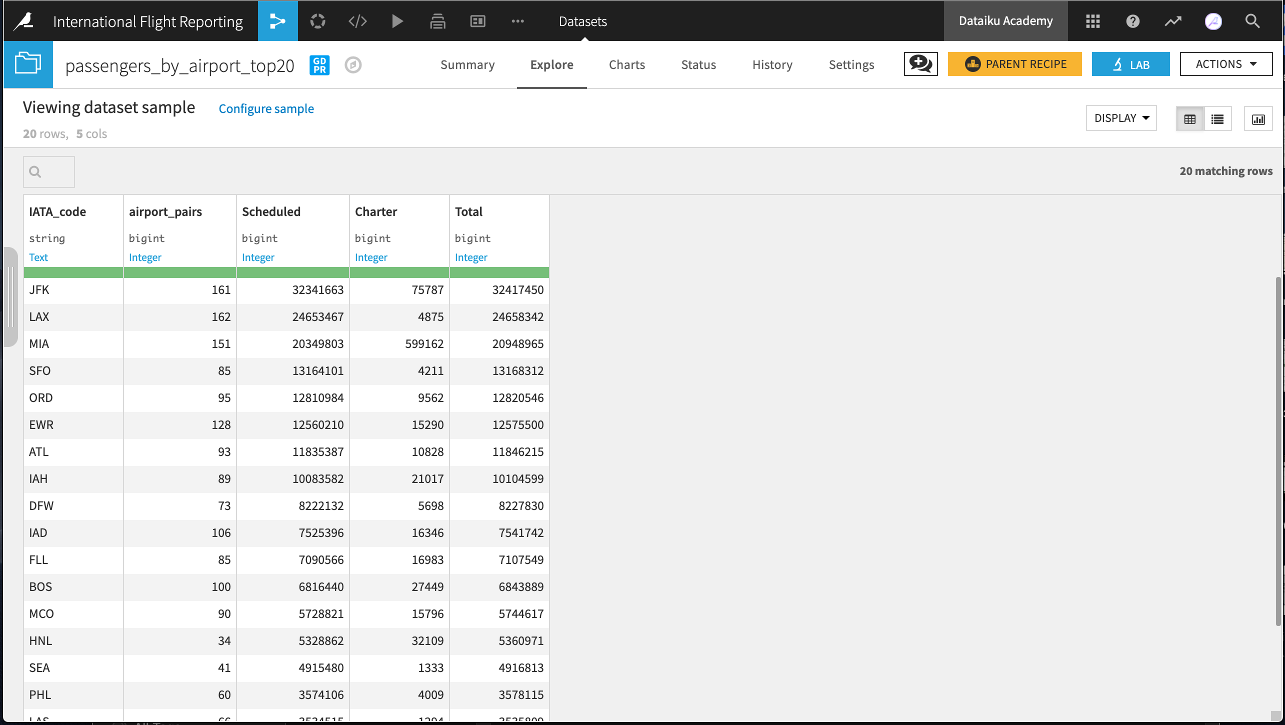
Next, we’re going to aggregate the information by airport to create a list of the 20 busiest airports for international travellers. We’ll use the Group recipe:
Starting from the passengers_prepared dataset, choose to group by usg_apt.
Name the output dataset
passengers_by_airport.In the Group step, deselect Compute count for each group, and then select the following aggregations: fg_apt (Distinct), Scheduled (Sum), Charter (Sum), Total (Sum)
Rename the columns in the Output step of the Group recipe according to the table below. Then run the recipe.
Original name |
New name |
|---|---|
usg_apt |
IATA_code |
fg_apt_distinct |
airport_pairs |
Scheduled_sum |
Scheduled |
Charter_sum |
Charter |
Total_sum |
Total |
TopN#
Finally, narrow down the top 20 airports by volume of international passengers using the TopN recipe.
From the passengers_by_airport dataset, initiate a TopN recipe. Name the output dataset
passengers_by_airport_top20.In the Top N step, retrieve the
20top rows sorted by the Total column in descending order .
.Run the recipe.
This recipe produces a list of the busiest airports by volume of international passengers. We can now export the dataset as a CSV, share it with other projects in the instance, or visualize it in the Charts tab. In a few easy steps, we’ve replicated the table on this Wikipedia page, even down to the total number of passengers. Not surprisingly, JFK and LAX top the list!
Calculate the market share of carrier groups#
Next, we’ll create a data pipeline for the information of flight totals from the dataset on international departures to and from US airports. As done previously, let’s use a Download recipe.
After starting a Download recipe, type
departuresas the name of the output folder.Copy the following URL as the data source:
https://data.transportation.gov/api/views/innc-gbgc/rows.csv?accessType=DOWNLOAD.From the Actions menu of the departures folder, click Create dataset.
Click TEST, and name the output dataset
departures.
Copying existing recipes to prepare departures data#
As with the passenger data, we want to look at the 2017 departures data.
From the Flow, select the Sample/Filter recipe and choose Actions > Copy.
Select the departures dataset as the input.
Type
departures_filteredas the output dataset and click Create Recipe.The Filter and Sample options remain the same. Run the recipe.
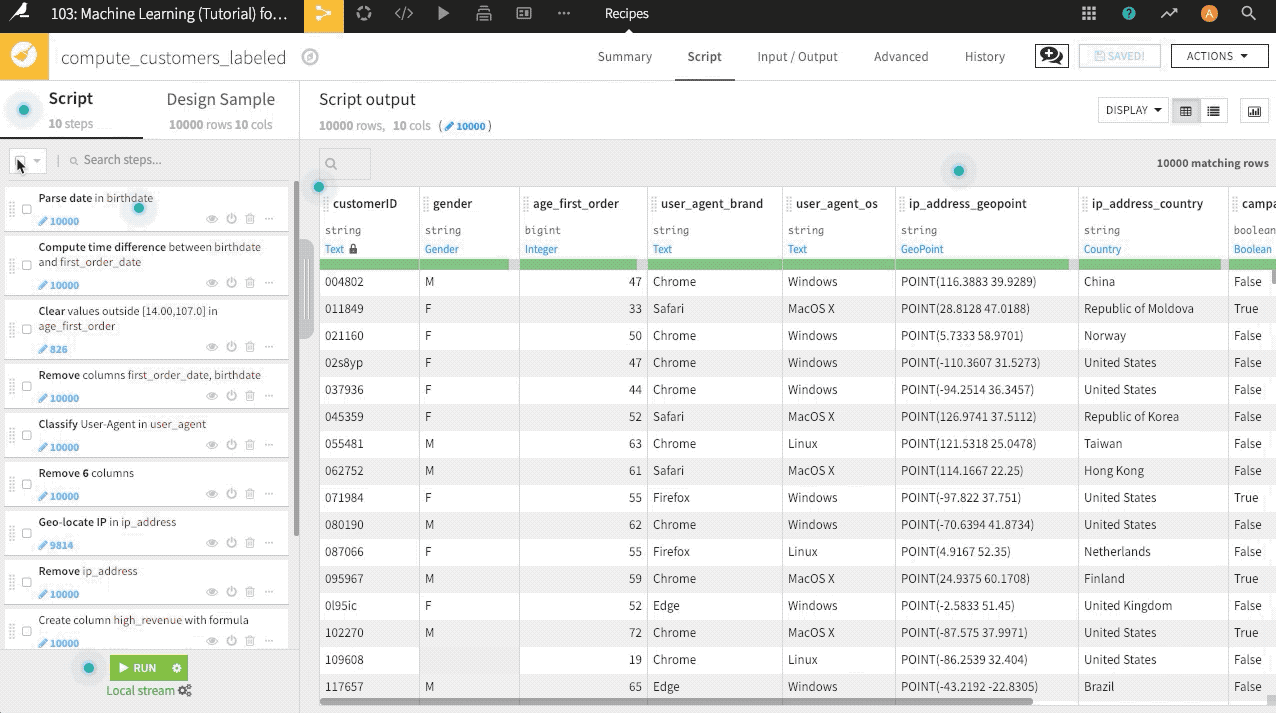
Now look through the columns of the departures_filtered dataset. They look quite similar to the initial passengers dataset. We can reuse the data preparation steps from the earlier pipeline by copying the entire recipe, as we did with the Sample/Filter recipe. An alternative shown in the GIF below is to copy and paste the steps from the first Prepare recipe into a new one for this pipeline.
Navigate to the existing Prepare recipe, and select all steps by clicking the empty checkbox at the top of the Script.
From that same Script menu, select Actions > Copy 3 steps.
With the departures_filtered dataset as the input, create a new Prepare recipe, naming the output
departures_prepared.In this new recipe, paste the copied steps, and run the recipe.
Note
Here’s a GIF from another example project that demonstrates how to copy-paste steps from one Prepare recipe to another.
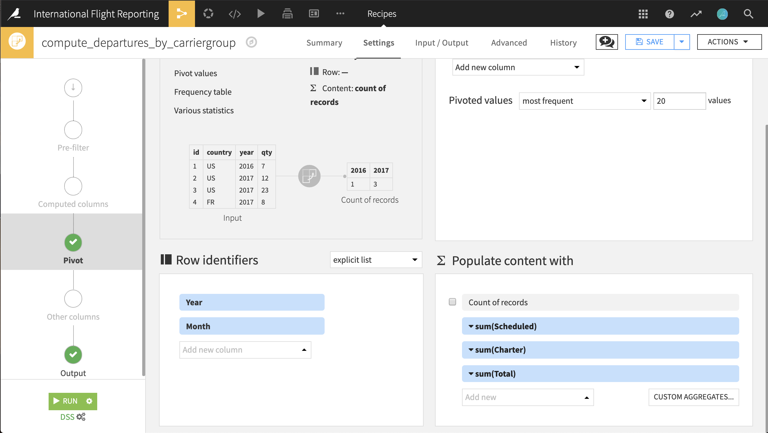
Pivot to aggregate carrier group totals into columns#
Each row in the departures_prepared dataset represents travel between a pair of airports during a month. To compare US vs. international airlines, we want to aggregate this dataset by the carriergroup column (where 0 represents a US airline) for each month of the year. The aggregated values we want to compute are the number of Scheduled, Charter, and Total flights.
With the departures_prepared dataset selected:
Choose Actions > Pivot.
Pivot by the carriergroup column.
Rename the output dataset to
departures_by_carriergroup.Click Create Recipe.
Select Year and Month as the row identifiers.
Deselect Count of records to populate content with, and
Instead, select the columns Scheduled, Charter and Total from the dropdown menu and choose sum as the aggregation for all.
Then run the recipe.
Note
For more information on the Pivot recipe, please see the documentation or the Visual Recipes course.
Next, we will add a Prepare recipe to clean up the pivoted data and create a few new columns. We will group the steps together so we can copy-paste the steps.
From the departures_by_carriergroup dataset, initiate a Prepare recipe, naming the output
departures_by_month.Create a new column with the Formula processor,
Scheduled_total, representing the total number of scheduled flights.Use the expression
0_Scheduled_sum + 1_Scheduled_sum.
Next, create two more columns with formulas,
Scheduled_US_mktshareandScheduled_IN_mktshare, for market shares of US and international carriers.The formula should be
0_Scheduled_sum/Scheduled_total * 100for the US column and1_Scheduled_sum/Scheduled_total * 100for the international column.
To organize these three Prepare recipe steps, create a Group named
Scheduled.Select all three steps in the recipe. From the Actions menu at the top of the script, select Group and name it
Scheduled.
Copy the Scheduled group to create two new groups,
CharterandTotal, with their respective aggregations.Achieve this by selecting the Scheduled group, copying the 3 steps from the Actions menu, pasting the new steps into the recipe, giving the group the appropriate name, updating the requisite columns, and repeating.
Note
Strictly following this convention in all cases would result in a column Total_total. For simplicity, name this column
Total. Know however that it refers to the count of all flights, both Scheduled and Charter, from both US and international carriers.Finally, remove the intermediary columns beginning with a “0” or “1” with the Delete/Keep columns by name processor.
Add this processor as a new step to the Prepare recipe. Select the pattern and Remove options. Use the regular expression
^[0-1]_\w*to match all columns starting with a 0 or 1 and followed by a word character of indeterminate length. Then run the recipe.
Note
Regular expressions (regex) are used to define a search pattern using a sequence of characters. They’re quite powerful and extensible and can be used in Dataiku in many places. You can find a good introduction to regex at the Python for Informatics course slides and also test out regex patterns online <https://regex101.com>.
Great job! We’ve created two summaries of larger datasets and shrunk them down into datasets with only a few dozen rows. In the first data pipeline we found the top 20 busiest airports. Then we also calculated the monthly totals of flights and the market share of two categories of carriers for 2017.
Here are the results.
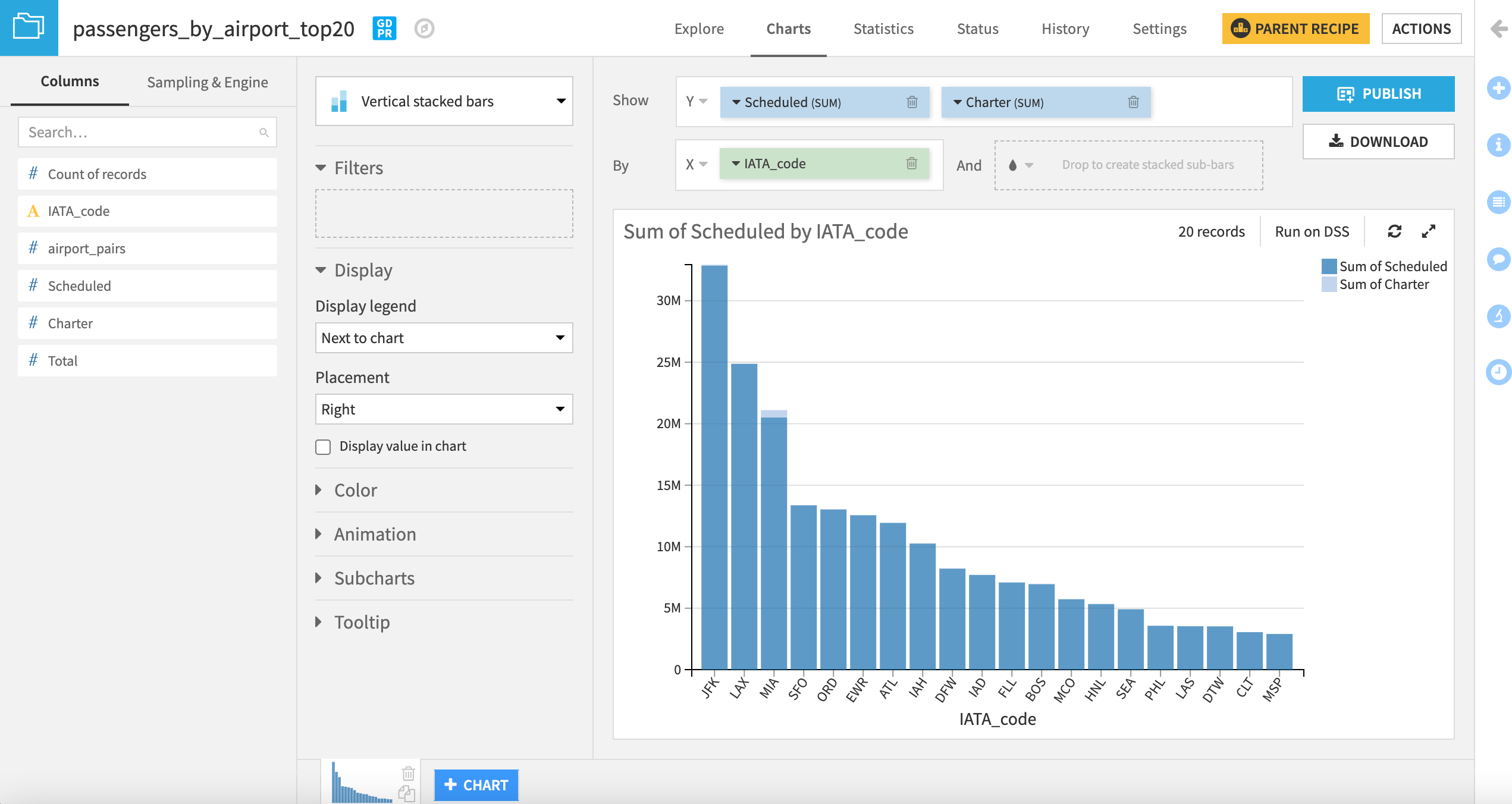
In addition to the overall trend, Miami jumps out as the only airport with a substantial number of charter flights.
Calculate year-to-year change#
Thus far, we added a filter to keep only data from 2017. Let’s widen this filter in our existing data pipeline to include 2016 so that we can compare departure data with the previous year. Note that once doing so, downstream datasets in the Flow will be out of date and need to be rebuilt.
Return to the Filter recipe that creates departures_filtered.
+ Add a Condition so that we keep rows that satisfy at least one of the following conditions: Year equals
2017or Year equals2016. Save the recipe.In the Flow, right-click on the Sample/Filter recipe, and select Build Flow outputs reachable from here.
This will prompt you to build departures_by_month.
Note
Please consult the reference documentation for more information on different options for rebuilding datasets in Dataiku.
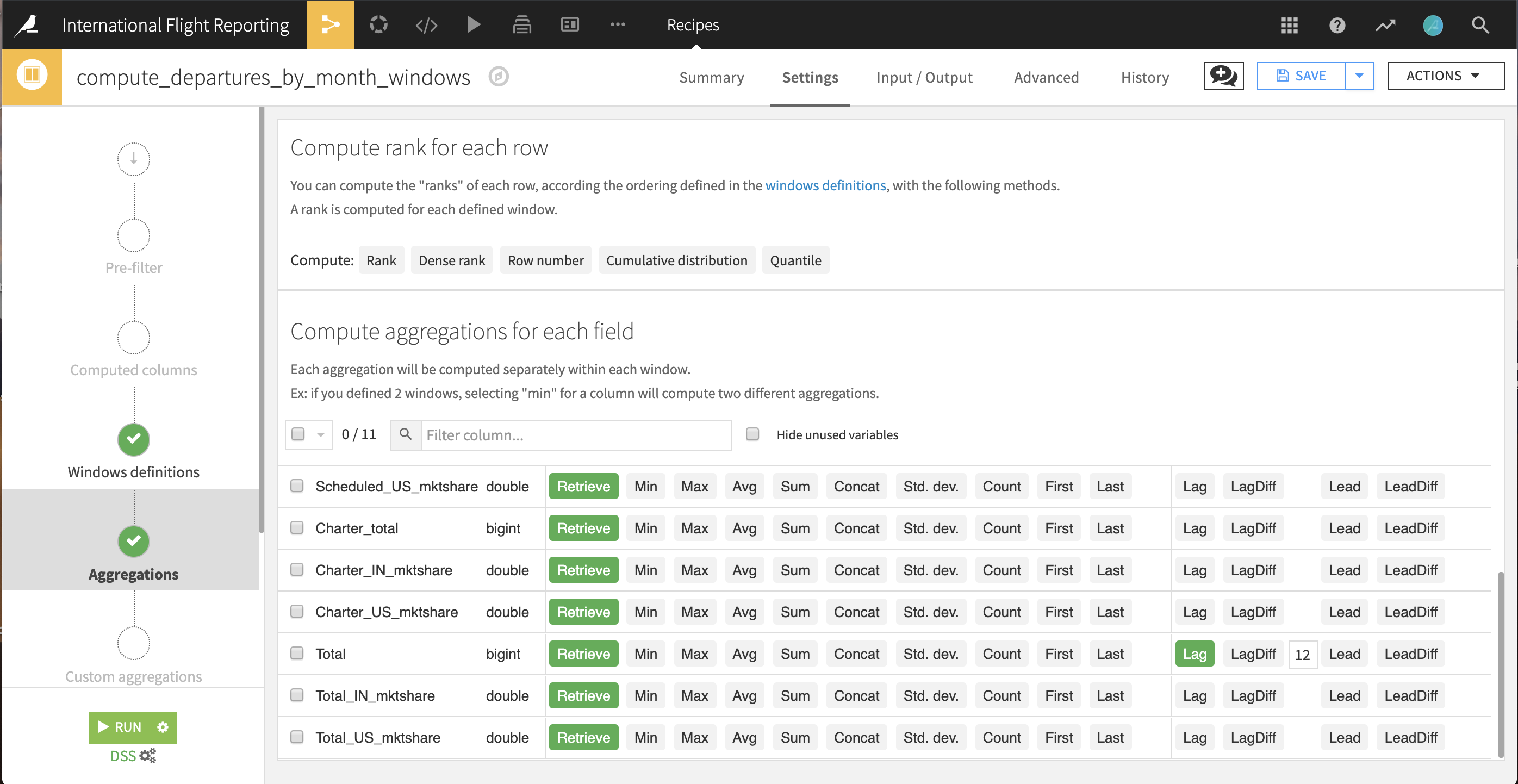
Window recipe#
The departures_by_month dataset now has totals of departures for two years: 2016 and 2017. Therefore, we can calculate how the traffic changed from month to month, across years, with the help of a Window recipe. For any month in our data, we need to find the same value 12 months prior, or, in the language of Window functions, lagged by 12 months.
With the departures_by_month dataset selected, choose Actions > Window.
Keep the default output
departures_by_month_windows. Click Create Recipe.In the Windows definitions step, turn on Order Columns and select Year and Month so the months are laid out in ascending, chronological order. This defines how the dataset will be ordered for the lag to be calculated.
In the Aggregations step, Retrieve all columns. For the Total column, additionally select the lagged value going back
12rows, that is, months, or one whole year.Run the recipe.
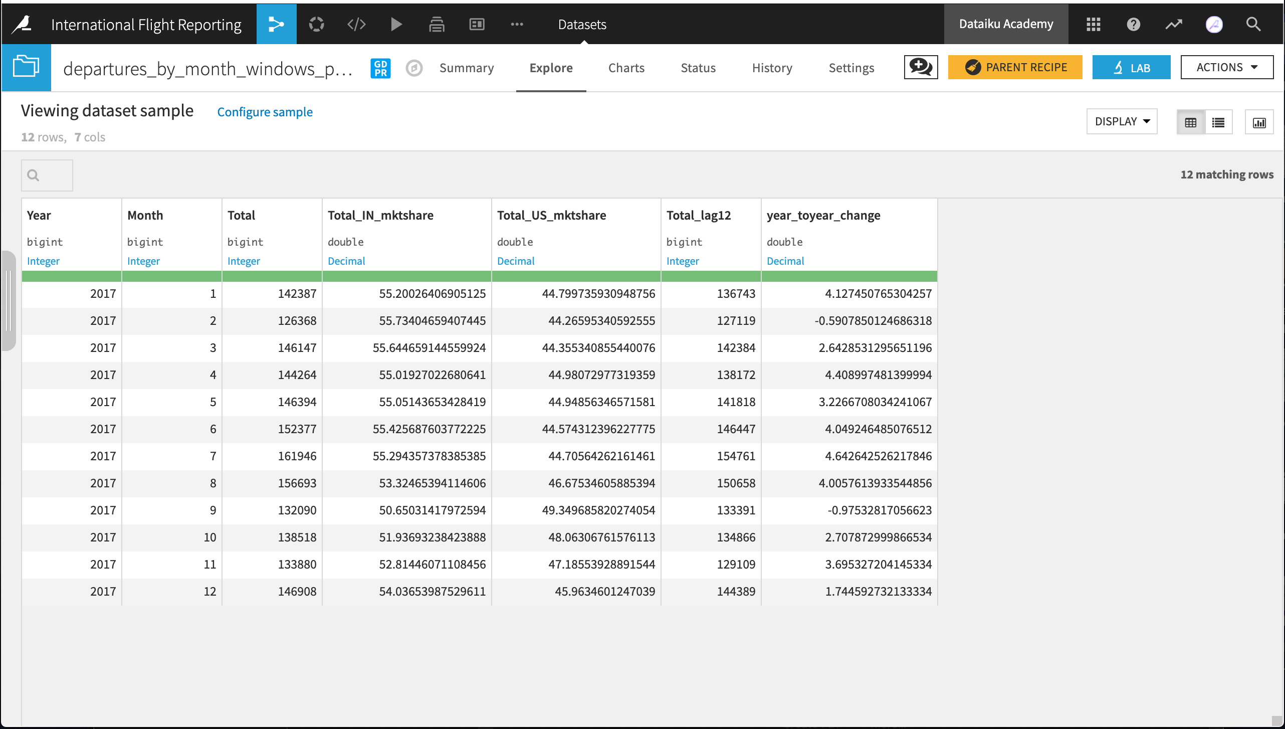
In the output dataset, all months in 2017 should now have a value for the lagged total number of flights in the column Total_lag12. For any month that year, the value of this column should match the value of the same month from one year ago. It’s easy to confirm this is correct just by visually scanning the data in the Explore tab.
Note
For more information on the Window recipe, please see the reference documentation on Window Recipes or the Visual Recipes course.
With this lagged value, we’re ready to create the final presentation dataset. Add a Prepare recipe to departures_by_month_windows with the following steps in the Script:
Keep only rows from the year we need: 2017.
Remember, we only need 2017 because those for 2016 have no lag value. The Filter rows/cells on value processor will help here!
Calculate a column for year_toyear_change.
Use the formula
(Total - Total_lag12)/Total_lag12 * 100
Keep only the following 7 columns: Year, Month, Total_US_mktshare, Total_IN_mktshare, Total, Total_lag12, year_toyear_change
The Delete/Keep columns by name processor is your friend here.
Run the recipe.
In the Charts tab, let’s visualize departures_by_month_windows_prepared with a line plot. Simply drag year_toyear_change to the Y-axis and Month to the X-axis, using raw values as the bins.
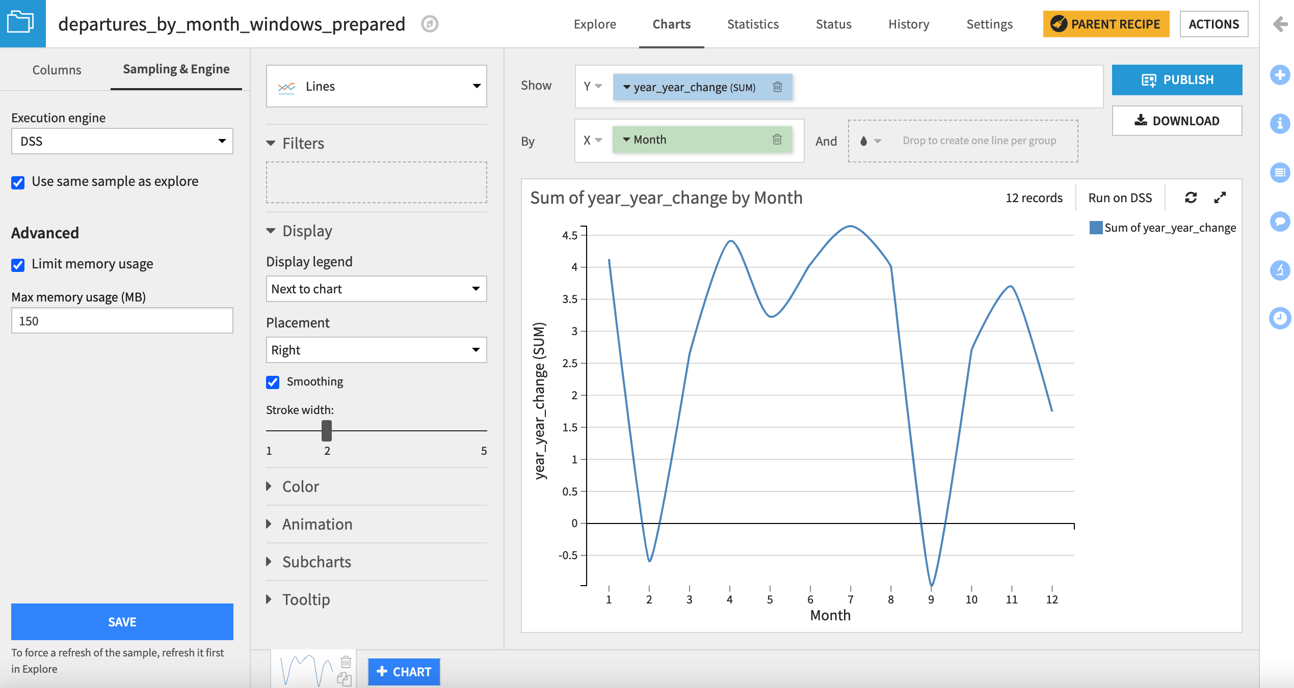
It appears as though February and September were the only months where the total number of 2017 flights didn’t exceed the 2016 total for the same month.
Learn more#
Great job! Building data pipelines is essential to creating data products. This is a first step in doing more with data. Data products can go beyond static insights like rankings or tables, and the process can be automated for production with scenarios.