

Tutorial | Process Mining#
Get started#
In this tutorial, you’ll use the Process Mining Business Application to analyze a fictional e-commerce company’s order-to-cash event log.
See also
For background on process mining concepts, see Concept | Process Mining.
Objectives#
In this tutorial, you’ll:
Open the Process Mining Business Application and browse available datasets.
Create a study by selecting an event log dataset and configuring column mappings.
Explore the process graph, identify the most common execution paths, and compare cohorts of cases.
Analyze specific variants and individual cases in the Cases & Variants Explorer.
Save your study and share it with your team.
Prerequisites#
To complete this tutorial, you need:
Dataiku 14.5 or later.
One of the following user profiles: Data Designer, Advanced Analytics Designer, or Full Designer.
Access to a Dataiku instance with the latest version of the Process Mining Business Application installed. To upgrade an instance, see Installing and configuring Business Applications.
Write permissions within the Process Mining application.
Note
If the Process Mining Business Application isn’t available in your instance, or if you don’t have the required permissions, contact your Dataiku administrator.
Use case summary#
This tutorial uses an event log from a fictional e-commerce company that sells wooden bird figurines. The dataset records every step in the order fulfillment lifecycle, from purchase to delivery.
The goal is to understand how orders actually flow through the fulfillment process, identify which variants represent efficient execution, and find where delays and exceptions most frequently occur.
Column |
Maps to |
Description |
|---|---|---|
order_id |
Case |
Unique identifier for each order |
activity_name |
Activity |
Name of the fulfillment step |
event_ts |
Start Timestamp |
Date and time when the activity started |
event_end_ts |
End Timestamp |
Date and time when the activity was completed |
event_sequence |
Sorting |
Ordering column for activities with identical timestamps |
customer_region |
Case Attribute |
Geographic region of the customer |
payment_method |
Case Attribute |
Payment method used |
Tip
Unfamiliar with some of these terms? The concept article defines the core concepts in the key concepts table and all mapping fields in the Data configuration section.
Open the app#
The Process Mining Business Application runs as a standalone web application. You access it from the Dataiku homepage.
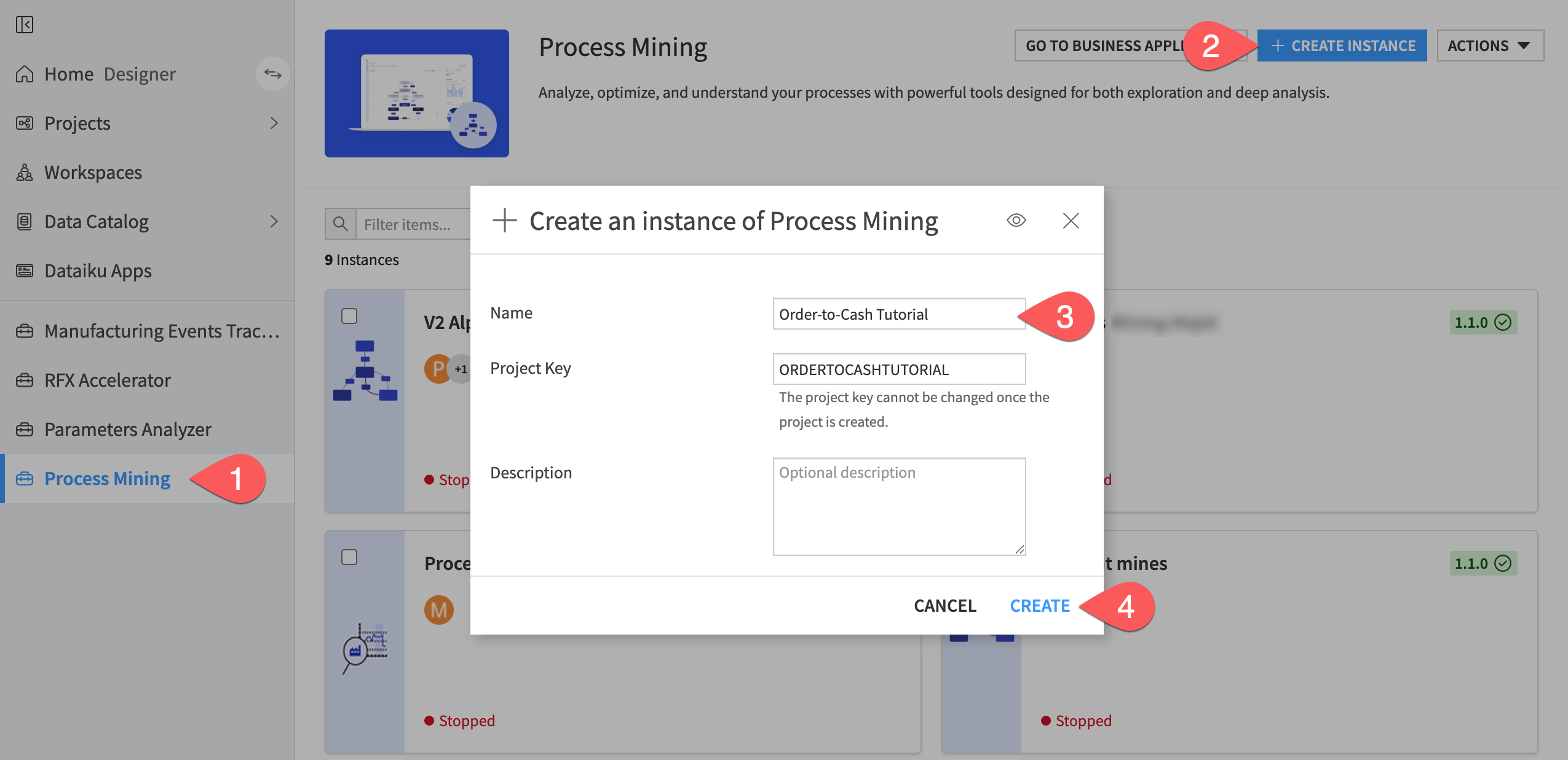
From the Dataiku homepage, click Process Mining in the left navigation panel.
Click + Create Instance.
In the Name field, enter
Order-to-Cash Tutorial.Click Create. The landing page opens.
Browse the data library#
Before creating a study, preview the demo dataset to familiarize yourself with its structure.
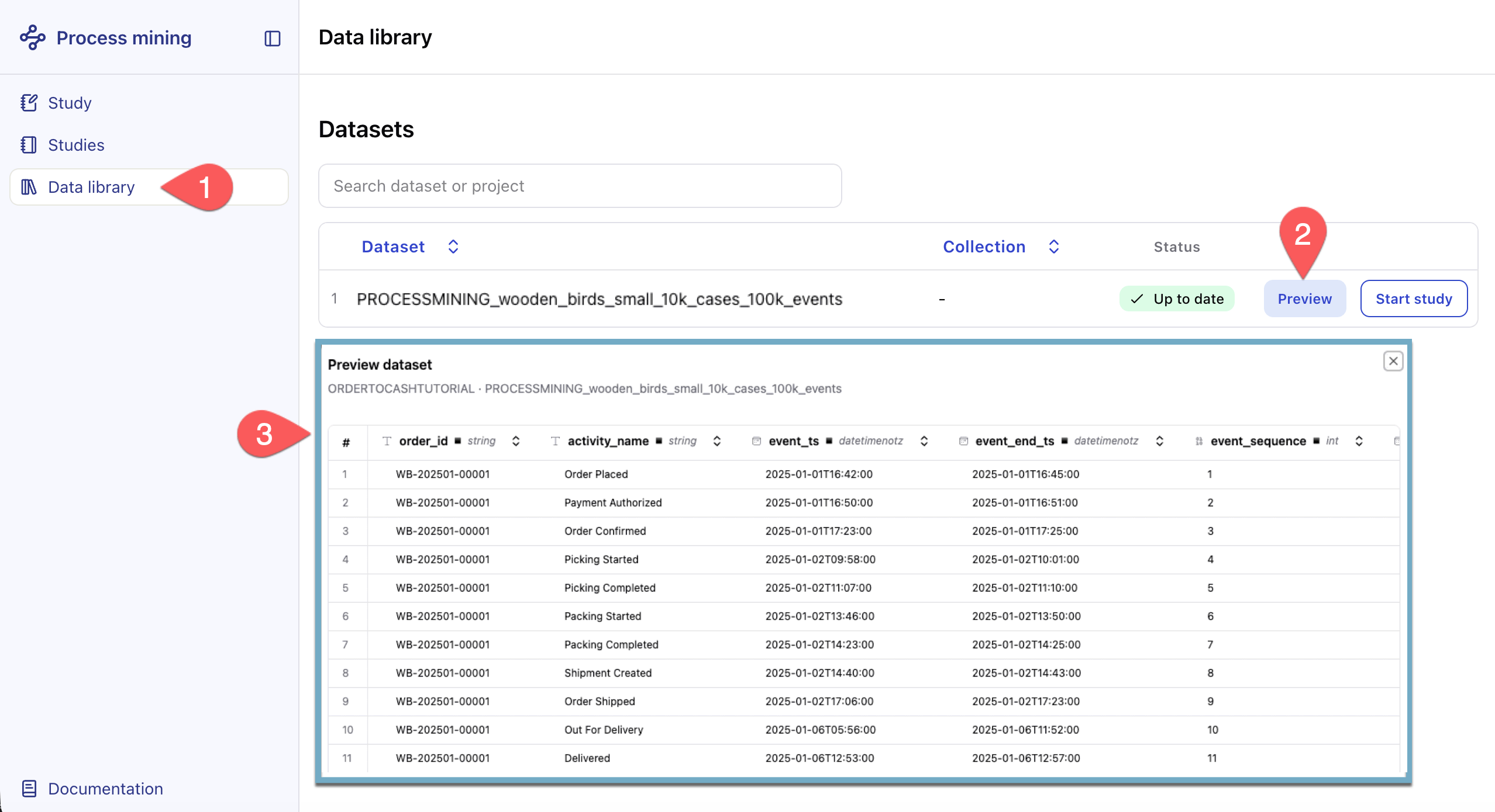
In the left sidebar, click Data library.
Click Preview on the PROCESSMINING_wooden_birds_small_10k_cases_100k_events dataset. A dataset preview opens, showing the first rows.
Important
If you don’t see the dataset, ask your Dataiku administrator to make it available.
Review the columns to confirm that the dataset contains the expected fields:
order_id,activity_name,event_ts, and the other columns listed in the use case summary above.
Once you’ve reviewed the dataset, you’re ready to create a study.
Create a study#
A study is a saved analysis configuration. It captures the dataset, column mappings, and filters you set up, so you can return to your work at any time or share it with colleagues.
Name and select data#
Close the preview and click Start study on the PROCESSMINING_wooden_birds_small_10k_cases_100k_events dataset.
Enter the name
Order-to-Cash Analysisand click the checkmark to save.
Tip
Studies are visible to all users of this app instance. In production use, choose a name that identifies both the dataset and your analysis focus so that colleagues can understand the study’s purpose at a glance.
The data configuration page opens, and a preview of the dataset rows and column statistics appears.
Review column mappings#
The application automatically maps columns based on their names. Review the mapping in the column headers above the data preview to confirm each field is correctly assigned.
Check that the three required fields are mapped: Case ID to
order_id, Activity toactivity_name, and Start Timestamp toevent_ts.Verify the optional fields: End Timestamp to
event_end_ts, Sorting toevent_sequence, and Case attributes tobird_model,wood_type,color, andfinish_type.In the customer_region column, click Map column and assign it as an additional Case attribute.
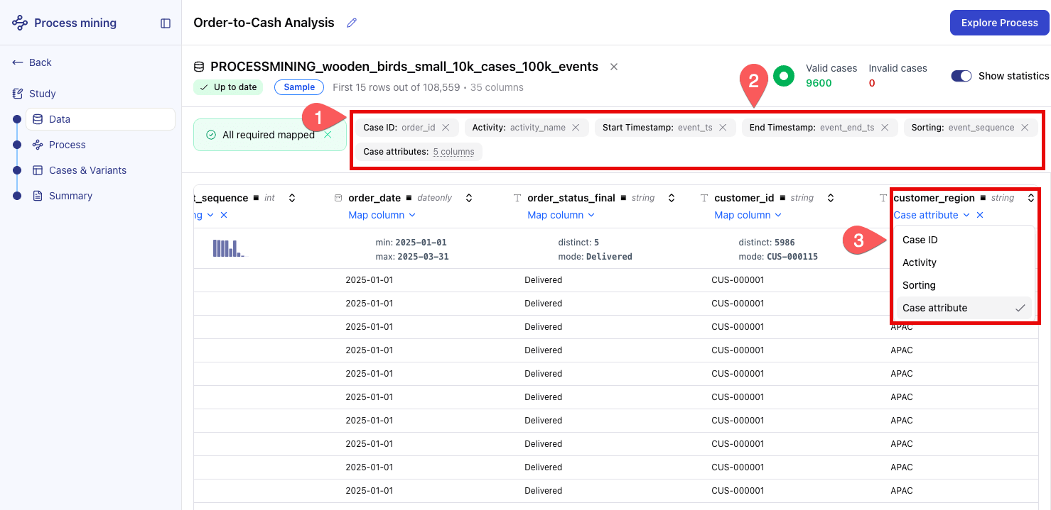
When the All required mapped banner appears at the top, you’re ready to proceed.
Tip
If a column is incorrectly mapped, click its header to open the dropdown and reassign it.
Review the data preview#
The application shows a data quality indicator and a preview of the interpreted event log.
Review the data quality indicator at the top of the screen. It shows the number of cases the application considers valid.
Note
A low percentage of valid cases typically indicates that some Case IDs have fewer than two events, activity names contain null values, or timestamps are missing. Consult the built-in Documentation page (accessible from the app landing page) for data preparation guidance.
Scroll through the preview table to confirm that order_id and activity_name values look correct.
When you’re satisfied, click Explore Process.
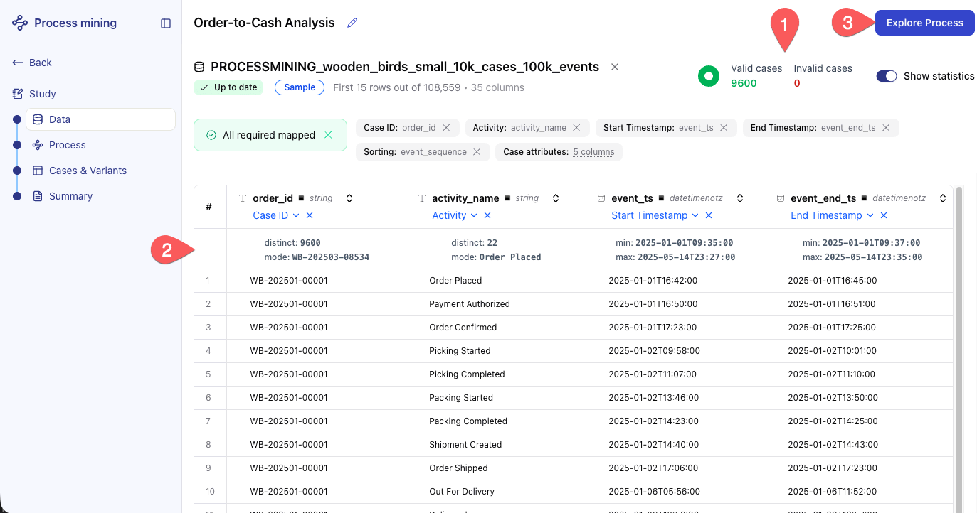
The application processes the event log and opens the Process Explorer.
Explore the process#
The Process Explorer visualizes your event data as a directed process graph.
Read the process graph#
Take a moment to understand what the graph shows before you interact with it.
Nodes (rectangles) represent activities: the named steps in your process.
Arrows represent transitions: a case moving from one activity to the next.
Color intensity reflects either frequency (how often) or duration (how long), depending on the active view.
Locate the start node at the top of the graph and the end node at the bottom.
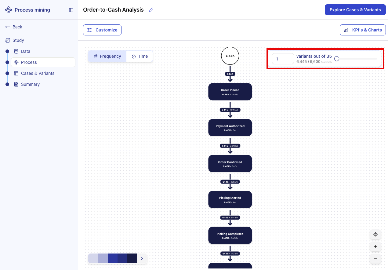
By default, you’re viewing variant 1 of 35, the most common execution path. You’ll adjust this in the next steps.
Tip
You can zoom in to focus on specific parts of the graph, or zoom out for an overview.
Switch between frequency and time#
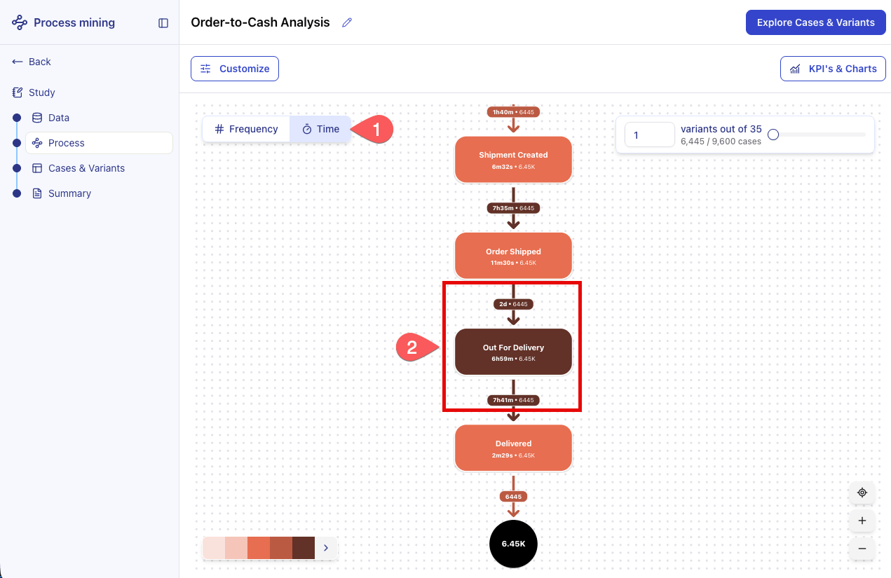
By default, the graph uses Frequency view, which encodes the number of times each activity and transition occurred. Switching to Time view highlights where the process slows down.
At the top of the graph, click Time. Node and transition colors now reflect median duration. Darker colors indicate slower steps.
Identify which activity or transition has the darkest color. That step is likely a bottleneck in the process.
Tip
Click any activity node to open its detail panel. The statistics shown there reflect the active filter scope, not just the variants currently visible in the graph.
Adjust the variant slider#
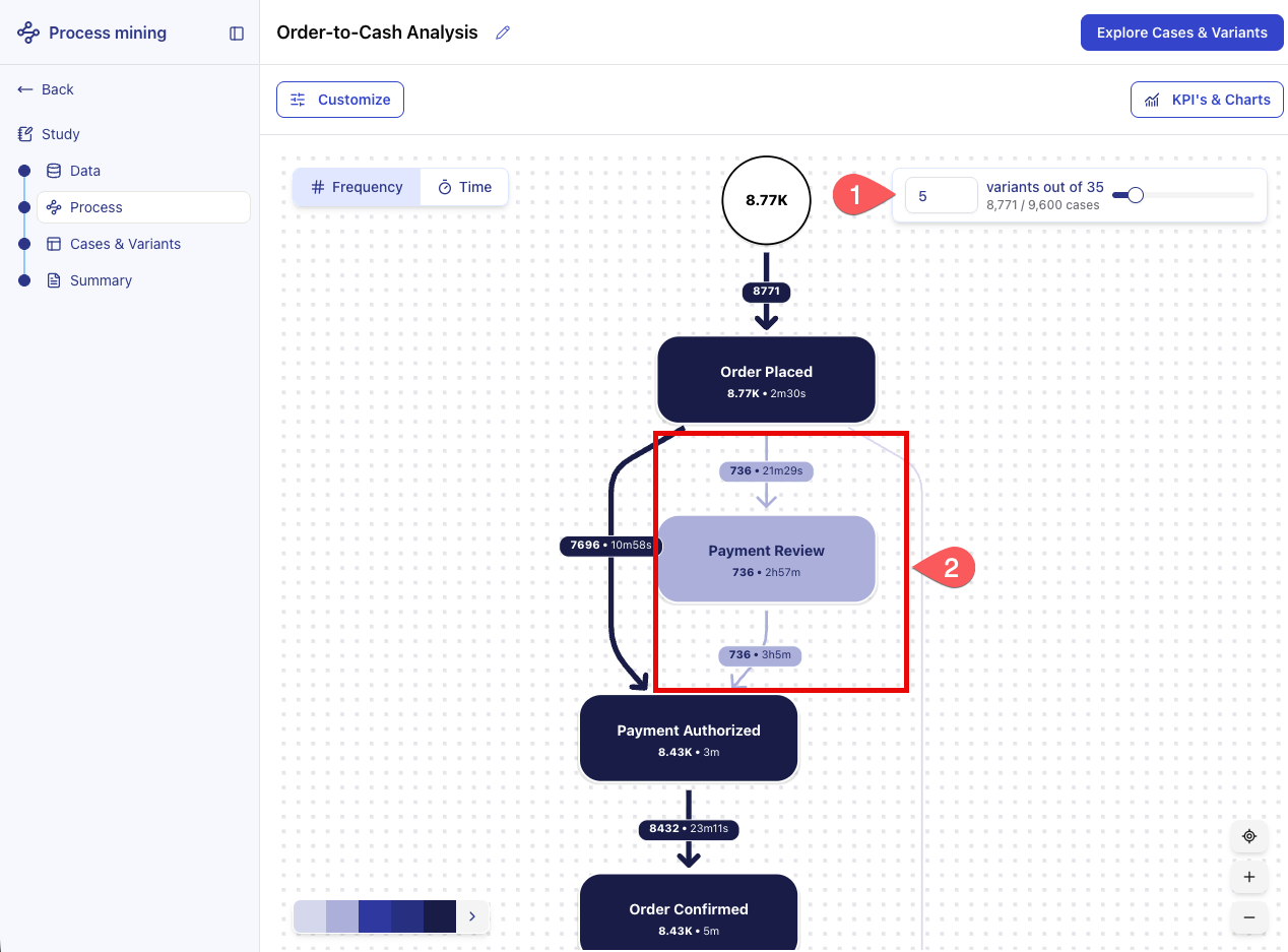
The variant slider controls how many of the most frequent variants are shown in the graph. Moving it to the right reveals lower-frequency paths, including edge cases and exceptions.
Move the slider to 5. New paths appear in the graph, including branches and deviations not visible in variant 1.
Identify a branch or deviation. For example, a path where orders go through a Payment Review step before being authorized.
Tip
Start with 5-10 variants to understand the most common execution paths, then increase gradually to explore edge cases. Most processes follow a few common paths. Understand those before investigating outliers.
Apply filters#
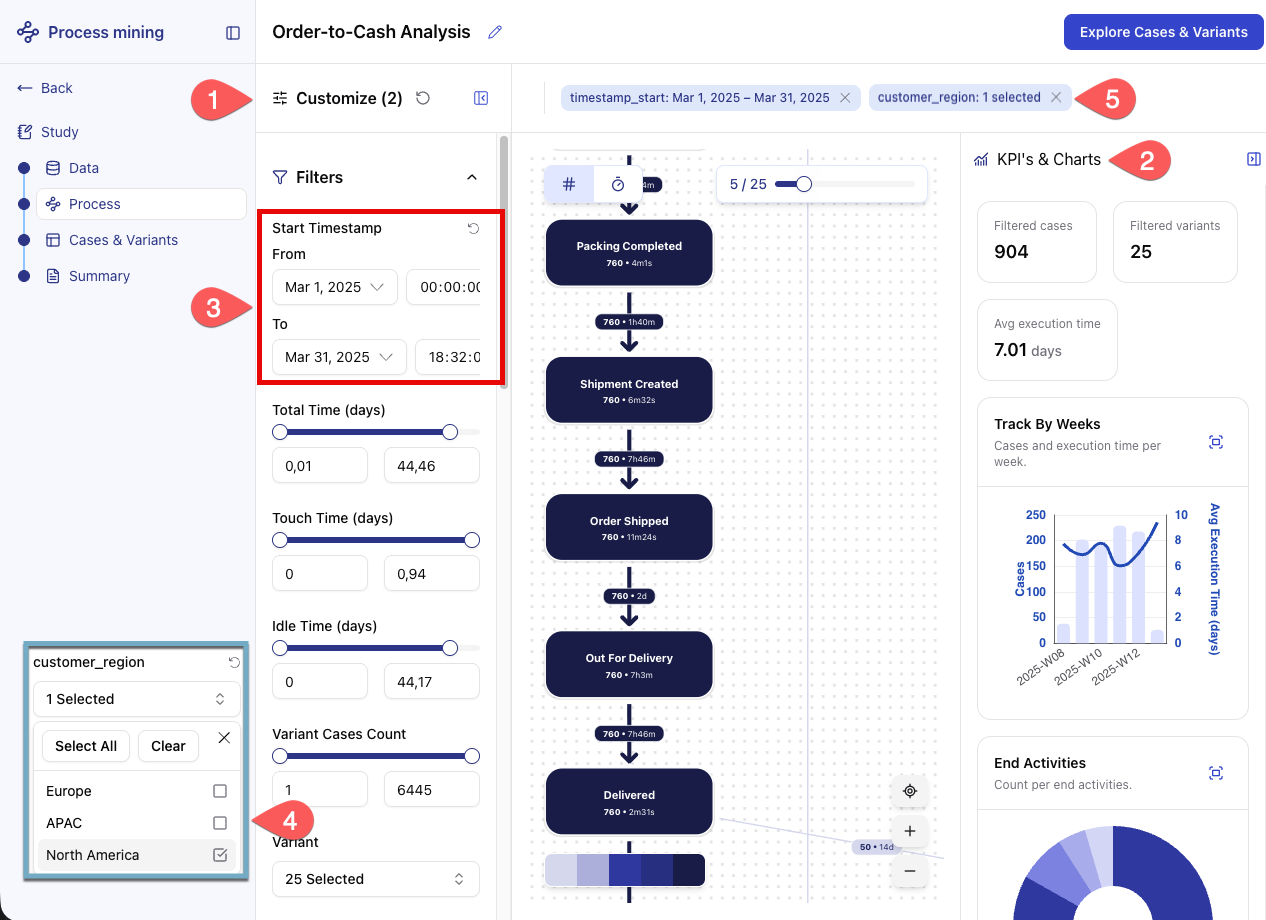
The Customization panel lets you scope the analysis to a specific time period, case attribute value, or activity count. The KPI’s & Charts panel on the right displays key metrics computed from the current dataset and active filters.
Click Customize to expand the left panel.
Click KPI’s & Charts to expand the right panel.
Under Filters, select the date range covering March 2025.
Scroll down and click the customer_region filter, then select only
North America.
Note
The graph now shows only cases that match both filter conditions. The KPI cards update to reflect the filtered data.
In the top banner, click the X button next to each active filter to remove them and return to the full dataset before continuing.
Compare cohorts#
A filter narrows the analysis to one population at a time. A cohort goes further: you split the cases into two subpopulations and compare them side by side, to see how the same process behaves for different groups of cases.
For this event log, one of the most revealing splits is between the orders that reached delivery and those that ended somewhere else. Cases that stop before delivery are cancellations, returns, or unresolved exceptions, and they tend to follow longer, more irregular paths.
In the Customize panel, scroll down and expand the Compare section. It lists the dimensions you can compare cases on.
Click End Activity. A Cohort A and Cohort B pair appears, each with its own selection of end activities.
For Cohort A, select only Delivered.
For Cohort B, select every activity except Delivered.
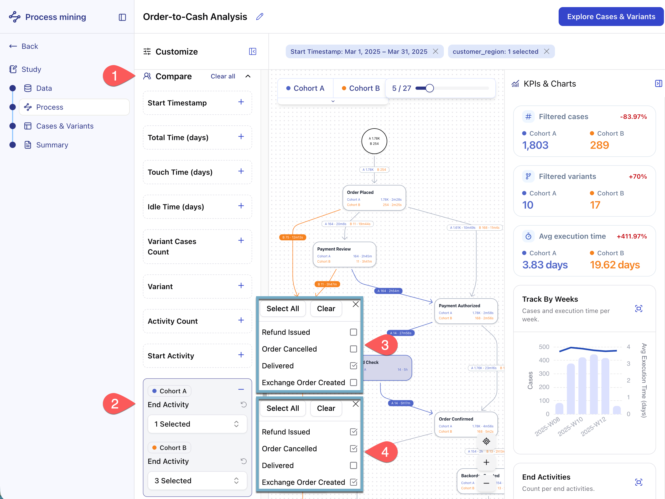
Now compare the two. Cohort A appears in blue and Cohort B in orange throughout the Process Explorer. Each node of the graph reports its figures for both cohorts, and the KPI’s & Charts panel shows two values side by side instead of one.
The contrast is immediate. Far fewer orders end without a delivery, but those that do take around five times longer to reach their end activity. They also spread across more variants than the delivered ones. This smaller population therefore consumes a disproportionate share of the overall process time and follows a more varied set of paths.
Once you’ve explored the comparison, click Clear all at the top of the Compare section to remove both cohorts and return to a single view of the process before continuing.
Tip
Cohorts don’t discard data the way a filter does. They partition it, so you keep the full picture while still comparing segments. Any dimension listed under Compare works as a basis: the start activity, the variant, or a duration, depending on the question you’re investigating.
Add a custom KPI#
The Customize panel also lets you define custom KPIs alongside the built-in ones. In this step, you’ll track the share of orders originating from North America.
In the Customize panel, scroll to the Business Metrics section and click + Add custom metric.
In the KPI name field, enter
North America Rate.For Aggregation type, select Rate.
In the Filter dropdown, select
customer_region, then set the value to North America.Click Save.
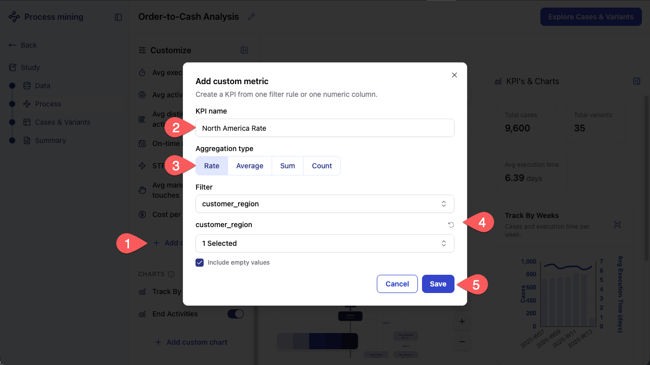
The new KPI appears in the KPI’s & Charts panel and updates automatically as you adjust filters or the variant slider.
Add a custom chart#
The Customize panel also lets you add custom charts to visualize how metrics evolve. In this step, you’ll track the North America Rate KPI week by week.
Still in the Customize panel, scroll to the Charts section and click + Add custom chart.
Enter
North America Rate per weekas the Chart title.For Chart type, select Bar chart.
In the Metric dropdown, select
North America Rate.Click Save.
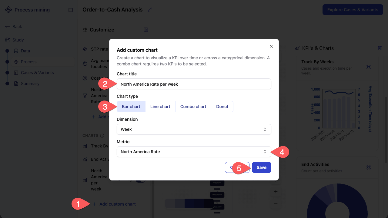
The chart appears in the KPI’s & Charts panel, visualizing the North America Rate broken down by week.
Analyze variants and cases#
The Cases & Variants explorer lets you drill into the specific variants and individual cases that make up the process.
Browse variants#
The left panel lists all variants ranked by frequency. Select one to see its cases in the center table.
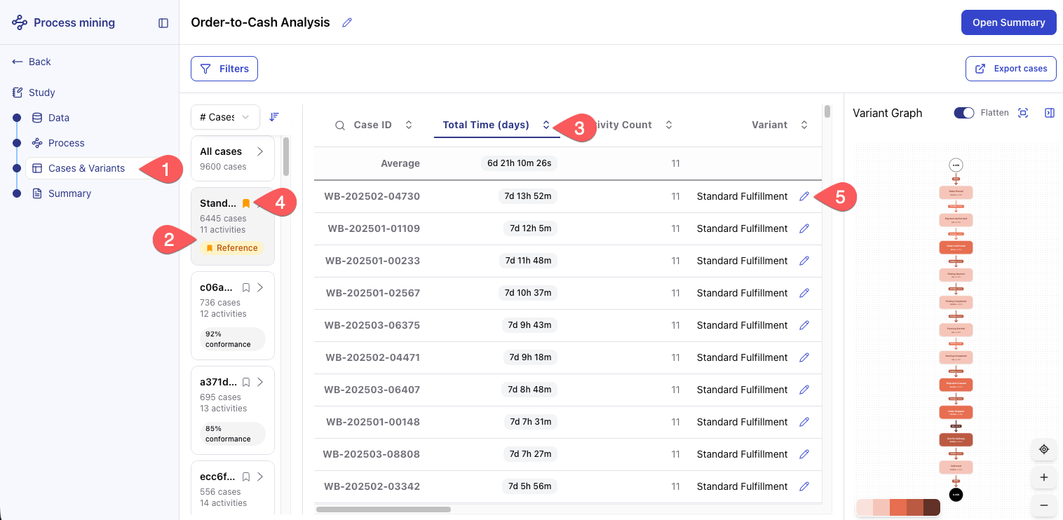
In the left sidebar, click Cases & Variants.
Click the first variant (069bf7e) to select it.
Sort the case table by Total Time in descending order to bring the slowest cases to the top.
Mark the first variant as the reference variant.
Click the pencil icon next to the variant name and rename it
Standard Fulfillment. Descriptive names make it easier to communicate findings across teams.
Note
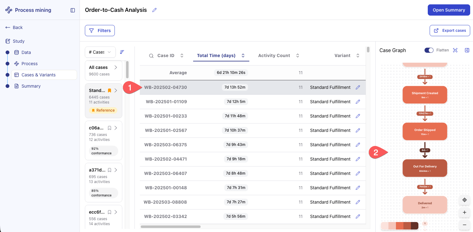
The left panel lists all variants discovered in the dataset, ranked by frequency by default. The center table shows all cases that followed the selected variant. Each row represents one order.
Once a reference variant is set, a conformance score appears for all other variants, showing how far each execution path deviates from the intended process.
Inspect a specific case#
With the cases sorted, you’re ready to examine the slowest one in detail.
In the case table, click the row of the slowest case identified in the previous step.
Examine the Case Graph on the right. It shows the actual sequence of activities this order followed, with per-activity timestamps and durations, so you can pinpoint where it spent the most time.
Tip
Use the Flatten toggle when inspecting a case with repeated activities. It switches between a compact view that collapses those repetitions and a linear view that unfolds each occurrence in sequence.
Export cases#
The Cases & Variants explorer supports export, allowing you to save the current case selection to a Dataiku dataset for further analysis.
Click Export cases.
In the confirmation dialog, click Export cases to confirm.
Click Open dataset to view the exported data.
Note
Export must be enabled by a Dataiku administrator. If the export option is unavailable, contact your administrator.
Share your findings#
With the analysis complete, you can go to the Summary page to present your findings, and share the study with your team.
Review the Summary page#
The Summary page lets you surface the key insights from your analysis in a format suitable for sharing with stakeholders.
In the left sidebar, click Summary.
Scroll through the page and verify that your custom additions are present: the North America Rate KPI, the North America Rate per week chart, and the Standard Fulfillment reference variant.
At the top of the page, click Download PDF to save the Summary as a file you can send to stakeholders who don’t have access to the app.
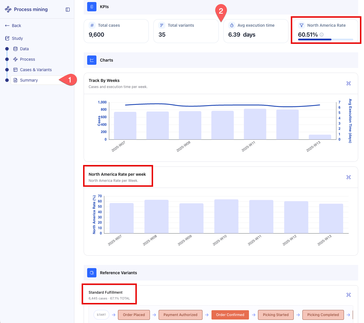
The page brings together the key outputs of your analysis, including the process graph, KPIs, and charts, allowing you to communicate your findings without requiring stakeholders to navigate the full study.
Note
The Summary page always reflects the current state of the study. Filters, cohorts, custom metrics, charts, and reference variants set in the other pages all appear here, and in the PDF you download. Review the study before sharing the export.
Next steps#
Congratulations! You’ve completed your first end-to-end analysis with the Process Mining Business Application.
See also
The app’s built-in Documentation page (left sidebar) for data model requirements, methodology details, and admin configuration options.
Process Mining article for the full product reference documentation.