

Tutorial | Charts in the grid layout of custom governance pages#
Get started#
Tutorial | Custom governance pages serves as a first introduction to the Custom Page Designer. On top of the basics presented there, the option of a grid layout brings greater flexibility to the design of custom pages. Most notably, it introduces a way to design custom charts and arrange them next to tiles of artifact tables and HTML code.
Objectives#
In this tutorial, you will:
Create a custom page with a grid layout in the Govern node.
Position an item table in a grid layout.
Create charts on top of projections and series definitions.
Create more advanced charts using custom code.
Build a complete dashboard to filter item tables via charts.
Prerequisites#
To reproduce the steps outlined in this tutorial, you will need:
Dataiku 15.0 or later.
A Dataiku Govern node connected to a Design node.
An Advanced Dataiku Govern license.
Be a Govern admin to access the Custom Page Designer.
Knowledge of the Custom Page Designer.
You’ll want to have at least a few Govern projects, following the Dataiku Standard template, with a workflow that’s started and a risk rating assigned.
Use case summary#
A central component of most standard Govern pages is a table and/or a matrix of items. However, from tables and matrices alone, it can be difficult to spot patterns and uncover insights across an entire portfolio of items. Effective AI governance at an enterprise level requires being able to answer questions like:
How are factors like risk, value, and cost spread across the portfolio?
How many initiatives are behind schedule? And who owns them?
How many assets, including those in production, don’t have the required documentation?
The grid page layout, and the charts you can build on it, provide a way to answer questions like these. Understanding the status of your AI portfolio becomes much easier with interactive charts embedded directly in the Govern node.
In this tutorial, you’ll build a custom page that brings together a table and charts showing insights into Govern projects. You’ll focus on learning the core building blocks (filters, projections, series, and charts) that all grid pages depend on. Once you’re comfortable with how those pieces fit together, you can apply the same pattern to build more complex pages tailored to your own objectives.
You can also take inspiration from the specific example found in this tutorial. Here you’ll create three charts:
The first visualizing counts of Govern projects by risk rating (a common categorical field).
The second visualizing a matrix of Govern projects by risk and value ratings (two categorical fields).
A third visualizing counts of Govern projects by workflow steps (as many types of items have an attached workflow).
Accordingly, once you’ve seen this example, you’ll be able to apply it to other types of items, following your own templates, to visualize your own metrics.
Design a page with a grid layout#
For certain custom page use cases, the item table, matrix, and HTML layouts provide the correct foundation. If you’re looking for greater flexibility, however, you may want a grid layout.
Create a new page#
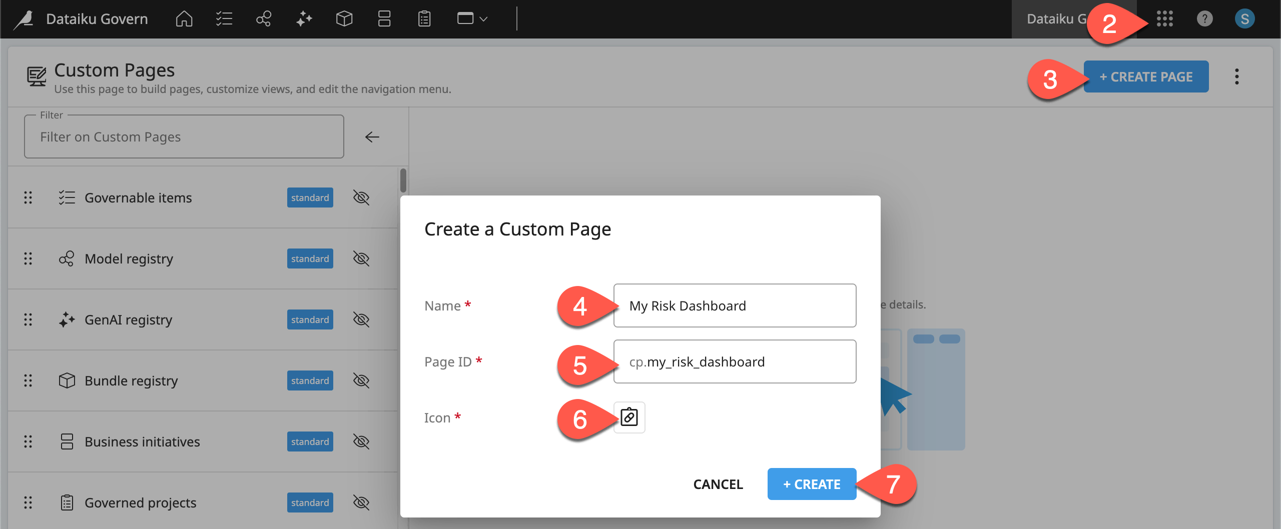
First, navigate to the Custom Page Designer, and create a page.
Open the Govern node. You can navigate there from the Overview panel of the Cloud Launchpad or, from a Design node, go to the waffle (
 ) menu > Dataiku Govern.
From the waffle (
) menu of the Govern node’s top navigation bar, select Custom Page Designer.Click + Create Page to add your own page.
In the dialog, name it
<YOUR INITIALS> Risk Dashboard.Make note of the automatically assigned Page ID.
Choose any icon to represent your page as it would appear in the top navigation bar of the Govern node when activated.
Click Create.
Add an artifact table#
Start with an artifact table, the same kind you’d find on an item table page layout.
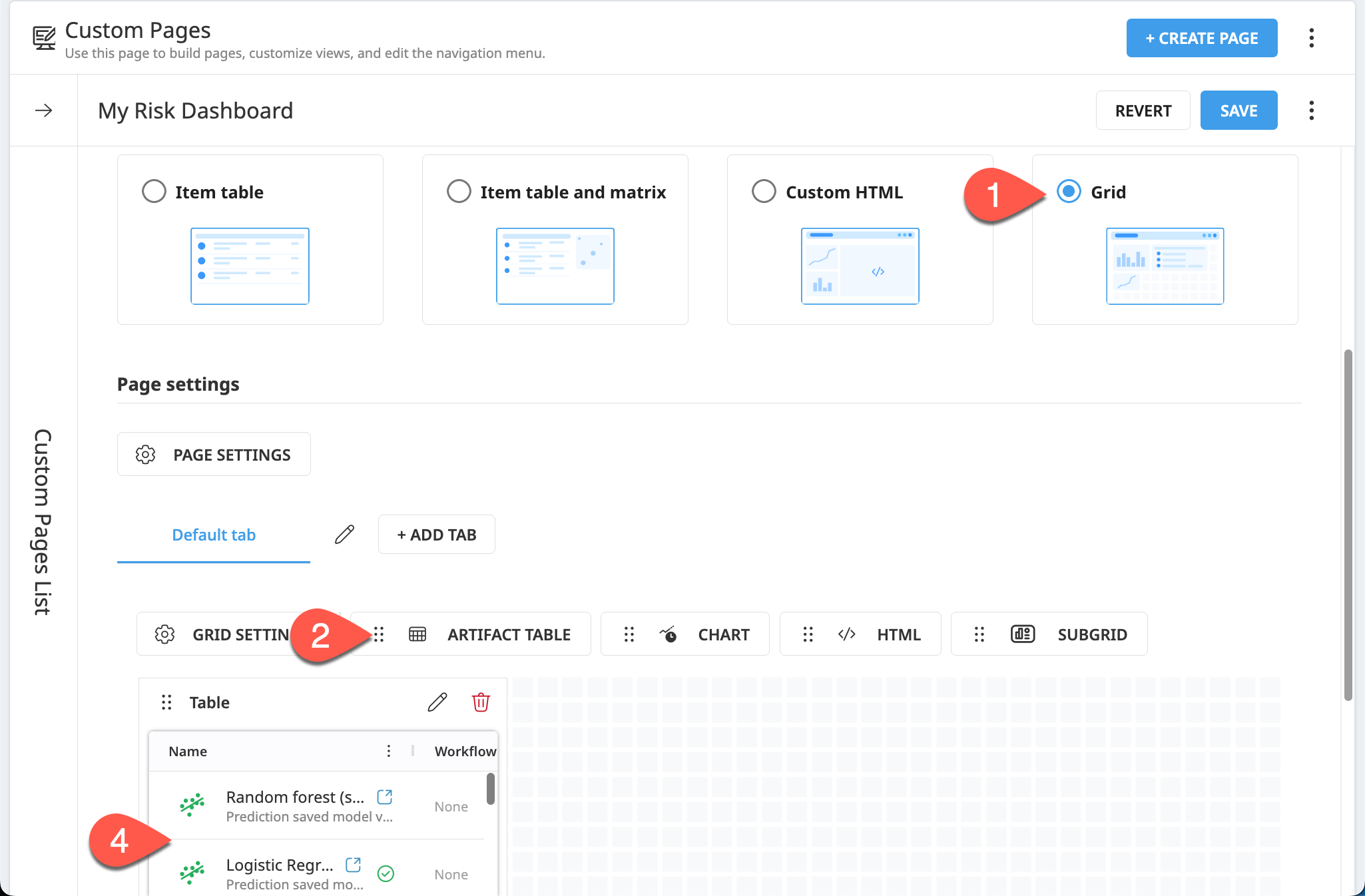
In the Custom Page Content section, be sure Grid is selected as the page layout.
Use the
 handle to drag an Artifact Table to the top left corner of the page canvas.
In the table tile dialog, click Add, accepting the default structure.
From the preview alone, you likely can see that the table includes a mix of all possible item types.
Filter items on a page#
As with other custom pages, often the first step is getting the desired set of items. You can do that by defining filter conditions.
One common item of importance in an AI portfolio is a Govern project. With this example in mind, filter the page to include only Govern projects following the Dataiku standard template.
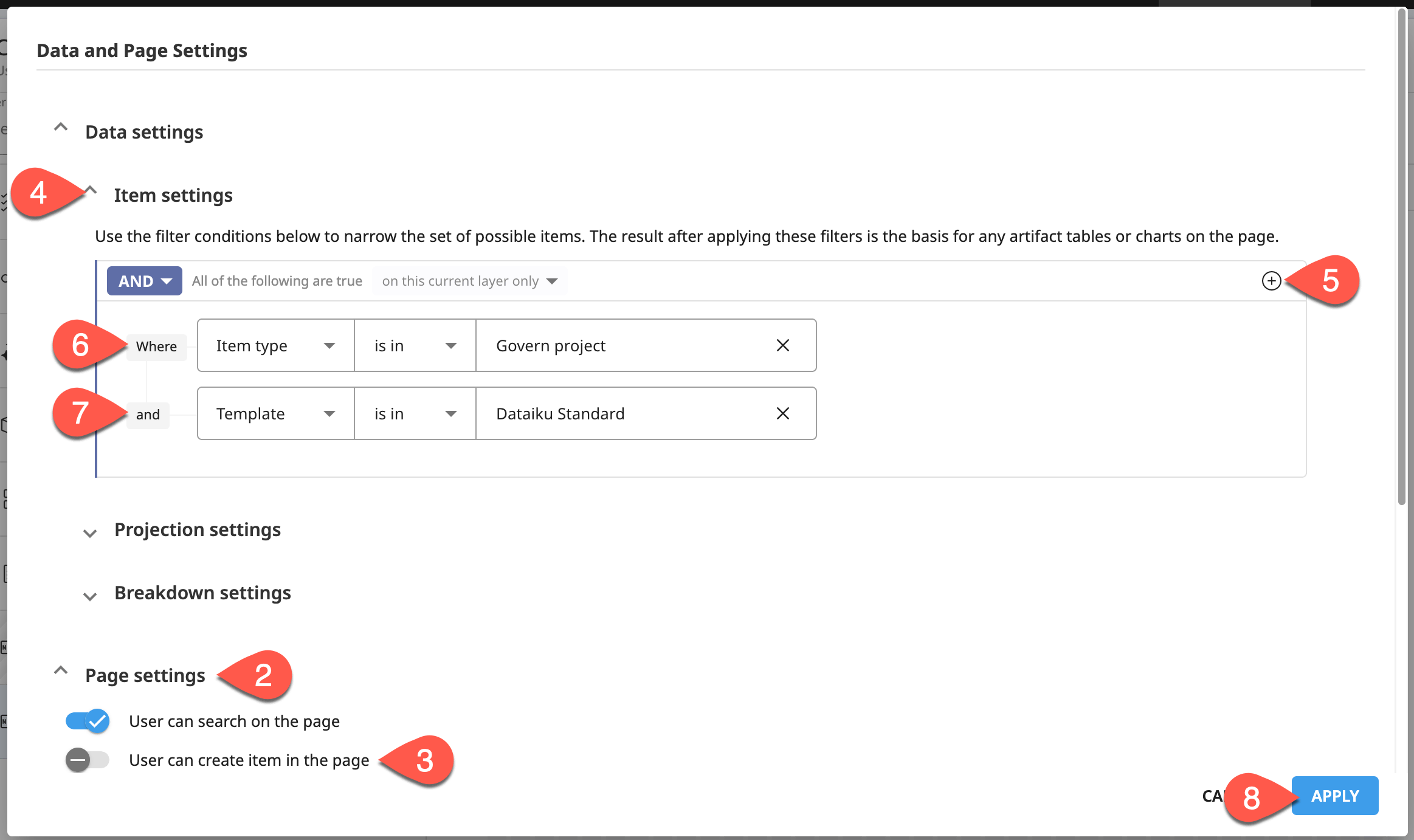
Above the page canvas, click Page Settings to configure parameters that impact the entire page.
Within the Data and Page Settings dialog, confirm that the Page settings section near the bottom is the same as what’s found on other custom page layouts.
Toggle Off the option allowing users to create items on the page. (This page is about analyzing existing items).
Focus on the Data settings > Item settings section. These filter conditions should also be familiar from other custom page layouts.
Click the plus (
 ) icon > Condition to add your first filter condition.
Filter for the Item type of Govern project.
Add a second filter condition for a Template of Dataiku Standard.
Click Apply.
In the page canvas, confirm the artifact table reflects these filters.
Tip
If you need a refresher on how these filters work, see Design filters for a custom page.
Build custom charts#
With a filtered set of items and a grid layout in place, you can now start adding custom charts to visualize the status of your AI portfolio.
Create a chart#
To visualize Govern projects by risk rating, start by adding a chart tile.
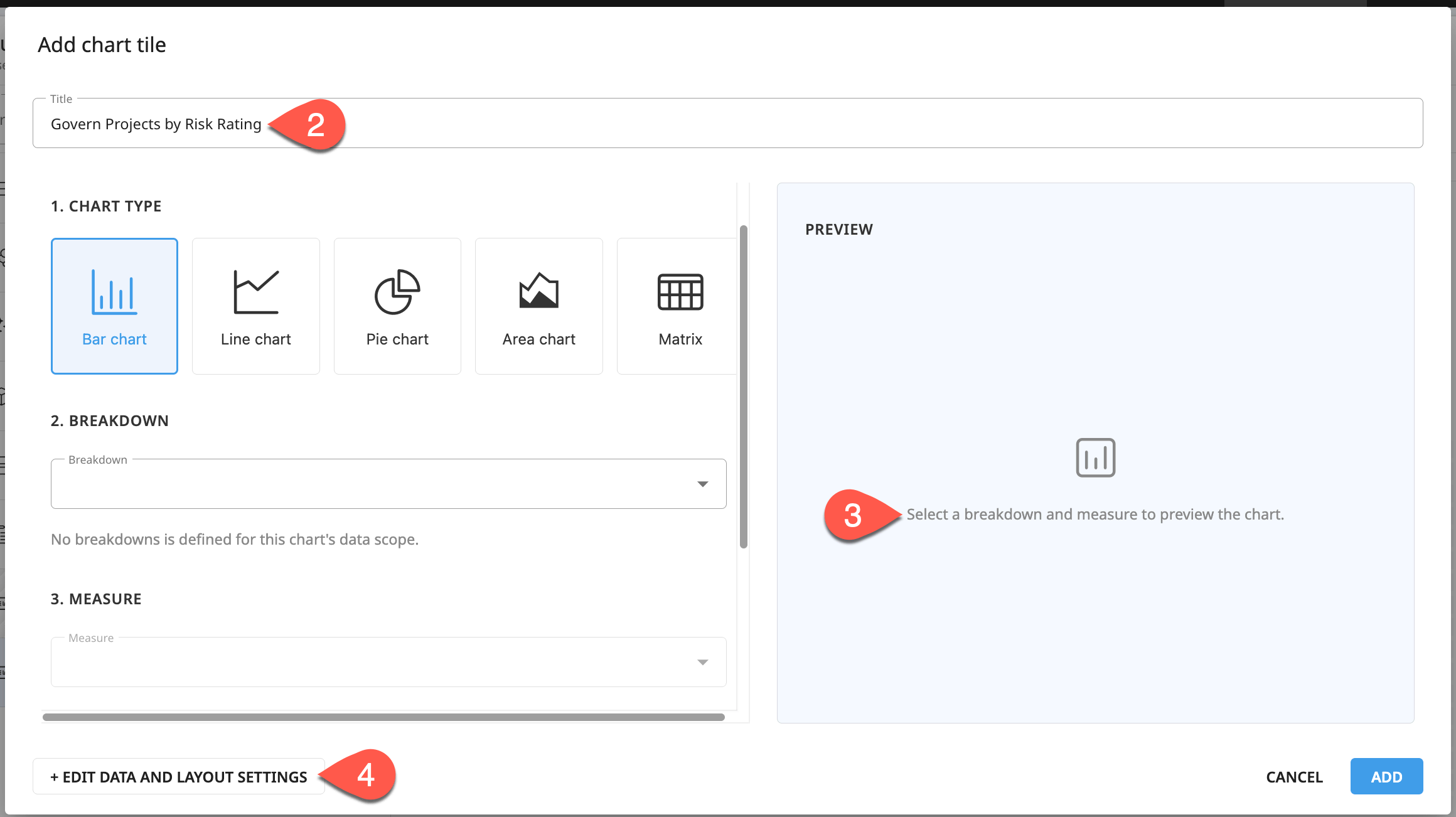
Click Chart to add that kind of tile on the page.
For the Title field, name it
Govern Projects by Risk Rating.Note the missing Breakdown and Measure.
Beneath the empty preview, click Edit Data and Layout Setttings.
Define a projection#
The chart tile preview indicated the chart needed a breakdown. However, before creating a breakdown, you need a projection. You can think of a projection as some element of interest inside the items for which you’ve filtered.
In this case, the page includes only Govern projects following the standard template. Possible projections then include all possible pieces of data relevant to those items. Properties like:
Fields attached to a Govern project (sponsors, target end date, feasibility rating, etc.)
Workflow steps (in this case the standard workflow steps)
A categorical field like risk rating is a natural choice for a property you’d want to visualize. Therefore, to visualize Govern projects by their risk rating, you first need to define risk rating as a projection.
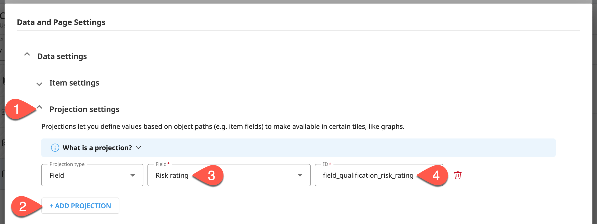
In the Data and Page Settings dialog, focus on Data settings > Projection settings.
Click + Add Projection.
Leaving the projection type as Field, search for
Risk rating(the full ID isqualification_risk_rating).Note how these two selections produce a default projection ID.
Tip
Requiring a projection before defining a breakdown is mainly about performance. Each item on a page could have dozens of properties: its ID, name, every field, workflow step, and so on. Loading all that into the browser for every item would be slow. By defining a projection, you tell Govern exactly which piece of data you need so it only has to load that.
Define a breakdown#
Once you have a projection, you can use it as a dimension in a breakdown. However, that’s only one half of a breakdown. A breakdown requires both a dimension and a measure:
Component |
Purpose |
|---|---|
Dimension |
What groups items together by the value of a projection. For example, a dimension based on a projection of a categorical field (such as “Risk rating”) groups items by their values — into groups like “High”, “Low”, etc. |
Measure |
A value computed for each group, using an aggregation function (such as Count, Sum, or Average). |
Accordingly, to create a chart showing the distribution of Govern projects by risk rating:
Risk rating is the dimension (once you’ve first made it a projection).
Count is the measure.
Following this example, create the breakdown.
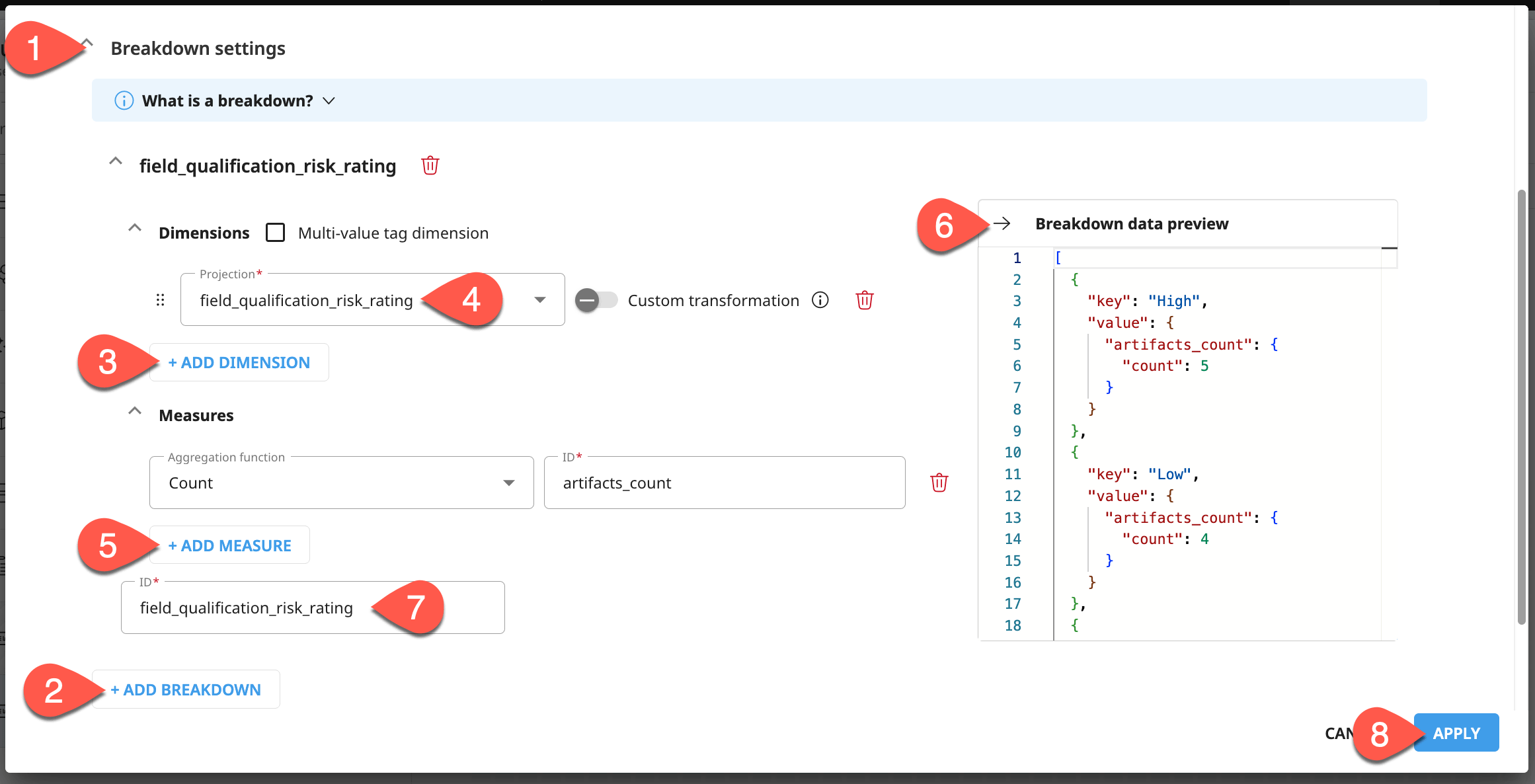
After creating your first projection, collapse those settings to focus on Data settings > Breakdown settings.
Click + Add Breakdown, and note the two components: dimensions and measures.
Click + Add Dimension.
For the Projection, select the only one you’ve defined: field_qualification_risk_rating.
Click + Add Measure, and recognize the default selection of a Count function.
Inspect the Breakdown data preview to understand the structure of dimensions and measures.
Note the default assignment of a breakdown ID.
Click Apply to accept.
Important
The JSON sample in the breakdown data preview is an array of objects, each with two properties: key and value.
The
keyproperty’s value is the categorical label for the risk rating (“High,” “Low,” etc.). This is the dimension.The
valueproperty holds a nested object containing the measure: a property named after the measure ID (artifacts_count), whose own value is an object with a count property holding the actual number.
Configure a chart#
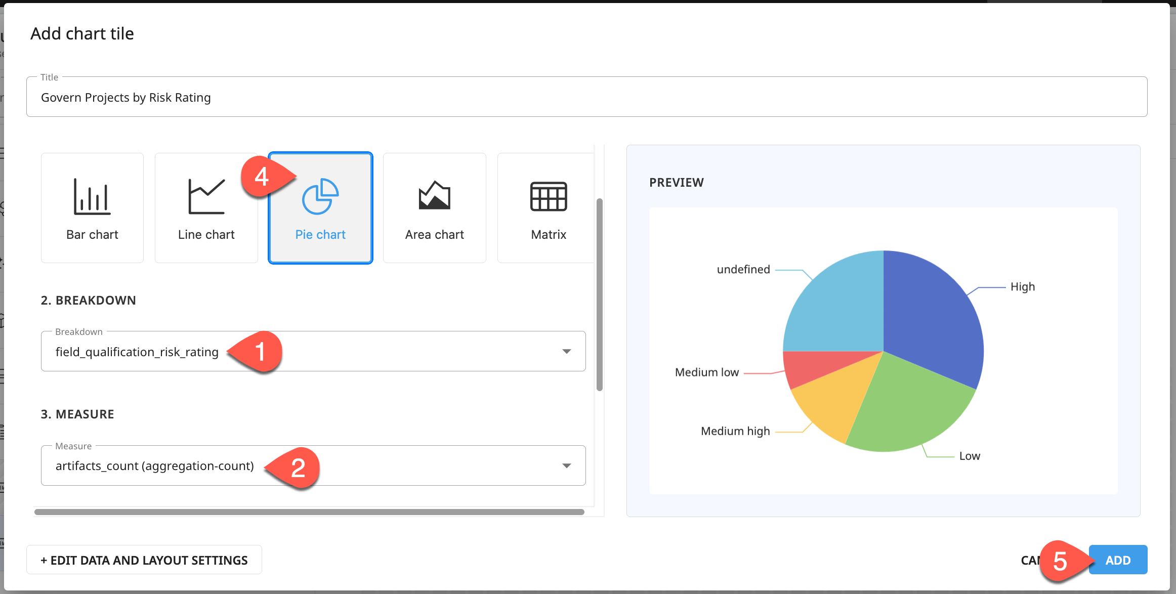
Once you have a complete breakdown, you can configure the previously empty chart. A few types of pre-configured chart types are available. For this type of data, a pie chart may be a suitable choice.
For the Breakdown, select field_qualification_risk_rating.
For the Measure, select artifacts_count.
Observe the Preview of a bar chart.
Change the Chart Type to Pie Chart, and see the updated preview.
Click Add, and confirm the chart’s placement next to the artifact table in the custom page.
Define a multi-dimensional breakdown#
A breakdown isn’t limited to only one dimension and one measure. For example, you could imagine wanting to visualize counts of Govern projects by multiple axes, such as risk and value. For that, you’ll need a breakdown with two dimensions.
Above the page canvas, click Page Settings.
Click + Add Projection. Leaving the projection type as Field, search for
Value rating(the full ID isqualification_value_rating).Under Breakdown settings, click + Add Breakdown.
Click + Add Dimension, and select field_qualification_risk_rating.
Repeat this step to add field_qualification_value_rating as a second dimension in the same breakdown.
Click + Add Measure, and note the default selection of a count measure once again.
Rename the breakdown
risk_value_rating_counts.Observe the structure of the Breakdown data preview, now with two dimensions.
Click Apply to make the new breakdown available to elements on this page.
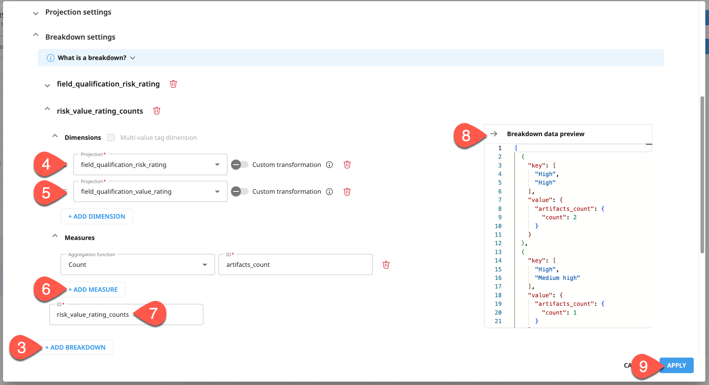
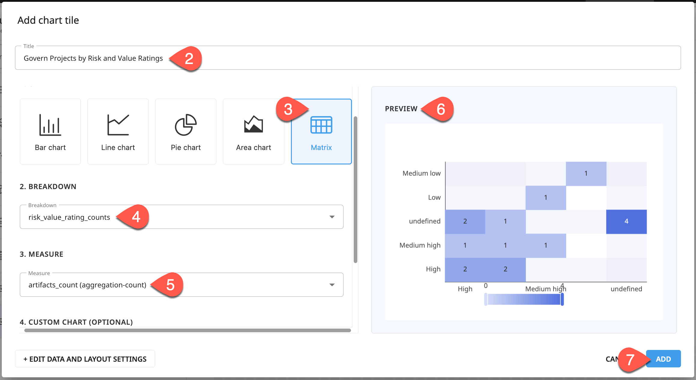
Breakdowns exist at the page level. Any chart on the page can access it. Try creating a new chart using this two-dimensional breakdown.
Above the page canvas, click Chart.
For the Title, name it
Govern Projects by Risk and Value Ratings.For the Chart Type, select Matrix.
For the Breakdown, select risk_value_rating_counts.
For the Measure, select artifacts_count.
Observe the Preview.
Then click Add, and confirm the presence of a second chart on the page canvas.
Define a chart with code#
The five pre-configured chart types address many of the most common visualization needs. For more advanced chart types or fine-tuning, you have the option of custom code using the ECharts JavaScript library.
Before creating a custom chart, first add a new breakdown.
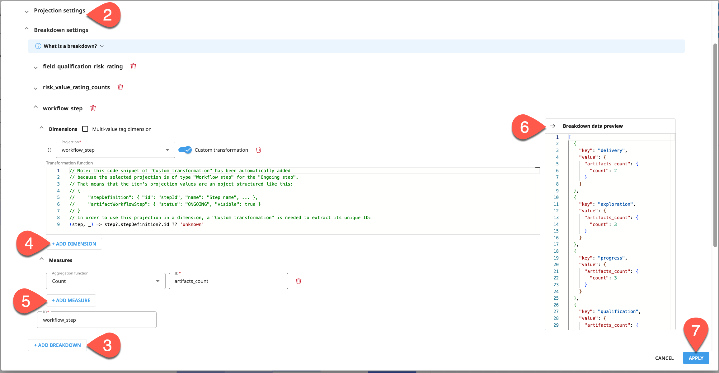
Above the page canvas, click Page Settings.
Under Data settings > Projection settings, click + Add Projection. For projection type, select Workflow step, and leave the default as the ongoing
workflow_stepID.Under Data settings > Breakdown settings, click + Add Breakdown.
Click + Add Dimension, and select workflow_step as the projection.
Click +Add Measure, and leave the default of Count.
Confirm the Breakdown preview shows counts by workflow steps.
Click Apply to finish defining the new breakdown.
You can now use this third breakdown in a chart to visualize Govern projects by workflow step. Instead of vertical bars however, you may prefer horizontal ones. You can achieve by defining any chart with code.
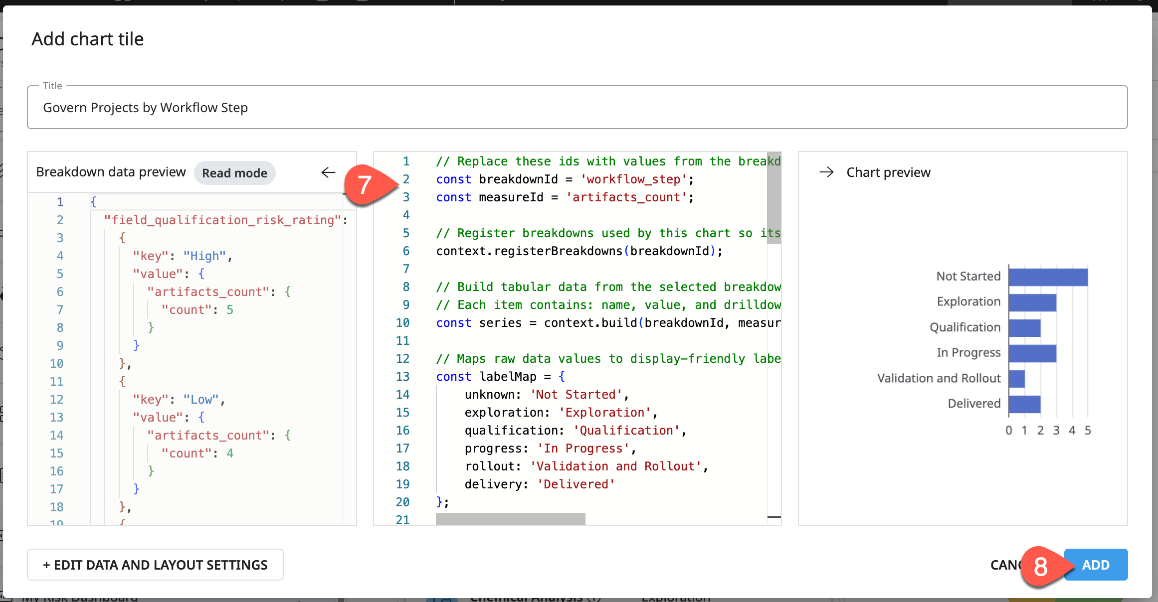
From the page canvas, click Chart to add a new tile.
In the Title field, name it
Govern Projects by Workflow Step.For the Breakdown, select workflow_step.
For the Measure, select artifacts_count.
Confirm the output of a bar chart in the Preview.
Click Convert to Custom Chart, and click Convert to confirm.
In the center panel, copy-paste the code below to create an ordered, horizontal bar chart with clean labels.
Horizontal bars
// Replace these ids with values from the breakdown data preview panel or the page or grid settings.
const breakdownId = 'workflow_step';
const measureId = 'artifacts_count';

// Register breakdowns used by this chart so its drilldown filters can be displayed and cleared.
context.registerBreakdowns(breakdownId);

// Build tabular data from the selected breakdown and measure.
// Each item contains: name, value, and drilldownValue.
const series = context.build(breakdownId, measureId, 'tabular');

// Maps raw data values to display-friendly labels.
const labelMap = {
    unknown: 'Not Started',
    exploration: 'Exploration',
    qualification: 'Qualification',
    progress: 'In Progress',
    rollout: 'Validation and Rollout',
    delivery: 'Delivered'
};

// Explicit workflow sequence, using RAW values (not display labels).
// NOTE: "unknown" (Not Started) moved to the front since it now represents
// work that hasn't begun yet, rather than a catch-all/unclassified bucket.
// Move it back to the end of this array if you'd prefer the old ordering.
const stageOrder = ['unknown', 'exploration', 'qualification', 'progress', 'rollout', 'delivery'];

const orderedData = [...series.data].sort((a, b) => {
    const aIndex = stageOrder.indexOf(a.name);
    const bIndex = stageOrder.indexOf(b.name);
    const aRank = aIndex === -1 ? stageOrder.length : aIndex;
    const bRank = bIndex === -1 ? stageOrder.length : bIndex;
    return aRank - bRank;
});

// ECharts renders category axes bottom-to-top by default, so reverse the array
// to make the first workflow stage appear at the top of the chart.
const chartData = orderedData.reverse().map((item) => ({
    ...item,
    name: labelMap[item.name] ?? item.name, // swap in the friendly label for display
    selected: context.drilldown.isSelected(breakdownId, item.drilldownValue),
}));

context.chartInstance.setOption({
    tooltip: {
        trigger: 'item',
        appendToBody: true
    },
    grid: {
        left: '25%', // extra room for the longer "Validation and Rollout" label
        right: '10%',
        containLabel: true
    },
    xAxis: {
        type: 'value'
    },
    yAxis: {
        type: 'category',
        data: chartData.map((item) => item.name)
    },
    series: [
        {
            type: 'bar',
            data: chartData,
            selectedMode: 'multiple',
            select: {
                itemStyle: {
                    borderColor: '#333',
                    borderWidth: 2
                }
            }
        }
    ]
});

// Toggle drilldown filtering when the user clicks a bar.
context.chartInstance.off('click'); // Clean previous drilldown callbacks
context.chartInstance.on('click', (event) => {
    const drilldownValue = event.data?.drilldownValue;
    if (drilldownValue !== undefined) {
        context.drilldown.toggle(breakdownId, drilldownValue);
    }
});
After confirming the result renders in the chart preview, click Add to accept.
Tip
As you inspect the code sample, note that the most important part is first defining the variables breakdownId and measureId.
Refine a page into a dashboard#
Item tables and charts are tiles you can use to develop custom pages into responsive dashboards.
Add an HTML tile#
While you can have an entire custom page as HTML, a grid layout enables you to place HTML tiles wherever needed. Add one such tile to give the page a header with some instructions.
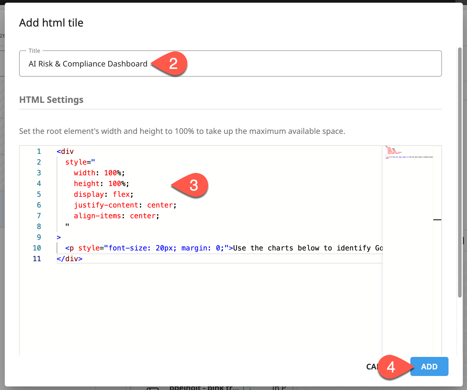
Use the
handle to drag an HTML tile onto the top of the page canvas.For the Title field, name it
AI Risk & Compliance Dashboard.Copy-paste the following HTML snippet:
<div
  style="
    width: 100%;
    height: 100%;
    display: flex;
    justify-content: center;
    align-items: center;
  "
>
  <p style="font-size: 20px; margin: 0;">Use the charts below to identify Govern projects by risk, value, and workflow step.</p>
</div>
Click Add to accept.
Adjust the size and placement of the tiles on the page canvas so the HTML tile stretches along the top, with the artifact table and charts beneath it.
Click Save to preserve the page’s progress.
Preview the page#
While you could continue building out the dashboard, this one is ready for a preview.
In a new Govern node tab separate from the Custom Page Designer, preview your hidden custom page:
In the top navigation bar, go to See more pages (
 ), and select your Risk Dashboard.
Alternatively, go directly to
{your-instance-url}/pages/cp.{your-page-id}.
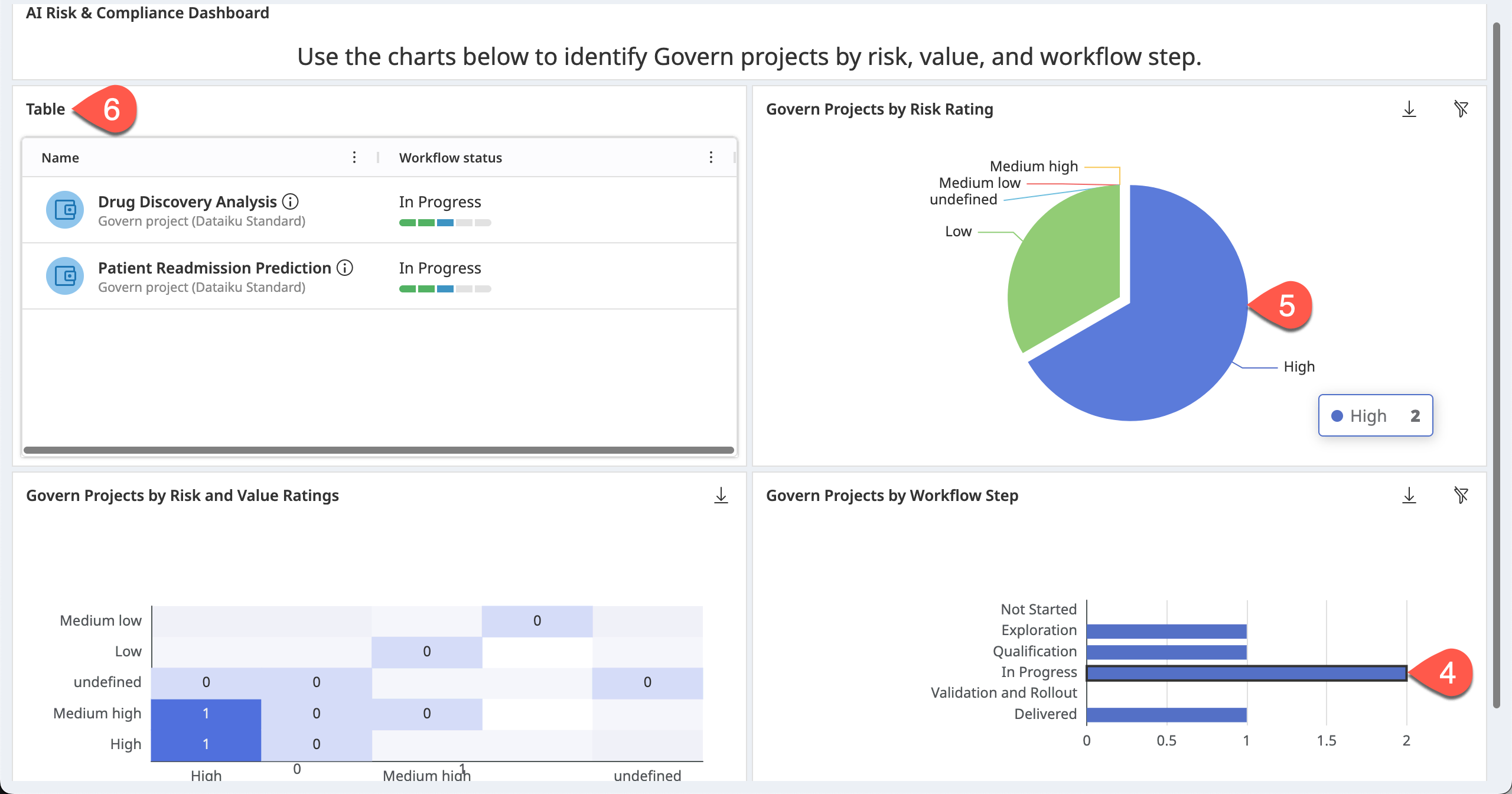
On one of the charts, click Load All.
Explore how the chart filters enable you to discover items of interest in the artifact table.
Filter for a specific workflow step, like In Progress.
Then in the pie chart, filter by a risk rating, like High.
Review the item table for the remaining high risk projects in progress.
Tip
Feel free to continue designing the dashboard! For example, you might experiment with adding multiple tabs to the page or nesting objects within subgrids.
Next steps#
Congratulations! You’ve taken your first steps using the grid layout in the Custom Page Designer to build rich pages from tiles of tables, charts, and more.
If you wanted to actually use the page built in this tutorial, you’d need to make it visible to non-admin users.
In the Custom Page Designer, go to the first section of settings in your Custom Page.
Toggle on the Visible option.
Before you finish, take a moment to delete work that you no longer need as a courtesy to those sharing your Govern node.
From the Custom Page Designer, open your Risk Dashboard page.
Click the vertical dots (
 ), and select Delete.
See also
Consult the reference documentation on Build custom pages to learn more.