
Model metrics and explainability#
In the previous Introduction lesson, we created and trained a model to classify images of bean plants into healthy, angular bean spot, or bean rust classifications. In this tutorial, we’ll view a number of different metrics and reports to understand the model and its performance.
Diagnostics#
In training sessions where Dataiku detects some performance issues, such as in our example, a Diagnostics button appears when training is completed.
Click on the Diagnostics button to view the information.
Note
If your model training session doesn’t trigger a Diagnostics button, you can go directly to the results summary by clicking on your model name under Session 1 to the left of the graph.
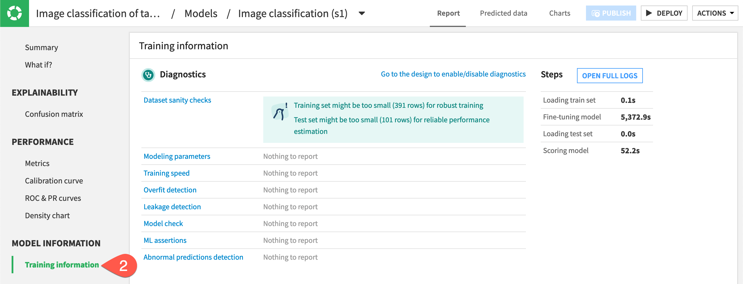
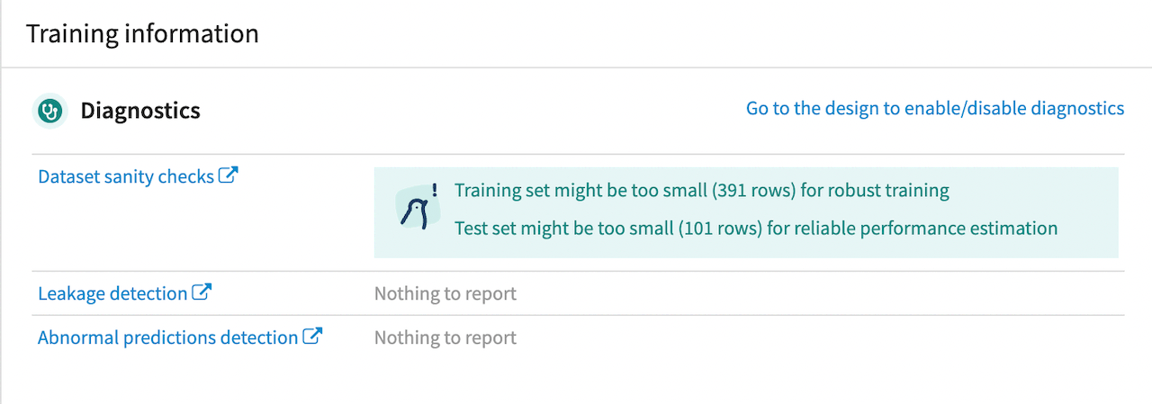
The Diagnostics panel gives some Dataset sanity checks with some potential ways to improve model performance, along with Leakage detection or Abnormal predictions detection, if applicable. In our model, the sanity checks suggest the training and testing sets are too small for robust performance. This was by design so the model would run faster for this tutorial, but in most situations, you would want to provide more images.
Results summary#
To view a more in-depth summary of model performance, navigate to Summary in the left panel. The summary shows our ROC AUC of .876 (your results may vary), which means the model had fairly good performance. The AUC is always between 0 and 1. The closer to 1, the higher the performance of the model.
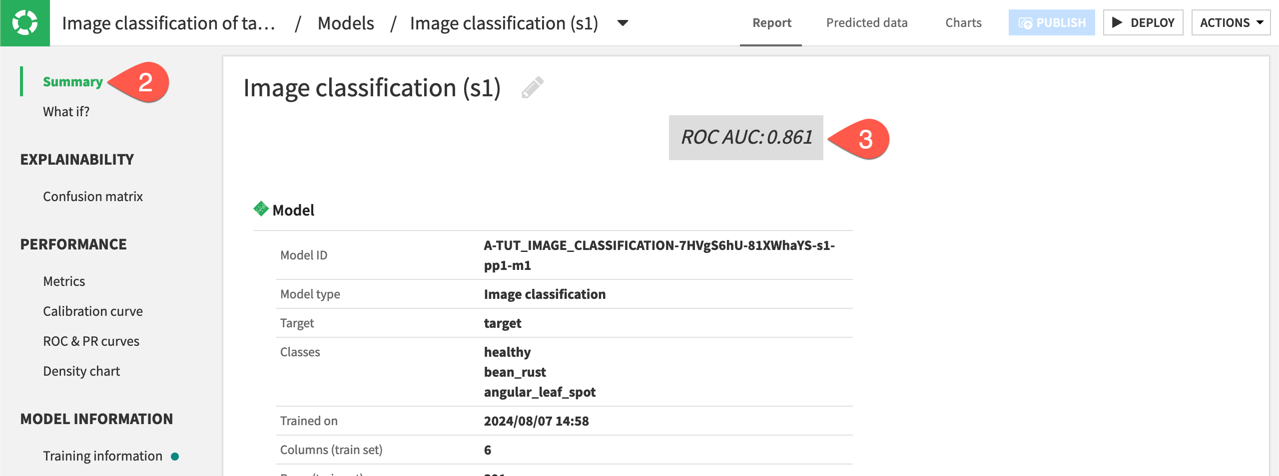
Take a moment to review the information given in the model summary.
What if?#
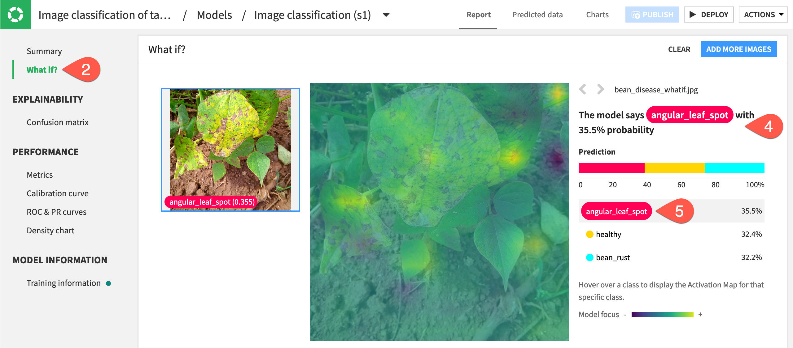
You can upload new images directly into the model to classify them, view the probabilities of each class, and see how the algorithm is making a decision. This information can give you insight into how the algorithm works and potential ways to improve it.
To see how this works, we’ll input a new image our model has not seen before.
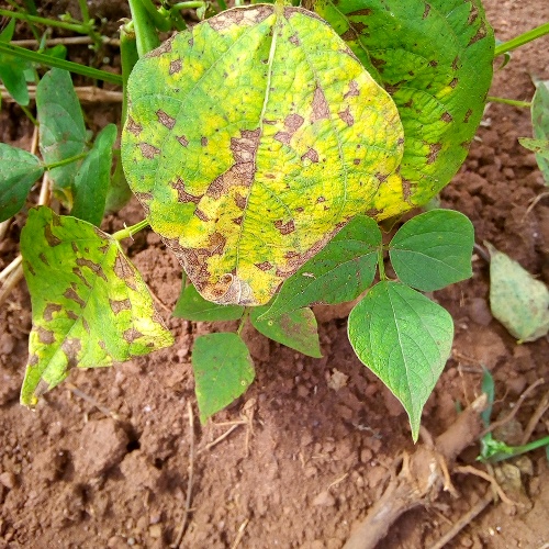
Download the file
*bean_disease_whatif*, which is an image of plants with angular leaf spot.Navigate to What if? on the left panel.
Either drag and drop the new image onto the screen or click Browse for images and find the image to upload.
The model classifies this image as having angular leaf spot disease, which is the correct classification. On the right, we can see the probabilities of each class were fairly close, showing that the model is having perhaps a difficult time distinguishing between classes. One way to fix this would be to add more images of angular leaf spot to help the model recognize that disease.
Hover over each of the classes with your mouse, and a heat map will appear to show which parts of the image the algorithm focused on to create the probabilities that the image falls into any of the three classes.
If the prediction in What if is wrong, you might see that the algorithm is focusing on the wrong parts of an image. You can fine-tune an additional layer of your model or change the data augmentation to make the algorithm more robust, as we’ll explore in the lesson Concept | Optimization of image classification models.
Confusion matrix#
To further check the model’s performance, you can view a confusion matrix showing how many images were correctly and incorrectly classified during training. In the Explainability section of the left panel, choose Confusion matrix.
In the model pictured below, you can see that 27 images with a ground truth of healthy were predicted as healthy, making these correct predictions. However, five images were predicted to have bean rust but were really healthy. Again, your results may vary.
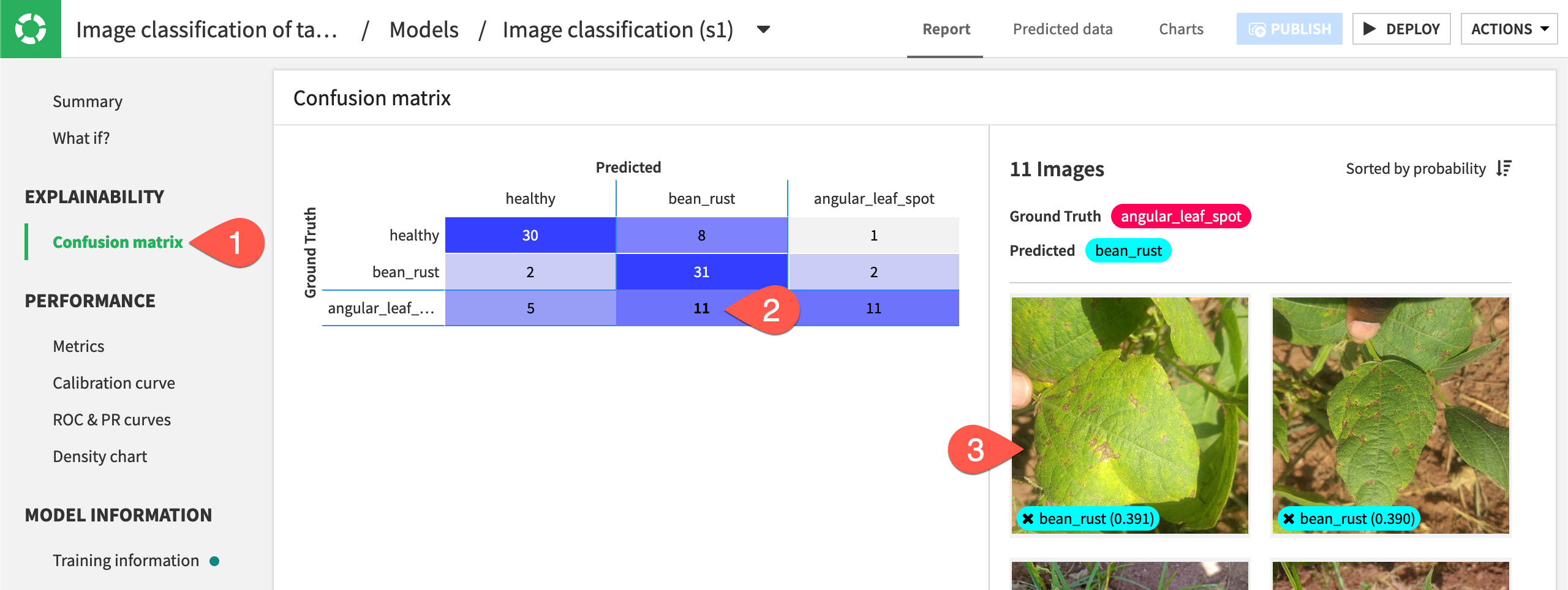
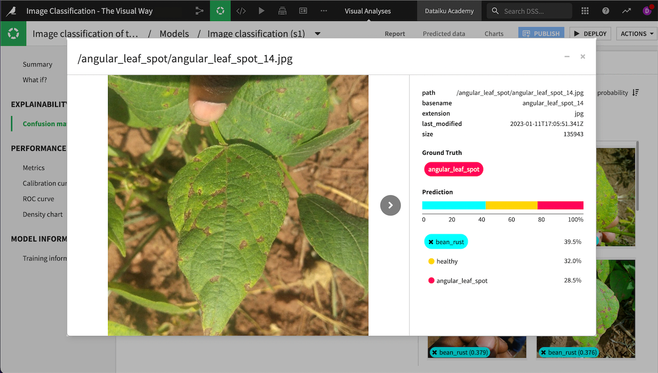
Click on the portion of the matrix with a ground truth of angular_leaf_spot and predicted class of bean_rust (in this example, the 13 in the bottom middle, though your numbers likely will be different). The images will appear on the right.
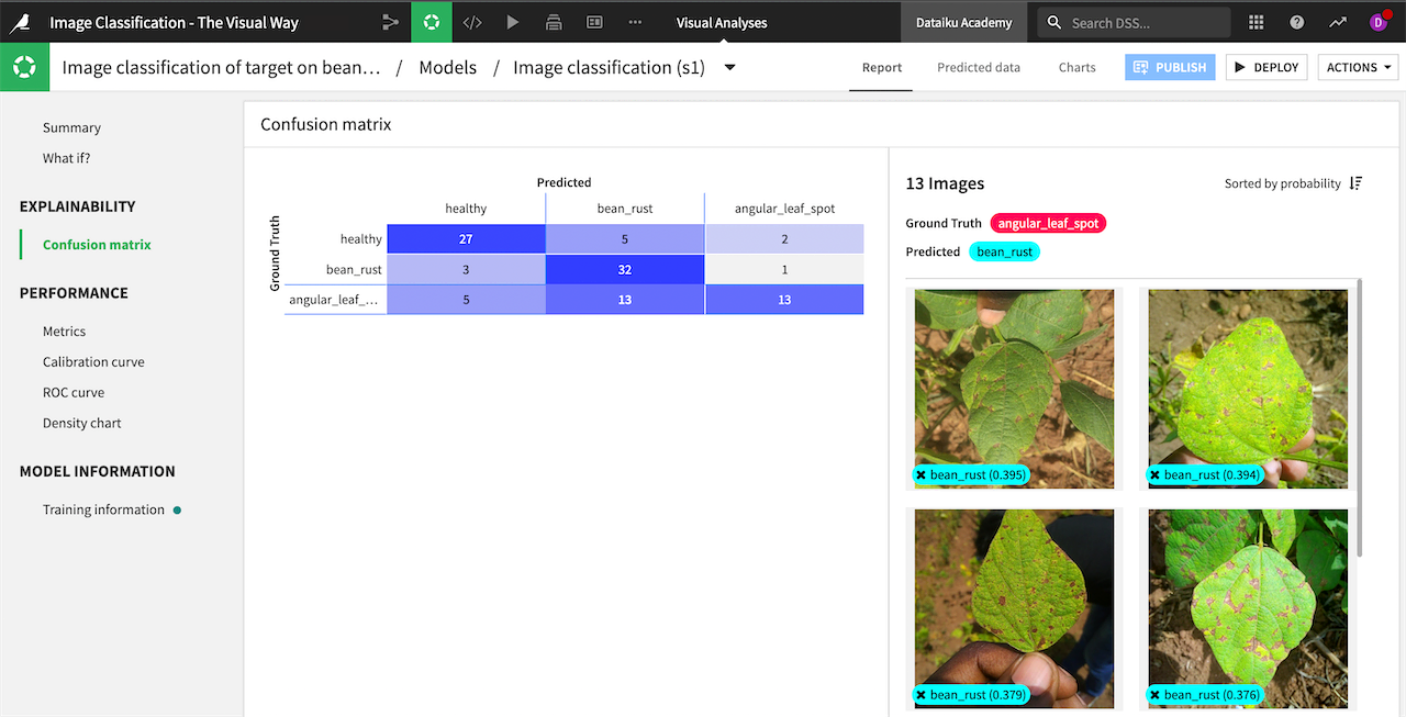
You can click on any image to view its information and use the arrow to browse through all 13 images. Doing so, you can quickly see that images of bean rust and angular leaf spot can be very similar, causing the model to make some incorrect predictions. Adding more images of angular leaf spot might help the model differentiate.
Click on other sections of the confusion matrix to explore images that were correctly or incorrectly classified.
Density chart#
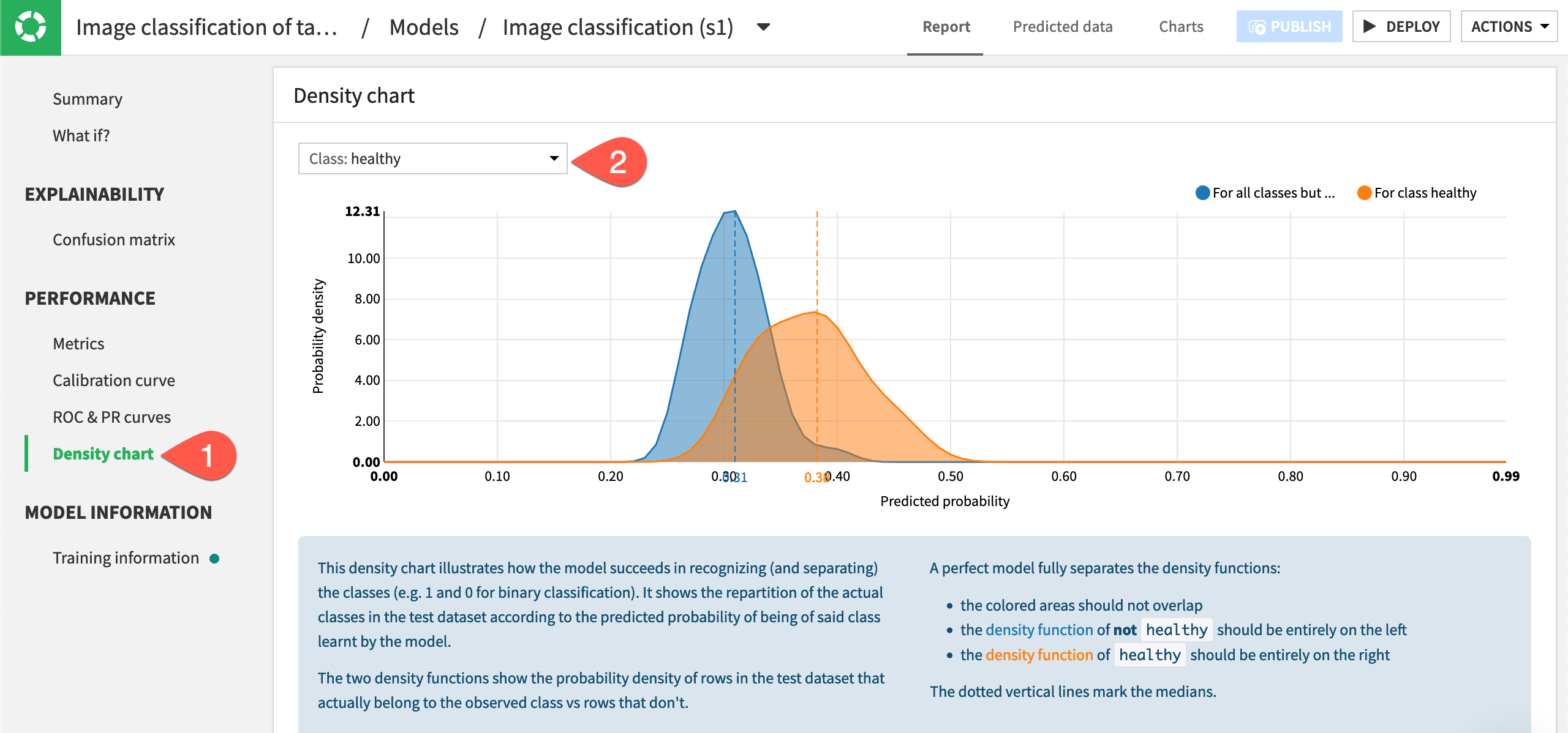
Another useful measure of performance is the density chart, which illustrates how the model succeeds in recognizing the classes.
Under the Performance section, select Density chart.
The two curves on the chart show the probability density of images that belong to the observed class vs. rows that don’t. In the below chart, the blue density function on the left shows the probability that an image was not healthy, and the orange density function on the right shows the probability of healthy. Ideally the two density functions are fully separated, so the farther apart they are, the better a model performed.
View density functions for each class by choosing each class from the dropdown menu in the top left of the chart.
Deploy the model to the Flow#
Now that we have reviewed performance of the model, we can deploy it to the Flow so we can use it to make predictions on new images.
From the model report where we viewed the performance metrics, click on Deploy in the top right corner.
Note
If you close the model before deploying it, it will not appear in the Flow. To find the model, you can click on the training files dataset and go to the Lab, or select the Visual Analyses menu from the top navigation bar.
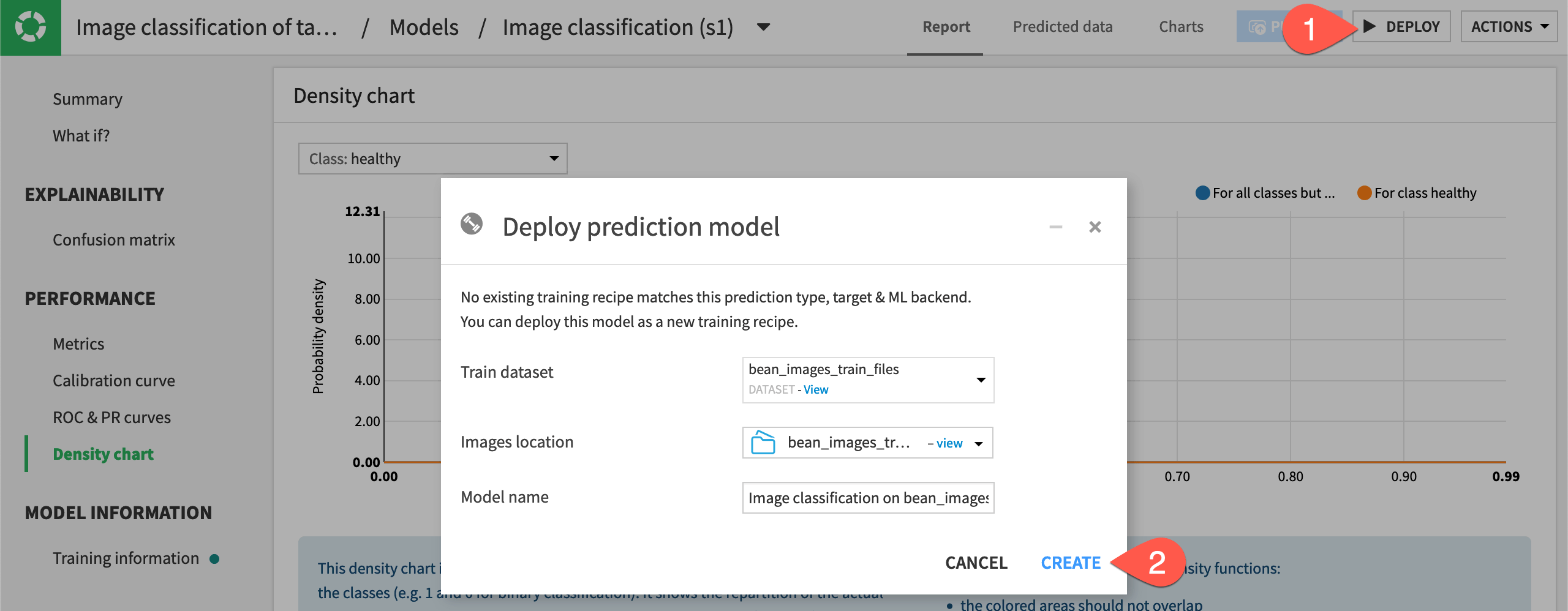
The model training recipe and model now appear in the project Flow.