
Tutorial | Python Bokeh webapps#
In this tutorial, we’ll create a simple Bokeh webapp in Dataiku. It’s a scatter plot on sales data from the fictional Haiku T-shirt company, similar to the data used in the Basics tutorials.
Get started#
Prerequisites#
Some familiarity with Python.
Technical requirements#
An instance of Dataiku - version 8.0 or above (Dataiku Cloud can also be used).
Webapp overview#
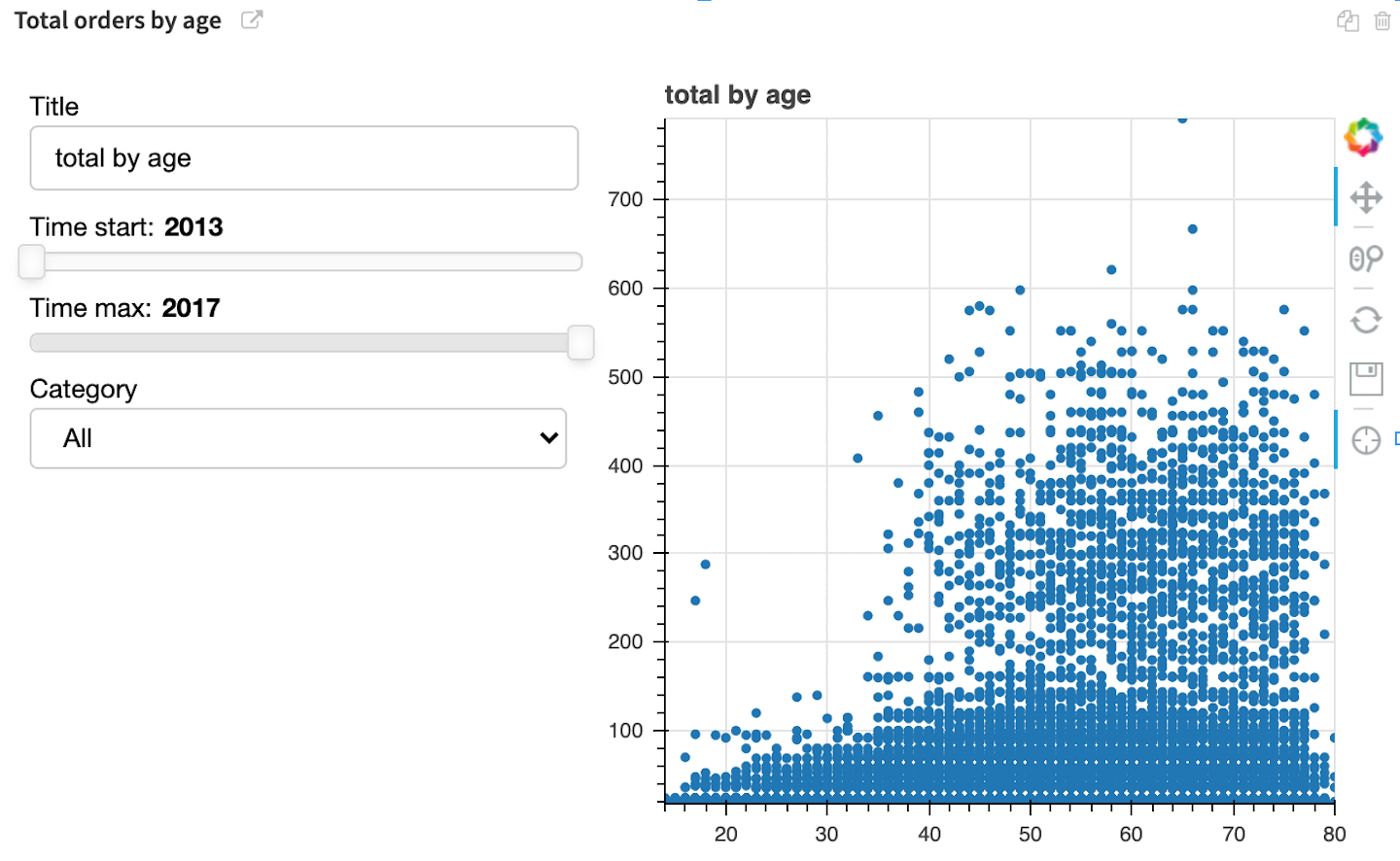
We will create a webapp which displays an interactive scatter plot showing the total number of item orders by customer age. To make it interactive, we will add a dropdown menu to filter on item category, as well as sliders to filter on age.
The finished webapp is shown below.
Create your project#
Create your project by selecting one of these options:
Import a starter project#
From the Dataiku homepage, click +New Project > DSS tutorials > Developer > Visualization.
Note
You can also download the starter project from this website and import it as a zip file.
Continue from the previous tutorial#
If you are following the Academy Visualization course and have already completed the previous tutorial, you can begin this lesson by continuing with the same project you created earlier.
Download and import dataset into new project#
Alternatively, you can download the Orders_enriched_prepared dataset and import it into a new project.
Create a new Bokeh webapp#
To create a new empty Bokeh webapp:
In the top navigation bar, select Webapps from the Code (</>) menu.
Click + New Webapp > Code Webapp > Bokeh > An empty Bokeh app.
Type a simple name for your webapp, such as
bokeh webapp, and click Create.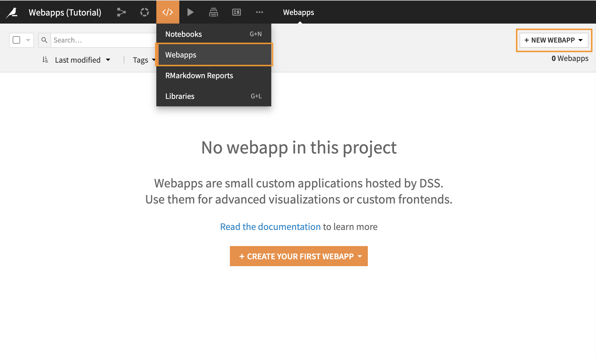
You will land on the View tab of the webapp, which is empty for the moment, as we haven’t started creating the webapp yet.
Navigate to the Settings tab of the webapp.
Explore the webapp editor#
The webapp editor is divided into two panes:
The left pane allows you to see and edit the Python code underlying the webapp.
The right pane gives you several views on the webapp.
The Preview tab allows you to write and test your code in the left pane, while receiving visual feedback in the right pane. At any time you can save or reload your current code by clicking on the Save button or the Preview button.
The Python tab allows you to look at different portions of the code side-by-side in the left and right panes.
The Log is useful for troubleshooting problems.
The Settings tab allows you to set the code environment for this webapp, if you want it to be different from the project default.
Note
In the Settings tab, under Code env, you can see the code environment that the webapp is using. It’s currently set to inherit the project default environment, which in this case is the Dataiku built-in environment.
As the built-in environment already contains the necessary packages for this tutorial, you do not need to change this. However, if you wish to use another code environment for this webapp or for another one, you can change it from the Code env dropdown menu, and then click Save.
Learn more about code environments in Dataiku in this article.
Code the webapp#
Let’s add the code behind the Python Bokeh webapp.
Import packages and set up data#
Go to the Python tab.
Replace the sample import statement with the following ones, so that we’ll have the necessary libraries to create the webapp and parameterize its inputs.
from bokeh.io import curdoc
from bokeh.layouts import row, widgetbox
from bokeh.models import ColumnDataSource
from bokeh.models.widgets import Slider, TextInput, Select
from bokeh.plotting import figure
import dataiku
import pandas as pd

# Parameterize webapp inputs
input_dataset = "Orders_enriched_prepared"
x_column = "age"
y_column = "total"
time_column = "order_date_year"
cat_column = "tshirt_category"
By specifying this information up front, it will be easier for us to generalize the webapp later.
The Dataiku API#
Add the following code to the Python tab to access a Dataiku dataset as a pandas dataframe. Then, we’ll add code which extracts the customer age and total amount spent from the pandas dataframe to define the source data for the visualization as a
ColumnDataSource.# Set up data mydataset = dataiku.Dataset(input_dataset) df = mydataset.get_dataframe() x = df[x_column] y = df[y_column] source = ColumnDataSource(data=dict(x=x, y=y))
Click Save in the upper right corner of the page.
Nothing is displayed yet because we haven’t created the visualization, but there are no errors in the log.
Define the visualization#
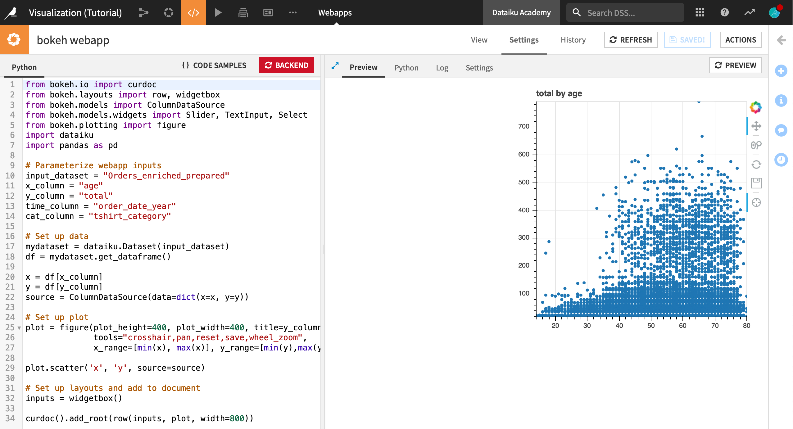
Add the following code to the Python tab to define the output visualization.
# Set up plot
plot = figure(plot_height=400, plot_width=400, title=y_column+" by "+x_column,
            tools="crosshair,pan,reset,save,wheel_zoom",
            x_range=[min(x), max(x)], y_range=[min(y),max(y)])

plot.scatter('x', 'y', source=source)

# Set up layouts and add to document
inputs = widgetbox()

curdoc().add_root(row(inputs, plot, width=800))
This code:
Creates a
plotobject with the desired height and width properties.Defines the title of the plot using the X- and Y-Axis column names.
Configures a set of built-in Bokeh plot tools.
Computes the minimum and maximum values of customer age and total, and uses those to define the axis limits.
Defines the visualization as a scatter plot that plots data from the
sourcedefined above.
The last two lines define the layout of the webapp and adds it to the current “document”. For now, we’ll include an empty widgetbox that we’ll populate in a moment when we add the interactivity.
Click Save.
The preview should now show the current (non-interactive) scatter plot.
Add interactivity#
The current scatter plot includes all orders from 2013-2017, across all types of t-shirts sold. Now, let’s add the ability to select a subset of years, and a specific category of t-shirt. To do this, we need to make changes to the Python code.
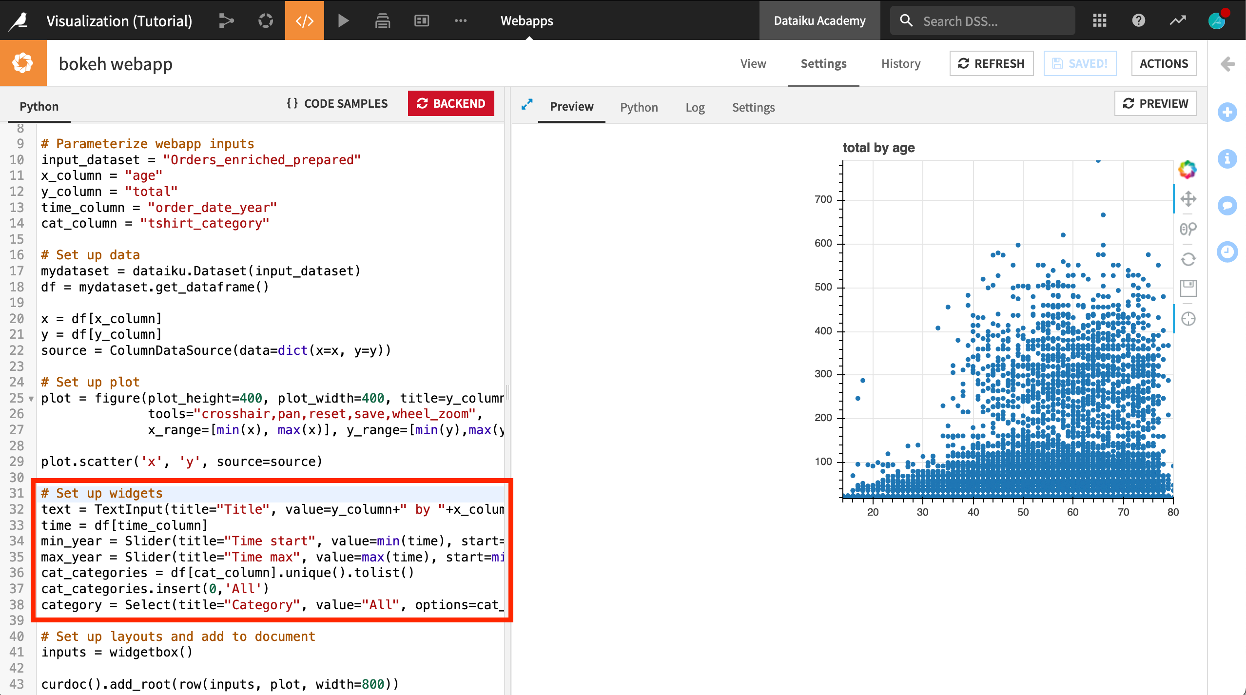
Define widgets#
Warning
The code in this section should be added after the code which sets up the plot, but before the code which defines the layout of the webapp. See the image below for reference.
In the Python tab, after the
# Set up plotblock of code, and before the# Set up layouts and add to documentblock, add the following:
# Set up widgets
text = TextInput(title="Title", value=y_column+" by "+x_column)
time = df[time_column]
min_year = Slider(title="Time start", value=min(time), start=min(time), end=max(time), step=1)
max_year = Slider(title="Time max", value=max(time), start=min(time), end=max(time), step=1)
cat_categories = df[cat_column].unique().tolist()
cat_categories.insert(0,'All')
category = Select(title="Category", value="All", options=cat_categories)
This code defines four widgets:
textaccepts text input to be used as the title of the visualization.min_yearandmax_yearare sliders that take values from 2013 to 2017 in integer steps. Their default values are 2013 and 2017, respectively.categoryis a selection that has an option for each t-shirt category, plus “All”. Its default value is “All”.
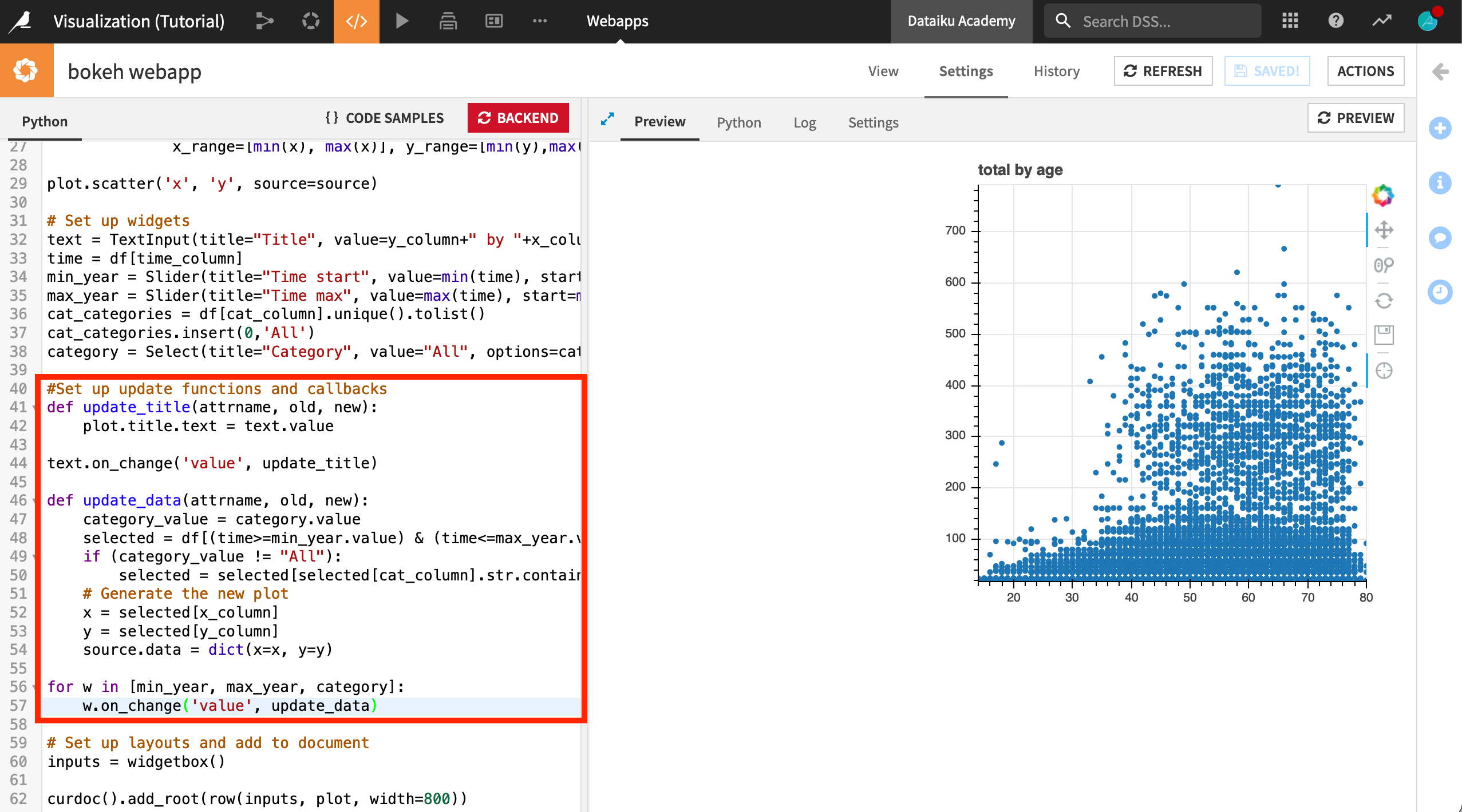
Set up update functions and callbacks#
Next, we’ll add the instructions on how to update the webapp when a user interacts with it.
Directly after the
# Set up widgetscode block, add the following code to the Python tab:#Set up update functions and callbacks def update_title(attrname, old, new): plot.title.text = text.value def update_data(attrname, old, new): category_value = category.value selected = df[(time>=min_year.value) & (time<=max_year.value)] if (category_value != "All"): selected = selected[selected[cat_column].str.contains(category_value)==True] # Generate the new plot x = selected[x_column] y = selected[y_column] source.data = dict(x=x, y=y)
With this code:
When the title text is changed,
update_title()updatesplot.title.textto the new value.When the sliders or the select widget are changed,
update_datatakes the input dataframedfand uses the widget selections to filter the dataframe to only use records with the correct order year and t-shirt category. It then defines the X and Y axes of the scatter plot to be the age and order total from the filtered dataframe.
Next, we’ll add the two following pieces of code that listen for changes to the widget values using the
on_change()method, which calls the functions above to update the webapp.Add the following code as a new line after the
update_title()function and before theupdate_data()function.text.on_change('value', update_title)
Add the following code after the
update_data()function.for w in [min_year, max_year, category]: w.on_change('value', update_data)
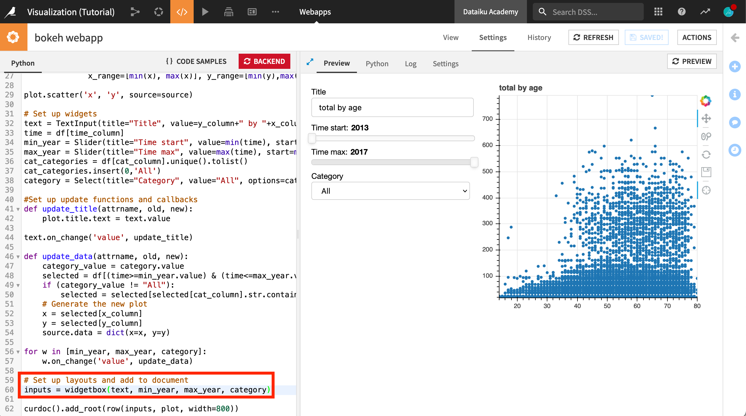
Update inputs#
Finally, change the definition of inputs as follows, to include the four widgets so that they are displayed in the webapp.
Right under the
# Set up layouts and add to documentcomment, replace theinputs = widgetbox()line of code with the following. See the image below for reference.Click Save and Preview.
Click to start the backend if prompted.
inputs = widgetbox(text, min_year, max_year, category)
After you’ve saved your work and refreshed the preview, the Preview tab should now show the interactive scatter plot we just created.
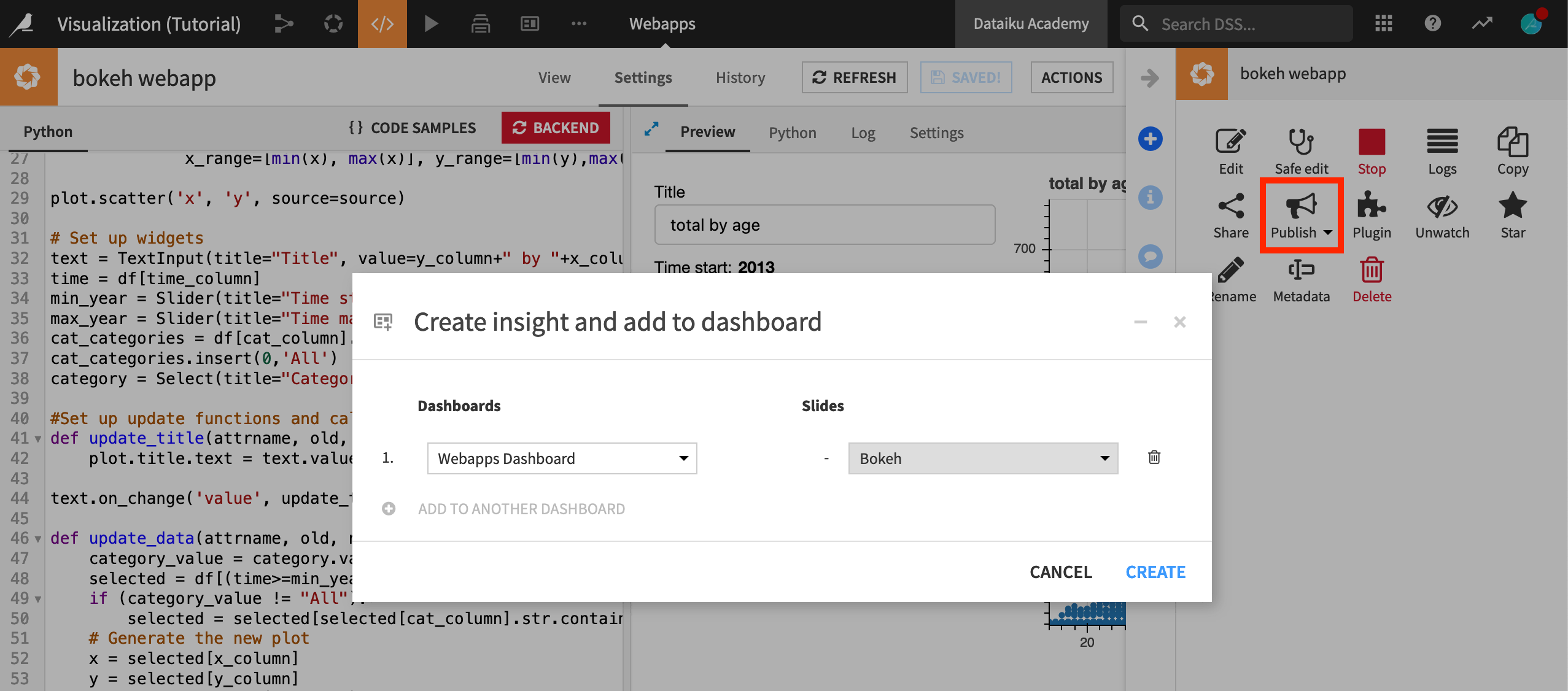
Publish the webapp on a dashboard#
When you are done with editing, you can easily publish your webapp on a dashboard.
Click Actions in the top-right corner of the screen.
From the Actions menu, click Publish.
Select the dashboard and page you wish to publish your webapp on. (The default is fine).
Click Create.
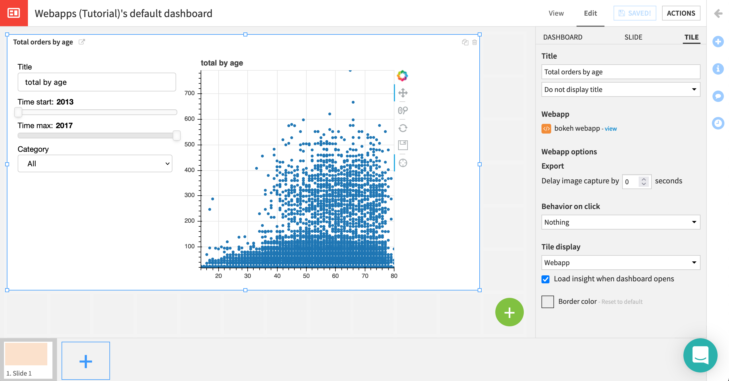
You are navigated to the Edit tab of the dashboard.
From the Edit tab, drag and resize your webapp, or change its title and display options from the Tile sidebar menu.
Click Save when you’re done.
Click View to see how your webapp is displayed on the dashboard.
Note
You can learn more about dashboard concepts in the reference documentation.
What’s next?#
Using Dataiku, you have created an interactive Bokeh webapp and published it to a dashboard.
To go further, you can:
See the Bokeh gallery (external) for further inspiration on what is possible in Bokeh webapps.
See the reference documentation for further details on using Bokeh in Dataiku.