
Tutorial | Custom aggregation for charts#
Get started#
In this tutorial, you’ll get hands-on practice setting a custom aggregation directly from the Charts tab of a dataset. Concretely, let’s say we’re a company selling t-shirts and we want to get the total price for each category of t-shirts.
Objectives#
In this tutorial, you will:
Set a custom aggregation function as a new variable using the Charts tab instead of a Prepare recipe.
Prerequisites#
To complete this tutorial, you’ll need:
Dataiku 12.0 or later.
Create the project#
From the Dataiku Design homepage, click + New Project.
Select Learning projects.
Search for and select Custom Aggregation for Charts.
If needed, change the folder into which the project will be installed, and click Create.
From the project homepage, click Go to Flow (or type
g+f).
Note
You can also download the starter project from this website and import it as a ZIP file.
Create a custom aggregation#
Custom aggregations in the Charts tab allow you to apply a personal function on data to create a new variable and display or manipulate it with other columns.
In this section, let’s create a column based on the t-shirt price and quantity to get the total price.
From the Flow, double-click on the orders dataset to open it.
Go to the Charts tab and click the + Chart button at the bottom of the page to create a new chart.
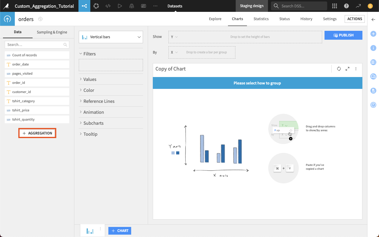
In the Data tab in the left panel of the chart, click on +Aggregation.
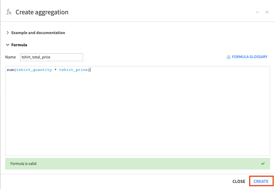
Enter
tshirt_total_pricein the Name field and thesum(tshirt_quantity * tshirt_price)function in the editor.Warning
The formula must be valid to create the aggregation. To ensure you set a valid formula, Dataiku provides:
A Formula glossary on the top right to offer some help on all formulas available.
Autocompletion in the editor.
Click Create to confirm.
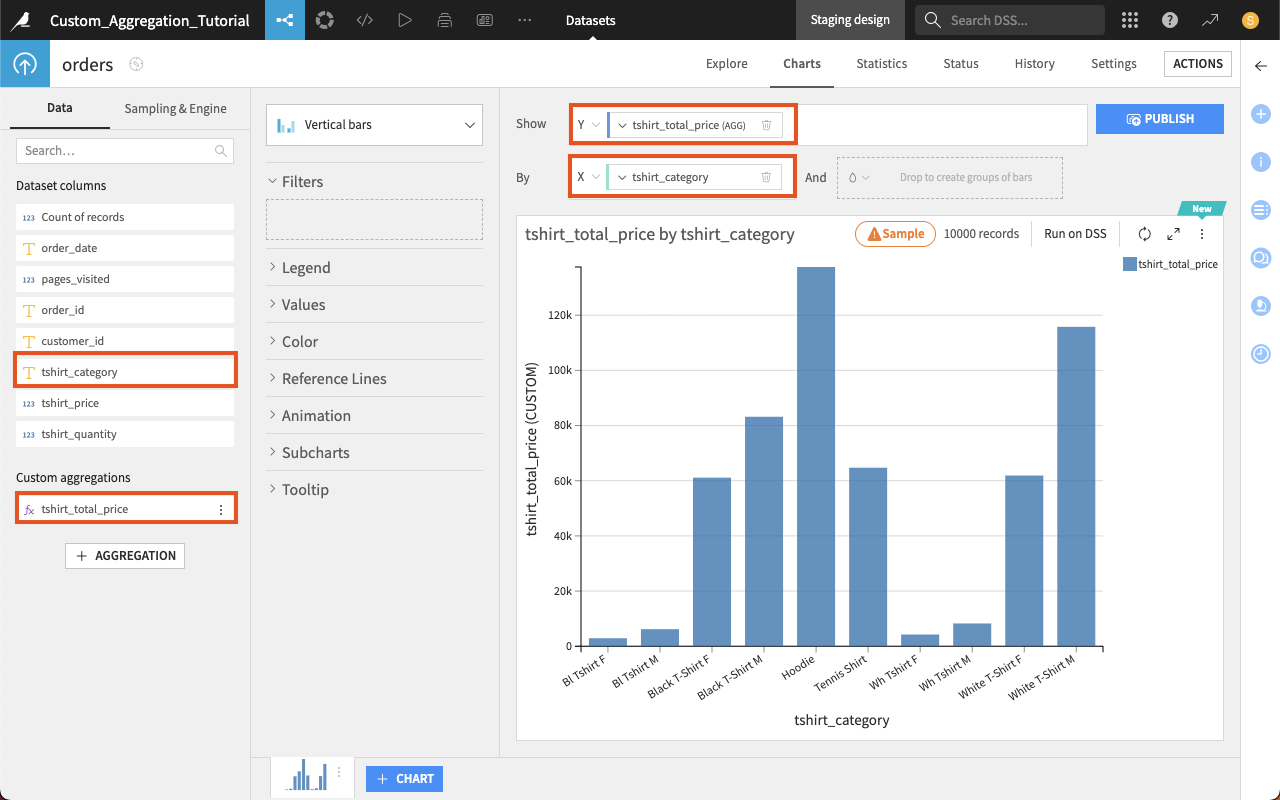
From the Data tab in the left panel, under Dataset columns, drag the tshirt_category column in the X (By) field to display the chart.
Still from the Data tab in the left panel, under Custom Aggregation, drag the aggregated tshirt_total_price column to the Y (Show) field.
Tip
Whenever you create a custom aggregation, you can edit, duplicate, or delete it. To do so, click the More options button to the right of the aggregation name (tshirt_total_price column) in the Data tab in the left panel.
Note
The created custom aggregation column works like any other column. You can use it with filtering, formatting and any other available option you would use.
Next steps#
Congratulations!
You’ve just created your first custom aggregation to add a new variable to your data. You can now enrich your data visualization directly from the Charts tab.
Improve your data visualization skills with the Academy course on Webapps in Dataiku.