
FAQ | How do I display non-aggregated metrics in charts?#
Some types of data visualizations plot raw (or non-aggregated) values, while other visualizations calculate some kind of aggregation. A scatter plot, for example, plots raw values, while a histogram plots bin counts.
The type of chart determines whether displaying raw values is possible.
Native charts#
The drag-and-drop interface for creating charts in Dataiku has five native chart types:
Basics
Pivot tables
Scatters
Maps (geographic)
Others (such as boxplot or 2D distribution)
Dataiku natively supports using non-aggregated values in scatter plots. For creating other types of charts, it’s possible to plot non-aggregated values when grouping by a dimension with unique values. This is often most useful when the data is already in a summarized format.
In cases where the grouping variable doesn’t have unique values, be sure to select the correct aggregation through the interface. For example, should Dataiku sum the values? Take an average? Or plot the minimum or maximum value in the group?
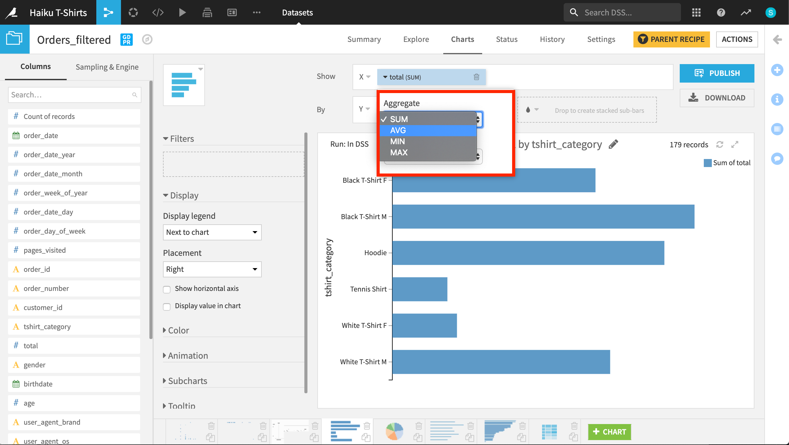
If total is the amount spent in dollars, should Dataiku plot the sum or average for each type of t-shirt category?#