
Tutorial | Dashboard management#
Dashboards are key tools for visualizing data. Let’s explore how to use and manage these native tools in Dataiku!
Get started#
Objectives#
In this tutorial, you will:
Edit an insight within your dashboard.
Filter the dashboard.
Share a filtered dashboard.
Export it as a PDF.
Prerequisites#
To complete this tutorial, you’ll need the following:
Dataiku 14.0 or later.
A minimum of Dataiku 12.4 and 12.5 to enable cross filter’s Include and Exclude feature, respectively.
Create the project#
From the Dataiku Design homepage, click + New Project.
Select Learning projects.
Search for and select Dashboard Management.
If needed, change the folder into which the project will be installed, and click Create.
From the project homepage, click Go to Flow (or type
g+f).
Note
You can also download the starter project from this website and import it as a ZIP file.
Use case summary#
Let’s say you work for a financial company that uses some credit card data to detect fraudulent transactions.
The project comes with several datasets, the main one being tx_prepared, which is a clean join of the three source datasets (tx, cards and merchants).
In short, tx_prepared contains comprehensive information about:
Credit card transactions (from tx), including the associated merchant details (from merchants).
Credit card specifics (from cards), such as transaction status and amount, merchant location and category, and cardholder creditworthiness.
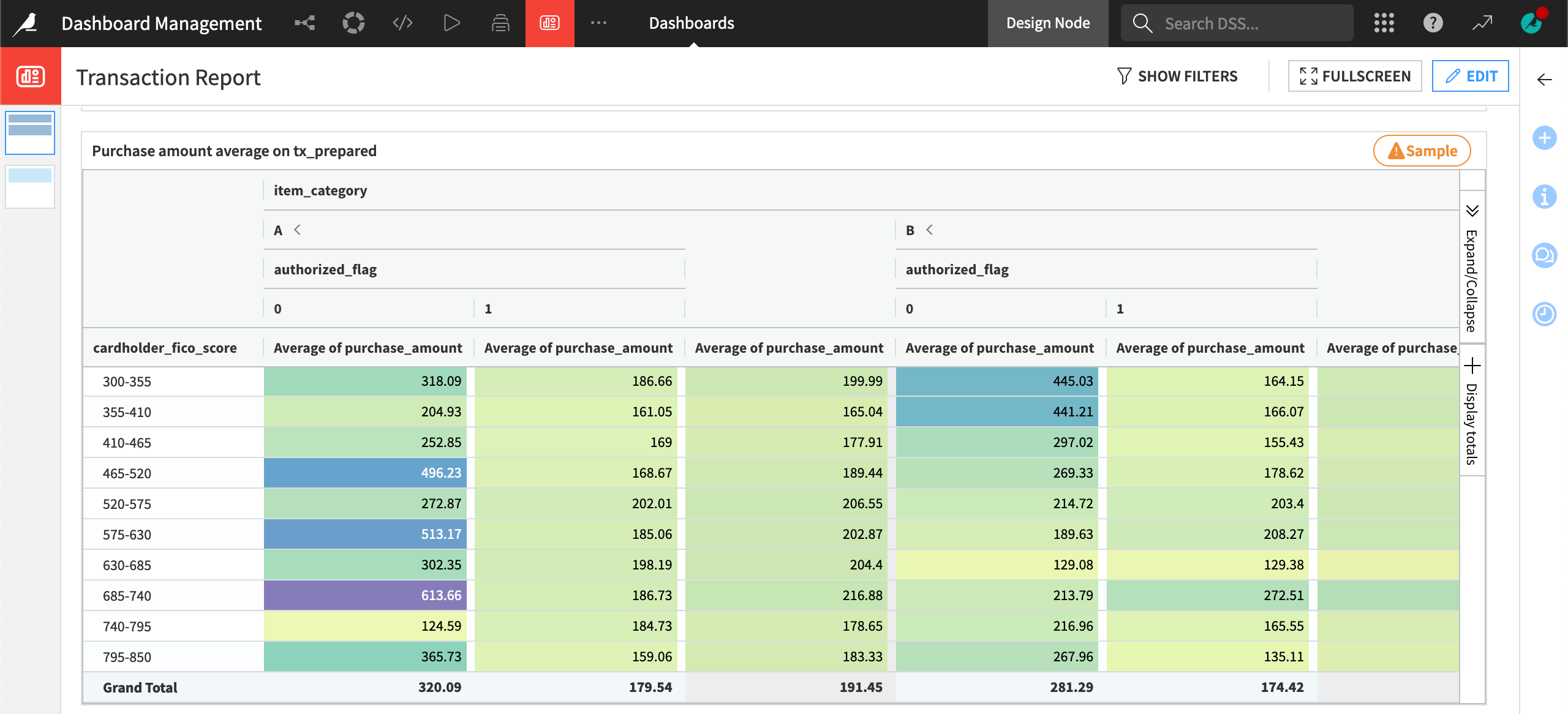
Edit the insight#
Let’s edit the pivot table insight added to the Transaction Report dashboard.
From the top navigation bar, go to the Dashboards (
 ) menu (or press
 g+p), and open the Transaction Report dashboard.Click the Open insight external link icon next to Purchase amount average on tx_prepared to open the insight. (Hover over the title to make the icon appear.)
From the top-right corner, click on Edit.
On the left panel, in the Format tab:
Under Display, change Display measures as from
Rowsto Columns.Under Color, set the Palette type to Diverging.
Note
Starting from Dataiku 14.0, you can customize the overall appearance of dashboards by applying a theme. This tutorial uses the default DSS Default theme. Learn more in the Visualization themes documentation.
Click Save.
On the top-right, click on Back to dashboard to see the modified pivot table. It reopens the dashboard in view mode.
Tip
If you return to the tx_prepared dataset and find the pivot table used to create the insight, this pivot table won’t have these changes. Insights and charts are independent objects. You can learn more about chart insights in the reference documentation.
Filter the dashboard#
You often need to provide the end user of a dashboard with the ability to interact with the insights on display. You can add data filters to an individual insight on its Edit tab, just like you would for a chart.
However, it also can be useful to have a filter that operates at the level of an entire dashboard page. This way, multiple insights on the same dashboard page can be subject to the same data filters.
Add filters#
Let’s demonstrate how the filter panel works at the dashboard page level.
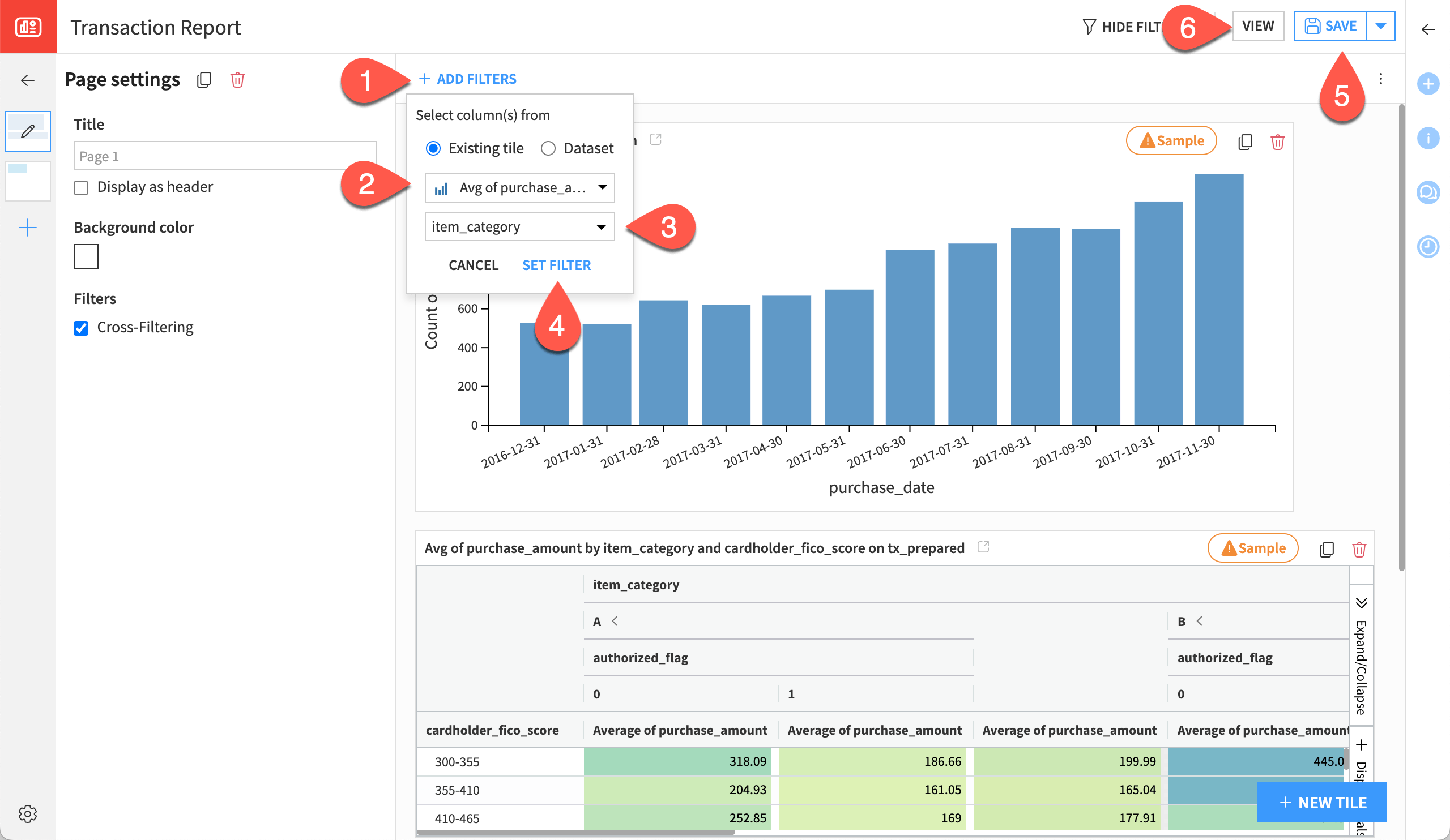
Click the Edit button to enter the edit mode.
Click the blue + Add Filters button to add a new filter.
Note
Users of Dataiku before 12.6 can use a filter tile by clicking the + New Tile button at the bottom right of the dashboard in Edit mode and selecting Filters.
Choose Existing tile, and then select the Purchase amount average on tx_prepared tile (that is, the chart insight for the pivot table).
Note
As the filter added to the dashboard refers to a dataset, you could also have chosen Dataset instead of Existing tile.
Choose item_category as the column to use for the filter.
Click Set Filter.
Click Save.
Click on View to see the results. As you can see from the filter at the top of the dashboard, all item categories are selected by default.
Use the cross filters#
Let’s say while presenting the dashboard in View mode, a stakeholder questions you on a specific date or category of the data. The cross filters feature allows for dynamically filtering tiles in view mode by clicking on the existing tiles of the dashboard.
In this example, assume you’re interested in transactions with no signature provided, during the peak in December 2017, and only the items of the categories A, B, and C.
Note
From the Edit mode, in the Page settings panel on the left, you can verify that cross filtering is enabled.
In the View mode, on the Transaction table insight on Page 2, navigate to the signature_provided column.
Right-click on a cell including a
1, and select Include only 1.Still on the Transaction table, navigate now to the item_category column.
Right-click on a cell including a
D, and select Exclude D.Back to Page 1, on the Number of transactions by month bar chart tile, right-click on the tallest bar and select Include only purchase_date - 12/2017.
Navigate back to the Edit mode.
You can notice that the cross filters set in view mode are temporary. Leaving the View mode or the dashboard page will discard the filters set as they should remain dynamic for a presentation purpose. You can also use the filters in View mode.
Use filters in View mode#
Let’s see the filter panel in action!
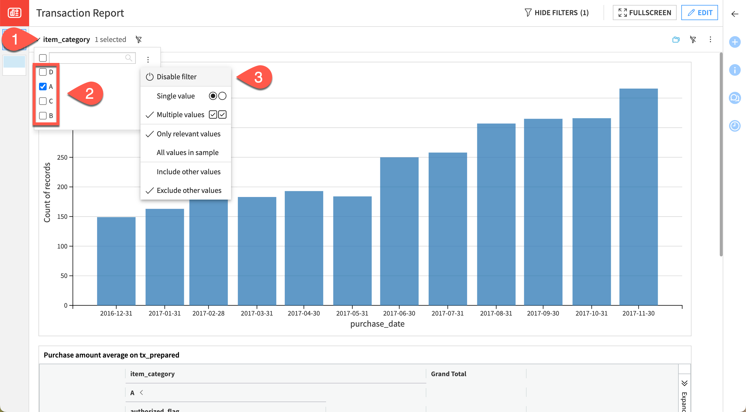
In View mode, in the filter panel on top, click on the dropdown of the filter item_category.
Deselect categories B, C, and D. Just like when applying a cross filter, the insight tiles are dynamically updated.
From the More options menu of the item_category filter, select Disable filter to deactivate the filter, and see how the data has returned to the insights.
Change the default selections in the filter tile#
To change the default selections for the filter tile, you must use the Edit mode.
From the Edit mode, select the item_category filter.
Check only the box for category A, and click Save.
Navigate back to the View mode to see that the default filter has changed, but the user can still make new selections.
Share a filtered dashboard via the URL#
Once you have filtered your dashboard, you can share the filtered view with other users by generating a URL containing all filter parameters. You can then share this URL with others.
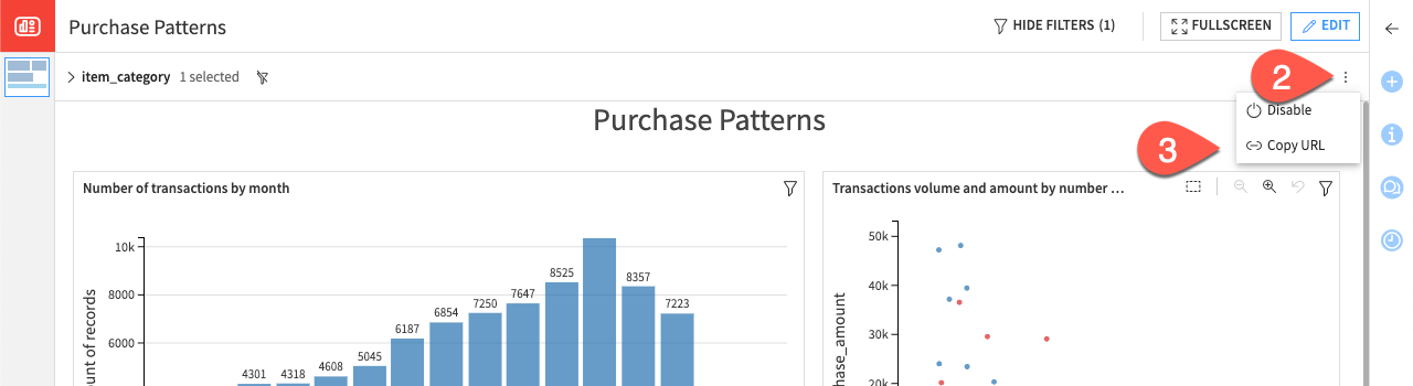
Still in view mode, click on the More options button in the filter panel.
Click the Copy URL button in the header. This action automatically computes the URL with the relevant filter parameters and copies it to your clipboard.
Note
The syntax of the generated URL is as follows:
${DASHBOARD_ID}_{DASHBOARD_NAME}/view/${VIEW_ID}?${FILTER_QUERY}
The filter parameters change based on the filtering options you select in the filter tile header (Include other values or Exclude other values). For further information on the generated URL, see the documentation on Filters query parameter syntax.
Export a filtered dashboard as a PDF#
You can also export a dashboard as a PDF with the filter parameters active in View mode. You can do this via the Dataiku interface or via the REST API.
Export using the Dataiku interface#
Warning
Users on a self-managed instance will need to have an administrator first enable the graphics export feature.
Still in View mode, in the right panel, select the Actions tab, and then Export.
Keep the default settings, and click Export Dashboard.
Dataiku will download the PDF to your file system and include the dashboard view with your selected filters.
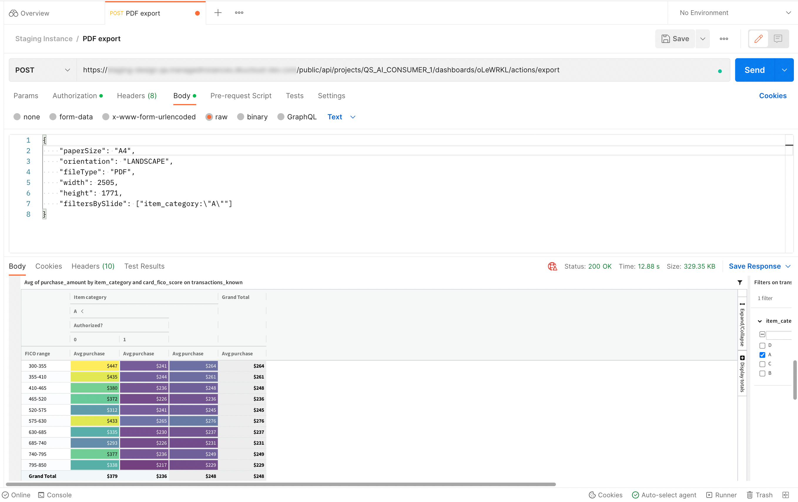
Export using the REST API#
You can also use the REST API to export the dashboard using the export endpoint.
In such case, the syntax of the POST URL is:
https://DSS_HOST:DSS_PORT/public/api/projects/{PROJECT_KEY}/dashboards/{DASHBOARD_KEY}/actions/export
Note
In the POST URL, {DASHBOARD_KEY} is the key of the dashboard, not the page.
If the dashboard URL is:
https://DSS_HOST:DSS_PORT/projects/TUT_DASHBOARDS/dashboards/sGBR0Zx_Transaction%20Report/view/vTYPOCI
The POST URL should be:
https://DSS_HOST:DSS_PORT/public/api/projects/TUT_DASHBOARDS/dashboards/sGBR0Zx/actions/export
The body of your request should look like this:
{
  "paperSize": "A4",
  "orientation": "LANDSCAPE",
  "fileType": "PDF",
  "width": 2505,
  "height": 1771,
  "filtersBySlide": ["item_category:\"A\""]
}
Next steps#
Congratulations! You’ve managed, edited, and filtered a dashboard that’s ready for sharing with stakeholders.
The next step might be publishing the dashboard on a workspace.
See also
See the reference documentation to learn more about dashboards, including insights.