
Quick Start | Alteryx to Dataiku#
Get started#
If you have experience working in a data analytics platform such as Alteryx, the prospect of migrating to a cloud-native platform like Dataiku may be exciting. At the same time, it might also be somewhat daunting.
With that transition in mind, let’s take a quick tour of a Dataiku project to introduce the main conceptual differences that will help you make the leap!
Objectives#
In this quick start, you’ll:
Review a completed Dataiku project from the perspective of a user with an Alteryx background.
Use this experience to understand the high-level differences between working as an analyst in Alteryx vs. Dataiku.
Prerequisites#
For this tutorial, you won’t actually need a Dataiku account of your own. All you need is internet access and a supported web browser (Google Chrome, Mozilla Firefox, or Microsoft Edge).
View the project#
In Alteryx, you would start by creating a new workflow. In Dataiku, you start with a new project.
Before you begin creating your own Dataiku projects, study a completed one from the gallery. The Dataiku gallery is a public read-only Dataiku instance. Accordingly, it has some limitations compared to a normal instance, but it has most of what you need to get started.
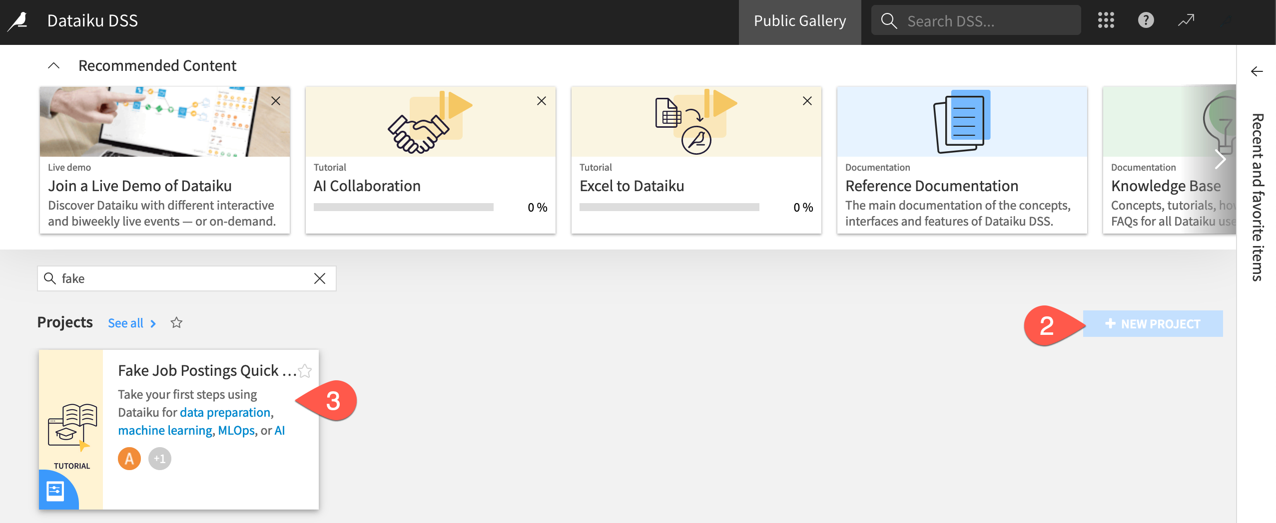
Visit the Dataiku gallery: https://gallery.dataiku.com/
Find the deactivated + New Project button, where you would normally get started.
On the left, filter for Fake Job Postings Quick Start, and select the project. Alternatively, directly visit: https://gallery.dataiku.com/projects/QS_JOB_POSTINGS/flow/
See also
This project starts with a dataset of real and fake job postings, applies some basic data preparation steps, and eventually trains a model to classify real from fake job postings. You’ll have a chance to build it from scratch in the Data Preparation Quick Start!
Data pipelines in Dataiku vs. Alteryx#
Data lineage#
The Flow in Dataiku is similar to a workflow in Alteryx in some ways:
Both an Alteryx workflow and a Dataiku Flow begin with input data sources on the left.
While preserving the input data, both platforms provide a visual way to understand the lineage of data transformations, before producing a final output on the right.
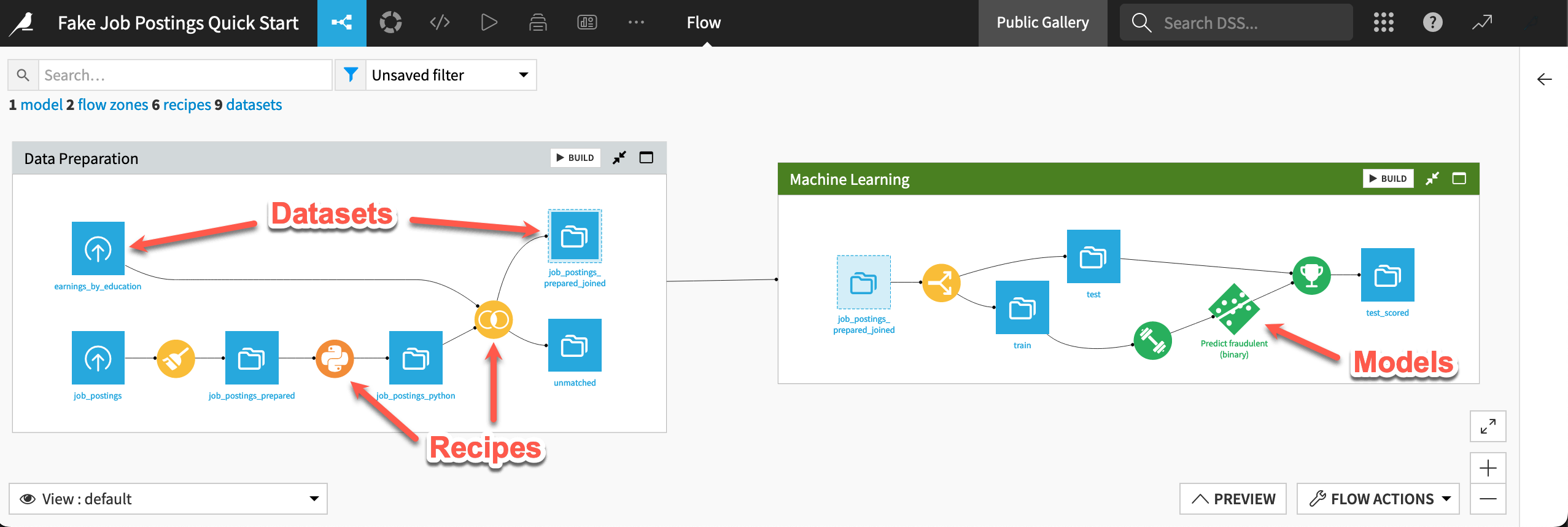
However, Dataiku introduces its own visual grammar:
Shape |
Item |
Icon |
|---|---|---|

|
Dataset |
The icon on the square represents the dataset’s storage location, such as Amazon S3, Snowflake, PostgreSQL, etc. |

|
Recipe |
The icon on the circle represents the type of data transformation, such as a broom for a Prepare recipe or coiled snakes for a Python recipe. |

|
Model or Agent |
The icon on a diamond represents the type of modeling task (such as prediction, clustering, time series forecasting, etc.) or the type of agent (such as visual or code). |
Tip
In addition to shape, color has meaning too.
Datasets and folders are blue. Those shared from other projects are black.
Visual recipes are yellow.
Code elements are orange.
Machine learning elements are green.
Generative AI and agent elements are pink.
Plugins are often red.
Take a high-level look at this project’s Flow!
Use the keyboard shortcut
g+fto go to the project’s Flow.Recognize how a square dataset like job_postings_prepared_joined is both at the end of one Flow zone (Data Preparation) and the start of another zone (Machine Learning).
Recognize how the color of a circle indicates the type of recipe (visual, code, ML, or GenAI).
Recognize how the diamonds represent an ML (green) and an LLM (pink) model.
See also
The Flow presents a dataset-level view of data lineage. One way to find a column-level view of data lineage is select a dataset, navigate to the Schema (![]() ) tab in the right panel, and click the data lineage (
) tab in the right panel, and click the data lineage (![]() ) icon.
) icon.
Pipeline navigation#
A new software platform brings its own way of navigation. While you can always click around to inspect the Flow, it can also be helpful to start learning some keyboard shortcuts.
Use one shortcut to preview the data in the Flow.
From the Flow, type
?to bring up the menu of keyboard shortcuts. Close that window when finished.Type
Shift+Pto bring up the dataset preview window. (Or click Preview near the bottom right).Click once on the job_postings dataset at the start of the pipeline to preview its first 50 rows.
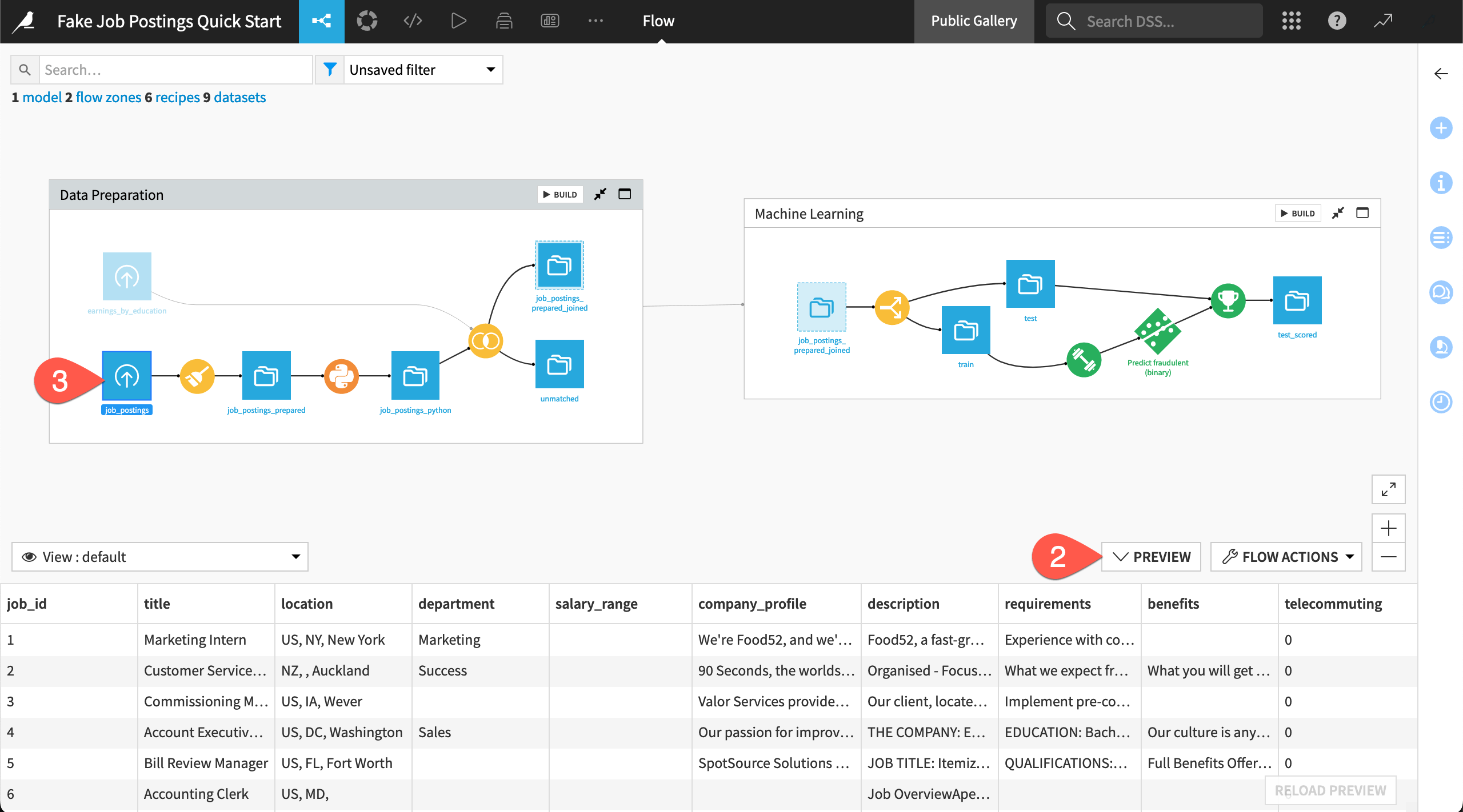
Click on other downstream datasets to preview them as well.
When finished, minimize the Preview menu (or
Shift+Pagain).
Pipeline organization#
In Alteryx, you would drag objects onto a canvas to create a personal pipeline. Dataiku, on the other hand, automatically determines the location of objects in the Flow.
While this can be a challenging mindset shift, it frees you from the obligation of organizing the pipeline yourself. As pipelines become long, this can become a major burden. Moreover, since you’ll be building these Flows alongside colleagues, having a standardized presentation is helpful.
In Alteryx, you would use the Tool Container to organize tools in a workflow. In Dataiku, you can organize a Flow by dividing it into separate Flow zones. By default, the position of Flow zones, and the objects inside them, is automatically set. However, on a normal instance, you’ll find a number of options for customizing the organization of Flow zones within the Flow display section of the project settings menu. These options include the ability to manually position zones.
This project has three zones (Data Preparation, Machine Learning, and GenAI & Agents) for the main stages of the project, built in their respective quick starts.
Click the full screen (
 ) icon on the Data Preparation Flow zone to focus on that part of the project.
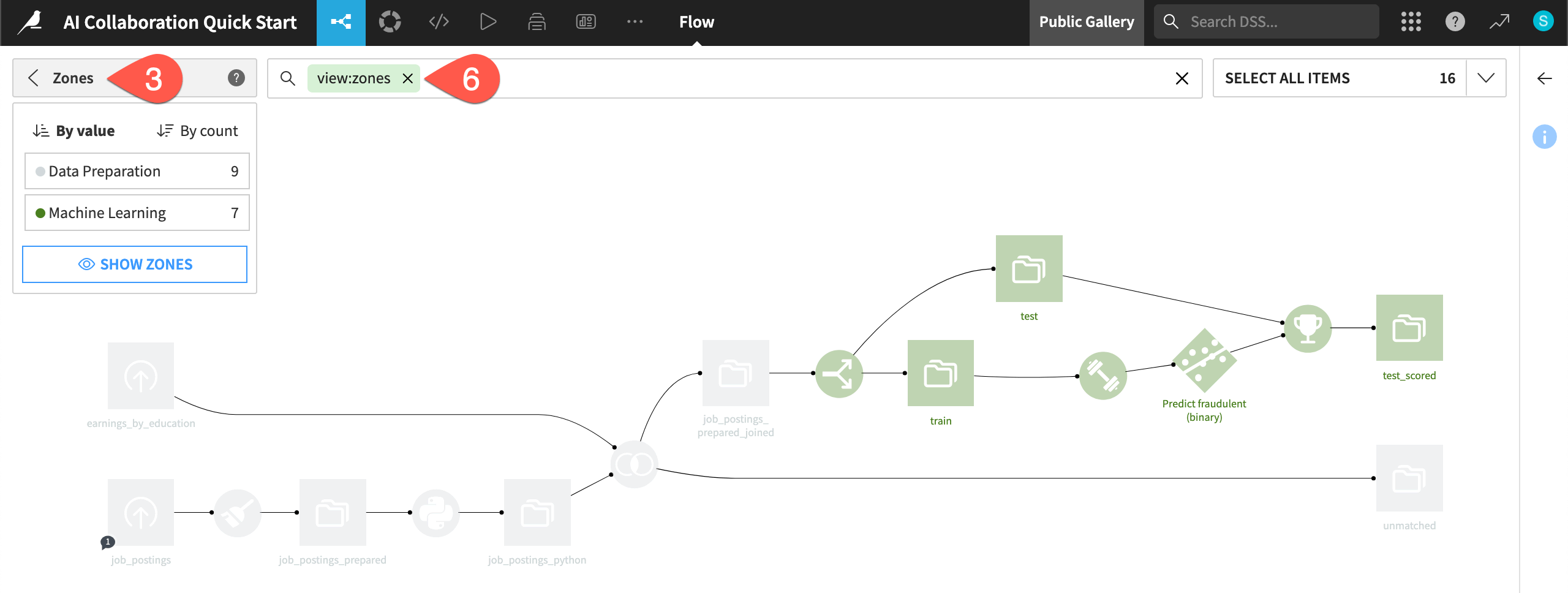
Click the X in the top right corner to go back to the main Flow (or
g+f).Open the Apply a View menu.
Select Zones to see the Flow color-coded by zone.
Click Hide Zones to see the entire undivided Flow.
When finished, clear the search bar to return to the default view.
Tip
Another helpful strategy can be hiding parts of a Flow. For example, right-click on a dataset, and select Hide all upstream or Hide all downstream to customize the Flow as you need it.
Dataset details#
One of the most frequent tasks for an analyst is tracking basic details or metadata about a particular dataset. In Dataiku, this comes built-in to every dataset.
Two methods help demonstrate this point.
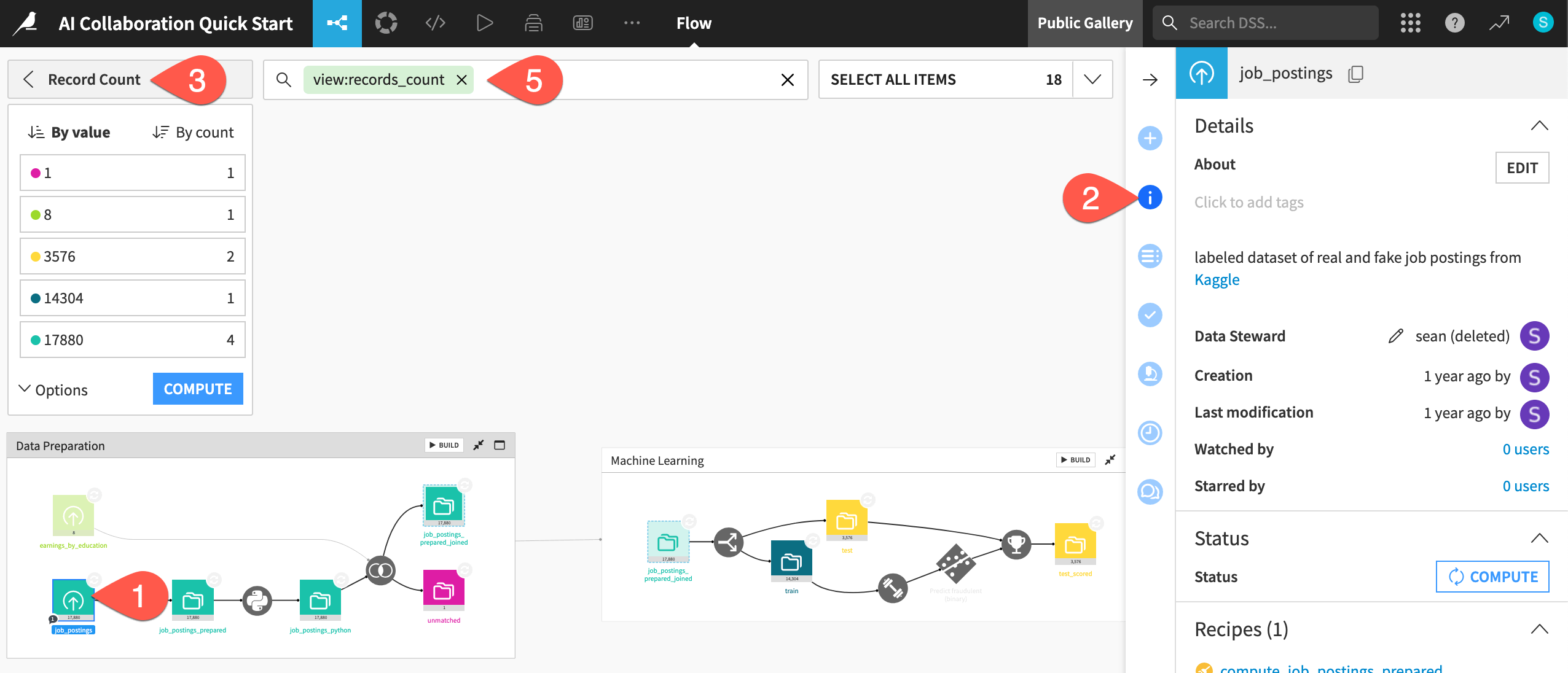
From the Flow, click once to select the job_postings dataset.
In the right side panel, click the Details (
 ) icon to see associated metadata such as a description, tags, and status.
Open the Apply a View menu, and select Record Count.
Observe the color-coded record count of each dataset.
When finished, clear the search bar to return to the default view.
Exploratory data analysis (EDA) in Dataiku vs. Alteryx#
Dataset sampling#
When you run a workflow using standard tools, Alteryx reads all connected datasets into memory. To get around this fact, you may have set a record limit to cap the size of a data stream and then removed it when needing the full results.
Dataiku, on the other hand, builds sampling into all datasets in the Flow. By default, the Explore tab displays the first 10,000 rows of a dataset. This can be surprising to new users. However, it’s necessary during the design phase of a project where you may be working with large datasets as opposed to smaller datasets stored locally on your computer.
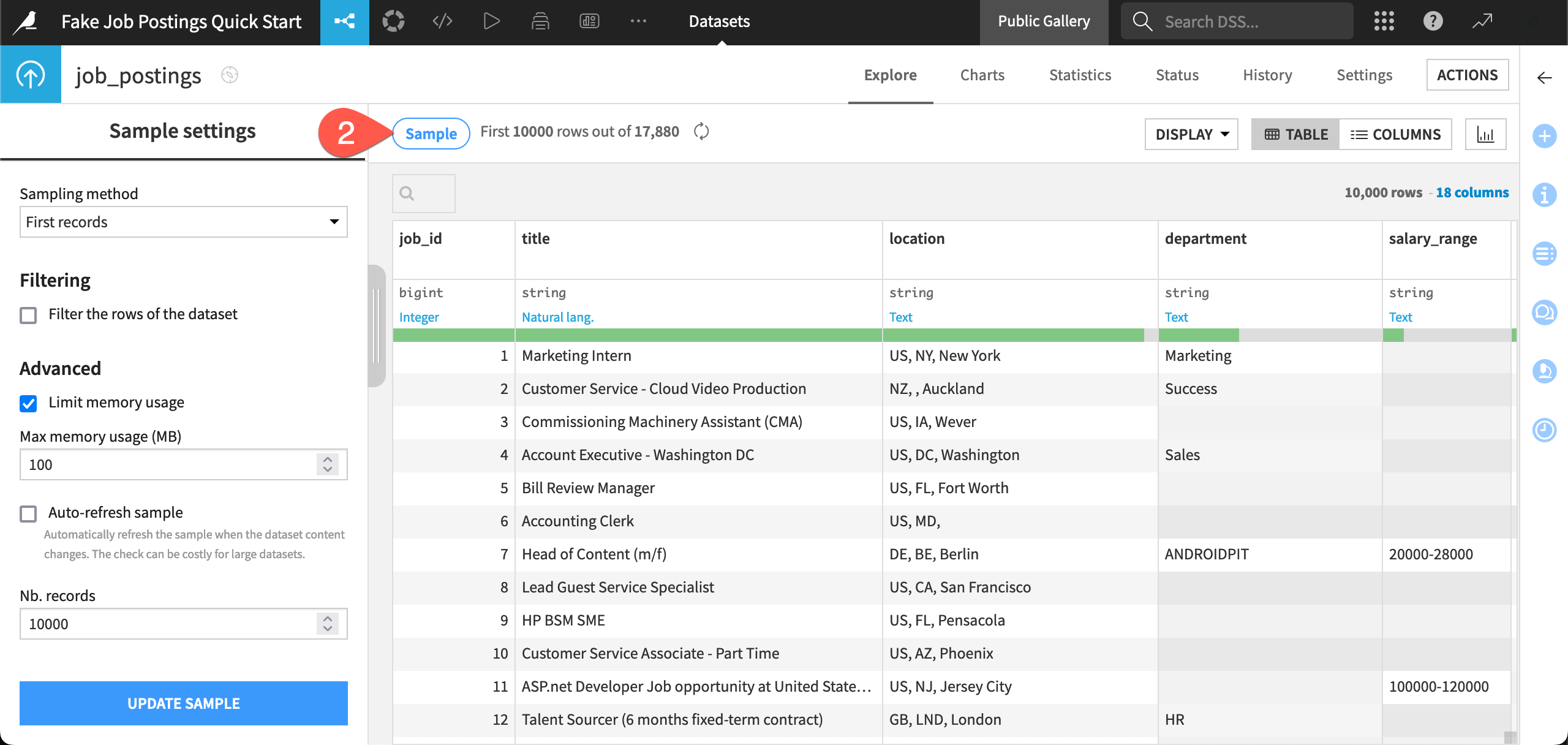
Double click on the job_postings dataset at the start of the pipeline to open its Explore tab.
Click the Sample button to check the current sample settings.
Use the Sampling method dropdown to view other available methods.
When finished, close it by clicking the Sample button once more.
See also
If rather than big data, your reality is wrangling small datasets, such as Excel worksheets, be sure to also check out the Excel to Dataiku Quick Start.
Dataset profiling#
To understand the contents of a dataset in Alteryx, you may have added the Browse tool after each tool. As before, you can access this kind of information in Dataiku from all datasets by default. This means less work cleaning up extraneous investigations that distract from the pipeline’s core activities.
Important
Remember that all such metrics are only computed based on the current sample (unless otherwise requested). In this case, that means the first 10,000 rows instead of the full 17,880. Sampling keeps things snappy!
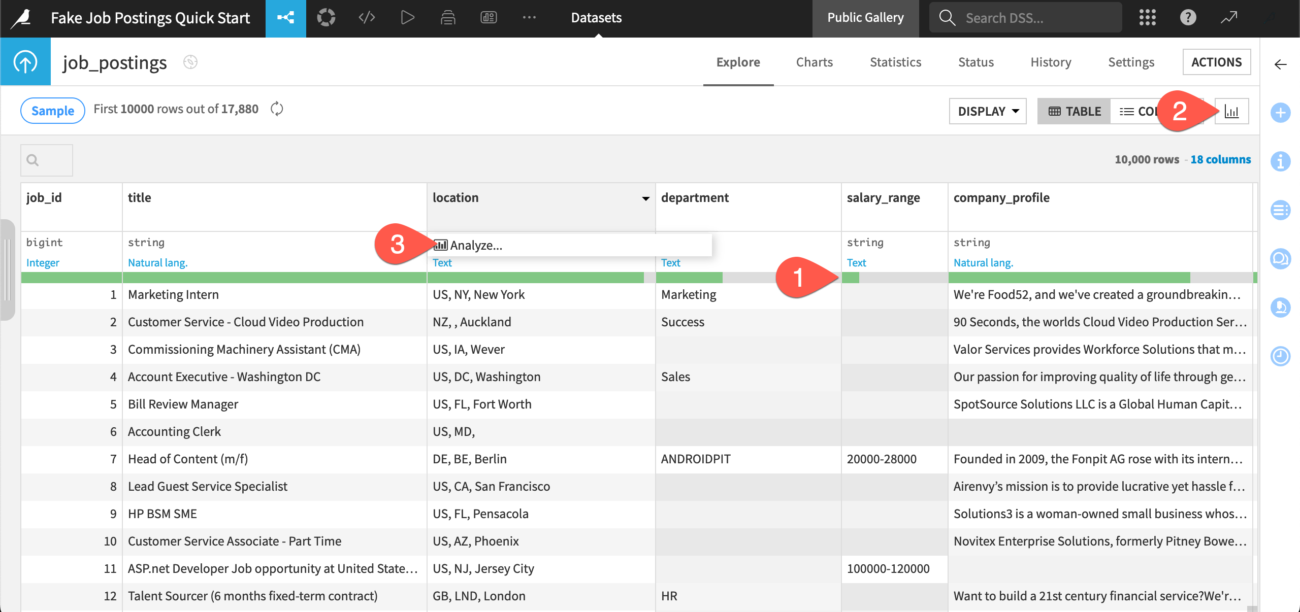
Underneath the name of each column in the job_postings dataset, see the data quality bar representing the percentage of missing values in each column (according to the current sample). Several columns, such as salary_range have a lot of missing values.
Click the Quick column stats (
 ) icon to view distributions for every column.
Click the header on a column such as location, and select Analyze from the dropdown menu (which has fewer options than normal because this is a read-only instance).
Use the arrow (
 ) to scroll through statistics of other columns, and then close the dialog when finished.
Tip
Rather than adding Interactive Chart or Data Investigation tools on an ad-hoc basis, Dataiku builds this need into every dataset. Navigate to the Charts tab (g + v) to create drag and drop style visualizations. You’ll find examples for the job_postings dataset.
Data preparation in Dataiku vs. Alteryx#
Dataset actions#
To build a data pipeline in Alteryx, you would drag tools from the tool palette onto the canvas. To do the same in Dataiku, you apply recipes to datasets through the Actions tab of the right panel.
Navigate back to the Flow (
g+f). If needed, typeShift+ZRto reset the zoom.Click once to select any dataset (a blue square), such as job_postings_prepared.
Click the Actions (
 ) icon to see what actions you can apply to the selected dataset.
In particular, see the (inactive) menu of Visual recipes.
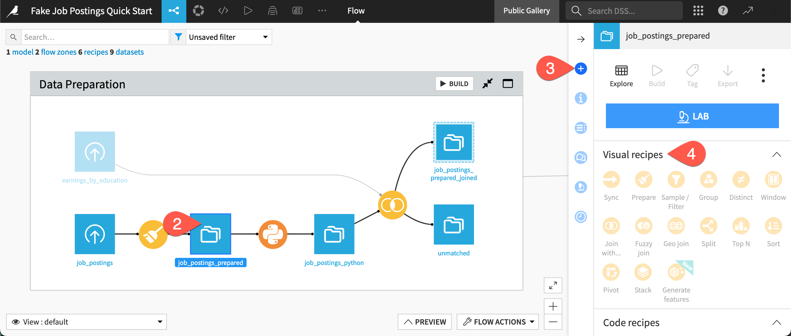
Tip
The available actions in the right panel change depending on what you currently have selected. To demonstrate this, select two datasets at the same time, or one dataset and one recipe together.
Tool library#
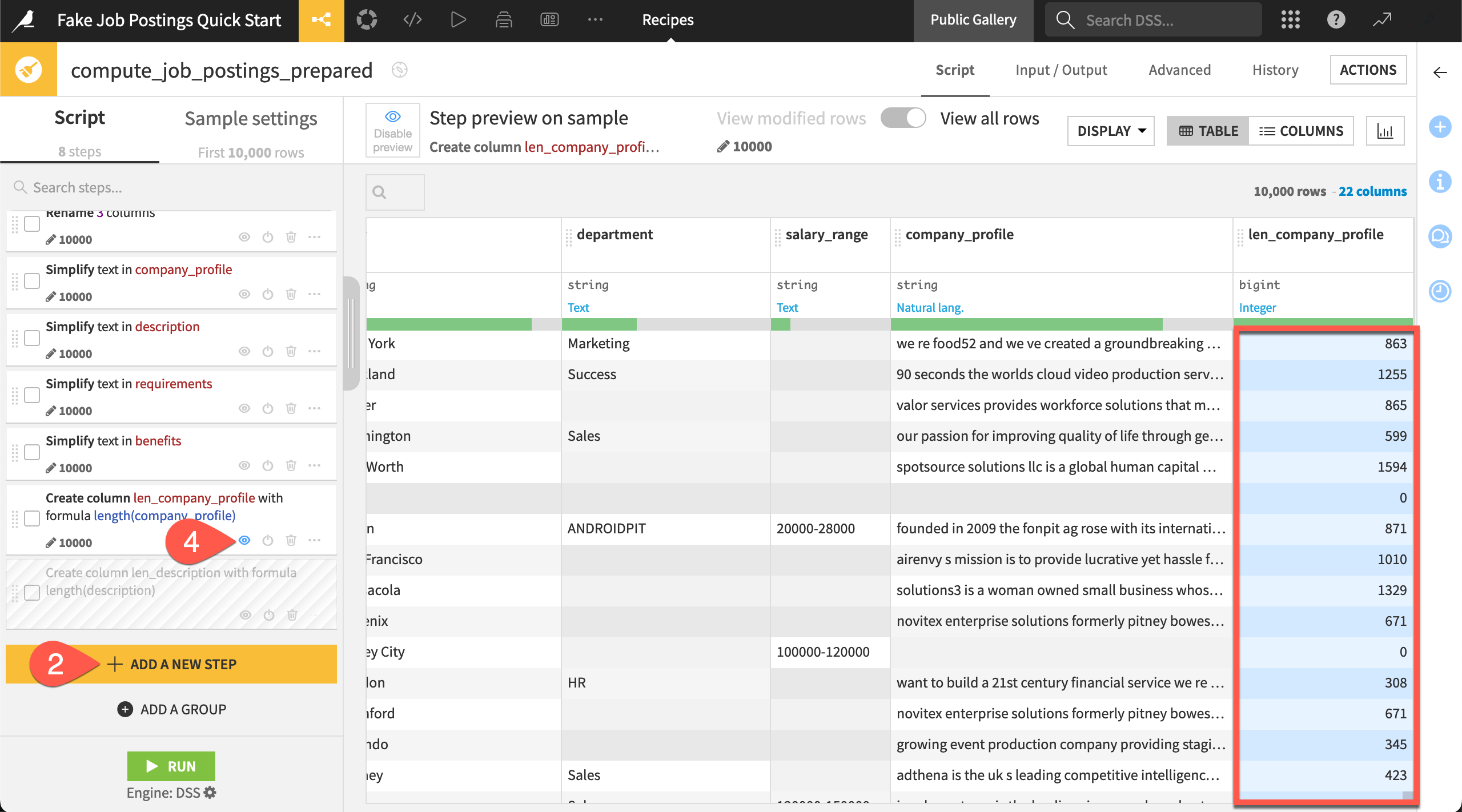
Compared to Alteryx, it may initially seem that Dataiku has fewer visual data preparation helpers. This is because the Prepare recipe is your Swiss army knife. This one visual recipe contains approximately 100 processors that cover functionality you’d find in Alteryx tools like Select, Formula, Transpose, and many more.
The Prepare recipe found in this project, for example, has eight processor steps in its script. Having all these actions completed in one recipe keeps the overall data pipeline more readable.
From the Flow, double click to open the Prepare recipe (
 ).
).Scroll to the end of the script, and click + Add a New Step to open the processor library.
Browse the available steps. You can even add some! The Geography section may be particularly interesting if you work with geospatial data. Close the library when finished.
Experiment toggling the eye (
 ) and power (
 ) icons to view the impact of a step or to disable a step.
Tip
The last two steps in the Prepare recipe feature Dataiku formulas. Formulas use a spreadsheet-like expression language for performing row-by-row calculations, manipulating strings, and more. You might look to the Window recipe for grouped aggregations like cumulative sums and moving averages. However, formulas also support relative referencing. This can be helpful for the kind of offset calculations available in Alteryx’s multi-row formula tool.
Joining datasets#
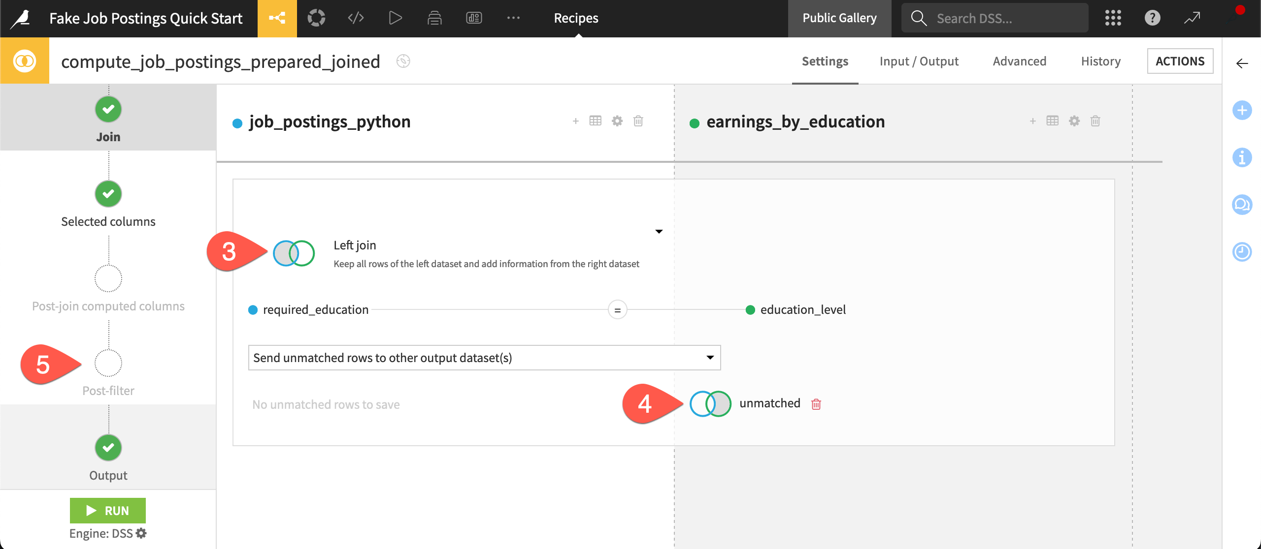
In addition to the Prepare recipe, Dataiku offers many other visual recipes for common data transformations. For example, in Alteryx, you would typically use the Join tool to combine datasets based on a common field. In Dataiku, you use a Join recipe.
Take a closer look at the Join recipe in this project. To get there, instead of going back to the Flow, let’s demonstrate another navigation method.
From inside the Prepare recipe, click the navigator (
 ) icon (or type
 Shift+A).Press the right arrow key until you reach the downstream Join recipe (
 ). Then press the
 Enter/Returnkey to open it.Click on Left join to view the available types of joins.
Recognize how the recipe sent unmatched rows from the join operation to the unmatched dataset.
Browse the recipe’s steps on the left, such as the Post-filter. Although not used here, many visual recipes include steps to filter data or compute new columns before or after the recipe’s primary operation.
See also
Later, you can enroll in the Visual Recipes course in the Dataiku Academy to dive into the complete menu of visual recipes!
Data processing in Dataiku vs. Alteryx#
Dataiku’s built-in sampling is a great advantage when it comes to working interactively in the design phase of a project. Of course, you’ll also need to execute recipes to compute the full outputs.
Computation engines#
In addition to its own engine for local processing, Alteryx has a limited number of in-database tools that enable a workflow to run in-database. Dataiku’s computational environment is different.
As a cloud-native platform, you connect to Dataiku through a remote server. While also being more secure from IT’s perspective, this enables you to access much more powerful computing resources, which can speed up processing times for large jobs.
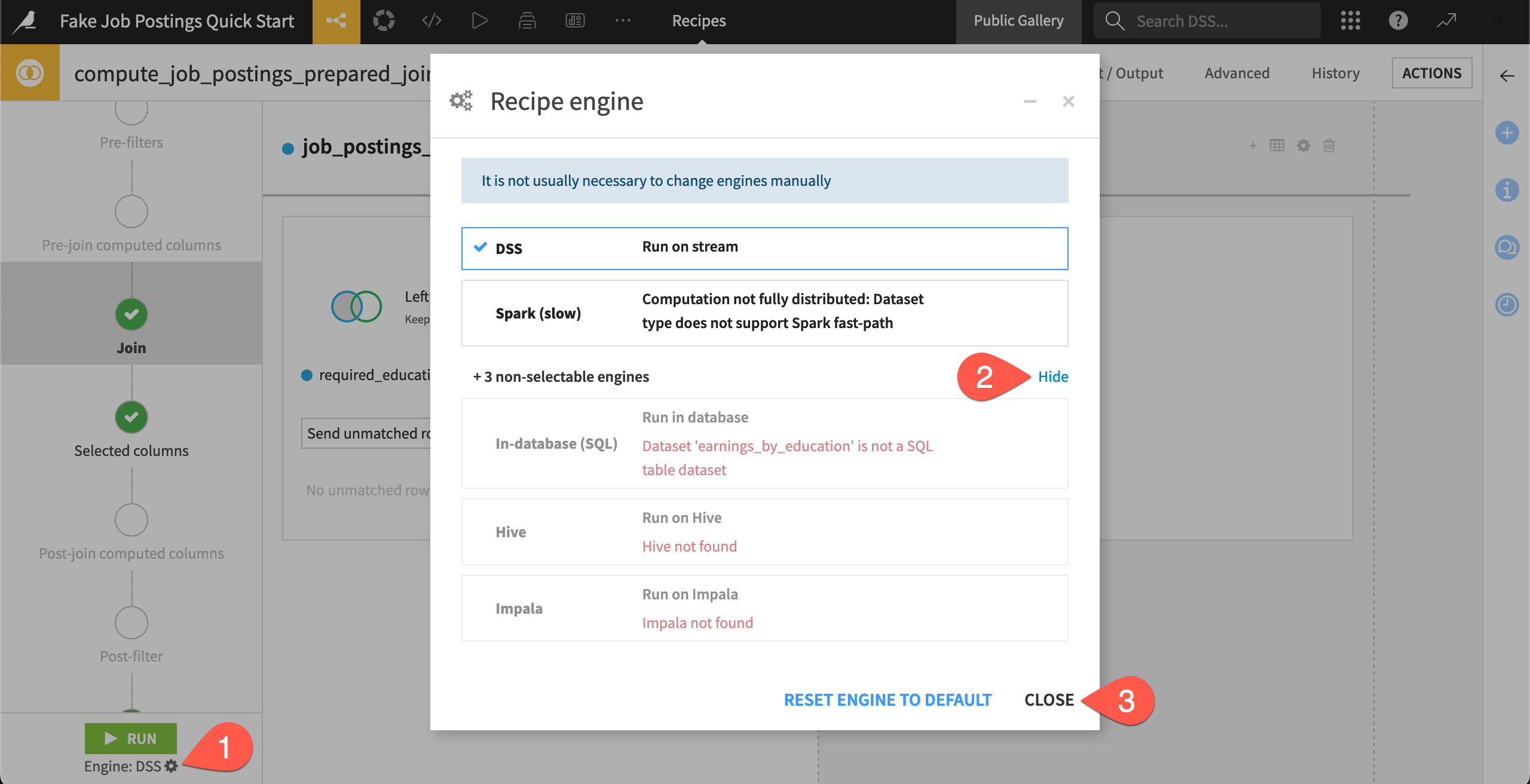
Despite all this impressive technology underneath, as a user building a pipeline, you won’t need to worry about selecting a computation engine. Dataiku selects the most optimal engine for your recipe based on the dataset’s storage location, the type of processing at hand, and the infrastructure available to your instance.
With the Join recipe open, click the gear (
 ) to open the recipe engine dialog.
In the dialog, click Show to view the non-selectable engines as well, and read why they’re not available.
Click Close when finished.
See also
You’ll learn more about how Dataiku selects recipe engines in the Data Pipelines course of the Advanced Designer learning path.
Data connections#
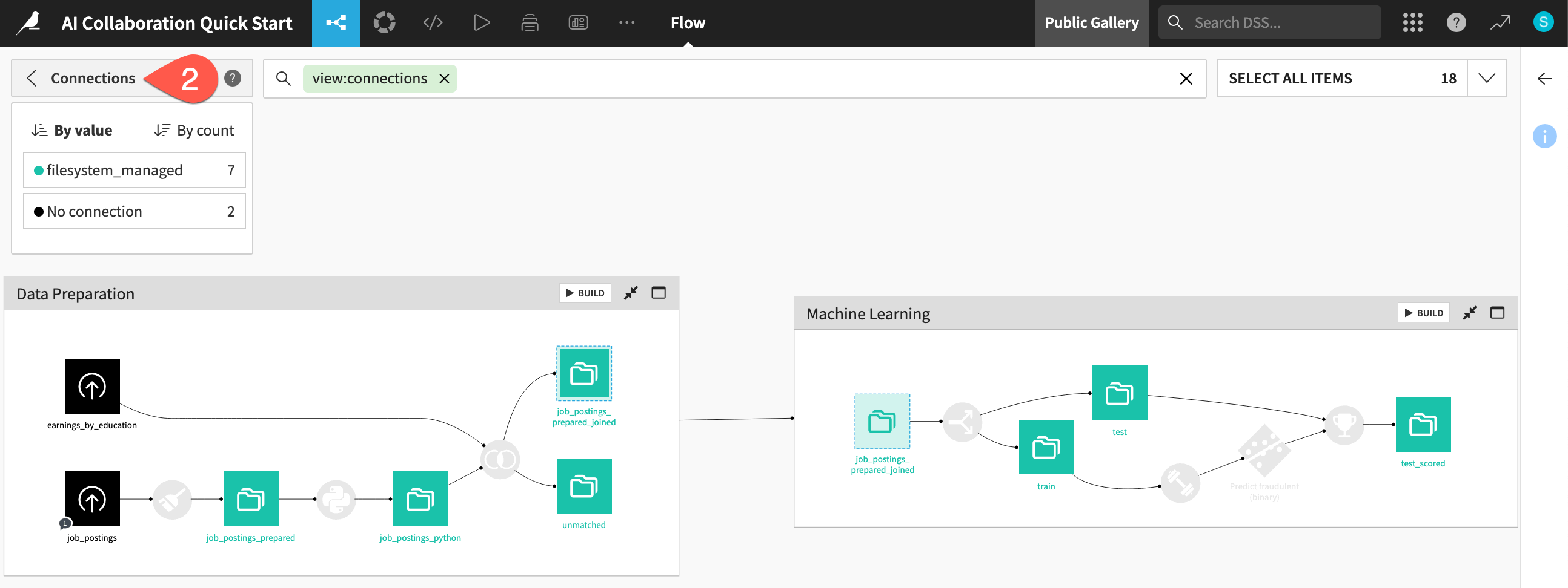
All visual recipes in this project use the DSS engine because the storage location of all datasets is a filesystem connection. This would not be the case in a real project!
There’s a handy Flow view to see the connections used in your project.
Navigate back to the Flow (
g+f).Open the Apply a View menu.
Select Connections.
Observe that all datasets downstream of the initial uploaded files are stored on the filesystem.
When finished, clear the search bar to return to the default view.
Depending on your organizations’ infrastructure investments, your data may be stored anywhere from a traditional relational database to a cloud data warehouse—essentially, wherever the data ecosystem moves!
Rather than transferring data across a network, Dataiku creates a view into the dataset’s storage. Think of the Flow as a visual layer on top of your organization’s existing storage and computing infrastructure.
Tip
Take the Join recipe in this project for example:
If both input and output datasets were stored in Snowflake, Dataiku would have selected the in-database SQL engine.
If both input and output datasets were stored in Amazon S3 buckets, Dataiku would have selected the Spark engine.
These engines would do the actual computation. Dataiku would show a sample of the results (and call upon the complete results whenever you request).
Running data pipelines#
Although Alteryx provides a Detour tool to bypass processes or the ability to turn off a particular container, you generally have limited control over how a workflow will run. Dataiku has much more flexible options for executing a data pipeline.
First, Dataiku has a concept of a dataset being outdated. If an upstream recipe has changed, the downstream datasets are out of date. Because Dataiku is aware of the Flow’s dependencies, it can skip computation steps when they’re not required.
Second, Dataiku can build pipelines, or sections of pipelines, with respect to an upstream or downstream reference. For example, while working on this project, you might want to:
Build just the job_postings_prepared dataset by computing only the Prepare recipe immediately before it.
Build only outputs in the Machine Learning Flow zone.
Select the upstream job_postings dataset, and build all outputs downstream.
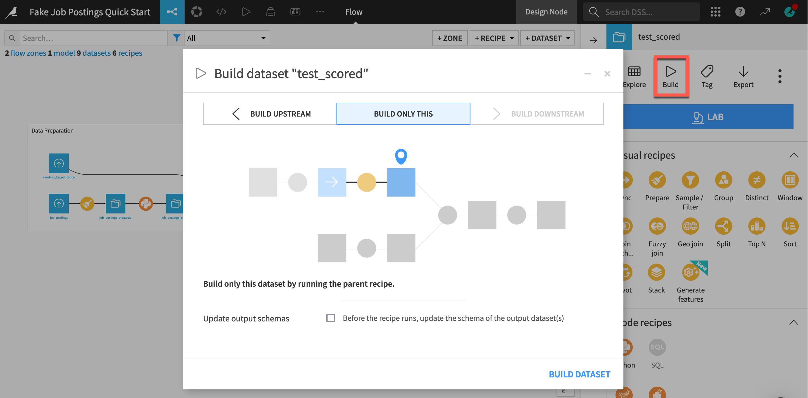
Select the downstream test_scored dataset, and compute only the necessary upstream dependencies to get an up-to-date output.
You can’t try this on a read-only instance. Below is a screenshot of a build dialog you would normally see in this last case.
At the far right of the Machine Learning Flow zone, select the test_scored dataset.
Note, in your case, the inactive Build option.
See also
Many Alteryx users may have used Batch or Iterative macros to build data pipelines in succession with different parameters. These users should look into Dataiku’s concept of dynamic datasets and repeating recipes.
Intermediate datasets#
One consequence of Dataiku’s architecture is that intermediate datasets in a Flow — those between the initial inputs on the left and the final outputs on the right — shouldn’t be a major concern.
In fact, their presence allows you to analyze a sample of data at any point in the Flow without having to add tools on an ad hoc basis.
If you’re thinking about intermediate datasets, keep in mind several points:
Aside from samples, your computer doesn’t store any data locally.
While prototyping your Flow, you may only be building one dataset or one zone instead of the entire pipeline from start to finish every time.
Given the smart computation options, you won’t need to recompute the same data if it’s not required.
Since you’re not using a desktop tool, while a job is running, you are free to move on to other tasks. Remember you can have Dataiku open in multiple browser tabs!
As discussed below, Dataiku has separate environments for development and production, meaning that you’ll optimize your data pipeline before moving it to a production environment.
Orchestration in Dataiku vs. Alteryx#
After creating a workflow in Alteryx, the next step is often to publish it to Alteryx Server, from which you can schedule and share it. However, orchestrating multiple workflows, such as triggering a new one upon the completion of another, can be challenging.
Dataiku’s answer for workflow orchestration has three main components:
Scenarios to automate actions
Data quality rules, metrics, and checks to validate data
Production environments to run jobs outside of the development environment
Automation scenarios#
A scenario is the way to automate actions in Dataiku. These actions could be tasks such as rebuilding a dataset at the end of a pipeline, retraining a model, or exporting a dashboard. You can even dynamically control how these actions execute. For example, if the average of a certain column is outside of a particular range, you can have the scenario stop its execution.
Once you have defined the set of actions to take place, you can define a trigger for when those actions should execute. In addition to time-based triggers, you can also define other types of triggers, such as when a dataset changes or with Python code. The completion of one scenario can even trigger the start of another scenario!
Finally, you can attach reporters to scenarios that send alerts through various messaging channels. For example, after a successful (or failed) run, the scenario can send an email with the results (or error message).
From the top navigation bar, go to the Jobs (
 ) menu, and select Scenarios.
Click to open the Score Data scenario.
Click Add Trigger to see options for when the scenario should start.
Click Add Reporter to see options for what kinds of alerts you can send.
Navigate to the Steps tab near the top right to explore the actions included.
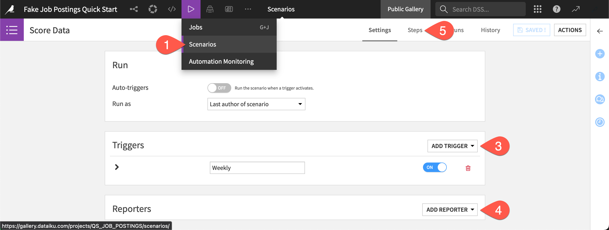
Click Add Step to see what other steps are available.
Tip
Builders of analytics apps or standard macros in Alteryx may wish to investigate Dataiku apps or Dataiku apps-as-recipes, respectively. Both are ways to repackage Dataiku projects into reusable applications. You’ll learn more in the Dataiku apps Academy course.
Data validation#
When you have scenarios running on automated schedules, you’ll need tools to verify that these jobs proceed as planned. You can achieve this objective with data quality rules, metrics, and checks.
The project at hand isn’t well-monitored. It has only one existing data quality rule that verifies if the record count of the input data is within a certain range.
From the Jobs (
) menu in the top navigation bar, click Data Quality (or use the keyboard shortcut g+q).Normally, this view would show a breakdown of all rules in the project, including those that may be returning errors or warnings.
Click job_postings to view the data quality rule attached to this dataset.
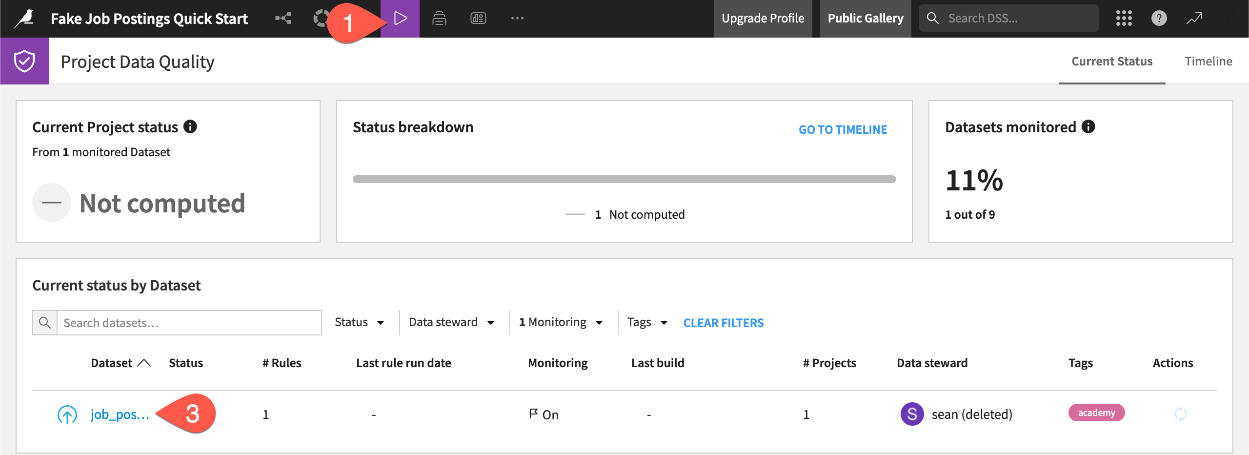
From the Data Quality tab of the job_postings dataset, click View Rules to see the expected record count.
See also
Learn more about metrics, checks, and data quality rules in the Data Quality & Automation course in the Advanced Designer learning path.
Production environments#
The last leg of Dataiku’s answer to workflow orchestration is an Automation node.
One reason to use Alteryx Server is to get the workflow’s computation off your desktop. Dataiku scenarios are already running remotely. Still, Dataiku as a platform actually consists of multiple nodes for specific stages of the AI lifecycle.
The Design node (what you’ve been looking at in the gallery) is where you’ll spend most of your time. It’s the development sandbox where you actively experiment with building Flows.
Production workflows, on the other hand, require a separate environment to avoid any unforeseen mishaps and allow for proper monitoring.
For a batch workload most common to Alteryx users, this environment is an Automation node.
For a real-time API use case, this would often be an API node, but there are also external deployment options (Amazon SageMaker, Azure ML, Google Vertex AI, Snowflake, Databricks).
There’s even a Govern node for monitoring data and model quality at the organization level.
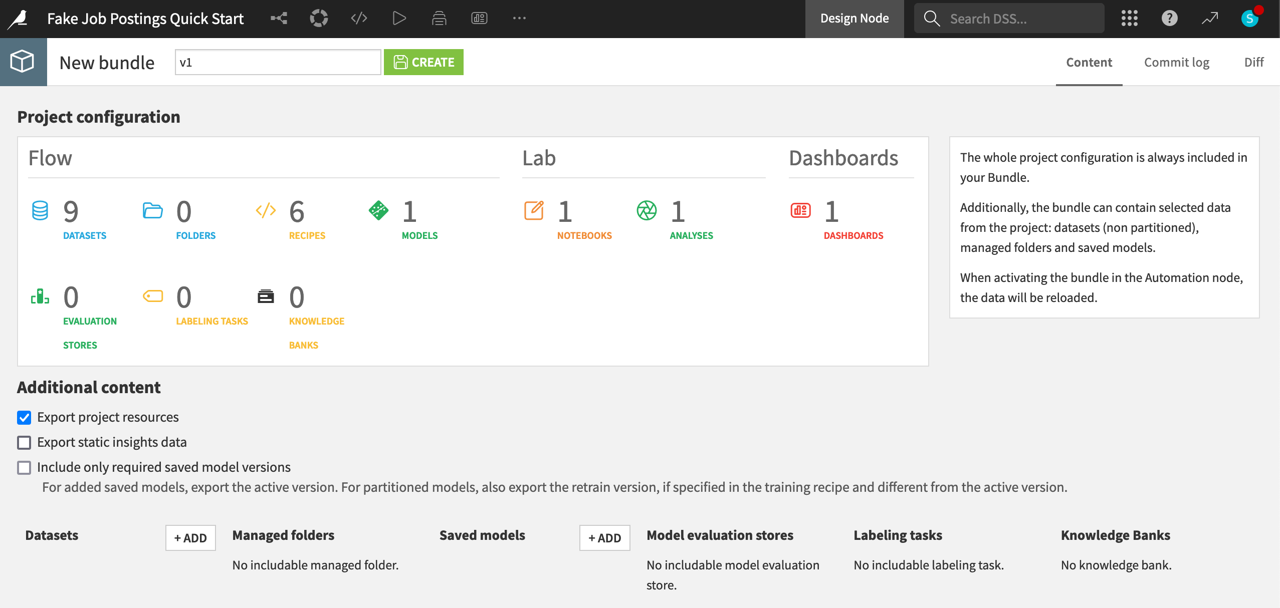
When you have finished building a Flow and created a scenario, the next step is to publish the project as a bundle on an Automation node. Once on this type of node, the scenario can run undisturbed.
On a normal instance, you’d be able to see a page of project bundles, like this one for example:
See also
You’ll learn more about pushing project bundles to an Automation node in the Project Deployment Academy course.
Collaboration in Dataiku vs. Alteryx#
Sharing assets#
With Alteryx Designer, you would locally download assets, and then manually sync outputs or email files to distribute them. In Dataiku, however, if you make a change in a project, your colleague only needs to refresh the page to see it!
Think of repeatedly saving and emailing new versions of Microsoft Word files (my_project_final_final_final.docx) vs. Google Docs where you always have the latest version.
In fact, when you have an asset ready to share, Dataiku provides a wide variety of options to do so, depending on the situation. You can export a dataset to a format like CSV or Excel. Alternatively. you might use a plugin to share it with a tool like PowerBI or Tableau. More often though, you might:
Publish the asset to a dashboard, workspace, feature store, or data collection.
Share the asset to another Dataiku project. The output of one project can become the input to another.
Again, you will run into a limitation on the read-only instance, but you can imagine the possibilities!
Navigate back to the Flow (
g+f).At the far right of the Machine Learning Flow zone, select the test_scored dataset.
Open the Actions (
) tab in the right panel.Click the vertical dots (
 ) to find the deactivated options for Share and Publish.
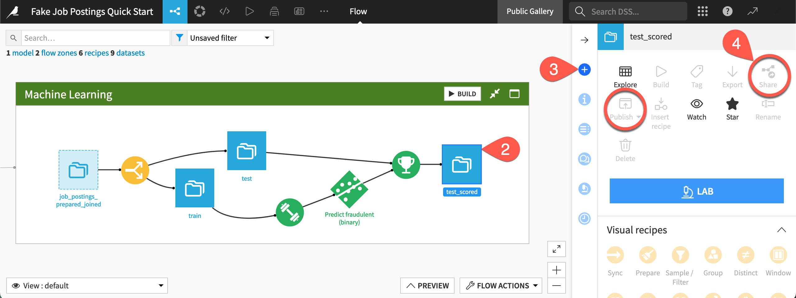
Type
g+pto go to the Dashboards page, and open the existing Project dashboard.
Tracking changes#
If accustomed to working individually in a desktop application, real-time collaboration in a web browser promises many exciting opportunities, but it can also be slightly intimidating.
For example, if you and a colleague are working on a recipe simultaneously, Dataiku will show an alert to avoid you overwriting each other’s work. (Think of the floating heads at the top of a shared Google Doc!) If this is a frequent problem, one strategy is prototyping your Flow in a separate Flow zone.
Colleagues making unwanted changes to your Flow may also concern you. The right panel’s Timeline tab, which tracks changes to an item, is one way to address this question. If you have a question for a colleague, use the Discussions tab above it. There are also Flow views to tell you about recent modifications.
If something unforeseen does happen, Dataiku projects have a built-in Git repository. This Git repository automatically commits changes so you can revert a project to a previous state.
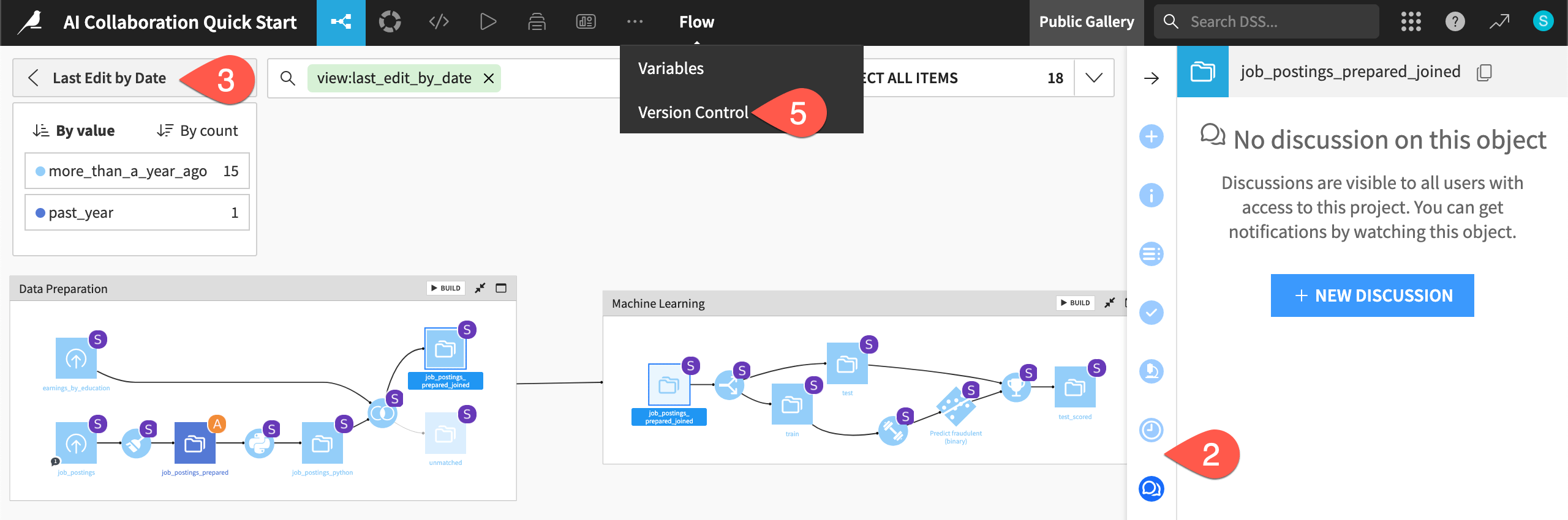
Navigate back to the Flow (
g+f), and select a dataset or recipe.Locate the Discussions (
 ) and Timeline (
 ) tabs in the right panel.
Open the Apply a View menu.
Explore views such as Last Edit by Date and Recent Modifications (which aren’t too interesting for this basic project!).
From the More Options (
 ) menu in the top navigation bar, select Version control to view the project’s Git commit history.
Security#
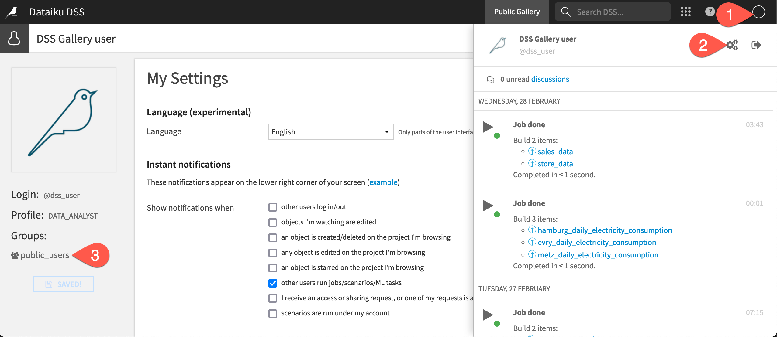
The prospect of collaboration also introduces a security question: could colleagues gain unauthorized access to a project or data? Dataiku addresses this issue with a groups-based permission framework.
To summarize, a user can belong to any number of groups. On a per-project basis, project owners grant groups various permissions, such as the ability to write project content, export datasets, or run scenarios.
As a gallery user, you won’t be able to access this page, but on a normal instance, you’d find a page like the following:
Open the Profile menu at the top right corner of the screen.
Click the gear icon to see Profile & Settings.
Recognize that this user belongs to a group called public_users.
Next steps#
Now that you have examined a completed Dataiku project, it’s time to build one yourself!
After signing up for a free trial, you’ll build the same project you’ve just examined from the ground up in the Data Preparation Quick Start.
See also
Once that’s completed, if you work a great deal with geospatial data, you’ll also be interested in the course on Geospatial Analytics.
Alternatively, if you were a user of Alteryx Machine Learning, you should also check out the Machine Learning Quick Start for a quick tour of AutoML with Dataiku.
If you tried coding with Python and/or R in Alteryx, you’ll find a much wider set of capabilities for coders inside Dataiku. See the Developer Guide or the Developer learning path to get started.