Tutorial | R Shiny webapps#
Get started#
Shiny is the most popular R package for creating webapps. Let’s demonstrate how you can create them within Dataiku.
Objectives#
In this tutorial, you will:
Create a simple R Shiny webapp within Dataiku.
Publish it to a dashboard.
Prerequisites#
Dataiku 12.0 or later.
A Full Designer user profile.
Some familiarity with R.
An R code environment that include the shiny package.
Create the project#
From the Dataiku Design homepage, click + New Project.
Select Learning projects.
Search for and select Visualization.
If needed, change the folder into which the project will be installed, and click Create.
From the project homepage, click Go to Flow (or type
g+f).
From the Dataiku Design homepage, click + New Project.
Select DSS tutorials.
Filter by Developer.
Select Visualization.
From the project homepage, click Go to Flow (or type
g+f).
Note
You can also download the starter project from this website and import it as a zip file.
For this project, you’ll use the Orders_enriched_prepared dataset of T-Shirt sales for a scatter plot, which you can filter by year and category using interactive widgets.
Create a new Shiny webapp#
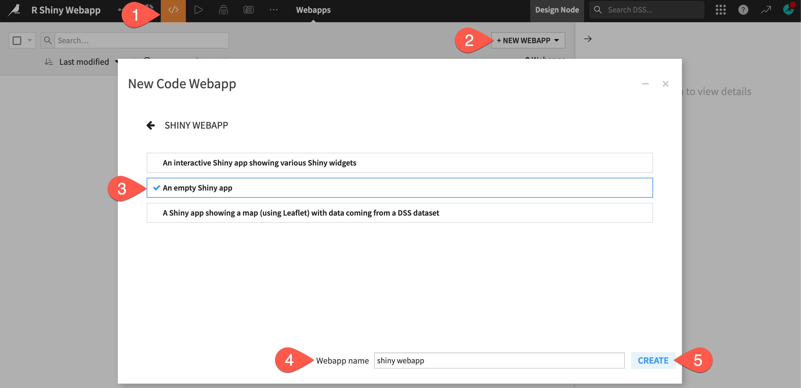
Create a new empty Shiny webapp:
In the Code (
) menu of the top navigation bar, select Webapps.
Click + New Webapp > Code Webapp.
Select Shiny > An empty Shiny app.
Provide a simple name for the webapp, such as
shiny webapp.Click Create.

Explore the webapp editor#
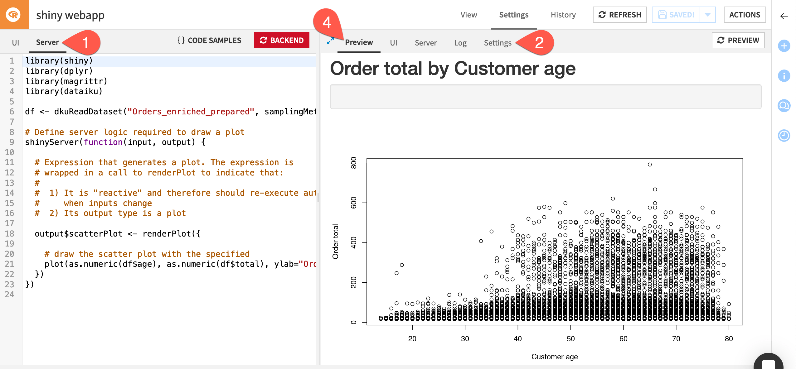
You will be redirected to the webapp editor, which is divided into two panes.
The left pane allows you to see and edit the R code underlying the webapp, and contains two tabs:
Tab |
Purpose |
|---|---|
UI |
Contains the code that defines the layout of the webapp, defines and displays interactive widgets, and displays the visualization generated in the Server tab. |
Server |
Defines the server logic required to create the visualization. It accesses the data, uses the selections in the widgets on the UI tab as input, and creates the output to be displayed in the webapp. |
The right pane gives you several views on the webapp.
Tab |
Purpose |
|---|---|
Preview |
Allows you to write and test your code in the left pane while having immediate visual feedback in the right pane. At any time you can save or reload your current code by clicking on the Save button or the Reload Preview button. |
UI and Server |
Look at different portions of the code side-by-side in the left and right panes. |
Log |
Useful for troubleshooting problems. |
Settings |
Set the code environment for this webapp, if you want it to be different from the project default. |
Code the webapp#
While the code is split across two files, and there is no explicit code needed to listen for changes to the widget values, the concepts behind Shiny and the Python webapp framework Bokeh are similar.
Let’s build the code behind the R Shiny webapp.
Define the UI#
In the UI tab, insert the following code to define the layout for the webapp.
library(shiny)

# Define UI for application that draws a histogram
shinyUI(fluidPage(

  # Application title
  titlePanel("Order total by Customer age"),

  # Webapp layout
  sidebarLayout(

    sidebarPanel(),

    # Show a plot of the generated distribution
    mainPanel(
      plotOutput("scatterPlot")
    )
  )
))
Note
The above code indicates:
Usage of the
shinyR library.The
shinyUI()function indicates the UI for the webapp.The
fluidPage()function allows for defining a flexible layout for the page. It accepts several arguments that are the components of the page layout.titlePanel()creates a title at the top of the webapp.sidebarLayout()defines a layout where widgets are defined in a sidebar panel, and the visualization is displayed in a main panel. For now, leavesidebarPanel()empty and just include the definition for themainPanel(), which will showplotOutput()as defined by thescatterPlotelement of the output object. You’ll add the interactivity later.
Define the visualization#
Now, in the Server tab, insert the following code to define the output visualization.
library(shiny)
library(dplyr)
library(magrittr)
library(dataiku)

df <- dkuReadDataset("Orders_enriched_prepared", samplingMethod="head", nbRows=100000)

# Define server logic required to draw a plot
shinyServer(function(input, output) {

  # Expression that generates a plot. The expression is
  # wrapped in a call to renderPlot to indicate that:
  #
  #  1) It's "reactive" and therefore should re-execute automatically
  #     when inputs change
  #  2) Its output type is a plot

  output$scatterPlot <- renderPlot({

    # draw the scatter plot with the specified
    plot(as.numeric(df$age), as.numeric(df$total), ylab="Order total", xlab="Customer age")
  })
})
Note
In the above piece of code:
It uses the
shiny,dplyr,magrittr, anddataikuR libraries.To incorporate Dataiku datasets into Shiny webapps, it uses the
dkuReadDataset()function to pull the dataset as an R data frame, as you would in an R recipe or notebook.The
shinyServer()function indicates the server logic for the webapp.The
renderPlot()function contains the code to generate the output visualization. It can also accept input from widgets in the UI code. You’ll will add the interactivity in a moment. The results ofrenderPlot()are saved to thescatterPlotelement of theoutputobject, which is then displayed in the Preview.
Once you have defined the UI and Server code, go to the Settings tab.
Confirm that you have a code environment that includes the shiny package.
Go to the Preview tab.
Click Start Backend to see a non-interactive scatter plot.

Add interactivity#
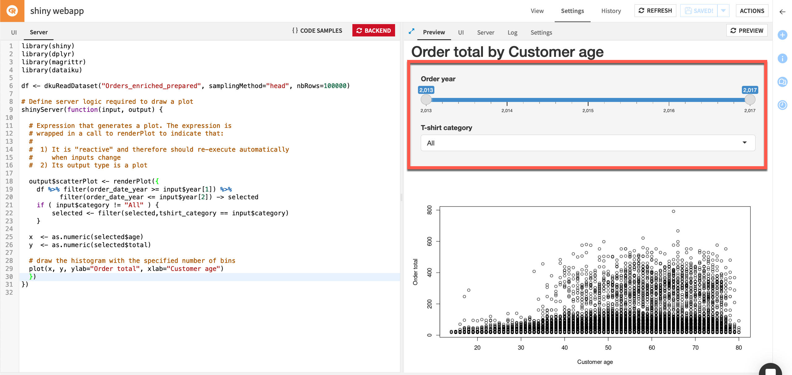
The current scatter plot includes all orders from 2013-2017, across all types of T-shirts sold. Now let’s add the ability to select a subset of years and a specific category of t-shirt.
To do this, you need to make changes to the UI and Server code.
Go to the UI tab.
Replace
sidebarPanel()with the following:sidebarPanel( sliderInput("year", "Order year", 2013, 2017, value = c(2013, 2017)), selectInput("category", "T-shirt category", c("All","White T-Shirt M","White T-Shirt F","Black T-Shirt M", "Black T-Shirt F","Hoodie","Tennis Shirt") ) )
Note
The
sliderInput()function creates a slider widget labeled “Order year,” that has values ranging from 2013 to 2017, and an initial state where all years are selected. The widget selection is saved to theyearelement of theinputobject.The
selectInput()function creates a dropdown selection widget labeled “T-shirt category,” that has values for each of the t-shirt categories plus “All.” The widget selection is saved to the category element of the input object.
Go to the Server tab.
Replace
output$scatterplotwith the following:output$scatterPlot <- renderPlot({ df %>% filter(order_date_year >= input$year[1]) %>% filter(order_date_year <= input$year[2]) -> selected if ( input$category != "All" ) { selected <- filter(selected,tshirt_category == input$category) } x <- as.numeric(selected$age) y <- as.numeric(selected$total) # draw the histogram with the specified number of bins plot(x, y, ylab="Order total", xlab="Customer age") })
Note
This takes the input data frame
dfand uses the widget selections to filter the data frame to only use records with the correct order year and t-shirt category. It then defines the x and y axes of the scatter plot to be the age and order total from the filtered data frame.Click Save and Preview to show the scatter plot including two interactive widgets.

Publish the webapp on a dashboard#
When you are done editing, you can publish your webapp on a dashboard.
Click Actions to open the right panel.
Click Publish > Dashboard.
Select the dashboard and page you wish to publish your webapp on.
Click Create.
Next steps#
Using Dataiku, you have created an interactive Shiny webapp and published it to a dashboard.
See also
See the reference documentation on Shiny web apps for further details on using Shiny in Dataiku.

