Quick Start | Excel to Dataiku#
Concepts#
Get started#
Are you an Excel user interested in adding Dataiku to your workflow? You’re in the right place!
Create an account#
To follow along with the steps in this tutorial, you need access to a 12.1+ Dataiku instance. If you don’t already have access, you can get started in one of two ways:
Start a 14-day free trial. See How-to | Begin a free trial from Dataiku for help if needed.
Install the free edition locally for your operating system.
Open Dataiku#
The first step is getting to the homepage of your Dataiku Design node.
Go to the Launchpad.
Within the Overview panel, click Open Instance in the Design node tile once your instance has powered up.
Important
If using a self-managed version of Dataiku, including the locally downloaded free edition on Mac or Windows, open the Dataiku Design node directly in your browser.
Once you are on the Design node homepage, you can create the tutorial project.
Create the project#
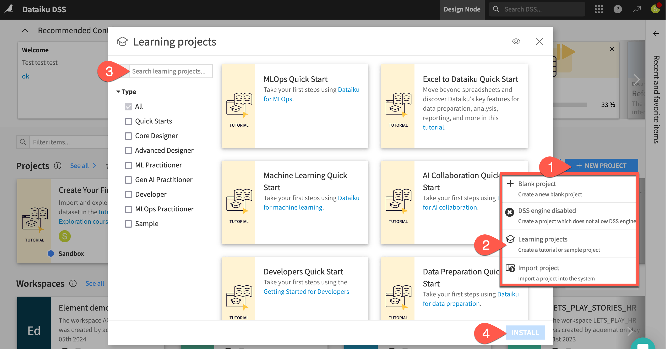
From the Dataiku Design homepage, click + New Project.
Select Learning projects.
Search for and select Excel to Dataiku Quick Start.
If needed, change the folder into which the project will be installed, and click Create.
From the project homepage, click Go to Flow (or type
g+f).
Note
You can also download the starter project from this website and import it as a ZIP file.
Objectives#
Before starting, take a moment to understand the goals for this quick start and the data at hand.
In this tutorial, you will:
Create a Dataiku project and import Excel data.
Interactively explore a dataset.
Clean and prepare data.
Join two datasets together.
Create pivot tables to analyze the data.
Use conditional formatting to visualize trends directly in your dataset.
Build charts and a dashboard to share insights.
Tip
To check your work, you can review a completed version of this entire project on the Dataiku gallery.
Use case summary#
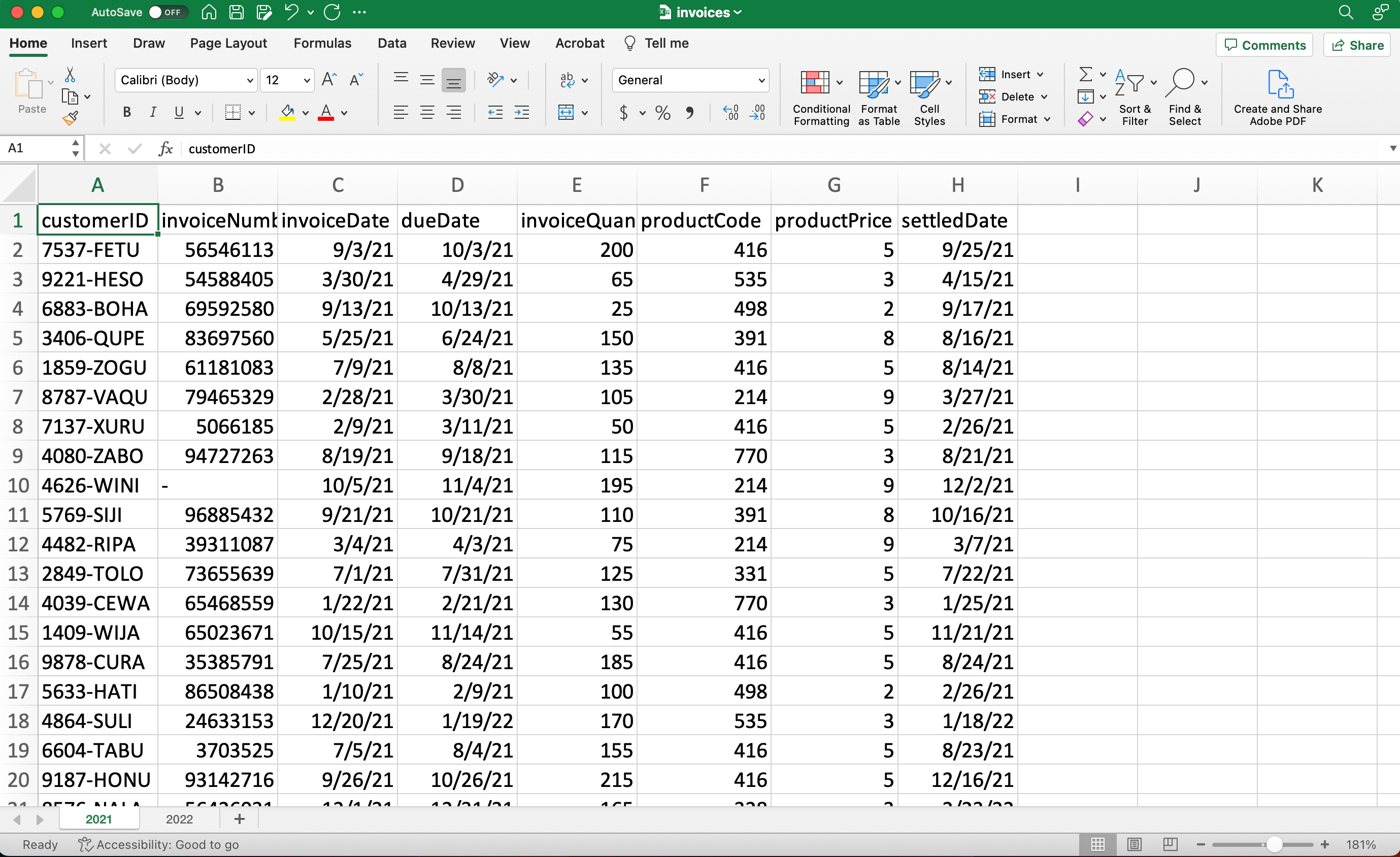
This tutorial works with accounts receivable data for a fictional office supply company. The invoices.xlsx file that you will download contains several thousand invoices, including the invoice date, due date, date paid, amount, and product code.
The Excel file contains two sheets, one with invoices from 2021 and one with invoices from 2022. In Excel, you might copy and paste to combine multiple sheets. In Dataiku, we’ll import both sheets into one dataset where we can perform analysis and visualization all at once.
The Dataiku project you’ve created is where you will import the Excel file. In Dataiku, projects are containers for all the files, analysis steps, visualizations, and documentation for a particular activity. This tutorial project also already contains one file you’ll use later.
Import and explore data#
After creating the project, you’ll be on the project Flow, where you’ll see the products dataset, which we’ll use later.
Import an Excel workbook#
First, we’ll import the first dataset to work with, invoices.xlsx.
Download the Excel file invoices.xlsx.
From the Flow, click + Add Item.
Choose Upload from the dropdown menu.
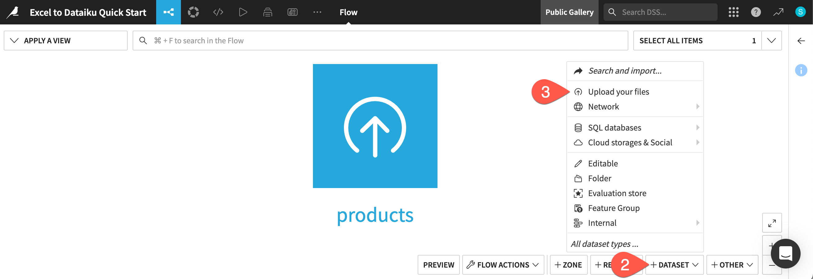
This takes you to the New uploaded files dataset page. Dataiku can connect to files in a number of different storage options, and you can upload files such as Excel or CSV files directly from your computer.
Click Select Files.
Navigate to the invoices.xlsx file on your computer, and either double-click the file name or click Open on the dialog box.
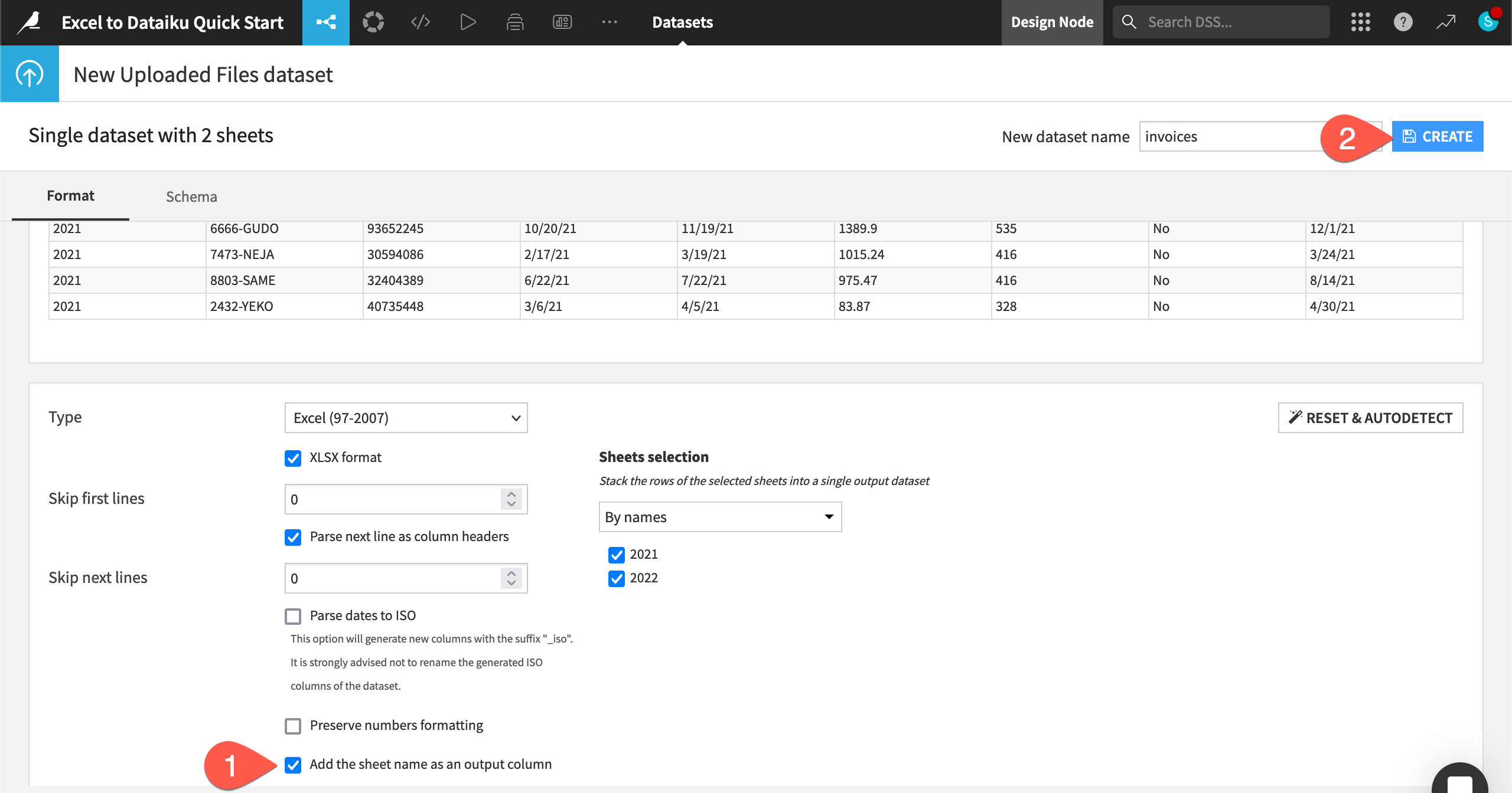
Dataiku automatically detects two sheets (for 2021 and 2022) in this one file. Click Create a Single Dataset.
Dataiku shows a preview of your data file, along with the data types and first few rows for each column. We can also configure various settings.
At the bottom of the page, confirm the option Add the sheet name as an output column is selected. This option creates a new column containing the sheet name that each row originated from — in this case, the year.
Click Create in the top right.
The rows from both sheets are now combined into one dataset named invoices, and Dataiku takes you directly to the table. You can see the total number of rows in the top left — in our case, 9,238 rows!
Tip
You can also import a multi-sheet Excel workbook into multiple Dataiku datasets. See How-to | Import an Excel workbook for details.
Explore the data#
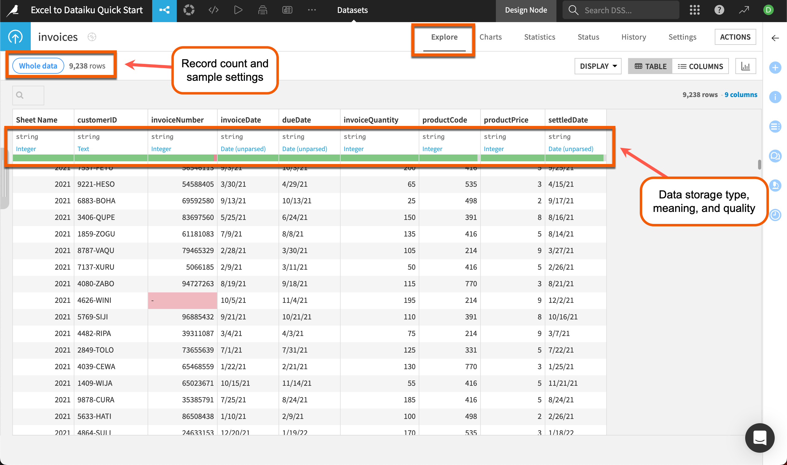
The default view for a dataset in Dataiku is the Explore tab, which looks similar to an Excel worksheet, with extra functionality. From here, you can get a quick overview of data quality, plus sort, filter, and analyze the dataset by any column.
Note
If your file contains more than 10,000 rows, Dataiku will show a preview of only the first 10,000 rows so you can work interactively on large datasets. You can change the sample settings by clicking on the Whole data or Sample button at the top left of the dataset. Read more about sampling in Concept | Sampling on datasets.
The top of each column includes several pieces of useful information. Directly underneath the column name is the data storage type (in gray) and the data meaning (in blue). The storage type and meaning are related but different.
Storage type refers to how Dataiku stores that column in the backend.
The column meaning gives an auto-detected, semantic label to the data type, such as date, text, or country.
The green and red bar near the top of each column gives us quick insight into potential issues with dirty data. For instance, we can see an invalid invoice number highlighted in red in the data and in the bar at the top of the column. Dataiku uses the column meaning to determine validity.
Analyze columns#
Before transforming the data, you’ll want to explore the data quality and distribution of data in each column. In Dataiku, you can do this with a few clicks using the Analyze feature.
In the Explore tab of the invoices dataset, click on the column called Sheet Name, which is the automatically generated column that includes the worksheet each row was imported from.
Select Analyze in the dropdown menu.
Use the arrows at the top left of the Analyze window to scroll through each column and view the quality and statistical summaries of each.
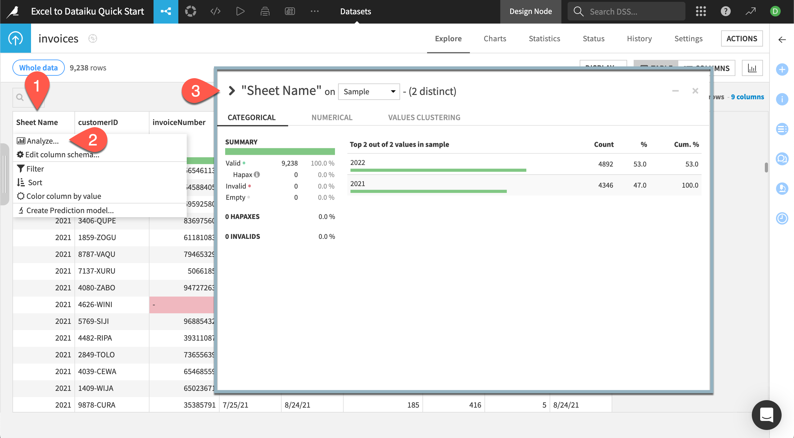
The Analyze window shows a summary of how many rows Dataiku shows as valid, invalid, or empty, giving you more insight into data quality.
For Sheet Name we can see all rows are considered valid. As you scroll through, pay attention to the invoiceNumber column. There are five invalid rows. We won’t be using the invoice number in this tutorial, so we won’t worry about fixing these.
For text or date columns, you can view the count of each value, and for numerical columns, you can view the distribution of numbers, along with statistics such as min, max, mean, and sum.
Tip
You can also use the dropdown for each column header to sort or filter the dataset by that column, or even edit the column’s description or datatype.
Clean data#
The Prepare recipe is a major workhorse in Dataiku. This is where you can perform many of the same cleaning steps as you do in Excel — such as find and replace, IF functions, or custom formulas — but with the added benefit of tracked, repeatable, and editable steps.
Create a Prepare recipe#
Let’s use a Prepare recipe to do some quick data cleaning and calculations. Within the recipe, we’ll use the processor library, a collection of about 100 built-in data functions. As we work, we can preview the output within the recipe screen. When we’re happy with the results, we’ll run the recipe to create a new output dataset that’s ready for analysis and visualization.
From the Explore tab of the invoices dataset, click on Actions near the top right to bring up the right panel, known as the Actions panel.
In the Visual recipes section, select Prepare.
Click Create Recipe.
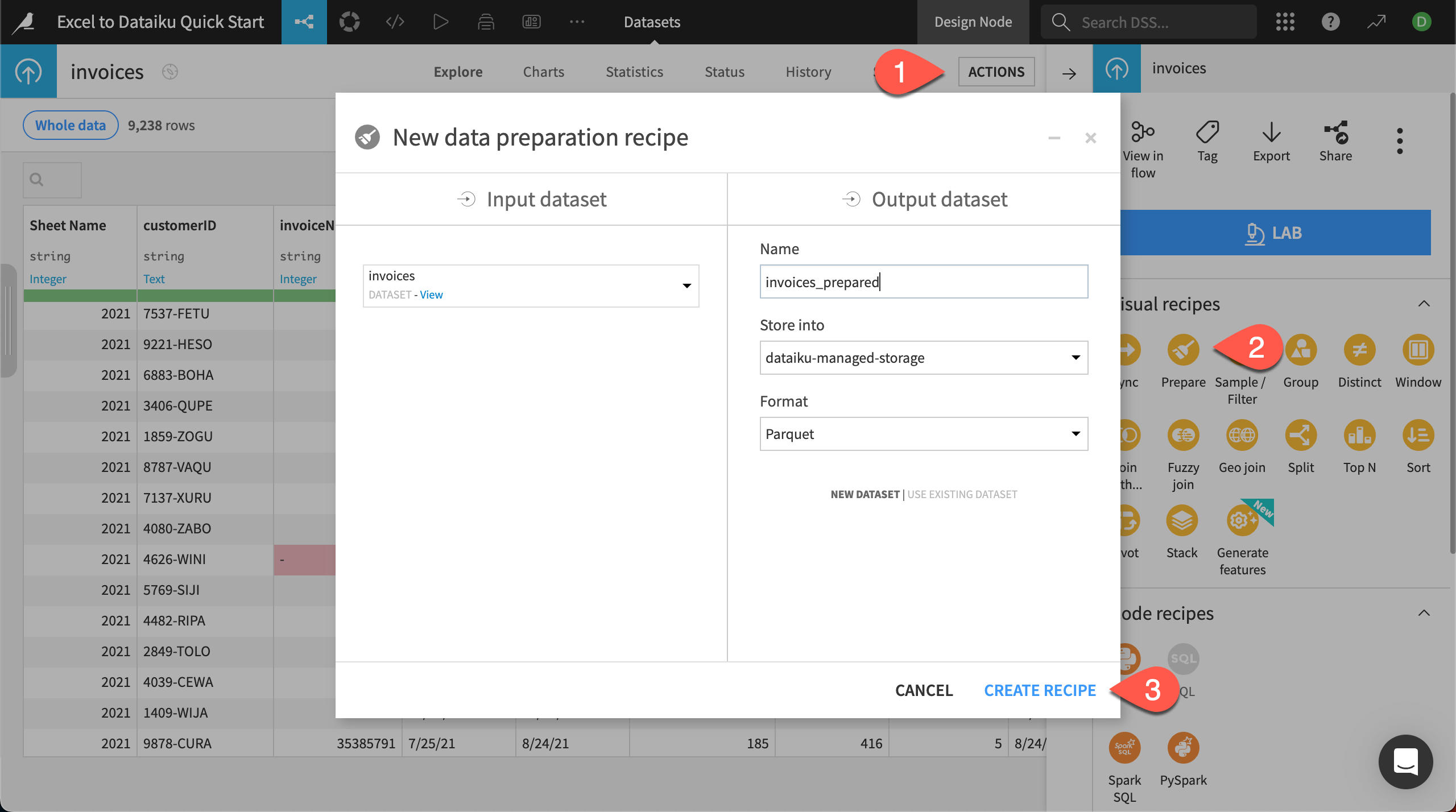
This brings you to the Prepare recipe Script page, where you add all the cleaning and transformation steps.
Edit column name#
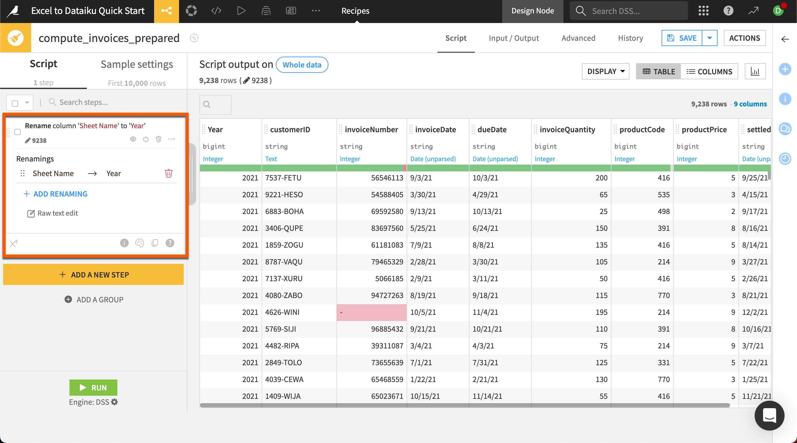
Most column names are understandable, but the automatically created Sheet Name column might cause confusion later, so let’s change it to Year.
Click on the column name Sheet Name.
In the dropdown menu select Rename.
Rename the column
Year.Click OK.
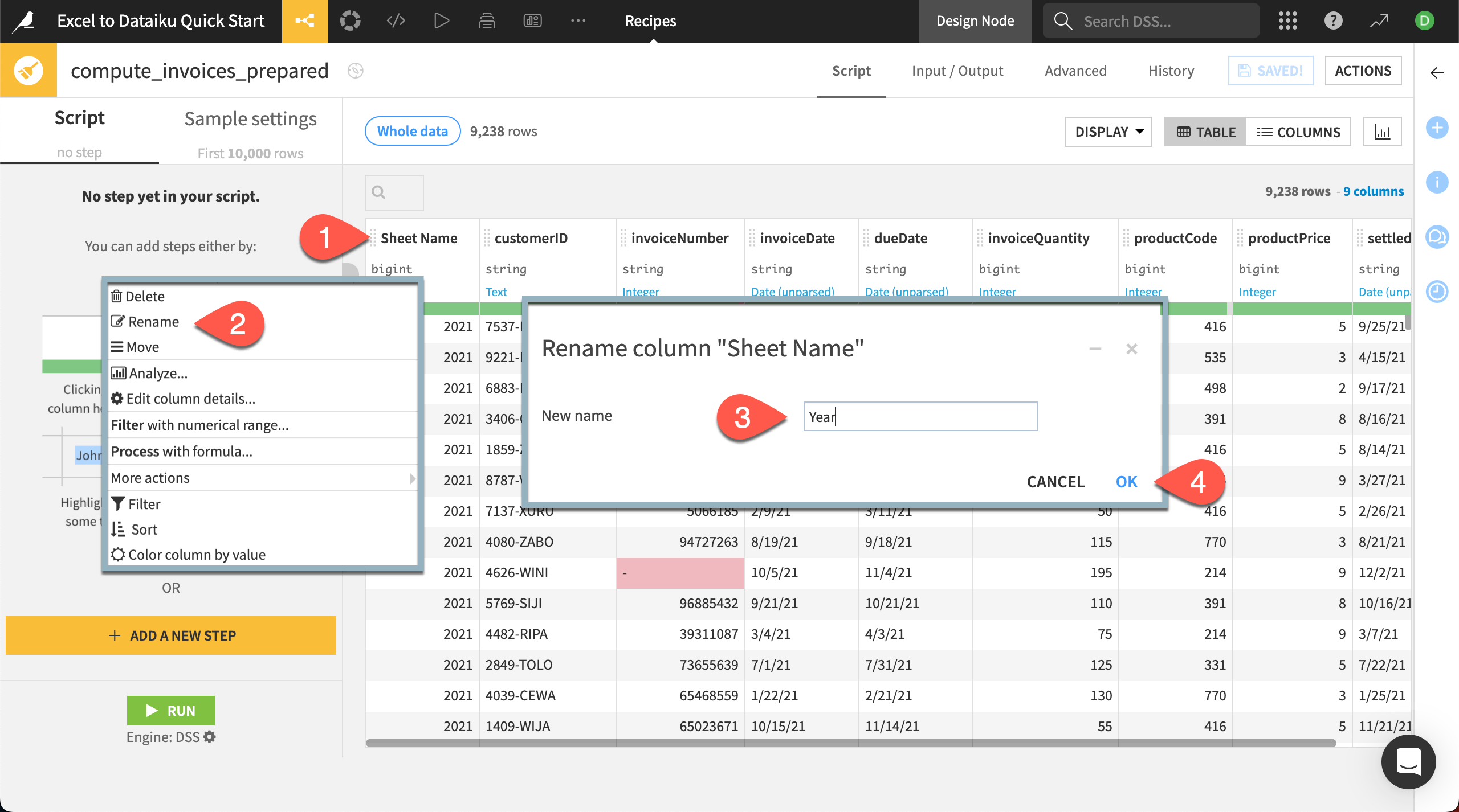
Nice job! You’ve successfully added the step Rename column ‘Sheet Name’ to ‘Year’ to your Prepare recipe. Notice the step now appears in the script on the left.
Tip
In the Prepare recipe, column headers also contain other proposed steps based on the detected meaning of the column. Check out the options available in some of the other columns, such as invoiceDate or productPrice.
Parse dates#
In Dataiku, you can transform dates from any format into a standard date format and even use a smart pattern finder to help. Transforming dates to standard format—which includes the year, month, day, and time—removes any ambiguity about the format and allows you to perform date functions.
We have three date columns to transform. This time, we’ll add a new step another way, through the processor library rather than the column header.
On the left side of the screen, click + Add a New Step. This brings up the processor library.
Search for and select the processor Parse to standard date format.
In the new step added in the script, choose multiple next to the Column input box. This will allow us to process all three date columns at once.
Click + Add a Column and select dueDate, then repeat twice more for invoiceDate and settledDate.
Next to Input date format(s), select Find with Smart Date to use the pattern finder tool.
Select MM/dd/yy, the correct format the input columns are in, then click Use Date Format.
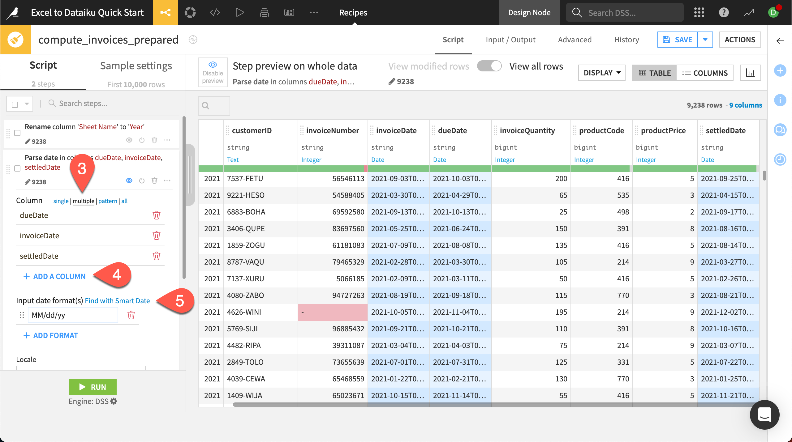
When you return to the script page, check the output preview. You should see that all date columns are now represented with standard formats!
Calculate time to payment#
Next let’s add a date calculation to find the number of days it took each customer to pay the invoice.
Click on the column header for invoiceDate.
In the dropdown menu, choose Compute time since.
In the new step, under until, select Another date column.
Add settledDate to the Other column.
Keep the output in days, and add an Output column name of
timeToPayment.
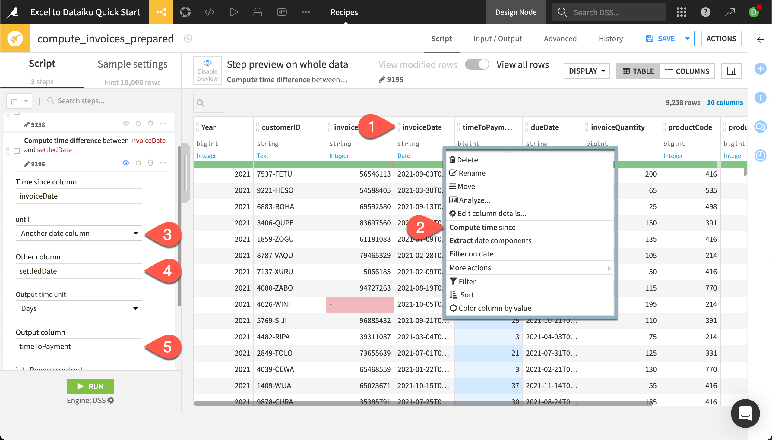
You’ll see the new output column in the preview of the dataset.
Write a custom formula#
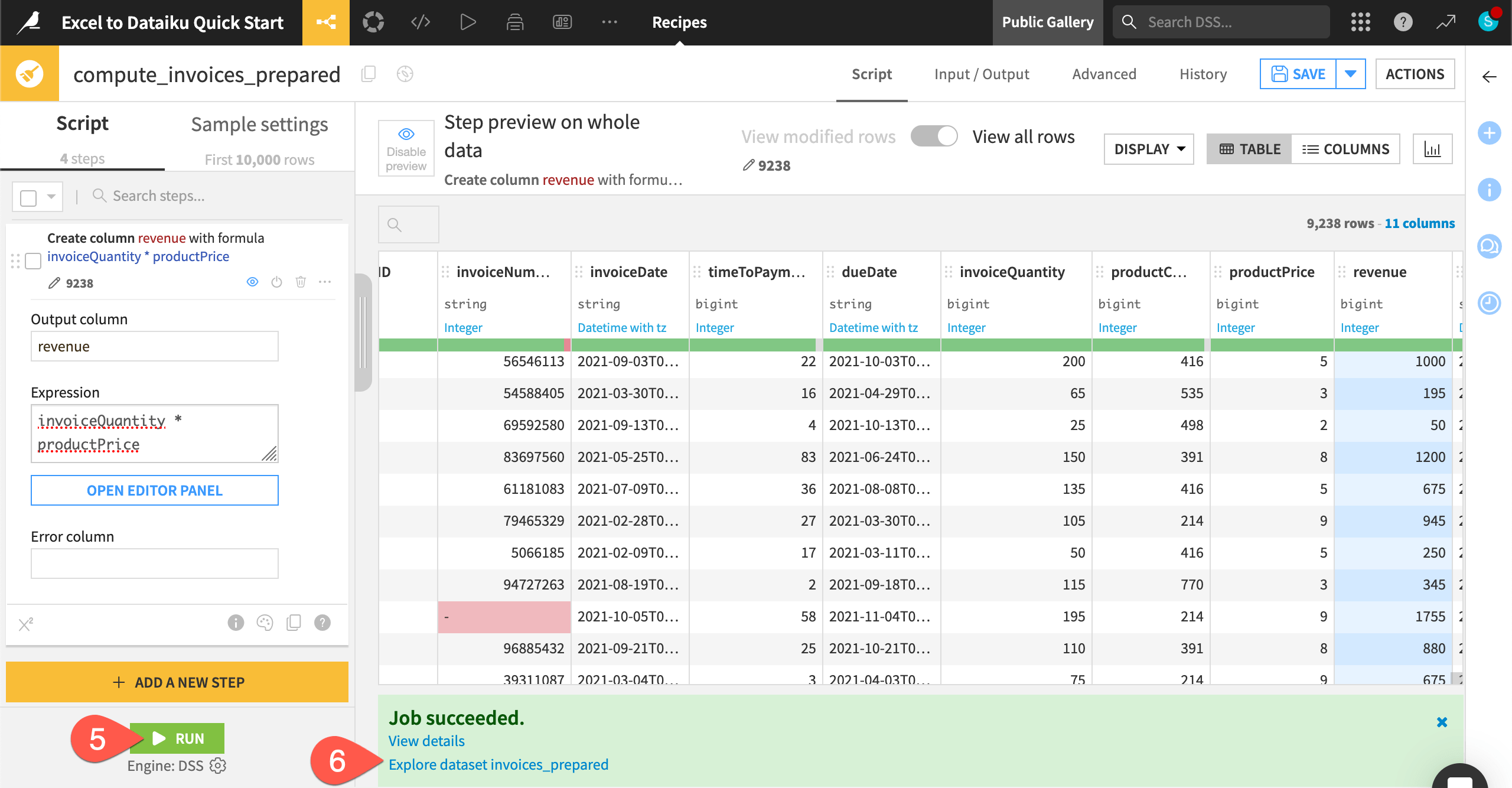
We have two columns regarding the revenue for our invoices — invoiceQuantity and productPrice. To find the total revenue for each invoice, we can create a custom formula that shows the total revenue for each invoice.
Dataiku also has its own spreadsheet-like Formula language with common mathematical and string operations, comparison and logical operators, and conditional statements that you can use to create new columns. For this example, we want to create a simple multiplication.
Click on the column header for invoiceQuantity.
In the dropdown, choose Process with formula.
In the new step, name the Output column
revenue.Under Expression, add
* productPriceto end of the formula that has been started for you.The new column revenue appears in the preview with the computed values!
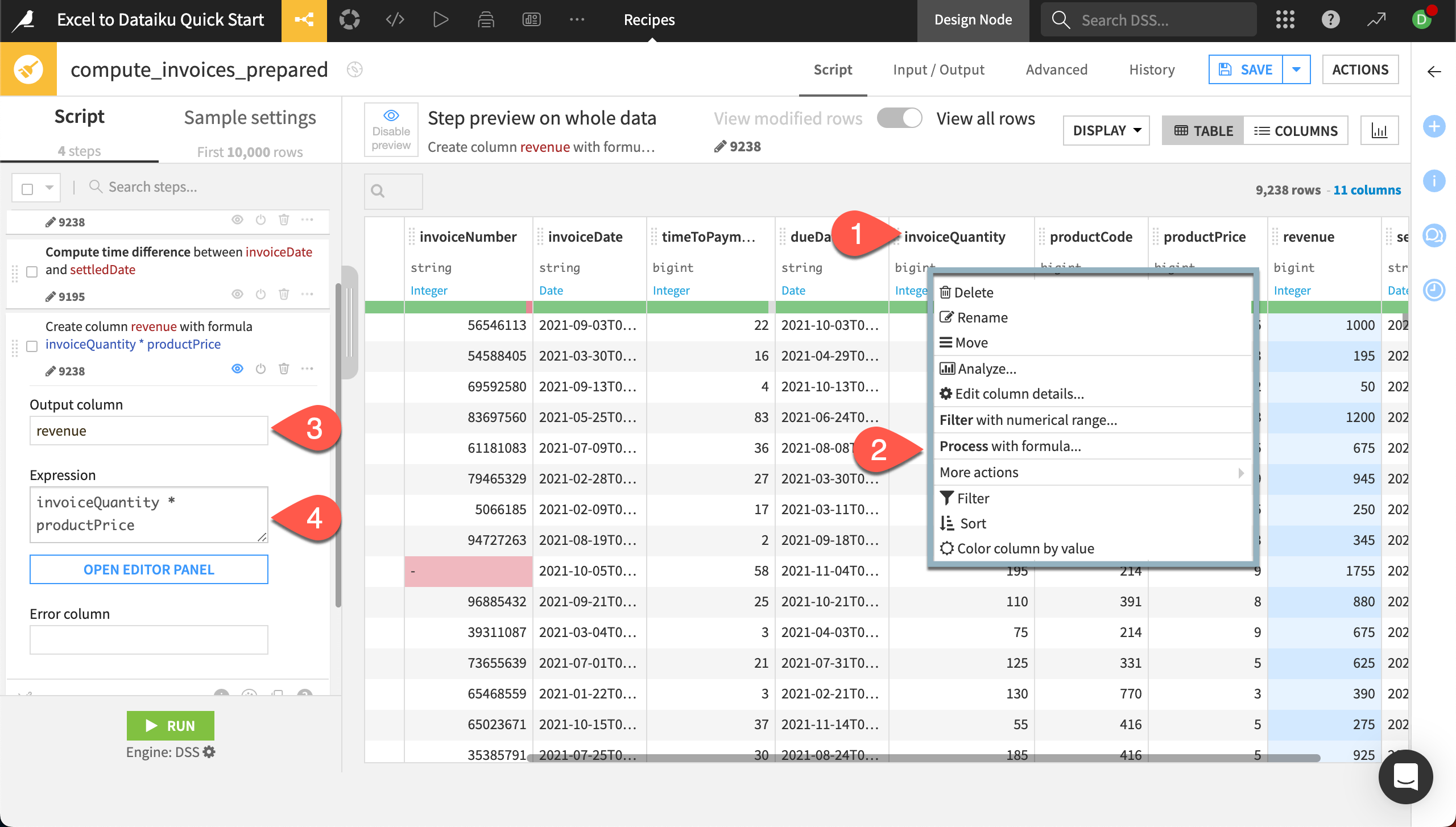
We’re now done with our data preparation and can run the recipe.
Click Run in the bottom left.
When the job is finished, click on Explore dataset invoices_prepared at the bottom of the screen to explore the new dataset with our cleaned and prepared data. This dataset will also now appear in the Flow.
Tip
The Prepare recipe has many other features to explore! You can group, color, comment, duplicate, and copy-paste steps (find options by clicking on the three dots () on any step in the script). You can also reorder steps by clicking on the left side of any step (
) and dragging it to the desired spot.
Join two datasets#
You might at times deal with data that exists in two separate but related worksheets or tables. In Excel, you can use a VLOOKUP or Index/Match to bring in values from another sheet based on values in a column. But this method is limited to bringing in values from only one column.
In Dataiku, you can join datasets based on much more complex relationships using the Join recipe. Joins connect data from two — or more! — datasets and match values based on a common key column. You can bring in multiple columns from the other datasets, save unmatched rows to check your join quality, and even filter your data pre- or post-join.
Create a Join recipe#
The invoices_prepared dataset includes a column called productCode, which is a number that represents a product sold by the company. We’ll match the codes to actual product names in another file, products, which has already been imported into the project, so we can analyze product sales.
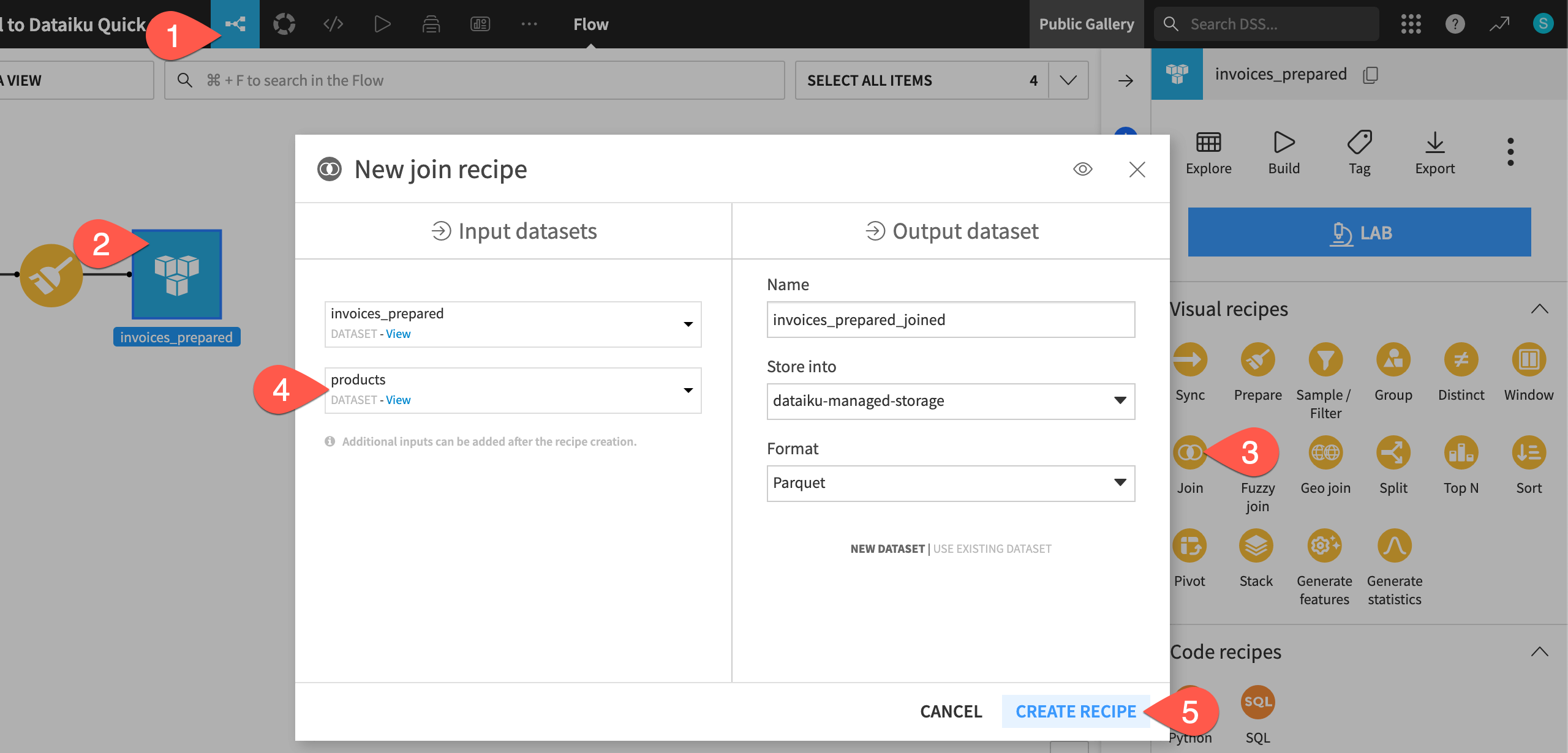
Return to the Flow. You can do this by clicking on the Flow (
) menu on the left of the top navigation bar, or by using the keyboard shortcut
g+f.Click on the invoices_prepared dataset.
From the Actions (
) panel, under Visual recipes, select Join.
In the New join recipe window, add products to the Input datasets.
Click Create Recipe.
Set the join options#
In the recipe settings, you can choose from a number of different options. You’ll first need to decide the join type.
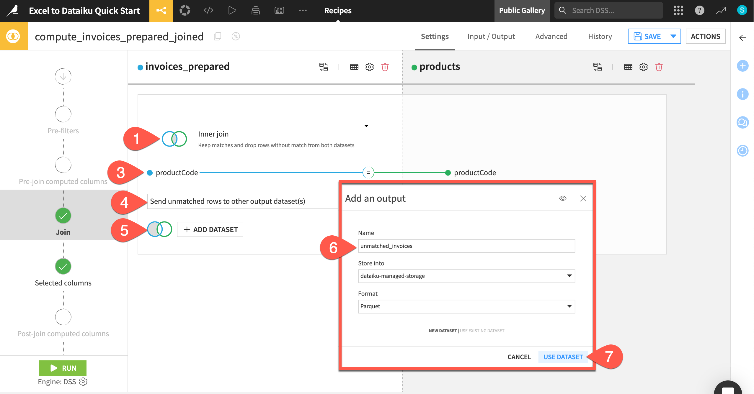
Click on Left join to view the different join types and explanations.
Change the join type to Inner join. This will leave us with only the rows that match from both datasets.
You also need to set the join key, which is shown directly below the join type menu. In our case, Dataiku has correctly identified the productCode column from each dataset.
Leave the automatically selected join key of productCode. If you need to change this, click anywhere on the join key visual to bring up the join condition settings.
Next, decide what to do with any unmatched rows. You can either choose to drop them or send them to another output dataset so you can gauge the quality of the join.
Click on Drop unmatched rows and change the option to Send unmatched rows to other output dataset(s).
Click + Add Dataset under the invoices_prepared dataset.
In the info window, add the Name
unmatched_invoices.Click Use Dataset.
Click Save.
In the next step, we can also check the columns to include in the output dataset. By default, Dataiku selects all non-conflicting columns, so it will include the productCode only from the left dataset. You can change these settings by choosing Manually select columns. We’ll leave the default.
We’re now done with the basic join settings. We’ve already practiced running a recipe from within its settings, so let’s run it another way — from the Flow.
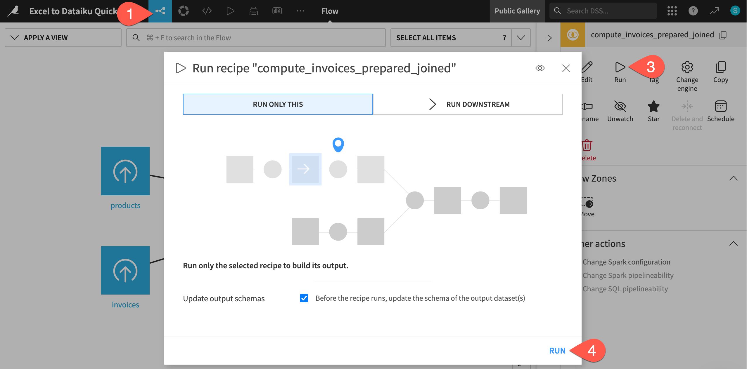
Return to the Flow, using the top navigation menu or keyboard shortcut
g+f.When you return to the Flow, the Join recipe will be selected.
In the right panel, click Run.
In this case, the dialog is set to Run Only This, which means only this particular recipe will run. Click Run.
When you see the Job completed notification, you can double click to explore the invoices_prepared_joined dataset.
You’ll see that the output dataset includes all information from the invoices dataset and also the product name.
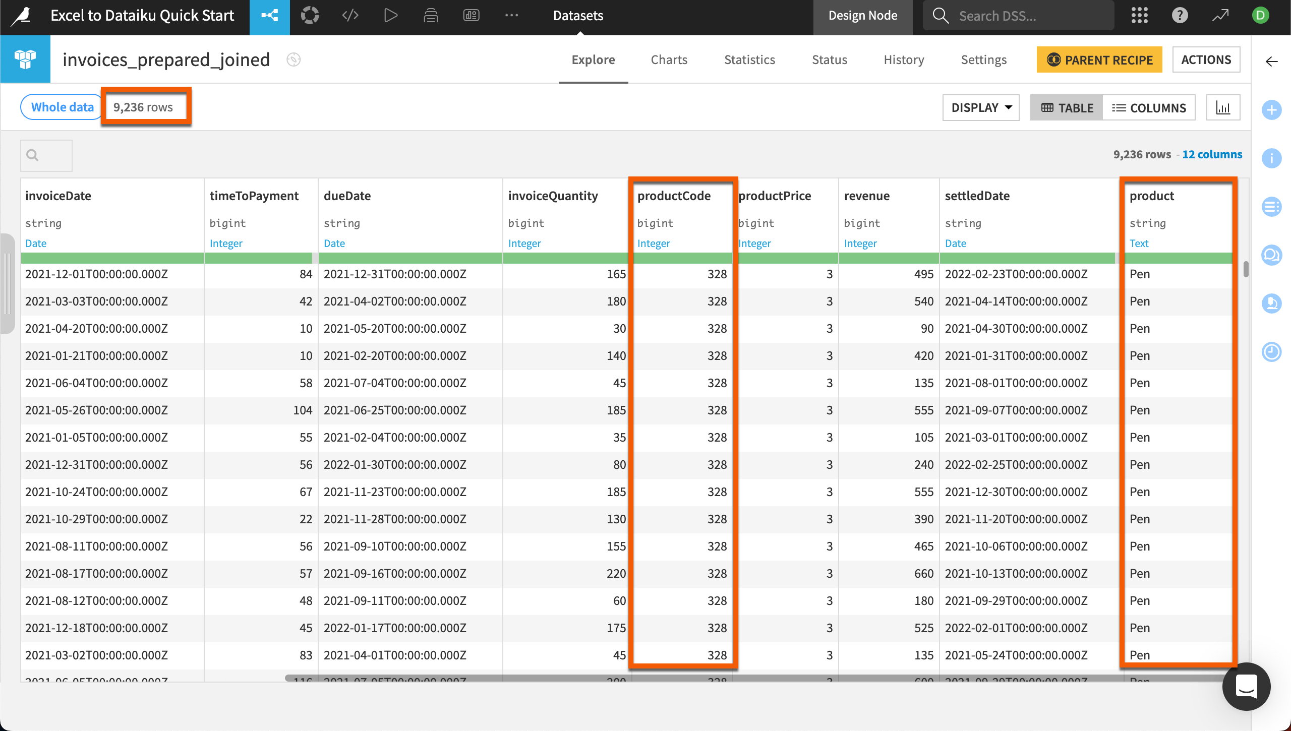
Also notice the dataset has 9,236 rows — 2 fewer than the original invoices dataset. You can explore these in the unmatched_invoices dataset created in the join. These two rows were missing product codes. Because these are a small portion of the data, we won’t worry about fixing them.
Next steps#
Congratulations! You’ve taken your first steps with Dataiku. Continue learning how to translate your Excel skills into Dataiku with the Excel to Dataiku User Guide.
You also can deepen your knowledge of Dataiku through the Core Designer learning path and challenge yourself to earn the Core Designer certificate.


