Tutorial | Machine learning basics#
Get started#
In this tutorial, we will create a machine learning model to predict whether a new customer will become a high-revenue customer. To do this, we’ll train a classification model using historical customer records and order logs from a fictional company, Haiku T-Shirts.
Objectives#
In this tutorial, you will:
Create a baseline classification model.
Browse the model report using charts of feature importance, confusion matrix, density, and ROC curve.
Iterate on the model design by configuring ML assertions, adjusting the feature handling, and generating new features.
Check the model for bias using native tests, such as partial dependence plots, subpopulation analysis, individual explanations, and interactive scoring or What if analysis.
Prerequisites#
Dataiku 12.0 or later.
An Advanced Analytics Designer or Full Designer user profile.
Basic knowledge of Dataiku (Core Designer level or equivalent).
Create the project#
From the Dataiku Design homepage, click + New Project.
Select Learning projects.
Search for and select Machine Learning Basics.
If needed, change the folder into which the project will be installed, and click Create.
From the project homepage, click Go to Flow (or type
g+f).
Note
You can also download the starter project from this website and import it as a ZIP file.
Use case summary#
It costs more to add new customers than it does to keep existing customers. Therefore, the business wants to target high-revenue Haiku T-shirts customers for the next marketing campaign.
Since the business is focused on finding and labeling (predicting) high-revenue customers, we’ll want to maximize the number of correct predictions while also minimizing the number of times the model incorrectly predicts that a customer isn’t a high-revenue customer. To do this, we’ll pay close attention to the confusion matrix when evaluating model results.
The business also wants to be able to measure how well the model is aligning with business expectations for specific known cases.
To enable this measurement, we’ll take advantage of Dataiku’s built-in model diagnostics such as model assertions. Model assertions, or ML assertions, act as a “sanity check” to ensure predictions align with business expectations for specific known cases.
Our goals with the model will be to:
Build a high-performing model to predict high-revenue customers.
Minimize false negatives — that is, minimize the number of times the model incorrectly predicts that a customer isn’t a high revenue customer.
Configure ML assertions.
Create the model#
In the Machine Learning Basics tutorial starter project, you’ll see an initial Flow that imports, prepares, and joins the customers and orders datasets.
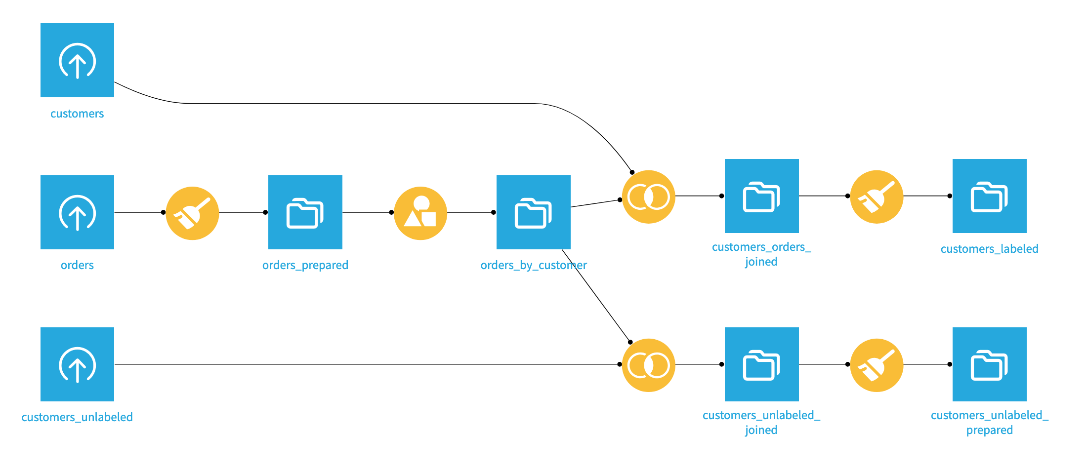
The preparation results in two datasets: customers_labeled, which we will use as a training dataset for our predictive models, and customers_unlabeled_prepared, which represents the new customers we want to predict.
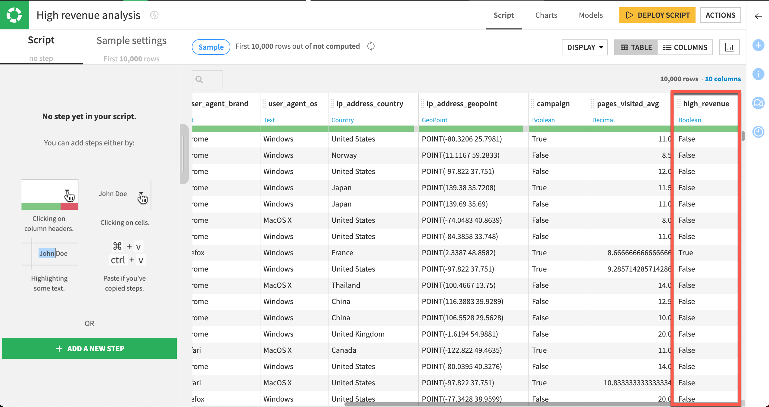
Our labeled dataset contains information about the customer including the age of their first order, the number of pages visited on average, and whether the customer responded to a campaign. The last column high_revenue is a flag for customers generating a lot of revenue based on their purchase history. It will be used as the target variable of our modeling task.
Train a baseline model#
Our goal is to predict (that is, perform a calculated guess) whether the customer will become a “high revenue” customer. If we can predict this correctly, we would be able to assess the quality of the cohorts of new customers, and help the business more effectively drive acquisition campaigns and channels.
In the Flow, select the customers_labeled dataset.
Click the Lab (
) button in the right panel.
Select AutoML Prediction.
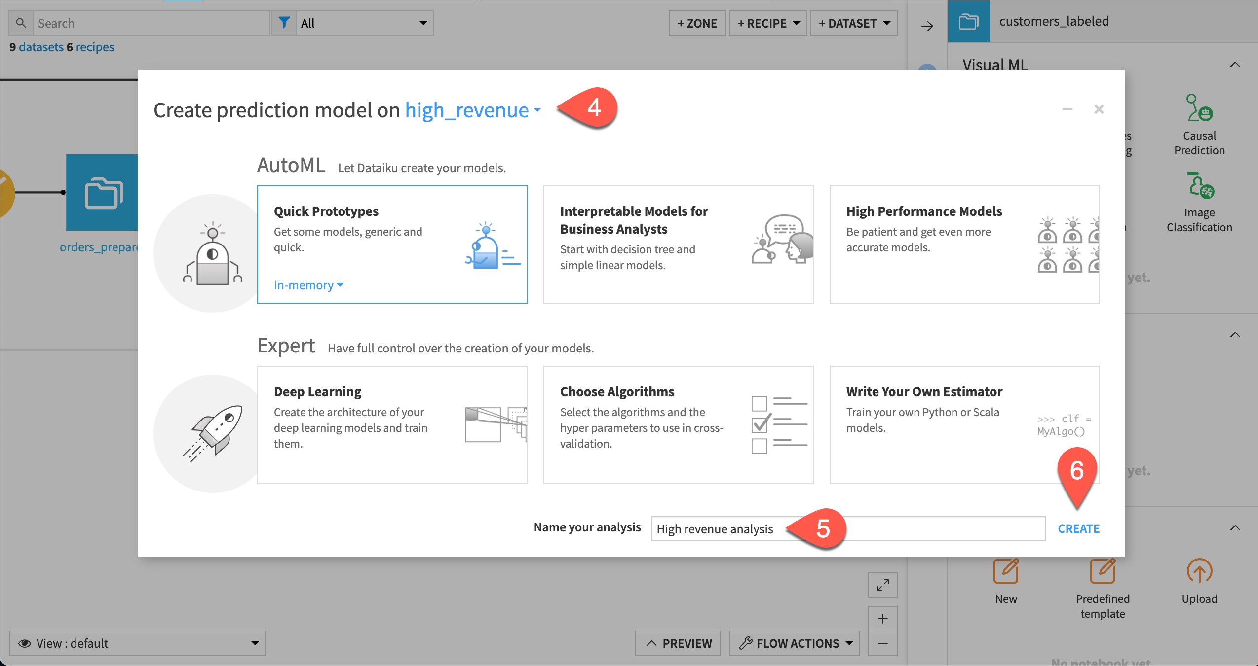
In the info window, after Create prediction model on select high_revenue from the dropdown menu of features.
At the bottom of the window, give the analysis the more descriptive name
High revenue analysis.Click Create.
Click Train. This will build our baseline models. Dataiku guesses the best preprocessing to apply to the features of your dataset before applying the machine learning algorithms.
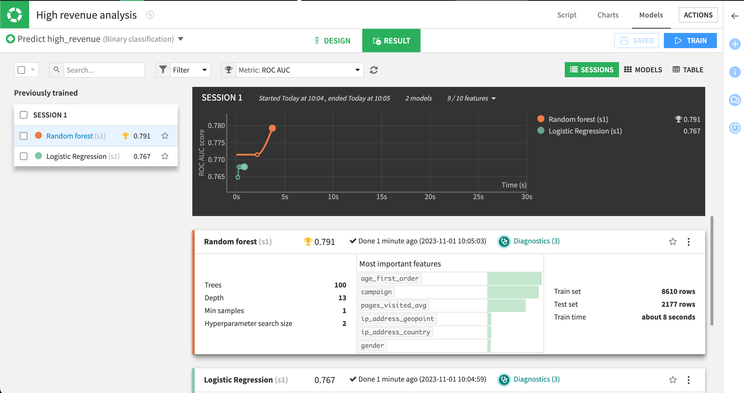
In a few seconds, Dataiku will present a summary of the results. In this case, two classes of algorithms are used on the data:
A simple generalized linear model (logistic regression).
A more complex ensemble model (random forest).
Note
While training the models, Dataiku runs visual ML diagnostics and displays the results in real time. You can hover over the visual ML diagnostics as the models are trained to view any warnings.
Examine baseline results#
We can use the results from our baseline model training session as a comparison as we iterate on our model and try to improve its performance.
Later tutorials will take a closer look at the model results, but we can take a brief tour.
The model summary includes the following information:
The type of model.
A performance measure; here the Area Under the ROC Curve or AUC is displayed.
A summary of the most important variables in predicting your target.
The AUC measure is handy: the closer to 1, the better the model. Here the Random forest model seems to be the most accurate.
On the left, select the Random forest model to view its model report.
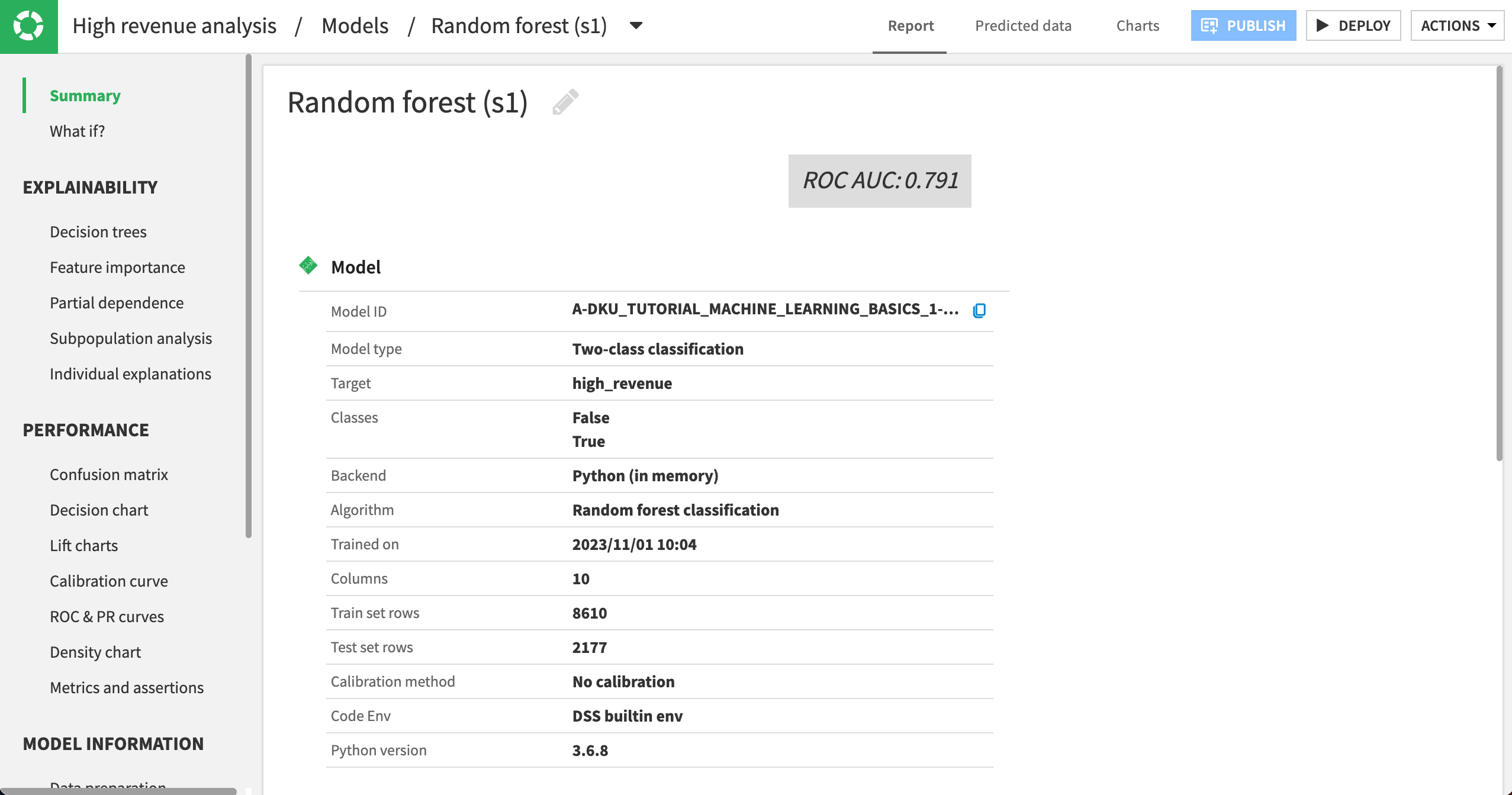
The Summary panel shows an ROC AUC value of approximately 0.791. Whether this is satisfactory depends heavily on your use case and objectives.
Note
You might find that your actual results are different from those shown. This is due to differences in how rows are randomly assigned to training and testing samples.
Evaluate the model#
Now that you’ve built your first model, let’s look at ways to interpret and understand its prediction quality and model results.
Model explainability#
The Explainability section in the left panel groups information for assessing the model’s behavior and the contribution of features to the model outcome.
Note
Some of the options under Explainability are algorithm-dependent. For example, a linear model will display information about the model’s coefficients, while a tree-based model will display information about decision trees.
Feature importance#
Let’s explore details about the model’s behavior and the relationship between input data and output predictions.
Navigate to the Feature importance panel.
Review the three provided charts.
Chart |
Description |
|---|---|
|
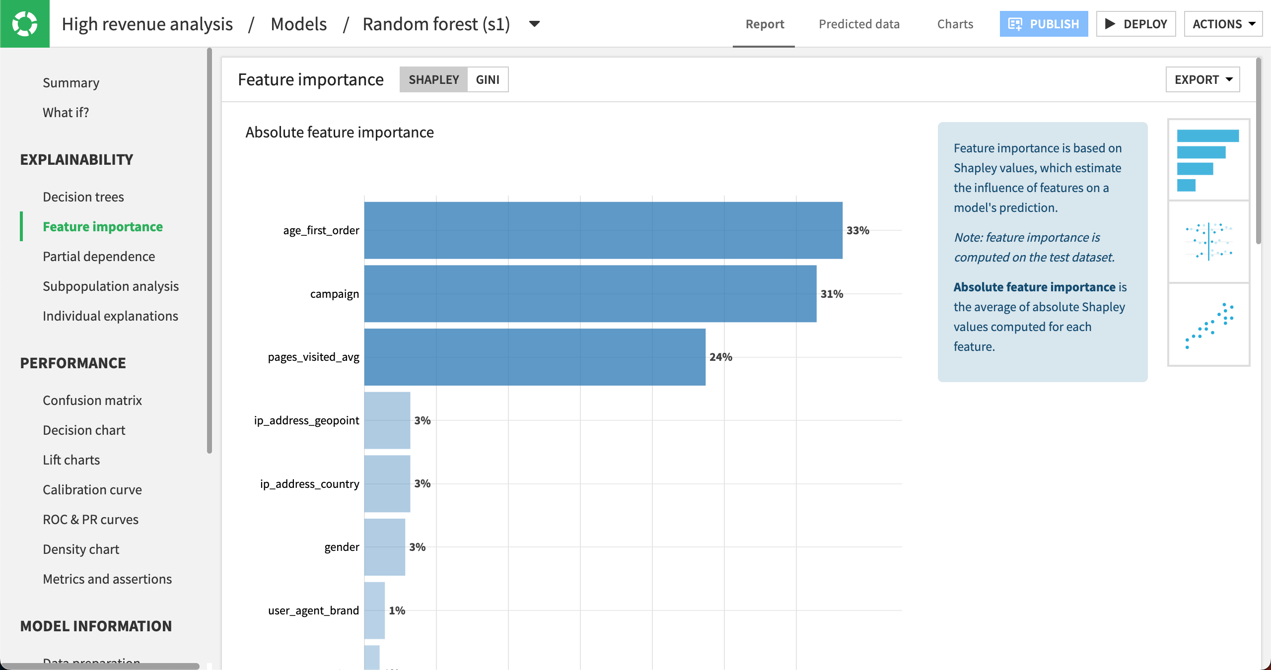
The Absolute feature importance plot reveals the impact of the variables used to train the model on the target feature high_revenue. Notice that some variables seem to have a stronger impact than others. Notably, the age at the time of first purchase, age_first_order, seems to be a good indicator along with the campaign and pages_visited_avg. |
|
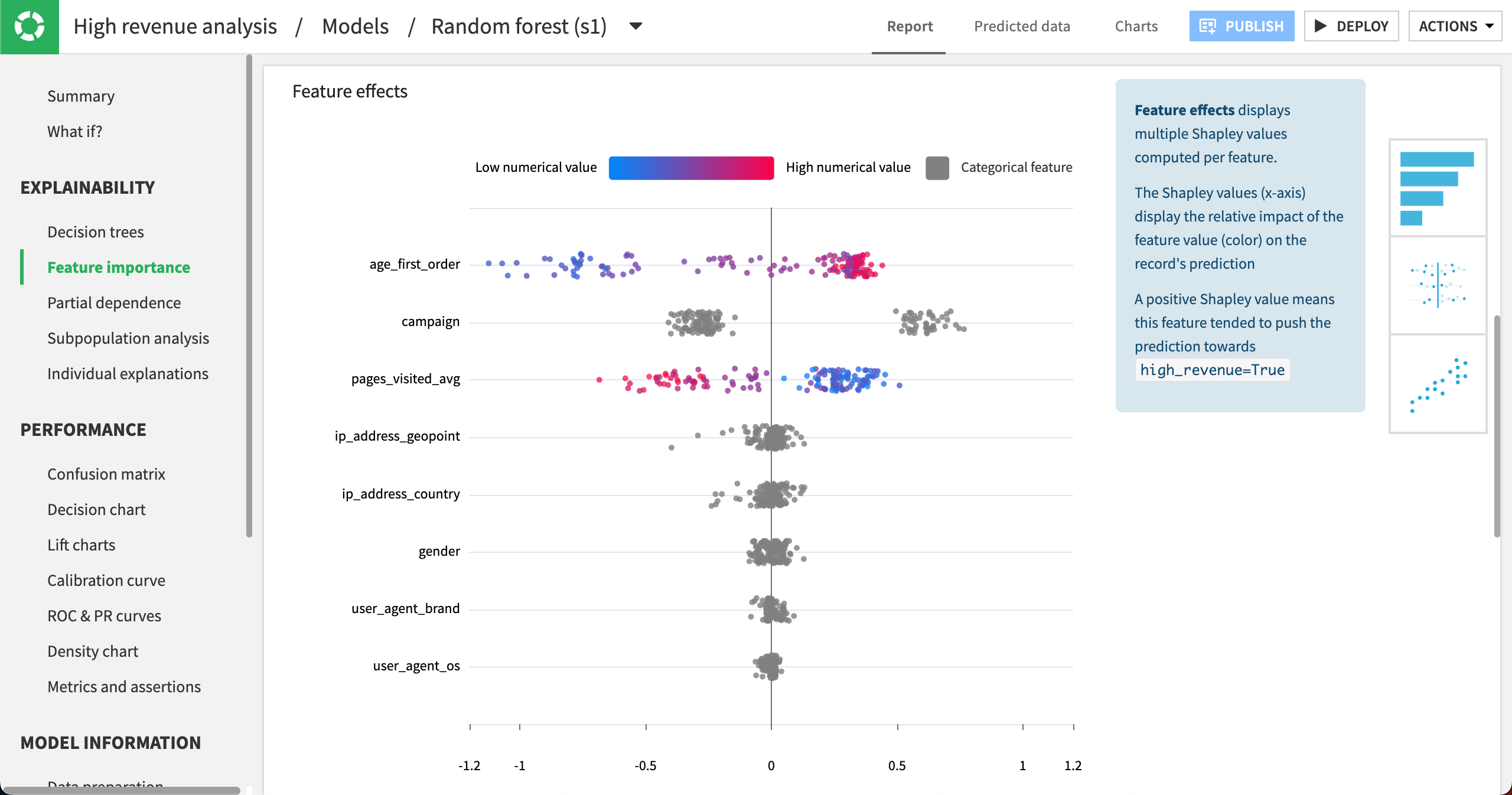
The Feature effects plot shows variables again ordered according to their importance. Each point represents one row from the dataset. The point’s position on the x-axis shows how strongly that feature value impacted the prediction, positively or negatively. The point’s color shows whether the feature value was relatively low (blue) or high (red). Categorical features are shown in gray. You can hover over any point to get additional details. |
|
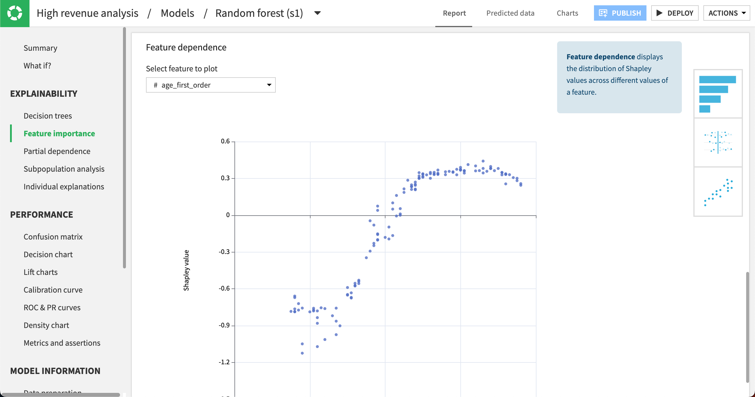
The Feature dependence plot displays the distribution of Shapley (influence) values vs. a feature’s values. You can choose different features in the Select feature to plot dropdown. Here, we can see that the age_first_order values that had the most effect on revenue are around 20 (negatively affecting revenue) and around 60 to 70 (positively affecting revenue). In other words, older customers are more likely to bring in high revenue. |
We can use this information to both evaluate the model’s performance and help meet business objectives. You can export the data from the tab by clicking Export in the top right. You can also share the charts to dashboards after a model has been deployed to the Flow or share the feature importance plot with the model documentation generator.
Note
The Explainability section also contains panels for creating partial dependence plots, performing subpopulation analysis, and providing individual explanations at a row-level. The Tutorial | Responsible AI training offers some hands-on practice with these concepts.
Interpret model performance#
The Performance section provides information for assessing the performance of the model.
Note
Options under Performance are also algorithm-dependent. Here we discuss options for our classification task, but a regression task would include a scatter plot and error distribution. A clustering task would have a heatmap and cluster profiles.
Confusion and cost matrix#
The confusion matrix is a table used to evaluate the performance of a classification model by displaying the counts of true positive, false positive, true negative, and false negative predictions. You can also view the associated metrics: precision, recall, F1 score.
These values depend on the cut-off threshold, or the probability at which we label something True or False. For our use case, this is the probability at which we classify customers as either high revenue (True) or not (False).
Note
By default, the value of the cut-off threshold is optimized by Dataiku. However, you can change the threshold manually in this panel.
Open the Confusion matrix panel.
Review the confusion matrix and think about whether it demonstrates a favorable result.

This panel also includes the Cost matrix. Cost matrices relate to confusion matrices by assigning specific gains or losses to each cell in the confusion matrix, thereby quantifying the financial or practical impact of each type of prediction error and correct prediction.
Let’s assign specific costs for our scenario. Keep in mind that we want to detect high-revenue customers as best as possible and minimize the error of misclassifying high-revenue customers as non-high-revenue customers (false negatives).
Configure the Cost matrix weights as follows:
If the model predicts True and the value is True, the gain is
5.If the model predicts True but the value is False, the gain is
-1.If the model predicts False and the value is False, the gain is
0.5.If the model predicts False, but the value is True, the gain is
-10.
Take a moment to consider why we chose these cost weights.
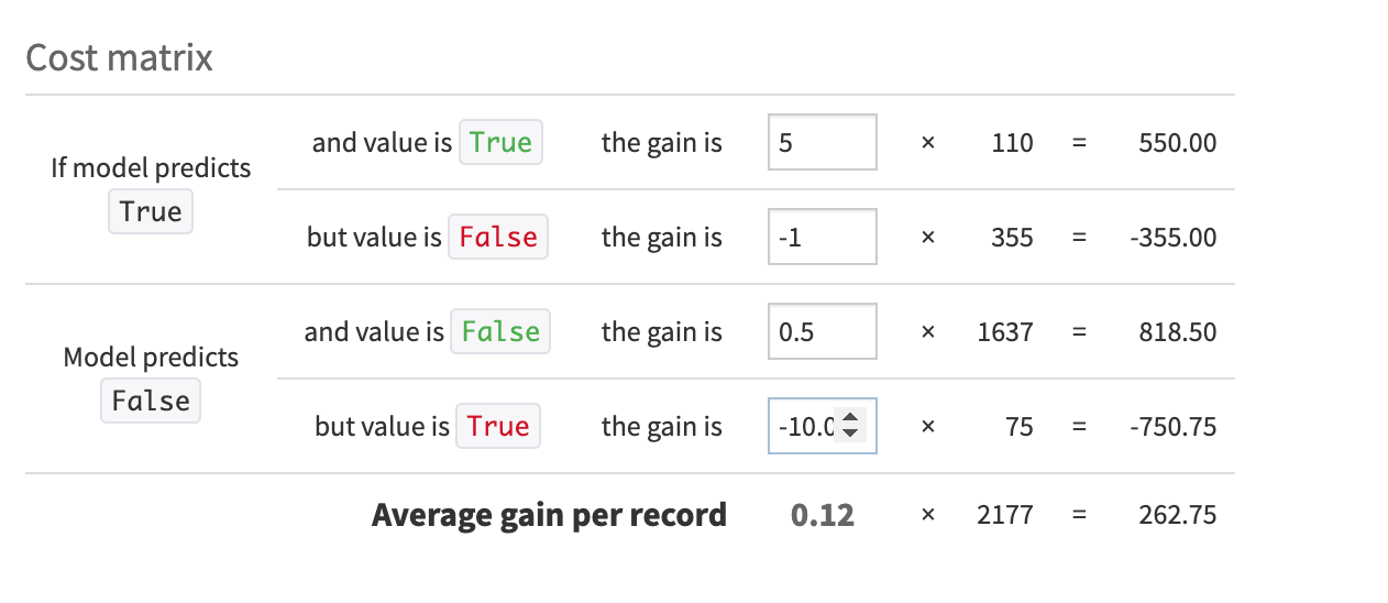
With this configuration, we lose one dollar for each incorrect prediction of True and lose ten dollars for each incorrect prediction of False. As you can see, we made the false negative much more costly than a false positive.
With our Cost matrix weights in place, we could experiment with adjusting the cut-off threshold using the slider at the top of the Confusion matrix until the Cost matrix reaches an Average gain per record that satisfies our business use case.
Metrics and assertions#
Recall from our business objectives that the business analyst wants to define built-in checks for ML assertions. Dataiku provides a way to find detailed performance metrics, dependent and independent of a cut-off threshold, and results of ML assertion checks.
Open the Metrics and assertions.
Review the tooltips next to different metrics to learn more about each value.
We don’t have any assertions defined yet. We’ll do that later in the tutorial.
Model information section#
Model Information is a recap about how the model has been built and includes ML diagnostics. This information is helpful when you want to tune your model design or share information about your model.
Training information#
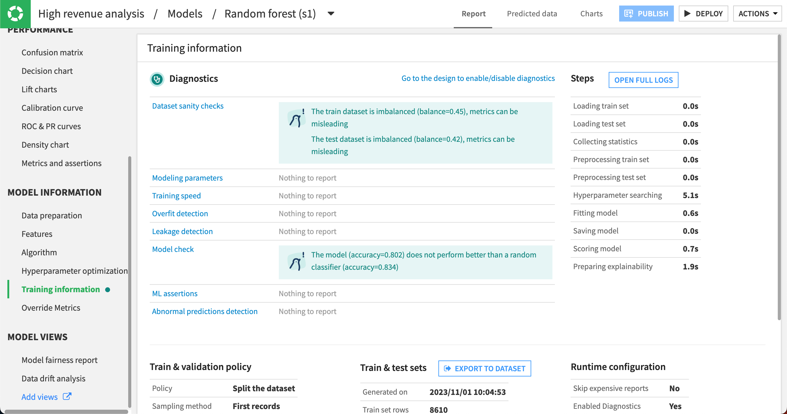
In the Training information panel, Dataiku displays the results of ML diagnostics including dataset sanity checks. It looks like, in our case, the train and test datasets are imbalanced. This is common in machine learning.
The train and test datasets are rarely completely balanced in machine learning, yet, Dataiku still alerts us about the level of imbalance. If the level of imbalance becomes too large, the model’s performance could be impacted.
Additionally, the Training information panel provides a way for us to export the train and test sets so that we know which rows the model used for training and testing. We could then export this dataset for conducting our own model evaluation or even for meeting regulatory compliance needs.
Note
This tutorial introduced a few different sections of a model report. If you want, you can review other panels and try to interpret them with this use case.
Tune the model#
You have built a basic model to classify high revenue customers and looked at a few ways to evaluate its performance. Because modeling is an iterative process, let’s now turn our attention to improving the model’s results and speeding up the evaluation process.
Return to the model design#
We first need to return to the design of the modeling task.
Navigate to the High revenue analysis attached to the customers_labeled dataset by clicking on Models within the High revenue analysis/Models/Random forest title at the top of the page.
Click on the Design tab near the top center of the page.
Configure the train / test split#
One setting we may wish to tune is the split between training and testing sets.
Click on the Train / Test Set panel of the model’s design.
By default, Dataiku randomly splits the first N rows of the input dataset into a training set and a test set. The default ratio is:
80% for training.
20% for testing.
This means Dataiku will take the first N rows of the dataset and randomly take 80% of those rows to train the model. This could result in a biased view of the dataset.
If we return to the customers_labeled dataset in the Flow, and analyze the high_revenue column, our target column, we can see that there is a class imbalance.
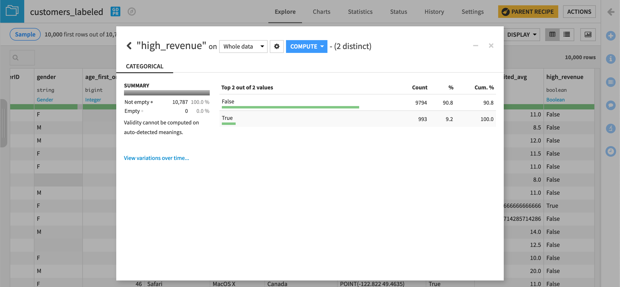
This could be problematic when taking only the first N rows of the dataset and randomly splitting it into train and test sets. However, since our dataset is small, we’ll keep the default sampling & splitting strategy.
See also
One way to try to improve a class imbalance is to apply a class rebalance sampling method. Visit the reference documentation on train/test set settings to discover how Dataiku allows you to configure sampling and splitting.
Adjust feature handling settings#
To address the issue about pre-processing of variables before training the model, we’ll use the Features handling panel. Here, Dataiku will let you tune different settings.
Reject GeoPoint feature#
Let’s decide which variables should be used or not used for model training.
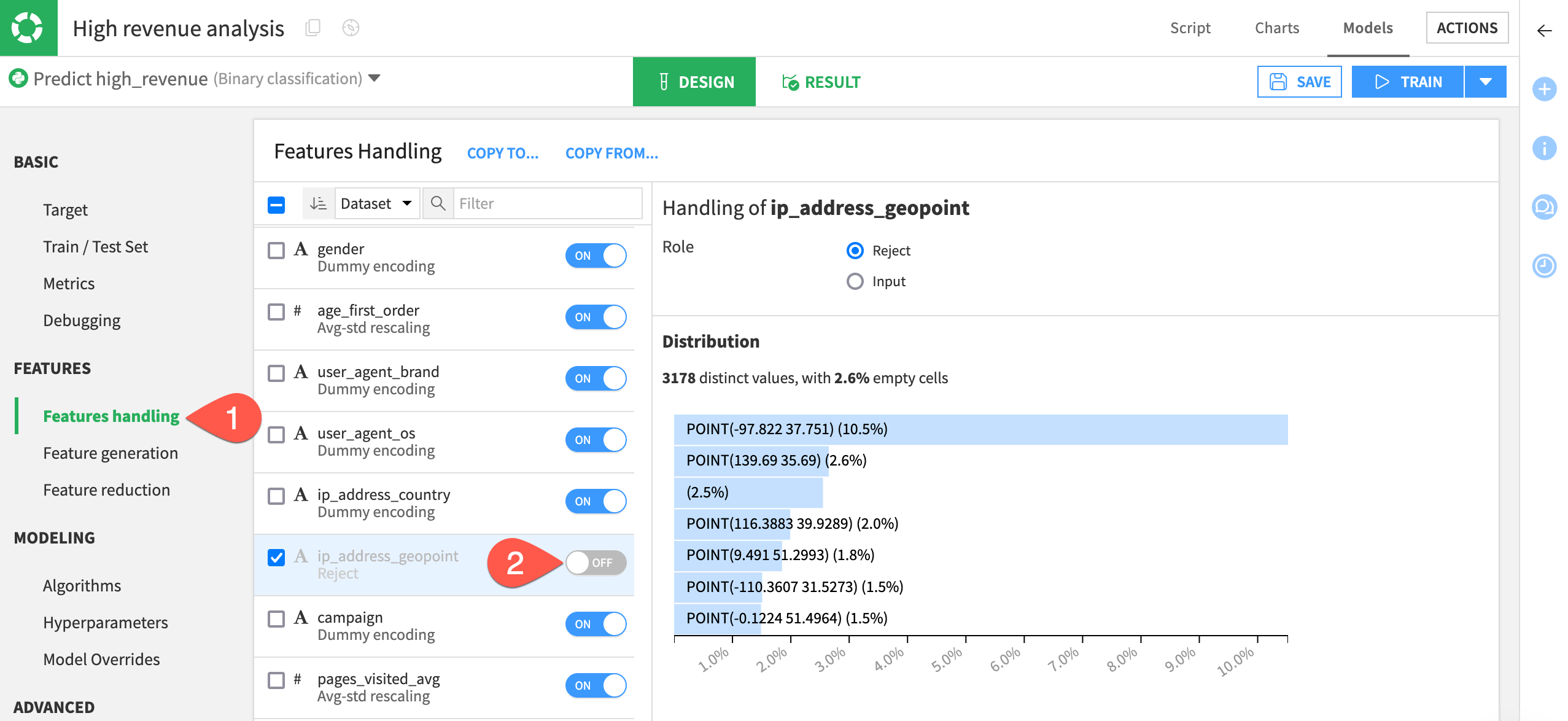
Since criteria like a GeoPoint isn’t relevant for our prediction because it doesn’t generalize well on new records, we’ll remove ip_address_geopoint from the model.
Select Features handling in the Features section of the left panel.
Toggle off ip_address_geopoint to exclude the feature from the model.
Disable rescaling behavior#
The Type of the variable is important to define how it should be preprocessed before it’s fed to the machine learning algorithm:
Variable type |
Contents |
|---|---|
Numerical |
Real-valued data. They can be integer or numerical with decimals. |
Categorical |
Nominal values: red/blue/green, a ZIP code, a gender, etc. Also, there will often be times when a variable that looks like numerical should actually be categorical instead. For example, this will be the case when an “id” is used instead of the actual value. |
Text |
Raw blocks of textual data, such as a social media post or customer review. Dataiku is able to handle raw text features with specific preprocessing. |
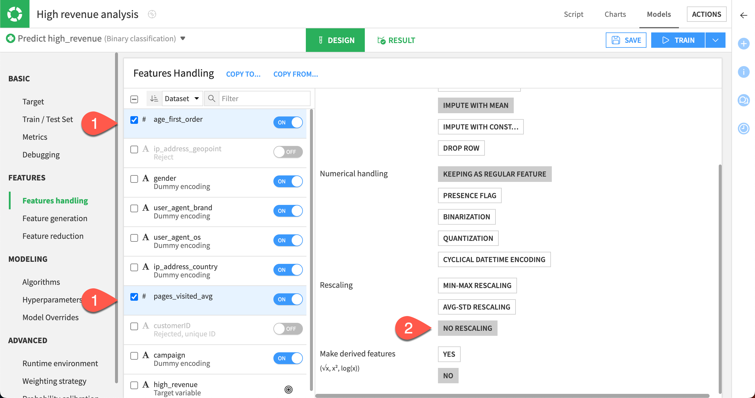
The numerical variables age_first_order and pages_visited_avg have been automatically normalized using a standard rescaling (this means that the values are normalized to have a mean of 0 and a variance of 1).
Let’s disable this behavior, and use No rescaling instead.
Select the checkboxes for the variables age_first_order and pages_visited_avg.
In the menu for handling the two selected features, under Rescaling, select No Rescaling.
Generate new features#
Generating new features can reveal unexpected relationships between the inputs (variables/features) and the target.
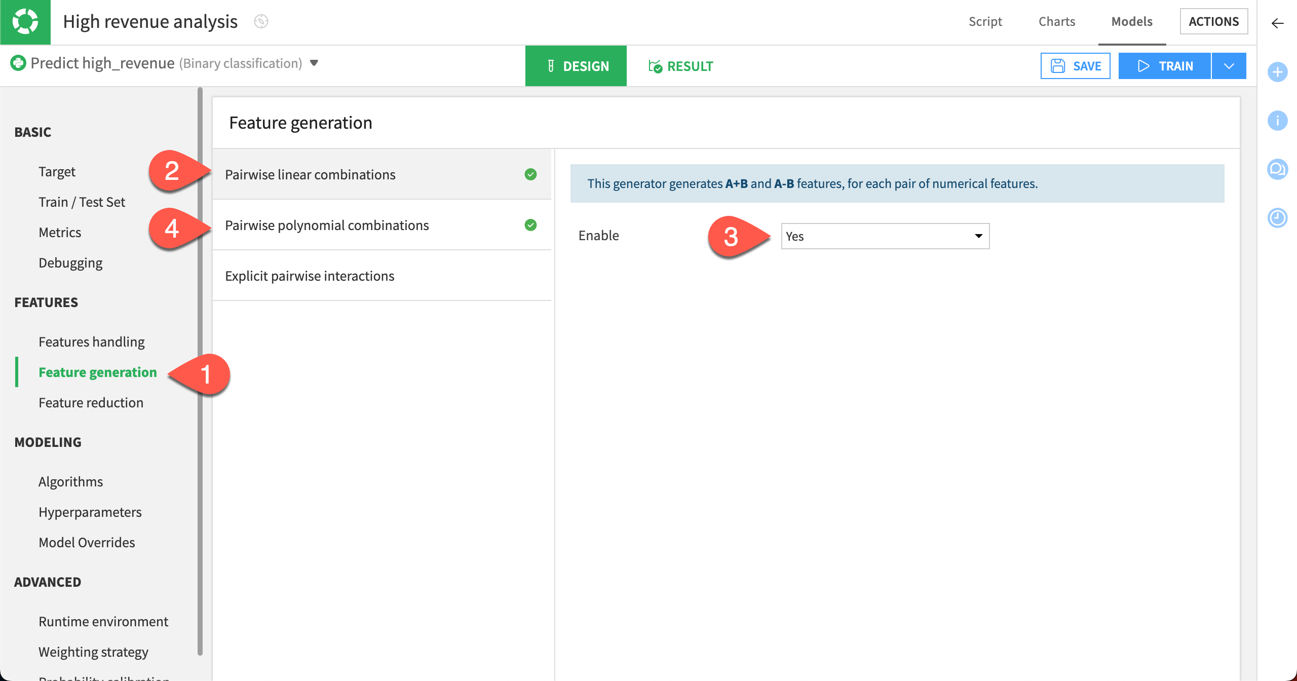
We can automatically generate new numeric features using Pairwise linear combinations and Polynomial combinations of existing numeric features.
In the Features section, select the Feature generation panel.
Select Pairwise linear combinations.
Set Enable to Yes.
Select Pairwise polynomial combinations.
Set Enable to Yes.
Train new models#
After altering the Design settings, you can build some new models.
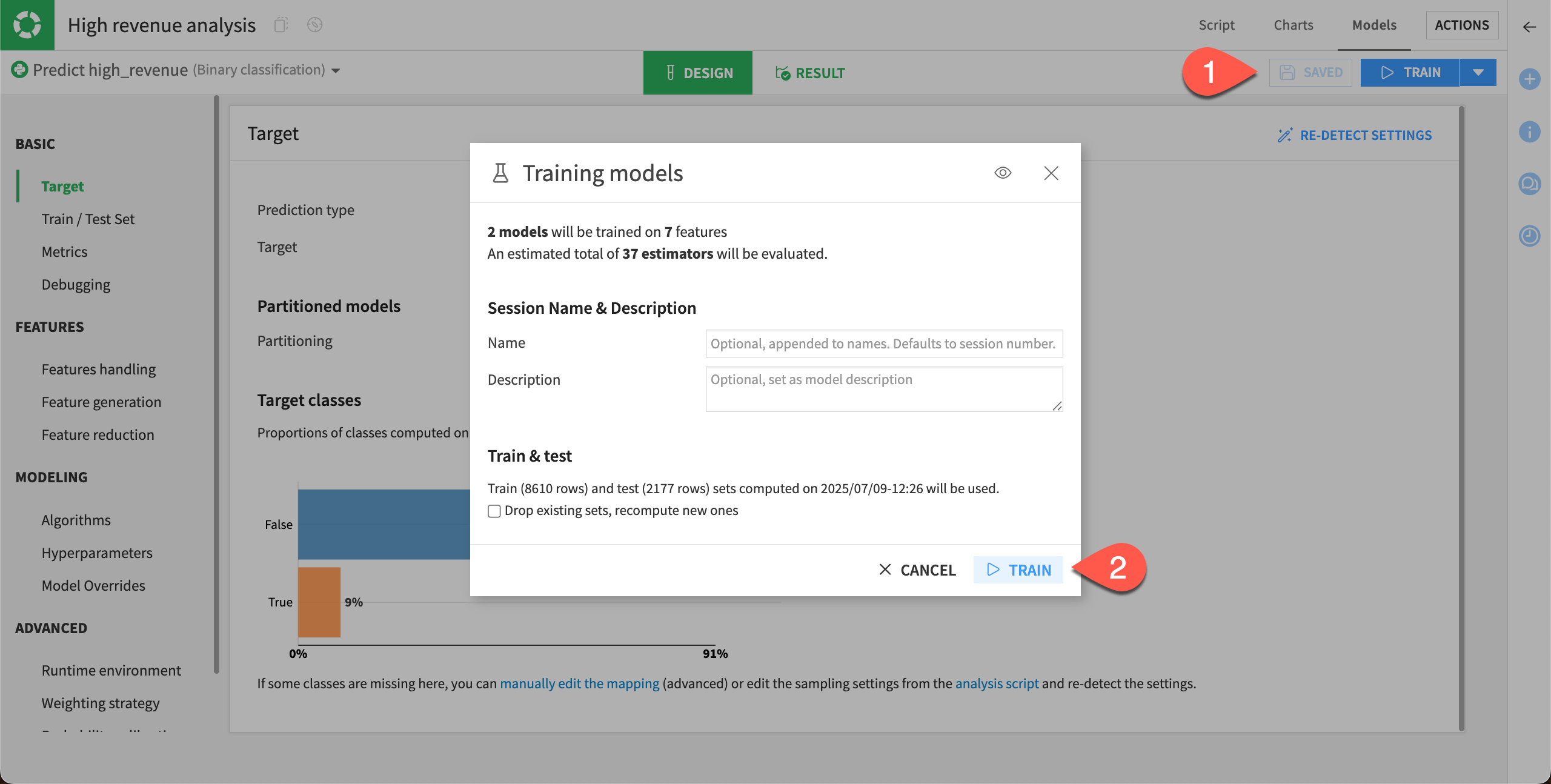
Select Save, and then click Train.
Select Train again to start the second training session.
Once the session has completed, you can see that the performance of the random forest model has now slightly increased.
Evaluate the new models#
In our case, session 2 resulted in a Random Forest model with an AUC value that’s slightly higher than the first model.
Diagnostics#
When training is complete, we can go directly to ML diagnostics.
Select Diagnostics in the Result tab of the random forest model to view the results of the ML diagnostics checks.
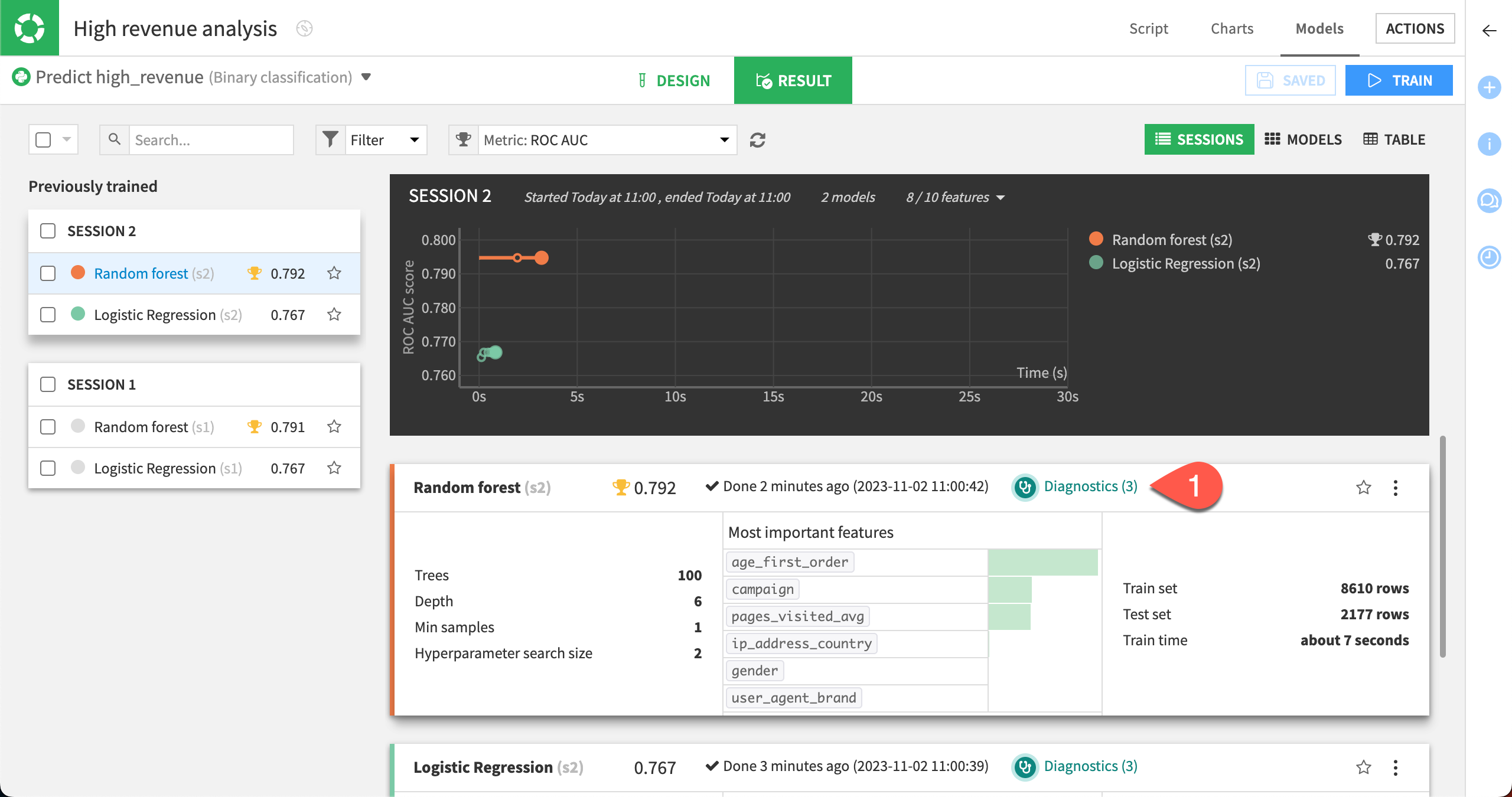
Dataiku displays Model Information > Training information. Here, we can view warnings and get advice to avoid common pitfalls, including if a feature has a suspiciously high importance — which could be due to a data leak or overfitting.
This is like having a second set of eyes that provide warning and advice, so that you can identify and correct these issues when developing the model.
Feature importance#
Finally, let’s look at the Feature importance charts for the latest model.
Select Feature importance in the Explainability section.
At the top of the page, change the Feature importance method to Gini to view the Variable importance chart.
We can see that the importance is spread across the campaign variable along with the features automatically generated from age_first_order and pages_visited_avg. The generated features may have uncovered some previously hidden relationships.
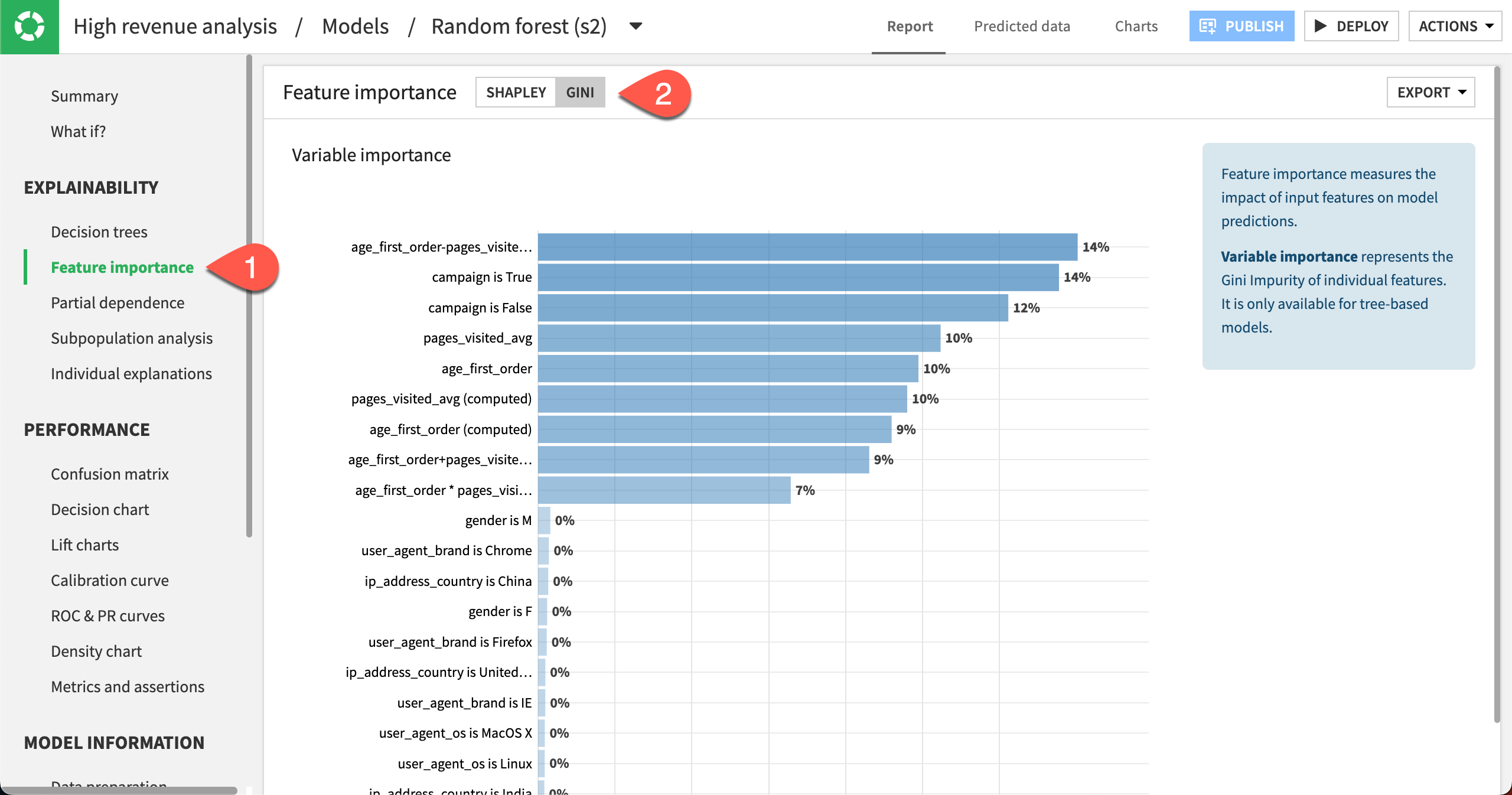
You can also switch the Feature importance method back to Shapley to view more feature importance charts such as Feature effects and Feature dependence plots.
Table view#
Now that you have trained several models, all the results may not fit your screen. To see all your models at a glance:
Go back to the Result tab. You can do this by clicking on Models in the High revenue analysis/Models/Randomforest (s2) title.
Switch to the Table view.
You can sort the Table view on any column, such as ROC AUC. To do so, just click on the column title.

Explain the model#
You’ve modified various settings that improved the model’s performance. Before putting this model into production, we want to make sure we understand its predictions. It’s advisable to investigate whether its predictions are biased, in this case for example, by age groups or gender.
Return to the model results#
For these explainability tests, we’ll need to return to the results of the modeling task.
Navigate to the High revenue analysis attached to the customers_labeled dataset.
Click on the Result tab near the top center of the page.
Open the model report for the best performing Random forest model by clicking on its name.
Compute a partial dependence plot#
We can compute partial dependence plots on both numeric and categorical features.
On numeric features#
First, let’s use a partial dependence plot to understand the effect of a numeric feature (age_first_order) on the target (high_revenue).
Click Partial dependence in the left panel.
Specify age_first_order as the variable.
Click Compute.
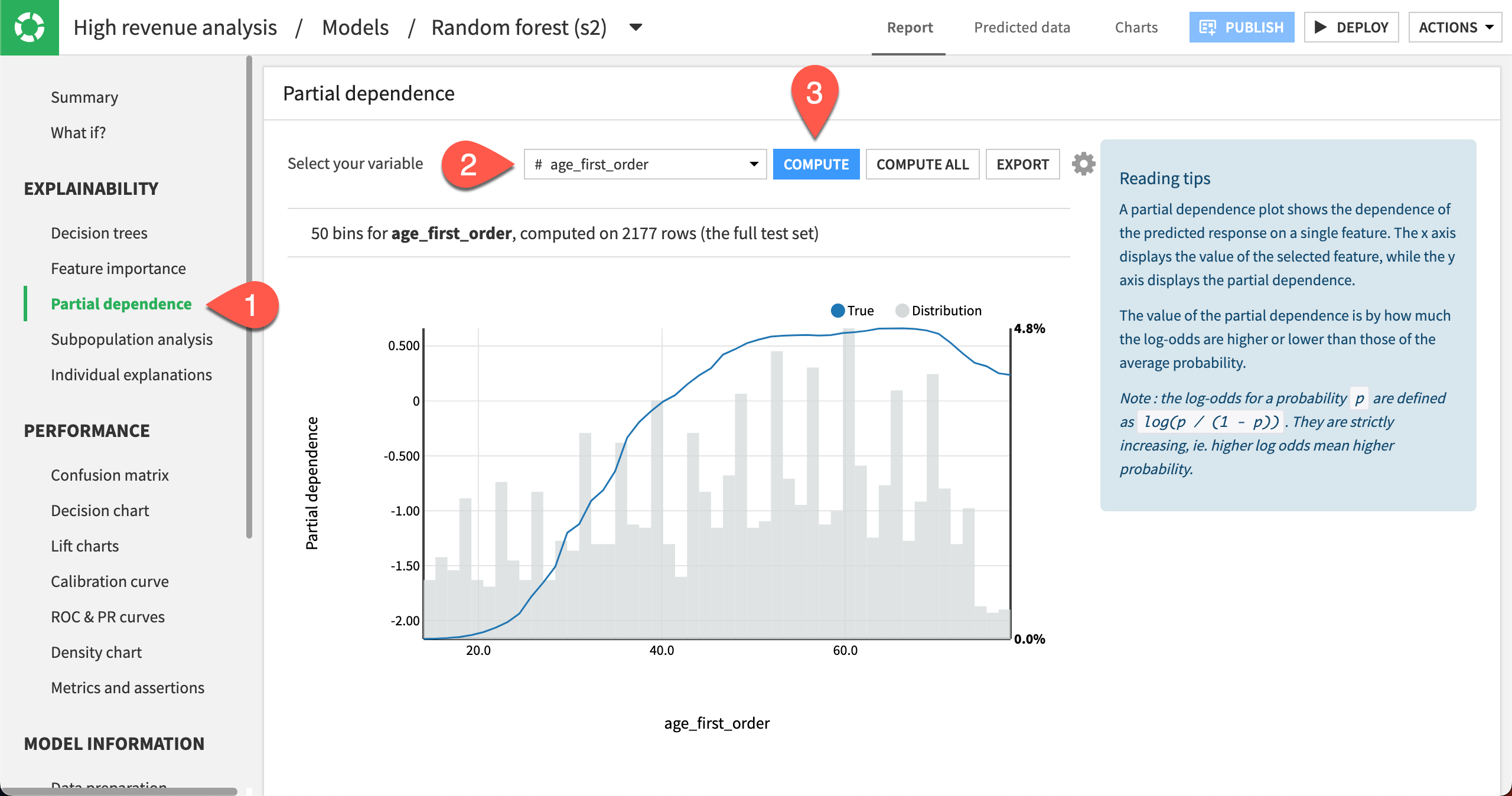
The partial dependence plot shows the dependence of high_revenue on the age_first_order feature, computed on the test set (2177 rows).
A negative partial dependence value represents a negative dependence of the predicted response on the feature value.
A positive partial dependence value represents a positive dependence of the predicted response on the feature value.
For example, the partial dependence plot shows that high_revenue being True has a negative relationship with age_first_order for ages below 39 years. The relationship reaches a plateau between ages 50 and 70, but then drops off until age 78.
Underneath the trend line, the plot also displays the distribution of the age_first_order feature. From the distribution, you can see that there is sufficient data to interpret the relationship between the feature and the target.
On categorical features#
Let’s see what the partial dependence plot looks like for a categorical feature gender.
Select gender as the variable.
Click Compute.
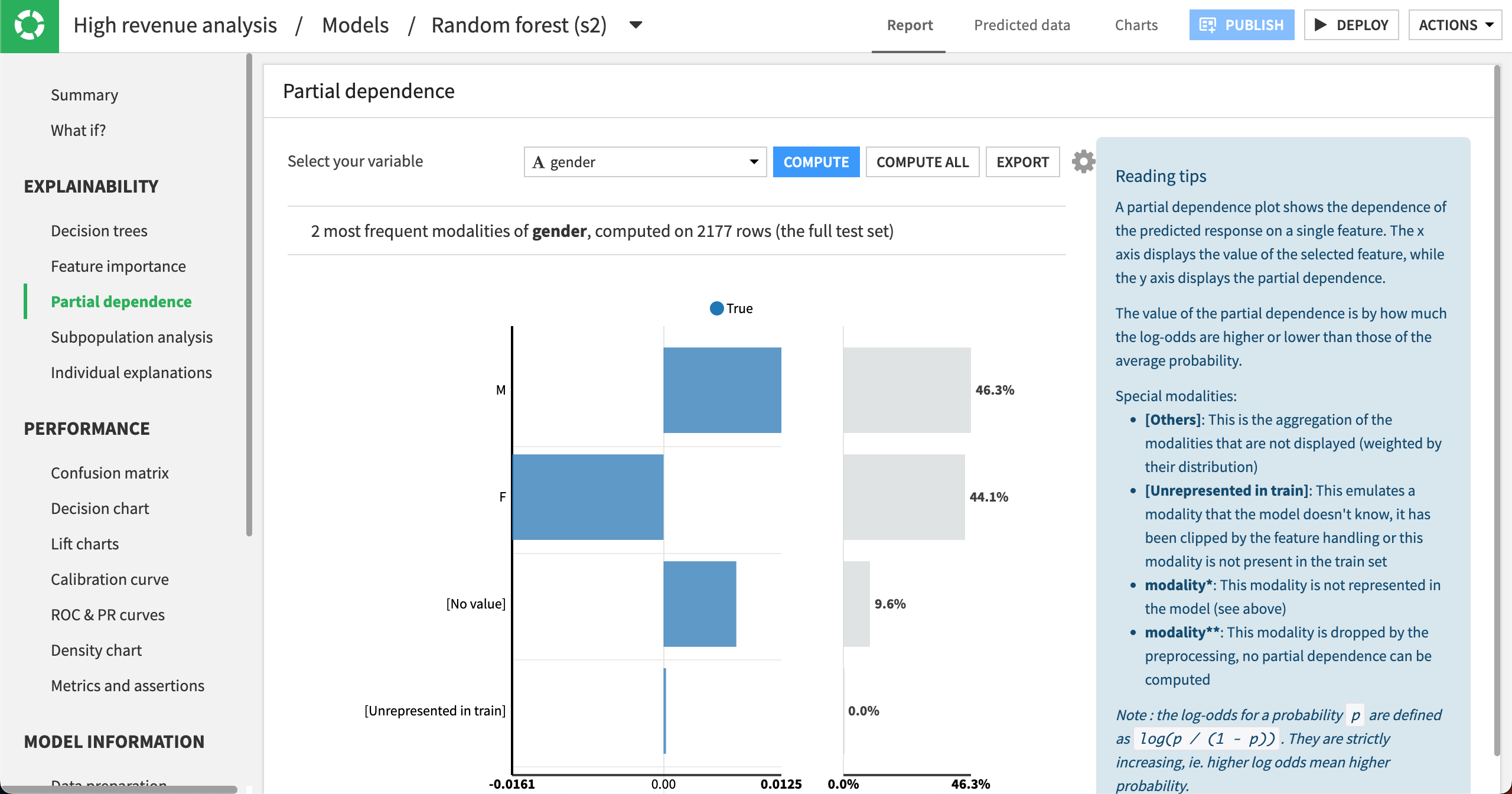
The partial dependence plot shows that high_revenue being True has a negative relationship with gender being F. In the cases where gender is M or has no value, then the relationship is positive. The gender distribution (on the right) is roughly equal between males and females, and it accounts for about 90% of the data.
Use subpopulation analysis#
Another useful tool to better understand the model is subpopulation analysis. Using this tool, we can assess if the model behaves identically across subgroups or if the model shows biases for certain groups.
Let’s use a subpopulation analysis to understand how our model behaves across different gender groups.
Click Subpopulation analysis in the left panel.
Specify gender as the variable.
Click Compute.
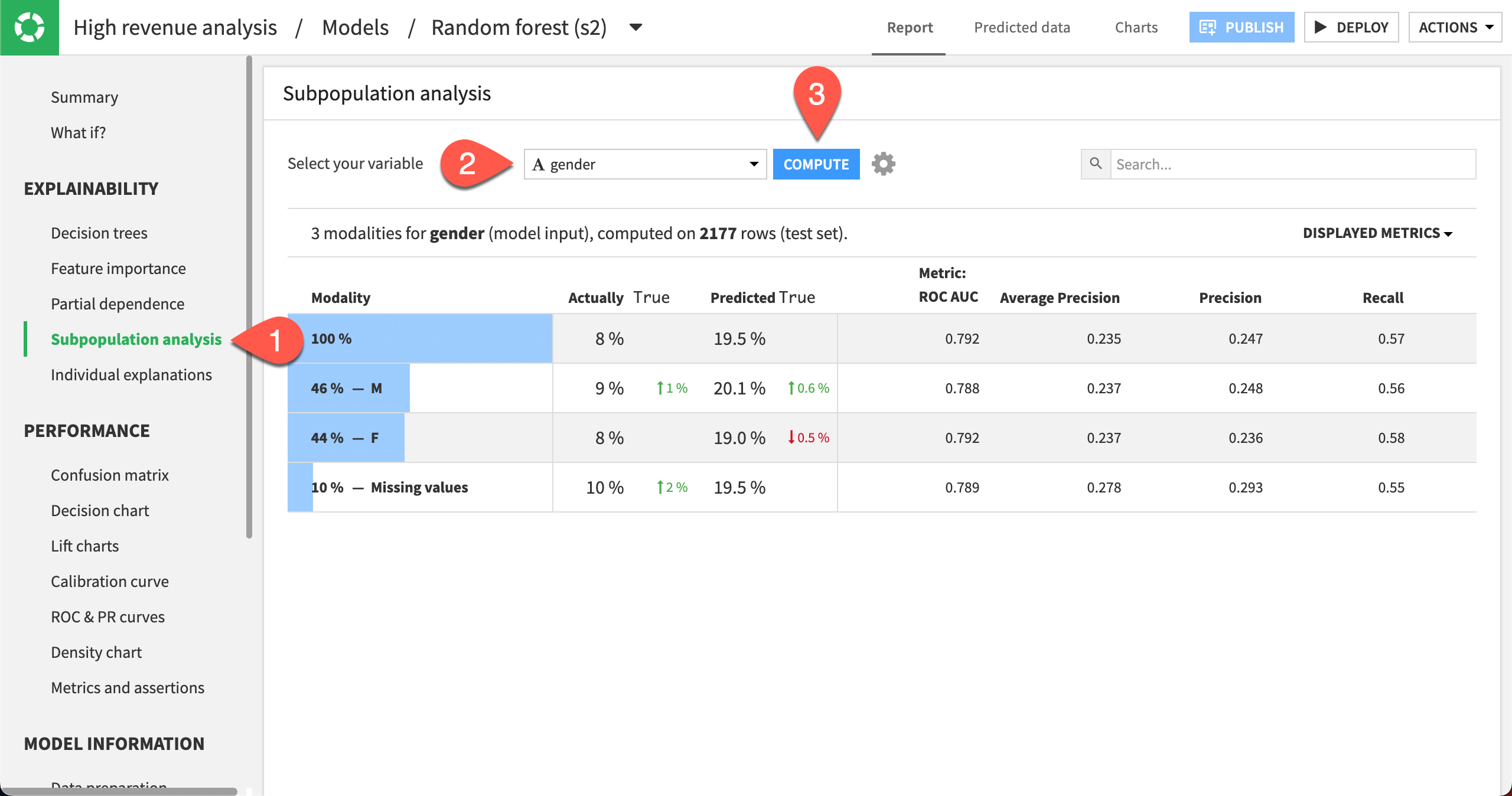
The table shows a subpopulation analysis for gender, computed on the test set. The overall model predicted that high_revenue was true approximately 19% of the time when it was actually true only 8% of the time.
The model predicted True 20% of the time for the M subgroup, when the actual number was 9%.
For the F subgroup, the model predicted that high_revenue was true 19% of the time when the actual number was 8%.
The predicted probabilities for male and female are close, but not identical. We can investigate whether this difference is significant enough by displaying more metrics in the table and more detailed statistics related to the subpopulations represented by the F and M rows.
Click the Displayed Metrics dropdown at the top right of the table.
Select F1 Score. Note that this metric considers both the precision and recall values. The best possible value is one, and the worst is zero.
Click anywhere on the F and M rows to expand them.
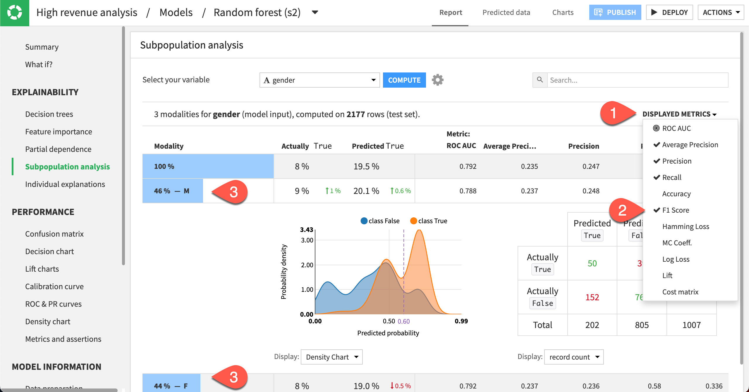
In this analysis, the male subgroup has the highest F1 score of all the groups, even though the score is quite low. Also, the confusion matrices (when displaying % of actual classes) for both the male and female groups show that the female subgroup does better (58%) at correctly predicting high_revenue to be true than the male subgroup (56%).
Explore individual explanations#
Apart from exploring the effects of features on the model, it can also be useful to understand how certain features impact the prediction of specific rows in the dataset. The individual prediction explanations feature allows you to do just this!
Note that this feature can be computed in two ways:
From the Individual explanations panel in the model results page.
Within a Scoring recipe (after deploying a model to the Flow), by checking the option Output explanations. See the Scoring Basics course for an example.
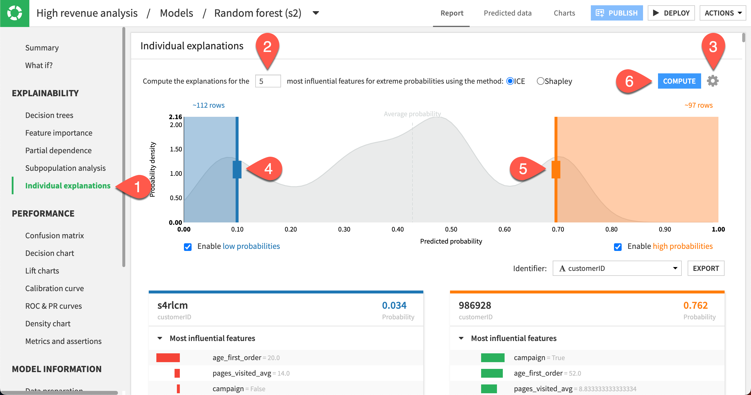
Let’s use the Individual explanations panel in the model results page to visualize the five most influential features that impact the prediction for specific samples in the dataset.
Click Individual explanations in the left panel.
Compute explanations for the
5most influential features.Click the gear icon in the top right corner to see more settings, such as the sampling details. Keep the Sample size as
1000.Move the left slider close to
0.10.Move the right slider close to
0.70to specify the number of rows at the low and high ends of the predicted probabilities.Click Compute.
Note
This sample is drawn from the test set because the model implemented a simple train/test split. If the model implemented K-Fold validation, then the sample would be drawn from the entire dataset.
The probability density function in the background is an approximation based on the test set. The boxes to enable low and high probabilities are checked by default, so that you can move the sliders.
In our example, Dataiku returned 112 rows for which the output probabilities are less than 0.10, and about 97 rows for which the output probabilities are greater than 0.70. Each row explanation is represented in a card below the probability density plot. Notice that Dataiku has selected customerID as the identifier, but you can change this selection.
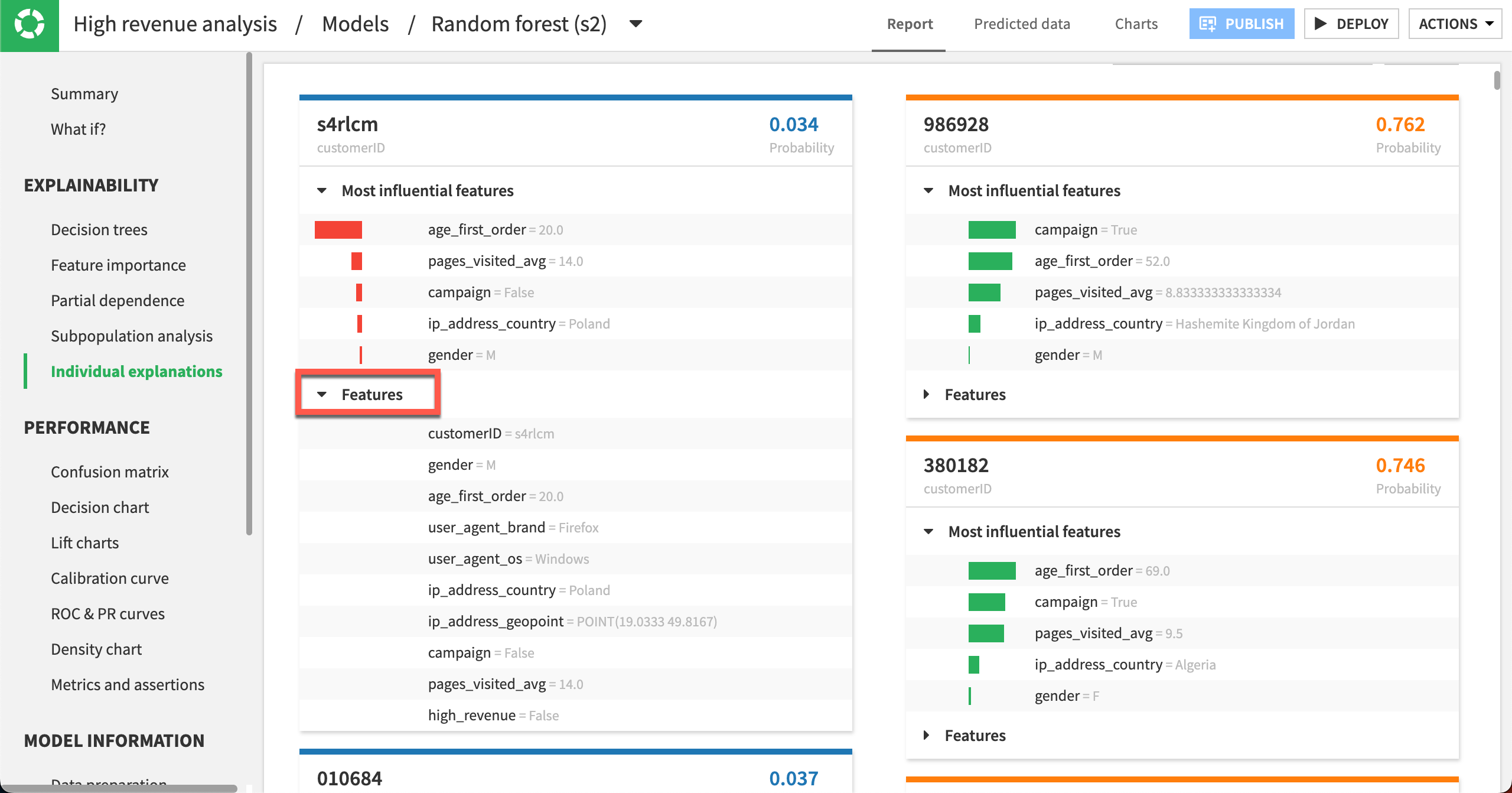
On the left side of the page, the cards have low probabilities of high_revenue being True and are sorted in order of increasing probabilities. In contrast, the cards on the right side of the page have high probabilities of high_revenue being True and are sorted in order of decreasing probabilities. For each card, the predicted probability is in the top right, and the customerID (card identifier) is in the top left.
For cards on the left side of the page, observe that all bars are red and oriented to the left. This reflects that the predicted probability is below average and the features negatively impact the prediction. In some cases, some bars may have counter effects (green and oriented to the right), even so, the net effect of the features will still be negative for cards on the left side of the page.
The opposite observation can be made for the cards on the right side of the page, where the bars are mostly – if not always – green and oriented to the right to reflect the positive impact of the features on the outcome.
You can click Features in a card to display the full list of all its features and their values.
Try a What if analysis#
What if analyses can be a useful exercise to help both data scientists and business analysts get a sense for what a model will predict given different input values. Let’s try out a What if simulation and see the resulting predictions.
Select the What if? panel to display the simulator.
Set the pages_visited_avg to 10.
Set age_first_order to 40.
Set campaign to True.
Set all other features to ignore by clicking the Ignore icon.
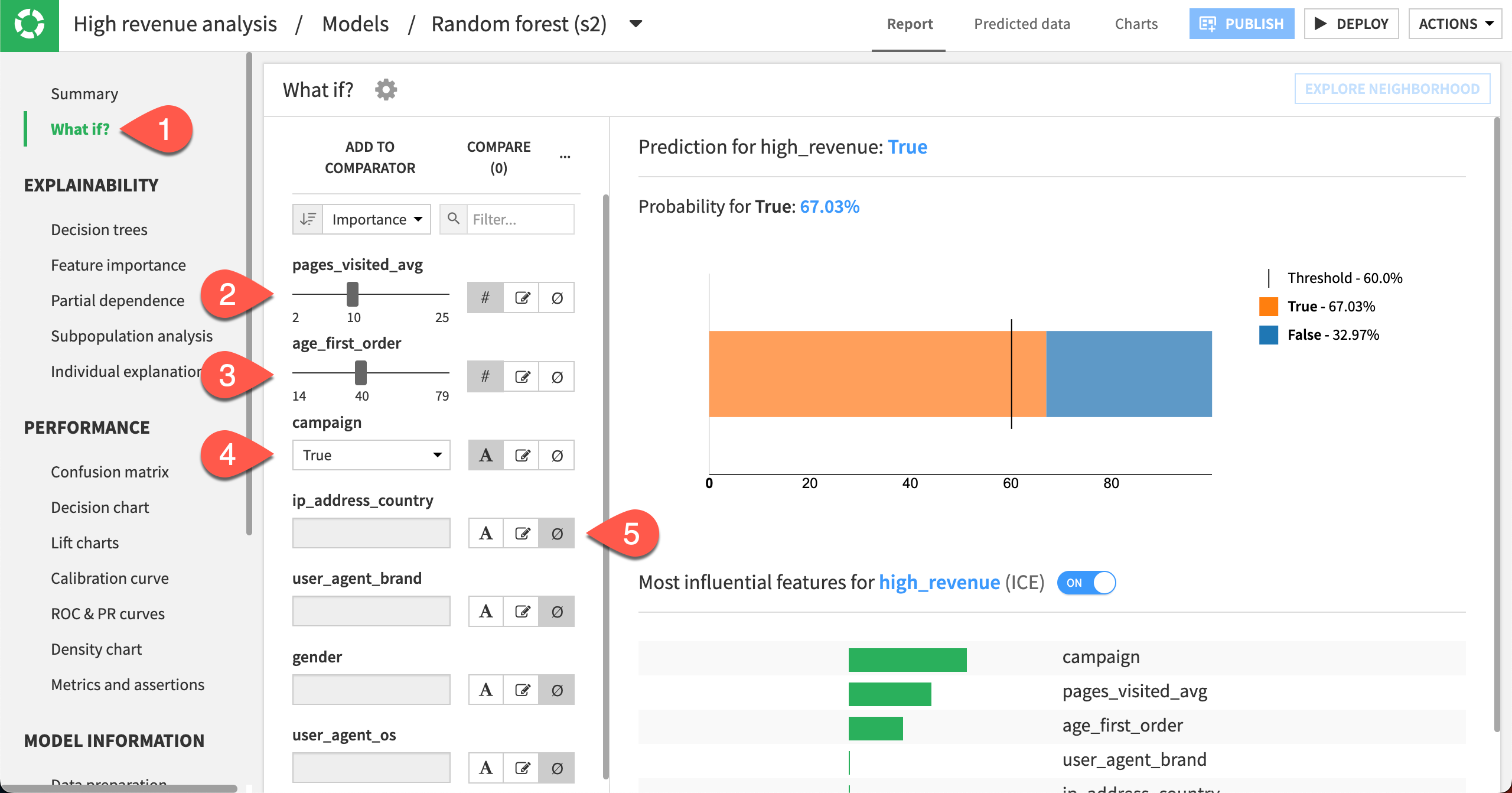
Given this analysis, the model would predict a high-revenue customer with a cut-off threshold of approximately 67%. This information could be useful for making assertions.
Next steps#
Congratulations! To seek out unintended biases, you have performed several different kinds of analyses that can help you interpret your model.
Once you have settled on a model, the next step is to use it to generate predictions on unseen data.
To do that, see Tutorial | Model scoring basics!
See also
You can find more about each of these explainability tests in the reference documentation:

