
Tutorial | Pivot tables#
Pivot tables are key tools for visualizing data. Let’s explore how to use them in Dataiku!
Get started#
Objectives#
In this tutorial, you will:
Create a pivot table with multiple levels of hierarchy.
Add conditional formatting to enhance the readability.
Prerequisites#
Dataiku 12.0 or later.
A basic level of knowledge about Dataiku is helpful. If you’ve never used Dataiku before, try the Core Designer learning path or a Quick Start tutorial!
Create the project#
From the Dataiku Design homepage, click + New Project.
Select Learning projects.
Search for and select Pivot Tables.
If needed, change the folder into which the project will be installed, and click Create.
From the project homepage, click Go to Flow (or type
g+f).
Note
You can also download the starter project from this website and import it as a ZIP file.
Use case summary#
This project focuses on a simplified credit card fraud detection use case. Using data about transactions, merchants, and cardholders, the Flow prepares datasets for further analysis. It involves preparing the data, just before applying a machine learning model to predict which transactions are likely to be authorized or fraudulent.
For the target variable, authorized_flag, a score of:
1 represents an authorized transaction.
0 is a transaction that failed authorization.
Create and customize a pivot table#
Let’s imagine that we’re interested in the relationship between FICO score (a measure of creditworthiness in the US) and whether a purchase is authorized or not. To explore this relationship, we’ll investigate using the transactions_known dataset, which would be the training data of possible Machine Learning models.
Beyond just counting transactions, we might want to analyze the purchasing behavior in more depth. One way to do this is by looking at the average purchase amount across different dimensions, such as authorization status, FICO score, and item category. A pivot table is a great tool to summarize and compare these values easily.
Create a pivot table#
Open the transactions_known dataset, and navigate to the Charts tab (or use the keyboard shortcut
g+v).From the chart type dropdown, choose Pivot table.
Drag purchase_amount to the Value field.
Drag authorized_flag to the Columns field.
Drag card_fico_score to the Rows field.
We have a pivot table! Let’s start refining it.
Adjust pivot table labels#
Let’s first define clearer labels.
In the card_fico_score dropdown, set the number of bins to
10and rename the Label toFICO range.In the authorized_flag dropdown, set the Binning mode to None, use raw values and rename the Label to
Authorized?.In the purchase_amount dropdown, add a
$prefix and rename the Label toAvg purchase.
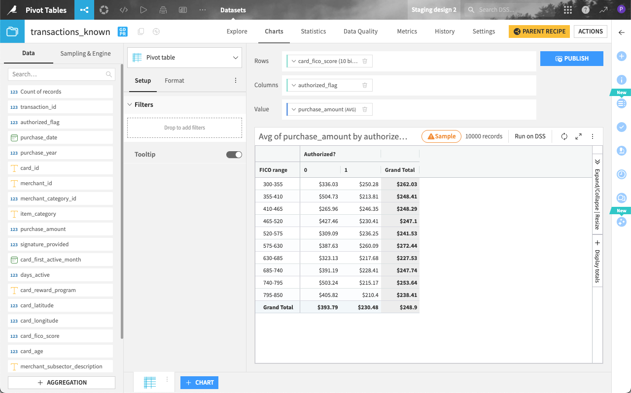
We now have a view of the average purchase between authorized and unauthorized transactions per FICO range.
Note
To aggregate purchase amounts differently (for example, using a sum), you can use the Multiplier dropdown to improve readability.
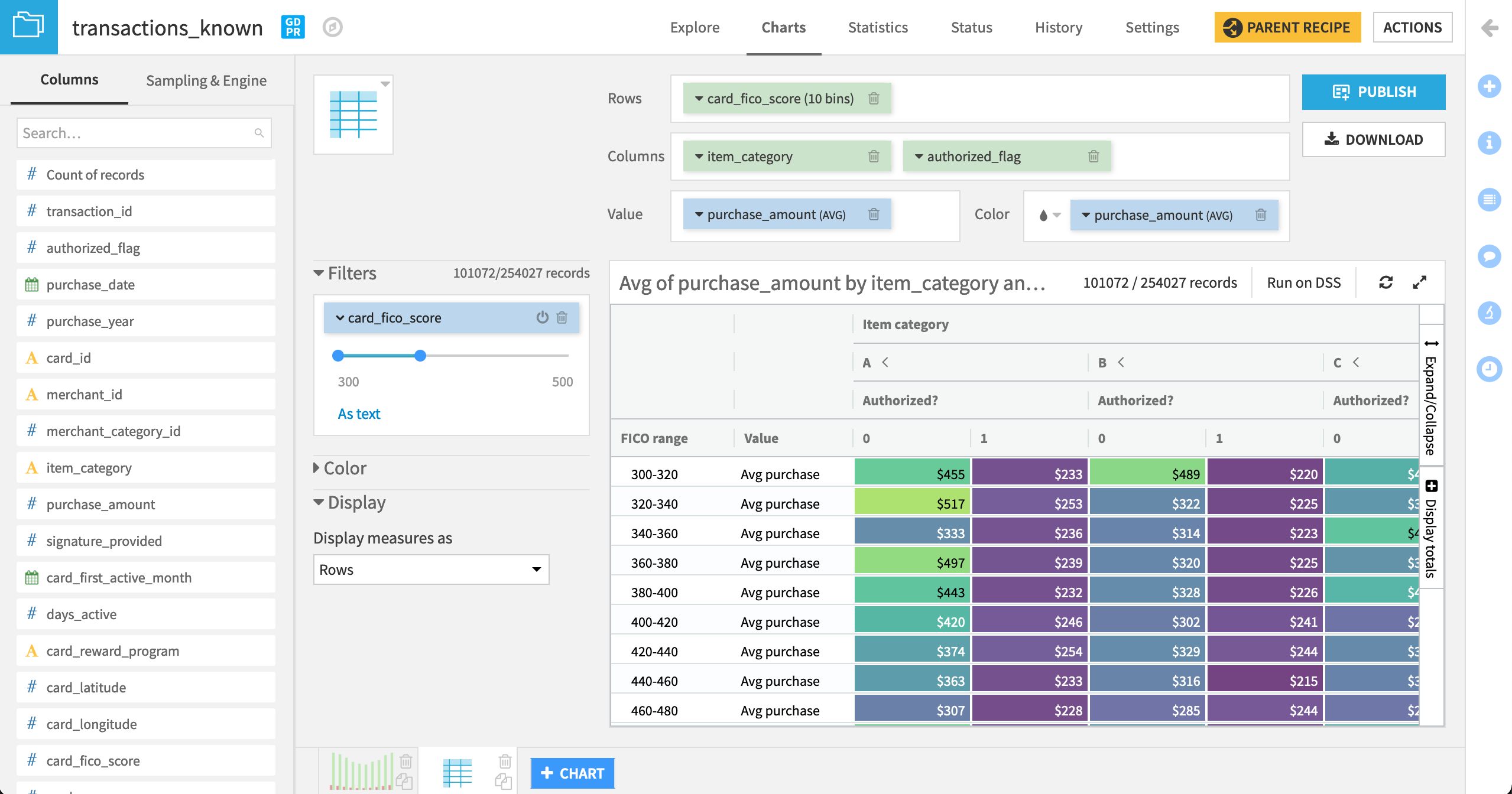
Add extra levels of hierarchy to the table#
Let’s explore variation by item_category. We can do this by adding extra levels of hierarchy to the pivot table (in either horizontal or vertical directions).
Drag item_category as the first item in the Columns field so it’s the left-most level of hierarchy in the table.
Click the item_category dropdown to:
Change the sorting to Natural ordering.
Rename the Label to
Item category.
For any FICO range, we can now observe the average purchase amount per item category, as well as expand columns within each category to see the breakdown between authorized and unauthorized transactions.
In the table, click the < and > next to category A to collapse and expand the table for that category, hiding and revealing a side-by-side comparison of authorized and unauthorized average purchases only for items in category A.
Experiment with these settings using the Expand/Collapse | Resize menu on the right side of the table. When finished, click Expand all.
Tip
Depending on your objectives, you may prefer to change the hierarchy of the table. Change the order of variables in the Columns field to view the impact. You can also add even more layers of hierarchy. Add a third variable like signature_provided to the Columns field to test this out! Remove it when done to match the rest of the instructions.
Add a color scale#
It’s easy to get lost in this table. Let’s add a color scale to help spot any outliers.
In the Format tab, open the Color panel, then drag purchase_amount to the Color field.
Change the color palette to Viridis to observe starker differences.
Display/hide totals#
Let’s also remove the item_category subtotals for a clearer side-by-side comparison of authorized and unauthorized transactions.
On the right side of the table, click Display totals.
Uncheck the box for Totals > Columns so that only grand totals remain.
Filter the pivot table#
After expanding all item categories, unauthorized purchases tend to have a greater average purchase amount than those authorized (see the yellow and green cells compared to the purple). This seems particularly apparent among cardholders with lower FICO scores. Let’s drill down further.
Under Setup tab, add card_fico_score as filter.
Adjust the card_fico_score filter to include scores ranging from
300to500. Remember you can click on the value and rewrite it, instead of manually dragging the range endpoints.Click the Expand chart icon at the top right of the table.
If you haven’t already done so, use the Expand/Collapse | Resize tool at the right of the table to expand all columns.
Tip
This is a pivot table we can share with stakeholders! You can now reduce the table size, and click Download as Excel to generate an .xlsx file of the final table.
Add conditional formatting#
To enhance the readability of your pivot table, you can apply conditional formatting rules based on other columns or value scales.
Let’s say we want to highlight purchases where the average amount is significantly different from the overall trend.
In the Format tab, open the Color panel and click on Custom rules.
Click the Apply to dropdown and select purchase_amount (AVG) to apply a rule based on its values.
Under Using, select Conditions, and add the condition
> 300.Click the Apply dropdown and select Red background.
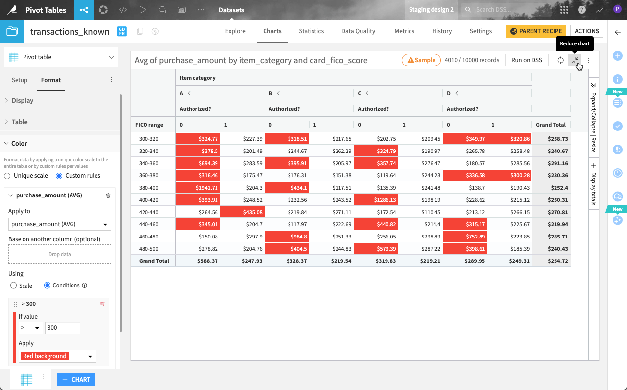
This helps provide more context, especially when comparing authorized and unauthorized transactions.
Next steps#
Congratulations! You’ve created not just an exploratory pivot table, but a polished version that are ready for stakeholders.
The next step is to publish the be managing the table to a dashboard. For detailed instructions, see Tutorial | Use dashboards to build reports.