
Tutorial | Dataiku stories with Generative AI#
Get started#
Dataiku Stories enable you to create presentations with your data using GenAI. Let’s see how it works.
Objectives#
In this tutorial, you will:
Create and customize a presentation with a GenAI-powered assistant.
Modify charts with the charts helper.
Update an image with the media tool.
Prerequisites#
Dataiku 13.3 or later.
A Dataiku workspace in which you have added the relevant datasets to build your stories.
Having at least the Contributor role for the workspace.
AI assistants enabled on the Dataiku instance.
Create the project#
From the Dataiku Design homepage, click + New Project.
Select Learning projects.
Search for and select Dataiku stories with Generative AI.
If needed, change the folder into which the project will be installed, and click Create.
From the project homepage, click Go to Flow (or type
g+f).
Note
You can also download the starter project from this website and import it as a ZIP file.
Use case summary#
The provided dataset contains HR-related data. Let’s say we want to create a presentation for future candidates we would like to attract to our company and hire. Today, new workers tend to want more than economic advantages and high incomes. Hence, we want to create a presentation that shows them what the company provides in terms of work-life balance, benefits in kind, and work atmosphere. We will leverage GenAI-powered tools to help us doing the story that suits best for us.
Select the workspace#
The first thing to do to build a story is to ensure we have a workspace to store our stories and their associated datasets.
Let’s start by selecting the workspace. To do so:
From the waffle (
 ) menu, click Workspaces.
Select a workspace you can use for this tutorial, in which you have at least the Contributor role.
Note
If you don’t have access to a workspace, see How-to | Create a workspace.
Manage the data#
Now that you have selected the relevant workspace, we need to publish the curated dataset containing the Human Resources data that will be used in this business user scenario.
To do so:
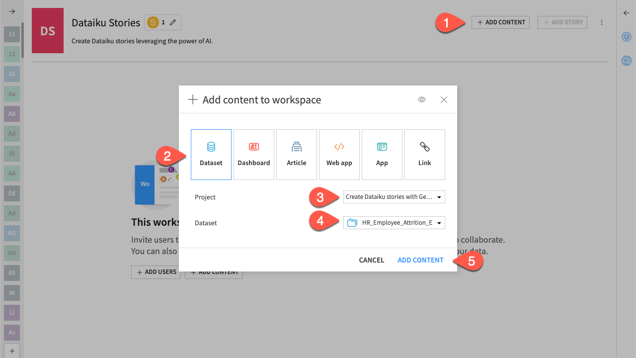
From the workspace homepage, click + Add Content.
Click Dataset to indicate the type of content to add.
In the Project field, select your project.
Note
If you have changed the name of your project as suggested before. Select the project with the name you gave.
In the Dataset field, select HR_Employee_Attrition_Enriched_prepared.
Click Add Content to validate. The dataset is added to the workspace homepage.
Now you have your data ready to be used, you can create your story:
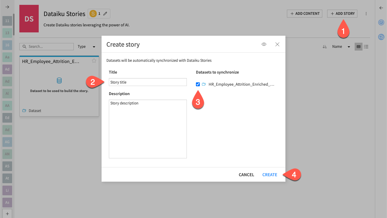
Click + Add Story and select + Create.
Give your story a name and a description that suits you.
Select the HR_Employee_Attrition_Enriched_prepared dataset to be synchronized.
Click Create.
Create the storytelling#
We can start at the highest level with the presentation assistant to create the baseline of our set of slides. The goal is to create a presentation that can be modified on the fly according to the results obtained, the ideas that arise, and the constraints we have from our company, thanks to the dynamism and versatility of GenAI tools.
Note
Even if you follow this tutorial, your results may vary due to the stochastic nature of the Generative AI features.
Create a pre-prompted presentation#
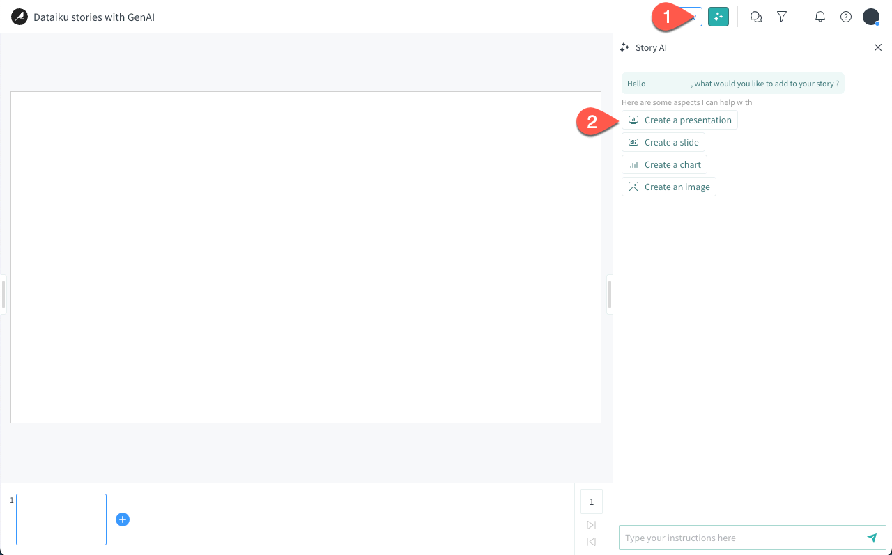
On the top bar, click the Story AI (
 ) icon to open the prompt input panel.
In the prompt panel, click on Create a presentation.
Note
The presentation assistant propose some pre-built options that you can click on to directly generate something by default. However, this may not be suitable for a specific storytelling.
After a quick moment for the presentation assistant to generate all the slides, you can see they show a varied panel of data insights and generated images. Even if it’s not exactly what we wanted, it can be considered as a relevant start that we can modify.
Create a custom presentation#
For our example, we want to specify the topic of each slide and give the assistant a small range of actions. We can get rid of the pre-prompted presentation and create a new one based on our key topics.
In the prompt panel, enter
Delete all slides.Submit the prompt.
Once again, we have a blank page to create the presentation according to the topics of work-life balance, job satisfaction, work atmosphere, etc.
Enter the following prompt:
Create a first slide that introduces the company with crucial points for work-life balance, work satisfaction, work atmosphere, and benefits in kind.
Then create a slide per topic and emphasize with a chart and one relevant image.
Finish the presentation with a fine conclusion based on the data, and include a beautiful image of happy workers.
Press Enter to validate.
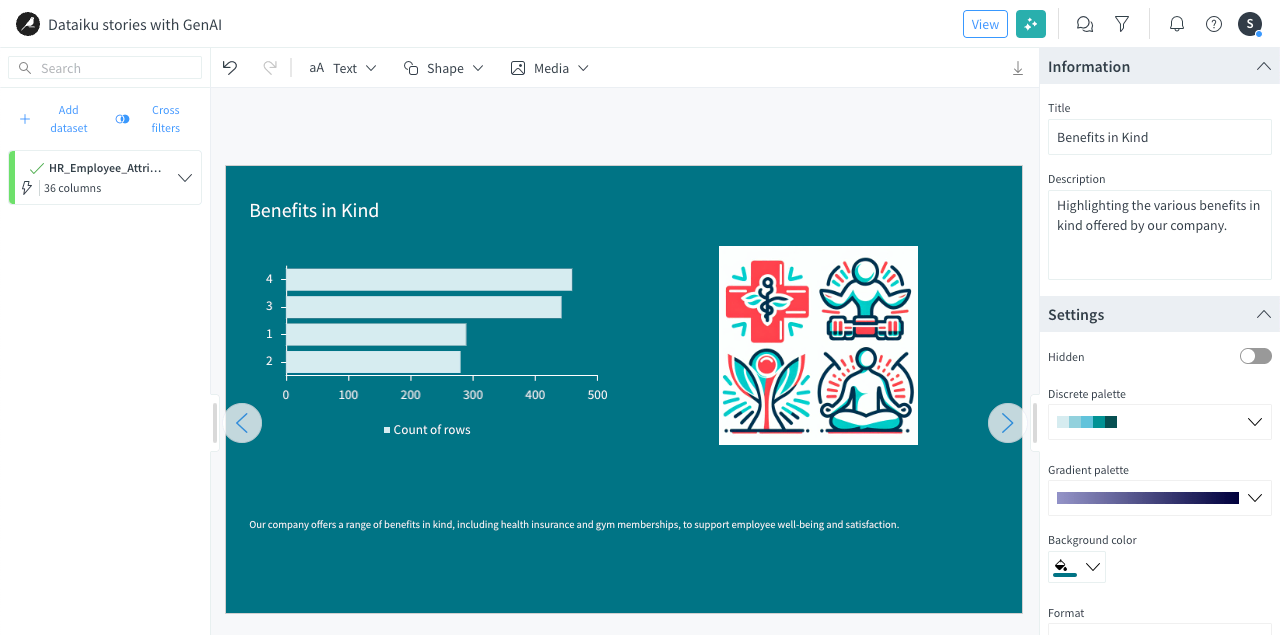
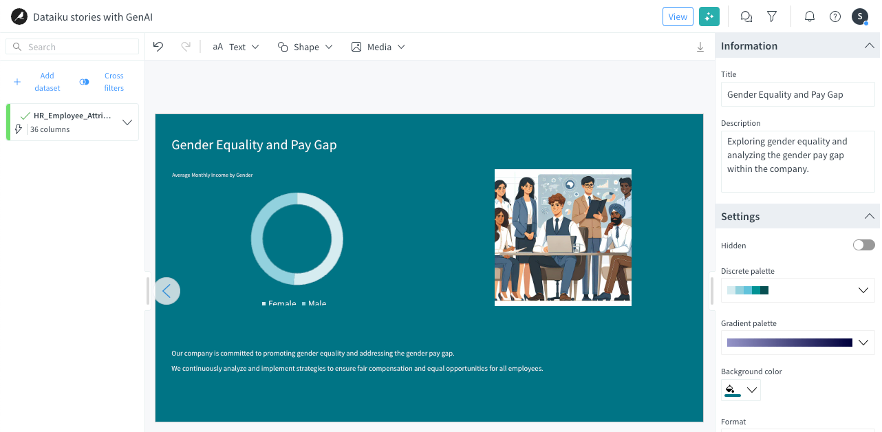
It seems that, in this particular case, the data we have doesn’t give us a relevant insight on benefits in kind within the company. Hence, we can focus on another key topic for a company, such as gender equality and the gender pay gap.
Enter the prompt
Delete the slide on Benefits in kind.Enter the prompt
Create a slide focusing on gender equality and the gender pay gap.
Important
The output is usually a matter of precision of the prompt. For optimal results, it’s best to provide as much detail as possible about what you want to achieve.
Modify charts#
Sometimes, the AI-generated charts aren’t exactly what you needed. You can change the properties of a chart with the chart assistant. The chart assistant has a specific number of properties it can change.
On the Work-Life balance slide, click on the chart.
On the popover action bar, click the Story AI (
) icon.Click on Edit chart properties.
Enter the prompt
What are the properties you can edit?and validate.
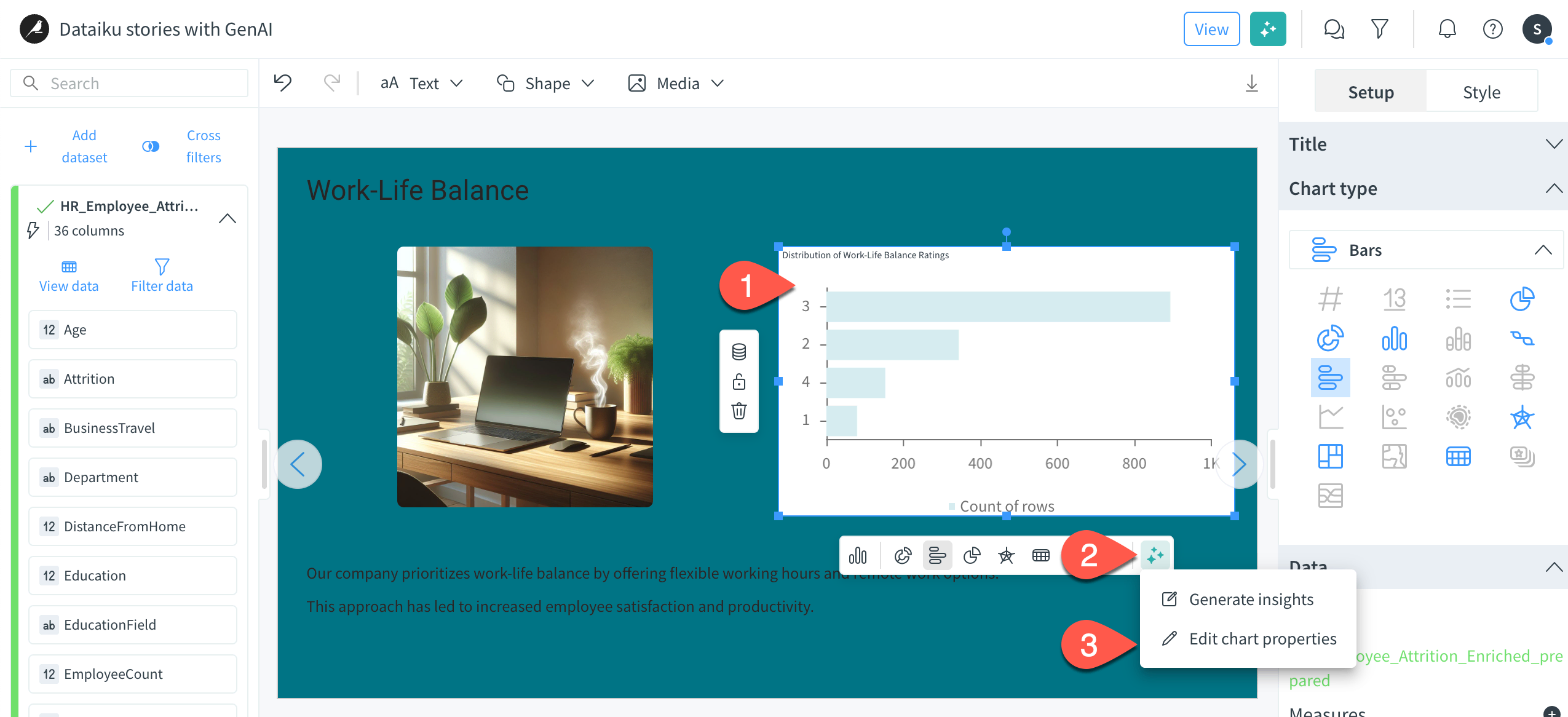
You can now see the available options in the chat when using the chart assistant. For example, you may want to change the color palette or the border style to align charts with your corporate identity guidelines. To proceed, just continue asking the chart assistant following the last prompt.
Generate images#
Let’s assume the image on the work atmosphere isn’t fitting our storytelling. We would like an image emphasizing the camaraderie.
Click on the image and press Delete key to delete it.
On the top bar, click Media > Generate image to access the image assistant.
Enter the following prompt and submit.
Generate an image with a luminous and cozy workplace with two workers laughing
amongst green plants. In the background, there is a table tennis table.
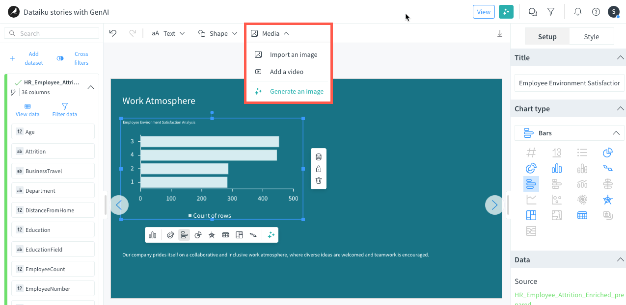
You can generate as many images you want until you are satisfied with the output.
Next steps#
We have created the presentation we wanted thanks to GenAI tools. However, you may want to change some details that are important for you.
To know how to fully and manually customize your story, continue to the Tutorial | Dataiku stories.