
Tutorial | Dataiku stories#
Get started#
Dataiku Stories empower business users to quickly build contextualized, interactive, and up-to-date data presentations so that they can more easily understand and share the stories hidden in their data. Through drag-and-drop visual interfaces, business users can collaboratively create meaningful reports with filters, annotations, and interactive elements that are automatically refreshed with new data.
Note
For more information, see the Concept | Dataiku stories article.
Objectives#
In this tutorial, you will:
Set up the relevant environment to build your story.
Create a story and edit its content for a clean final presentation.
Explore the source data directly from within the story.
Learn the different ways to filter the data for the story itself or to let users use them.
Prerequisites#
To complete this tutorial, you’ll need:
Dataiku 13.3 or later.
Having at least the Contributor role for a workspace.
The image for illustration purposes when building the title slide.
Create the project#
From the Dataiku Design homepage, click + New Project.
Select Learning projects.
Search for and select Dataiku Stories.
If needed, change the folder into which the project will be installed, and click Create.
From the project homepage, click Go to Flow (or type
g+f).
Note
You can also download the starter project from this website and import it as a ZIP file.
Use case summary#
Let’s say our Human resources team wants to analyze the attrition rate in the company to improve employee retention.
In this tutorial, the objective is to use the story feature to share the stories hidden in the data. The HR team could present the findings to company managers to take action against turnover.
Note
This tutorial relies on the IBM HR Analytics - Employee Attrition & Performance dataset that has been artificially manipulated to add some geographical data.
Select and configure a workspace#
The very first thing to do to build a story is to ensure we have a workspace to store our stories and their associated datasets. In this section, we will:
Select a workspace.
Add the relevant dataset to make the data available for our story creation.
Select a workspace#
Let’s start by selecting the workspace. To do so:
From the waffle (
 ) menu, click Workspaces.
Select a workspace you can use for this tutorial, in which you have at least the Contributor role.
Note
If you don’t have any workspace, see How-to | Create a workspace.
Add the data for building the story#
Now that you have selected the relevant workspace, we need to publish the curated dataset containing the Human Resources data that will be used in this business user scenario.
To do so:
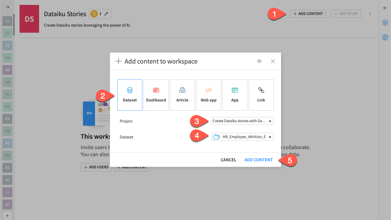
From the workspace homepage, click the Add Content button in the top right corner.
Click Dataset to indicate the type of content to add.
In the Project field, select your project.
In the Dataset field, select HR_Employee_Attrition_Enriched_prepared.
Click Add Content to validate. The dataset is added to the workspace homepage.
Create the story#
From the workspace homepage, click the Add Story button.
In the Title field, enter
HR Report.Select the HR_Employee_Attrition_Enriched_prepared dataset as the Datasets to synchronize.
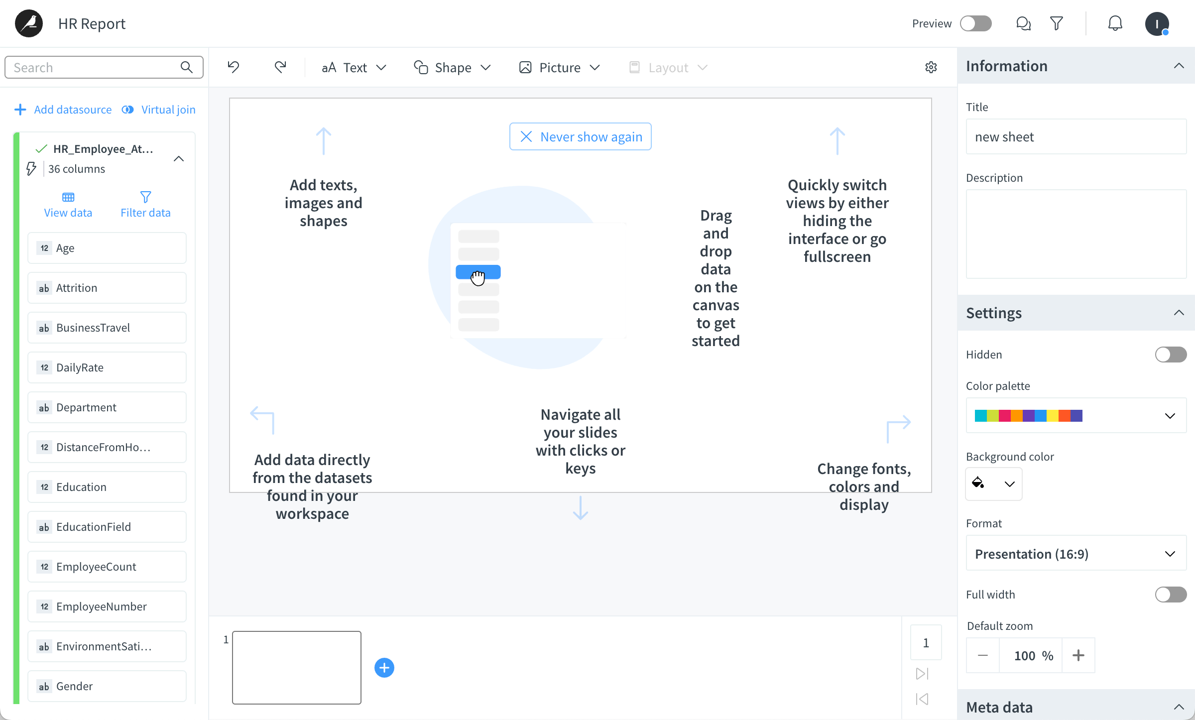
Click Create. The story opens in a new tab, with the following interface.
Add a title slide#
Let’s use the first slide as a presentation title slide that will only include a background image and a title.
Add an image as the background#
First, let’s add the background image.
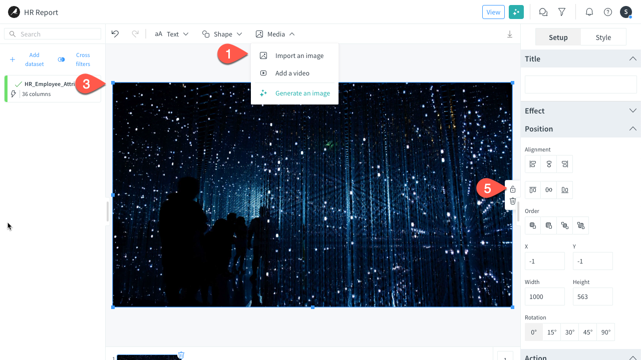
In the header menu, click Media > Import an image to add an image.
Go to the directory where you’ve downloaded the image and select the image.
Resize it so that it fully covers the slide.
Tip
Use the corner selection handles to resize the image without distorting its proportions.
Right-click it and select Elements order > Sent to back.
Click and select Lock to avoid any changes.
Tip
You can also double-click and select lock.
Add text for the title#
Now, let’s add the title.
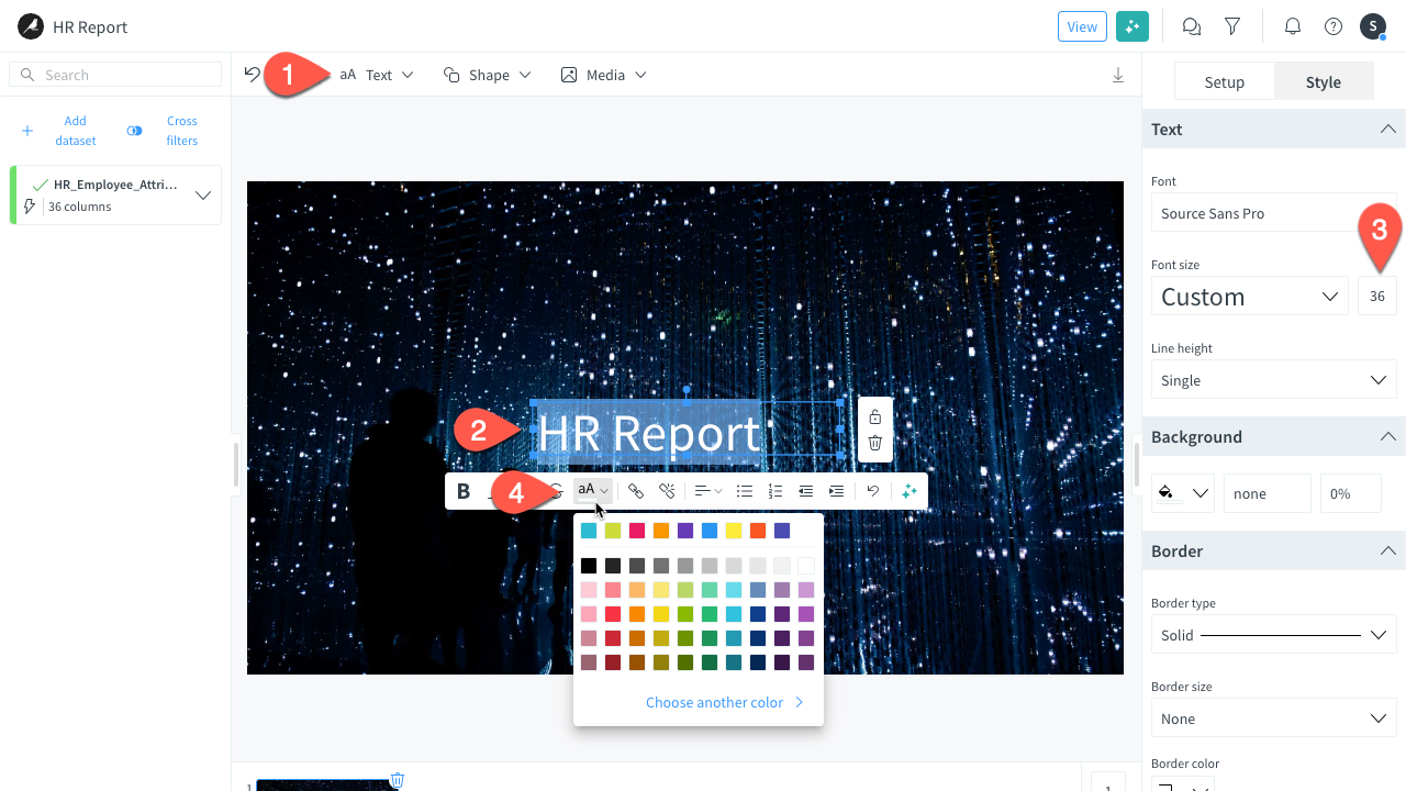
In the header menu on top of the story, select Text > Extra large.
Enter the slide title:
HR Report.In the Style tab, under the Text dropdown, set the font size to
36.On the popover action bar, click on the color icon, and set it to white (as the background image is dark).
Explore the data#
Before building your first charts you may want to explore your data and change some columns directly in you story.
From the data bar on the left, click the View button.
Take some time to look at the different columns at your disposal in the dataset to build your story. This window allows you to:
Hide columns.
Edit the column names.
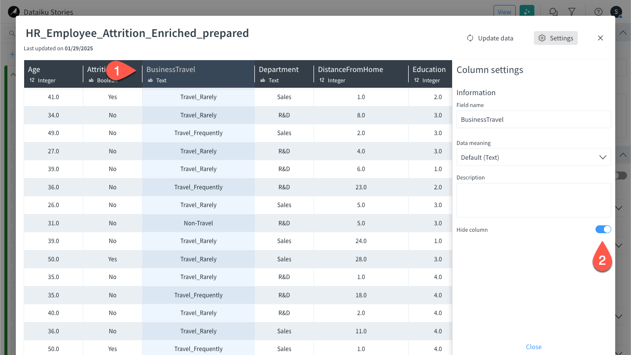
Hide a column#
The dataset column allows you to hide some columns from the data bar you would consider as irrelevant for building your next charts. To do so:
Still from the dataset window, click the BusinessTravel column.
In the right panel, enable the Hide column option.
Click Close to shut down the column edition panel.
Edit a column name#
You can change the name of the columns directly in your story to make some clear and consistent naming for your work.
Still from the dataset window, click the DistanceFromHome column.
In the Field name, enter
CommutingDistance.Close the window once done to resume the story edition screen.
Build content slides with charts#
See a screencast covering similar steps to those required here.

Now that your data is clear and ready to be used, let’s add new slides with charts for the analytics content.
In the slide navigator at the bottom of the page, click the + button to add a new slide.
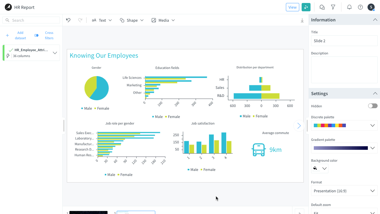
In the header menu on top of the story, select Text > Extra large and enter the following slide title:
Knowing Our Employees.Adjust the text box size and in the Style tab of the inspector:
Align the text to the left.
On the popover action bar, click on the color icon, and set it to blue (top left blue in the palette).
Add the following charts by dragging and dropping the columns from the data bar to the slide and setting up each chart using the Setup tab of the inspector panel:
Columns used Chart title Chart type Aggregation type Chart 1 - EmployeeCount
- Gender
Gender Pie Sum on EmployeeCount Chart 2 - EmployeeCount
- JobSatisfaction
- Gender
Job satisfaction Histogram Sum Chart 3 - Commute
Average commute Metric Average Note
When selecting the aggregation function, you can set a unit in the Unit field, such as
kmfor the commute distance.Position the charts properly on the slide and potentially customize their styles.
You can build more charts if you want. The final slide could look like that:
Now let’s add a second slide to analyze the turnover in the company.
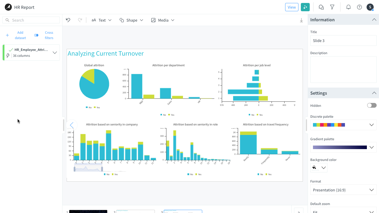
Add a new slide with a text box for the title:
Analyzing Current Turnover.Add the following charts by dragging the columns from the data bar to the slide and setting up each chart using the Setup tab of the inspector panel:
Columns used Chart title Chart type Aggregation type Chart 1 - EmployeeCount
- Department
- Attrition
Attrition per department Bars Sum on EmployeeCount Chart 2 - EmployeeCount
- YearsAtCompany
- Attrition
Attrition based on seniority in company Vertically stacked bars Sum on EmployeeCount Position the charts properly on the slide and potentially customize their styles.
Again these are the important chart, but you can discover other ways to draw insights building more charts. At this stage, your slide could look like that:
Tip
In the inspector, use the Chart options section to customize the charts (size, value display, position, margins, etc.).
Add some actions on click#
As any good story needs a good storyline, you can create links between slides to manage the navigation thanks to different actions provided when clicking on a text field or a shape available on a slide:
Reload data
Clear filters
Previous page
Next page
Go to slide
Fullscreen
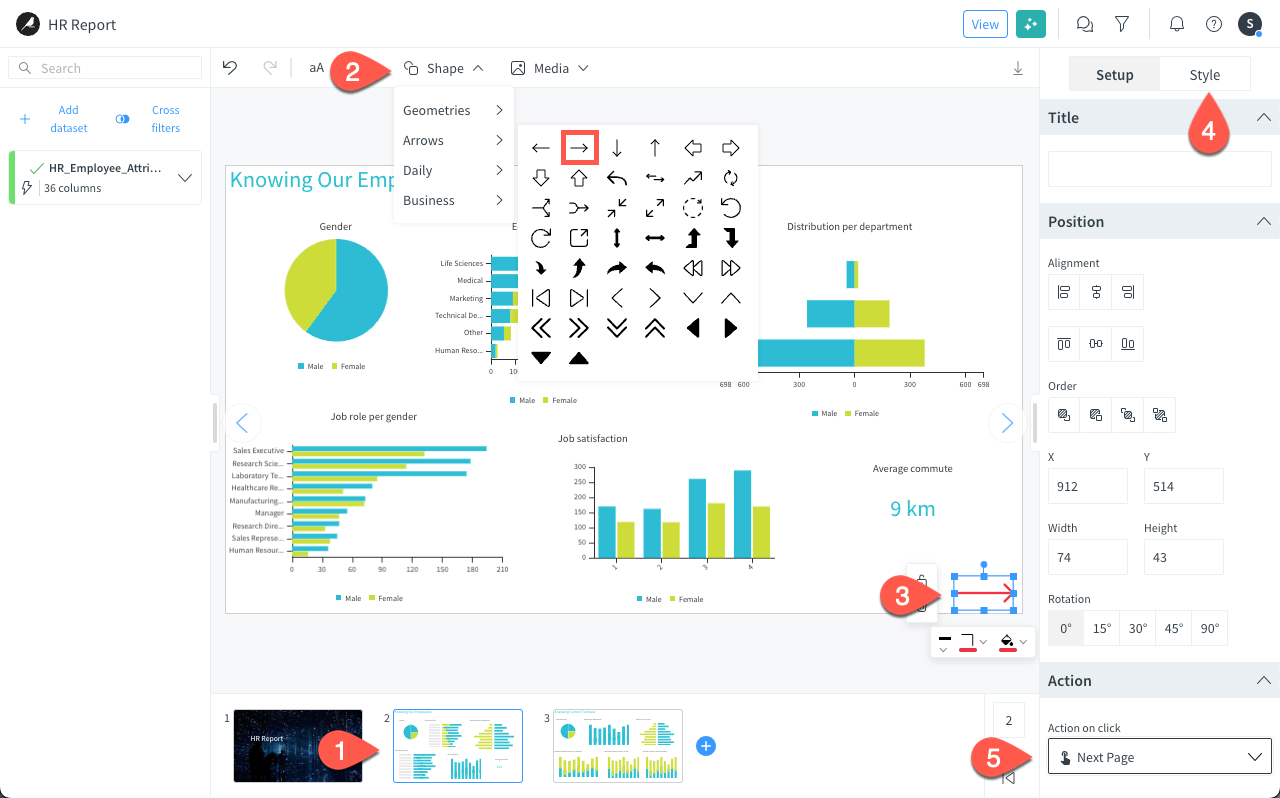
Let’s add a Next page action to an arrow shape on slide 2. To do so:
In the slide navigator, return to slide 2.
In the header menu on top of the story, click Shape > Arrows and select the right arrow.
Position it at the bottom right of the slide.
In the Style inspector on the right, set the Stroke color to pink or any color of your choice.
Navigate back to the Setup inspector, scroll down to the Actions section, and in the Actions on click field, select Next Page.
Filter the data as the story author#
Your story and its analytics are built. You can now enable some filters to refine your charts and display new insights. Stories offer different filtering options so that you can filter the data at different levels (datasets or charts) while authoring the story.
Note
When exporting your story in PDF or PPT, your filters remain applied.
Apply filters at the dataset level#
You can apply filters at the dataset level when editing the story.
Caution
Keep in mind that filters defined at the dataset level apply on all slides. To apply filters only to some aggregations, use chart filters instead.
Set the filter#
Let’s say we want to focus our attention on people who are unsatisfied with their job (satisfaction level 1 and 2). To do so:
In the data bar, click the Filter (
 ) button.
In the dialog, click + Add a new condition block.
In the Filter type dropdown, select JobSatisfaction (avg).
Select the strictly lower < operator.
In the Value field, enter
3.Click Save.
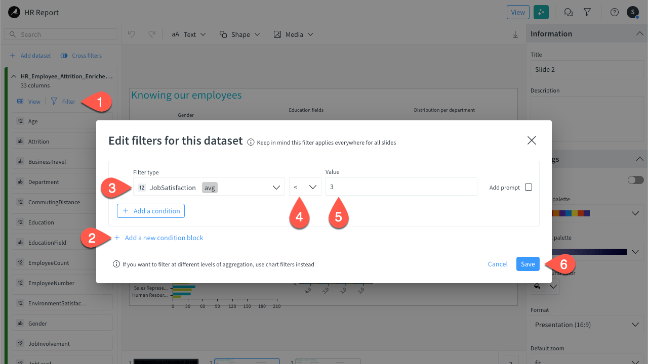
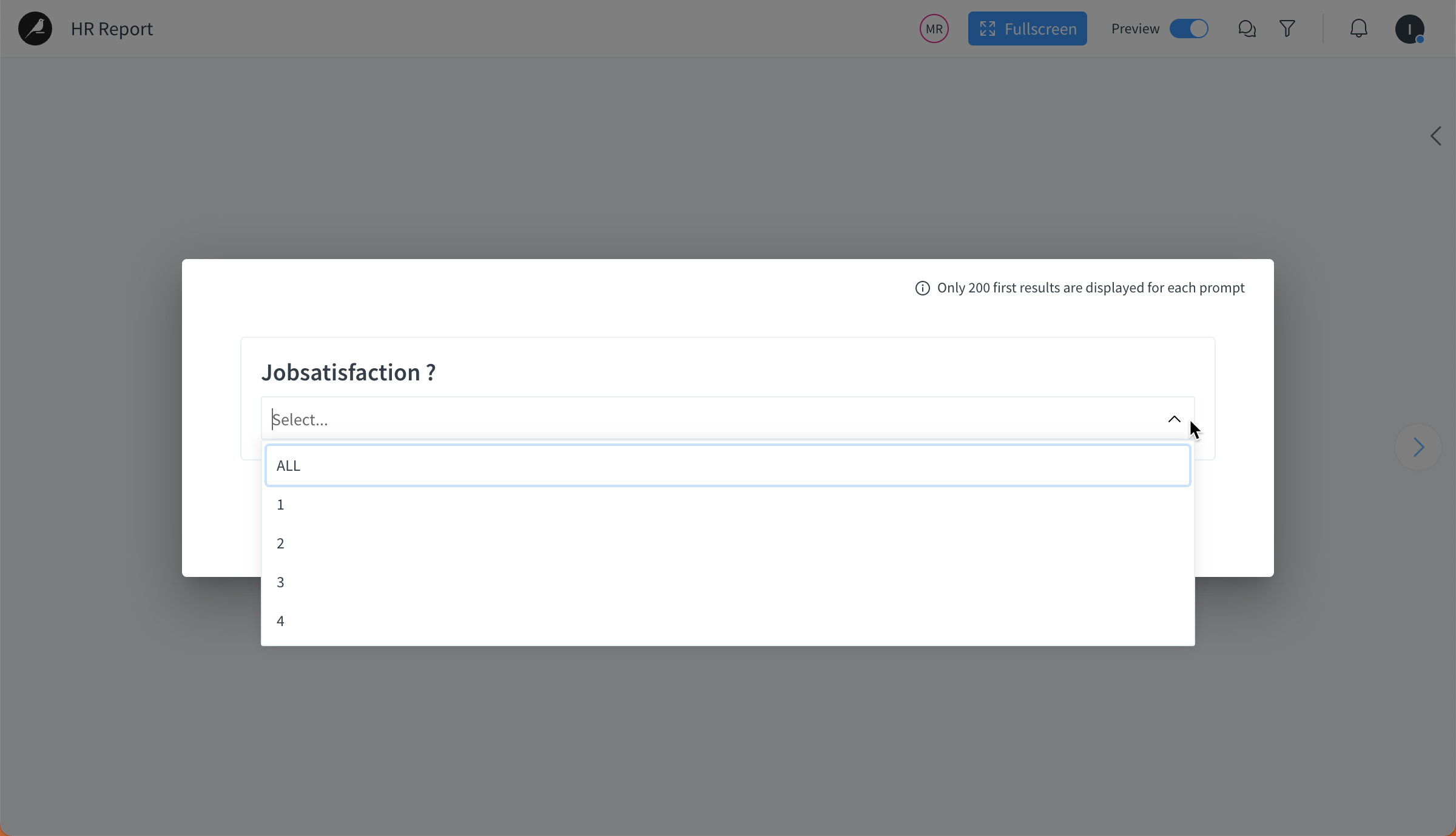
Note
If you enable the Add prompt option when setting the filter, whenever you open the preview mode, a prompt will invite you to apply a filter on the selected column.
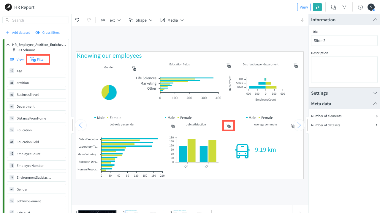
Once the filter is saved and back to the story editor:
You can see that the Job satisfaction chart only shows levels 1 and 2.
A counter is added to the Filter data button in the data bar to indicate that some filters are enabled.
Filter icons are added to all charts impacted by the filter.
Remove the filter#
Let’s now remove the filter before moving forward. To do so:
Click on the Filter (
) button in the data bar.Click the bin (
 ) icon next to the relevant filter.
Click Save.
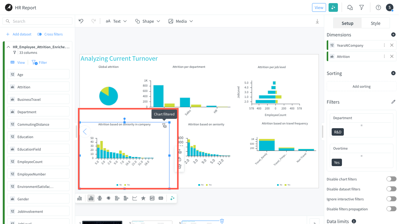
Apply filters at the chart level#
You can apply filters at the chart level only, for higher granularity.
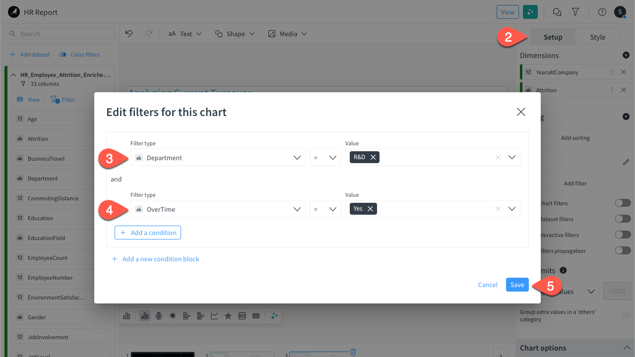
Let’s say we want to filter the Attrition based on seniority in company chart on employees working in R&D and working over time. To do so:
On slide 3, select the Attrition based on seniority in company chart.
In the Setup inspector, scroll down to the Filters section and click the Add filter button.
In the dialog, click + Add a new condition block and set the first condition as follows:
In the Filter type dropdown, select Department.
Keep the equal operator.
In the Value field, select R&D.
Click + Add a condition and set the second condition as follows:
In the Filter type dropdown, select OverTime.
Keep the equal operator.
In the Value field, select Yes.
Click Save.
Once the filter is saved and back to the story editor:
You can see that the Attrition based on seniority in company chart is filtered out.
A filter icon is added to the top right of the chart.
You can now remove the filters for the last way of setting filters in a story.
Set filters for the story users#
Finally, let’s see how to set filters that can be used by story users when viewing the story.
Let’s say you want to allow your users to filter on gender and department.
In Edit mode (as opposed to View mode in the top bar), click the filter (
) icon in the top bar.Note
If you strictly followed the tutorial, you are already in Edit mode.

In the Filters panel, click Add filter.
In the Field dropdown, select Gender.
Keep the default Type and Alias.
Click Set filter. The Gender filter is added to the Filters panel as a multiple-choice option.
Click again Add filter.
In the Field dropdown, select Department.
Select the Tags type.
Click Set filter. The Department filter is added to the Filters panel as a dropdown menu. When you select a value, it’s selected as a tag.
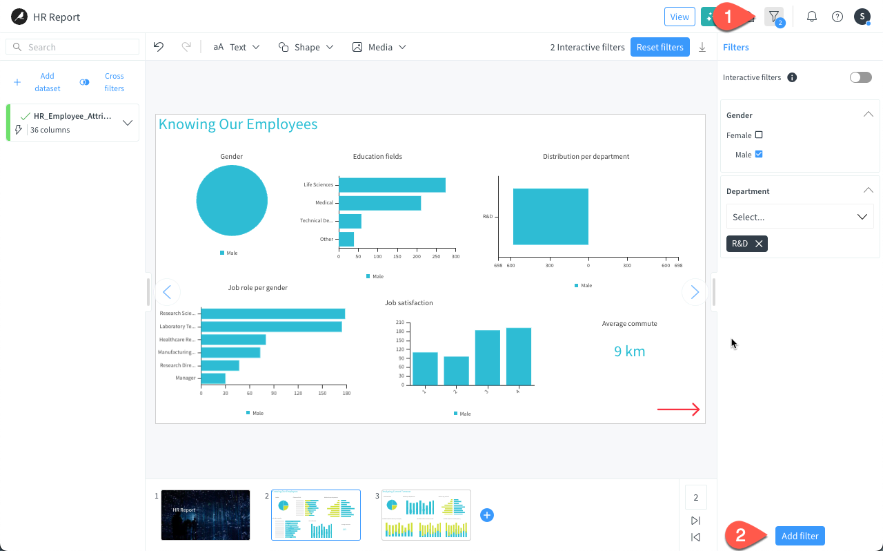
Note
At any time, you can edit a filter by clicking the pen icon next to a filter set in the Filters panel.
Important
The user filters are available on all slides and apply to all slides.
Switch to view mode#
The ultimate goal of a story is to present your slides to other stakeholders and let the readers collaborate with the content while viewing the presentation.
This section explains how to switch to view mode and use filters in this mode. When viewing a story in view mode, any users can apply filters.
Add filters#
Let’s see how to use filters set by the authors to focus on men from the R&D department.
Switch to View.
Click on the filter icon (
) in the top bar to display the Filters panel.Click on Gender > Male and select R&D in the Department filter. A counter is added to the filter icon in the top menu and the view indicates that there is two interactive filters enabled in the story.
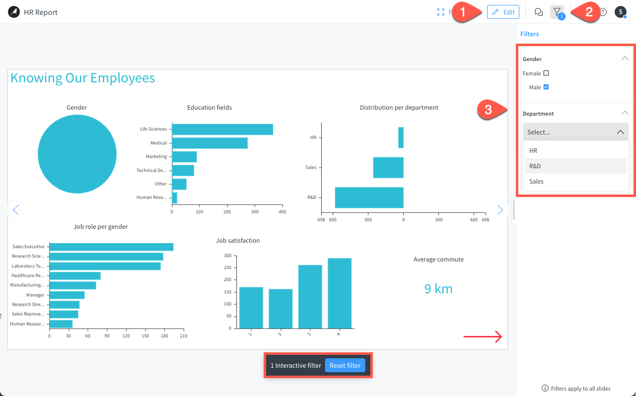
Tip
You can also click directly on any chart to filter on other components (job roles, satisfaction, etc.).
Remove filters#
Once filters are defined you can always remove them by:
clicking Reset filter at the bottom of the presentation, or
opening the Filters panel and deleting them here.
Next steps#
Congratulations! You’ve manually created and modified your story with essential elements (text, charts, images) and learned how to present it. You’ve also learned to filter your data within your story at different levels as an author and set filters that story users can utilize.