
Quick Start | Dataiku for manufacturing data preparation and visualization#
Get started#
Are you a manufacturing domain expert interested in using Dataiku for real-world manufacturing tasks? You’re in the right place!
Create an account#
To follow along with the steps in this tutorial, you need access to a 13.4+ Dataiku instance. If you don’t already have access, you can get started in one of two ways:
Follow the link above to start a 14 day free trial. See How-to | Begin a free trial from Dataiku for help if needed.
Install the free edition locally for your operating system.
Open Dataiku#
The first step is getting to the homepage of your Dataiku Design node.
Go to the Launchpad.
Within the Overview panel, click Open Instance in the Design node tile once your instance has powered up.
Important
If using a self-managed version of Dataiku, including the locally downloaded free edition on Mac or Windows, open the Dataiku Design node directly in your browser.
Once you are on the Design node homepage, you can create the tutorial project.
Create the project#
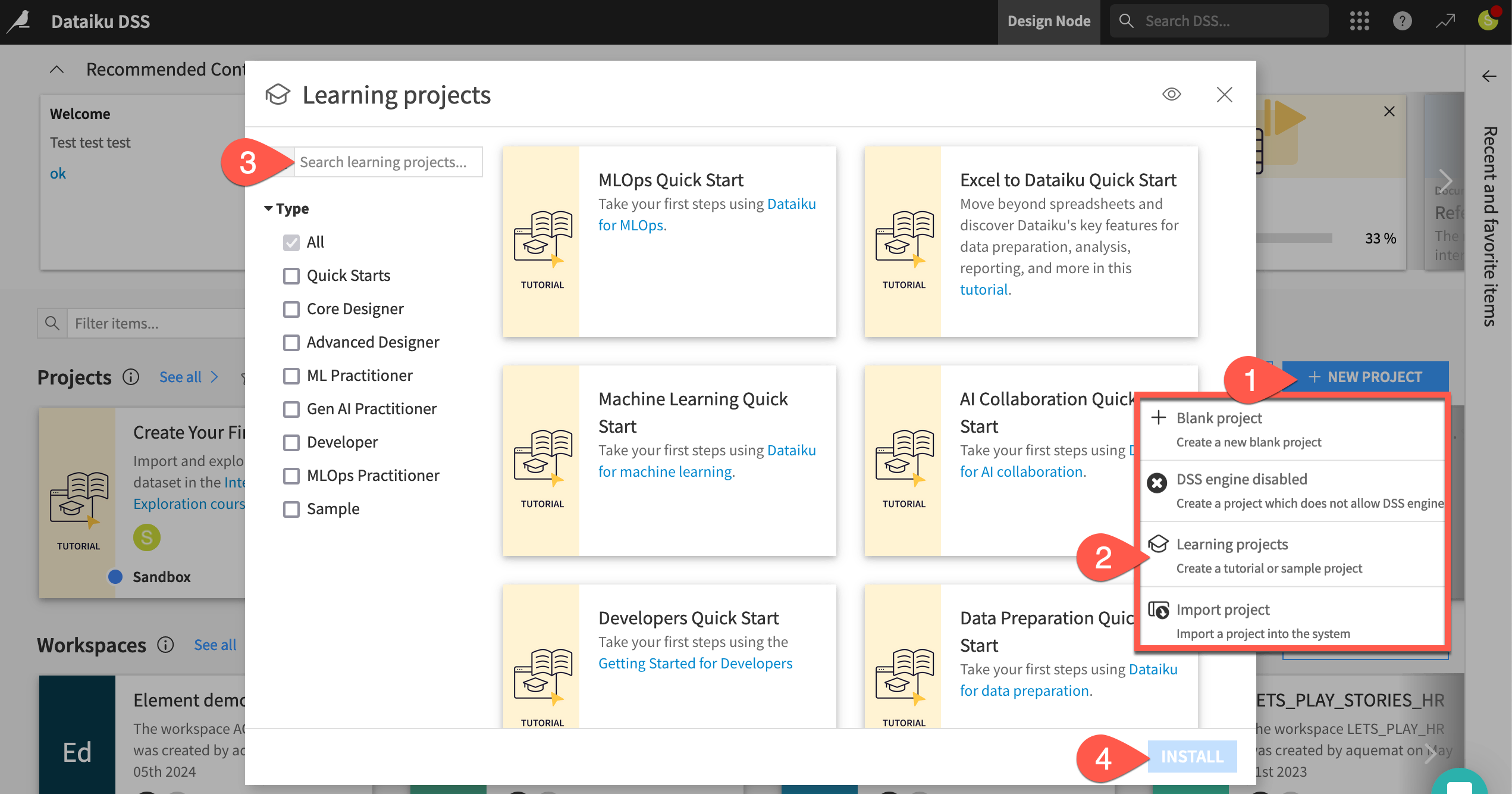
From the Dataiku Design homepage, click + New Project.
Select Learning projects.
Search for and select Manufacturing Data Prep & Visualization Quick Start.
If needed, change the folder into which the project will be installed, and click Create.
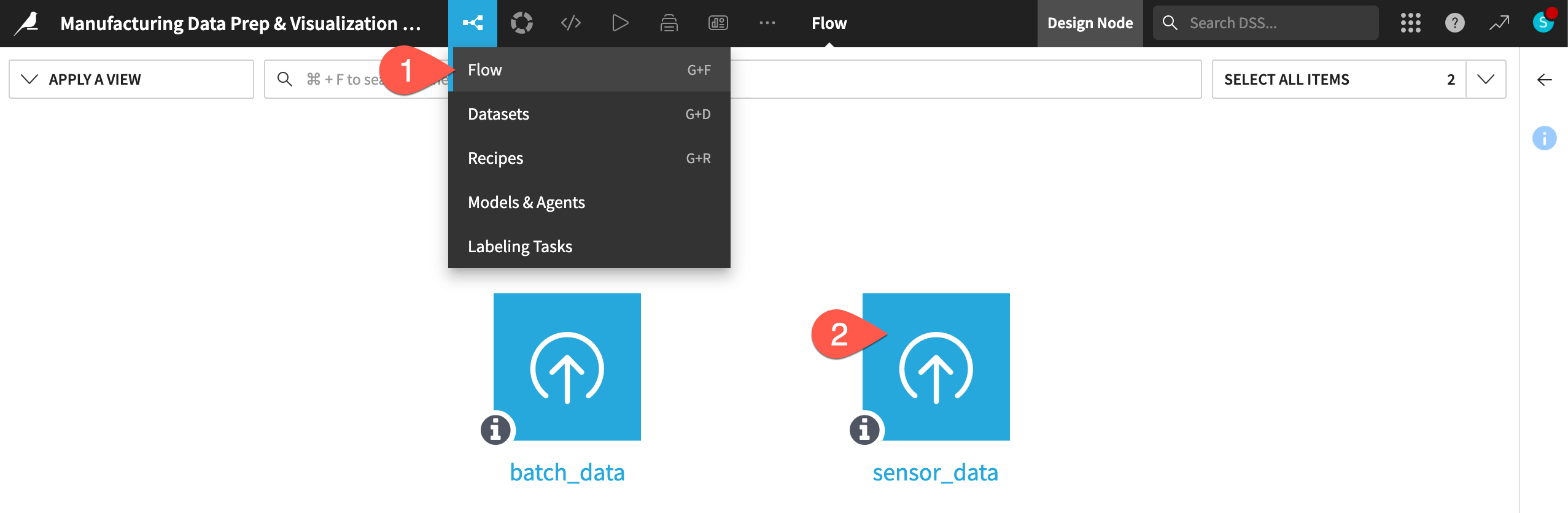
From the project homepage, click Go to Flow (or type
g+f).
Note
You can also download the starter project from this website and import it as a ZIP file.
Understand the project#
This quick start provides a practical example of how manufacturing experts, such as process and quality engineers, can apply Dataiku to complex datasets often encountered in process and quality control. By reviewing this quick start, users will gain insight into data cleaning, data preparation, and dashboard creation tailored to monitoring and investigating manufacturing processes.
Objectives#
In this quick start, you’ll resolve typical manufacturing data challenges, such as how to:
Convert time-series sensor data from long to wide format.
Unify different time stamp formats.
Remove outliers.
Combine a dataset of continuous sensor readings to a dataset of discrete production batches.
Tip
To check your work, you can review a completed version of this entire project in the Dataiku Gallery. This project also includes several recommended next steps mentioned in the conclusion.
Explore data#
The project at hand includes sensor and batch data extracted from real manufacturing processes and anonymized for usage. Before actually preparing the data, let’s explore it briefly.
Begin with the sensor data.
If not already there, from the left-most (
 ) menu in the top navigation bar, select the Flow (or use the keyboard shortcut
 g+f).Double click on the sensor_data dataset to open it.
Tip
There are many other keyboard shortcuts! Type ? to pull up a menu or see the Accessibility page in the reference documentation.
Compute the row count#
One of the first things to recognize when exploring a dataset in Dataiku is that you are viewing only a sample of the data. This enables you to work interactively even with large datasets.
From within the Explore tab of the sensor_data, click the compute row count (
 ) icon to determine the row count of the entire dataset.
Click the Sample button to open the Sample settings panel.
Click the Sampling method dropdown to see options other than the default first records.
When ready, click the Sample button again to collapse the panel.
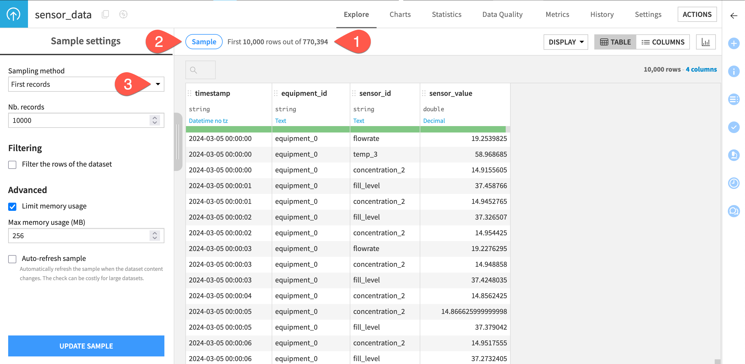
Caution
For large datasets, the sampling method can have a significant effect on the results of the column statistics, possibly making them misleading.
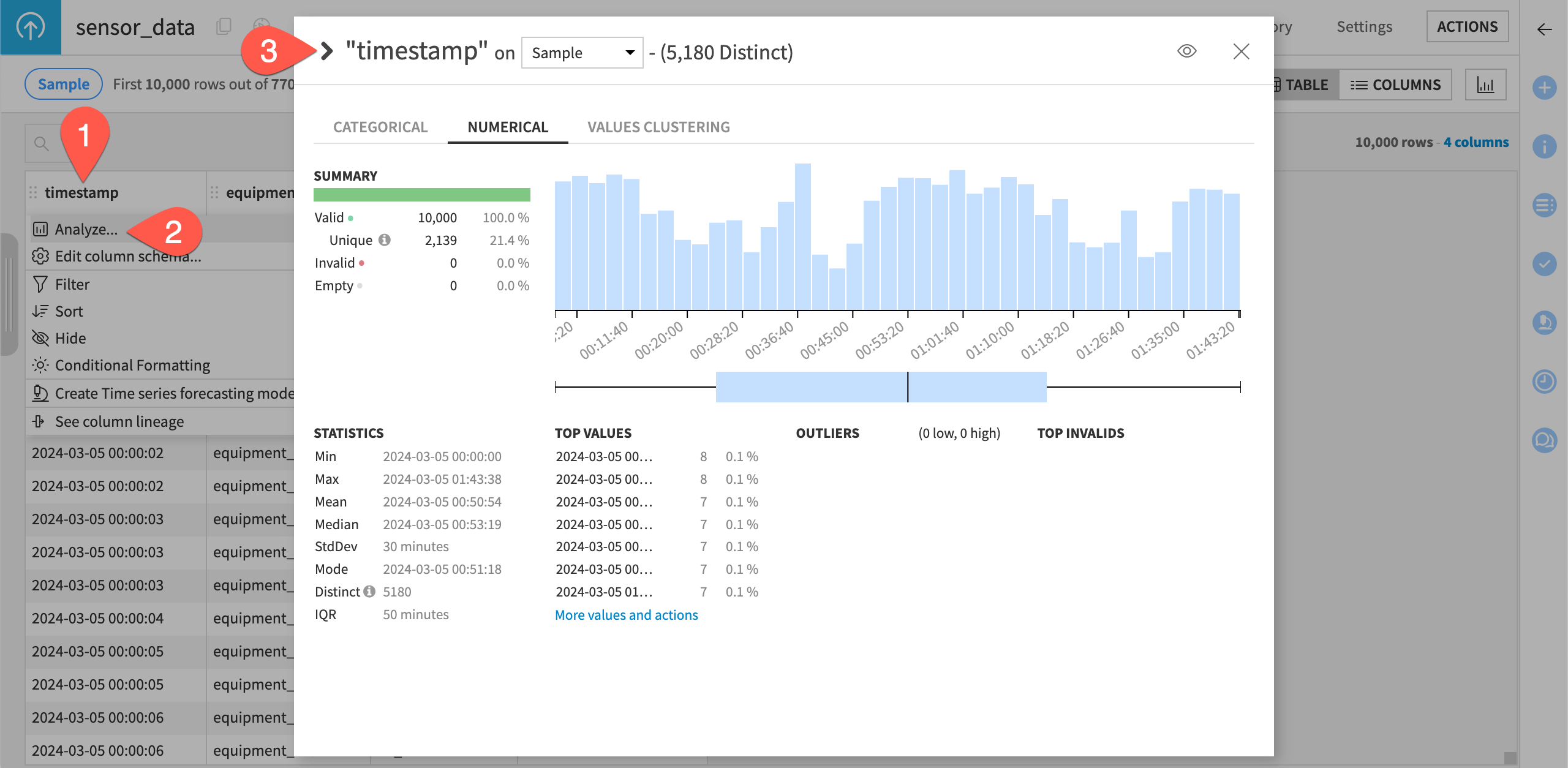
Analyze column distributions#
When exploring a dataset, you’ll also want a quick overview of the columns’ distributions and summary statistics.
Click on the header of the first column timestamp to open a menu of options.
Select Analyze.
Use the arrows to cycle through presentations of each column distribution.
For example, you can see from the analysis of the column equipment_id, that there appear to be two machines for this dataset.
Similarly, in the column sensor_id, there appear to be nine different sensors.
Tip
Explore the batch_data dataset using the same steps used for the sensor_data dataset. For example, you can analyze the batch_duration column to see statistics on the different durations of the production batches.
Clean data#
Once you have a sense of the dataset, you’re ready to start cleaning and creating new features using visual recipes.
Important
Recipes in Dataiku contain the transformation steps, or processing logic, that act upon datasets. They can be visual or code (Python, R, SQL, etc).
Pivot data#
Begin by using the Pivot recipe to convert the sensor_data dataset from long to wide format, as is often necessary when dealing with manufacturing time series sensor data.
From the sensor_data dataset, open the Actions (
 ) tab of the right panel.
From the menu of visual recipes, select Pivot.
For Pivot by, select the sensor_id column.
Name the output dataset
sensor_data_pivoted.Click Create Recipe, accepting the default storage location and format.
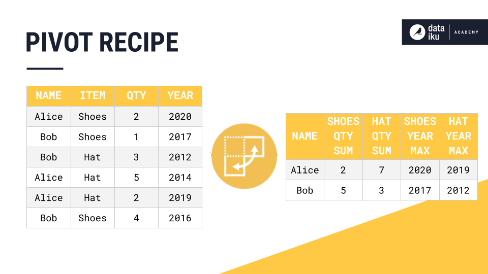
We’re interested in the sensor value for each timestamp or the interpolated sensor value if there is no measured value for a given timestamp. Accordingly, configure the recipe:
Under Row identifiers, add timestamp and equipment_id.
Under Populate content with, deselect Count of records.
From the Add new dropdown, select sensor_value.
Click on the field that appears, and select Avg as the aggregation method.
Click Run (or type the keyboard shortcut
@+r+u+n).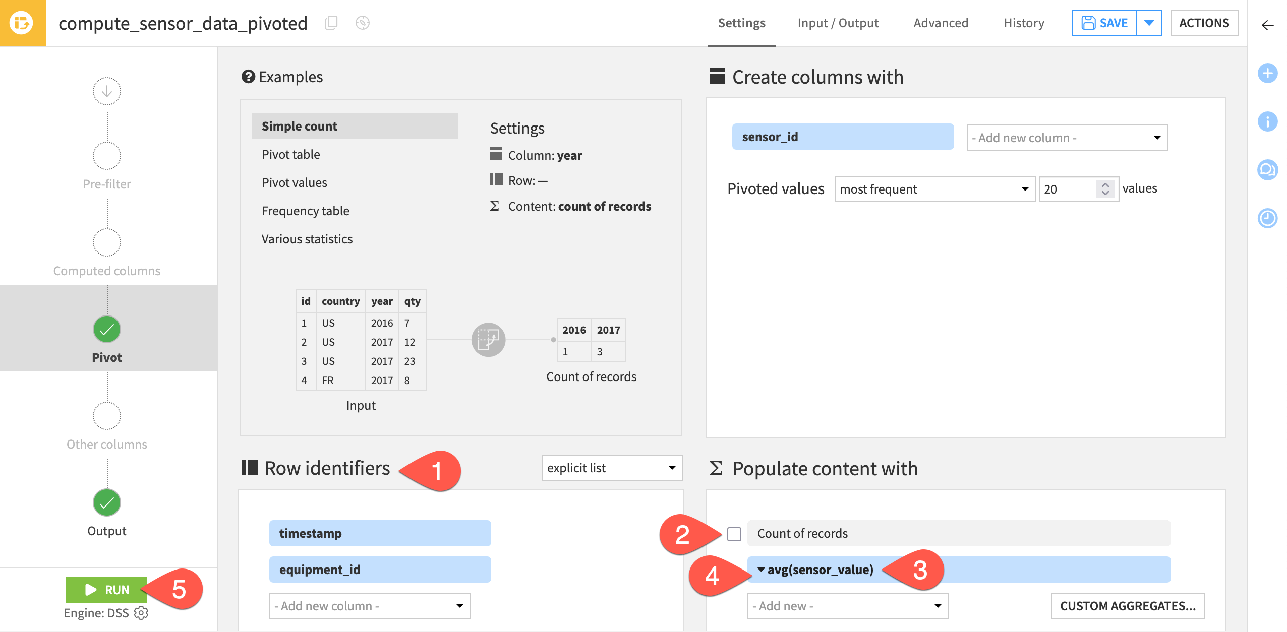
When finished, open the sensor_data_pivoted dataset to see the results.
Parse dates#
Now continuing preparing the pivoted data.
From the new sensor_data_pivoted dataset, open the Actions (
) tab.From the menu of visual recipes, select Prepare.
Name the output dataset
sensor_data_pivoted_cleaned.Click Create Recipe, accepting the default storage location and format.
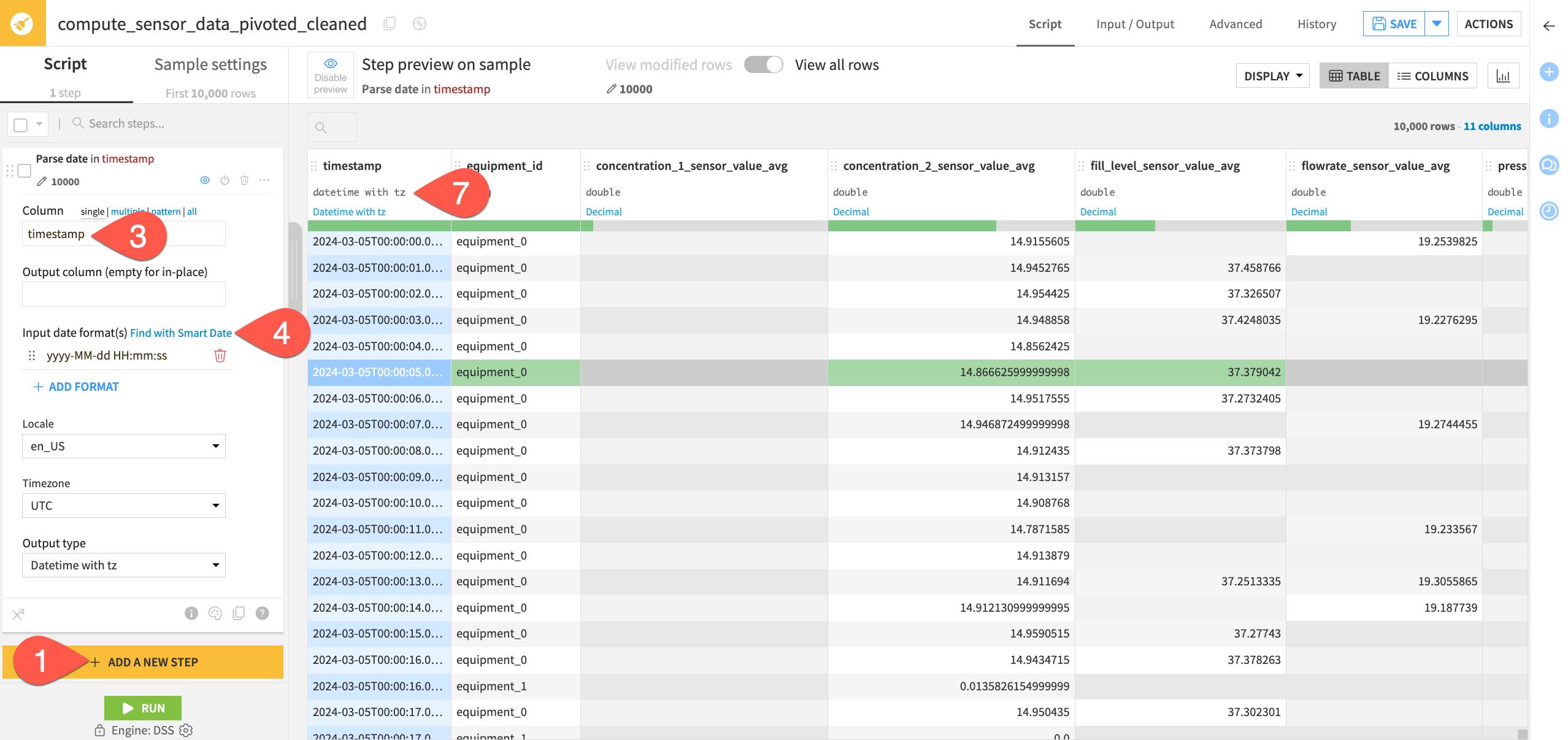
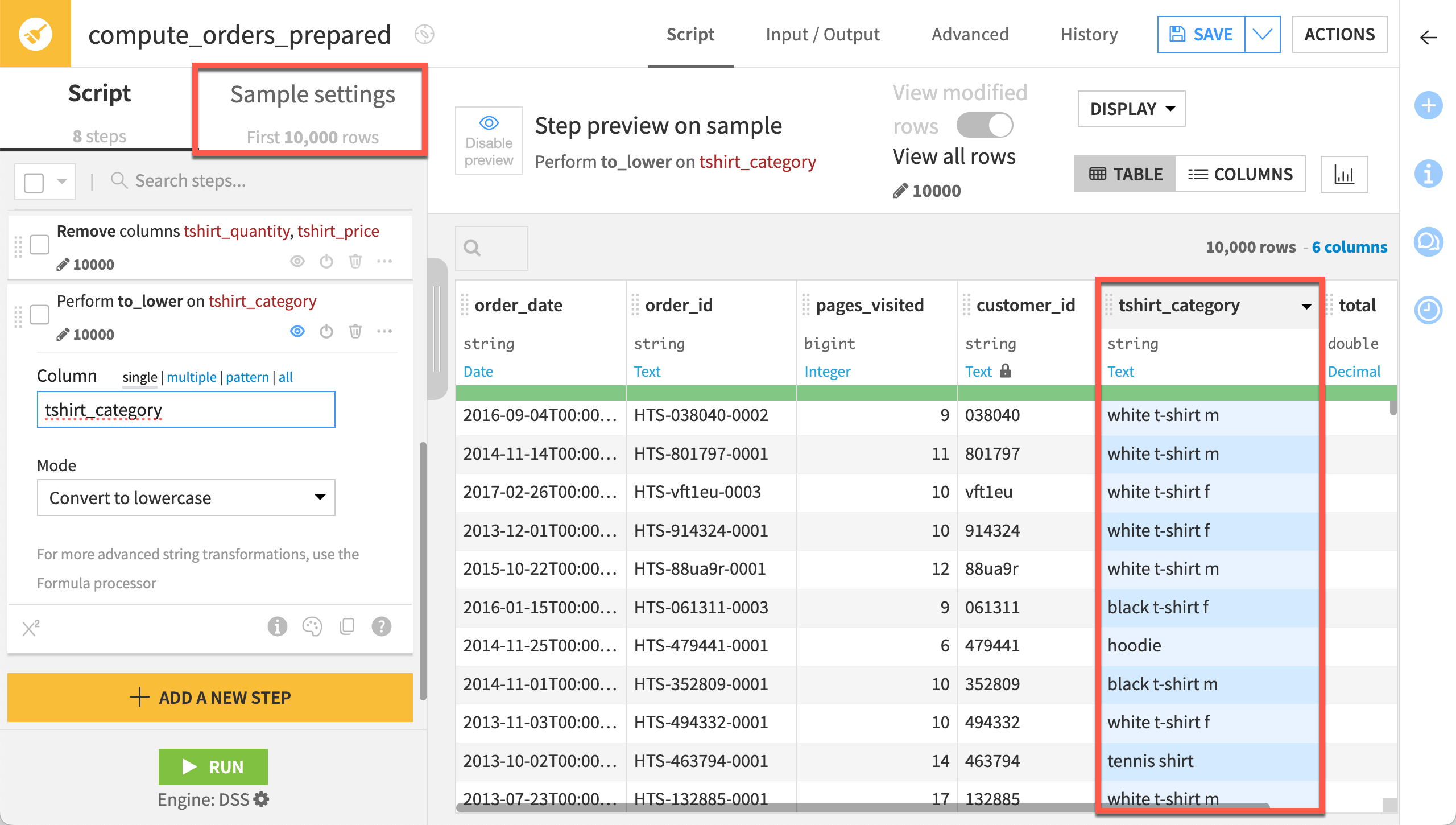
Next, parse the timestamps in the dataset to a date format since they’re currently interpreted as string format.
Click + Add a New Step to open the processor library.
Search for and select the Parse date processor.
In the “Column” field, begin typing
timestampand select the timestamp column.For the input date format, click Find with Smart Date.
Select the yyyy-MM-dd HH:mm:ss format.
Click Use Date Format.
Directly underneath the column header, change the data type of the column from string to Datetime with tz (or Date if using an earlier version of Dataiku).
Remove outliers#
In this section, let’s remove outlier sensor readings.
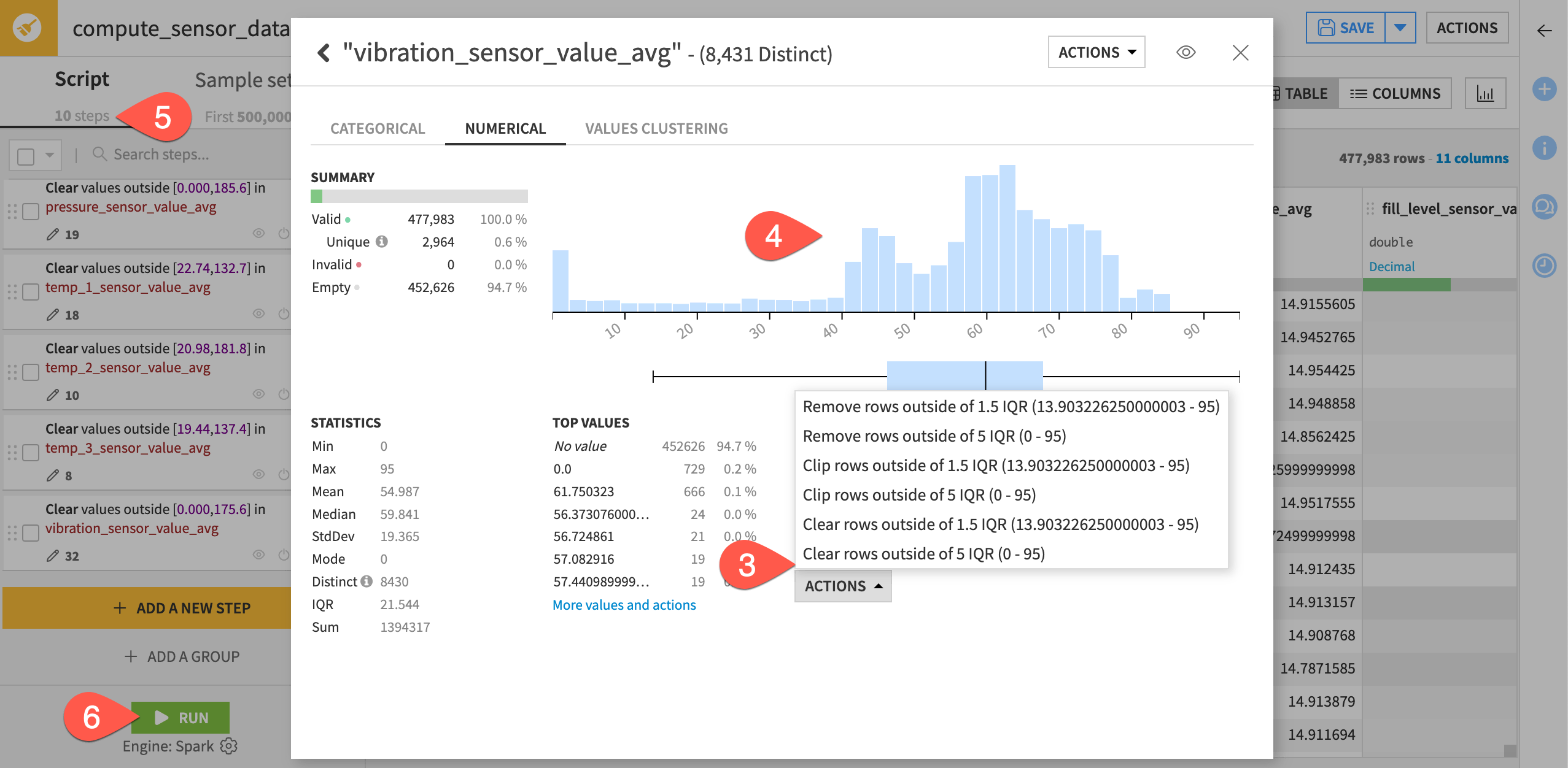
First, increase the sample size to get true values for the interquartile range.
In the Prepare recipe, switch from the script to Sample Settings.
Increase the number of records to
500000(500k) to include the entire dataset.Click Update Sample.
Switch back to the Script tab.
Now, you can clear outlier values. We’ll consider readings outside the fifth interquartile range as an outlier.
Open the header of the first sensor column, concentration_1_sensor_value_avg.
Select Analyze.
Beneath Outliers, select Actions > Clear rows outside of 5 IQR.
Observe that the distribution of values has shifted to a smaller range.
Repeat these steps for the other eight sensor columns, bringing the script total to ten steps.
When you have cleared outliers from all sensor columns, click Run to execute the recipe on the full dataset.
When finished, explore the results in the sensor_data_pivoted_cleaned dataset.
Join data#
This project handles a situation common when dealing with process manufacturing data. There is a dataset with the continuous sensor readings and a second dataset with information about each production batch. The sensor readings have no explicit allocation to a respective batch. You must use the timestamps to determine which batch a sensor reading was measuring.
Create a Join recipe#
In this step, you will join the batch_data dataset to the sensor_data_pivoted_cleaned dataset using the Join recipe. As a result, the sensor readings will be allocated to a machine and to a batch period (each batch has a start and end time).
Navigate back to the Flow (
g+f).Double-click to open the batch_data dataset (This will be the “left” dataset).
Open the Actions (
) tab of the right panel.From the menu of visual recipes, select Join.
For the second input dataset, select sensor_data_pivoted_cleaned.
Name the output dataset
batch_and_sensor_joined.Click Create Recipe, accepting the default storage location and format.
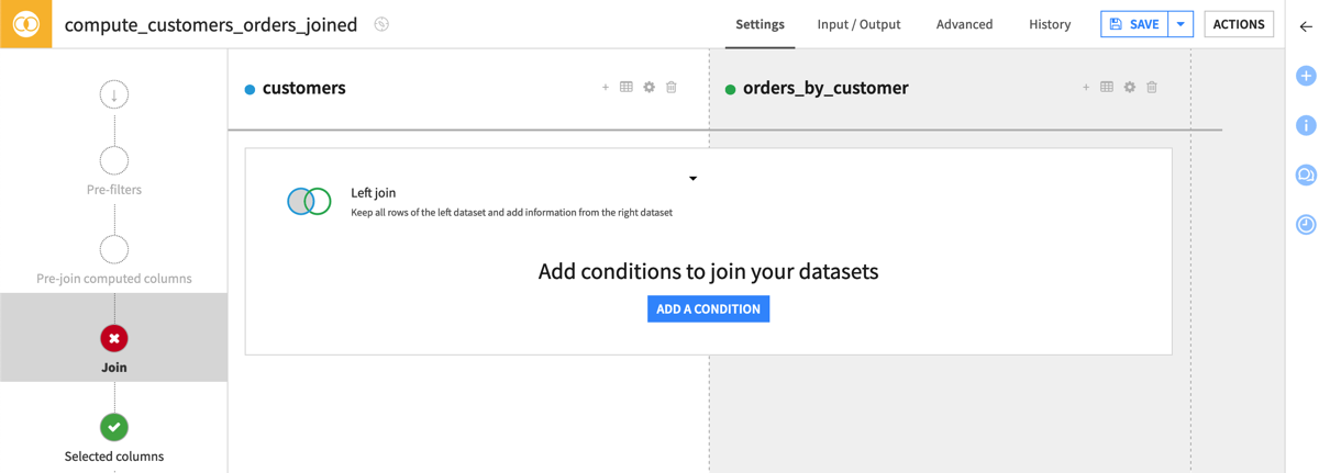
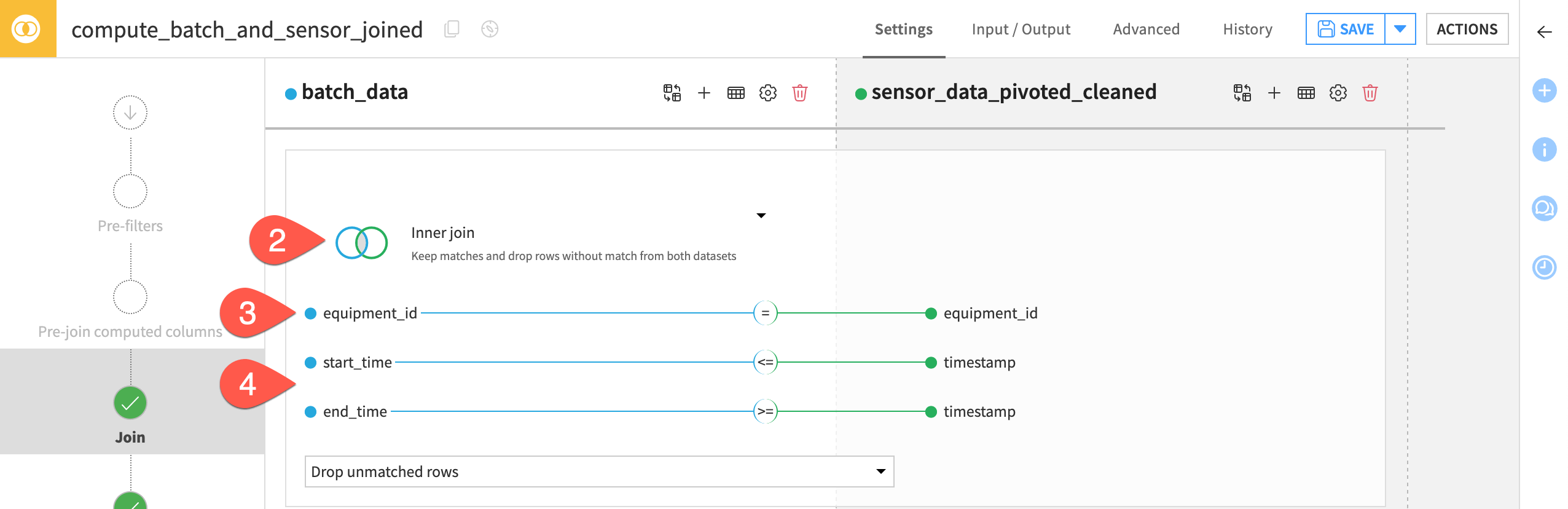
Configure the Join step#
You have a number of different options when deciding how to join datasets. Once you know the type of join required for your use case, you can define the conditions for the join key.
On the Join step, click on Left join to view the various join options.
Select Inner join so that the output dataset retains all batches for which there are sensor readings, and all sensor readings for which there are batches.
Click on equipment_id to open the join conditions menu.
In addition to equal equipment_id values as the first condition, add the following two conditions:
start_time from batch_data
<=timestamp of sensor_data_pivoted_cleanedend_time from batch_data
>=timestamp of sensor_data_pivoted_cleaned.
Doing this allocates the sensor readings of a given equipment machine which occur between the start and end time of a given batch, to that respective batch.
Tip
The recipe will drop unmatched sensor readings and batches. You could also collect unmatched rows to another dataset for debugging or situations where you want to handle unmatched data in a different way.
Select columns for the output dataset#
The next step is to choose which columns should appear in the output.
On the left hand panel, navigate to the Selected columns step.
Keep the default options of Select all non-conflicting columns for both left and right datasets. This keeps all columns from each dataset, except the conflicting equipment_ID column found in both datasets.
On the left hand panel, navigate to the Output step for a preview of the columns that the output dataset will contain.
Before running, click Save (or
Cmd/Ctrl+S).

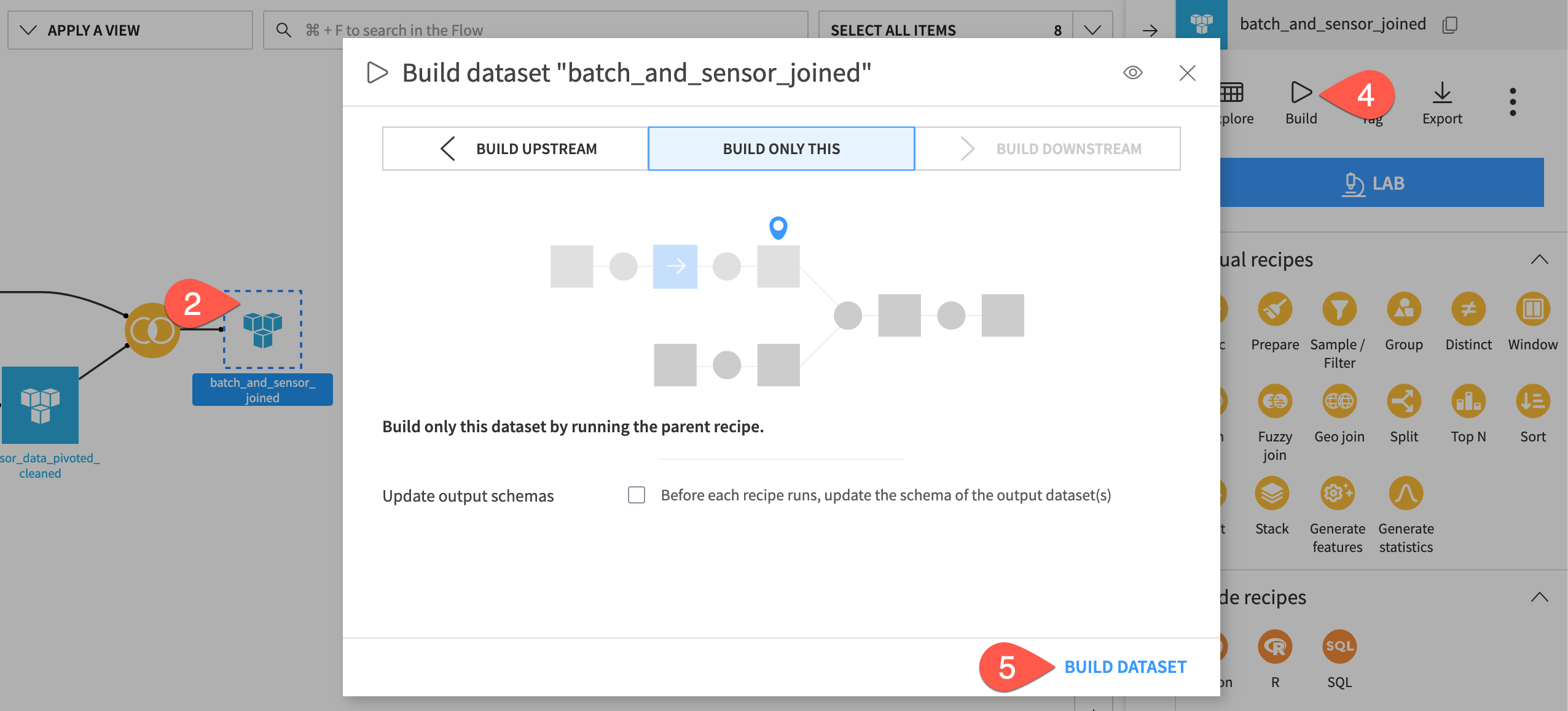
Build a dataset from the Flow#
Often, you won’t want to open an individual recipe to run it. Instead, you can instruct Dataiku to build whatever dataset you want, and Dataiku will run whatever recipes are necessary to make that happen.
Before running the Join recipe, navigate back to the Flow (
g+f).Click once to select the empty (unbuilt) batch_and_sensor_joined dataset.
Open the Actions (
) tab.Click Build.
Since you have already built the datasets preceding this step, leave the default “Build Only This” mode, and click Build Dataset.
See also
Instead of “Build Only This”, you could have selected “Build Upstream”, which would build any out-of-date “upstream” datasets. You’ll learn more about build modes and automating builds with scenarios in the Advanced Designer learning path.
Create visualizations and a dashboard#
In this section, you’ll generate a dashboard containing several charts and metrics to visualize and analyze the data.
Note
This quick start only includes the creation of a small handful of visualizations. See the corresponding sample project for a more extensive dashboard built on this same data.
Create visualizations#
Let’s first create three visualizations before publishing them to a dashboard.
Important
We won’t use the joined dataset previously created since this dataset has repeated batches (one for every sensor reading). We’ll use the joined dataset in the extended example of this project, rather than in this quick start.
From the Flow, double click to open the batch_data dataset.
Navigate to the Charts tab (
g+v).
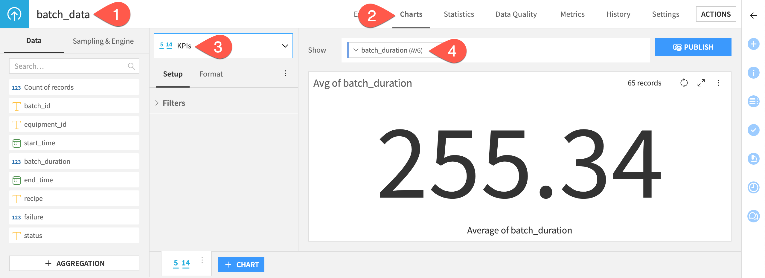
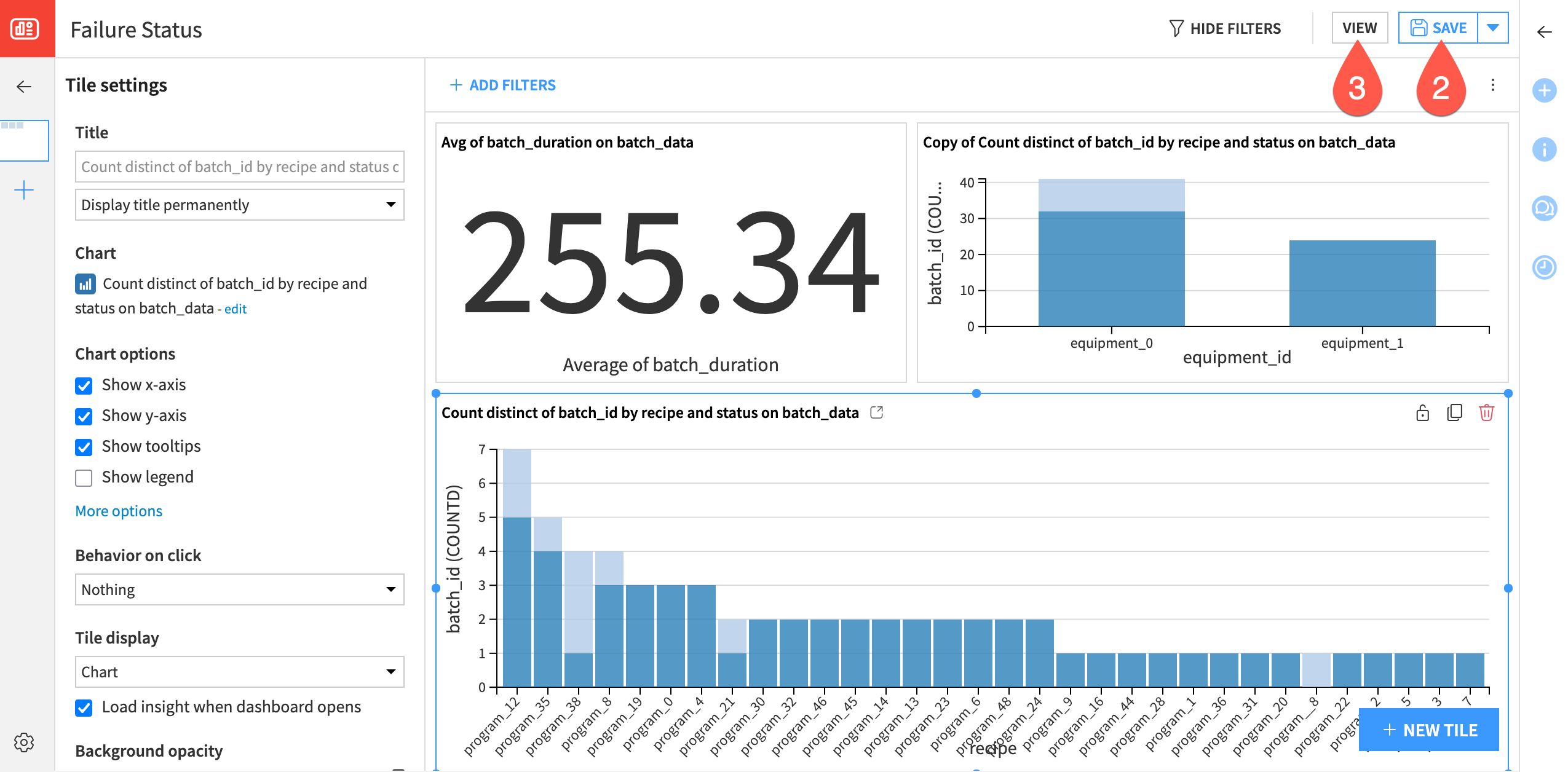
Create a KPI chart#
First, create a KPI to include in the dashboard: the average batch duration.
From the Flow, double click to open the batch_data dataset.
Navigate to the Charts tab (
g+v).Select KPIs from the chart type menu.
Drag the batch_duration column to the Show field.
By default, the chart computes the average value as the KPI.
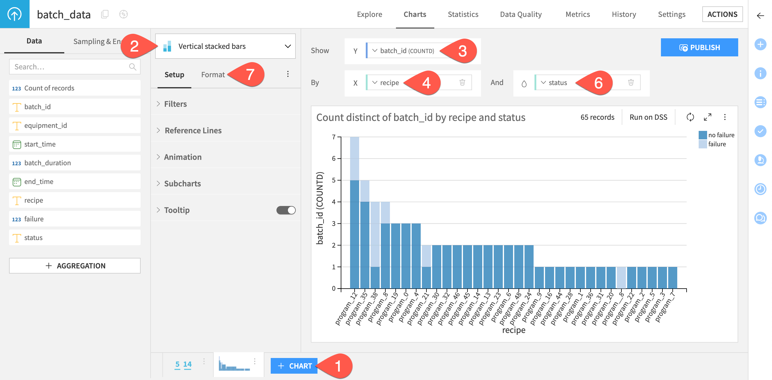
Create bar charts#
Now, let’s create a bar chart showing each production recipe/program, split by failed and successful batches.
Click + Chart.
Select Vertical stacked bars from the chart type dropdown menu.
Drag batch_id to the Y axis field. Keep the default aggregation function as COUNTD (distinct count) to plot the number of distinct batches for each program.
Drag recipe to the X axis field.
Click on the field to increase the max displayed values to
50to ensure that the plot shows all programs.Drag status to the color droplet (
 ) field to generate vertical columns stacked by failure status.
Go Format to modify many other chart settings, including your own color palette.
Additionally, create a bar chart showing the number of failed and successful batches.
At the bottom of the screen, click the vertical dots (
 ) on the first bar chart.
Select Duplicate.
Replace recipe with equipment_id for the X axis field.
Make any additional customizations as needed, such as editing the title.
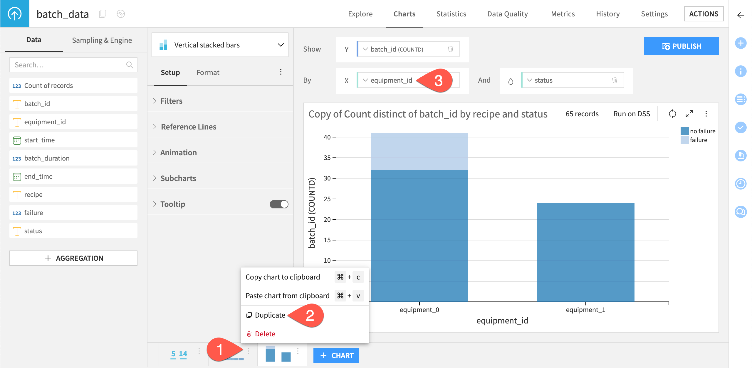
Tip
The resulting chart should reveal that all failures occur on the machine equipment_0, which in practice would warrant a closer inspection and root cause analysis on this machine.
Create a dashboard#
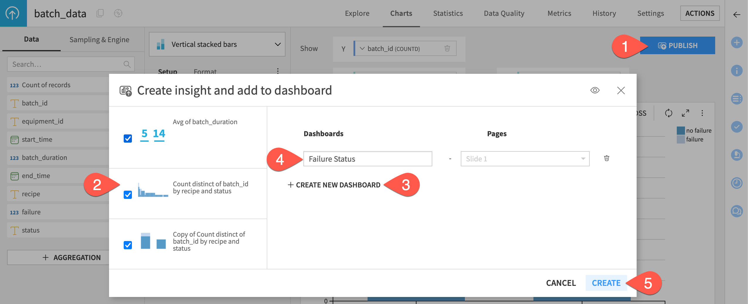
Having now created the visualizations, publish them to a dashboard.
Click Publish at the top right of the page.
Select the three visualizations you previously created.
Click + Create New Dashboard.
Provide a name, such as
Failure Status.Click Create.
The edit mode of the dashboard tab of Dataiku will automatically open, and you should see your visualizations. You can now adjust the size, and further details and options of the dashboard, such as titles and legends.
Drag and resize the chart insights on the page as needed.
Click Save (or
Cmd/Ctrl+S).Click View to see the finished dashboard.
See also
For more resources, see the Dashboards section of the Knowledge Base.
Next steps#
Congratulations! You’ve taken your first steps toward preparing and visualizing manufacturing data with Dataiku.
You’re now ready to begin the Core Designer learning path and challenge yourself to earn the Core Designer certificate.
Additionally, we recommend you take a look at the extended sample of this quick start - the Manufacturing Data Prep and Visualization Sample Project. In addition to viewing this project on the gallery, you can also download the extended sample project on your own instance through the same catalog from which we installed this quick start.
With this sample project you can check your work from the quick start and see further data preparation steps you may want to apply to your data. You’ll also find a more extensive dashboard that would be more typical for use in manufacturing operations, including sensor readings, a correlation matrix, and distribution plots. This sample project also includes a more detailed wiki that will explain these additional steps.