
Concept | Dataiku stories#
Watch the video or read the summary below.

What are Dataiku stories?#
Dataiku stories allow you to build contextualized, interactive, and up-to-date data presentations so that you can understand and share the stories hidden in your data. The data comes from datasets added to a centralized workspace so that the data can be sourced from projects across the company. Then stories are created from said workspace to have access to the associated datasets.
A story is the object that contains all the slides you want to create for later presentation and collaboration.
Through a drag-and-drop visual interface, you can collaboratively create meaningful reports with filters, annotations, and interactive elements that are automatically refreshed with new data.
The aim of a story is to be shared and read by a community of users that need to interact with this content.
Note
The story is available to the workspace users in:
View mode for users with the Members role.
Edit mode for users with the Contributors role.
Benefits of stories by persona#
Dataiku stories offer important benefits for different personas:
Data & analytics leaders can give business users access to data from trusted datasets that their teams have control over while empowering them to explore and build data reports on their own. They can also ensure that data and insights produced by their teams are actually used by the business to ensure a data-driven culture.
Analysts and data scientists can share context with business stakeholders through annotations and comments and allow them to interact with data elements to dig deeper into key questions.
Line-of-business (LOB) leaders and domain experts can use the data that they know is up to date and validated to build presentations, explore relationships in data, and create visualizations and charts enriched with narratives highlighting the business outcomes.
Generative AI (GenAI) features#
Dataiku stories includes many GenAI tools to help you build the best stories from your data, helping users get to grips with the tool by using text and prompts ranging from the simplest to the most specific ones, allowing the tool to either create content from scratch or craft the precise story you want to tell. They’re involved in many different ways:
Feature |
Description |
|---|---|
Text helper |
Helps you generate a paragraph or an image based on simple words. When you click on a small text, you have the option to Generate a paragraph or Generate image, which calls the text helper to generate a few sentences or a usable image, respectively, based on the text input. Once generated, you can apply this content as is, regenerate, or discard it otherwise. |
Presentation assistant |
Is a global helper. It’s involved at every level of a presentation: the presentation itself, a single slide, a chart, or an image. You can use a prompt to generate and act on any of these objects, whether they were created using GenAI tools or manually. In the instructions, you can ask the assistant to create a presentation and sequentially provide more instructions to the assistant on what needs to be adjusted, like adding filters on existing slides created, creating or customizing different elements of the existing slides, adding more slides, etc. |
Chart assistant |
Focuses specifically on charts. With the chart assistant, you can generate charts and modify their settings such as the titles, colors, border styles, and more. |
Image assistant |
Generates images on demand through the text helper or other options such as the Media menu. |
GenAI features are meant to be used as the entry point of Dataiku stories.
Note
Administrators must enable AI Assistants under Administration > Settings > AI Services. Admins can choose to use Dataiku’s AI Services or a separate large language model (LLM) connection.
Data management in stories#
This section describes in greater detail how the source data is managed in stories.
Data mapping between datasets and stories#
As seen above, stories rely on data coming from datasets added to the centralized workspace. Upon creating a story, Dataiku asks which datasets you want to synchronize with your story. It’s possible to select one or several datasets. The list only shows the dataset you’ve added to the workspace.
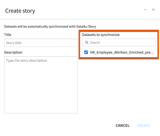
Note that file-managed datasets are mapped in the story backend in an analytical database that makes stories performance scalable with large numbers of users. Importing this type of dataset can take some time depending on the data size.
SQL datasets used in stories use the same SQL connector as Dataiku and performances will depend on the underlying database server.
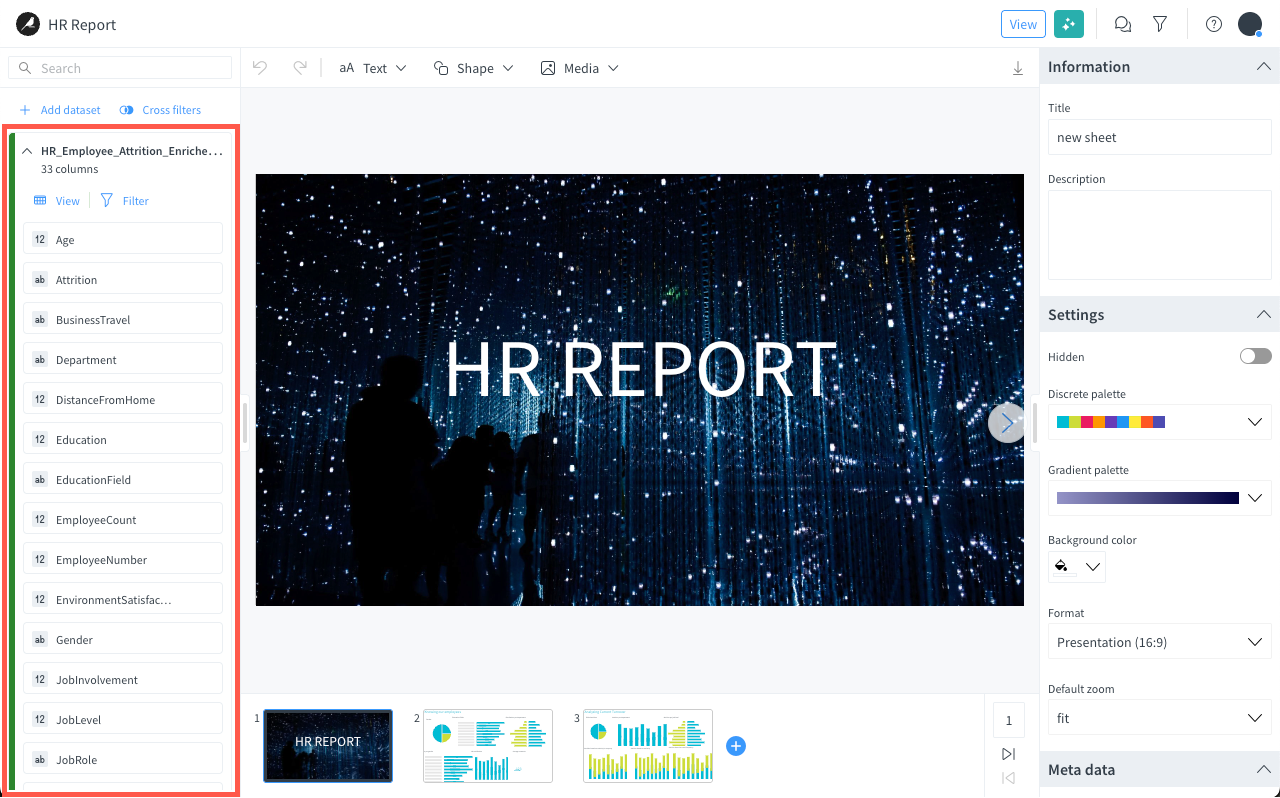
Once the story is created, whenever the source datasets get updated (with new columns for instance) the data bar is synchronized. You can see the update status for each dataset in the data bar.
Data view and edition from the story#
From the story data bar, the View button allows you to view the content of the attached dataset.
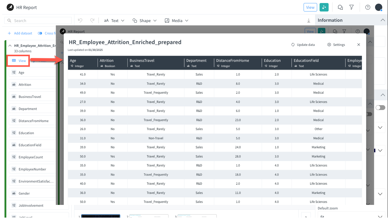
From this dataset view, you can:
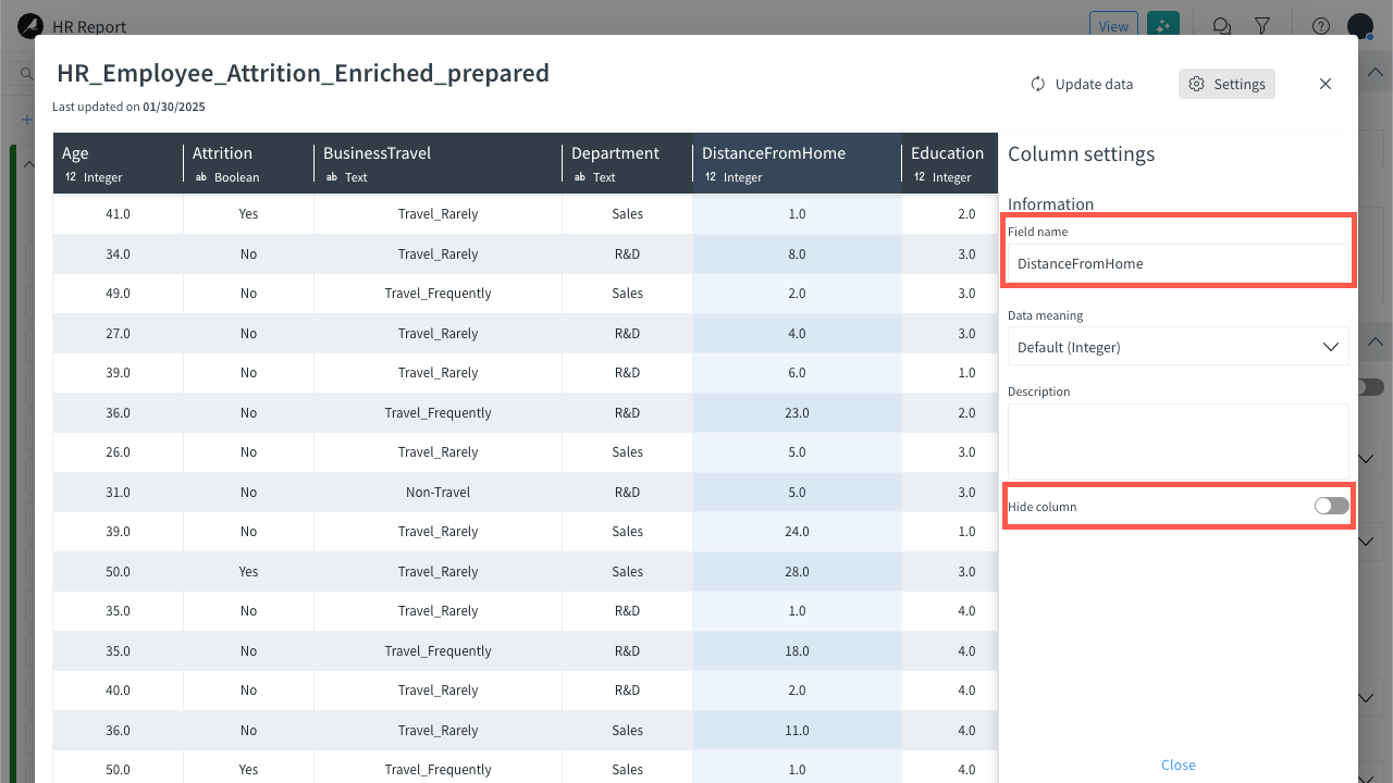
Rename columns to improve the label display in charts.
Hide columns from the data bar for clearance.
Data filtering#
Stories include two types of filters:
filters used by story authors or contributors, and
interactive filters used by story readers.
Filters for authors/contributors#
Filters designed for story authors or contributors can be set on both datasets and charts.
Caution
Keep in mind that filters defined at the dataset level apply on all slides. To apply filters only to some aggregations, use chart filters instead.
Filters on datasets#
Filters on datasets are defined while editing the story, using the Filter button in the data bar on the left, via a no code user interface.
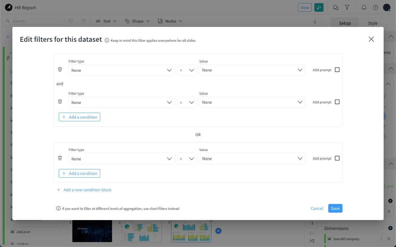
As you can see above, several level of condition blocks can be defined and conditions can be set on either numerical or categorical fields from the selected dataset.
Once defined, these filters are executed upon the story presentation. They apply on the dataset for all the queries in the story.
Filters on charts#
Filters on charts are defined while editing the story, using the Add Filter button in the Filters section of the inspector on the right.
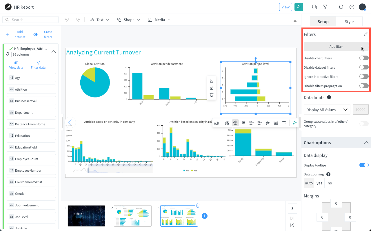
Just like dataset filters, the filters use a no code user interface where you can define several level of condition blocks and set conditions on either numerical or categorical fields from the dataset.
Once defined, these filters are executed upon the story presentation.
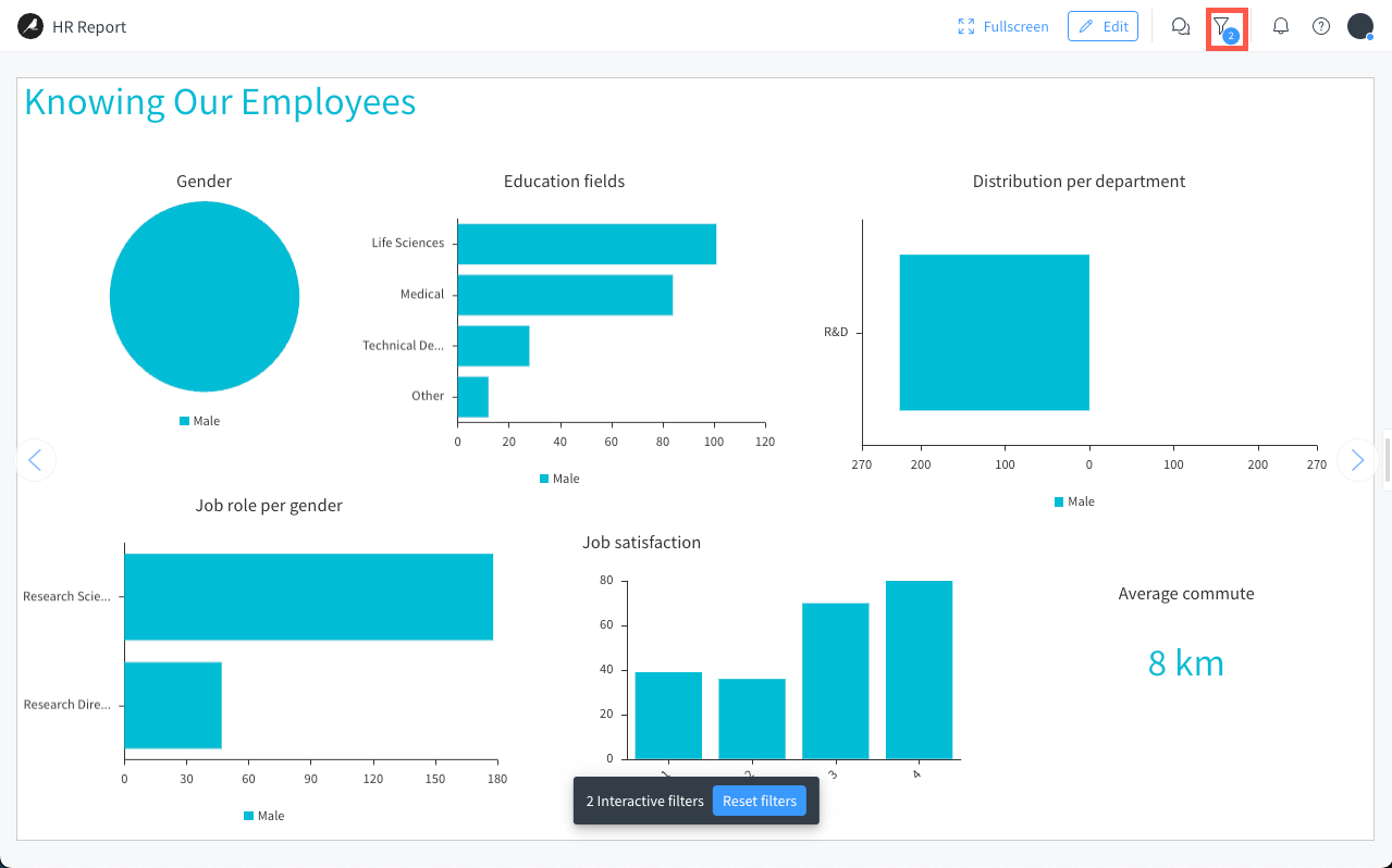
Interactive filters for the story reader#
Interactive filters are available in view mode, for the story reader.
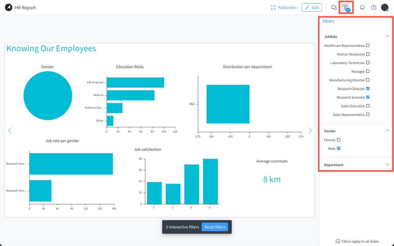
Important
The interactive filters apply to all slides.
When viewing a story in view mode, if filters are defined, a counter is added to the filter icon, as shown below.
Collaboration features in stories#
Stories are a collaborative tool where users can:
Comment any slide, both in edition and view modes, via the comment panel on the right.
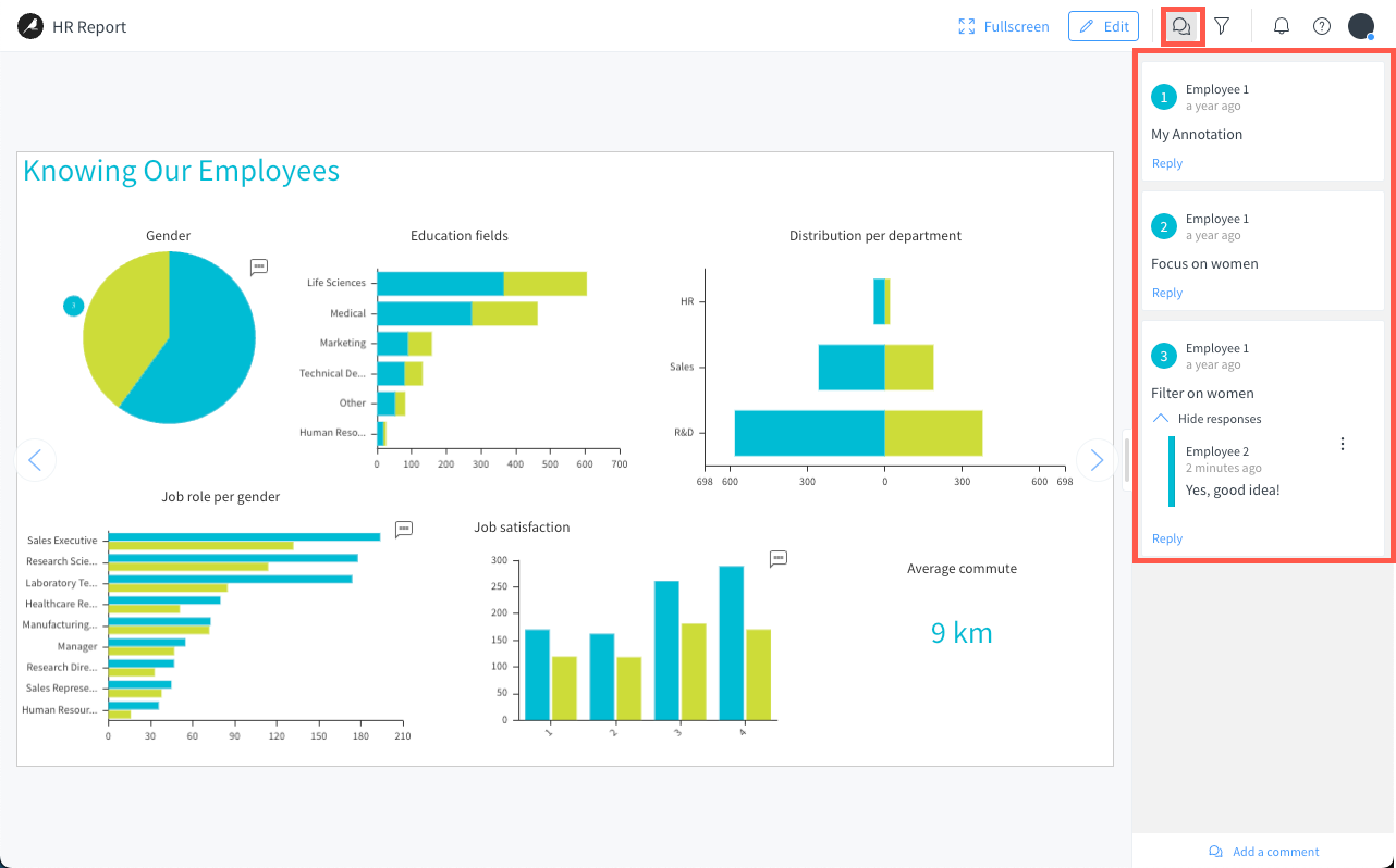
Annotate charts only in view mode. Annotations are a sort of marker defined directly on the chart, to raise the attention of users on a specific metric.
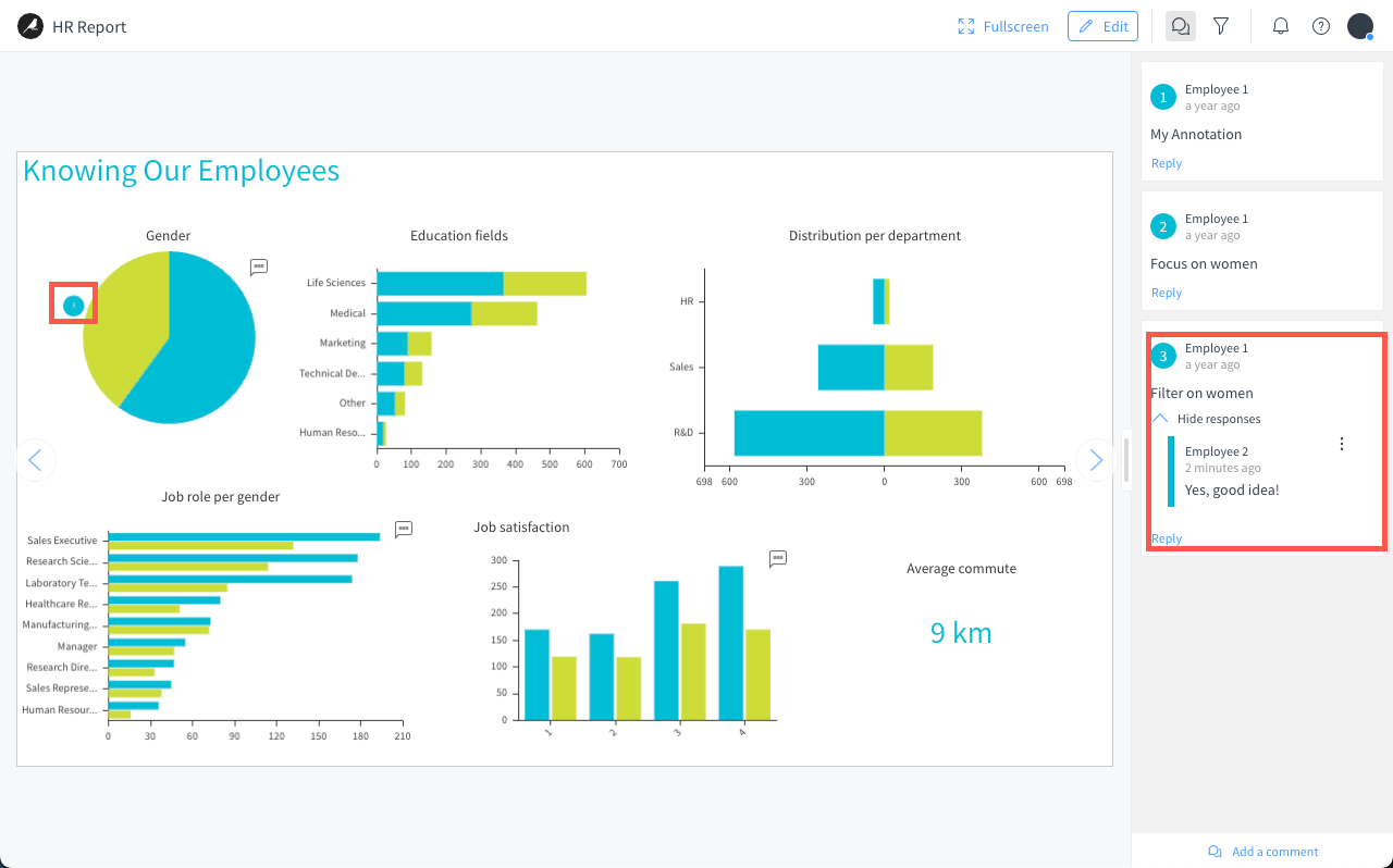
Comments and annotations can include a filter so that, when a user selects the comment, the presentation is filtered providing the right context for said comment.

Next steps#
Continue learning about stories by working through the following articles: