
Tutorial | Interactive statistics#
Get started#
Exploratory data analysis in Dataiku often begins with the Analyze tool and the Charts tab. When you’re ready to dive deeper, you’ll often want to advance to the Statistics tab.
The Statistics tab of a dataset allows you to generate statistical reports on your data by creating cards within a worksheet.
Objectives#
In this tutorial, you’ll create a variety of statistical reports, including:
Autosuggested analyses
Descriptive univariate and bivariate analyses
Fit curves and distributions
Multivariate analyses, such as principal component analysis and correlation matrices
Inferential hypothesis testing
Recipe-generated statistics
Prerequisites#
Dataiku 12.0 or later.
An Advanced Analytics Designer or Full Designer user profile.
Create the project#
From the Dataiku Design homepage, click + New Project.
Select Learning projects.
Search for and select Interactive Statistics.
If needed, change the folder into which the project will be installed, and click Create.
From the project homepage, click Go to Flow (or type
g+f).
Note
You can also download the starter project from this website and import it as a ZIP file.
Use case summary#
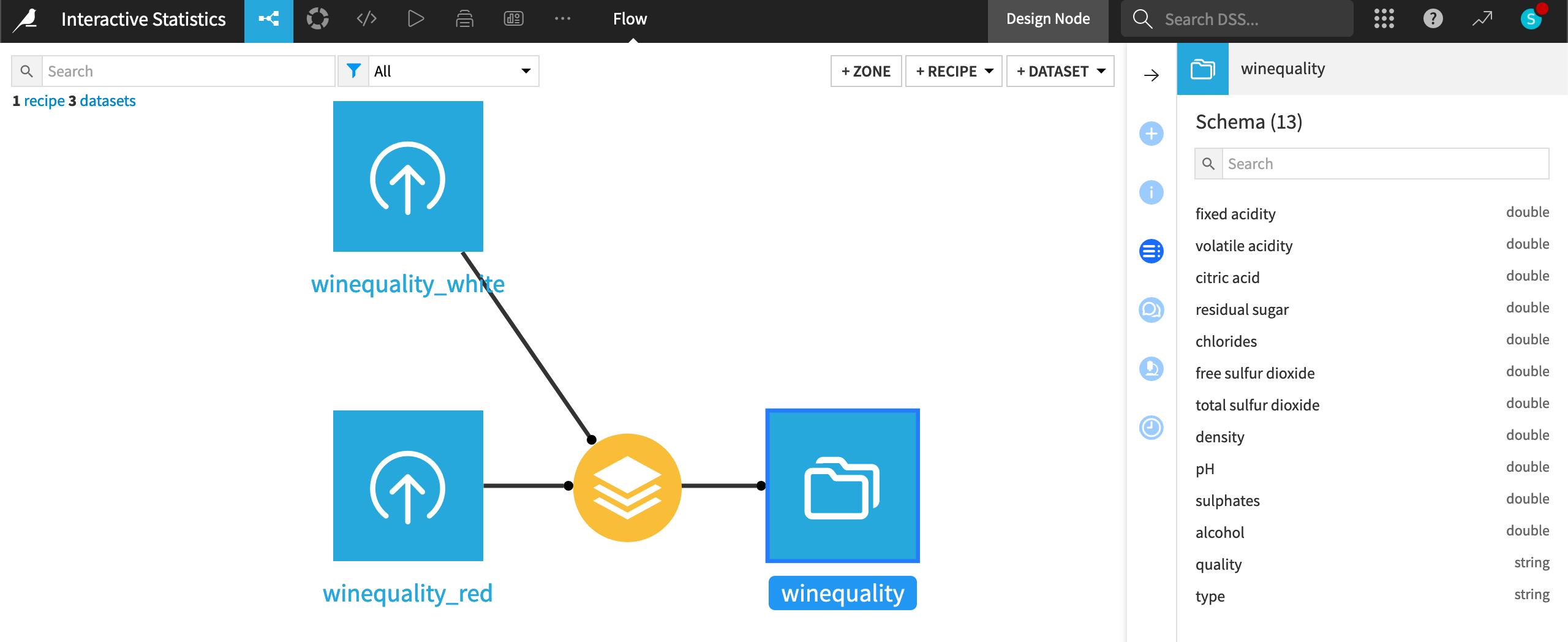
This tutorial performs EDA tasks on the wine quality dataset from the UCI Machine Learning Repository [1].
The original dataset consists of 12 features (or variables). The starter project includes an additional column through the Stack recipe for a variable type. It indicates whether an observation belongs to the red or white wine category.
The type and quality variables in the dataset are treated as categorical variables, while all other variables are numerical.
Tip
Once you have created the project above, feel free to complete the following walkthroughs of various analyses and tests in any order. They can be completed independent of one another.
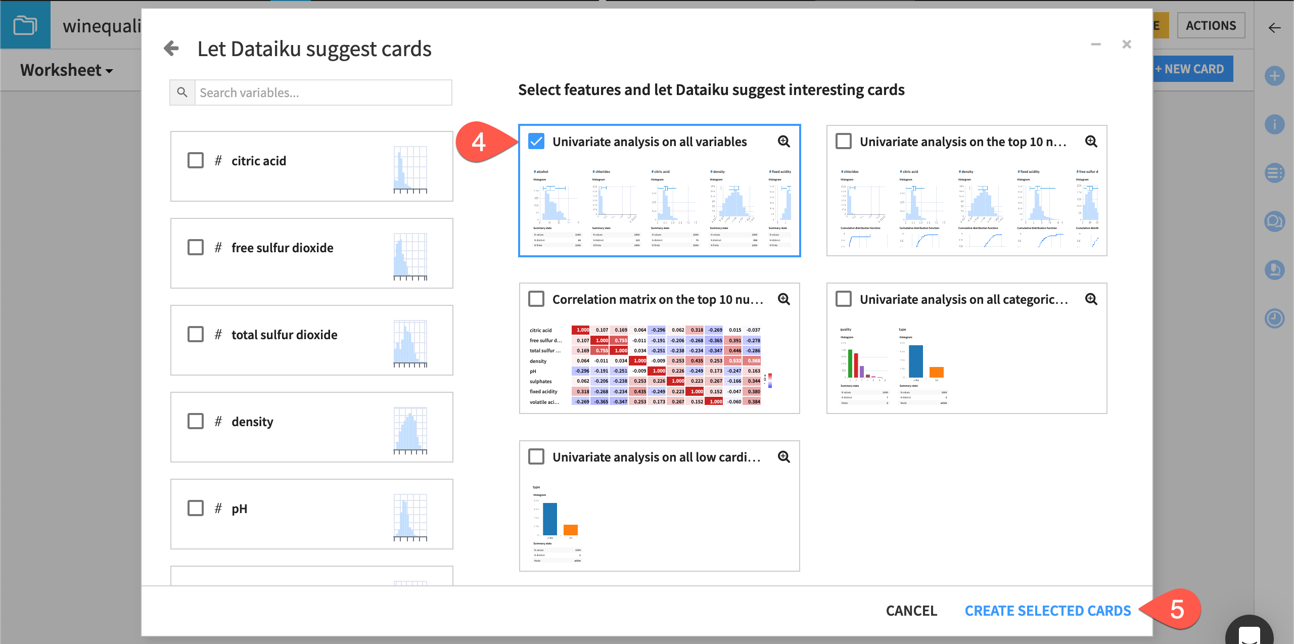
Use automatically suggested analyses#
A statistics worksheet allows you to create many kinds of statistical reports. One option is to allow Dataiku to automatically suggest analyses.
This runs a smart assistant to discover patterns in the data by suggesting analyses on variables of interest. This is particularly useful when there are many columns in the dataset or when you need some notion of where to begin your analysis.
Let’s try it now!
From the Flow, open the winequality dataset.
Navigate to the Statistics tab of the dataset.
Click + Create Your First Worksheet.
Select Automatically suggest analyses from the window of possible card types.
Select cards interesting to you, and click Create Selected Cards.
See also
See the reference documentation to learn more about Assisted Data Exploration.
Run univariate and bivariate analyses#
Of course, you can also manually select the statistical report you wish to generate. A common place to begin is exploring distributions of individual or pairs of variables with descriptive statistics.
Univariate analysis#
Univariate analysis is used to compare the data distribution of individual variables.
Let’s use it to see a side-by-side comparison of the variables density, alcohol, and type.
Important
As covered in Concept | Variable types for interactive statistics, remember that the \(\boldsymbol{\#}\) symbol denotes a numerical variable and the \(\mathrm{\mathbf{A}}\) denotes a categorical variable.
From the existing statistics worksheet, click + New Card at the top right.
Select Univariate analysis.
From the list of available variables on the left, drag density, alcohol, and type to the variables to describe section. Alternatively, you can select a variable on the left and click the plus icon.
Click Create Card to let Dataiku create the analyses selected by default.
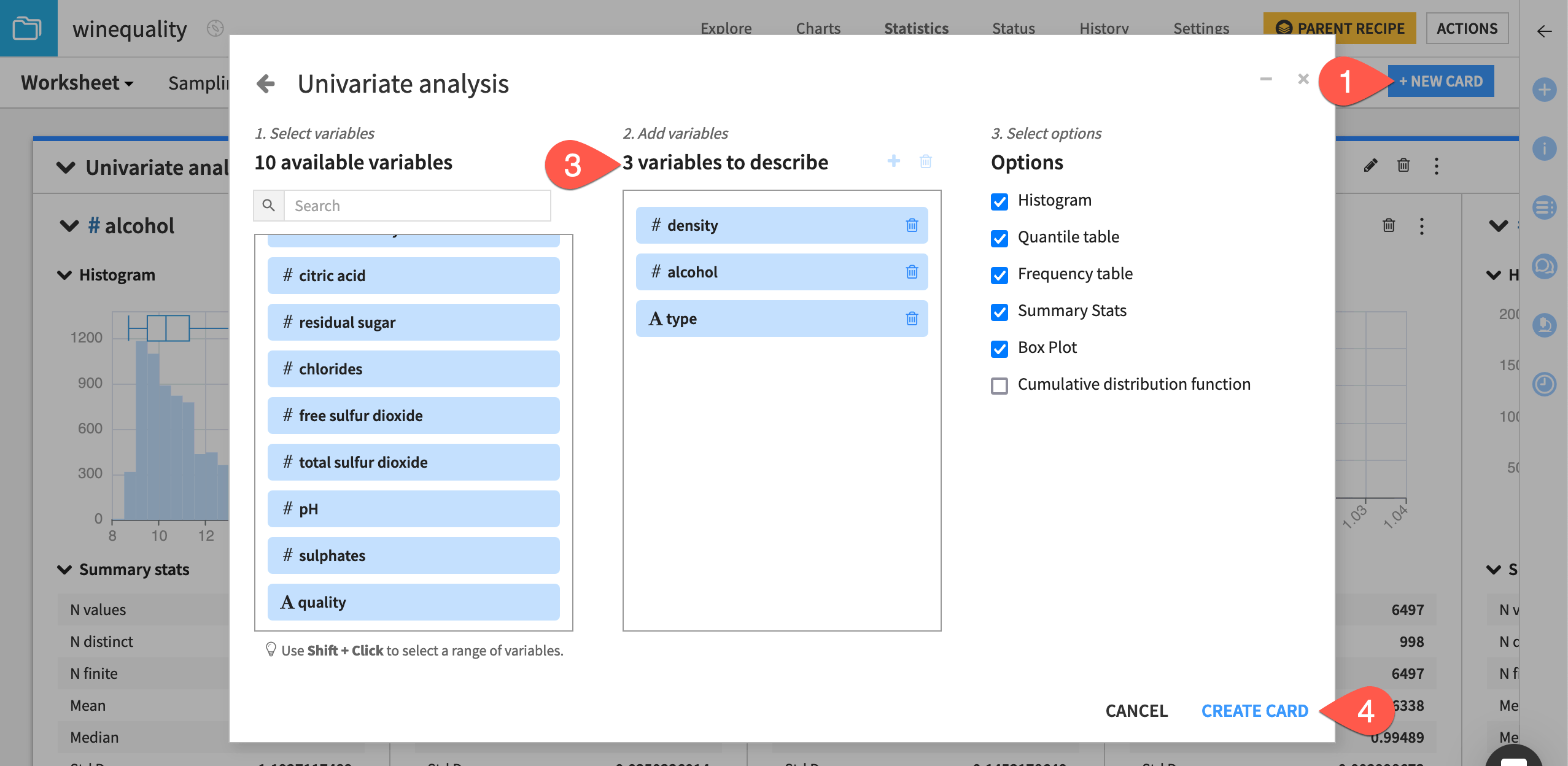
Important
Dataiku automatically selects the statistical Options to the right that are appropriate for the numerical variables (density and alcohol) and the categorical variable (type). You can deselect any of these options if needed.
In the worksheet, Dataiku creates a card with one section for each variable. The type of statistical chart and descriptive statistic in each section depends on whether the variable is categorical or numerical.
In this case, the categorical variable type displays a categorical histogram, while density and alcohol each display a numerical histogram and box plot insert. Also, a quantile table is applied to the numerical variables, while a frequency table is applied to the categorical variable.
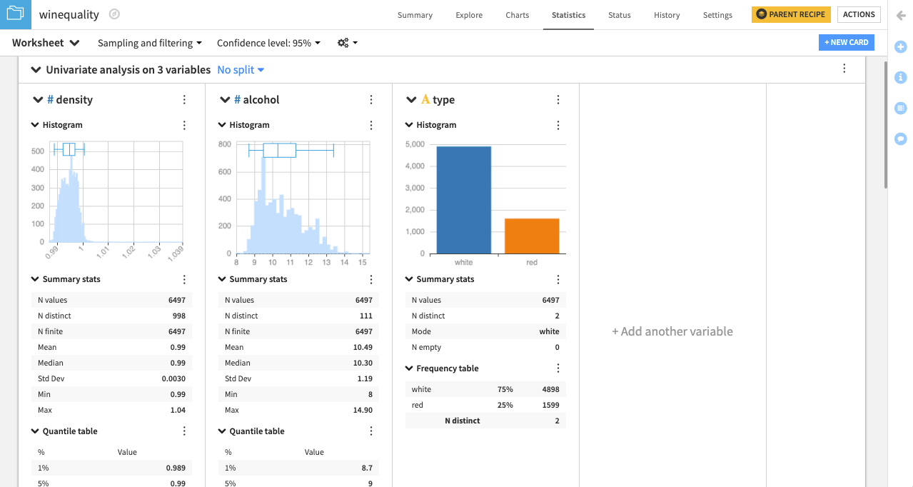
Important
By default, Dataiku computes worksheet statistics on a sample of the first records in your dataset. You can configure this setting by clicking the dropdown arrow next to Sampling and filtering.
See also
For more information, see Univariate Analysis in the reference documentation.
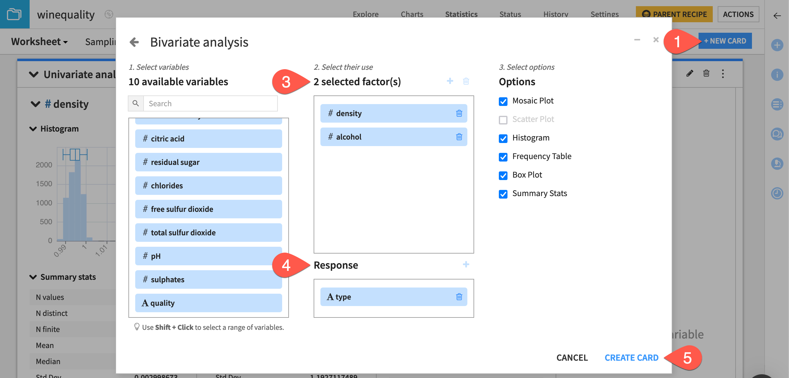
Bivariate analysis#
Bivariate analysis lets us examine the data distribution for pairs of variables simultaneously.
In this section, let’s examine the response variable (type) for each factor variable (density and alcohol).
From the existing statistics worksheet, click + New Card at the top right.
Select Bivariate analysis.
From the list of available variables on the left, drag density and alcohol to the selected factors box.
Drag the type variable to the Response section.
Click Create Card.
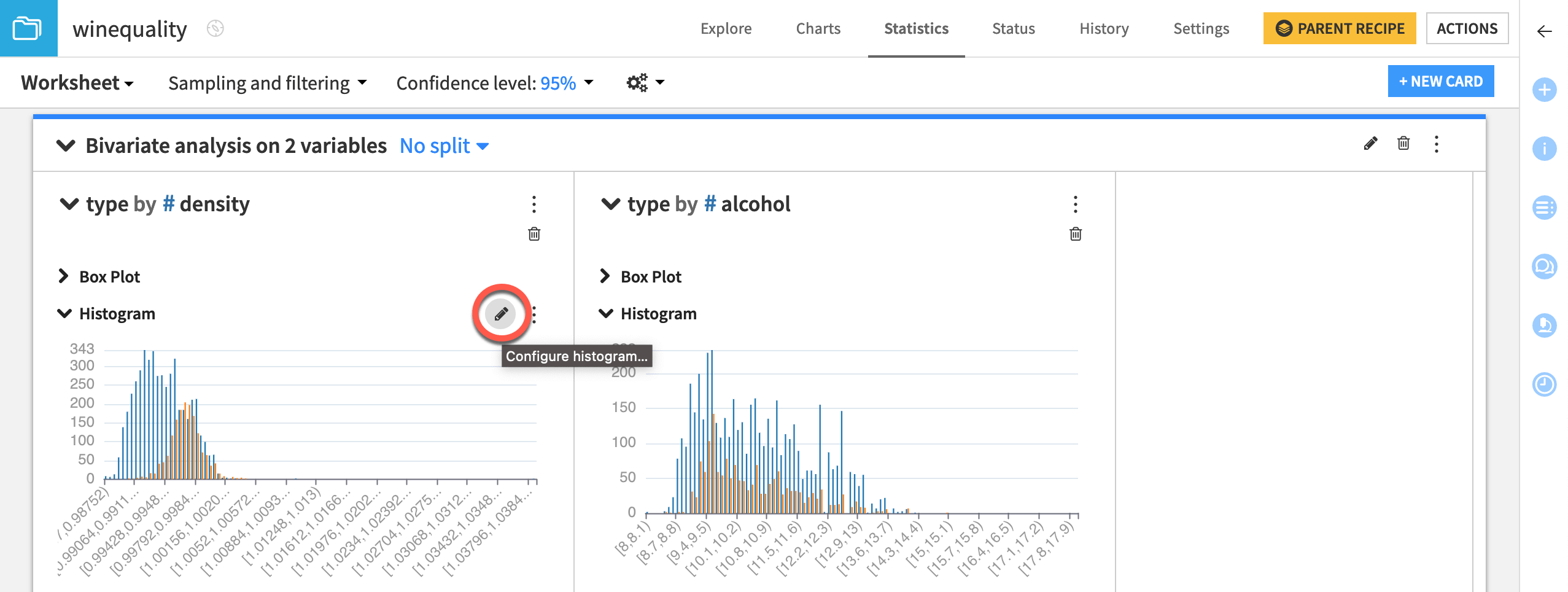
Refine card visualizations#
Dataiku creates a card with one section for each factor-response pair.
Notice that each descriptive statistical visualization (such as a histogram) in the card has a pencil icon that appears when you hover over it that lets you choose additional configurations. For example, clicking the pencil for a histogram plot enables you to select a binning mode and maximum number of bins.
In the type by density histogram, click the pencil (
 ) icon to adjust settings.
Set the density binning mode to Fixed nb. of bins.
Set the Nb. of bins to
100.Click Apply.
Repeat the same steps for the type by alcohol histogram.
See also
For more information, see Bivariate Analysis in the reference documentation.
Fit curves and distributions#
Another aspect of descriptive statistics involves modeling the probability distribution of your dataset. Three cards support these kinds of analysis for numerical variables.
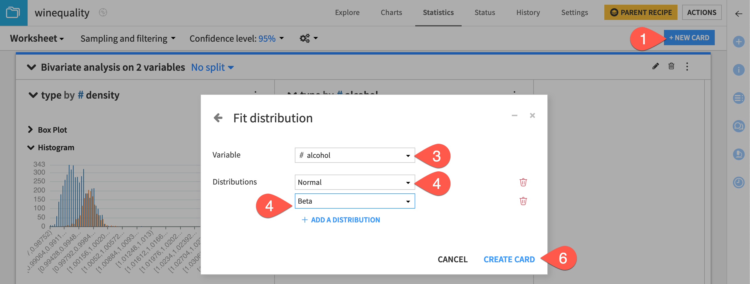
Fit distributions#
Dataiku allows you to estimate the parameters of univariate probability distributions using the Fit Distribution card.
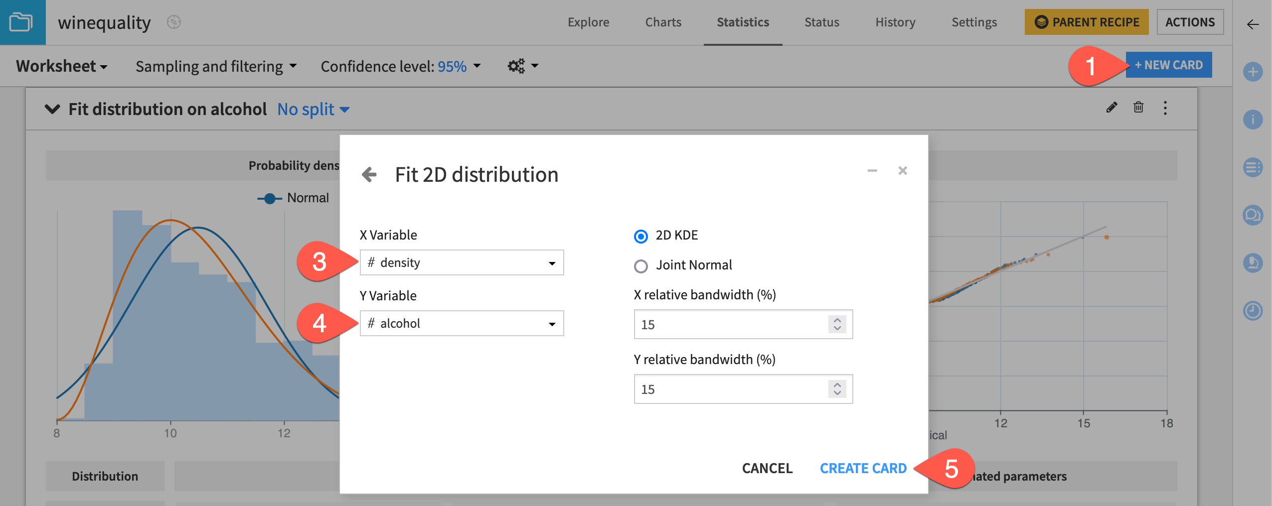
Let’s attempt to fit the normal and beta distributions to the dataset, considering only the alcohol variable.
From the existing statistics worksheet, click + New Card at the top right.
Select Fit curves & distributions and then the Fit Distribution card.
Select alcohol as the variable.
Select Normal as the distribution.
Click + Add a Distribution to add the Beta distribution.
Click Create Card.
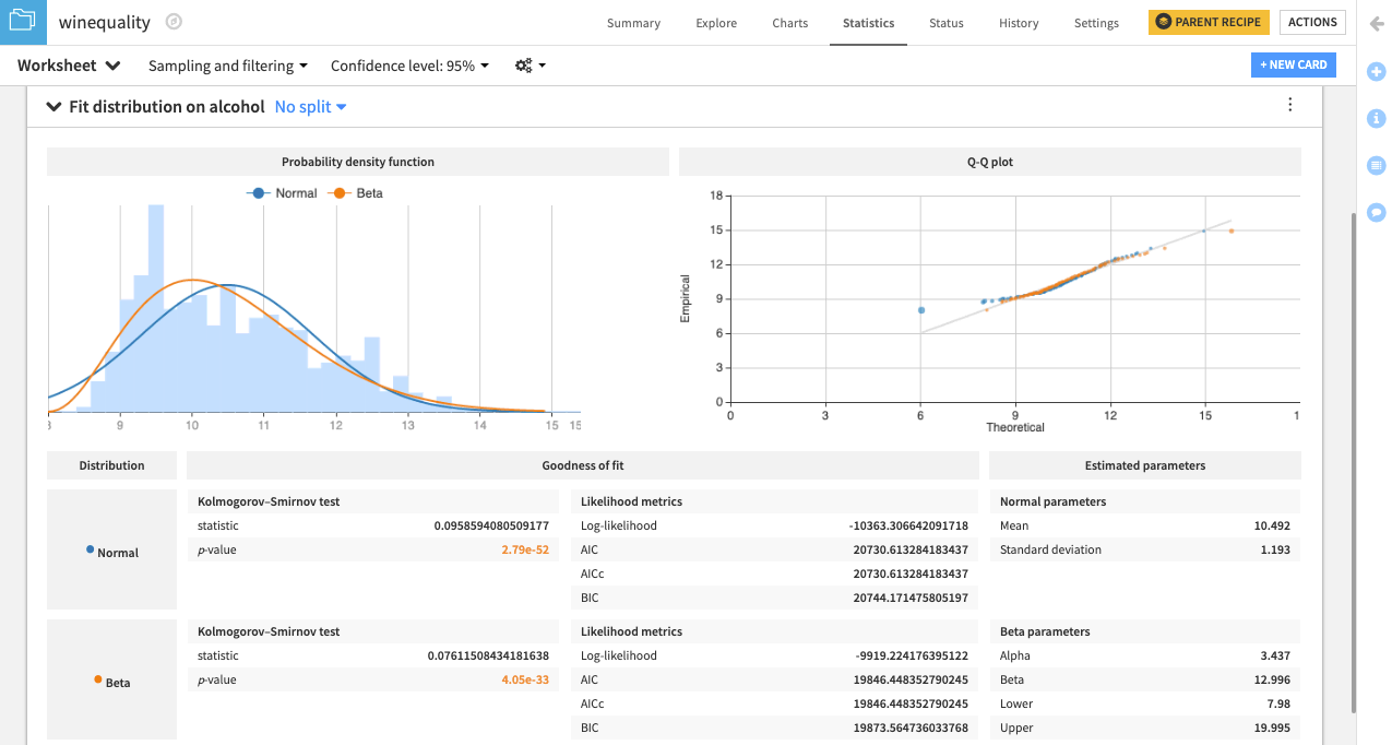
Dataiku creates a card that shows the normal and beta probability density functions fit to the data.
There is also a Q-Q plot that compares the quantiles of the data to the quantiles of the fitted distributions. Observing points that are far from the identity line suggests that the data couldn’t have been drawn from either distribution.
Additionally, the card includes goodness of fit metrics and the estimated parameters for the normal and beta distributions.
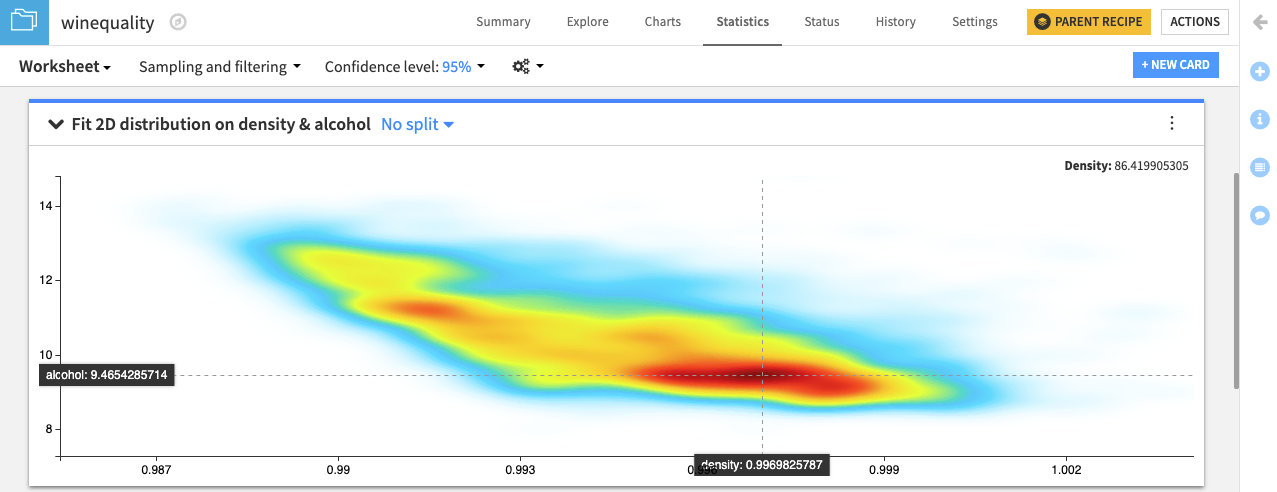
2D fit distributions#
Similarly, the 2D Fit Distributions card is available for visualizing and estimating bivariate probability distributions on your dataset.
Let’s attempt to fit a 2D kernel density estimate (KDE) to the dataset, considering only the density and alcohol variables.
From the existing statistics worksheet, click + New Card at the top right.
Select Fit curves & distributions and then the 2D Fit Distribution card.
Select density as the X variable.
Select alcohol as the Y variable.
Click Create Card, keeping the 2D KDE and relative bandwidth defaults.
Tip
Instead of the defaults, you can increase the relative bandwidth values to make the KDE plot smoother or decrease them to make the plot less smooth.
See also
For more information, see Fit curves and distributions in the reference documentation.
Fit curves#
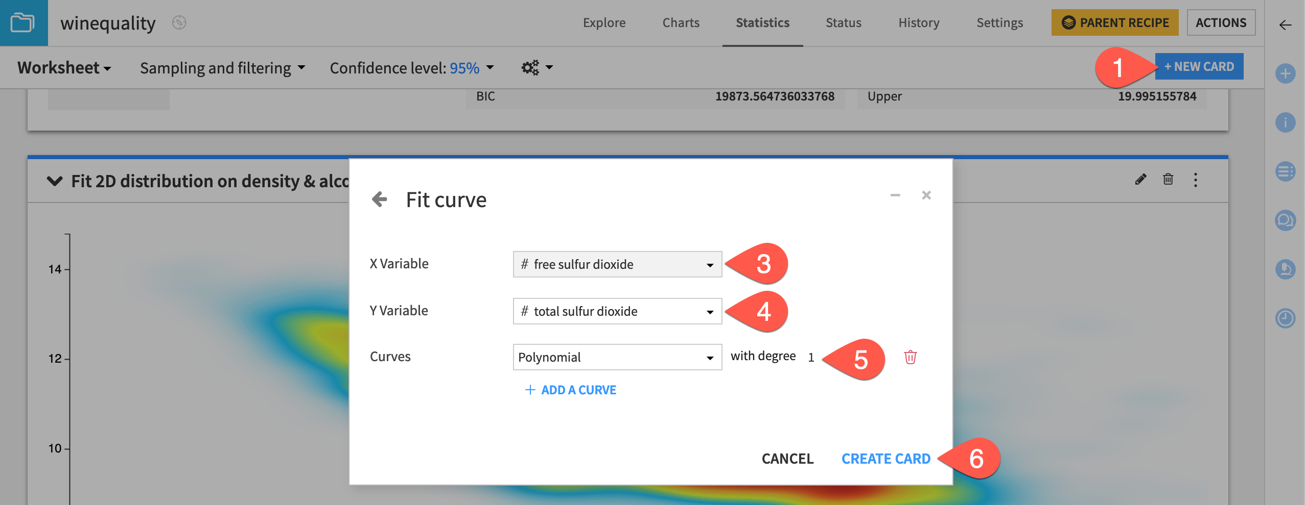
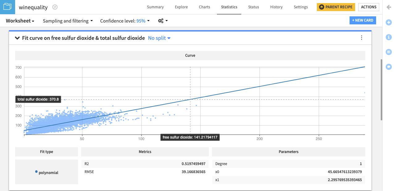
Finally, let’s use the Fit Curve card to find the best line or curve that models the relationship between the free sulfur dioxide and total sulfur dioxide variables.
From the existing statistics worksheet, click + New Card at the top right.
Select Fit curves & distributions and then the Fit Curve card.
Select free sulfur dioxide as the X variable.
Select total sulfur dioxide as the Y variable.
Fit a polynomial curve of degree
1.Click Create Card.
It appears that an increase in the value of the free sulfur dioxide variable results in an increase in the value of the total sulfur dioxide variable and vice-versa. This indicates that both variables are positively correlated. We can confirm this by finding the correlation coefficient between these variables.
See also
For more information, see Fit curves and distributions in the reference documentation.
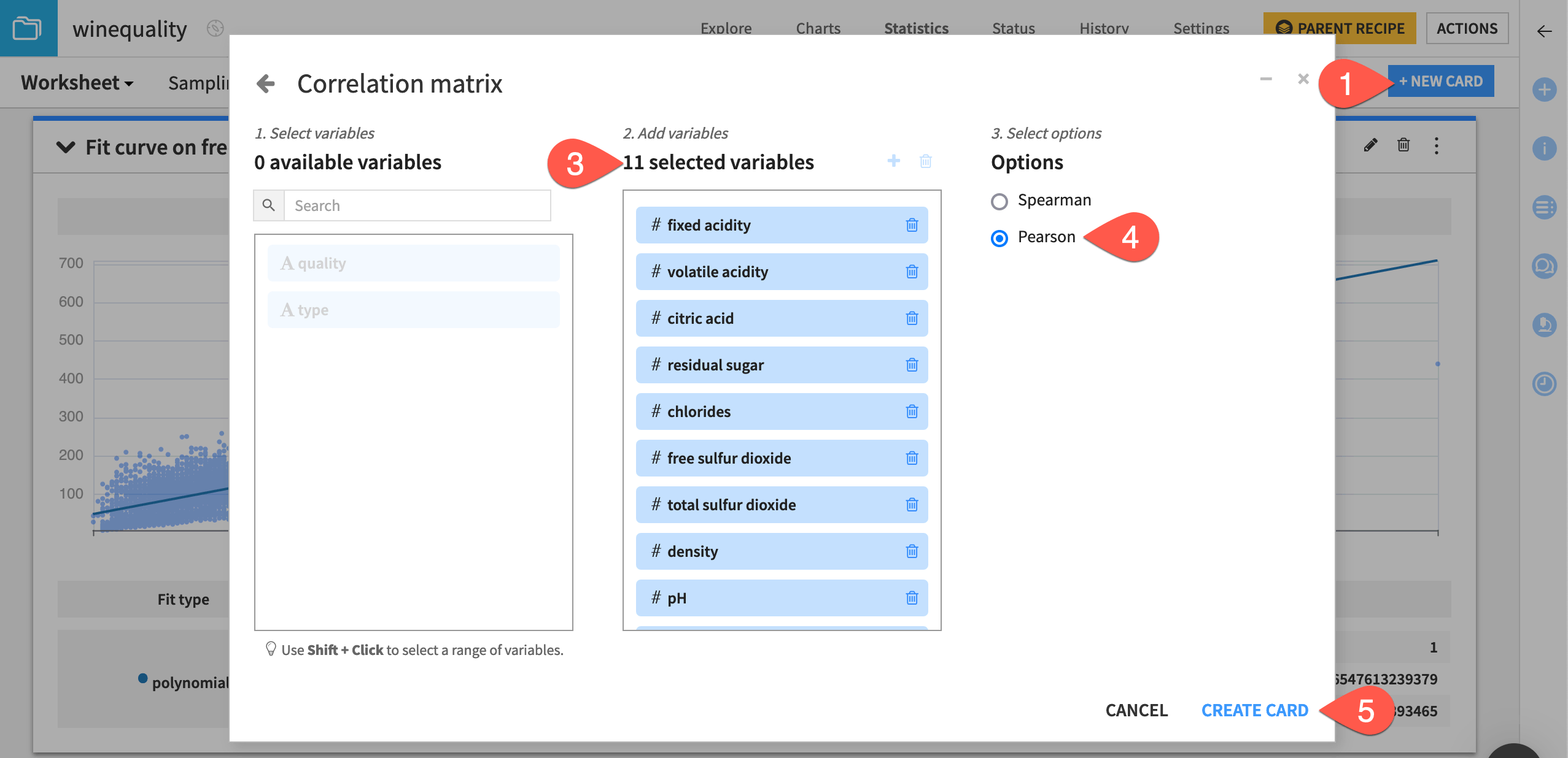
Create a correlation matrix#
The Correlation matrix card allows you to examine the degree to which pairwise relationships may exist for variables in the dataset.
Let’s create the card.
From the existing statistics worksheet, click + New Card at the top right.
Select Multivariate analysis and then the Correlation matrix card.
Move all 11 numerical variables from the left to the selected variables column.
Switch to the Pearson correlation coefficient option.
Click Create Card.
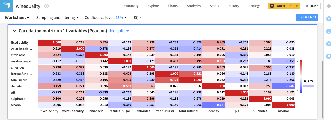
The correlation matrix card displays a heatmap with the pairwise correlation values in the matrix cells. Of all the variables in the dataset, free sulfur dioxide and total sulfur dioxide have the largest positive correlation (0.721). This confirms the observation that we made from finding the fit curve.
Also, notice that the variables density and alcohol have the largest negative correlation (-0.687) in the dataset. This negative correlation implies that wines having higher density values tend to have lower alcohol content.
See also
For more information, see Correlation Matrix in the reference documentation.
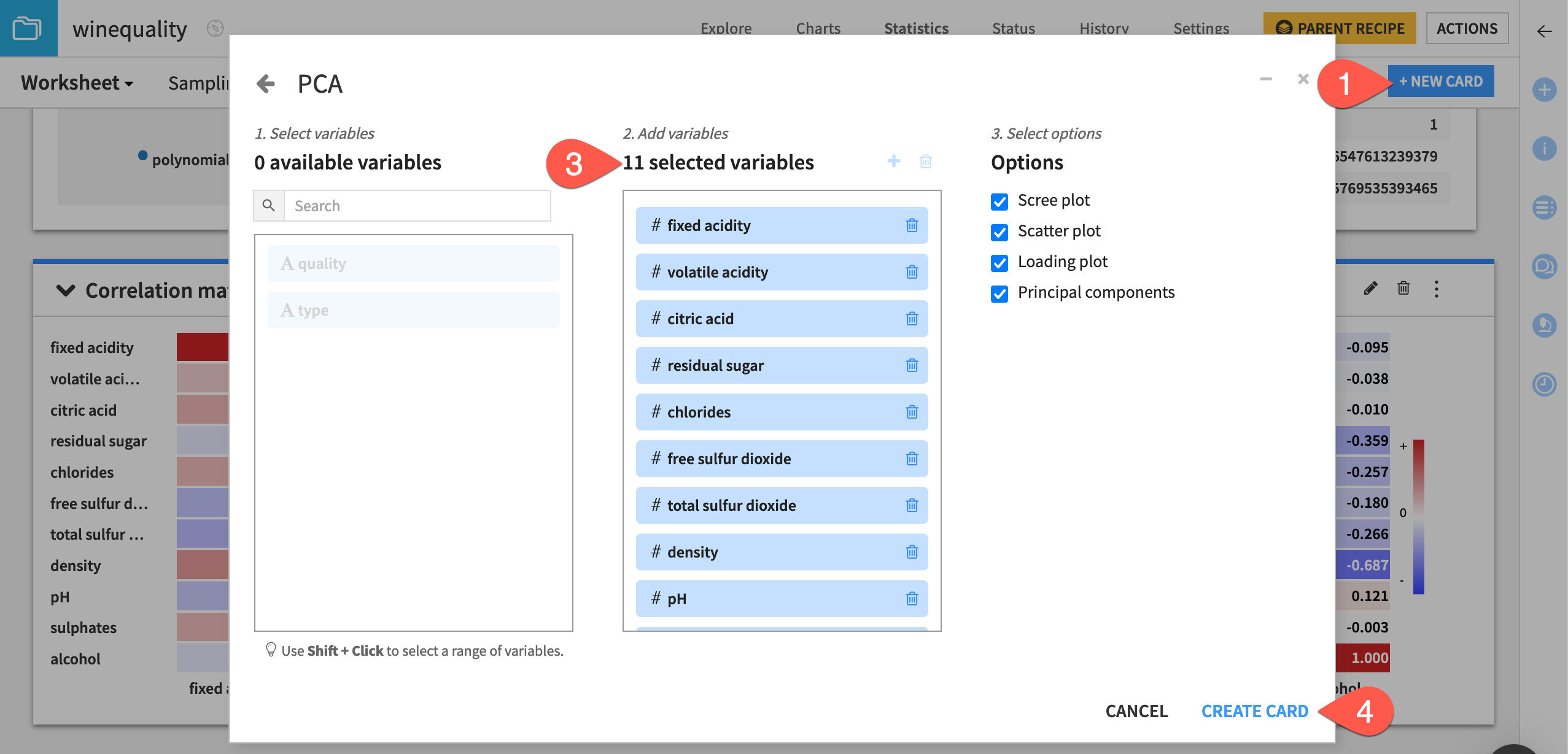
Analyze effects of dimensionality reduction with the PCA card#
When working with a dataset having many variables, you may be interested in analyzing the effects of using a reduced number of variables (or dimensions) of the data. For example, you may choose to explore the structure of the winequality dataset in two dimensions.
Dataiku enables you to analyze the effects of dimensionality reduction using a feature extraction method called Principal Component Analysis, or PCA.
Let’s use the Principal Component Analysis card to represent the winequality dataset in two dimensions.
From the existing statistics worksheet, click + New Card at the top right.
Select Multivariate analysis and then the Principal Component Analysis card.
Move all 11 numerical variables from the left to the selected variables column.
Click Create Card.
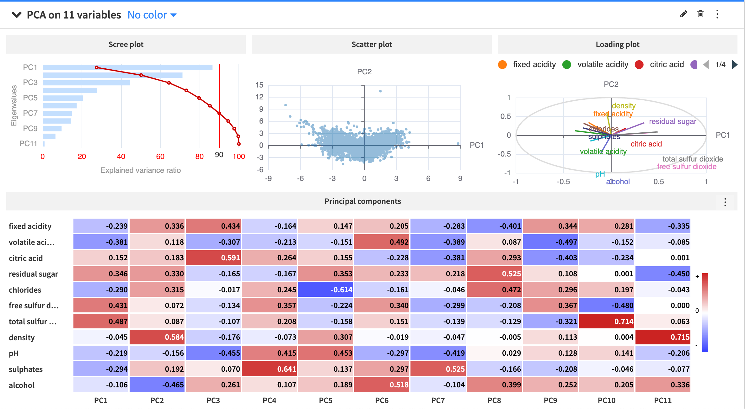
This produces a few outputs:
Visualization |
Description |
|---|---|
Scree plot |
It shows that using only the first two principal components retains about 50.2% of the variance in the dataset. To retain a variance of at least 90% (the red vertical line), you must use a minimum of 7 principal components to represent the data. |
Scatter plot |
It shows the data projected onto the first two principal components. |
Loading plot |
It shows how strongly each of the 11 numerical variables influences the first two principal components. Vectors forming a small angle, such as volatile acidity and fixed acidity, are likely to be positively correlated. Vectors meeting in an orthogonal angle (or nearly orthogonal angle), such as density and total sulfur dioxide, aren’t likely to be correlated or have little correlation. When two vectors form a large angle, such as residual sugar and pH, they’re likely to be negatively correlated. |
Principal components heatmap |
A matrix of the principal component loading vectors. For instance, the first column of the matrix corresponds to the loading vector of PC1, or a vector of the coefficients used in the linear transformation of the dataset to the first principal component dimension. |
See also
For more information about the PCA card, see Principal Component Analysis in the reference documentation.
Perform statistical tests#
You can make data-driven conclusions from the winequality dataset using Dataiku’s built-in statistical tests. These statistical tests are a form of inferential statistics that use a sample to make predictions about a population. In other words, these tests allow you to test hypotheses about a population using a sample.
One-sample Student t-test#
One-sample tests compare the location parameters or distribution of a population to a hypothesis using one sample. Other statistical tests for numerical variables may use two or more samples to test equality or similarity between populations.
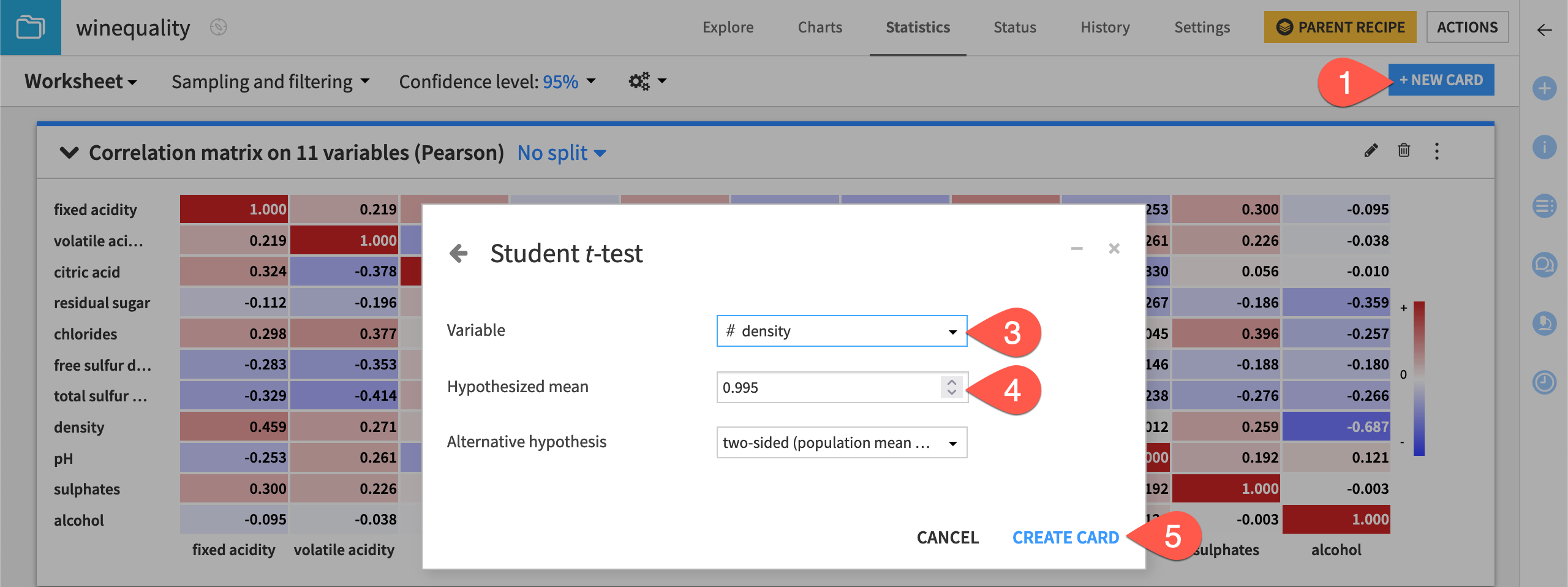
Let’s determine whether the mean of the underlying population for the density variable is equal to a specified value. To do this, we will use the one-sample Student t-test card.
From the existing statistics worksheet, click + New Card at the top right.
Select Statistical tests and then the Student t-test / Z-test card from the One-sample test panel.
Select density as the variable.
Type
0.995as the value for the Hypothesized mean.Click Create Card.
The card displays a summary of the density variable, including the:
Mean
Tested hypothesis
Results of the test
Plot of the distribution for the test statistic
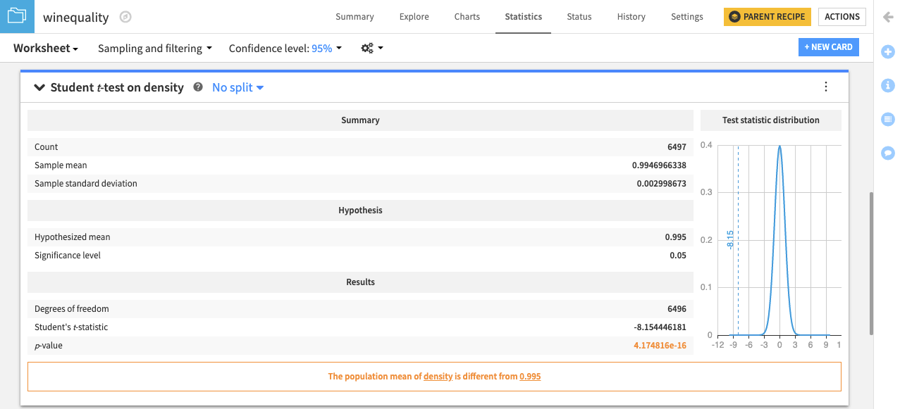
The card also displays a conclusion from the test. In this case, it concludes: “The population mean of density is different from 0.995.”
Similarly, you can test whether the median of the population for the density variable is equal to a specified value using the Sign test (one-sample).
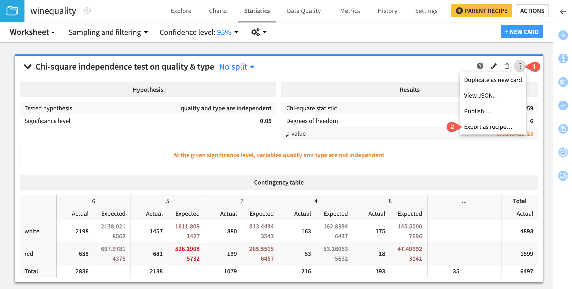
Categorical Chi-square independence test#
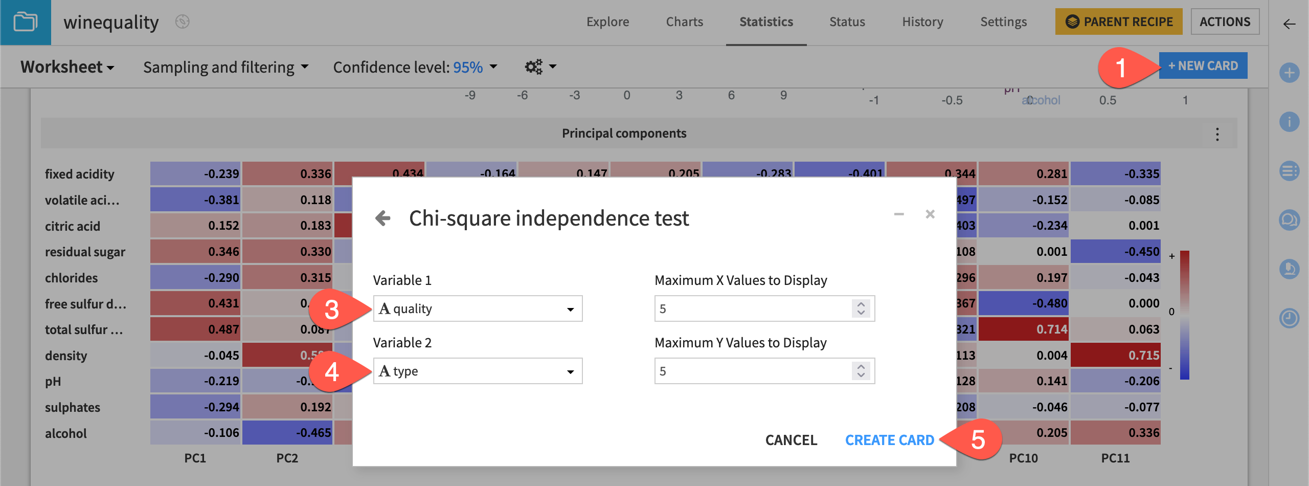
All statistical tests are performed on numerical variables except the Chi-square Independence Test.
Let’s try it to see if two categorical variables in the winequality dataset are independent.
From the existing statistics worksheet, click + New Card at the top right.
Select Statistical tests and then the Chi-square Independence Test card from the Categorical test panel.
Select quality as Variable 1.
Select type as Variable 2.
Click Create Card.
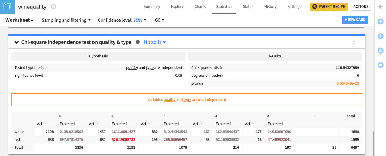
The resulting card displays the tested hypothesis and the results of the test.
Similar to the statistical test results, the Chi-square independence test card also provides a conclusion. In this case, the result is that “Variables quality and type aren’t independent.”
See also
For more information, see Statistical Tests in the reference documentation.
Leverage the Generate statistics recipe#
Another way to analyze statistics in Dataiku is through the Generate statistics recipe. It can be used to embed statistical tests in your Flow.
Note
This section of the tutorial requires Dataiku 12.6+.
Export as recipe#
From the statistics worksheet, you can export the Chi-square independence test card as a recipe.
Click on the vertical dots (
 ) menu of the Chi-square independence test card.
Select Export as recipe.
Select Create Recipe.
Review the pre-filled fields, and the Run the recipe.
The recipe and output dataset should be visible in the Flow.
Create the recipe from the Flow#
You can also create a Generate statistics recipe from the Actions panel in the Flow.
Select the winequality dataset.
Click Generate statistics from the Actions panel.
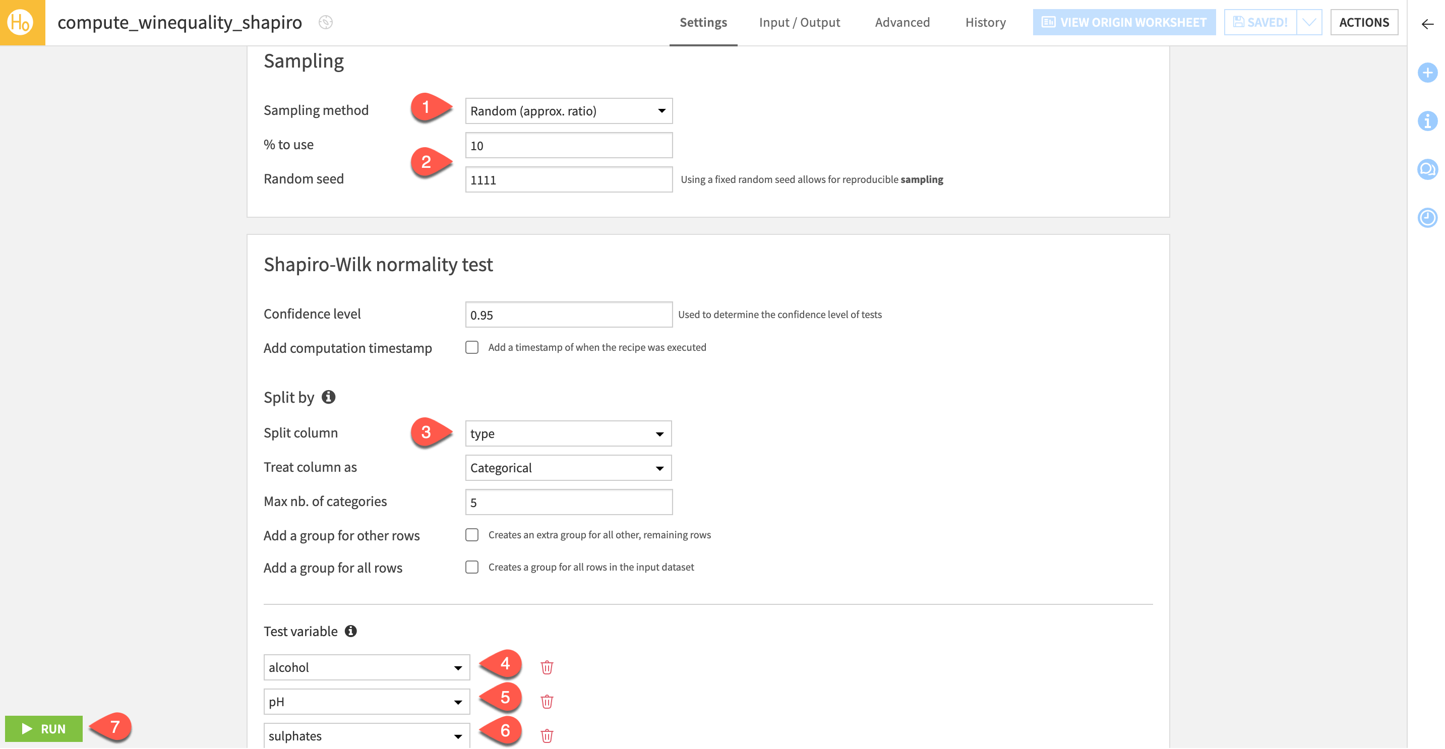
Navigate to Statistical test: One-sample > Shapiro-Wilk Test.
Select Create Recipe.
Configure the Generate statistics recipe#
One benefit of the Generate statistics recipe is that you can perform multiple statistics tests at once. Let’s configure three normality tests in this recipe.
Since this test works best with fewer than 5000 records, set the Sampling method to Random (approx. ratio).
Set the % to use to
10and set the Random seed to1111.For the Split column, choose Type.
For the Test variable, choose alcohol.
Select + Add a Statistical Test, and choose pH.
Select + Add a Statistical Test, and choose sulphates.
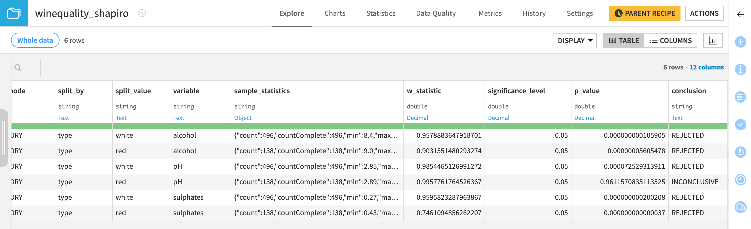
Click Run to execute the recipe, and open the output dataset.
You’ll be able to see six tests and their conclusions. It should appear that all tests but one reject the null hypothesis that the data is normally distributed.
Tip
Another benefit of the Generate statistics recipe is that you can periodically run the recipe using scenarios.
Next steps#
Congratulations! You’ve tried out a range of statistical analyses and tests using the native Statistics tab. Take the next steps by trying out further tests and customizing the outputs on your own.
Note
Also note that when more flexibility is required, you can create Code notebooks to explore a dataset with your own code.
Tip
You can find this content (and more) by registering for the Dataiku Academy course, Interactive Statistics. When ready, challenge yourself to earn a certification!